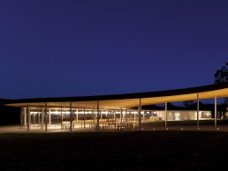
Grace Farms, USA
BuroHappold Engineering’s lighting team worked alongside SANAA and Handel Architects to create a unique space for the arts and community of New Canaan, Conneticut, that embraces and welcomes its natural surroundings yet utilises intelligent lighting solutions at night to bring the building alive.
Grace Farms, designed by architectural practice SANAA, is in the northeast of New Canaan, Connecticut, USA. Envisioned as a new type of space to house a new kind of programme where the foundation’s initiatives of nature, arts, faith and community could interact with each other, it is also known as the River building. SANAA’s goal was to make the architecture become part of the landscape without drawing attention to itself, or even feeling like a building and the hope was that people would have a greater enjoyment of the beautiful environment and changing seasons. Under the continuous roof are five transparent glass-enclosed volumes that can host a variety of activities and events, while maintaining a constant sense of the surrounding environment.
Chosen by the ownership team as the executive architect on the project, Handel Architects based in New York, worked with SANAA’s vision to develop the porous membrane, which includes a 700-person sanctuary / indoor amphitheatre; a library that includes an enclosed glass conference room; commons – a dining room and living room with capacity for 300 and a lower level that accommodates a lecture hall and ancillary spaces; a staffed welcome centre; and a partially below-grade gymnasium / multipurpose space with adjoining media lab and game room. The original barn on Grace Farms’ land has been renovated to serve as a welcome centre with a greeting space in each of its two wings and houses many of the day-to-day programmes.
The evolution of the design was a process that lasted for over five years, with the project going through several iterations throughout the schematic and design development. The formation of the architecture went hand-in-hand with the evolution of the foundation’s vision of how it would be used, meaning the team at Handel needed to be flexible even through the construction phase in order to make significant changes to the project so that the vision and architecture remained in harmony.
In terms of lighting, according to Handel’s Peter Miller, artificial light was to be at a minimum during daylight hours given the large expanses of glass used on the project – meaning little additional light was actually needed. “However, artificial light was integral to the night experience,” he tells mondo*arc. “It was important that the building walls were as invisible as possible during the day and night. Use of artificial lighting was critical to highlight interior and exterior elements so that the walls became immaterial.”
Working alongside SANAA and Handel Architects on the project was BuroHappold’s US lighting team, led by Associate Principal Gabe Guilliams. “The initial brief included little in terms of preconceived lighting ideas, other than maintaining a delicate touch on both the building and the landscape,” he tells mondo*arc, “if it had been an option to have no electric lights they would have accepted it.
“SANAA referenced their Rolex Learning Center project and how happy they were with the lighting there, so we studied the project and through dialogue with SANAA, began to understand what it was about the Rolex centre that they liked.”
“It’s always important to work with skilled lighting professionals when working on projects of this nature,” picks up Miller. “A truly gifted set of lighting designers such as BuroHappold could immediately understand the concept of what we were trying to build and offer solutions to enhance the experience. They were able to work within our parameters, while expanded our vision for what was possible.”
The main challenge of this project for Handel Architects was to accentuate the invisibility of the building in daylight and at night. Maximum transparency of the glass was achieved through careful selection of lighting including colour temperatures and beam angles.
“In the end, each light needed to be carefully adjusted so that they would properly highlight the opaque surfaces we wanted to see, while not creating reflections in the glass,” said Miller. “This allowed the building walls to disappear at night and during the day.”
But before the project even got to this stage, the planning and zoning commission hearings were a big challenge – with neighbours confronting the development, concerned that it wouldn’t fit in to the context of their existing rural neighbourhood, particularly given its 1,400ft length and transparency.
“For six months we travelled to New Canaan and gave testimony at monthly hearings defending the subtlety of our proposed project,” says Guilliams. “We did a photographic essay on the existing nightscape in and around New Canaan to contrast the norms of the neighbourhood with our design at Grace Farms. Central to discussion was how the revered Glass House by Philip Johnson functioned at night. We demonstrated that the significant transparency was a benefit because there were few opaque surfaces to become light reflectors.
“Johnson recognised the need for landscape lighting at the Glass House so that he could see through the glass at night instead of only reading himself and his housewares in reflection,” continues Guilliams.
“We ceded that we needed light outside of our volumes for this very reason. The trees in the landscape would receive uplight to serve this function and to minimise the visual impact for the neighbours we only illuminated trees from the river building’s side.”
The covered walkway that extends the full length of the building was also a perfect receiver because it follows the slope of the hillside and is not visible from neighbours’ vantage points across the valley. According to Guilliams, uplighting the ceiling enhanced the sense of wayfinding at night and appealed to SANAA in a very similar way to the Rolex Center; the purity of the surface material was maintained by removing light fixtures from it.
Structurally, the building was a lot kinder to BuroHappold largely because the team avoided locating lights in the ceiling. The big exception to this is the sunken gymnasium, where they chose to tuck lights in to the ceiling. “We did this to minimise visual obstructions as seen from the landscape,” says Guilliams. “The roof has a slight bow to it and doesn’t offer much view to the ceiling surface from outside – so we managed to limit light spill to the landscape.
As discussed, natural daylight is the dominant light throughout the day at Grace Farms with not much electric light required. As the day comes to an end, the wood ceiling throughout becomes activated, transitioning the warmth of the sunset glow to the interiors. “We’re really pleased with the way lighting works at Grace Farms,” says Guilliams. “We did 15-20 mock-ups during the design process, eliminating the risk involved for a number of our more aggressive design ideas. We struck a delicate balance between the need for the interiors to be functional; the exteriors to enhance that function; and for the two together to create a singular experience.”
For BuroHappold, light in this project is an activator; a wayfinder through the site, it is playful and promotes socialising in the commons. It is focused, with light on task in the library and it is calm – imbuing a sense of serenity in the sanctuary. From higher density landscape lighting outside the commons, to largely moonlight glow outside the sanctuary, the gradient density of landscape lighting supports the human transition upon ascent from social spaces to the place of prayer.
One of the stand out lighting features in this project is the beautiful ceiling detail devised by BuroHappold using Flos Glo Ball fixtures in the commons and custom pendants in the sanctuary. In their standard form, the Glo Ball fixtures have a massive canopy mounted to the ceiling that holds the ballast. The custom pendants in the sanctuary have a 120cm canopy at the ceiling to make the wiring splices accessible, as is required per the US National Electric Code.
“We preferred that all of this be concealed and accessible from above the tongue-and-groove ceiling,” says Guilliams. “We worked with the contractor where several slats from the ceiling would become a removable panel at each fixture. The panel would extend from glulam to glulam. The stems for each fixture now appear to pass straight though the ceiling, without a hint of their supporting canopies.”
In considering elements of the project that could have been approached differently, from an architectural point of view Miller tells mondo*arc: “A lot of effort was spent to make the exterior spaces and the glass enclosed spaces work perfectly. The care spent in those spaces is evident such that it makes the opaque interior spaces feel more enclosed than they could be. If we had more time, I think we would have made more examinations on how to treat the opaque interior spaces.”
Summing up, Guilliams notes that the biggest distinguisher at Grace Farms for him, was the singular focus from everyone on the team, from the client, to the designers, to the builders, telling mondo*arc: “In large, I credit this to our client Sharon Prince (Grace Farms Foundation President). It has been her mission to see Grace Farms come to fruition – and she was relentless. From the lighting side alone, she was at nearly every mockup we did, mockups that often lasted until the early hours of the next morning. I can only imagine how that permeated to the other 30 plus consultants on the project, and the final result speaks volumes. The sense of camaraderie on this team is one that I can only wish to have on future projects.”


