MGM Healthcare, India
Dating back to 300BC, India has a rich history in medical education and sciences, with world-renowned physicians such as Jivaka Kumarabhacca and Charaka showing the world how to treat diseases and illnesses.
At a time when surgeries worldwide were done primitively, well-trained surgeons in India, such as Sushruta, performed the most advanced and complex surgeries, including cataract, plastic and reconstructive. Sushruta was also a great teacher, giving students practical, hands-on experience in surgical skills by getting them to make incisions on the skin of fruit.
Inspired by this glorious past, the Mahatma Gandhi Medical (MGM) College and Research Institute has developed a reputation for medical education in India. The next stage of its evolution was the launch of India’s first USGBC, LEED Platinum-certified hospital in Chennai, Tamil Nadu – MGM Healthcare.
The inspiration for MGM Healthcare came from a “health-caring movement”, which looks to redefine the patient experience across all parameters – through design, expertise, technology and environmental sustainability.
Lighting was recognised as an imperative element in this movement, to support doctors and therapists during treatments and to promote the healing process in patients with an increased sense of wellbeing. The right light at the right time in the right place was considered critical in this movement, characterised by acute cost awareness and savings as a result of lower energy costs.
With a built-up area of more than 300,000sqft, this 11-storey, 400-bed hospital has been optimally designed by KGD Architecture to provide the most comforting ambience for healthcare; every aspect of the hospital reflects an ethos of healing and a sense of serenity, from the city’s tallest vertical garden, to the use of music therapy in critical care areas, to thematic art galleries on each floor celebrating the various facets of Tamil Nadu.
These myriad tasks and the vastly different spaces and users demanded a variety of lighting treatments, without compromising on energy efficiency. As such, Dr. Amardeep M. Dugar, Founder and Principal of Lighting Research & Design, was brought in to develop the lighting design for the hospital.
Although utility in terms of wayfinding was non-negotiable, there was a lot of room to experiment in terms of brightness, colour temperature and colour rendering. However, one general principle followed throughout the hospital, which was to make the effect of the 100% solid-state lighting as natural as possible, so as to provide a better sense of wellbeing among patients and staff.
One of the key methods of doing this, Dugar explained, was to move away from the traditionally cold, sterile atmosphere of hospitals and create something warmer, more akin to hospitality lighting.
“The preliminary brief was to provide the functionality and style of a hospitality environment, so as to elicit a certain emotional response from the hospital users,” he said.
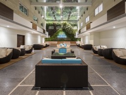
This style is evident in the MGM Healthcare lobby, which had to be inviting yet professional, to complement the furnishings and décor in creating an overall appeal. “While a well-lit lobby was essential, care was taken not to flood it with overabundant illumination that might create environments akin to an emergency room,” Dugar explained.
The lobby was divided into entrance, reception and waiting areas, each with its own lighting treatment to provide a different ‘feel’. The reception desk is well-lit, and prominently highlighted with a decorative pendant from Aromas, lit at 3000K, so that patients and visitors know exactly where to go first, and have adequate illumination for reading and signing necessary paperwork.
The lobby space also incorporates a separate VIP Lounge – a waiting area specially allocated for important guests and visitors. The lighting solution here sought to create a relaxed and soothing atmosphere. Abby’s ceiling-mounted cylindrical 3000K downlights with adjustable heads provide accentuated illumination, which can also be used to highlight the paintings on the walls. Decorative floor lamps from LEDS-C4 and wall-mounted up-downlights from Astro Lighting are added next to seating areas, creating a more relaxed atmosphere for guests to relax or socialise. Gold-finish luminaires are specified to match the beige and gold colour scheme used in the entire lobby and lounge areas.
The decision to use the warmer, 3000K colour temperature in all the non-clinical areas of the hospital was integral in creating a more hospitality-like environment, and was the result of a process Dugar refers to as “evidence-based design”.
“Evidence-based design in healthcare is a developing field of study that holds great promise for benefitting key stakeholders,” he said. “It proposes a framework where the built environment is represented by nine design variable categories: audio environment, visual environment, safety enhancement, wayfinding systems, sustainability, patient room, family support spaces, staff support spaces and physician support spaces.
“From its initial focus on reducing patients’ stress, evidence-based design evolved to include patient and staff safety; staff morale and productivity; and environmental sustainability.
“As this was my first foray in evidence-based design in healthcare lighting, I used my personal experience while visiting family and friends who were undergoing treatment at hospitals. The cold and sterile atmosphere tends to exacerbate their anxiety and stress levels. Therefore as a first step, a warm colour temperature of 3000K was used in all the non-clinical areas.”
Dugar opted for a neutral colour temperature of 4000K in the clinical and semi-clinical areas, striking a gentle balance without causing too much contrast. However, some semi-clinical areas, such as corridors and the nurses stations, were illuminated at 3000K with decorative luminaires to create a more balancing effect.
In general, the corridors were illuminated via bespoke, ceiling-recessed, double-asymmetric linear profiles in 4000K. Taking care to avoid glare for patients in stretchers or wheelchairs, these fixtures wash the two walls of the corridors, offering glare-free illumination as well as wayfinding. After dark, these linear profiles can be dimmed using an analogue rotary dimmer mounted on the entry walls of each corridor.
In the executive floor corridors, catering to the high-end suite rooms, circular coves with 3000K LED tape from Ledos provide a soft, warm illumination more akin to a hotel corridor. Bespoke, wall-mounted decorative up-downlights in 3000K provide supplemental illumination in all corridors.
In the doctors’ offices, lighting had to serve multiple functions, as the spaces act as both a regular office and an examination room. Office lighting has to be ergonomically correct and individually adaptable, while examination rooms require high levels of general illumination and good colour rendering to show the true tone of the skin, for example, for visual examination.
However, since the majority of the consultancy in a doctor’s office consists of simply talking with the patient, a soft general illumination was deemed as the best lighting solution. As such, Abby’s Skylight modular panel luminaires in the grid ceiling were deemed the best way of reaching the 500lux average requirement, with a colour temperature of 4000K and high Ra 90 value.
Elsewhere, MGM Healthcare features a number of other areas, both public-facing and back of house, each with their own specific lighting requirements: from administration offices, to the cafeteria and training rooms. The administration office combines direct and indirect lighting with task lighting, to create an optimum working environment for both paper and screen work. Abby’s Circulo and Enso circular pendant luminaires, in different sizes and configurations, create a more intimate, less clinical feel, while the luminaires also match with the exposed ductwork in the ceiling.
When illuminating the cafeteria, bright lighting was used as a means of keeping staff and visitors awake and alert. The use of ambient and punctual lighting elements defines the design and feel of the cafeteria. Large windows let in plenty of natural light during the day, while a rhythmic composition of ‘floating’ 3000K linear profiles integrated between the wooden rafters provide illumination at night.
The training rooms, used by doctors for conducting special training sessions, also double up as an auditorium for major conferences, meaning that they are dynamic environments where people meet, learn, share ideas and collaborate. This called for a flexible lighting strategy that was designed for easy pre-programming and dimming. Ceiling coves with Ledos’ LED tape in 4000K provide ambient illumination to eliminate glare and fill in the shadows on faces. Additional spotlights from Abby, also in 4000K, provide accentuated illumination.
However, the highlight of the hospital though is the vast, living green wall. The largest vertical garden in the city, the green wall brings a welcoming natural feel to the pre-function area outside the training rooms. Although situated under a large skylight that allows for ample natural light, supplemental illumination was required for those sections of the wall not receiving the required illumination. Additionally, the living wall becomes a night-time feature, especially during conferences, which meant that it required special highlighting. Abby’s linear grazers in 4000K were used from the top-downwards and below-upwards, evenly washing the green wall. The rest of the lighting in the pre-function space was kept to a bare minimum, ensuring the focus remained on the green wall.
With all of these myriad areas throughout MGM Healthcare, each with their own lighting requirements, creating a sense of unification was one of the most challenging aspects for Dugar. “Subtle design elements, especially in terms of decorative elements such as similar up-downlights or gold finishes were introduced for visual continuity within the different spaces,” he explained.
“In spaces where it was not possible to include decorative elements, this continuity was maintained through similar cove lighting elements or colour temperatures.”
While the links between good lighting and good health and wellbeing are becoming widely recognised within the lighting design field, when developing lighting for a healthcare facility, its role is much more pertinent. Dugar was therefore on hand to provide some additional consultation to the building staff on how the lighting could be used to boost wellbeing.
“Lighting for health and wellbeing has now become the single selling point for almost all projects, and more so for this project, as it is all about healthcare,” he explained. “As improving the healing process was the prime objective of this project, health and wellbeing were definitely more integral factors here. All key building management personnel were briefed and educated right from the concept design stage itself, in order to bring them onto the same page with respect to lighting.”
The end result is a thoughtful lighting strategy that, while catering to the specific needs of a healthcare establishment, does so in a way that eschews the overlit, cold and clinical environment usually associated with hospitals. Instead, what Dugar has developed creates an environment that is warmer and altogether more welcoming, where lighting becomes a subtle, yet significant element in the overall healing process.


