100 Liverpool Street, UK
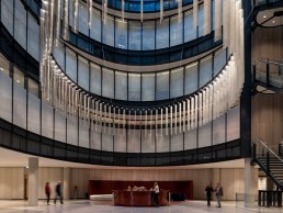
Speirs Major has created a striking lighting scheme for the 100 Liverpool Street retail and office redevelopment in London, characterised by one of the UK’s largest bespoke chandeliers, The Cloud.
Achieving a BREEAM Outstanding rating, the 100 Liverpool Street large-scale flexible retail and office redevelopment is the latest stunning project to join the esteemed profile of lighting design for Speirs Major.
Located adjacent to Liverpool Street Station and its future Crossrail Station in London, 100 Liverpool Street underwent an extensive strip-out, rebuild and extension to provide a sustainably-constructed, 48,300sqm, lettable office space.
Speirs Major worked closely with Hopkins Architects and interior designers Universal Design Studio (UDS) to conceive the lighting scheme for the vast space, including, arguably, the UK’s largest chandelier constructed to date, dubbed The Cloud.
The UK-based lighting designers developed the lighting schemes for external after-dark identity, ground floor and mezzanine retail arcades, office entrance lobbies, roof terraces, the second-floor lobby and atrium, as well as shared amenities such as the atrium stair, bike store, changing rooms and WCs.
arc caught up with Senior Partner of Speirs Major, Mark Major, to discuss the lighting journey for the expansive building. “We were initially approached by British Land to bid for the project. 100 Liverpool Street was the first project in Broadgate that we worked on, but since then we have prepared a full site-wide strategy and we are working on several other projects, including 1 Broadgate with AHMM, and Exchange Square with DSDHA,” he said of winning the project opportunity.
“We were given an outline brief through a schedule of areas and scope, but the specifics of the lighting brief were developed collaboratively between ourselves, British Land, Hopkins Architects and UDS, allowing for a more flexible and creative approach.”
The ground floor Octagon Mall retail arcade also serves as an important east-west circulatory route, linking the station, Liverpool Street, Bishopsgate, and Broadgate Circle. Enhanced by the soft reflections of shoppers and the sinuous geometry of the lighting channels, the ceiling design encourages a gentle flow of movement. This is achieved by crafting a balance of brightness, which manages any contrast when moving between inside and outside, while also ensuring the retail frontages have prominence.
Major explained: “The project can be viewed as two distinct parts – the retail arcade connecting to the wider public realm, and the office development. For the retail space, the lighting narrative concerns creating a sense of flow – supporting intuitive wayfinding between Liverpool Street Station, Broadgate Circle and 1 Broadgate (in the future), while amplifying the presence of the retail offer within the arcade. The office project also has an element of flow – we considered what the journeys that people make through the buildings should feel like and, in line with the architectural and interior design approach, we focused on creating great atmosphere in the ‘public’ spaces that would support a buzzing, social, collaborative environment.
“The lighting supports the experience of these journeys, which can vary depending on the mode of arrival (e.g., by train, tube, foot, bicycle) and the mood and motivation of the individual – busy and focused or meandering, browsing, socialising, etc. We designed the lighting to describe and enhance these journeys, visually defining and connecting spaces and areas, and building in moments of dwell. We have a lot of experience with this type of lighting – airports, public realm spaces, galleries – as with this project, for all these the lighting of circulation is hugely important and often underrated.”
Two entrance lobbies, to the south and north, provide access to the office space. In each a wash of light onto key vertical surfaces supports a strong external identity while promoting legibility and wayfinding. Highlights to artwork, furniture, and planting contribute a warm ambience, while the distinctive pendants chosen in collaboration with UDS provide a sense of human scale and essential task lighting. Lighting is also integrated into the handrails of the escalators, which avoids problematic maintenance and provides additional visual cues that aid in wayfinding.
Upstairs, the second-floor lobby and atrium hold the main reception, café, informal meeting, and flexible working areas. Again, highlights are added to selected vertical surfaces, reinforcing the clear legibility and wayfinding. Appropriate ambiences are achieved with further task and feature lighting pieces in zoned areas, such as the reception desk, seating areas and workstations.
“Architecturally speaking, we considered how we would address each space, defining zones, and revealing materials, textures, and colours. For the second-floor lobby, light to the perimeter helps define the boundaries, making the spaces more legible and creating a sense of depth,” said Major. “The atrium required special consideration, with its bold conical shape, vast size, dramatic exposed staircase, and the multiple viewpoints from the offices. Having had the experience of hanging lighting objects within large voids in a number of projects over the years, we knew that this could bring several benefits. By creating a point of reference, hanging an object in such a space can both provide a sense of human scale, while also emphasising the grandness/volume. From a practical point of view, it also puts the light where you need it.”
The hanging object referenced here by Major is thought to be the largest chandelier ever constructed in the UK, known as The Cloud.
“We started by sketching some ideas, and as a design team settled on having just one large object, rather than a series of objects – a clean, simple, and practical solution that could be executed at the right scale. In fact, the geometry of the piece is entirely derived from the architecture, considering elements such as the cladding grid,” explained Major.
“We also needed to consider practical issues such as the impact of the hanging points on the cleaning cradles. So, in terms of form, size and disposition, the form evolved to perfectly occupy the exact space it needed to. We conceived of the design as a simple ring from which we would hang blades that reflect and soften the light from a series of downlights, the latter providing the functional and ambient light to the atrium below. The blades draw on the language of materials that Hopkins and UDS used in the architectural cladding and interior design – light coloured perforated metal with softly curved edges – ensuring that the chandelier also visually belongs to the building.
“There is a similar language in the materials used for the illuminated ceiling in the café bar, which also features tuneable white light, helping to tie the spaces together and enhancing the sense of design cohesion. The design was modelled extensively in 3D and mock-ups, testing various designs of blades to create the soft, light, cloud-like effect we wanted.”
“Because of the dual nature of the blade (one side matte, one side reflective) the effect reads slightly differently depending on which way round you walk – a nod to the natural variation of a cloud. And, if you look closely, the perforations in the blades create an interference pattern that scatters light and creates further ‘cloud-like’ textures – so essentially more clouds within the cloud. Bringing this hugely ambitious idea to reality required a huge amount of work and collaboration within the design team and with the manufacturing partner, Stoane Lighting, and a corresponding amount of bravery from the client. But it has become a very important part of the signature of the building, and it truly brings something very special to the space.”
Continuing higher into the building, the top five floors include setback offices, which open out onto a series of outdoor planted terraces and amenity spaces. Soft lighting within the planting and under the soffit accentuates the textures and helps to soften the indoor/outdoor transitions, supporting safe and easy circulation. The low-level exterior light also supports views out through the glazing from the office interiors and spectacular views from the terraces out across the city, with minimal lighting pollution.
Despite not being directly involved in the lighting for the office spaces here, Major spoke of an evolution her perceives in the lighting of workplaces generally. He said: “Trends that had already begun to emerge, such as increased focus on employee wellbeing and staff retention have been accelerated by the Covid-19 pandemic. Having worked at home for many months, people are keen to retain some of the advantages of increased flexibility (i.e., not being tied to a desk). Interestingly, it seems to be the social aspect of work that is drawing people back, so more fluidity in layouts, more breakout and social spaces, access to natural light, and biophilic design approaches are coming to the fore. For all these aspects, lighting has a huge role to play – supporting the design of workplaces that people will want to return to. In this sense, the design for the communal spaces for 100 Liverpool Street has proved incredibly forward thinking in its design.”
Overall, the project was such a success for all those involved due to the close working relationships between all parties. Major concluded: “It was certainly an ambitious project but highly rewarding. Just the chandelier design and the feature lighting for the bar/café area would be considered ambitious in their own right, but the attention to detail stretches much further right across the whole project, from details like the swept up the plaster cones for the downlights that soften their effect across the ceiling to the clean integration of the linear channel lighting that grazes the walls at the perimeter – each aspect had its own design challenges.
“What made this project so satisfying though, was the level of collaboration between the members of the team, and the engagement and support of the client. That gave us the confidence throughout the project that our ideas would be listened to, and once agreed, we would get the support to see them properly delivered.
“We see it as one of the great workplace projects we have completed, both in terms of ambition and execution.”


