600 West Chicago, USA
Lighting designers at Schuler Shook played an integral role in the redevelopment of Sterling Bay’s 600 West Chicago office building, creating a bright and lively space for its tech clients to meet and interact.
Twenty years ago, Chicago’s historic Montgomery Ward catalogue building was redeveloped into a tech destination known as 600 West Chicago. Now, under Sterling Bay ownership, the property has received the WELL Health-Safety Rating and has been transformed again to meet the unique needs of today’s workforce. 600 West Chicago features an expanded retail experience to serve both tenants and surrounding neighbours, modernised tenant amenities, updated interiors, and a renewed focus on accessing the outdoors.
The team at lighting design studio Schuler Shook played a pivotal role in the building’s most recent transformation, brought onboard by the project’s architect Lamar Johnson Collaborative (LJC). Asked to review the lighting design and validate the ideas developed up to that point, Schuler Shook soon found that the lighting design was going to become a more significant component for the project.
“When we joined the design team, they had finished the schematic design phase and were preparing to provide an update to the client for the design development phase,” said Laura Román, Senior Lighting Designer at Schuler Shook. “At this point, we were able to review their progress, conduct lighting calculations for the concepts suggested and provide new lighting design ideas. We also participated in the client presentation to obtain the owner’s approval of the design.
“The interior designers – Charlie Green Studio – came to the table with specific concepts in many areas, which we then confirmed and developed. The overriding narrative was to provide a bright space, with visual clarity and visually stimulating lighting with attractive decorative features.”
One of the main challenges of this project was to transform the lobby and adjacent spaces of the warehouse into bright, invigorating, and comfortable areas that felt open and easy to navigate. This approach was required to facilitate the flow of almost 7,000 people a day that pass through the 21,380sqft lobby to work in the multiple technology companies such as Groupon, Uptake, Tempus, and Big10 Network, that are housed in the building.
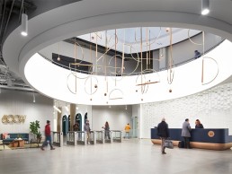
The huge oculus in the lobby at 600 West Chicago is a key focus of the space and an area that Schuler Schook was heavily involved with.
The design team wanted to highlight a sculptural mobile that features in the space, with fixtures located at the perimeter of the oculus opening. However, according to Román the team was struggling with fixture placement, considering it produced glare from the various viewing angles. “One idea discussed was to graze the vertical fade of the oculus. This approach was discarded as it would have required introducing a cove at the bottom of the oculus to conceal the fixture.
“While reviewing the renderings, an inspiration came to mind, ‘what about making the vertical face of the oculus the lighting element in itself?’ We discussed the benefits of using a back-lit tensile fabric as a means of providing a soft glow to accentuate the sculptural mobile without hot spots or any glare concerns. The whole team was excited about exploring this solution.
“The next step was to conduct several mock-ups. This is where the idea came to fruition successfully, making it one of the most visually captivating features of the space,” continued Román. “The luminous membrane also contributed to the acoustic absorption of the space, which was an added benefit.”
In terms of lighting levels achieved by the illuminated oculus, a 40-fc average was provided using a low output LED matrix concealed six inches behind the membrane. The LED system was dimmed throughout the day to match the daylight levels penetrating the space via the skylight above and adjacent lobby windows. The colour temperature of choice for the oculus LED system was static 3500K, as tuneable white was cost-prohibitive.
In terms of key architectural lighting considerations on this project, there were several concerns the designers had to keep in mind throughout. The existing lobby had very dark finishes and several hard surfaces that created acoustical concerns. In addition, several partitions in the space made circulation in the lobby cumbersome, blocking daylight contributions from adjacent windows and the skylight above the oculus.
“Considering this and the amount of people that traverse the space in the morning and afternoon during rush hours, the new architectural design ‘opened up’ the space visually and functionally – allowing more daylight into the space,” continued Román. “In addition, existing security checkpoints that blocked the flow of people were relocated to the perimeter of the lobby, eliminating the bottle-neck issues associated with the previous scheme.
“Another major contributor to the visual clarity of the lobby was providing lighter value finishes for horizontal and vertical surfaces. The lighter finishes, coupled with general broad lighting delivered by cylindrical fixtures with uplight and downlight distributions, created the sense of spaciousness that the client desired. To further contribute to this solution, grazing with light all the textured vertical surfaces added visual interest. Other methods of lighting, such as highlighting door frames indirectly and lighting coves, created the perfect visual canvas that demonstrates the success of this lighting design.
“Fixtures were dimmed throughout the day to conserve energy and balance electric lighting with daylight.”
Throughout 600 West Chicago, the entire design team worked hard to acknowledge the building’s history, while also creating something that felt more contemporary. With some wonderful ideas, they created opportunities to showcase the building’s history. “There is a corridor that was used by internal messengers, who used roller skates to move quickly through the building,” said Román. “In these corridors, a decorative custom-made mobile fixture with roller skate wheels and hanging sockets with exposed antique A-shaped LED lamps delivers a whimsical effect to a rather functional space. As well as this, a mechanical wall was rescued from storage and displayed in the main corridor; we added a soft halo of light with the simple use of an LED strip concealed behind the frame.
“For the most part, architectural lighting was completely concealed from view, except for the cylindrical pendants that provide soft direct and indirect general illumination. With this in mind, the interior design team then carefully curated and selected decorative fixtures to achieve an industrial chic style that was in harmony with the architectural lighting.”
While internally the building had experienced several interventions throughout the years, thereby sparing the design team from any constraints, when it came to the façade lighting, there were some restrictions while working on the exterior drop-off renovation and the Riverwalk corridor.
“In the exterior drop-off renovation, the team was not able to surface mount fixtures because we weren’t allowed to perforate the façade to secure the fixtures to the building,” added Román. “This was a major limitation for the façade lighting, which was restricted to in-grade fixtures or fixtures concealed in the new landscape areas.
In the Riverwalk corridor we couldn’t trespass the public’s right of way, and change the existing lighting which is part of the City of Chicago scope. New lighting was restricted within the boundaries of the private property. For this area, existing fluorescent and metal halide floodlights were replaced with LED decorative sconces.”
Reflecting on the success of the project, Román said: “We are proud to have retained all of the original design goals established by the client, architect and interior designer. We did this without changing nor steering the design team away from their vision. We were able to employ lighting technology, such as the dimmed back-lit membrane to reach their goals and enhance the space. Every detail and lighting effect came together dynamically while being in coherent harmony.”
And with the project one of several workspaces from Schuler Shook to be recognised at this year’s IALD Awards, Román added: “We have been lucky at Schuler Shook to have designed for a range of project types. In the case of corporate projects, especially the ones intended for tech tenants, it can be easy to fall into the trap of designing basic and functional lighting that meets the code. Luckily, this team designed for people and the project shows that the right design approach with architects, interior designers and lighting designers working as a cohesive team, helps create an inviting and invigorating space.
“We think it is so important for corporate workspaces to be bright, vibrant and either allow daylight penetration or mimic daylight if this valuable resource is not available in the space,” continued Román. “The visually appealing and luminous quality apparent in this project proves that a lobby and adjacent corridors that are easier to navigate visually, will provide the perfect opportunity to socialise and mingle. The previous intervention was dark and acoustically loud and raised the stress level of an already hectic commute. Now, the lobby feels brighter and more spacious, we can see the patrons stopping for coffee in the morning, drinks in the late afternoon, and throughout the day to take a break.
“We would like to thank Sarah Jacobson from LJC and Jenn McCord from Charlie Green Studio, for leading a talented group of designers, vendors and contractors into achieving this beautiful architectural transformation.”


