Radisson Blu Scandinavia, Sweden
Situated in the centre of Gothenburg, Sweden, the Radisson Blu Scandinavia has undergone a dramatic interior renovation, dominated by a remarkable new lighting feature created by Lighting Design Collective (LDC).
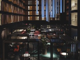
The renovation centred around the heart of the hotel – a vast interior atrium overlooked by guest rooms and surrounded by perimeter skylights. The atrium features a bar and café, alongside multi-purpose areas and pre-function spaces.
The interior design, developed by Lundwall Architects, started with darkness as a base material, and the designers worked with LDC to craft a balanced atmosphere, revealing transparencies, integrating lighting into latticed furniture, highlighting textures and playing with reflections.
Barbara Rodriguez, lighting designer at LDC, explained: “Our job was to dialogue with the existing design and find the right balance. Because the interior designers chose a lot of dark and reflective surfaces, this was very interesting for us because as lighting designers we usually try to find some darkness so that we can create some drama, and so there isn’t homogeneity. So we worked with them to try to reveal what was hidden.”
The atrium includes a series of canopies, intended to look like a collection of arches, that lower the height of the space in some areas to create a more intimate feel. Tracks fitted with Reggiani’s Yori projectors have been integrated into the canopies, providing gentle illumination to the spaces below. “Because it is a very big space, the canopies help to create open rooms within the space, and we integrated lighting into them,” added Rodriguez.
The dominant feature of the new renovation, though, is the huge suspended light structure that sits above these canopies. Designed to suit the large scale of the atrium, while functioning as a data-driven ambient communicator, the structure generates luminosity through light patterns, forming an abstract landscape with smooth movements linked to real-time meteorological data.
“The prime generator for the lighting concept was natural light,” explained Rodriguez. “We all live and are influenced through it. The relationship of its movement across the sky sets our body clocks. Flowers crane their heads on a daily cycle to maximise its life-giving benefits. Natural light is an ambient communicator giving us information about the weather, but importantly, also the time of day.”
The feature therefore was born out of a desire to lower the height of the atrium, and bring a sense of the outdoors into the vast, open space.
“It was born because first of all, it was very difficult to light all of this big space, because the ceiling is very far away,” she continued. “So sometimes we did have these canopies and some furniture to attach lighting to, but sometimes there was nothing at all. We thought we could design a feature that could have a double function – functional lighting, but also providing some brightness and flexibility to the space.
“Also, we wanted to create a symbol for the renovation, because it’s an existing hotel – I think the interior façade is from the 1980s, and it has a very strong geometry, which is not necessarily in fashion right now. It’s the central space that all of the rooms look into, and because a lot of activities take place there, we wanted to give it a new look.”
Although there is some connection to the outdoors through the perimeter skylights, Rodriguez also felt that having a large, central feature would connect guests to the sky further. “The atrium is a rectangle, and it has a skylight on the perimeter, and then an opaque ceiling,” she said.
“It’s connected to the outside, so you have views of the sky, which always makes your space feel dim, because the sky is always going to be brighter somehow. But, because it has this huge scale, we thought it would benefit from having a bright object.
“One of the reasons why we proposed to have this luminous surface in the atrium is because on a winter day at 4pm it will be a dim space with a connection to a dark sky, so the daylight in Scandinavia is one of the reasons that we proposed this.”
Furthering this connection to the sky, LDC wanted to make sure that the feature worked well both in daylight and at night, while retaining a very simple design.
“We wanted it to have a very simple geometry, as opposed to the geometry of the existing façades, because it had all these angles and details, so we knew that whatever we designed there, it had to be very clean and minimal. It had to look almost like it was not designed,” said Rodriguez.
“It had to work with daylight and during the night, so we proposed to have these backlit textiles, because if the lighting is not on they just look like clean surfaces.
“In the beginning, it was way bigger, we had to reduce the size of it. Because the space is so big, I think we overdid it. But it’s nice to see that even if you cut it in half, because the ideas are so strong, it still works.”
The feature, controlled by Skandal Technologies’ Poet software, also acts as a digital infrastructure that opens a new revenue channel for the operators, making it easy to create, commission and execute immersive content within the space and renting these as ambient branding for the corporate customers.
In the end, the lighting integrates brand colours together with graphical elements and custom generative content, all brought together in an artfully curated whole, while the feature creates an additional layer of lighting in the space.
“The tables, canopies and the functional lighting for these are on ground level, and the feature piece is always above it, so they work on different levels,” Rodriguez added. “So it feels like it’s part of a ceiling or an artificial sky, part of the ambient, and then the rest of the lighting is at your level. The functional lighting and the light for the tables, is closer to you, and this feature is like a cloud.”
Lighting can have a great impact on the feeling of comfort, while promoting an identity and sense of excitement, creating lively spaces and inviting destinations. The lighting scheme for the Radisson Blu strived for these qualities in an attempt to drive guests’ engagement and sociability to help turn the space into a destination. By introducing a dynamic volume driven by data yet created by light, the hotel’s night time image symbolises its newly renovated and contemporary character, conceptually connecting the atrium with its environment, its happenings and its purpose.
And, Rodriguez believes that the balance achieved through the architectural lighting at the ground level, and the vast structure overhead, helps to create a unified, cohesive scheme. “The architectural light brings balance, so all of this darkness and these surfaces are rendered, and have come to life through light, but it is also functional, so you don’t get lost in that maze,” she said.
“And the feature, I think it brings a lot of flexibility to the space, because if someone rents out the ballroom for an event, they can personalise it, so it makes people feel attached to it. And on the day to day, it’s spectacular. It creates a focal point within the space that before was lost. It was like a little piece of sky, and now they have something to look into every day.”


