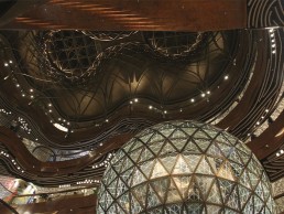
K11 Musea, Hong Kong
Hong Kong’s Victoria Dockside is a vibrant new art and design district that knits hotel, office and cultural components with outdoor public gardens, reactivating the waterfront public realms. Designed by KPF Architects, the architectural diversity of the site emulates its varied elements, while the use of stone, glass and metal finishes provides a rich materiality.
Sitting in the middle of this development is the K11 Musea, a new 1.2 million square foot development envisioned by businessman Adrian Cheng. Home to cutting edge retail, world-class contemporary art, culture and gastronomy, the Musea is intended to completely reshape the retail experience for the consumer.
As a key member of the creative team behind the project, Speirs + Major worked to design the light for all of the interior and exterior public spaces in the project. Keith Bradshaw, Principal at Speirs + Major, explained how the firm got involved in the project: “We were already working on the site of the development on both the Avenue of Stars and Salisbury Gardens. We met with the client, and he felt that our depth and breadth of experience was right.
“He could also see how we could help to knit the development into its context, in the sense that the interiors would become an extension of our work on the external areas.”
Cheng’s vision for the project, Bradshaw explained, was to assemble a team of ‘100 Creative Powers’ who would shape the design and experience of the project, led by himself in a curatorial role. He provided Speirs + Major not with a traditional brief, but instead “an expression of the character, atmosphere and experience he wanted to create”.
“The brief called for an atmosphere that would not normally be associated with a shopping mall,” Bradshaw explained. “‘Bespoke’, ‘Welcoming’, ‘Crafted’, and ‘Contrast’, were all keywords. Our client envisioned K11 Musea as a creative environment with an independent and memorable atmosphere – a place where people would feel relaxed yet inspired. Our job was to deliver that across a vast, complicated and hugely varied series of spaces.”
Bradshaw and the Speirs + Major team quickly understood the importance that lighting would play in bringing together the various elements of the vast project, to create a sense of cohesion across the spaces. “I think we were the only members of the design team that contributed to the design of every part of the Musea, so in that sense light is the common thread that stitches all the elements together,” he said.
However, the need to create something ‘bespoke’ and ‘crafted’, while shaping an ‘independent and memorable atmosphere’ in the context of a busy retail/cultural hybrid environment made this particular project completely different to other retail scenarios that Speirs + Major has worked on. Bradshaw continued: “We had to break away from all pre-conceptions of retail lighting.
“The challenge was complex: we needed to find the right compositional balance so that the light would connect the spaces together; highlight the key architectural features, art pieces and cultural insertions; deliver for the retailers; and all the while keep the atmosphere we were trying to create at the front of our minds.”
To do this, Bradshaw developed a lighting concept based on the notion of a bespoke collection of luminous objects. The lighting details in each space are distinct, but the deliberate coherence in design language and materials across the collection works to bind them together as a whole, delivering a sense of cohesion while retaining the flexibility to address the individual, idiosyncratic spaces and shape the character of the development.
Details are carefully integrated and arranged to create a sense of energy and dynamism, yet balanced to avoid detracting from the retail shop fronts or overwhelming the art pieces.
Recurring ‘crystal ball’ luminaires are placed in various configurations throughout the space, appearing in their most dense clusters nearest the atrium. Although seemingly bespoke-made, these fittings are more of a customisation than a fully bespoke product, comprising downlights fitted with a crystal cover, which made them simpler to source and install.
Bradshaw explained the inspiration behind these fixtures: “We were considering the idea of a motif that could further act as a source of visual connection. The ‘crystal ball’ concept delivered on a number of levels.
“The glow and sparkle of the cut crystal offered the ‘crafted’ feel that we wanted, and we could create a sense of dynamic energy and movement that would draw the eye vertically by arranging and clustering them in certain ways.
“We were also able to influence the ceiling design to support our concept – the pattern of curved wooden channels that support the crystal balls were created as an extension of the lighting concept.”
Because of the sheer scale of the project, a large number of interior architects were involved, each working on different spaces within the project. For each space, Speirs + Major worked closely with each of them to ensure that the materials and textures they had chosen were well expressed, and that light was properly integrated.
“Throughout the project, we were careful to ensure that the quality of the light remained a consistent and common factor across all of the varied spaces,” Bradshaw explained. “Our luminous objects are designed to be recognisable as a collection despite their varying sizes, scale and arrangement. Each individual piece responds to its setting, with details that contribute a decorative element as well as a soft, flattering light to visitors.
“We also played with extremes of scale, exaggerating these with lit highlights to create a sense of spectacle, and balancing them with relatable human-scale details.”
Such an approach is evident in the ‘Opera Theatre’, where a spectacular five-storey-high glazed, illuminated ‘Gold Ball’ dominates the void, while the miniature cut crystal balls cluster at the edges of the atrium ‘galaxy’, suspended from the ceilings and recessed into the floor.
The main structure of the ‘Gold Ball’ incorporates Stoane Lighting’s Iris, alongside Linea Light Group’s Iris 67-3 projectors, which illuminate the feature structure.
“The ‘Gold Ball’ was designed by us as a singular luminous object,” said Bradshaw. “As such, we integrated the light within the frame of the structure to highlight the cut crystal patterns.
“We designed it to be deliberately majestic in scale, but also to exude warmth. It is balanced by the crystal balls, which provide a more relatable human scale.”
Above the huge ‘Gold Ball’, Radiant Lighting’s 3D LED Flex 40 fixtures are located within the skylights, adding additional downlighting to the structure.
Elsewhere, cultural insertions including art installations, pop-up stores and artisanal displays are located along the concourses and dotted throughout the entire Musea. Speirs + Major approached the lighting for these ever-changing elements in the same way that they would an art gallery, providing a lower than usual level of general light, allowing for contrasting highlights, adding the flexibility to change sources, texture and focus through track lighting.
These showcases are illuminated via a range of methods, from Delta Light’s SuperLoop and Midispy in the Beautilicious area and Lumenpulse’s Lumenfacade Interior at the Rain Forest showcase in the Maison of Fashion area, to Rosco’s Litepad HO90, located in the lift lobby showcase.
Throughout the Musea a number of green walls and columns bring a feeling of nature and the outdoors inside, alongside various plant displays. Stoane Lighting’s Baldican XIM Wallwash, the X-LED Mesh from Carl Stahl, and Luci Lighting’s Power Flex Indoor highlight these green walls, while plant displays in the Beautilicious area are illuminated by LightGraphix’s LD51.
Away from the main spaces, people can find a variety of eccentric, independent atmospheres to enjoy. Bradshaw continued: “Our client wanted the traditionally back of house areas to act as places of comfort and respite, so the light for each of the eleven lift lobbies and seven toilets is carefully and elegantly integrated, to accent their characteristic surfaces and materials. Lanterns and vertical light structures provide points of focus.”
Capping off the development is the Bohemian Garden, found on the roofscape. Visitors access this garden via an escalator that ascends through a cage of layered metal and suspended crystal lanterns, emerging into a serene, delicately lit garden. After dark, the curvaceous features – vertical greenery, cascading water, esoteric play structures and modular canopies – are softly highlighted. When required for events, the central lawn may also be dynamically lit from discreet lighting rigs.
Despite the vast size of the project, and the almost bespoke feel of the lighting solution, Bradshaw revealed that the lighting elements used to create the scheme were surprisingly straightforward. “Although there are a select number of bespoke details and customisations, the bulk of the scheme is built on core lighting techniques such as concealed slots, coves and downlights. Even the luminaires that appear bespoke are often standard products that have been cleverly applied or adapted.”
The lighting scheme created by Bradshaw and the Speirs + Major team adds to the luxurious, glamorous nature of the K11 Musea, helping to create a lasting impression on visitors, as Bradshaw concluded: “We are exceptionally pleased by the way in which the lighting delivers on the brief. As a hub of what is essentially a brand new district in Hong Kong, the lighting has provided K11 Musea with a very distinct and memorable character that is proving very popular.
“Lighting works to bind the various eclectic spaces together and highlight the cultural insertions so they can be readily enjoyed, while also delivering functionality.
“And, while it is undoubtedly photogenic, we find the experience of the spaces to be just as good in reality as it appears on screen.”


