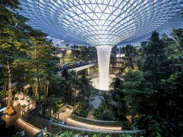
Jewel Changi Airport, Singapore
The Jewel Changi Airport is the latest piece of iconic architecture in Singapore. Combining retail spaces with interior gardens and the stunning Rain Vortex waterfall, Lighting Planners Associates designed the lighting for this impressive new destination.
Jewel Changi Airport is a world-class, multi-dimensional lifestyle destination that combines gardens and attractions, retail and dining offerings, a hotel, and facilities for airport operations.
Designed by renowned architect Moshe Safdie, it has been gaining plaudits since its official opening towards the end of 2019 for its iconic glass and steel domed façade and huge indoor waterfall – the largest of its kind in the world – which acts as a striking, dramatic centrepiece to the building.
Aimed at being the next tourist hotspot in Singapore, Jewel Changi was created with the idea of marrying the contrasting concepts of a serene garden and a bustling city. The beautiful indoor gardens marry with large retail spaces more akin to shopping malls. Taking cues from the Garden of Eden, Shangri-La and the Hanging Gardens of Babylon, the architect’s vision was to design a unique destination for travellers and locals alike.
The vast glass dome fills the interior with an abundance of natural daylight, creating an experience more in line with strolling through an outdoor park, rather than an airport terminal. The natural light that floods the space is complemented by lighting design from Lighting Planners Associates (LPA), which sought to create a 24-hour, immersive visual experience, in which the gentle and slow transition of natural light is reflected in the artificial lighting.
Brought in to the project by developers Changi Airport Group, through which the studio has a good track record of previous experience, LPA worked closely with Safdie Architects to complement its vision. For Reiko Kasai, Managing Director of LPA Singapore, the opportunity to work with an architect of Safdie’s calibre was an exciting prospect: “The most unique part of this project is the architect.
“From the very beginning, he was very excited to create a garden park within the airport. His concept idea, and the expectation for the lighting, was to create something very subtle within the protected environment. The lighting had to be as if you were walking in a park in the evening.”
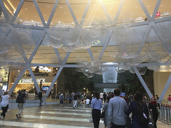
From afar, Jewel Changi’s façade glows with a blue-white lighting that alludes to a depiction of clear daytime sky, creating a soothing, calming impression. This colour constantly shifts within its blue hues to show a transition of time, while creating a pleasant contrast with the warm interior lighting. Up close, the glow around the façade fades from floor to ceiling, with the glowing light of the interior gaining prominence and dematerialising the façade.
For the interior space, Kasai continued: “Our initial concept was for an amphitheatre that appreciates nature, that blends natural light with artificial light.” The colour temperature and brightness of the lighting constantly changes, giving different experiences throughout the day. However, the retail area has been clearly differentiated from the garden spaces through differences in brightness levels – in the retail area, frontage is brightest, with light levels concentrated towards the perimeters, while in the garden space, light levels are intentionally kept low, so that the eyes are able to wander into the magnificent views.
Sunyoung Hwang, Associate at LPA Singapore, explained: “Because of the dome structure, there is a lot of daylight coming into the building, especially in the central garden areas, and there are pockets that let light through to the retail areas. But we wanted to make sure that the retail areas still have the experience of the ‘outside’ areas, extending the garden feeling.
“We wanted to use tunable white lighting for all the retail areas. When we were developing the concept, it was quite new in the market, and the client was hard to convince, so we had to do some mock-ups to convince them what kind of value it brings to the project. In the end we didn’t take the colour temperature as high as it could be during daytime, except in the areas receiving daylight through the opening, because the client wanted to have a warmer feeling for the retail spaces throughout the day.”
Although the contrasting spaces within Jewel Changi blend together effectively, there was some degree of conflict between the designers and client over how the project should be defined.
Kasai continued: “The architect had a very strong idea of creating a retail shopping experience within the garden, but the client and the developers had the opposite vision. What they wanted was more like a shopping mall with greenery. That was a big challenge for us because in the beginning we worked to fulfil the architect’s vision, to create the experience of walking in nature, in a natural environment, but then this was replaced by the need to fulfil the requests from the operator’s side.”
This conflict was in some ways complicated by LPA’s design approach, in which the firm adopts a ‘less is more’ approach. “In Singapore, clients often get very nervous when they sense the word ‘darkness’ or ‘subtle’,” Kasai explained.
“LPA’s lighting design is known for creating beautiful shadow, light and shadow, learning from nature, beautiful darkness. These terms are almost taboo to some clients.”
However, after a series of mock-ups, demonstrated to both the client and other consultants, including the architects, LPA was able to finalise the selection of lighting fixtures, and agree on the right colour temperature and brightness throughout the space.
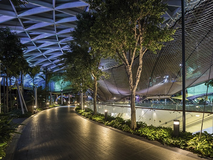
In the garden spaces, LPA was free to create a much more subtle, atmospheric lighting scheme. Instead of a uniform, homogenous lighting experience, pockets of light are created so that both light and dark can be appreciated, creating a sequential rhythm that allows visitors to appreciate light without using too much of it.
Adding to this sense of intrigue, one of the key parameters for the lighting within the garden areas was for fixtures to remain hidden amongst the greenery so that they don’t disturb the ‘look’ of the forest.
As such, pole-mounted lights are placed amidst the trees, while step and coping lights from KKDC offer the main source of functional lights along two walking trails within the Shiseido Forest Valley, with spike-mounted spotlights for the trees. Elsewhere, Roblin’s fibre optic lighting was used to create a ‘firefly’ effect in the Shiseido Forest Valley, West Gateway Garden, and the attractions at Canopy Park. Uplights were limited to the trees, while other lights were aimed downwards to minimise light spill to the sky, and the reflection of light sources within the interior from the glass panes of the dome.
Throughout the Jewel, LPA utilised a range of downlights and spotlights from the likes of Alto, Erco, HK Lighting, Endo and Zumtobel to create a subtle yet specific, focused lighting scheme.
“The elements of lighting that we chose are very minimal, almost not visible,” Hwang explained. “When you go there, there are not many lighting elements that you can find very easily. It’s very focused.”
“The project is under a glass dome, which is considered an indoor environment, but actually, because there are lots of greens and plants, we had to consider IP-rated, outdoor fixtures,” added Yusuke Hattori, Associate Director at LPA Singapore.
“The challenge was to comply with indoor lux level standards, while creating the exterior feeling. To cater to this outdoor feeling, we only had bollard lights and pole lights, as those are lighting elements that you normally see in outdoor environments.”
The defining centrepiece of the Jewel Changi though, is the beautiful Rain Vortex. At 130ft tall, it is the largest indoor waterfall in the world, spanning the full seven-storey height of the building.
The waterfall utilises Singapore’s plentiful rainfall, funnelling rain from the roof through a central oculus, before it is then recycled back to the roof. A recreation of the precipitation cycle, the Rain Vortex is seamlessly integrated into Jewel Changi, framing natural rainwater as the centrepiece.
Highlighting this extraordinary feature is a special lighting show, which LPA helped to coordinate. As a key focal point of the project, LPA ensured that its architectural lighting scheme complements the lighting show. Most of the light fixtures in the Shiseido Forest Valley, terraces and Canopy Park dim down during the show, while LPA also installed “stardust” point source lighting around the rim of the waterfall, which is activated during the show.
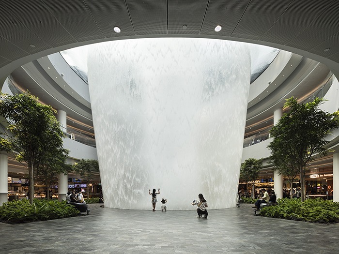
Outside of this, no lighting fixtures were installed on the complex latticework of the glass ceiling, as the architect wanted a clean visual of both the internal dome and the sky outside.
Since officially opening in October 2019, the Jewel Changi has become a landmark destination for Singapore, and the LPA team has expressed its pride in being involved in such a notable project.
“Because of the size of the project, we’ve spent a lot of time on it – more than 13,000 hours – but we’re very proud of the team, and that we finally delivered a good result,” said Hattori.
“It was a really demanding, time-consuming project, because there were so many people from so many different perspectives and departments, each with their own agenda,” added Kasai. “The scale of the project is so big, and because it can be seen as a garden, as a shopping mall, as a public space, it’s a mixture of everything, that meant that it was completely unique.”
Looking back over the project, a particular highlight for LPA is seeing how visitors have interacted with the space since its opening. “Seeing how people spend time there is really what we intended in terms of atmosphere. We’ve seen people after long flights having naps, sitting and chilling out, so that was quite successful for us,” Hattori continued.
“We said in the beginning we wanted people to appreciate the space at any time, be that daytime or evening, early in the morning or late at night, when the lighting show turns on or when it’s off, you still enjoy the space,” said Kasai.
“In fact the architect, Moshe Safdie seems to be extremely happy with how this project was conceived. He’s said that he’s so happy to see people in the space – whoever comes here, they all look very happy. Whether it’s local people or visitors.
“Because of that, we’re very happy with the contribution that we were able to make.”
