Naera Hotel, Spa & Art Gallery, China
Merging art and light to create a beautiful feeling of escapism, Klaasen Lighting Design has helped to turn the Naera Hotel, Spa & Art Gallery in Xitang, China into a picturesque, relaxing retreat.
Born out of a passion for art, organic farming and international luxury travel, the newly-opened Naera Hotel, Spa and Art Gallery in Xitang, China, has been designed with rest and relaxation in mind. The resort, situated just over an hour’s drive from Shanghai, is the realisation of the childhood dream of owner and developer, Zhu Shu Lei of Xitang Zhidi Cultural Development, who, after failing to find an international operator brand that shared the same views and vision for his hotel concept, decided to create his own brand.
The resulting Naera Hotel is part of a wider redevelopment of East Xitang, and has been created to reflect his desire to provide a retreat based on top quality service, spa and wellness treatments, mixed with the beauty of art and the nourishment of organic farm food; around 2,000 different teas have been selected to be made available to guests, providing a different selection of teas in rooms each day.
A destination for escapism, from the moment guests arrive, they are transported into a different world. The drop off point is screened off from the busy main road by a dramatically illuminated wall, and guests enter through a “landscape portal”. From here, they travel through a meandering, uplit screen maze that leads to the reception. The deliberate maze walk is intended to wind people down on the way, centring their minds and spirit in calmness. Art works are also located along this walkway, and throughout the hotel, giving each journey a sense of exploration and discovery.
The Naera Hotel, Spa and Art Gallery has been designed by Shanghai architects Leeko Studio to reflect a typical Chinese garden, with all public spaces located around a central courtyard. Lighting for the resort was designed by Martin Klaasen and Grace Eng of Klaasen Lighting Design, with the intention of being the “glue” that reinforces and brings out the uniqueness of both the architectural design, and the interior design of Horizonal Space Design’s Ju Bin, while also adding to the sense of exploration, showcasing the artwork and creating a peaceful feeling of calmness in the Chinese garden. Throughout the resort, Klaasen and Eng utilised warm colour tones, concealed lighting and controlled light levels, with accent lighting to highlight artworks, in a scheme that adds to the experience for visitors.
“We didn’t have a specific lighting brief, but our approach was implicitly based on my prior collaboration with the interior designer, who loves our approach of concealed lighting, focused accents and controlled lighting levels, bringing into value the key features of the overall architectural and interior design,” explained Klaasen. “Our design style and understanding of the lead consultant’s design philosophy was key.”
The prior relationship that Klaasen shared with both the architect and interior designer Ju Bin is something that he feels helped throughout the process, as there was an immediate, implicit understanding between their goals and ambitions for the project. “When Ju Bin was approached for this project, he insisted to the client that he wanted us to be appointed as part of the team as well,” Klaasen continued.
“The close collaboration that we had was key to the success of this project, but more than that, it was the mutual trust and respect, and the ensuing friendship between the owner and his consultants that created the base for the success. When each expertise is valued, respect and understanding is shown for each other, the results generally surpass expectations, as was the case in this project. It also makes the collaboration a joy and motivates each member of the team to put in the extra mile.”
The harmonious relationship that Klaasen has with Ju Bin helped to create a space in which the lighting is seamlessly integrated within the wider architectural and interior design. Light serves as a tool to enhance the interiors and bring extra focus on the smaller details within each area, whether this is one of the art exhibits on display, or the materials used by the interior design team.
“Lighting is often called the glue that gels everything together, so the identity is created by the architect and interior designer, mostly. The lighting designer’s role is to create the appropriate lighting effects, moods, accentuation and dynamics that reinforce this,” Klaasen continued.
This is particularly evident in the entrance walkway, where the lighting is kept very minimal – there is no signage or downlighting, light is only used to illuminate the panelling that lines the corridor, with additional spots on the pieces of artwork on display. This minimalistic approach is something that was key to Klaasen’s lighting design, adding to the sense of intrigue and discovery for guests. “It was a deliberate choice, and one that came after close consultation with the design team and the owners to make sure that we were all on the same page,” he said. “As a general rule, lighting should have a supporting role, not a dominant or overpowering role. It’s about the space, and the experience of the space, not about the lighting itself.
“The intrigue and exploration of what the hotel has to offer is brought to life by the lighting, and by carefully choosing the lighting effect, the angles of impact and the moment of visibility as you move around. As the guest journeys around the hotel, the task of the lighting designer is to reveal the spaces, their architectural features, and art as a visual experience. It is planned, and it is timed.”
On practically every corner of every area throughout the resort, there are pieces of artwork – from guest rooms to the corridors, restaurants and even the washrooms. Klaasen Lighting Design therefore added focused spots of light to showcase each individual piece. However, this was not without its challenges, as Klaasen explained that going into the project, they didn’t realise quite how much artwork there would be. “We always knew that there would be art and artworks, but we never knew to what extent, how big, what shape, what size,” he said. “It was only in the last few months before the opening that we started to get a feel for what this fantastic art was going to be.
“We had to challenge ourselves to find solutions, because we had provisional lighting put in place, but it was without really knowing what was going to be put where, and I think even the artist only decided on some of the artworks once he was here. That meant that the infrastructure for lighting was there, but it was not perfect. We had to improvise along the way to bring in some additional lighting, move some lighting, maybe add in some conversion lenses or spread lenses – find ways to adapt to the situation that we had with the lighting that was already in place.”
The willingness and ability to adapt is something that proved beneficial for the entire design team throughout the project, as Klaasen explained that there were some instances where the interior designers would have suggestions for the lighting, while conversely, on other occasions, Klaasen posed alternatives for the interior design that would allow lighting to be better integrated.
Such examples can be found in the cove lighting, which required several adjustments to get just right, and in the recessed step lighting as well. However, despite these various challenges, Klaasen believes the strong sense of communication helped them through: “Like in all projects, your design is as good as the end result, so communication, supervision and site assistance to the contractors implementing your design are crucial to its success. Explaining and educating all parties involved in the realisation of your lighting design of the installation requirements and the intended lighting effects to be achieved is crucial.
“The challenges become even bigger if there are language barriers, but luckily our team was able to communicate our design intents in detail, and supervised to see the intended effects achieved.”
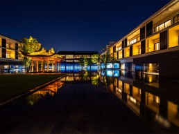
The desire to create a sense of wonder and discovery through lighting extended to the outside areas of the resort as well. The hotel is built around a central courtyard; inspired by typical Chinese gardens, this courtyard consists of a large body of water, punctuated with islands of trees and a central pavilion. The lighting here sought to utilise the reflections of the water to create a magical feeling of peace and calm.
This feeling was enhanced by the deliberate decision by Klaasen to avoid using any façade lighting on the hotel’s exterior. Instead, light emanates from within the building, where people are seen as silhouettes moving through the connecting corridors and walkways – it was a design decision that transforms the courtyard completely after dark. “During the day, the natural light lights up the building, you can see the architecture, you wonder what’s inside. After dark, it’s exactly the opposite,” he explained. “At night, the effects are practically reversed, with light radiating out from the interiors.”
This design decision meant that the lighting designers had to work hard to ensure that all outward facing areas had balanced lighting, with brightness kept at a level so that overall, it looked consistent and uniform – a difficult task when these areas, including the restaurant, bar, tea house, lobby and library, all had different lighting requirements. This was achieved though, through clever positioning of the lights and carefully managed dimming levels.
Because of the enclosed nature of the central courtyard, Klaasen had the opportunity to use the outward facing areas as elements in a special, colourful light show that can be viewed from all around the hotel. Playing at the top of each hour, sometimes with increased frequency, the show consists of carefully selected colours that slowly move or change. The play of colours has been designed to be non-intrusive, so that it does not interfere with the normal operations or public activities of the hotel, but instead creates a relaxing experience for guests to enjoy.
Since the hotel was completed, it has received a great deal of praise, from the staff at the resort who claim that the lighting design is some of the best that they have seen, to the interior designers who feel that Klaasen has truly captured the “Oriental” style of lighting. The client has also said that the lighting adds the “finishing touch to the hotel”, and Klaasen believes that the approach of the client was integral to the success of the project. “An understanding and respectful client that validates and trusts your expertise, mixed with a great vision and understanding of design and the design process, made a great difference,” he said.
“As a designer, a happy client is all you can wish for. It means you have more than satisfied their expectation, you validated their trust in you. If, as part of that, you also feel \you have fulfilled all your own design visions and expectations, you have realised a project close to perfection, something that does not happen often.”
He concluded: “The great collaboration, respect and understanding between the client and the design team has created a result beyond everyone’s expectation, myself included. It seamlessly integrates lighting, architecture, interiors and landscape as one overall experience.”


