The Original Store, Thailand
Inverse Lighting Design’s new lighting scheme for Bangkok’s Original Store beautifully accentuates its clean lines and sharp interiors, while transforming the multi-use space into a glowing lantern after dark.
Situated on one of Bangkok’s very first roads, the Original Store, owned by Central Group, is a multi-storey, mixed-use facility that combines a retail space and café with a library, temporary and permanent exhibition spaces, as well as a fine dining restaurant, spread across five floors.
Designed by Vincent Van Duysen Architects (VVDA), the Original Store is striking for its crisp, sharp lines and exterior terracotta brickwork – a sharp contrast to the surrounding neighbourhood. This contrast is accentuated further by a sleek lighting scheme, designed by Inverse Lighting Design.
Inverse became involved in the project after having previously worked with Central Group on a number of other projects in Bangkok, but Bangkok Studio Director Bernhard Bstieler revealed that he had been a longstanding fan of the Original Store’s notable architecture.
“This project, located in Bangkok’s “Creative District”, is just a few steps away from our studio. We passed by this charming building every day and saw its great potential,” he said.
“Although we worked on several projects for the Central Group like the Central Embassy, Open House and Park Hyatt Bangkok, we did not know this building belongs to them until the client asked us to get involved in the project. Also, with Vincent Van Duysen as the concept architect, it was even more exciting for me as my first project in London was the Designer room at Selfridges with the same architect.”
With the space having a number of different uses across its five floors, the lighting design had to serve multiple functions, from retail lighting, to schemes suitable for exhibitions and fine dining. Such variety was noted in the brief, as Bstieler explained: “As the programme of each floor is different, the brief called for a coherent lighting solution that expressed the architectural design language, while supporting the function and enhancing the atmosphere of each space.
“Another objective was to transform the retail space to provide a more relaxing atmosphere in the evenings when Aksorn, the restaurant owned by chef David Thomson, and the Siwilai Soundclub are operating. The displays and merchandise should radiate a soft glow as a ‘lantern’ to guide the guests to the two venues.”
Meanwhile, the main staircase connecting each level was another key architectural feature within the project; with a large roof light at the top, the stairwell is filled with natural light during the day, but Inverse sought to use artificial lighting to create a more dramatic feel to the primary connecting space after dark.
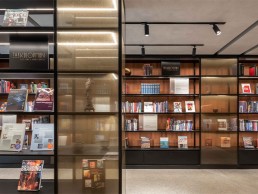
In the main building, the architect created a series of glass vitrines for curated product arrangement. In the evening, these are then transformed into the lantern-like objects desired by both the lighting designer and client.
“The main concept was a combination of flexible lighting in the ceiling and integrated lighting within the vitrines, which provided accent lighting to the merchandise on levels one and two, and the exhibition on levels three and four,” Bstieler continued. “The integrated lighting within the vitrines was essential to provide sufficient illumination and minimise possible shadowing on the merchandise. At the same time, the lights can be dimmed in the evening, when the vitrines are closed and act as a glowing lantern, providing a warm and soft backdrop for evening guests.”
The integrated display lighting, courtesy of Pro-Light, is complemented by formalighting’s Zero Compasso track-mounted spotlights, which illuminate the free-standing displays and the exhibition and event areas on the upper floors. All sources have a high colour rendering to ensure a true render of colour for the exhibition area’s merchandise and objects.
Along the central staircase, Inverse looked to provide indirect lighting concealed along the perimeter walls for the stairwell in a move to highlight the contrast between the terracotta walls and the concrete staircase. The use of hidden fixtures creates a gradient lighting along the walls, guiding customers from the entry level all the way to the roof level.
For such a clean-lined, sharp scheme, Inverse took great care and attention to ensure that the lighting was just right. Bstieler explained: “We explored the possibilities and developed a detailed design using many tools, including lighting simulations, physical models and mock-ups on site. For example, we built some ceiling and furniture details 1:1 in our studio to test the lighting effect and coordinate the architect’s details. We also studied whether continuous indirect lights along the perimeter wall in the stairwell were sufficient for the guest to walk up and down.”
As the Original Store comprises a number of different spaces, each with their own unique lighting requirements, Bstieler explained how the lighting was modified to suit each need: “We tailored the lighting specifically for each area by using spotlights with varying beam angles mounted onto the track, allowing us to create different ambient and accent lighting levels for each location.
“In addition, concealed lighting within the shelving of the vitrines and fixed counters create another layer of lighting defining, for instance, the store and library. In the restaurant, we used indirect ambient light, and decorative lighting on the walls and tables, creating a pleasant atmosphere.”
Stepping outside, the building’s clean lines are accentuated and highlighted with a carefully integrated lighting solution. Lighting here is provided from internal vitrines that light up the façade’s openings. The terracotta finish on the outside, matching the terracotta tile work in the internal staircase, is gently uplit from each floor level’s ledges, with fixtures from Clear Lighting providing a very smooth gradient to the outside of the building. Combined with the soft glow from the inside, the entire building is lit up and, from a distance, appears as a large lantern, which gives a subtle illumination to the historic neighbourhood.
And Bstieler is hoping that the crisp façade lighting will inspire others in the neighbourhood, leading to an improved nighttime ambiance in the district. “The surroundings are rather dark at night, so our subtle exterior lighting seems to stand out,” he said. “We hope that this project opens up an opportunity and sets an example of good lighting for other historic buildings in the area, which would enhance its unique identity at night.”
Throughout the process, Bstieler continued, Inverse worked in close collaboration with VVDA to “discuss all the possible options to ensure the function and aesthetic”. “Inverse and VVDA were developing detailed designs to ensure seamless integration of the lighting into the architectural details,” he explained.
This meant that early on, the lighting designers needed to modify their original interior concepts, but such was the collaborative nature of the project that this was a simple hurdle to overcome. Bstieler explained: “The initial idea was to conceal all the ceiling spotlights within troughs to maintain a clean ceiling appearance. But due to the existing beam structure and the cooling strategy of the space, the air handling unit between the existing beams occupied most of the area.”
“However, coordination between the services led us to a consistent solution in all the floor levels, having track recessed on either side of the AC unit, while keeping the correct distance to provide sufficient lighting to the display units.”
Bstieler continued that It was through this consultation and collaboration that he found most reward while working on this project. “I appreciate the most how the design develops with all the constraints and problems you face on site,” he said. “With a great team effort and collaboration with other consultants, the result is very satisfying, and we feel that lighting is an integral part of the architecture.
“The most rewarding thing in this project is the close collaboration between the client, architect, local team and operator, with all the cultural differences and expectations, to create a project that everyone can be proud of.


