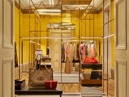
Brown’s Brook Street, UK
At the new flagship Browns store on London’s Brook Street, Nulty has used light to enhance the luxury, boutique feel, creating a more tailored, comfortable retail destination for shoppers.
Luxury London retailer Browns has recently been added to the Nulty portfolio of beautiful retail lighting schemes with its newly completed flagship store on Brook Street in central London.
Browns has been a staple of British fashion for decades housing some of the greatest designer labels since its inception in 1970. This store is located in a Grade II* listed building that dates back to 1720. Each room has a unique identity, whether expressed through its architecture, size or colour scheme, and there is a mix of spatial and more intimate areas across the various floors.
Flexibility was key in the lighting design, and each room’s style had to be accounted for in a changeable approach that retains the identity of each space. The lighting design needed to adapt to these variations in style and so a mix of integrated lighting in hanging rails, shelving and niches were needed to illuminate the items on display. The lighting schemes can be altered throughout the spaces to recreate day or nighttime scenes, whilst spotlights and integrated direct and indirect light can be changed to accommodate various events or parties.
Evoking a modern twist within the plush historical setting was important to the concept. A breathtaking floor-to-ceiling light structure, by interior designers Dimorestudio, graces the atrium with neon-like LED light tubes from Encapsulite, creating a stunning focal point and contemporary ambience.
Martina Alagna, Lighting Designer at Nulty, sat down with arc to explain the historically conscious lighting scheme. With an already well-established portfolio of retail lighting projects, Nulty was chosen by Browns as the specialist lighting designer. “They wanted an expertise on lighting,” explained Alagna. “They knew that the interior designers are very forward thinking with their designs, but also very attached to traditions and the historical part of the design. But to bring everything up, Browns wanted a lighting designer, so we got involved straight away.”
During initial meetings, the team established a common design approach to the historic structure and understood that the lighting scheme was to be flexible according to the individual uses of each space. “From the first meetings together with Browns, they wanted to have a very flexible space, especially in areas like the Yellow Room and The Club on the third floor, where they have the VIP changing rooms. In these locations, customers have a completely different shopping experience from the other levels,” Alagna elaborates. “The Yellow Room, for example, turns into an event space, so it became a focal point for the entire project, and Browns really wanted this space to be changeable depending on the events that were happening,” she added.
Working within the historic building also brought challenges for lighting placements. During these initial meetings to determine the lighting scheme, it was important for the team to address the structural issues that would prevent certain luminaire placements. It was decided that the majority of fixtures would be integrated into the furnishings rather than permanently fixed to any architecture. Pieces such as LEDFlex’s Ultimo Neon, LED Linear’s Lyra Hyrda, DGA’s Mini Tini spots and Folio’s Tiny miniature LED profiles are integrated seamlessly within the furniture within the store.
“The feeling when you walk in is very different to a traditional store. The lighting is more tailored and specific to certain elements, whether it’s the merchandise or the architectural detail, or a historical part of the building. Whereas, usually if you walk into a different store it’s more focused on the merchandise and the architecture itself is not really part of it. This was absolutely one of the nicest elements about the project as well – for example, the staircase that is original to the building has been painted gold but all the nice details are there, and having this lighting structure in between also highlights all the little elements that you can see through the staircase. The major element is the handrail that goes all the way up, which is a very unique part of the staircase. Illuminating this from the centre to the outside means that you can appreciate the heritage part of it a lot more than you would through traditional spotlights or wall-mounted luminaires.”
She continued: “To create this level of lighting within retail, you definitely need to have some ambient lighting, focus and accent lighting on merchandise, and any other elements that you want to bring attention to.
“In this case, we couldn’t create the ambient light in a traditional way. We had to find alternative solutions to make sure that it had other illumination around the merchandise and not just the spot and the accent lighting on it. For example, Dimorestudio had some lighting panels that created a silhouette of the merchandise, with mini adjustable spotlights to illuminate. But, it wouldn’t be sufficient to have just these elements in the room – they needed to have some ambient lighting and general illumination to make sure that there was not too much contrast.”
Nulty integrated uplighting elements within the furniture to illuminate the vaulted ceiling and bounce back the lighting within the store, while highlighting the architectural features. This was offset with floor lamps, an addition not typically seen in retail environments. “No one would usually include floor lamps in their specification, but Browns was happy to have these ‘out of the box’ elements that would create a more comfortable environment for people,” explained Alagna.
“It has more of a boutique, tailored feel, instead of being in a big store where everything is brightly illuminated. It was nice to tailor the levels depending on the heritage building elements. There are pockets where the ambient lighting drops a bit to purely focus on merchandise and architectural elements, to let these stand out.”
“On a few occasions we couldn’t include the lighting within the furniture because it was so thin or so delicate, so we had to seek other solutions. For example, in the jewellery rooms we wanted to have a line of light integrated into the profile of the cabinets, but we couldn’t. Instead we went for miniature spotlights [DGA’s Maestro] at the perimeters of the cabinets to shine onto the jewellery.”
In order for the design team to achieve the overall, luxury boutique feel in the store, a lot of time and consideration was put into the choices of furniture and finishes. The same dedication to specification was translated into the lighting fixtures and Nulty choreographed a series of fittings that worked perfectly in each space. Speaking of her experience working with the interior designers, Alagna said: “I really enjoy working with studios with clear ideas and high standards because it makes our work even more appreciated. In instances where things weren’t possible, we had to find a different solution because we needed the light there. We tried and tested together, and I think the result comes up pretty well,” she added.
While the store has specific lighting scenarios on each level, there is an overarching continuity amongst each floor. “It’s definitely unique as a general approach but at the same time, there are elements that are repeated several times within each floor,” explained Alagna. “It is very interesting because for a lot of heritage buildings in the UK, the higher you go up in the building, the shorter the ceiling gets, so it’s not just ambient in terms of the space around you, but also the height of the ceiling changes quite a lot.
“Every space is definitely unique, all of the rooms have different shapes and different sizes, and we had to play with the lighting. We knew what elements we’d have in the room, and then depending on the size of it, we could change and adapt and move things around in the structure, or have a floor-standing lamp to boost the light levels a bit – it was great fun.”
Elsewhere, an interesting design feature in the VIP fitting rooms was the technical mirrors. Not only do they perform as a regular mirror, but they also have integrated screens that allow the customer to select clothes to be brought to them, and even the option to pay for an item. Within the third floor VIP fitting and lounge rooms there is no natural daylight. To recreate day and night scenes, Nulty chose dynamic white lighting panels on the ceiling to create a unique shopping experience for the user. “There are eight different scenes, from the ‘night out’ scenes with warmer lighting effects that are able to reach the candlelight colour temperature, typical of restaurant lighting, through to daylight scenes with brighter, cool lighting to reveal the richness of the fabrics, etc.,” Alagna told arc. “There are also smaller lighting elements around the room, such as integrated hanging rail lighting or elements within the shelving – all these different elements within the room change depending on the shopping experience that you want to have. If you have an evening dress for a special occasion, you might have the lighting that matches the situation to see how it looks. If it’s a daylight outfit instead, you can tailor it to a daylight setting, where it’ll be a cooler colour temperature.”
Working with Browns was a great experience for Alagna, and the brand shone with its willingness to be involved and be as flexible as possible in order to create the beautiful scheme. “The lighting was a really big support for the entire project, so of course there was a lot of pressure, but we thought of all these little necessary elements from the beginning. So, by the end of the project, we had discussed so much and reviewed things extensively together with Browns, who were always part of the design processes and meetings. They were really present to review everything and make sure the concept was captured. I think in the end it came out really well and they were happy with the result,” she explained.
The final impression of the project was a challenging yet successful one for Alagna. She said: “It was very challenging in the beginning, because it was so different to anything else that I have worked on. There were so many different elements, and different collaboration elements with the Italian interior designers. Of course we know what we’re doing, but you never know what the client’s response will be. But, we did our best to make the different areas stand out, while also creating these little pockets of different experiences to bring that boutique feel.
“It’s a very comfortable space where you walk in and you don’t feel like you’re in a store. It’s more like you’re entering into someone’s house and trying to find the little pockets of what is going on in the space. It’s also really nice how it is connected with the restaurant area and the courtyard, which is all part of our design too. You might have your very nice shopping experience, and then you go to the restaurant for a relaxing meal with friends. The inviting space is full of personality – it doesn’t make you buy something and run away, you want to spend more time in the store.”


