The National Museum of the United States Army, USA
Opened at the end of 2020, the National Museum of the United States Army tells the storied history of the US Armed Forces, with a dramatic lighting strategy from Available Light.
The National Museum of the United States Army opened to the public in November 2020. Located on a publicly accessible area of Fort Belvoir, VA, it acts as the Army’s “front door” and is an enduring effort to tell the Army’s story and honour the accomplishments, sacrifices and commitment of American soldiers.
The museum is the first comprehensive and truly national museum to capture, display and interpret more than 245 years of Army history and brings to life that history in times of war and peace as told through the eyes of soldiers. The museum also offers educational experiences illustrating the Army’s role in building and defending the US, as well as Army humanitarian missions and technological and medical breakthroughs built on Army ingenuity.
A joint effort between the US Army and the Army Historical Foundation, the building was constructed using private funds, with the US Army providing the infrastructure, roads, utilities, and exhibit work that transformed the building into a museum.
Architect Skidmore, Owings & Merrill designed the building, with Clark Construction Group beginning construction of the 185,000sqft facility in 2017, while the US Army Corps of Engineers coordinated site preparation, constructing the roads, and installing utilities.
Exhibit designers Christopher Chadbourne & Associates and later, Eisterhold Associates, created the museum’s storyline and exhibit design, supported by lighting designers Available Light. Having first got involved in 2008, Steven Rosen, Creative Director, and Derek Barnwell, Lead Designer and Project Manager at Available Light spoke with arc about the design.
“From the Army’s founding in 1775 leading all the way to modern American society, the project is a cultural history museum,” says Rosen. “The nine galleries are laid out in consecutive time order with a 300ft long media and lighting-rich connecting concourse and with commonly designed entry portals leading to each experience.
“Because we had a 45,000sqft plan with an almost 27ft-high ceiling ‘black box’ to work with, we conceived a continuous flowing gallery-to-gallery immersive theatrical environment. We worked diligently to let the corners of the various spaces go dark, so the entire visitor experience felt as if it emerged from darkness.
“For continuity, clarity, and orientation there are many similar elements in each gallery exhibit, including the strategy of presenting and lighting graphics. To tell a myriad of stories, each gallery is given a deep historical treatment using artefacts, tableaus, realistic cast figures, macro-scale artefacts, synchronised A/V presentations and so on, to tell the story of how specific events shaped a nation.
“Multi-layers of light take on a significant role to help craft the visual environment. From clean shadow-free brushstrokes of light on graphic panels and rails to hundreds of theatrical accents, we aimed to deliver a vibrant and dynamic sense of place.”
Over the many years of the design process, Rosen, Barnwell and their team (Associate Lighting Designer, Rachel Gibney; and Designers Li-Hwa Yu, Nastassia Ortiz, Matt Zelkowitz, Bill Kadra, Hess Smith and Lindsay Duval) had dozens of conversations with exhibit and graphics designers, content developers, A/V treatment writers, expert army historians, army personnel, and museum leadership about how the lighting should look. “As storytelling collaborators, we’re not interested in simply adding light to a completed 3D environment,” Rosen says. “That rarely leads to a satisfactory and organic experience. By the time installation rolled around, we felt we had our task mapped out and we set to work on delivering the lighting experience that had been discussed and vetted.”
Rosen and his team ensured special consideration was given to the hundreds of delicate objects from the army’s archives, which all required conservation lighting levels of 35-60 lux. “Too often, conservation level lighting equals boring lighting design,” continues Barnwell. “Our investment in creating a theatrical and dramatic experience didn’t end at the outside of the artefact cases. In most of the cases we installed a fibreoptic grid system developed by Luxam Lighting; just as every theatrical spotlight and track head was considered an individual paintbrush of light, a variety of zoom-focus fibre spots and light bars were distributed in every case and dramatically focused by a team led by Rob Rowlands of Luxam.”
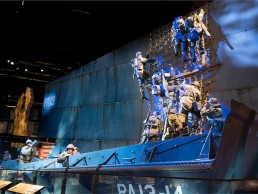
Within the museum there is a wide range of dioramas and exhibits depicting scenes from various wars and battles. While it was important to the lighting team to find similar gallery-to-gallery treatments for clarity and orientation, it was equally important that they developed unique storytelling moments to make the arc of the visitor’s journey more interesting and compelling.
Rosen explains: “Control over the environment is key. We are dedicated to using small paint brushes of light instead of big washes. Those smaller strokes allow us to strategically avoid video projection surfaces, control light levels on artifacts and direct focus to what is important. This high level of lighting control brings a sense of drama and gravitas to the moment and this specially crafted light supports the desire for an extremely meaningful visitor experience.
“As an example of this, at the Soldiers Stories entryway to the galleries, 42 stainless steel pylons, each celebrating a person who gave the ultimate sacrifice, is presented in a striking and sterile lighting presentation – it is unlike anything else in the museum.”
Another striking highlight within the museum is a replica of the Wright Brothers’ Wright Flyer, “an abstract environment, bathed in theatrical light,” says Rosen. “Then you also have moments of the Meuse-Argonne Offensive in WWI being re-enacted and given the full multimedia theatrical immersion treatment with lighting, audio, video and special effects, all synchronised together to form a powerful battlefield experience. Visitors stand on a glass bridge, allowing the environment to extend beneath them.”
As mentioned previously, the museum benefits from ceiling heights of 27ft and while the vertical space was created to accommodate macro-artefacts, the lighting team took full advantage of the height. “The ceiling heights were fantastic,” says Rosen. “In most museum gallery situations, the distance from luminaire to target is very short and the magical softening and blending that happens when a beam of light has distance to travel is mostly lost. The gift of height means many of the dioramas are more beautifully sculptured from a distance away. To this end, we deployed more than 460 ETC Source Forward profiles in multiple layers of light, for framing objects, laying down gobo/colour washes and artfully creating evocative lighting compositions.”
However, with hundreds of feet of curvilinear wall displaying graphics, artifacts and so on, the high ceilings – hosting many large, hanging macro-artefacts – also presented the team with challenges when it came to allowing them to consistently illuminate the long flowing walls. Barnwell explains: “To address this situation, we designed and built a curving lighting track eyebrow”, stood off from and tracing the walls. For a clean appearance, track heads were concealed in a channel.”
Reflecting on challenges during the project, for Rosen the biggest issue was the drawn-out amount of time the project took, explaining: “Maintaining continuity, engagement and enthusiasm over the 12 years this project was in our studio was difficult,” he says. “We saw many critical contributors exit the project for any number of reasons. Keeping track of changes to this enormous experience could be a little mind-bending, but thankfully Derek Barnwell was with the project from day one and continues to address client questions even today, his institutional knowledge of this project is encyclopaedic!”
Over the 12-year span that the lighting team worked on the project, the LED Revolution hit the industry. The original lighting specification called for ceramic metal halide profile units and track heads. Thankfully, there was time for the lighting team to sit on the side-lines with the project to better understand the implication, challenges and benefits of transitioning to a radically new and game-changing light source. “Ultimately, we decided moving away from what was soon to be an obsolete technology was the better route to take,” Barnwell says, “and we began the process of educating our client – and frankly, ourselves – on why we believed we should revisit the entire lighting specification and use LED. We did an exhaustive cost-benefit analysis and oversaw several workshops and mock-ups. Although this was an extraordinary effort that touched virtually everyone on the project team, we believe the change was of long-term benefit to the job.”
Taking a final reflection on the project, Rosen explained to arc how it’s hard to describe the emotional impact the project has had on its audience. From soldiers and families who lost colleagues and loved ones in battle, to the public interested in making better sense of what the US Army is and how it operates, to the myriad of people in between these two extremes, the reaction, has been “incredibly satisfying.”
“We poured a lot of effort into every detail, large or small, and we are proud of the final product,” says Rosen. “We are grateful to have worked with some of the best in the business to create this world-class experience.”


