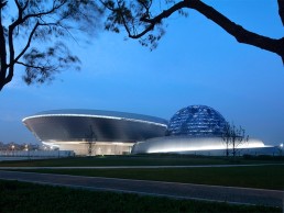
Shanghai Astronomy Museum, China
The newly opened Shanghai Astronomy Museum is characterised by its beautiful, swirling form, designed by Ennead Architects to replicate the “geometry of the universe”. Brandston Partnership developed the lighting concept for this striking new centre.
Designed by Ennead Architects, the Shanghai Astronomy Museum was opened earlier this year. At 420,000sqft, the new astronomical branch of the Shanghai Science and Technology Museum is the largest museum in the world dedicated solely to the study of astronomy.
The building’s sweeping, flowing form – which features no straight edges or right angles – is inspired by the solar system itself, and has been designed as an immersive experience that places visitors in direct engagement with real astronomical phenomena. Through scale, form, and the manipulation of light, the building has been designed to heighten awareness of our fundamental relationship to the sun and the earth’s orbital motion.
Lead designer Thomas Wong, Partner at Ennead Architects, drew inspiration for the museum from the classic “three-body problem” in physics, looking to the intricate choreographies created by gravitational attraction of multiple bodies within solar systems – this is reflected in the winding architectural ribbons of the museum’s façade.
The museum and each of the three principal architectural components of the design – the Oculus, the Inverted Done, and the Sphere – act as functioning astronomical instruments, tracking the sun, moon and stars.
The Oculus, suspended above the main entry to the museum, demonstrates the passage of time by tracking a circle of sunlight on the ground across the entry plaza and reflecting pool. The Sphere houses the planetarium theatre, which is half submerged within the building. With minimum visible support, it evokes an illusion of weightlessness or anti-gravity, while its perforated shell transforms into a glowing orb after dark. The Inverted Dome is a large, inverted glass tension structure that sits on top of the central atrium of the building at the roof line. Here, visitors can occupy the centre of the glass dish with an unimpeded view of the sky. The culmination of the exhibit journey, the Inverted Dome cuts the view of the horizon and adjacent urban context, and thus focuses the visitor’s eye on the all-encompassing sky. A 720-degree spiralling ramp inside the museum underneath the Inverted Dome traces the orbital flow of the visitor sequence throughout the museum exhibits, sending the eye upward to its apex.
Set within an expansive green zone, the museum grounds also include a host of buildings and programming, including temporary and permanent exhibits, a 78ft solar telescope, an observatory, optical Planetarium, Education and Research Centre, and Digital Sky Theatre.
The lighting concept for the new Astronomy Museum was developed by Brandston Partnership Inc, who later passed the project on to a local design team for the onsite installation.
Thomas J. Wong, AIA, Design Partner at Ennead Architects and designer of the Shanghai Astronomy Museum explained the importance that light plays on the museum’s wider design, and why it was so important to work with lighting designers at Brandston Partnership: “Light is one of the primary ways we study and understand the universe, so it was an incredibly important aspect of the design.
“We worked with Brandston Partnership to supplement the natural daylight and integrate a lighting design that highlighted the major architectural features in a dramatic way.”
Director at Brandston Partnership, Wai Mun Chui, explained further how the lighting studio got involved in this landmark project: “We were brought in to work with Ennead’s design team to create the Big Picture idea. That mainly involved highlighting the building exterior and all the major public spaces of the interior – the area under the Inverted Dome, the Sphere, etc – but not the exhibition spaces. These were handled by a local company,” he said.
“Ennead has been a collaborator of ours for a long time, we’ve worked on projects with them for many years and probably completed more than two dozen projects with them. So, when they called us to say that they really wanted us to help on developing the concept, of course it was a yes from us.”
By the time Ennead approached Brandston Partnership to develop the lighting concept, the bulk of the spatial design for the building was completed. However, as soon as he saw the renders for the site, Chui knew that they were on to something special. “When I first saw it, I thought that it was a stunning design. We saw a lot of images and renders from both the exterior and interior, and it’s stunning. And I think the building, in terms of features, speaks for itself. It’s very clear that Ennead wanted this to be a very special experience for visitors.
“They already had some idea of how they wanted the space to look, but we spent a long time locked up in a room to work out all of the big ideas for the whole project. We put all of the drawings up on the wall and on the TV screens, so that we could draw at the same time as we spoke and discussed ideas. It was a very fun process, which we have truly missed in the last two years, but that’s how we came up with the ideas together.”
The collaborative process was built on creating a lighting scheme that would sit in harmony with the architecture, and allow the building itself to take centre stage, rather than the lighting becoming the primary focus. “We didn’t want the message when you approach the space to be “wow” in terms of the lighting,” Chui continued. “It should be about the space and the whole experience – from approaching the site and the building, how you perceive the space and the features within. We wanted the lighting to really enhance the experience, but not necessarily be what you see when you arrive.”
To that end, the lighting strategy was relatively minimal, particularly on the exterior. Because of the museum’s proximity to the nearby observatory, light pollution was a real consideration. “We really wanted to minimise how bight the site was, and avoid any light pointing directly upward,” Chui continued.
“We also didn’t want to light up all of the surfaces. The idea was to just put a few strokes of light here and there, so that you recognise the building. We also knew that the metallic finish of the façade would reflect light, so any surface lighting or surrounding lighting would be reflected off the façade surface.”
With a stripped back, simple exterior lighting concept, the main lighting feature was the addition of a band of light spanning the exterior of the Sphere. The light, tracing a path that winds up the side of the building, was kept low, so as not to distract from the glowing Sphere.
“The idea was to use some sort of step light to illuminate the path and bounce light up the surface,” Chui explained. “We didn’t want anything inground, or anything pointing upwards. Instead, what we have is a simple solution that creates a uniform, continuous line of light along the path while at the same time, lighting up the base of the slender wall, but the source remains hidden from view. That highlight came through our development work with the architect to create a detail at the edge of the path that allowed the light source to be concealed, but still deliver an intense band of light.”
Elsewhere, the museum’s other defining features, the Oculus and the Inverted Dome, had a much more minimal lighting strategy, instead allowing the design itself to shine. “Our concept was really about highlighting certain edges so that you can read the form of the building, we tried not to overdo it,” Chui continued. “We haven’t lit the Oculus because it creates a really dramatic effect on its own, projecting the sun throughout the day.”
Instead, the lighting concept features a series of small, lit domes within the ceiling of the entrance, surrounding the Oculus. These are softly uplit to provide a gentle, functional illumination, appearing as planets orbiting the sunlight of the Oculus.
Similarly with the Inverted Dome, the design concept used the ambient lighting from the museum interiors to bring a gentle glow to the centre of the dome. “The whole idea is that when you’re in the top of the Inverted Dome, you don’t need any lighting, it’s about light coming through from the interior, and I think it works really well,” Chui said. “It’s purely about the architecture and how this works, it’s not about the lighting. I think Ennead can be very pleased with it.”
With the Shanghai Astronomy Museum’s atypical, curving form specifically designed to “echo the geometry of the universe and the dynamic energy of celestial movement”, Chui felt that there was more freedom for expression when designing the lighting concept, which was equally inspired by the museum’s subject matter. “The team wanted something that was not a typical solution – they wanted to push the boundaries,” he said.
“The whole building is very edgy. In the same way, they had the same expectation that the lighting would not be typical. When you go inside, you realise that there are no straight lines, everything is curved, so the lighting expression is also to enhance the building’s curve.
“If you imagine starlight, it’s a bit random, the sky is a bit random, so in expressing the curve, we also saw lines of light, random patterns of light, to match the design of the building.”
This approach continued with the interior lighting concept where a layered approach combining linear fixtures, wall washes and a small selection of downlights accentuate the curves and shapes within, while also respecting the plentiful daylight that filters into the space. “There is so much daylight coming in, so the idea was to create a lower ambient condition,” Chui explained. “There’s a striking light around the ramps and the stairs, the walls are lit, and then there are a few downlights on the path, so it’s very subtle.
“At night, the ambience is expected to be much lower, so we issued guidelines about the light levels, and guidelines about the general lighting control system, to make sure that there is a control system in place so that adjustments could be made.
“We wanted to make sure that there is a flexibility and capability, so that everything can be balanced.”
Indeed once Brandston Partnership had drawn up the lighting concept, they passed it on to a local design team to bring to life. Chui explained this process further: “We created a package with the layout and the sketches and details so that the local team would know the idea behind it and the basic detail that was required. For example, when talking about the path lighting, it’s very schematic, but we explained that it had to be essentially a light box behind a perforated panel.
“It’s important to coordinate to make sure that everybody understood the overall concept, but also the important things for each detail.”
And while Chui has yet to visit the museum in person, from what he has seen from images, he is satisfied that Brandston Partnership’s original concept has been brought to life. “What I judge is did they get the concept correct, and I think from that standpoint, it’s very close.
“When I first saw the photos, I thought ‘wow, this is really stunning’. We were involved in the concept stage, we developed all these big ideas and gave Ennead a lot of sketches about where to locate light, in terms of the details, but they worked with the local team to make all these things work.
“When I look at the pictures, I see our concept. They did a really good job in terms of carrying on and developing the design, and the lighting at the end of the final product looks exactly like what we all envisioned. That’s the beauty of this project.”


