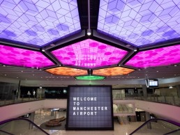
Manchester Airport Terminal 2, UK
As part of an ongoing redevelopment of Manchester Airport, Terminal 2 has been expanded and revamped, more than doubling its capacity for passengers. The new-look terminal features a dynamic and welcoming lighting scheme designed by Hoare Lea.
Pre-pandemic, Manchester Airport was the third largest airport in the UK, with almost 30 million passengers travelling through each year.
Spanning across three terminals, the airport is undergoing a vast, £1bn transformation, first announced in 2015 by Manchester Airports Group (MAG) and spearheaded by architects Pascall + Watson. The huge transformation programme comprises a series of 60 enhancements; key elements among these include new piers, aircraft stands, forecourt and multi-storey car park.
The centrepiece of the transformation though, is the extension of Terminal Two. Completed earlier this year it offers state-of-the-art facilities and provides a first-class experience for passengers, in a modern, bright and spacious environment.
The new terminal features a series of open, double-height spaces and floor-to-ceiling glazed façades, ensuring a bright and airy interior awash with natural light, while more dynamic touches have been introduced to create a vibrant and welcoming space for travellers.
Hoare Lea has designed the lighting strategy for the expansion, working alongside Pascall + Watson, and principal contractor Laing O’Rourke on the development.
David Linville-Boud, Associate at Hoare Lea, explained how the lighting concept first took shape: “The general look and feel had been developed by the architect, and CGIs had been produced by them, which included lighting elements. We took their conceptual designs and investigated how we could achieve the desired intent, what typical products would allow this to be achieved and what their general performance specifications would need to be (beam angles, outputs, optical controls, etc) in order to achieve the design principles required for each space.
“As designs started to become more detailed, if there were opportunities for alternative or additional lighting within the contract, this was detailed, designed out and presented accordingly. A good example of this is the introduction of the giant, colour-change hexagons in the departure lounge, which were introduced to replace the original design of skylights above the space.”
The primary focus for Linville-Boud and Hoare Lea was for the lighting to enhance the experience for users of the space. He continued: “While highlighting the architecture is an important visual element, the experience of the journey of travellers through the airport and their appreciation of each space while being able to undertake the tasks within each is the primary requirement – whether it is a functional task such as security, or a leisure task such as circulating around the departure lounge, or just passing time waiting for departure. Different lighting treatments react to the architecture, the varied ceiling heights, the space usage and assist in defining each space and guiding travellers through the arrivals or departures activities.”
Taking the architectural design intent and the building blocks defined within the basis of the design, Linville-Boud explained that the concepts for each space were fleshed out as individual elements to define the exact performance requirements, product types and installation requirements to fit the architecture and the overall lighting design approach.
“Following on from this, the complete BIM model was utilised to build lighting design models to make it easier to handle the design for each space due to the large size of the scope areas,” he added. “From there, full designs were undertaken for every space to ensure compliance whilst also considering the appearance within 3D space to ensure the best passenger experience.”
Working within a large-scale, £1bn redevelopment programme, the scope of the project is incredibly vast. As such, the design team had to work hard to ensure a level of consistency across the site, while the logistics of working within an airport also presented a number of challenges for Hoare Lea, as Linville-Boud explained: “The main challenges included the sheer scale of the project, covering multiple areas and ensuring a cohesive design that coordinated between each space.
“Due to the nature of being an airport, some very specific requirements exist for certain applications and careful development of the lighting was required in order to achieve the specifics while ensuring the appearance was coordinated and integrated to prevent a solution that may meet the requirement but at a cost of reducing the aesthetic of the overall space.”
Linville-Boud added that, due to the size of each space within the terminal, and their respective, clearly defined architectural designs, lighting the volume of each space, providing visual interest and creating the right ambience were integral factors that were “as important as achieving the lighting on the working plane”.
“With the concepts set out at the earlier stages of the design process, these needed to be rolled out and tailored to suit each space exactly,” he continued. “This resulted in a few adjustments to fit the geometry of each area as the ambition was to ensure consistent details, such as product spacing across each open area to allow the pattern and rhythm to be maintained.
“Each area type had its own design solution; for instance, circulation areas utilised a baffled ceiling with lighting integrated into the baffle layout, whereas the security area was based mainly on suspended downlights in-between rafts. This methodology was consistent throughout, giving the coordinated layouts and identity to each area.”
The idea of a consistent methodology and identity throughout is an integral factor to the wider redevelopment of Manchester Airport, which will eventually see other areas expanded and renovated. However, while working within the context of a wider redevelopment plan may have been a challenge, Linville-Boud didn’t see it that way.
“The large-scale nature of the project doesn’t overly complicate the actual lighting design or solutions, but it does complicate the design delivery due to the sheer size of the spaces and the associated quantity of the lighting products required.
“Each space was designed in full, whether it was a WC, corridor or check-in hall – this ensured the designs were exact for each and not based on a rollout of theoretical design parameters that may not transfer correctly into the actual architecture.
“There are specific requirements for ‘task’ areas in an airport, which must be met alongside the general typical requirements for usability of the spaces. As these were generally known during the design process, providing integrated solutions was possible, rather than needing to add additional lighting as an afterthought,” he said.
“The extension to Terminal Two and the new pier also set the methodology and design approach that will be continued into other spaces as and when they are developed. Due to this, it was important that at the early stages, the design solutions had a certain flexibility to allow them to be tailored to similar yet different spaces – some of which weren’t designed at that time.
“Other areas are being looked at, and the designs will follow the methodology employed already here for a consistent approach throughout the terminal and piers. The designs, as per the architecture, need to be read as one and not seen as a refurbished building and a new build. In addition, the commonality of lighting products and consistency in the lighting design and lighting control will create a seamless integration of the extension to all areas of the terminal, allowing better management of the building services, more efficient operation, and provide visual uniformity, creating a calmer, more pleasant environment.”
For this large-scale operation, a new lighting control system was employed for all the lighting integrated into the existing building management system. DALI was utilised in every luminaire, with the exception of the large colour-change hexagons, which operate from a DMX protocol. Lighting control types were set as part of the basis of design, and this was then rolled out across the various spaces with adjustments to suit individual situations. The DALI system, created by Laing O’Rourke, operates almost 20,000 drivers, more than 3,000 sensors and 500 application controllers – the project won Laing O’Rourke the Large Indoor Project category at the 2020 DALI Awards.
The introduction of a dynamic control system was part of a push to improve the user experience within the terminal, as Linville-Boud explained: “The lighting control system and the way it has been employed increases the quality of the travellers’ experience, while also giving full controllability and the associated benefits for the airport operator – whether it’s dimming, scene setting, colour control or event activation.
“The system is also linked to the flight information to be able to raise and lower light levels around gates depending on their utilisation. The large colour-change hexagons are positioned adjacent to a two-storey media wall, and they have the ability to respond to the content being shown on the wall.
“The ability to group and control sets of luminaires allows the lighting to be used to guide travellers through the spaces – areas not in use can be dimmed, allowing the passengers to follow the lighting through their travels.
“Airports can be alien and confusing environments with many users circulating in all directions with limited knowledge of the layout of the spaces. Every aspect that can reduce this confusion can come together to ease the ability to locate their destination, whether this is through signage, architectural designs and materials or lighting. The separation of lighting treatments and light levels into specific areas enhances this ability to navigate and negotiate through spaces to the desired destination.”
As Linville-Boud mentions, airports can be hectic and stressful places. Therefore, with the addition of a dynamic lighting system, he believes that the lighting design will help to facilitate a more calming and uplifting environment for travellers both arriving and departing from the terminal.
“All lighting has been selected to be low glare to enhance visual comfort,” he said. “In transient circulation spaces, lighting is mainly shorter linear fittings integrated into the layout of the baffled ceilings, giving visual guidance to travelling routes. Larger spaces utilise alternative solutions with the appearance suitably scaled to suit the size of the space and the ceiling height, which can vary substantially.
“All of the lighting is part of the architecture to give a pleasing appearance to make the spaces feel more harmonised. In specific areas, such as the check-in and departures, additional feature elements are included – in the check-in hall to create an impressive welcome mat and in departures to add active features to make enticing spaces where passengers can enjoy their dwell time and be immersed into the environment.”
Following the opening of the revamped Terminal Two in July of this year, Linville-Boud is satisfied that the final lighting scheme sits in keeping with the wider architectural design, creating a welcoming space for travellers.
He concluded: “The final appearance of the lighting meets the design intent in both performance and appearance, and creates people focused spaces that enhance the user experience from the moment they arrive right through to boarding a plane.
The lighting is successful and integrates very well with the architecture, which itself creates amazing spaces that flow from one area to the next, forming a fully coordinated and effective transition that gives a quality and relaxing experience in such a busy and active environment.”


