Glenlivet Visitor Experience, UK
The iconic whisky brand Glenlivet has created an immersive and interactive visitor experience at its Speyside distillery that reflects its rich heritage, high standards, and welcoming nature. A vibrant lighting scheme from Into adds to the warm and welcoming atmosphere of the space.
The Glenlivet, Speyside’s original single malt, is welcoming whisky fans to its newly refurbished home in Speyside, Scotland. After undergoing 18 months of extensive renovations, the home of The Glenlivet has become so much more than a distillery, with a new look and feel.
Following in the footsteps of its founder, George Smith, and his legendary hospitality, the redevelopment reflects his high standards and welcoming nature. Using innovative technology combined with exclusive bottlings, immersive tours, and whisky tastings, The Glenlivet brings visitors an experience like no other. From exploring the art of whisky-making and showcasing rare editions, to reflecting The Glenlivet’s heritage throughout the interiors, the new visitor experience pays homage to being the original mark of quality for Speyside single malt.
Designed by London-based studio Blacksheep, with lighting design from Into, the valley of the smooth flowing River Livet echoes throughout the visitor experience, while the interiors have been inspired by The Glenlivet Estate and the wilderness of the Cairngorms National Park, in which it sits.
Working closely with the interior designers throughout the entire project, Johanna Paice, Associate at Into talks arc through the design process: “When we first met with the interior design team, they ran through their concept for each area – their visuals had a very strong aesthetic and really helped us to get an idea of what the client would like and how the overall space would work. We discussed possible lighting ideas and solutions at this stage; for some areas, they had very strong ideas of what the lighting should be like and the effect they wanted to create, in other areas it was more of a discussion. Our concept was to make the space feel inviting and to ensure there was a balance between showing off the products and experience but still making it feel authentic to the original space and location.”
The visitor centre is spread over the ground and lower floors of the distillery. Visitors enter via the reception where they are greeted by a spectacular custom chandelier by London-based florists, Grandirosa, which is made from local dried wildflowers. From here the visitors embark on a guided explorative journey through a series of spaces that bring the story of The Glenlivet to life. Spaces that follow, include a lounge, which acts as a waiting area ahead of the tour; The Tasting Room – a dramatic circular space featuring a round custom walnut table at its centre as well as a sculptural display that rises from the table displaying a selection of whiskies; then there’s The Sample Room and The Provision Room retail spaces; The Drawing Room – an atmospheric and relaxed onsite bar; The Smugglers Hideout – an elevated private space for tasting the finest bottles of whisky; and then finally The Glenlivet Warehouse, featuring floor to ceiling whisky barrels that are illuminated with hidden linear LEDs washing down. The Warehouse space is split into three, the angel’s share showcasing the aging process of the whisky with a large backlit display, with the two other areas focusing only on the areas of interest making the space feel moody and interesting.
Initially, Into focused on each area of the Experience separately, reviewing the integral details via mock-ups to ensure they worked with the finishes suggested. The team then added layers of light to the space to enhance Blacksheep’s interior design. “Every fitting was reviewed and colour temperatures throughout the space were considered to get the best effect possible,” said Paice. Final fixtures for the project were selected from: KKDC, Engima, UFO, LightGraphix, Stoane Lighting, TM lighting, Hunza, Lightform, Lite-house, and Soraa.
Into used clever lighting design to differentiate the various spaces while ensuring they were seamlessly linked. “We wanted the space to feel harmonious, but the individual areas also needed to stand out in their own right, especially the retail spaces,” Paice explained. “Lighting was used to zone the areas with dimming to each; we also used colour temperature to denote different areas. The retail spaces were slightly cooler with 2700K light fittings, this also helped highlight the true colour of the whisky. Whereas the Experience area was a lot warmer with 2200K fittings.
“Showcasing the products was one of the main focuses of the lighting scheme,” Paice continued. “This was done with integral lighting details mounted within the joinery and I think this helped to get the balance between showcasing the products and staying true to the concept and the homely feel of the ground floor space. It helped that the interior finishes were naturally warm, with lots of rich colours and woods used. The whiskey itself is such a lovely amber colour that highlighting this with warmer light helped to really bring the bottle to life.
“The tasting room was slightly different to the other spaces, while it was still very dramatic as you walk in, the lighting was more visual with large circular suspended profile rings mounted at high level and used as a feature. They were dimmed very low instead of using them to light the space. We also highlighted the bottles within the display using light sheets hidden within each bespoke shelf. As the visitors taste each one, the shelves with the whisky they are tasting illuminates.”
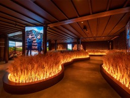
The main theatrical elements throughout the space are within the lower ground floor experience and as guests walk into the Speyside room filled with barley, the architectural lighting is used to create drama within the space. “We wanted to bring the barley to life and make sure it didn’t get lost,” continued Paice. “This was done with fibre optic pavers mounted within the base of the barley shining up and through. The light shimmers and moves to create the effect of barley moving in the wind.
“The rest of the lighting in the space is focused, with dramatic pools of light on the floor and uplighting details to the carved wood walls to add depth and layering the space.”
For Paice, as there are so many beautiful handmade displays and finishes within this project, highlighting them in a sensitive way became even more important. “Lighting also helped to create unusual effects and make the space feel more impactful and dramatic,” she said. “We are really happy with the overall lighting design. It’s very close to what was originally discussed at the concept stage with the only differences occurring because of the various mock-ups, which identified the best execution of each lighting detail. Not only did these demonstrate to the client possible ways to present their product, but they also steered the collaboration between lighting and joinery, which was a great success.”
Darren Orrow, Director at Into, added: “This was such a fantastic project to work on; both the interior designer and client had some great ideas for lighting. We all worked very closely on mock-ups and detailing to make sure our collective creative vision could be realised within budgets and timescales.”
Commenting on the finished product, Miriam Eceolaza, Director of The Glenlivet, said: “After 18 months of renovations, we can’t wait to open the doors to our local communities and bring whisky lovers into our new visitor experience. It’s a true immersion into the iconic Speyside region, walking guests through our stunning indoor field of local barley, tasting from our old and rare archives, experimenting with our famous cocktail capsules and taking a unique piece of Speyside home with our straight from the cask personalised bottling. From the decor and design to ambience and atmosphere, guests will witness something truly original at every turn.”


