BIO4, Denmark
Speirs Major and Gottlieb Paludan Architects have collaborated to create a wondrous façade for Copenhagen’s BIO4 biomass-fired power station.
As part of Copenhagen’s drive to become the world’s first CO2-neutral capital by 2025, local utility company HOFOR has drawn attention to its transition to sustainable energy with a bold and dynamic intervention of architecture and light at its new biomass-fired CHP power unit, BIO4.
Situated on the site of the original Amagervæket power station, the plant has undergone several upgrades since it was first constructed in 1971, eliminating the production of harmful emissions and ensuring that it is not an eyesore to nearby residents.
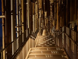
Completed in October 2021, the new project was spearheaded by Gottlieb Paludan Architects and Speirs Major, who won a design competition in 2014 with a concept that uses dynamic light to activate a unique ‘Forest Façade’. This six-metre-deep façade is adorned with a fascia of suspended tree trunks, creating the appearance of a dense forest. A clear visual signifier of the unit’s use and its move away from fossil fuels, the façade also plays an important role in engaging the local community and helping to embed the building into the wider identity of Copenhagen as a city.
Jesper Ravn, Architect and Lighting Designer at Gottlieb Paludan Architects, said of the initial design concept: “The story we wanted to tell was a story about wood, and giving the citizens of Copenhagen a relationship and connection to where their heating comes from.”
Keith Bradshaw, Senior Partner at Speirs Major, added: “What is very clever about the way the façade was designed, and the access in through the façade, is that it remembers to connect people to this huge, oversized, industrial facility. You don’t realise quite how big it is until you stand near it, and you certainly don’t realise how awesome it is until you stand within it. Allowing people to understand the scale of the project is something that was really ambitious, yet simple, but for me that is the nature of relating to a forest; as you walk towards it you realise that it’s much bigger and more sophisticated and complicated and layered than you might have imagined from the outside.”
Given the scale of the building and its prominent location, just two kilometres from downtown Copenhagen, its architectural expression and visual identity was also crucial. By day, the unique, organic wooden cladding system, mounted in a galvanised support structure, helps to soften the lines of the vast building while adding a sense of nuance and texture.
After dark, Speirs Major designed the visual image to be strong, yet subtle, managing the light intensity so that the façade would sit comfortably within the city context. The projected light creates a beautiful, dappled effect, gently revealing the depth and texture of the façade, while the kinetic animation celebrates the building as a source of heat for the city.
Bradshaw continued: “We went through several ideas about whether the fixtures and the light should be in the façade or projected onto the façade, and where we ended up was, in really simple terms, a very large-scale impact created with as minimal energy as possible.
“It’s layered up, sometimes with three layers of light, because you need that layering to create the magic moments where you don’t realise it’s artificial light. That’s a very rare thing in the work that we do. It’s like when you go to the theatre, most people don’t look at the lights, they just look at the effect, and they either believe it or don’t believe it. Once you clear away the technical solutions and just think about the effect, that made it feel magical.”
Ravn agreed that the new façade lighting brings a feeling of magic to the building: “One of the big achievements is when you look at the light, you can’t stop looking at it. You just want to dream your way into it. It’s like looking at little ripples in the water, a field of crops in the wind; it’s very recognisable, and yet you’ve never seen anything like it. It pushes buttons in your imagination in that it looks natural and organic, and it organically brings back the thought of where the wood comes from, that it’s alive.
“Residential buildings are less than a kilometre away, they can see this from their bedroom windows, and I don’t think that they tire of it because it’s so gentle and natural. There’s a great achievement in that.”
The lighting for the façade appears in tones of warm white under normal circumstances, with a limited palette of colours for special and civic occasions provided to further boost the local community’s engagement with BIO4.
To achieve this, Speirs Major used 49 Martin Professional Exterior 1000 projectors, while 150 DALI controlled lights from the likes of iGuzzini, Stoane Lighting, LightGraphix and Vexica are used for downlighting, linear stair handrails and other elements of the design.
Bradshaw explained further the components used to create the dynamic façade scheme: “It’s theatrical effects within architectural fixtures, and what is significant about it is that it is permanent, and it’s very robust,” he said.
“It is one of the most difficult environments in which you could put light fittings outside. There’s a lot of weather that comes through the harbour, so you need a fixture and an installation that can handle that. Also, because it’s an industrial facility, the detailing needed to feel appropriate for the setting. It’s a robust piece of infrastructure, but it creates a very delicate, theatrical effect.”
Although the six-metre-thick forest appears only on the main façade, the ‘forest’ thins out to a single skin of trunks along the east and west façades. While this may have been a challenge to Speirs Major, Bradshaw believes that the positioning of the light projections helps to reinforce the feeling of depth.
“While most of the fittings are on the public side of the project, we could project the light three-dimensionally around the corner, which created the layered effect that we were getting elsewhere on the main elevation. This means that the side elevation, which is only one-metre-thick, and the main elevation look like one piece. It took a lot of skill and quite a bit of luck for it to look just as beautiful as it does, as it is not just an elevation, it’s a three-dimensional object that we’ve lit. Everything about the façade is very three-dimensional – it is an abstracted, framed view of a forest that we’ve gently placed around the building. It’s a playful abstraction of what’s going on inside the building.”
Within this abstract forest of light, a staircase leads up to a viewing platform on the roof. By ascending the stairs, visitors can immerse themselves in the forest and experience the kinetic light effect from within – an experience that Bradshaw compares to entering a remarkable alternate reality.
“The journey up the staircase is really amazing because this is a civic infrastructure project, it’s not a space that you think would be easy for people to inhabit. But what is so beautiful about the architectural design and the scaling of the staircase is that as you walk through it and experience the effect of the dappling of light coming through all the layers, all the narratives of being in an enchanted forest begin to start. There is something mystical about it. There is an energy in the forest. Even though the temptation may be there for some, you don’t really want to look for where the light is coming from, you just want to experience the effect.”
The addition of a means for the public to directly interact with the building is something atypical to what one might expect for this kind of infrastructure project, but Ravn feels the move was an integral part in giving citizens of Copenhagen a connection to the power station.
“If you think of power stations from different generations, Battersea Power Station for example, that is effectively a Victorian cathedral saying ‘we love energy, we love progress’. The next generation didn’t want to build in brick, they wanted quick, efficient, hidden sites that were out of the way. But that’s not enough today,” he said. “Cities are growing, and someone will be living close to these things soon, so it’s not acceptable that we build ugly infrastructure that no one wants in their back yard. That’s why we tried to make something attractive that people can relate to and appreciate. We then took that to extremes by inviting people to come closer, to touch it and walk up the façade, which is very unusual. Our desire was to connect citizens to the reality of where we get our heat.”
Bradshaw added: “Connecting people to where their heat comes from is what underpins this entire project. The level of civic engagement and civic responsibility, pride, and knowledge is extraordinary – people care about this project, they care about where their heat comes from, and they want to know what this site is for. By being humble enough to say, ‘this is what it is, this is the reality of who we are, let’s do something special with it’, rather than pretending it doesn’t exist is very brave.
“The celebration that this power plant is a major green provider of heat for Copenhagen – it covers almost 60% of the district heating in the city – means that as we continue to engage people with issues of energy and sustainability, telling the story of what it takes to power a city, rather than hiding it away or burying it underground, we are using light to promote its lower carbon footprint.”
Since the competition stage in 2014, Speirs Major and Gottlieb Paludan Architects have been in close, constant collaboration on this project, working together to create a finished project where the architecture and lighting are seamlessly intertwined in one, cohesive narrative.
Both Bradshaw and Ravn believe that this collaboration is something that directly contributed to the success of the overall project.
Bradshaw said: “If we were making a film, Jesper was the producer, the person that really made it happen, where he kept everyone connected and focused on what this was. That would not have happened had Jesper not done it.
“People use the word collaboration all the time, but there’s another story to what good collaboration is, and it’s much rarer. We do a lot of projects, but very rarely do you come out of it with an amazing result and an amazing feeling that you have done something special. There are no doubts on this project; we were always pointing in the same direction because we had an idea that was appropriate, timeless, authentic, real, and we felt that we had to protect it for as long as possible until it was delivered. Getting down to the heart of what we aspired to do, we can say that it has been delivered beautifully.”
Ravn concluded: “I’ve always known that I could trust Speirs Major, and that they could deliver a beautiful solution. It took a long time before anything regarding the lighting got specific, we were very close to the end before we saw what this was going to look like, but by throwing words back and forth about what we feel, what it is, how we understand each other, reassured everyone.
“That is the strong link between light and architecture; I don’t think that you can separate the two. I work with both and they’re one thing – there is nothing that architecture is about that light is not also about.
“How does the light work together with the architecture? How can it bring the space to life? How can it be the visual music to the physical building? The soul in the body? The electricity in Frankenstein’s monster? How can the light be that? That’s hard, but that’s the point in bringing light and architecture together, and I think we’ve been able to do that all along.”


