ATI Head Office, UAE
When Dubai-based engineering and architecture consultants ATI moved into its new head offices, the firm’s in-house lighting designers sought to create a scheme that would create a harmonious and comfortable working environment.
Established in 1980, ATI is an award-winning architecture and engineering consultancy firm. Based in Dubai, the company also has offices around the world in Sharjah, Istanbul, Tokyo, Kyiv, Almaty and Moscow, and has delivered end-to-end services on more than 700 projects around the world.
Across the firm, its main disciplines include architecture, interior design, lighting design and landscape design, as well as MEP design, structural design, and construction supervision.
To coincide with its 40th anniversary, ATI decided to relocate its design team to a newer, larger space that better reflected its brand vision and creative work. Located in the heart of Dubai, the firm hopes that the move will help establish ATI within the city’s urban core.
When it came to designing the new headquarters, the goal was to create several unique areas within an open plan, collaborative space, in a bid to facilitate and inspire employees while maintaining a future-oriented working environment. Lighting for the new office space was designed in house by Mohannad Al Salkhadi, Principal Lighting Designer at ATI.
Spanning across 460sqm, the office space consists of four separate adjacent units, where a combination of both direct and indirect lighting was used throughout. When developing the lighting concept, Al Salkhadi was keen to take into consideration the working environment, as well as employee wellbeing. As such, it was important for the lighting to follow the layout of the workspace to balance the use of direct and indirect lighting.
Luminaires were carefully selected and distributed to serve light “where needed, when needed and however needed”. To achieve this, a thoughtful process of product sourcing and evaluation took place during the design stage, which included looking at a number of different technical specifications.
The first of which was light distribution beam angle; an essential criterion of the design was to avoid flooding the space with unnecessary light. As such, a variety of beam angles was used, including narrow, wide, and elliptical beams. This was in part due to the special interior architecture, which consisted of different volumes, along with the office space. Enhancing this further, to ensure the right amount of light was used within the target workplanes, each desk space was provided with a luminaire that delivers the exact amount of required light.
Complementing the abundant sunlight entering the space, a CCT of 4000K was selected for the artificial lighting, while a CRI as high as 90 was a mandatory requirement, due to the heavy use of building material samples where the best appearance is needed.
Luminaires formed an important element of the interior design, and as such were selected to integrate seamlessly and proportionally within the surroundings. In the studio’s open space, linear suspended luminaires were placed to perfectly match the workstation lengths. Each individual luminaire provides separately switched direct and indirect light, giving staff the freedom to have a preferred mood at any time. In areas such as the library, garden and sample room, fully adjustable spotlights were provided to adapt to ever-changing events and displays.
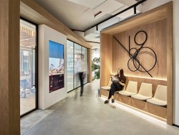
On entering the workspace, visitors are greeted by the main reception area. Here, the lighting design needed to emphasise the main interior design features, such as the unique wooden structure used to frame the space. The spread of light therefore had to enhance this perspective by highlighting the main inflection lines of the wood; to achieve this effect, a spotlight was placed where the surfaces changed direction. In addition, features such as the ATI logo and greenery have been highlighted by a combination of medium and wide beam angles, maintaining the contrast between the objects.
Elsewhere, in the main board room, a bold decision was made to eliminate the use of downlights and suspended lighting – instead, lighting was designed on three layers; hidden cove lights provide indirect light, while lines of light integrated within the wooden ceiling take care of direct light. Additional ambient lighting comes from concealed shelf lighting.
Elements of this approach continue in the CEO and Executive Director’s offices, although this room did require its own character. Alongside a soft, homogenous colour scheme, lighting was expected to seamlessly blend in with the wider interior design. Besides indirect cove lighting, a set of well-studied spots were placed between the ceiling’s wooden, slatted details to highlight the separate “islands” of the room – the desk and meeting space.
In the communal spaces, a slightly different approach was taken with regards to the lighting – in the sample room in particular. As the office deals with a wide variety of building material samples, the sample room is considered a live testing stage for all materials, appearances, and matchings. Because of this, the area was illuminated with fully rotatable and adjustable surface spots. With a CRI of +90, coverage from opposite angles to cancel shadows, and under-cabinet integrated lights, every corner of the room will receive the required light needed for internal materials discussion and sample presentations.
Breaking away from traditional office spaces further, the renovation features an indoor “garden” and library space on route to its communal, central gathering hub. Intended as a space for casual discussions and interactions, the lighting was designed to match, providing the right amount of light with the desired contrast to create visual separation.
Continuing the more relaxed ambience, the office’s “lounge” space is considered a favourite spot for many clients and guests. Furnished with an organic feel and surrounded by plantation, the wooden ceiling provides the ideal housing for slim linear lights that merge in a perfect fit, blending in with the framework of the space and giving maximum visual comfort.
The main workspace, dubbed the “Studio” was designed to be simple and elegant. Based on a module of four workstations, the Studio allows ATI’s team of designers to have an easy-going workflow between different disciplines. Each workstation module is topped with a suspended white linear light with separately controlled direct and indirect light. Suspension height was also taken into consideration to allow for the perfect spread of indirect light.
On completion of the project, Al Salkhadi explained how different the process was, designing the lighting for the firm’s own office space: “Keeping in mind that even the interior design as also in-house, we were able to confidently design each of the spaces to make sure that they will be unique, yet in harmony with the rest of the office space.
“The lighting helps to highlight each of the areas, creating visual boundaries based on the contrast of lighting levels. It also provides the space with an energetic atmosphere.
“The interesting part was the opinions of the rest of the team; with a variety of professions and backgrounds, we had lots of different feedback. But when we explained to them the preciseness of the lighting design, and the reasons why every part was designed the way that it was, they started to understand and appreciate it more.”


