Mojang Studios, Sweden
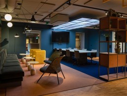
At the newly renovated headquarters for video game developers Mojang Studios, Reform used light to create an inviting and altogether more homely environment.
Swedish video game developer Mojang Studios, best known as the producers of Minecraft, has recently undergone an expansion and renovation of its Stockholm offices as part of its continued growth and expansion.
Local designers at Reform were brought in to spearhead the renovation, updating the office space to create a more inviting working environment, including the lighting design.
Beata Denton, Lead Lighting Designer at Reform, explained: “A strong theme was to enhance the internal staircases, to make them central, as a nave between the floors, with light, sound and plants.
“We had workshops with representatives from the different competencies within the company; they wanted better lighting than what they had, specifically regarding adjustability both in workplaces and in meeting rooms. Some of them even considered the lighting to be more important than the interior design.”
These workshops led to the creating of a design concept that was built around key words and phrases – friendly, playful, practical, with no office feeling, while injecting some fun. “We wanted the right light in the right place at the right time as a starting point,” Denton added.
Throughout the office space, the working environment was designed to meet high standards in terms of lighting, acoustics and accessibility, creating peace of mind for staff working there. A key part of this was to make the lighting controllable and individually adaptable, so that the user can influence their own lighting environment.
Denton explained: “Since a lot of the work is done on computer screens, creating graphics for the Minecraft world, we wanting to give staff the possibility to switch off direct lights. There are suspended linear lights that are controllable, such that two opposite desks use the same light. This is a more costly solution than what would be needed for less sensitive colour and graphic related tasks and workplaces. But it is always important for the individual to be able to adjust light levels, with dimmable general light in zones over larger work areas, combined with controllable desk lights.
“In shared workspaces, the desk light is usually the most relevant solution to personalised lighting. Who otherwise would decide on the light levels for 20 individuals with different eyes, ages and preferences?”
Another aspect that Reform wanted to bring in was an element of surprise, particularly in the communal, transition areas. Denton continued: “Passages and cloakrooms have recessed low lighting in walls as opposed to light from above. The breakout areas and lounges are important relaxing spaces, where coming from the artificial world that they are creating, they instead want the real and tactile materials, soft lighting, and a cosy feel with warm light at 2700K.
“The central staircases were given a feeling of surprise and life by integrating moving lights. In the smaller spiral staircase, we mounted a projector with an animation wheel creating an image of slowly moving water in a blue/green colour. The image is projected on the ceiling of the restricted space; this works well with the space and becomes a feature, making climbing the stairs more relaxing and dreamlike.
“The bigger staircase in the main lobby was already in place, constructed of black steel with open steps. We had the back side clad with living moss, into which we integrated fibre optics to give an illusion of dew drops glimmering in the morning sun.
“In the main conference room, we wanted to add some natural and harmonious feelings, rather than the traditional conference feeling. We chose an organically shaped suspended fitting, of course dimmable with scenario settings, and combined this with accent lighting onto curtains all around the perimeter of the room.
Within Mojang Studios’ offices are social “Hubs” located on each floor. Alongside coffee bars and meeting areas, the Hubs act as specific “magnets” to make people want to explore and move between the floors. These include a games room complete with billiards and arcade games, multi-function rooms for workshops or yoga, a sound studio, and creative labs.
“The Hub is centrally placed in the building, without any direct daylight,” Denton explained. “We created a ceiling above the main touch down table, with tunable white light to suit individual preferences or the time of day. Mojang’s graphic designers designed a Minecraft cloudscape print for the diffusor – square and rectangular clouds as opposed to round ones.”
While the Hub takes some inspiration from the blocky, modular aesthetic of Minecraft with its light box ceiling, Denton added that Reform shied away from taking a similar approach with the general lighting throughout. “Other than in the Hub, we felt that the light would rather enhance the design, which is in shapes inspired by the modular graphics, not so that the lighting itself had to imitate the modular concept. The design guidelines also give more direction towards the friendly, homely but still striking lighting design.”
The move to create a more “homely”, informal lighting scheme was very much a conscious decision on Reform’s part, and ties into the initial concept approach of creating a space unlike a “traditional” office.
“Our interior designers worked closely with us in every part, we were creating the space together with regular internal workshops and meetings to bring the mood and atmosphere to life,” Denton added.
“The workspaces are totally to the highest standard technically, as well as the individually adjustable lighting. Another very important design choice was that all work desks for more permanent use are located by windows. This adds to the comfortable, homely feeling while being beneficial to health and wellbeing.
“The building itself is stunning, a striking old brewery made of brick with tall chimneys. It sits right on Lake Mälaren, looking out at the city hall right across the water, this gives a special relationship to natural light from basically all rooms. Its massive walls give a certain robust and characteristic feel to every corner of the space. The interior design enhances and uses this with the design of custom-made seating by the windows, and little alcoves with integrated lighting.”
Throughout the workspace, architectural lighting is offset by decorative pieces such as pendants and wall sconces. As with all of her projects, Denton was keen to ensure a harmony between the architectural and decorative elements. “We always say that all the lighting combined creates the lighting of the space we work with,” she said. “We try to abolish the division between ambient and decorative. That often leads to doubling up on lights, which is really wasteful, so we create the lighting with every fitting as an integral and equally important part of the scheme.”
This approach has led to a design that is warm and welcoming – a far cry from the typical scheme one might expect in a workplace environment, but one that will be of great benefit to all staff and visitors.


