Clark International Airport, Philippines
One of the main transits in and out of the Philippines, Clark International Airport has recently undergone a large-scale renovation. Lighting for the new-look terminal was designed by local studio Light Plan Inc.
Situated to the north of Manila, Clark International Airport is one of the main transits in and out of the Philippines. Originally opened in the mid-90s, the airport is currently undergoing a widescale development, with four new terminals expected to be opened by 2025. As part of this ongoing work, Lead Architect Populous and Architect of Record CASAS Architects recruited local lighting design practice Light Plan Inc to develop the lighting for the new-look terminal.
Light Plan Inc has prior experience working on airports, having recently completed the Mactan International Airport (also in the Philippines), and the Indira Ghandi Terminal in India.
Jinkie de Jesus, Principal and Founder of Light Plan Inc, explained the original design brief, and how this shaped the lighting design approach. “The brief had several technical considerations, such as complying with Singapore Chiangi Airport standards, LEED certification, and to produce a lighting plan that is energy efficient and easy for maintenance,” she said.
“For the design, we had free reign, but the client wanted to set themselves apart from Mactan International Airport. Taking to heart the brief, and getting to know our client – a consortium among Chiangi Airport and two local developers, Robinsons Land and Filinvest – their vision and aspirations for the terminal set the tone for our lighting design approach.”
This approach was built around two key words – sustainability and showcase. “Being one of the most affected countries by global warming, we aimed to minimise energy consumption by using the minimum number of lights possible to do the job,” explained de Jesus.
“In a local culture where bright equals good, we wanted to impart another approach where we do not need to light excessively for a space to look and feel good.
“We also wanted to create a passenger terminal that would be a showcase or role model for how airport lighting should be in the Philippines. “Airports like this are rare in the Philippines – most of the terminals are substandard when it comes to lighting, and we have the opportunity to create something that can bring pride to the Filipino people, and to convey the message that we can do better. Sadly, we have relaxed and come to accept inferior design, work, or products. Our design inspiration comes from rejecting this culture. We put our minds and hearts to providing the best lighting our budget can allow.”
To adhere to its sustainability requirements, Light Plan Inc listed a set of strategies for the lighting, such as establishing a minimum distance between light fixtures, the idea being the further away, the better. Setting a cap of a distance of three metres meant that they could reduce the number of fixtures needed.
With energy efficiency a priority, the designers also needed to be stringent on compliance. As such, only the highest lumen per watt fixtures were considered, with advanced optics also key to get the light where it needed to be. Longevity was also a consideration, with fixtures chosen that would last, while maintaining proper lux levels beyond five years of operation.
However, de Jesus explained that with these requirements came a number of challenges. “For the arrival corridor, where we had a staggered arrangement of linear lights, we had to go through several rounds of layouts and calculations to ensure that we would still comply with the uniformity values, regardless of their playful arrangement,” she said.
“In the departure hall, as the fixtures were mounted at varying heights, we were concerned about the intensity and distribution of light on the floor, so we specified drivers with dip switch presets and established different intensities depending on the mounting height of the fixtures.”
The specification process, de Jesus added, also proved to be a challenge for the designers. “In the Philippines, it is common that a client will ask for value engineering and alternatives to the original specifications. But as we were designing for sustainability, only the best products in the market could technically comply. In the end, we still went with the majority of these base specifications, since we saw that the inferior products could not do what the higher quality products could. It was good as we had the opportunity to educate our clients and colleagues. Communicating your design and the rationale behind it is as important as designing itself. If we did not get to properly convey the design and specification, the final outcome would not have turned out this way.”
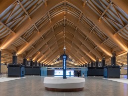
One of the major focal points for the new-look Clark International Airport is in the departures hall, where vast, vaulted wooden ceilings creates a church-like quality. “We wanted to uplight the large wooden glulam arches to showcase the warmth of the wood and the scale of the cathedral ceiling,” de Jesus explained. “It is a simple method, but because of the repeated pattern created by the light, it had a grand effect.
“After several schemes were presented and budget considered, we went with 2700K narrow beam projectors on either side of the arch so the passengers can see the effect regardless of which direction they are facing. The warm colour was perfect for the shade of the wood and contrasted with the 3500K general lighting.
“The pattern created by the lit arches is stunning, as you see different lighting effects as you move into the passenger spaces. Another layer of feature lighting is the reflected light of the general lighting softly and uniformly washing the whole ceiling. When we were doing our design and calculations, we wanted to create this soft blanket of light that would be visible and appreciated from the outside of the terminal.”
The decision to opt for a general CCT of 3500K came after a series of mock-ups, in which the designers tested a variety of colour temperatures. “We thought about how to best illuminate the terminal so that it looked good, and also how to light up the passengers, so they look and feel good, and found that 3500K was the most flattering to the interior finishes and people’s faces – ideal for selfies,” de Jesus continued.
“Tasks and transactions could also be carried out comfortably under this colour of light. The prescribed lux levels were just right at 300 lux. Some international standards would have lower values, but since this is the Philippines, 300 lux is acceptable for functionality, but also not too bright that it will cause finishes to be washed out.”
The need to create an environment where passengers feel good was of great importance to the lighting designers, particularly given how stressful and hectic airports can feel. This is something that de Jesus has recognised in other airports within the Philippines, and was keen not to replicate. “Traveling itself can be stressful and we see that the airport process and environment can contribute to the stress,” she said.
“Ninoy Aquino International Airport in Metro Manila was named the world’s worst airport from 2011-2013, and has continuously been in the top 10 for the past few years. For Clark, we wanted to change the narrative in all aspects and for the lighting we wanted passengers to feel relaxed and happy going through each space and process.
“The selection of lights with a good glare cut was specified. Not too high as the space would look like a hotel, but also not flushed to the ceiling that it would glare. We had the Chiangi guidelines that touched both on horizontal and vertical illumination. Having that good balance between horizontal and vertical lighting also helps make the passengers feel comfortable.
“We avoided high colour temperatures commonly found in our airports in the Philippines and only specified within the range of 2700-4000K. We closely studied which colour of white would showcase the cool tone finishes of the terminal that used blues, greens, and greys. We also wanted to make the space photogenic for passengers.”
Indeed, it seems that there has been a conscious move throughout the project to make an airport that felt different to others in the country. “Clark Airport feels elegant, but at the same time, straightforward,” de Jesus added. “Apart from the departure hall, all other areas only have general lighting, no further accents or embellishment, but even in the absence of accent lighting the terminal still looks great.
“It feels elegant because the lighting is not excessive and is only provided where it is needed. There is a subtle play of contrast, so the finishes are brought to life. It is a combination of simple high-quality finishes lit up with proper lighting. The space looks put together and each lighting point is deliberate. Not many airports locally have that kind of approach of a well thought out lighting scheme, and I think this is how Clark differentiates itself from the rest.”
The efforts made to differentiate the airport have contributed to a successful end result. Looking back, de Jesus reflected on the project’s outcome. “Our team is happy and our client is happy; we cannot ask for more,” she said. “During the last few weeks leading up to the inauguration, the site was still buzzing with last minute work. We were there in the evenings and when all the lights were turned on, our team was very excited since we knew that it would look great.
“We also like that through lighting, we found a way to differentiate Clark from its older twin, the Mactan International Airport. Both airports are spectacular with their unique light identity.”
It is a view that de Jesus believes is shared among travellers and locals alike passing through the airport – a relief for the designers, who hoped that the lighting would enhance the traveller’s journey. “The light and architecture are united – we went through a lot of detailing work to integrate fixtures everywhere possible,” she said. “The lighting is there to support and highlight the architecture, not overpower and take the attention away from it.
“Through lighting, we aim to enhance and elevate the passenger experience by providing the right light for the required function and showcasing the space. Besides our client, our customers are the passengers arriving and departing Clark, and through the lighting we can help them navigate through the space with ease.
“This terminal was a pet project of past president Rodrigo Duterte, and with its opening we saw a sense of pride in the country. Lighting may be a minor part in the whole scheme of things, but I believe it contributes to something that brings pride and joy to Filipinos.”


