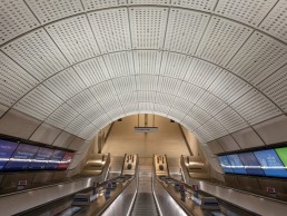
Elizabeth Line, UK
Officially opened in May 2022, Crossrail’s Elizabeth Line is the largest new infrastructure project in Europe, spanning 42km. Intended to be accessible and inviting, the sub-surface station design features a delicate, indirect lighting scheme, designed by Equation.
Spanning across 42km and six stations in central London, the newly opened Elizabeth Line has changed the game for underground station design.
The £14.8bn Crossrail venture, connecting east and west London, is the largest new infrastructure project in Europe. As part of this, the new stations were designed to be calm, safe, spacious, and accessible, creating a pleasant environment for London’s inner-city commuters. While the above ground stations and their surroundings are designed to respond to the local context, the sub-surface station design has a consistency and familiarity from end-to-end of the line, characterised by its gentle curves and soft, indirect lighting.
Coming from a public tender originally launched in 2009, the line-wide architectural components design was led by a consortium including Grimshaw Architects, Atkins, Maynard, as signage and wayfinding consultants, and Equation Lighting Design. The scope of this line-wide design, which was implemented across all stations, included the escalator tunnel, the lower concourse, cross passages, and platforms.
“An early inspiration was the simple, elegant and functional design of the Piccadilly and Northern Line underground stations,” said Keith Miller, Director at Equation. “In the first half of the 20th century, London Transport underwent a period of radical change under the stewardship of Managing Director Frank Pick. Modernist architect Charles Holden’s 1920s and 1930s station designs and his motto of ‘when in doubt, leave it out’ informed the development of the sub-surface station architecture for Crossrail.
“In those old underground stations, there was lots of indirect lighting, they were very design-led and minimalistic, with a slight Art Deco feel to them, that was the inspiration for the project.
“Grimshaw took a rigorous approach to the design, considering aesthetics and functionality, maintenance and sustainability when specifying materials and finishes. The reason why there are highly perforated surfaces along the walls and ceiling is to optimise the acoustic properties of the cladding. The soft rounded corners of the cladding enhance visibility as passengers approach a corner. And so, with lighting, we were part of a coordinated solution, with all components fully integrated to create an innovative, functional, cost-effective and sustainable set of products.
“We were also interested in creating a visual language of large luminous surfaces. On the platforms, rather than pursue a typical downlighting solution, we integrated lighting into the platform edge screen – creating a visually continuous luminous panel extending for 250-metres along the length of each platform. The lighting provides a soft ambient light to the space, which enhances the architectural design. It’s not at all glary. The panels have a controlled, consistent surface brightness. On the escalator tunnels, the lighting is concealed at low level, which creates an elevated feel to the space.”
The soft, indirect lighting was part of an overall goal to create a more inclusive environment for all passengers, as Miller explained: “We wanted to reveal the architecture to create a comfortable space that was legible and doesn’t feel gloomy.
“We even went to the extent of consulting specialists at University College London and Ophthalmologists at the City University about how partially sighted people see, what the issues are for them, trying to reinforce the principles of design for equal access rather than taking things at face value.”
With the general design spanning across six different stations, each with their own design team and separate tender, Miller explained the complexities of coordinating the overall principles across each site. “We made our design work as a generic station, and then the station design teams took that on for their site-specific work. For example, Tottenham Court Road has a curved platform, while Paddington has got a very long underground concourse, so the design teams there adapted the generic design to their station, following our principles.
“The idea was that for passengers, as you arrive at each station the tunnelled spaces have a consistent architectural design, until you get above ground, and then it’s a site-specific and unique station design that responds to the local context.”
One of the ways that Equation implemented the indirect lighting was through a series of custom-made “totems” that run along the centre of the lower concourses.
The totems incorporate various facilities such as signage and speakers, as well Future Designs’ Ikon uplighters. Intended to shine light onto the ceiling, which is then reflected back to the floor, Future Designs was approached by Crossrail to develop a custom luminaire that would fit into pre-existing dimensions of the totems. As an uplighter, one of the biggest challenges was heat dissipation, however the design of the Ikon allowed it to act as a reliable and effective heatsink, drawing heat away from the mechanics and regulating the device’s temperature.
The brand developed Ikon Emergency luminaires to be incorporated into the totems as well. These were designed to automatically illuminate in the event of a power failure, guiding passengers to safety. The design features high and low level lights mounted on the sides of wayfinding totems, and vertical luminaires mounted on the front faces of the totems to spread light in all directions and throw the light across a large distance on the floors – a particular challenge for Future Designs, as the positioning and spacing of the totems had already been set before they were brought on board to design the luminaires.
Future Designs also developed custom Plinth luminaires for the escalator tunnels, bringing a delicate glare-free uplighting to the space. Located within the deck area between each escalator, the fixtures are designed to diminish visual glare to passengers, preventing direct view of the LED source while providing a balanced light.
Elsewhere, further illumination in the Elizabeth Line’s cross passages came from Designed Architectural Lighting (DAL), who integrated luminaires within the tunnel construction and architectural detail. This lighting system incorporates the cable management system, with panels for speakers, CCTV and antennae running alongside the recessed, linear LED luminaires.
Throughout the sub-surface levels of the Elizabeth Line, one of the key concepts for the lighting came through the smart use of colour temperature in differentiating ‘zones’. Miller explained: “We classified the underground spaces as being either ‘slow’ wayfinding spaces or ‘fast’ transition spaces. If you’re travelling down the escalator, it’s about moving from A to B quickly, seeing where you’re heading and moving in that direction. These spaces are lit in a cool, 5000K light.
“Then the other spaces, the ‘slow’ wayfinding spaces, are lit in a warm, 3000K light. When you’re in these spaces you can pause and reflect, while you’re waiting for a train on the platform or when you’re in the lower concourse, deciding which way to go. We wanted the transition between wayfinding and transition spaces to have a visible difference in terms of colour temperature. We thought that going from 3000K to 4000K was too small a variation that would perhaps look like it was a mistake, so by going from 3000K to 5000K, it was more obviously intentional. Whether people notice it when they move through the space or not, we don’t know, but we thought that subconsciously, it would influence users.”
For such a large-scale infrastructure project in the centre of London, Miller explained that there were a number of stakeholders involved, which impacted on the way that they approached the lighting design, when compared to a “typical” private client.
“The whole project was very evidence-based. For everything that the team wanted to achieve, we had had to set the scene, rationalise the objectives, demonstrate that we’re moving in the correct direction, we constantly had to provide evidence that we were going to fulfil the requirements,” he said.
“There was a rigorous design process, but all the design issues were ironed out at the design stage; we went through peer reviews, we had to present to London Underground. Our immediate client Julian Robinson, Head of Architecture at Crossrail, was very supportive in terms of having a clear vision for the project, and he steered the team in the right direction right through to completion.”
One area where Equation had to be more assertive with its vision for the lighting though, was with some of the technical specifications in the early stages of the project. “At the beginning of the project in 2009, London Underground wanted to stick with tried and tested fluorescent light sources. It was quite a challenge to move confidently forward with only LED light sources in some ground-breaking custom luminaire designs envisaging what it should be possible to achieve ten years in the future,” Miller explained.
“We had to take the client on a journey and say, ‘this is the nascent LED technology’, and every step of the way prove to stakeholders that what we were saying could be verified.”
After convincing the client that LEDs were the correct way forward, Miller continued that the next hurdle to overcome was “proving that the technical design could work”. Through a whole prototyping phase, the client had a contractor in a secret location in Leighton Buzzard, Bedfordshire, where the sub-surface station environment and all the architectural components were being prototyped. The prototype stage evolved from visual mock-ups of the station environment like stage sets, through to the fabrication and testing of full-size cladding, seating, lighting and signage elements. These were developed as reference points for Crossrail to illustrate how the design could be manufactured and to iron out any issues and design details as the scheme progressed.
“The C100 team would design something, for example the totem uplight, and it went through a number of iterations – a visual mock-up first, then a real prototype luminaire. We went out to market and commissioned UK manufacturers to build full size prototype luminaires, and these lived in the warehouse, where all project stakeholders could collectively review the design and refine the details. Eventually the station contractors took everything on board for the final designs for each station. Gradually the entire process was de-risked.”
What is evident when travelling along the Elizabeth Line is how different it feels to other lines along the London Underground network, with the lighting and wider architectural design contributing to a pleasant travelling experience.
“Passenger safety and the passenger experience were first and foremost,” said Miller. “How people experience the railway, what they see and creating an integrated design. With our scope, and with Grimshaw’s scope, it was all about working together to get everything looking consistent throughout the sub-surface station environments, it’s all finely detailed and deliberate.”
As the final station on the line finally opened in late October, Miller is hoping that the Elizabeth Line will set the standard for London’s Underground network going forward: “I think it sets a clear benchmark in terms of passenger experience. It’s fresh, bright, it’s a comfortable environment for all users. The whole user experience has been well-considered from concept to execution. From a lighting point of view, it creates legible spaces and it’s easy to navigate, so it has fulfilled the brief. It looks good as well, and it’s a nice place to be, that’s the key thing.”


