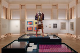
Tartan, UK
Celebrating the history of Scotland’s most famous fabric, Tartan, at V&A Dundee, features a dynamic lighting scheme, created by DHA Designs.
Opened in April this year, the latest exhibition at Dundee’s beautiful V&A Museum is a celebration of one of Scotland’s most iconic fabrics. Tartan, which will run until January 2024, is an in-depth exploration of the textile that aims to celebrate the story of the traditions, fashions, and creativity that it has inspired in communities worldwide.
Showcasing more than 300 objects from over 100 international lenders, the exhibition features a dynamic lighting design, courtesy of lighting consultancy DHA Designs. The studio was brought on to the project by exhibition designers – the aptly named PLAID Studio – to create the lighting scheme for the exhibition, returning to V&A Dundee after having previously collaborated on the VideoGames, Night Fever and Michael Clark exhibitions in the past.
However, despite working on previous exhibitions in the space, David Robertson, Director at DHA Designs, explained how Tartan differentiated from their earlier works. He told arc: “The most unusual element [about Tartan] was that this was the first show that originated at, and was curated by, V&A Dundee; all previous shows there had started elsewhere and therefore already had a lighting design in place.
“The brief for this exhibition was quite open, but there was definitely a desire to make sure it felt like a celebration of tartan in all of its forms. It was also important that the exhibition is by topic (innovation, identity, power, etc), not chronological, so the lighting wanted to change from area to area to suit the subject.”
Working to replicate the symbolism of tartan, and complement the design produced by PLAID Studio, DHA used horizontal and vertical linear light sources to reflect the warp and weft of the material.
Indeed, creating a lighting scheme that would allow the exhibitions to pop was one of the core parameters for the design concept. Robertson continued: “It was important that the space felt light and bright, especially at the start – the external lobby is daylit. Many of the exhibits were 50 lux, and as a material gives very little light back and can look flat, balancing the object against the ambient and architectural lighting would be crucial to the visitor experience.”
An example of this can be seen in the first display, entitled The Grid, which is a large framework of cases and walls in a regular pattern. As well as integrating light into the cases, DHA Designs concealed linear light above and below them to match the location of the voile panels to make the space feel inviting and light, segmenting it to reflect the warp and weft of the tartan. “We considered coloured light for this, but felt that with many dark coloured objects, this might upstage the content, and that warm white light was a more elegant solution,” Robertson added.
While the decision to use linear lighting was due to its ability to “both appropriately and softly light the exhibits to light both object and labels”, the move also serves to highlight the unique architecture of the building itself.
Robertson continued: “The structure of the grid encourages the visitor to look up immediately, so the ceiling was going to be seen. The next areas are unusually open plan; we chose to use the existing architectural detail of linear lighting that is really designed for house lighting and hasn’t been used in an exhibition before. We dimmed it right down but were pleased that it highlights the architecture, while the linear source is in keeping with the case and setworks lighting below. We matched the colour temperatures, so it felt like one cohesive solution.
“The gallery is split in two by a low bulkhead, and for a second part where the exhibition gets darker – including a film on slavery and dramatic Alexander MacQueen pieces – we chose not to use this architectural lighting, which complemented the exhibition design and paced the exhibition.
“The routing of any exhibition means that you move between the two spaces – choosing exhibits and lighting that go beneath the bulkhead is an opportunity, and we were able to use more uplighting to some dynamic fashion and artworks here to emphasise the change, rather than trying to hide it.
“The gallery is challenging due to the angle of the track that is flush with a pitched ceiling, and the roof lights, but we are working with the V&A on a new detail that moves the track out of the ceiling into a more user-friendly horizontal location without spoiling the line of the architecture. This is necessary given the scale and scope of the ambitious exhibitions the V&A now mounts.”
This intimate knowledge of V&A Dundee and its exhibition spaces served DHA Designs well, as the team already knew what would and wouldn’t work within the wider context of the building.
Robertson added: “This is our fourth collaboration since the museum opened five years ago. Knowing the space definitely helped – especially knowing which areas could not be lit from the track.
“The sawtooth ceiling and (closed) roof lights restrict track locations, and we knew where we needed to supplement this with new hanging track to best light the exhibits. Previous exhibitions (VideoGames; Night Fever; Michael Clarke), suited a much darker, more dramatic environment of individuated spaces, and there was more coloured light and AV. This exhibition was a chance to do something different.”
One new element, which brings a sense of dynamism to the exhibition was the introduction of gridded gobos to the floor – a late addition from the design team. “Although the objects were all glowing and the ambience welcoming, I felt it needed a little sparkle,” Robertson said. “Using two overlapping gobos at 45°, I tried to mesh a custom tartan pattern on a large expanse of empty floor in the area that spoke about the warp and weft of the pattern. In an exhibition that showcases many artists’ responses to tartan, I thought ‘why shouldn’t lighting have a go’.”
Across the Tartan exhibition, more than 300 objects are on display, but one of the key messages for the exhibition was to showcase the “democratic nature” or the material. Robertson explained how the lighting helped to democratise the displays. “There were more than 100 international lenders, including some contemporary artists and commissioned pieces, but the exhibition is non-hierarchical. Tartan in all its forms is more important than any one exhibit or person – used by rich and poor, nationalist and unionist. So, the biggest challenge was to make sure every object was well-lit and had a value; whether a faded piece of historic tartan or a sparkling outfit work on RuPaul’s Drag Race; whether a tartan-covered car, or a tartan-covered Xbox controller.”
Since the exhibition opened on 1 April, it has gained widespread plaudits and positive reviews. Looking back on the project, Robertson hopes that the lighting contributes to a positive overall experience for visitors.
“I was most pleased that the initial idea of a bright space has worked, and the visitor feels welcome; and then once their eyes have adjusted and the mood of the exhibition changes, we switch that into a more focused and dramatic lighting scheme. I hope the visitor, thanks to the lighting and more open-plan exhibition design, gets to appreciate the ceiling and architecture, as this would not suit all exhibitions.”
Robertson concluded though that, due to his own personal experience with tartan, he found working on the project as rewarding as a guest visiting the exhibition would. He said: “As someone who comes from the North East of Scotland and was forced to wear kilts as a child, it was a great experience to return to my roots and learn much more about this fascinating and versatile subject.”


