Changing light, not build, to create more sustainable exhibition spaces
Pippa Nissen, Director at Nissen Richards Studio, discusses the role that lighting can play in creating more sustainable exhibition spaces.
When we’re designing a new exhibition or gallery, we have to think about how to transform a space as much as possible for maximum impact. We’re constantly under pressure to create something new for repeat visitors, so that each time they come it is a different experience. For temporary shows, the accent is on value for money, while a blockbuster show needs to come complete with ‘selfie moments’ and visually rich displays.
In the past, exhibition design was notoriously wasteful, with every aspect effectively new-build. As we face the future, we are rightly being asked to design more sustainably and also take more responsibility ourselves for thinking laterally and questioning the sustainable credentials of everything we specify. We are thinking increasingly about how to change the appearance of something without adding much in the way of a physical build – and how lighting and graphics can help us achieve this. The aim is for minimal build, but with the ability to change the way it looks and feels throughout a day, or even during a single visit. We can add colour and graphic surfaces, which are easy ways to create dramatic effects, but it’s even better if we can pair this with a clever lighting kit to enable multiple layers of change.
Over the years, I have enjoyed working with lighting design that empowers change and can adapt. I have also been drawn to working with theatre consultants, who have a history of storytelling, which draws from my studies and work in theatre, using light to tell a story and imply all sorts of things – another place, memory, emotion, or idea. I have worked a lot over the last 20 years with Zerlina Hughes, founder of Studio ZNA. We first met on a theatre project all those years ago and I enjoy how she seems to feel the spaces and responds in a very creative way to creating dynamism through light.
A really early project we worked on together perfectly encapsulated lighting’s transformative power. It wasn’t a museum project, but a bar called Liquorish in East Dulwich, where the brief was about adapting through the day from the space being a cafe for young mothers in the morning, to hosting business lunches later and then transforming in the evening into a nightclub vibe with a DJ and dancing. We developed a shifting series of lights on a scene set, that accomplished just that. During the day, we used linear lights paired with windows, and long new roof lights, with smaller interior windows within the spaces. Later on, these lights became stronger, and started to take over from the natural daylight through the windows. Another set of light bulbs were designed to be closer to the tables to give the flattering feeling of candle light. A larger installation of lights in a double height space then became a feature, and achieved a pin-point effect – almost like a still night sky. At a certain time, deep colours started to emerge as lines of colour throughout, with gelled lights on edges of windows and in niches starting to shine, so that the whole space became filled with coloured light. Lighting alone permitted a seamless transition to totally different atmospheres.
Since then, the first bit of kit I now always ensure appears in our cost plan is a lighting control system. It’s fairly pricey, but it means that the space is adaptable to different modes and situations. I am always interested in lighting that considers surfaces, colour, and movement, rather than in the fittings per se. In reality, I rarely use visible fittings, unless bespoke or picking up on shapes or materials we’re using elsewhere in the architecture. I want to think about how a space feels and can adapt. We encourage lights that are small and hidden – and that can change and complement stories. We create troughs and niches to hide lights and conceal fittings.
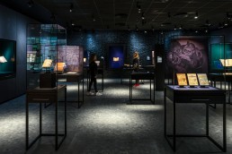
A more recent project, as a permanent gallery space where the client wanted repeat visitors and the ability to easily adapt, but without large additional costs, was Opplyst at the National Library of Norway. Again, change was achieved to a large degree through lighting, making the space feel magical via a dynamic control system. Coloured, gelled lights shift really slowly across the space, creating a subtle shift between warmer and cooler moods. As you enter, the first experience is a series of light boxes that are pure white, creating a visual ‘reset’ break from outside. Each object is then spot-lit, encouraging visitors to feel as if the only thing they are looking at is each object, with interpretation hidden within the showcases, or subtly placed on light sheets alongside. The beauty of light sheets, when used with a perspex diffuser, is that many different materials can be placed on top with a printed text, and dimmed right down so that, like a kindle, it appears just lit. The text can be reprinted easily but always looks good.
For us light is a boost to give more impact, and also an emotional connection to our build – as a way of enhancing and changing people’s experiences and creating a theatrical twist. So, my tip would be, when thinking about a new exhibition project, to consider carefully how much of a theatrical change can be made through pairing lighting with architectural moves, and then allowing different effects to be revealed slowly through time, so that the space isn’t still and one-dimensional, but has a dynamic and changing appearance. This feels like value added to the client, while visitors feel that they are in an ‘experience’ and the client ends up with a more flexible space that can be used in different ways. They can even add a party mode to the scene setter, so that spaces can be used by corporate or private clients in a different way as a revenue stream. No extra build, but a completely different atmosphere. This feels like the future – and a sustainable one too.


