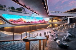
SKP Chengdu, China
A vast new luxury retail space, spanning two distinctive underground environments and a large civic park, has been given a stunning after dark identity, courtesy of a lighting scheme designed by Speirs Major Light Architecture.
Situated within a greenbelt site in China, SKP Chengdu is a vast, luxury retail masterplan that comprises three interconnected spaces – two distinctive underground retail environments, overlaid with a large civic park – in one remarkable, harmonious scheme.
Designed by architecture firm Sybarite, the entire space has been elevated to another level thanks to a lighting scheme from Speirs Major Light Architecture (SMLA).
Activating the site at night with a stunning after dark identity, the lighting design plays an integral role in enhancing the signature SKP style, creating a vibrant atmosphere for shoppers, while also supporting intuitive wayfinding and navigation.
SMLA joined the project having previously worked with Sybarite and SKP on its Beijing superstore. The existing relationship meant that the initial brief from SKP was relatively straightforward, as Benz Roos, Associate Partner at SMLA, explains: “The client said to us ‘you’ve done this great thing in Beijing, can you repeat it?’ That was the starting point, but the scope of this project turned out to be vastly different.
SMLA Senior Partner and CEO Keith Bradshaw notes: “We were incredibly excited to work on this project as our experience was that there is something special about working with Sybarite. Their ambition and encouragement lead us to do great work together. SKP Chengdu was an extraordinary opportunity – a huge public park and retail environment flowing across multiple levels.
“Working also with our close friends at Field Operations and Fountain Workshop also meant that we were able to develop ideas and solutions that are often simple but never dull. The after dark image was on everyone’s mind from the very start, and the project was a real team effort.”
Roos continues: “It was such an unusual location for a retail space – sunken into the ground with green space on top of it. Where typically in retail you have a public-facing presence, here you can’t see it from street level.
“Our scope was initially for the retail façade lighting, but this naturally grew and evolved to include the interiors and the landscape lighting for the park, until we ended up lighting essentially everything.”
Across SKP Chengdu, the project is interspersed with standout moments, from the sprawling Towers of Life – six illuminated water towers – to the glazed Central Cube, the spectacular escalator entrances, and the ‘Supernova’ – a bespoke light feature.
Connecting each of these elements together into one fluid scheme was one of the core components of the lighting approach, as Roos explains: “We had to think of this not as individual pieces, but as parts of a larger puzzle. Within that, we honed down a strategy based around some key moves. The Central Cube is a centrepiece in the space; the Towers of Life is another centrepiece; the Supernova is another.
“So, part of the concept was built around creating these fabulous sculptures and an almost museum-like experience – that was something that we embraced.
“And on the other hand, something that Torquil Macintosh from Sybarite was very open and honest about, which I appreciated, is that it is still retail – people come to this place to buy stuff. That is what the true core is. While we aim to be poetic and experiential, it’s necessarily both a spectacle and an experience – that is what retail is about. Sybarite and SKP do retail spaces very well, so it was inspiring to work with them. As a designer you want to create amazing spaces, and that is what they do.
“It’s a tricky balance however, because as lighting designers you are always thinking about the experiential moments, the arrival, and using light to create space and legibility, but in retail you are by definition the background, because you can’t overshadow the shops themselves. You need to have that journey sequencing throughout.”
Within the park space atop the shopping centre, the lighting design team was mindful of retaining its luxuriant green character. The lighting of the landscape elements is carefully controlled, with bespoke fixtures creating contrast that gives rise to a stylish, ‘outdoor film set’ feel.
“We designed these fixtures as Sybarite initially didn’t want to include lighting columns,” Roos continues. “We showed them a column that created an effect that looked almost like a fashion show – where the trees become the models. The columns use indirect light and reflectors, so that there is no glare. We also made smaller versions to uplight the trees – it was a much softer way of lighting and creates a sense of drama and celebration.”
The softer approach to illuminating the park space atop SKP Chengdu is punctuated by the “major moments” of the Towers of Life – the spectacular, colour-changing lighting for six water-spewing beacon sculptures that rises to 39-metres above the ground – and the stunning glazed Central Cube, which provides access to the metro network. Here, light creates a beautiful glow with gentle animation on the water-washed glass, but equally provides vital functional light for wayfinding and orientation.
Criss-crossing the park, canyon-like avenues are cut into the landscape, connecting the 500,000sqm of submerged retail environments. Apertures are encircled at park level by lit handrails, providing a buffer between the landscape and the retail, and assisting with wayfinding and orientation. The handrails, Roos explains, were fitted with a mesh detail throughout, casting the space in a soft glow, while the patterned grazing of light along the frit creates a unified aesthetic across the site.
With multiple ways to descend, each entranceway has its own character. The open stair is a grand descent, lit simply by light along the handrail, keeping the focus firmly on the retail vista ahead. Several escalator entrances feature backlit shimmering mirrored wall panels and eccentric linear roof lights, supporting a glamorous, lively transition.
These enticing features were complemented, Roos believes, using reflective materials, such as metal canopies and the aforementioned mirrored wall panels, meaning that the lighting approach could be kept relatively simple.
“It’s not always about the luminaires, it’s about the materials and how light interacts with these materials. We worked with Sybarite on what finishes should be used; in one of the retail spaces there are large copper canopies – if these are fitted with downlights, it’s a no brainer to put white paving underneath it, because then the white paving reflects, and it lights the space much better. It’s quite simple lighting but it works by the nature of reflections. Architects often forget that with metals, you should not light the metal, you should light what is opposite it to make it come to life. But Sybarite was open to this, and it has helped the overall appearance of the space, both during the night and the day.”
The collaborative approach to bring the best out of the space is also evident on one of the entrance portals – a space where the absence of light adds to the overall aesthetic quality. Roos continues: “We talked a lot about contrast. At one of the entrance portals, the elevator shaft is black. At first, they wanted to light the shaft, but we talked about it, and I said, ‘don’t light the shaft at all’. Because everything else is lit, this black, monolithic thing becomes a centrepiece; the absence of light makes it a centrepiece.“
Within the retail space, SKP Chengdu is broken down into two separate, distinct areas: SKP-North and SKP-South. The lighting design for the common spaces, avenues, and concourses is designed to reinforce the powerful branding inherent in the design language. Details are fully integrated and the lighting focuses on enhancing the signature curved surface elements, ‘folded’ textured façade details, and revealing the material qualities of key vertical surfaces.
In SKP-N, the lighting feels positive and luxurious, while allowing the merchandise to remain the primary focus. SKP-S, however, is the cutting-edge, fashion-forward zone; here, the design is more brutalist, with a lot of textured concrete, and the lighting reflects this through a more monochromatic, industrial aesthetic.
“They are like two different worlds that live next to each other,” Roos explains. “It made the project very exciting to work on, as there is the elegant, high-end retail setting of SKP-N, and then the craziness of SKP-S, which was more of an experimental, experiential shopping environment.
“What is fun about SKP-S is that it is more about the overall experience, whereas SKP-N is calmer, and the brands are more like experiences in themselves. Because SKP-S is a brutalist space, the idea was to create a lit environment that was monochrome in colour, which would contrast with the amazing colour of the shops.”
SKP-S is also home to the bespoke Supernova light feature. Inspired by stars, planets, gravitational waves and the connection of time and space, the piece spans eight metres in diameter and consists of three layers of triangular, perforated panels that move and rotate around a giant luminous hemisphere, creating a mesmerising, otherworldly effect.
With multiple spaces, each with their own requirements and unique aesthetics, Roos’ description of the project as a “puzzle” is entirely apt. Because of this approach, he says the result is “a wonderful and remarkably cohesive tapestry of different spaces and areas, each containing different experiences in light.”
Looking back on the completed project, and the culmination of each of these different spaces, he says, is “surreal, because of the scale”.
He continues: “We were often focused on all the individual details, yet in the end, all the puzzle pieces came together. Sometimes you can only imagine so much; and to comprehend something of this scale and have the overall vision, it feels like you need to be like a film director – I’m not always sure if my brain can process that volume!
“As a designer, you always design in the context; it was always about this sunken space and the dark park on top of it. There are so many details that we can talk about for hours – we constantly zoom in and zoom out, but then the finished images came in, and this is where we finally saw the full picture coming together. We saw how all the elements work together and form this language.”
By designing a lighting scheme that is perfectly tailored to the key architectural elements of SKP Chengdu, SMLA has further contributed to this great retail space, crafting a stunning, experiential after dark identity.


