HLB Lighting Design announces merger with CS Design
(USA & Canada) – HLB Lighting Design has announced a merger with Montreal-based lighting design firm, CS Design.
The merger supports HLB’s strategic planning efforts to expand its global footprint while providing clients with exceptional service, cutting-edge design, and a comprehensive range of lighting solutions. The CS Design team will now operate as part of the HLB Lighting Design brand, marking a significant step in the firm’s expansion, and enhancing its capability to serve clients worldwide. The combined strength of both teams will continue to drive the firm’s leadership in architectural lighting design.
Carrie Hawley, Senior Principal and CEO of HLB, says: “This merger is a thrilling opportunity to further our mission of positively impacting lives around the world through light.
“CS Design has an exceptional track record of delivering remarkable projects, and together, we will continue to provide the most transformative client experience in the industry. We look forward to expanding our presence throughout the North American continent, and this merger represents a key step in strengthening our support of clients across Canada.”
Founded in 2008, CS Design has gained recognition for its innovative and award-winning project work. With expertise spanning a wide range of sectors – from high-end residential to institutional and commercial buildings, as well as urban design and exterior illumination – CS Design has built a distinguished portfolio that aligns seamlessly with HLB’s commitment to delivering world-class lighting solutions.
CS Design’s founder, Conor Sampson, a registered architect and seasoned lighting designer, will become a Principal at HLB Lighting Design. A respected educator, he is an Adjunct Professor teaching lighting design at McGill University and serves as the Canadian Liaison to the International Standards Organisation (ISO) Technical Committee 274.
“We are very excited to join the HLB team,” adds Sampson. “We look forward to being part of a larger community of design experts and leveraging HLB’s global platform to elevate our work. We anticipate expanding our presence in Montreal and the surrounding areas, all while contributing to HLB’s ongoing legacy of excellence in lighting design.”
www.hlblighting.com
www.designcs.ca
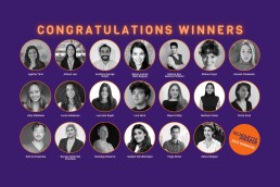
Silhouette Awards unveils 2025 winners
(Global) – The winners of the fourth edition of the Silhouette Awards mentorship programme have been revealed.
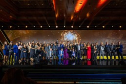
After a record number of submissions from 26 countries, 20 winners were revealed during a virtual celebration that took place on 28 February.
The 2025 Silhouette Awards winners and their mentors are as follows:
- Agathe Tiret, mentored by Ratna Kumari
- Allison Lau, mentored by Shahrzad Abtahi
- Anthony George Girgis, mentored by Armaghan Ahmadi Venhari
- Diana Andrea Niño Bogoya, mentored by Ximena Munoz
- Gabriel Pinheiro, mentored by Cherine Saroufim
- Göknur Kayır, mentored by Sergio Boccia
- Ksenia Chubenko, mentored by Tim Hunt
- Lally Widelska, mentored by Philip Hammond
- Lucie Koháková, mentored by Marcos Juarez Nicolau
- Lucrezia Seghi, mentored by Lee Barker-Field
- Luis Mora D, mentored by Myriam Patricia Lopez Yanez
- Maya Gribby, mentored by Daniel Blaker
- Melissa Toasa, mentored by Sacha Abizadeh
- Petra Koza, mentored by Eugenia Cheng
- Petros Kitsantas, mentored by Vinod Pillai
- Rezvan Shahrabi Farahani, mentored by Maneck Tandon
- Santiago Navarro Castro, mentored by Magdalena Gomez
- Sudipti Varadharajan, mentored by Camila Blanco
- Tiago Winer, mentored by Fabiana Nery Pardhanani
- Zahra Shojaei, mentored by Andy Powell
Over the next six months, the winners will engage in personalised mentorships, enhancing their skills and advancing their career aspirations – benefiting not only the mentees but also the mentors.
Katia Kolovea, Co-Founder of the Silhouette Awards, said: "Each year, we are inspired by the incredible talent that emerges through the Silhouette Awards. This mentorship journey is more than just recognition – it’s about creating meaningful connections, fostering growth, and empowering the next generation of lighting professionals. The passion and creativity we see in our winners reassure us that the future of the industry is in great hands."
Eve Gaut, Co-Founder of the Silhouette Awards, added: "The overwhelming response to this year’s programme has been truly incredible. We are so proud to see the Silhouette Awards evolve into a global movement that not only highlights emerging talent but also actively nurtures it through mentorship. The collaboration between mentees and mentors is what makes this programme so special, and we are thrilled to see it continue to make a real impact in the industry."
A stream of the winner’s celebration is available here.
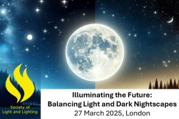
SLL to host conference on Illuminating the Future
(UK) – Taking place on 27 March at the Senate House, University of London, the Society of Light and Lighting is hosting a thought-provoking conference that will take a deep dive into the complexities of night-time lighting.
Titled Illuminating the Future: Balancing Light and Dark Nightscapes, the conference will feature experts from various fields, including environmental science, urban planning, criminology, and social psychology, offering a balanced examination of the pros and cons of artificial light after dark.
From the lighting industry, key speakers include Mark Major and Benz Roos, Speirs Major Light Architecture; Chiara Carruci, Noctua; Dan Lister and Florence Lam, Arup; Ruth Kelly Waskett, Hoare Lea; Elettra Bordonaro, Light Follows Behaviour; and Andrew Bissell, Ridge & Partners.
Key topics of discussion, include:
- Impact on Nocturnal Species: Exploring the latest research on how artificial lighting affects wildlife, including shifts in behaviour, migration patterns, and ecosystem health. Experts will discuss potential strategies for minimising disruption while accommodating human needs.
- Crime Reduction and Public Safety: Delving into the contentious issue of whether increased lighting truly reduces crime rates. Experts will present data and case studies that either support or challenge this notion, considering the nuances of urban design and community dynamics.
- Social Interaction and Community Well-being: Assessing how night-time lighting influences social behaviour and community interaction. Discussion will include the role of lighting in fostering a sense of safety, encouraging night-time activities, and its psychological effects on different demographics.
- Design Considerations for All: Focus on the importance of inclusive lighting design that considers the needs of vulnerable groups. Experts will discuss best practices in urban planning that promote safety and accessibility in night-time environments.
For more information and to register see https://www.cibse.org/sll-illuminating-the-future.
CIBSE/SLL, LIA and ILP members can attend at member rate of £100+VAT (Standard rate is £200+VAT). Email sll@cibse.org to get your discount code.
The conference is sponsored by DW Windsor, Urbis Schreder, and We-ef, with a drinks reception sponsored by Lug Lighting. The event is presented in partnership with the Insitution of Lighting Professionals (ILP), and Lighting Industry Association (The LIA).
www.cibse.org/sll-illuminating-the-future
Brasil! Brasil! The Birth of Modernism
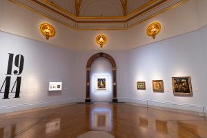
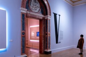
David Atkinson Lighting Design (DALD) recently completed the lighting design for the Brasil! Brasil! The Birth of Modernism exhibition at the Royal Academy of Arts, London.
This major exhibition features more than 130 works by 10 important Brazilian artists from the 20th century, capturing the diversity of Brazilian art at the time.
In the early 20th century, a new modern art was emerging in Brazil. Starting in the 1910s and continuing into the 1970s, Brazilian artists were adapting contemporary trends, international influences and artistic traditions to create a new type of modern art; art informed by the vibrant cultures, identities and landscapes of Brazil.
Everyday life in Brazil was the subject of this new modernism, and the Indigenous identity and Afro-Brazilian experience were among the many influences these artists drew upon in their work. This was a group of people looking inward at their rich cultural resource to set a new course for modernism that was borne out across South America.
The exhibition brings an expanded view of Brazilian Modernism to UK audiences, showing work by artists who have historically received less exposure in this country, including Anita Malfatti, who spearheaded the movement, and Tarsila do Amaral, now internationally celebrated as a leading female figure of Brazilian Modernism. The exhibition includes the self-taught artists Alfredo Volpi and Djanira da Motta e Silva, an artist of indigenous descent, Afro-Brazilian artist Rubem Valentim and performance artist, Flávio de Carvalho.
The majority of works come from rarely seen Brazilian private collections, as well as Brazilian public collections, most of which have never been exhibited in the UK.
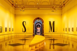
The brief from the Royal Academy and exhibition designer Carla Jucaba to DALD was for the lighting to create tonal contrast between the galleries, without detracting from the artwork, as well as adhering to conservation constraints.
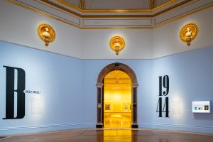
The lighting design approach was simplistic but immersive, with each gallery being painted in a different shade, subtle hues of colour washed the walls from high level track fixtures fitted with colour correction filters and carefully controlled by the addition of Barndoors.
Central to the majority of gallery spaces the exhibition designer included different shaped seating benches that incorporated LED strips in a warm colour temperature to the underside to create a floating quality from the floors.
Within each gallery, important work was displayed on stepped “Focus Panels”, which incorporated LED strips creating a halo offset with each LED strip being tuned to the appropriate gallery colour. The focus panel artworks were lit by softly focused zoom profile fixtures mounted off the existing high-level tracks.
The majority of artwork was lit by a combination of medium and narrow fixtures at 2700K, while the sculpture was lit from softly focused profile fixtures.
DALD utilised The Royal Academy’s stock of iGuzzini Palco fixtures with various accessories along with a supplement of LED zoom profiles, which were all controlled via Casambi.
In Conversation: Paul Nulty & Martin Klaasen
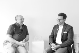
Following the news of Nulty's acquisition of Klaasen Lighting Design, arc caught up with Paul Nulty and Martin Klaasen for an exclusive chat about the deal, how it came to be, and what the future now holds for both brands going forward.
How did the two of you first meet?
Paul Nulty (PN): We had crossed paths at industry events, but it wasn’t until about five years ago that we had our first real conversation. The relationship developed from there, primarily due to our shared passion for light. Martin and I are completely aligned when it comes to the way that lighting design should be done and the value that lighting designers bring to a project.
When and how did the topic of acquisition come about?
Martin Klaasen (MK): It might surprise a few people to hear that I am 70, so I have been ruminating over the future of Klaasen for a while. I love what I do and have no plans to stop anytime soon, but getting a succession plan in place had been at the back of my mind for a few years. The most important thing for me was finding a home for my loyal team, some of which have been with me for nearly 17 years. Merging with an architecture practice or engineering firm never felt like the right move. What I had in mind was a like-minded practice that shared Klaasen’s values – hence Nulty came into the picture, and Paul and I started talking.
What was it about Klaasen that appealed? Were you specifically looking to expand into the Southeast Asia / Australian market?
PN: The Klaasen brand comes with a fantastic pedigree of projects and is preloaded with a wealth of experience in the Asia-Pacific market. We obviously gave the whole thing a great deal of consideration, but in the end the decision felt like the logical next step. It allows us to solidify our presence in Asia and bring additional resource into the practice – the added benefit being that this design talent has been nurtured by Martin.
How were the negotiations?
MK: The negotiations were surprisingly smooth because I made a conscious decision not to put up any barriers. We were clear about what we wanted and genuinely appreciative about what the other party could offer.
PN: There are not many instances of lighting design practices coming together, so in many ways, we were making it up as we went along. The negotiations were helped by the fact that we see this as the beginning of a new beginning – we came together because of our mutual love of lighting design, and because of this, the partnership makes us stronger.
What added benefits will the acquisition bring both to Nulty as a whole, and the Klaasen team?
PN: The end result is undeniably better than the sum of its parts. Klaasen amplifies Nulty’s international profile and design capabilities in Asia and Europe. Conversely, Nulty gives Klaasen the scope to enhance its processes and evolve as part of a global brand.
MK: The collaboration was a no brainer because it works both ways. I have always admired Nulty from afar, particularly Paul’s business acumen and how he has harnessed this to build the company on the global stage, while ensuring the company stays true to its original values. This was a key motivator for me, as I want my team to achieve great things in a supportive and caring environment.
How does Klaasen fit within the wider Nulty brand?
PN: As we knit the two companies together, our priority is creating the best space for our team to flourish. When designers are engaged and empowered, they produce their best work – it’s a simple equation. Martin and I know that we’re only as good as the people we employ, so we are singularly focused on building an inspiring and collaborative culture as we integrate Klaasen into the wider Nulty family.
How has the integration process been? Has it impacted on the workload of the Klaasen team? How are both they and the wider Nulty team adjusting?
PN: We had a lot of conversations about the integration process early on to prepare everyone for the transition. Our Managing Partners Mark [Vowles] and Ellie [Coombs] went out to Singapore to get to know the team and bring them up to speed on our philosophy and processes. Jordan [Faust], who now heads up our Nulty Lisbon studio, also worked closely with the team in London to put in place a plan for Europe. We wanted the integration process to be seamless but incremental, so while there will be modifications behind the scenes, there won’t be any disruptions or changes to the service our clients have come to rely on.
MK: My team is like a small family, so I was as open as I could be about the plans for the transition. It was important to me that we were transparent about our strategy and that there were no surprises or bumps along the road.
How will the Klassen and Nulty teams collaborate going forward?
MK: Nulty and Klaasen have been good friends over the last few years, which has been built on trust and mutual respect and we are confident that this will stand us in good stead. I can’t tell you exactly where we are going, but we are clear about the direction of travel, and it’s that 1 + 1 adds up to a great deal more than two.
PN: We’ve always prided ourselves on being an energising force in the industry, taking whatever direction that we want, and making up our own rules. We have got big plans for the next 12 months, and now that we have strength in depth and the right people around us to facilitate boundary-breaking design and thought-provoking ideas, the future is looking bright.
What is next for you both?
MK: Paul jokingly describes me as the grandad of the company! It’s a term I like, because being a grandparent is about having the best of both worlds. I’ll continue to oversee the team in Singapore and nurture client relationships in the region, but I’ll also be able to redirect some of my energy to the part of my role that gives me joy – mentoring designers.
PN: Nulty is a global organisation that values local cultures, so we will be tapping into Klaasen’s knowledge of the regions central to our expansion plans. The key focus will be knowledge sharing, as this is something that is personal to Martin and inherent to the Nulty movement. You can expect to see much more of this as we harness our collective expertise to facilitate further growth.
www.nultylighting.co.uk
www.kldesign.co
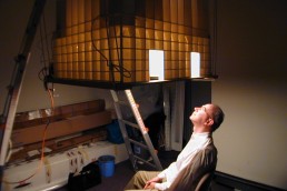
Lam Partners Principal, Paul Zaferiou, retires
(USA) – After 40 years with the company, Lam Partners has announced the retirement of its Principal, Paul Zaferiou.
Transitioning into the role of Principal Emeritus, Zaferiou will occasionally advise on projects still in progress as needed, along with mentoring junior design staff about the principles of lighting design.
Throughout an extraordinary career in lighting design, Zaferiou has been an integral part of Lam Partners, beginning in 1984 under the mentorship of the firm’s founder, Bill Lam. Over the years, he experienced and contributed to major transformations in lighting technology, from incandescent and fluorescent systems to the widespread adoption of LEDs. His work has been instrumental in the success of countless architectural and landscape projects worldwide.
During Zaferiou’s time with the firm, Lam Partners has grown and evolved significantly, expanding from its roots in Cambridge, Massachusetts, to include offices in Pittsburgh, Denver, and Washington DC.
Speaking on his retirement, a statement from Lam Partners reads: “While the firm has embraced change, its core values of “People, Passion, and Craft” have remained steadfast. The Lam culture of integrated design and collaboration is stronger than ever, and Paul leaves the firm in the capable hands of a talented and accomplished new generation of designers and partners.
“We extend our deepest gratitude to Paul for his contributions and commitment over the years, and wish him all the best as he embarks on this new and exciting phase of life.”
Former IALD President Victor Palacio dies
(Mexico) - The global lighting community was saddened this weekend to hear of the passing of former IALD President, Victor Palacio.
Widely regarded for his gentle nature and wealth of knowledge in the field of lighting, Palacio has long stood as a mentor to emerging lighting professionals. For more than 35 years, he dedicated himself to educating future lighting professionals and would regularly share his wisdom through museum and architectural lighting courses, his role at the IALD, as a Silhouette Awards Mentor, and speaking at international lighting conferences – including IALD Enlighten, LightFair, and UNESCO’s International Day of Light.
Initially trained in electronics engineering, Palacio first entered the world of lighting as an electronics specialist for a flux metre manufacturing company, before moving on to work with Fuji Film during the 1986 World Cup in Mexico.
Shortly afterwards, Palacio joined his father’s commercial lighting business, working alongside an architect in the projects department on electronics drawings. Always driven to continue expanding his knowledge, Palacio completed various technical course throughout his early career, before delving into the study of light and the technical attributes of a lighting engineer. Becoming, as he put it, the “ultimate geek”, he would heavily study the IES Lighting handbook while making lighting calculations.
Building his interest in the lighting industry, while working for his father, he was taken on board to work on a museum lighting project, which would determine his passion for lighting design and historic preservation for years to come.
When working inside some of Mexico’s most renowned museums, Palacio began to pay close attention to the impact that lighting was having on their many historic artefacts, as well as the buildings themselves. After completing a brief course at Mexico’s National School of Preservation at the National Institute of Anthropology and History, Palacio developed a course specifically focused on museum lighting.
In 2006, Palacio established his own lighting design firm, Ideas en Luz, where the idea of preservation continued as a key focus in his work. Speaking to arc in 2018, he said: “Highlighting architecture, façades, and features were what we originally focused on as a firm. Then I began to think, as did my colleagues, that even though it’s an important factor to architectural lighting, it’s not the main goal that we are striving to achieve.
“We began to consider other factors related to the functions of places, for example the working place, to the productivity in residential spaces, to relaxation and commercial places to experience shopping. All of which, to some of us, came intuitively, and to others in a knowledgeable way. We started focusing on peoples’ experiences.
“Our philosophy of working is to create the visual experience of spaces. When we talk about visual, we relate it to lighting, experience is related to people, the spaces are related to the places where people perform activities, whether they’re recreational or commercial, interiors and exteriors; we focus our design ideas on that. When we are defining what lighting will be in a place, we will contribute in an important way to the experiences people will have in that space.”
Throughout his career, Palacio was heavily involved in the work of the IALD, helping to establish it as an international association, and serving as President in 2016-17. As the association first looked to expand beyond the USA, Palacio penned a metaphor for its globalisation efforts that many in the industry will still be familiar with; instead of chasing butterflies and catching them with a net, it’s better to build a beautiful garden that will attract all the butterflies.
During his term as President, Palacio also witnessed the first steps of the IALD’s Certification of Lighting Designers (CLD) programme. Not wanting to enforce a lighting programme into universities, Palacio believed it was better to formulate an internationally recognised certification through the association. Alongside his term as President, Palacio’s roles within the IALD also included terms as Chair of the IALD Membership Committee, and as a member of the IALD Education Trust’s Board of Directors, among many others.
In 2024, Palacio was inducted into the prestigious IALD College of Fellows, with the association recognising his exceptional contributions to lighting design and the IALD, and his unwavering commitment to advancing the profession.
Speaking at the time of his induction, IALD President Andrea Hartranft said: “Victor’s exceptional talent, dedication to the IALD, and passion for lighting design have made a lasting impression on our industry. We are honoured to recognise his achievements and contributions to the organisation and profession.
“His passion for lighting goes beyond professional achievements; he shares it with friends, colleagues, students, and other professionals, recognising the profound presence of light in nearly every facet of human activity.”
Following the news of his passing, a statement from the IALD described Palacio as “a visionary in the lighting design community, a leader whose passion and dedication shaped the profession. As the founder of Ideas en Luz in Mexico City, he shared his passion for lighting with colleagues and the world. His immeasurable contributions, mentoring countless designers, and elevating the profession globally, leave a legacy of excellence and inspiration. We extend our deepest condolences to his family, friends, and colleagues. His light will continue to shine in the hearts of those he touched.”
The Asociación Profesional de Diseñadores Iluminación (APDI), to which Palacio was an honorary member, said: “His departure leaves a great void in the global community of lighting designers, but also a valuable legacy that will continue to illuminate the path of those of us who share his passion for lighting design. His commitment to excellence and his tireless curiosity to innovate have led to significant contributions to the development of our profession, influencing generations of designers around the world and leaving a deep mark on the sector.
“Beyond his professional career, those of us who had the privilege of knowing him closely know that Victor was a generous, close person and always willing to share his knowledge. His warmth, his enthusiasm for learning, and his ability to inspire others made him a great mentor and a dear friend to many designers.”
Sarah Cullen, now editor of darc, but formerly Editorial Assistant on arc magazine, interviewed Palacio for a feature in arc #103. Reflecting on her time with him, she said: "I had the pleasure of meeting Victor in Mexico City in 2018 for an interview in arc magazine issue #103, when I was a bright-eyed, bushy-tailed Editorial Assistant for the publication. Seven years later, and no longer formally part of the architectural lighting world (now I am submersed in the decorative lighting and interior design sector on darc magazine), the news of Victor’s passing still shocked and saddened me.
"Our brief interaction left a mark on me in the early days of my career at [d]arc media. Victor was a warm and inviting character to interview and settled my nerves immediately with his calm temper and words of encouragement. I wrote in my article, “A clear personality trait Palacio carries is that of a caring mentor”, and from what I have perceived over my time in the industry, he was exactly that for so many lucky people.
"Victor dedicated his life to light, in all its shapes and forms, particularly its relationship to people, architecture and history. He was a modest man that held a quiet power, which left a loud, bold mark on the international lighting industry, and he will be missed dearly by so many.
"And remember: "Instead of chasing and catching butterflies in a net, it's better to build a beautiful garden that will attract all the butterflies." A metaphor that he used to represent the IALD, but one that holds true in so many parts of life."
Paul James, [d]arc media Managing Director, said: “Victor was not only a colossus of the lighting design profession, he was a colossus of a human being. His kind-hearted and warm nature meant he was always generous with his time and expertise. As we tried to establish arc magazine following its launch 26 years ago, he was available to offer advice in his typical humble way – never condescending, always encouraging. It is something I have never forgotten.
“Victor will be hugely missed by the lighting design family. It is a testament to his inspirational, yet modest spirit that his passing has touched so many people. We have lost a titan of lighting design.”
A mentor, inspiration, and dear friend to many, Palacio will long be remembered for his invaluable contributions to the lighting design profession.
Signify CEO to step down
(Netherlands) – Signify CEO Eric Rondolat is to step down from the company’s Board of Management after the shareholders Annual General Meeting (AGM) this April, the company has announced.
Rondolat has held the position of CEO and Chair of the Board of Management at Signify since the company was listed on the Euronext Amsterdam stock exchange in May 2016. Before this, he was Executive Vice President and CEO for Lighting at Philips from April 2012 to May 2016.
The Supervisory Board and Rondolat have agreed that the time is right for a change of leadership. The Supervisory Board will now conduct the search for a successor, and will consider both internal and external candidates.
Following the announcement, Rondolat said: “It has truly been a great honour for me to lead this exceptional company through the demanding transformation of the lighting industry. I am immensely proud of what our teams have achieved, building the industry leader in a new technological era. Together, we have developed a culture of responsible innovation and set new benchmarks for sustainable growth, while enhancing our teams’ solidarity and customer centricity.
“As we conclude this important chapter of our transformation, I am very confident that Signify will continue to lead and successfully execute its growth strategy. While the Supervisory Board conducts its search, I remain more than ever committed to my colleagues, our customers, investors, and other stakeholders.”
Gerard van de Aast, Chair of the Supervisory Board of Signify, adds: “On behalf of the Supervisory Board, I would like to express our gratitude to Eric for his vision and dedication, as he led the business for more than 12 years.
“Under his leadership, Eric successfully delivered the company’s separation from Philips and IPO, continually establishing Signify as the global leader in lighting for professionals and consumers. His experience and unrivalled knowledge of the market have been essential to successfully navigating the challenging and dynamic market conditions of recent years. His foresight led to the transformation of the business t LED and connected lighting technologies. In doing so, he has set the course for Signify to continue to lead the lighting industry through the digital age. We are pleased that Eric will remain with the business until the AGM 2025.”
Regional lighting projects shine at Light Middle East Awards
(UAE) – The 11th edition of the Light Middle East Awards, held on the final day of Light + Intelligent Building Middle East celebrated excellence in the field of lighting design and technology in a glittering ceremony.
Held at Dubai’s Ritz Carlton DIFC, the awards gathered the region’s most influential lighting designers, manufacturers, and suppliers to spotlight outstanding products and projects in the field across three main categories – Project of the Year, Product of the Year, and Partner of the Year – with a total of 18 winners awarded on the night.
Abdul Muhsin, Show Director for Light + Intelligent Building Middle East, commented: “The Light Middle East Awards celebrate excellence in lighting design and technology. The diversity and creativity showcased in the winning projects reflect the transformative impact of light in enhancing urban spaces, creating sustainable environments and delivering meaningful experiences. Congratulations to all our winners and participants for setting new benchmarks for the industry region-wide.”
Two companies secured the ultimate award of the evening, the Project of the Year – International category. Light-to-Light secured a win for its work on the lighting concept Dawn and Dusk (Koit Ja Hamarik) in Estonia, while Loomit SRLS was awarded for its work on the Antwerpen Central Station and its surroundings.
Lighting projects around the region were celebrated at the ceremony, with 10 winners picking up the awards under the Project of the Year – MEA category. Light Touch PLD collected two awards on the evening for Hotel Lighting Project of the Year and the ultimate Light Middle East Project of the Year for its work on Six Senses Southern Dune: The Red Sea in Saudi Arabia.
Speirs Major Light Architecture was awarded Heritage Lighting Project of the Year for At-Turaif in Diriyah Saudi Arabia and Light Alliance won Sustainability Lighting Project of the Year for the Misk Schools Campus in Saudi Arabia. Nulty secured the Retail Lighting Project of the Year award for Marina Mall, Abu Dhabi, while dpa lighting consultants was awarded Leisure Lighting Project of the Year for One&Only One Za’abeel.
Studio N and Light & Lives won the Restaurant Lighting Project of the Year category for OPSO Dubai and CARO Steakhouse Frenzy respectively, both being Dubai-based restaurants.
The Workplace Lighting Project of the Year was awarded to Studio Lumen for the Pinnacle Offices while Delta Theta Lighting Consultants took away the award for Residential Lighting Project of the Year for their work on Casa Amal, Dubai.
iGuzzini Middle East clinched two awards on the evening, winning Indoor Lighting Product of the Year for Filorail and Outdoor Lighting Product of the Year for Trick em.
Other lighting products celebrated on the evening include Loop, by Arkoslight, which won Decorative Lighting Product of the Year and Chameleon, by ewo, which was awarded Intelligent Lighting Solution of the Year.
The Peer Award is a public voting category that includes all shortlisted product entries. Votes were placed online and live at Light + Intelligent Building Middle East 2025, with the award going to Linea Light for the XENIA_AF_BLADE lighting solution.
The Partner of the Year award recognises manufacturers, suppliers and distributors in the MEA region that have demonstrated excellence in lighting, innovation and collaboration, leading to successful lighting projects, Following extensive consideration by the judging panel LEDFlex Group was awarded in this coveted category.
The 2025 edition of Light Middle East Awards is supported by Centersvet as the Gold Sponsor and NuLumenTek, Media Facade Limited, Linea Light and LARSA Lighting as Category Sponsors.
www.light-middle-east.ae.messefrankfurt.com
A full recap of Light + Intelligent Building Middle East will be available in arc 144 - coming soon.
Growing Your Business: Marketing
Often one of the first things to be cut when budgets are tight, Marcus Steffen, Founder of Akarui, discusses how integral the role of marketing is to growing your business.
Marketing is one of those great mysteries. Trillions are spent every year on it, but understanding what it is and how to do it well is a challenge. I will start with the caveat that I am not an expert on marketing, but I have had to try and learn to grow my business, as all small business owners do. I hope that by sharing my experiences, it helps others as they try to plan their marketing strategies.
Marketing has evolved over the last few decades. It used to be that a simple advert, either on TV or in a newspaper, would bring in work. As the media world has fragmented, this has become far more complex, and so more work needs to be put into how to reach those who could use your services. In addition to this, clients now have access to endless information online, which they have become very good at analysing before you ever speak to them. Due to this, there is huge blurring of lines between marketing and sales. Many clients will do heavy independent research before they make contact. Once they have identified your company as someone they might want to use, they look at around 20 pieces of information before they reach out to you. These can be pages on a website, social media posts, print media and others. The content used within your marketing is also doing your sales work for you, which can be both a benefit and a curse.
To take control of this marketing, structure is needed to ensure the messaging is correct, and also building a customer journey to the point they want you to help with their projects. This is where a marketing plan becomes essential. Without this, everything else falls apart. When looking at bigger industries, even the most spontaneous, unedited social media posts are most likely part of a carefully orchestrated marketing campaign. Having a marketing plan also helps relieve some of the pressure to constantly be trying to think of what to do next. You can dedicate focused time to building a marketing plan, with all the creative energy that goes into that, and then focus on delivery afterwards.
Marketing Strategies
One of the key principles of marketing (and sales, because of the merging of the two) is having a range of marketing strategies. If you rely on one way of getting new business (e.g. referrals) then if something affects that, it means your new business goes to zero. Having a range of different marketing strategies builds in resilience to your plan, and ensures a more steady and flexible flow of work. It also allows you to grow the business faster. Improving five different strategies by 5% is far easier than improving one by 25%.
A general rule of thumb is a minimum of three marketing strategies. These can be anything, and does not need to be something you need to pay for. Here are some examples:
• Referrals
• Previous Clients
• Social Media Posts (LinkedIn, TikTok, Instagram, etc)
• Pay-Per-Click Advertising (GoogleAds, Instagram)
• Magazine Adverts
• SEO (Search Engine Optimisation)
• Your Website
• Published articles
• Videos (YouTube, etc)
• CPDs (Continual Professional Development sessions)
• Networking
There are lots of options available, and weaving these into your marketing strategies will provide more business. Many of these do not cost money if you are willing to put your own time in (remember to analyse the cost/benefit of spending your own time on this rather than hiring someone else). But how do you plan for these?
Making a Marketing Plan
Marketing plans are all about getting more business. As such, each strategy should have measurable targets that they need to achieve. Some are easy to measure. Money spent on an advert should produce a certain number of leads, of which a percentage are converted into work. You might have to try a strategy and spend some money to understand what these figures are, but from then on, they should be measured. Others are more difficult to measure. For example, meeting new people from networking is not a target. Attending four events a month, resulting in six new contacts, would be a target.
Next, you need to think about what you are going to use in your marketing strategies, the dreaded word: content. Building content is a massively complex task, and hundreds of books and online guides exist. I would rather make a few key points to guide you on what you might like to consider. This can be applied to typical content (an article or a post on social media) but also not so logical content (e.g. what you talk about when networking).
It’s not about lighting design
Harvard Professor Theodore Levitt said “people don’t want to buy a ¼” drill bit. They want a ¼” hole.” Seth Godin (marketing guru) took this further in his book This Is Marketing, and said people don’t want a ¼” hole, they want to mount shelves. But they don’t want to mount shelves, they want to tidy up the last remaining boxes from the move they made six months ago, so they can relax in their new home. They want the space to feel clean and tidy. They want the satisfaction of a job well done. They want the admiration of their partner.
People don’t want lighting design. They want something else, but a lighting design is a requirement to deliver that. Whether it is a safe street, an amazing experience in a restaurant, a cozy home to relax in or a productive space to work, clients have desires and fears. Understanding these is essential, since then you can show, through your content, how you can give them this.
Understand your client’s motivations
Who you are targeting with your marketing can have a large impact on the message you want to send. When you want to appeal to a client, you want to understand their motivations for using your service or product. The client might want a beautiful building at the end, but an interior designer might value technical support and reassurance. A project manager might value efficiency and consistent delivery of work on time more than anything else.
Budget
Marketing needs a budget to work. There are many cost-effective methods of marketing that don’t require huge budgets, but there is always a cost. This could be your personal time (and you need to put a value on that time) or paying others to do the marketing. Then there is the investment in whatever marketing strategies you are using, whether it is Pay-per-click, adverts in a magazine or entertainment for clients. Often the first thing a company cuts when needing to make savings is the marketing budget, but this is extremely short sighted. Any investment in marketing should be giving a return on investment, and it is a numbers game. Tracking the spend on each strategy and how much business this is bringing in is essential. This is why having measurable targets for strategies is so important. It is also important to factor in the time the strategy will take to implement. PPC marketing is quick, and should be generating income in a short time. On the opposite, networking and hosting events can take over a year to bear fruit. In either case, regular assessments of the ROI is important, with a view to refine and improve those numbers over time.
As I said at the start, I am not a guru of marketing, but I do feel that without a marketing strategy, no business is going to survive. We are all amazing, creative designers, but attracting new clients requires more than that. Making a plan that is beyond relying on referral is essential for the unknown future.
Book Recommendation: This Is Marketing by Seth Godin
SLL Pockets of Light
Held in her own hometown of Abbots Langley, UK, Kristina Allison, SLL President Elect, organised a Remembrance-themed edition of Pockets of Light, hoping to inspire a future generation of lighting designers.
This November, the Society of Light and Lighting (SLL) brought its popular Pockets of Light event to the small village of Abbots Langley, situated just outside Watford, UK.
Pockets of Light, for those not in the know, is an event based around bringing lighting to the next generation through engagement with schools.
The pop-up event aims to provide pupils of varying ages the opportunity to engage with lighting equipment to test out their effects, before setting them a task to design a lighting scheme for a building façade, which is then brought to life by supporting lighting designers and manufacturers.
Pockets of Light, as an event, was made famous by the UK-wide Night of Heritage Light event in 2015, led by Liz Peck. It has since been delivered at a number of locations, by different people with different schools all around the UK.
Rather than being fixed annual events, Pockets of Light are instead down to individuals or teams with a drive to undertake the event and go into schools to talk about light and lighting design. This year, Kristina Allison, Environmental, Sustainability and Net-Zero Lighting Capability Lead at WSP, and President-Elect of the SLL, felt that drive, and decided to bring the event to her own hometown of Abbots Langley.
Speaking with arc, Allison says: “Last year, after seeing all the wonderful photographs from Light Night Leeds, led by David Battersby (Gamma Illumination) and Dan Lister (Arup), I wanted to have a go at doing my own version of Pockets of Light in my local community, at St Lawrence Church in Abbots Langley, Hertfordshire.
Typically, although not always, Pockets of Light events have been hosted at churches or cathedrals – “the intricate nature of the architecture lends themselves nicely to being artistically lit,” Allison adds. So, with this in mind, and armed with an array of beautiful photos of past PoL events, she set to work to get the local community on board with the event.
“Initially, I contacted the St. Lawrence Church, and they were very receptive to the idea. The next critical step was to have the involvement of the local schools; I reached out to Parmiters, St. Michael’s Catholic High School, and Future Academies Watford, who are all close to the village.
“I pitched the idea of the STEM lesson and the Pockets of Light event, and all were keen to be a part of it. It is a bit of a challenge to get through to the right people at the school and hope that they will be receptive to the idea. It was my aim to provide the STEM lessons in lighting design for secondary school-aged pupils. I think this is an important time in education, and a time when we start making decisions about what we might like to do after school life and for a career. I also feel that this is the time where school pupils will have had little to no exposure to lighting as a career option. This is often confirmed when asking a lighting professional now ‘how did you get into lighting?’.
“There was an extra special part in making this all happen – very close to the village is the Warner Brothers Studio Tour in Leavesden. Again, I managed to get in contact with the right people and pitched the idea. Keen to support the local community, Warner Brothers offered to fund the event and to give tickets for the Harry Potter Experience tour to the design winners.
“All the wonderful people and companies who contributed to the STEM lessons and the event were so willing to support me in making this event happen. I think this is maybe for a few reasons – firstly, because people are nice generally and like to help in STEM community projects; and secondly, because the creative arts industry isn’t so well funded by government, the community (both at large, and the lighting community) step in to make things like this happen.”
As the event was held in early November, Allison and the involved parties settled on a theme of ‘Remembering Remembrance’. “I discussed theme ideas with the village church, and we thought, if there were to be a theme, what could it be? We all agreed that the event would be held the evening before Remembrance Sunday, so the timing of it would suit the theme of remembrance too,” explains Allison.
“And as St Lawrence Church is an 800-year-old Saxon church, with a lot of architectural interest and a rich history with a war memorial at the front, it seemed like the perfect theme for this Pockets of Light.”
With a theme in place, Allison prepared a STEM lesson presentation, covering the fundamentals of lighting, lighting techniques, materials and textures, and examples of how to apply them. The lessons were delivered to 76 GCSE year 10 and year 11 age pupils (14-16 year olds) who, Allison says, were “so curious and engaged with the lighting equipment laid out on the workshop benches”.
“Having the opportunity to explore the lighting products, what they did, and the lighting effects they created was new to them – it was exciting.”
The event was supported by lighting manufacturers Architainment, Architectural FX, iGuzzini, Martin Architectural, Tryka, Urbis, and Thorlux – all of which supplied equipment for the STEM lessons and event. Matthew Wright from Martin Architectural joined Allison on one of the lessons, bringing with him a moving gobo projector. “The pupils loved seeing the colourful patterns projected onto the otherwise plain wall,” Allison recalls.
“After the lighting design lesson, they then experimented with the lighting equipment I set up for them to play around with. I set them a task to sketch their design ideas onto line drawings of the church façades that I had pprepared on paper, and illustrate the lighting techniques they’d learnt during the lesson.
“This is another key part in STEM and Pockets of Light – having the unique opportunity to play with lighting, to understand how light behaves and explore the effects that can be made. Once the school STEM tour was finished, the designs were then reviewed based on creative, technical, theme, and buildability merit, with four winning façade lighting designs selected to realise as part of the event.”
Allison selected four winning designs alongside a team of lighting professionals that included Matthew Wright and Sean O’Callaghan, Martin Architectural; Juan Ferrari, Hoare Lea; Ryan Rolph, Tryka; Helen Loomes, SLL; Simon Fisher, FMark; and Scott Pengelly, Urbis Schréder.
It was with the support and coordination of this team that the lighting equipment needed to realise the winning designs was pulled together on time. After a day of setting up, the event itself was a big success, and Allison was overwhelmed with the support that it received from the local community.
“Light has that ability to bring people and communities together, this was clear on the night of the event, where more than 200 people from the local areas came out on a cold November evening to see the creativity on display,” she says.
“Following the event, I have received many positive comments too – the schoolteachers and the pupils came along to see their creations realised and were thrilled; the church commented on how it had ‘once again put the church at the heart of the community’. Another particularly poignant comment I overheard on the night was that it ‘nearly brought me to tears’ – the theme of remembrance combined with the wonderful designs from school pupils really hit a chord with the public on the night.”
Immediately following the event, Allison recalls that she felt “a bit taken aback”, left reeling from the organisation that went into the event, but also the overwhelming feedback that she received.
“So much thought and organisation had gone into pulling it all together, I was still taking it all in,” she says. “The photographs from the community were showing up on social media and on LinkedIn posts, it was beautiful how the lighting design community had supported me, and how the local community loved it. I’m still a bit in awe of all that were involved.
“I have been invited to go back to the schools, and the church is interested in hosting the event again, so from a community engagement perspective, all my hopes and goals for this Pockets of Light event have definitely been met. I hope someone else will see these photographs and, like I was, be inspired to take on the challenge and organise their own version of Pockets of Light.”
The chief aim for the event though, Allison feels, was to engage the next generation in the power and magic of lighting design – something that she feels was a big success.
“The ultimate goal was to pass on knowledge of light and lighting design to school age pupils, and to show them what a career in lighting might entail. Lighting is such a fascinating subject, including product design, creative, and also in technical ways.
“Maybe the lessons gave a general appreciation of the lighting used within our built environment, or hopefully planted a seed in a pupil’s mind for a future career in lighting.”
David Morgan Review: Organic Lighting FortaCast
FortaCast, the latest in-ground linear lighting system from Organic Lighting, incorporates several innovative and patented design features. Keen to find out more, David Morgan takes a closer look.
There are many points of entry for people working in the lighting industry, from the purely artistic to the highly scientific. In the case of Laurence St. Ives, the founder of both Organic Lighting and Orgatech Lighting, his way into the market was as an importer of German and Italian office furniture designed for use with desktop PCs in the 1970s.
As the use of PCs became widespread, minimising glare on computer screens from overhead fluorescent lighting was a major concern. To address this issue Laurence developed the first free-standing high lumen output office up-lights, helped by some lighting design and optical development from Stanley Lyons at Thorn Lighting, whose company manufactured the metal halide lamps.
Orgatech in the UK was founded in 1976 to sell these up-lights, quickly followed in 1979 by the launch of a USA company, which is still running today. Laurence moved to the US in the 1980s, first to New York and then to California.
Organic Lighting was created in 2002 as a sister company to Orgatech Lighting to focus on colour changing LED lighting and, in 2009, with the advent of white LEDs, it is claimed that Orgatech became the first in the USA to introduce professional-quality flexible lighting strips.
The latest luminaire development from Organic Lighting is the FortaCast in-ground linear lighting system, which incorporates several innovative and patented design features.
In-ground linear lighting systems have become a popular tool for creating lines of light for exterior and interior lighting applications, but they have proved problematic for electrical contractors to install and to maintain.
To overcome these issues, the FortaCast bodies are made from glass reinforced concrete (GRC) and are designed to be installed by paving, general contractors, and landscaping contractors rather than electrical contractors.
The IP68-rated flexible Aqueon LED light engines used in the FortaCast system are a separate element from the GRP housing and are installed and removed via the last section in the run, with the help of miniature nylon rollers built into the housing.
FortaCast GRC bodies can support a drive overload of up to 4,500kg and are available in a variety of colours and surface textures to coordinate with other paving and landscape materials. It is understood that the GRC materials used have a lower carbon footprint than cast concrete due to the higher percentage of glass and aggregate in the mix.
The FortaCast system includes four standard profile sizes, offering various lengths in each size, standard radiused sections, corner sections, angled-joint sections and end sections, which act as the insertion point for the LED light engines. In addition to the standard shapes and sizes, Organic Lighting can develop custom-shaped housings to meet project requirements – for example to accommodate road cambers or irregular surfaces. The smallest section profile in the range is 51mm wide x 70mm deep with a 29mm wide window. The largest section profile is 102mm x 102mm with a 51mm window.
The standard circular sections are based on the mid-size 76mm x 76mm profile with nominal diameters of 1.2-metres, 0.9-metres and 0.6-metres.
The Aqueon LED light engines incorporated in the FortaCast system are available in fixed white colour temperatures from 2700K to 5700K, in amber, tuneable white, RGB and RGBW versions. Power consumption of up to 6W/m for the white light engines and 9 W/m for the RGBW type. Dimming and streaming pixel DMX control are both available.
The light engines are factory sealed and submersible with a rated life of 60,000 hours. The maximum light engine length is 15-metres and at the end of life the old light engine can be removed and a new one inserted without having to remove the top covers or disturb the housings along the FortaCast run.
The installation instructions for the system are detailed and a little daunting, including a requirement for the contractor to have at least five years’ experience and preferably certification from the Interlocking Concrete Pavement Institute.
The GRC body sections are aligned together with a joiner piece, which includes drainage channels. The mating surfaces are then bonded together on site with a special adhesive. Once all the housing sections are in place and protected with a removable cover tape, then the paving or concrete floor can be installed.
Once the floor is complete, the final assembly can be made. At this point the rollers are installed with some silicone grease to aid the insertion of the flexible light engine, and the two-part windows are bonded in place. A lower laminated glass window is bonded to the primed concrete surface first with a high shock absorbing performance tape. Then the top diffusing PTFE window, which is provided with an adhesive lower surface, is bonded directly on top of the glass. Joints between the windows are then sealed with silicone.
The FortaCast system has been developed to make long-term maintenance and replacement of the light engines as simple as possible in order to give a potential life expectancy of up to 30 years. It is refreshing to see such a fully developed lighting system that offers maximum creative opportunity to the lighting designer while also being highly functional and maintainable.

