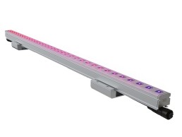
Petridis Storm
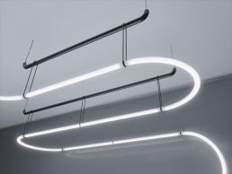
Available in surface or recessed options, Storm is a 24V DC low voltage aluminium profile for tracking lights with smart magnet technology. It is an ideal solution for small showcases, homes, rest areas, museums, hotels, exhibition halls and generally for many architectural projects.
Designers Mind: Beauty in Design as a Tool for Restoration
Designers Mind contributor Martina Frattura explains her recent research into the quantification of beauty, and how a new aesthetic sensibility could improve our lighting design choices.
“Beauty is the greatest power in this world”. While the writer Anatole France stated this in the 19th century, more than a hundred years later, beauty is still considered a by-product of function, while aesthetics and emotions are mystified and labeled as difficult to study.
The global pandemic led us to experiment with how the environment affects our physiological wellbeing. At the same time, the progress of cognitive neuroscience created an opening for the scientific world to an interdisciplinary approach, called Neuroscience of Architecture, which takes into account the experiential dimension of architecture in aesthetic terms.
So what are the aspects of the architectural experience? Vision, within the sensory segment, dominates the perception of architectural spaces and is responsible for the elaboration of the characteristics of a building in a “bottom-up” fashion. A controlled degree of complexity coupled with the ability to feel comfortable appears to induce positive reactions to our environment. In other words, beauty develops as a state of balance between curiosity and familiarity, and the degree to which these characteristics of the places we inhabit influence how we feel.
The similarities between Beauty and Light
Beauty as a visual necessity, and lighting as a means of vision become systematic factors of a unique relationship: the connection that is created between one’s self and the surrounding world. They both direct attention by creating a hierarchy of reading what we have around us and attributing value to it. Beauty and light are therefore keys to our minds’ permeability: light establishes the way we perceive space, facilitating or altering our understanding of it, while beauty helps us feel involved through the pleasantness of the space.
The degree of affinity that can be established between a person and an external element (Norman, 2005) can be influenced by the ability of lighting to convey this pleasant feeling.
Conscious and unconscious factors, visual and non-visual signals, contribute equally to the experience of emotion, and it follows that integrated design can lead users to experience emotional responses to beautiful objects, including architecture.
Transforming common beauty emblems into design cues
And where do we see beauty? The perception of beauty could be altered by education, cultural upbringing, and personal experience. For this reason, I have investigated 10 different countries, proposing to more than 160 people an empirical study on beauty as a key factor for soft charm in architecture. I chose to work with user-based research to verify the hypothesis that direct attention could be restored in the built environments through interaction with beauty. To do this, the experiment was designed to couple with environmental psychology studies, according to which nature works by lessening cognitive processes and improving the ability to concentrate.
Can we use our perception of beauty to replenish our mental energies? The results of the studies would suggest so.
Two types of data, quantitative and qualitative, were collected. The first dataset, consisting of EEG (Electroencephalogram) and GSR (Galvanic Skin Response) suggested that exposure to beauty may be associated with a decrease in attention fatigue, hence an improvement in direct attention. The second system is created from the answers of each participant to the question: “Where do you see beauty?” and it revealed four macro topics for all the people tested:
Family/partners/pets; objects of affection; landscapes; everything that is “above eye level”.
A thematic approach was chosen to analyse the data with the aim of identifying patterns that suggest the following aesthetic needs of a user in a space: feeling at ease; having an experience that is in tune with previous ones; maintaining prolonged engagement; achieving an immediate positive approach to space.
When translated into design cues, as an attempt to apply empirical aesthetics directly to the neuroscience of architecture, these global themes could help create beauty by addressing key issues such as purpose, context, and process.
Artificial lighting recalling pleasant effects
Can lighting design recall the effects of beauty? Answering this question might improve the applied lighting strategy and therefore the overall sense of wellbeing in a space, which is why I tried to correspond to the aesthetic demands raised by the qualitative research.
“Feeling at ease” - Lighting planning should consider the non-visual effects of light exposure, for example the circadian rhythm. While respecting our changing need for stimulation and relaxation, the choice of the light spectrum and exposure time should be tailored to the type of activity required.
“Previous experiences” - As a cue for positive emotions, lighting should have familiar details, again based on the end use of that space, which could be translated in colour temperatures and direction of light appropriate to the activities. The latter is of great importance, as its influence encompasses both non-visual and visual effects, allowing for a fully pleasant experience of space.
“Being engaged with the space” - The lighting should be designed and organised in such a way as to provide continuous care: the spatial transitions, as well as the dedicated areas, should have a particular light study together with a global one, allowing a reading of the space as a whole.
“Instant positive approach” - The space should be alluring, so that curiosity does its part, adding value with focal glow and play of brilliance effects.
It would therefore seem that the aesthetic value of a space depends on the fusion of various elements in a single positive impression and that the foundation of our search for beauty is based on experimentation both in variety and in coherence.
In other words, the ability to recognise beauty depends on our need to encounter it.
Instinctively and intuitively, we proceed to discover the pleasant aspects in every environment we find ourselves in, constantly restructuring the space and giving it new meanings while approaching special values to something in particular.
The sensory and emotional response patterns may suggest the basis of our experience and despite individual differences, these patterns could help design beauty-informed lighting scenarios. Luckily, beauty and function are not that far apart.
And you, where do you see beauty?
Have you heard about ALAN? Now, there is also ROLAN!
In this article, Dr. Karolina M. Zielinska-Dabkowska examines the new ROLAN movement and points out why this might be the next big thing for lighting professionals.
Artificial light at night (ALAN) is a term that was first used in an article published in Science News by Ben Harder in 2002 [1]. It described the noticeable effects of artificial light at night on ecology, then a few months later, another researcher, Ben Clarke, used this term when investigating outdoor lighting and crime [2]. ALAN was also used in the context of astronomy in 2004, by Kohei Narisada and Duco Schreuder, in their Light Pollution Handbook [3]. As years passed by, numerous researchers began to refer to this term and there is even an ALAN Research Literature Database [4].
However, it took another decade for ALAN to become a larger movement. This began in 2013, when the first ALAN conference took place in Berlin/Germany (arc reported about this event at the time) [5]. Following this, a series of conferences were held in Leicester, UK; Sherbrooke, Canada; Cluj-Napoca, Romania; and Salt Lake City, USA. Then more recently, two conferences were held online, due to the Covid-19 pandemic. The next conference is planned for 2023 in Calgary, Canada.
The ALAN conference series is dedicated to examining all aspects of artificial light at night. The broad scope of the conference includes how light is produced (e.g. technologies, industry, and lighting design), where it is present (e.g. remote sensing); what effects it has on humans and the environment (e.g. ecology); how it is perceived by the public (e.g. perceptions of safety and security), and how the benefits and detriments of lighting may be better balanced, controlled and managed by regulations.
More recently, in the general consciousness, the term ALAN has been connected to the work of the International Dark Sky-Association (IDA), a non-profit organisation, whose mission it is to protect the night from light pollution [6]. The IDA is known for its award-winning International Dark Sky Places (IDSP) programme that encourages communities, parks and protected areas around the world to preserve and protect dark sites through responsible lighting policies and public education, as well as via their Fixture Seal of Approval (FSA) programme, global conference series Under One Sky, and other initiatives.
The term ALAN was also used in 2021, in conjunction with the work of the Artificial Light at Night Working Group, which gathered 20 experts from various fields to participate in the “Dark and Quiet Skies for Science and Society II” conference, which was co-organised by the United Nations Office for Outer Space Affairs (UNOOSA), the International Astronomical Union (UIA) and the Government of Spain. After the event, the main results of the conference were published in the Dark and Quiet Skies II Working Group Reports [7].
Interestingly, the International Commission on Illumination (CIE) [8], which is the international authority devoted to worldwide cooperation and the exchange of information on all matters relating to the science and art of light and lighting, colour and vision, photobiology, and image technology, never recognised and adopted this term in their vocabulary (the terms and definitions contained in the international standard CIE S 017:2020 ILV: International Lighting Vocabulary, 2nd edition) [9].
Considering their role, it’s crucial that the term ALAN is recognised by the CIE and other lighting bodies, and that this occurs in the very near future in order to reduce the light pollution produced by ground-based lighting installations; this is necessary to support night-time professional and amateur astronomical observations, undisturbed human sleep, and the correct functioning of flora and fauna.
Although the ALAN movement and the ideas behind it are very valuable and important, it involves quite an enclosed circle of researchers whose recent findings are often highly scientific, with very little direct applicable knowledge for lighting professionals.
Additionally, the language and physical quantity/measurement units used differ from those that lighting professionals currently apply in their daily practice, which also hinders communication and the application of these new research findings (Table 1).
Physical Quantity | Lighting Professionals | ALAN Researchers |
Irradiance, Ee (W/m2) | Rare | common |
Illuminance, Ev (lx) | common | rare |
PAR* photon flux density (PPFD) EPAR (µmol photons/m2) | not used | rare |
Radiance, Le (W/m²·sr) | not used | rare |
Luminance, Lv (cd/m2) | common | not used |
Sky radiance (astronomy) Lsky, SQM (mags/arcsec²) | not used | rare |
Radiant flux, Φe (W) | not used | rare |
Luminous flux, Φv (lm) | common | rare |
PAR* photon flux (PPF) ΦPAR (µmol photons/s) | not used | rare |
Spectral power distribution (SPD; e.g., spectral irradiance in W/m²∙nm) | rare (increasing) | rare (increasing) |
Correlated color temperature (CCT; K) | common | rare |
Color rendering index (CRI; Ra) | common | not used |
Flicker frequency (Hz) | rare (increasing) | not used |
Flicker % | rare (increasing) | not used |
(Degree of) Polarisation | not used | just emerging |
Today, there is an awareness of water, air, and soil pollution and the impact that they have on the entire biosphere, including humans, flora, and fauna. However, artificial lighting as a pollutant has been neglected for a long time and only recently has it been considered a potential pollutant.
There’s no denying that lighting professionals need to educate themselves – when they are better educated, the benefits of this extend to everyone, not only human beings but the entire ecosystem.
With the recent climate change emergency and environmental degradation, a different approach to designing outdoor lighting is necessary, instead of relying upon the outdated, traditional, human-centred approach that lighting professionals have used in the past. This involves a new paradigm shift in exterior illumination that provides responsible outdoor light at night in order to protect planet Earth, and to also transform the existing world into a healthier environment. The immense challenge for the implementation of the above goal involves skilful lighting design based on a foundation of solid research, so the negative aspects of outdoor lighting on the environment, public health, wellbeing and life quality are minimised. This inspired me to think about the most effective and practical way to educate lighting professionals. It seemed necessary to have a dialogue with ALAN experts, and to also translate the scientific research and complex knowledge into easy-to-understand information.
Out of this need, the Responsible Outdoor Lighting at Night (ROLAN) movement was established in 2022, with the first conference held online [11]. This two-day event gathered not only well-respected ALAN researchers but also esteemed lighting professionals whose recent work is more environmentally conscious and sensitive to protecting dark skies and the nocturnal landscape.
This platform provided a new form of communication and exchange between these two divergent groups, as well as the possibility of presenting their work and sharing their unique knowledge.
ROLAN 2022 was organised by the ILLUME research group from the Gdansk University of Technology, Poland, [12] and the Society of Light and Lighting (SLL) from the UK [13]. There were also other Founding Partners that were invited to join this movement, including the International Dark‐Sky Association, the International Association of Lighting Designers [14], the Illuminating Engineering Society [15], the Institution of Lighting Professionals [16], and the Lighting Industry Association [17].
ROLAN 2022 Takeaways
ROLAN 2022 was born out of the need to facilitate a much‐needed collaboration, and to offer the support necessary to improve lighting practice, enhance research, and provide networking opportunities between practitioners, researchers and manufacturers. The conference was held over two days between 12-13 May 2022, with stimulating talks and panel discussions that involved 32 speakers from around the world. An interdisciplinary format was used for the event, which allowed for an increased understanding of ROLAN topics [18].
These talks were divided into four dedicated sessions. In session one: Losing our dark nights – the audience heard from astronomers and astrophysicists about the extent and consequences of light pollution from urban environments. In session two: called Best lighting practice(s) to reduce light pollution – experienced lighting professionals used different case studies to explain and demonstrate the various ways in which we can minimise the impact of outdoor illumination, by reducing light pollution. In the third session: Light pollution legal aspects – the participants learned about the legal frameworks and light pollution laws and guidelines that exist in different countries, including Slovenia, Germany, France, Poland, and the UK. In the fourth session: The impact of light exposure at night on the environment and humans – researchers discussed the negative consequences of improperly designed outdoor illumination on nature and all living beings. Each one of the four sessions was summed up with panel discussions to point out the most important findings.
In the afternoon of the last day of the event, representatives of the ROLAN Founding Partners had the opportunity to give their feedback on the event, and to also explain the reason why each organisation decided to support the ROLAN conference and movement.
According to Ruskin Hartley, CEO and Executive Director of the International Dark‐Sky Association (IDA): “It has been absolutely fascinating, almost like a university-depth course. There seems to be a violent agreement in terms of what needs to be done, in terms of high-level principles. We have some wonderful examples of projects from around the world, where in a sense money is no object, so you can bring the right people and the right team together to get this right. There also appears to be an agreement on the real challenges. How do you get this out to scale, how do you take it out beyond the design community, down to the consumer level? How can we take this energy and make it simple and actionable for anyone who wants to be part of the solution? The other key message that came out of the conversations was how do we make this an emotional issue that everyone cares about? For IDA, that is why we have been involved in this. The conference brought the whole world together to talk about this set of issues. How do we take it forward so that the growing number of people around the world, who want to be part of the solution have access to the tools and resources that they need? To talk to their neighbours, to talk to their communities, to talk to officials about the steps they can take. I hope this is just the start of the conversation as we move forward together to put the right tools in place.”
Andrew Bissel, President of the Society of Light and Lighting (SLL) said of the conference: “It was fascinating, there is so much information that has been shared with everyone. From an SLL point of view it is something that has become a topic that we want to take further and explore with our lighting guides. We have LG21 Protecting the night-time environment [19], which is designing for dark skies, but we need to expand on that. We need to start looking at all of our lighting guides, such as the office lighting guide - office lighting its current brightness, when it is left on at 4pm, emits a huge amount of light into the streetscape and into the night sky. We need start putting a Dark Sky section into every lighting guide that we have within the SLL and get people to understand the sheer scale of the impact that every building has. When you add up each building, the school, the hospital, the offices, not just the public realm and roads – we have a huge problem with too much light at night. So, from an SLL point of view, if we provide the right advice and the right education, we will bring about change, so it was absolutely important that we were part of ROLAN.”
Bob Bohannon, Head of Policy & Academy of The Lighting Industry Association (LIA) highlighted the need for this kind of event, saying: “ Part of what we do at the LIA is we teach. We communicate with the Government, with manufacturers and out to local authorities. How do we take these emotional methods and explain what we have to achieve? ROLAN was a great two days of joining up the gaps so we can make this real, street by street, town by town.”
Monica Luz Lobo, President of the IALD, added: “It’s an honour to support this opportunity to give light to this topic with this highly skilled line up of panelists. We are sure the collaboration between research and practice is key to deliver excellence in lighting and to improve human light.”
Susanne Seitinger, President of the IES, considered this event to be a great opportunity: “IES’s mission statement is to improve the lit environment by bringing those together with lighting knowledge, and by translating that knowledge into actions that benefit the public – and I think everyone here has talked about how what we do has a significant impact on urban life, on home life, on health and wellbeing. Emerging from the pandemic, I felt this strong new resurgence and interest in how people structure their environments. We all had to, for better or worse, figure out how to create environments that are healthier, that we can inhabit 24/7 in very different ways – and now thankfully, we are able to re-inhabit the public space too, which is the most important part, because this is where we find connections.”
Lastly, Graham Festenstein, Vice President of the ILP, said: “This has brought together different disciplines and specialisms across lighting and has facilitated great discussions. Collaboration is really important, and hopefully this will kickstart more collaboration between us all. At ILP, our role is furthering best practice in exterior lighting, and the environmental impacts have been important to us for many, many years. As a professional body, from a practical perspective we want to collaborate, we want to be able to work with our research colleagues who can give us the evidence. What we want is evidence-based research, and to incorporate this into best practice, and our application guidances – and with that, hopefully influence standards. And that follows on, in terms of being able to bring the evidence to policy makers, politicians and the public. Lighting strategy is a social and political project and I think that really sums up our view as a professional body – and it’s one of our priorities.”
What next?
At the moment, seven Founding Partners are working on the ROLAN manifesto, and this declaration will be presented to the lighting community in October 2022 during Light + Building in Frankfurt.
The SLL are in the process of making all recordings from the conference available to be purchased on demand, so all this knowledge will soon be available to a wider audience.
There was also a special issue of Light Lines from the SLL on the occasion of the ROLAN 2022 conference, with written contributions from selected participating experts in lighting design, biology, medicine, astronomy, and public engagement [20].
ROLAN was possible with the financial support of four dedicated sponsors. Diamond sponsor: Thorn Lighting from the UK, Gold Sponsor: Filix Lighting from Croatia, and two silver sponsors: GL Optics from Poland, and Selux from Germany.
There are also other lighting manufacturers who are adapting their products based on recent ALAN research in order to provide lower CCT options, along with reduced blue light content, directional, full cut-off and fully shielded luminaires with integrated lighting controls, and this trend continues to grow. It will be interesting to see what the lighting industry is going to present during Light + Building this year, and if spectral power distribution (SPD) and flicker will be considered in the luminaires exhibited at the event.
For more information about ROLAN 2022 event please contact Conference Chair: k.zielinska-dabkowska@pg.edu.pl
References
1. Harder, B. Deprived of darkness: The unnatural ecology of artificial light at night. Science News, 2002, 161, pp. 248-249. Available online: https://www.sciencenews.org/article/deprived-darkness (accessed on 2 August 2022)
2. Clark., B. Outdoor lighting and crime. Part 1: Little or no benefit. Astronomical Society of Victoria, Inc. 2002. Available online: https://bit.ly/3QhJEQY (accessed on 2 August 2022)
3. Narisada, K.; Schreuder, D.A. Light Pollution Handbook. Dordrecht: Springer, 2004
4. ALAN_DB. Available online: http://alandb.darksky.org (accessed on 2 August 2022)
5. Zielinska-Dabkowska K.M., The Value of Less Light. arc 2013, 77, p.150.
6 Who we are. Available online: https://www.darksky.org/about/ (accessed on 2 August 2022)
7. https://noirlab.edu/public/products/techdocs/techdoc051/
8. About the CIE. Available online: https://cie.co.at/about-cie (accessed on 2 August 2022)
9. E-ILV. Available online: https://cie.co.at/e-ilv (accessed on 2 August 2022)
10. Pérez Vega, C.; Zielinska-Dabkowska, K.M.; Schroer, S.; Jechow, A.; Hölker, F. A Systematic Review for Establishing Relevant Environmental Parameters for Urban Lighting: Translating Research into Practice. Sustainability 2022, 14, 1107. https://doi.org/10.3390/su14031107
11. Responsible Outdoor Lighting at Night (ROLAN) 2022. arc 2022, 127, s.118-119. Available online: https://issuu.com/mondiale/docs/arc127/118 (accessed on 2 August 2022)
12. ILLUME. Available online: https://wilis.pg.edu.pl/en/department-geodesy/illume (accessed on 2 August 2022)
13. Society of Light And Lighting (SLL). Available online: https://www.cibse.org/society-of-light-and-lighting (accessed on 2 August 2022)
14. About IALD. Available online: https://www.iald.org/About/About-the-IALD (accessed on 2 August 2022)
15. About the IES. Available online: https://www.ies.org/about/ (accessed on 2 August 2022)
16. About The ILP. Available online: https://theilp.org.uk/about/ (accessed on 2 August 2022)
17. The Lighting Industry Association. Available online: https://www.thelia.org.uk/# (accessed on 2 August 2022)
18. Programme. Available online: https://sforce.co/3Sr8DTU (accessed on 2 August 2022)
19. LG21 Protecting the night-time environment (2021). Available online: https://bit.ly/3OZgvJ4 (accessed on 2 August 2022)
20. SLL Light Lines 2022,15, 3. Available online: https://bit.ly/3P98hhw (accessed on 2 August 2022)
GreenLight Alliance: TM65: a driver manufacturer’s perspective
Rob Bremmert, Quality Engineer and Patrick van der Meulen, Business Development Manager at eldoLED, break down CIBSE’s TM65 initiative, and explain what it means for driver manufacturers.
The global building industry’s response to national net-zero carbon targets will be a big factor in determining whether humanity avoids a catastrophic climate crisis in the coming decades.
Figures for the UK published by the UK Green Building Council (UKGBC) show that the built environment is responsible for more than 25% of total UK greenhouse gas (GHG) emissions. Annual emissions from the building sector have fallen by around 30% since the turn of the century, but this is largely attributable to the growth in renewables, mostly wind and solar, as a proportion of total electricity generation. In other words, it is not the result of any specific initiative for which the building sector can take credit, but is largely the result of government policy for the electricity industry.
Nevertheless, this means that operational emissions – to heat and light buildings and to power appliances – are on a downward trajectory. Harder to reduce are the embodied carbon emissions generated by the production of building materials and appliances, by the construction process itself, and by the disposal and decommissioning of equipment and structures. But without a massive reduction in embodied carbon emissions, the building sector has no chance of reaching net zero.
The first step in reducing the carbon built into new construction projects, refurbished, or re-equipped buildings, is to understand how much embodied GHG, measured in equivalent kilograms of carbon dioxide (kgCO2e), is in the various components of a building project.
This is why the TM65 initiative from CIBSE has attracted the attention of environmentally aware individuals and organisations in the lighting industry, not only in the UK, but around the world: for the first time it gives lighting designers, specifiers and architects a clear and transparent way to calculate the carbon embodied in new lighting equipment.
So what is the purpose of the TM65 standard? How is embodied carbon calculated according to TM65? And what is the experience of performing TM65 calculations for a manufacturer of lighting equipment?
TM65 explained
The embodied carbon in a product is the GHG emissions associated with the extraction of the materials from which the product is assembled, its manufacturing process, repair, and treatment at the product’s end of life, as well as any GHG produced in the shipping of the product. TM65 can be carried out at a basic level (where stages A2, A3, A4, C2, C3 and C4 are simply scaled via a buffer factor (fig. 1) or at mid-level where they are individually accounted for.
To illustrate the point, let’s use the example of an LED driver, since this is eldoLED’s area of expertise.
The global warming potential embodied in an LED driver arises from the materials that it contains, such as copper, aluminium, brass and plastic. Energy is required to mine, process, and refine the raw materials, to shape them, then to transport them to the factory where they are assembled into a new LED driver. At the end of a luminaire’s life, the materials in the driver will be transported to a waste treatment site, where they will be either buried in landfill, or better, recycled. Every part of this process uses energy, and so generates GHGs.
The total GHG emissions attributable to a product can be declared in an environmental product declaration (EPD), having executed an exhaustive LCA (Lifetime Carbon Assessment). A full LCA verified into a legitimate EPD is time consuming and expensive, hence, very few building services equipment manufacturers offer them.
This is why CIBSE devised TM65, a toolkit to enable consultants or designers to calculate the embodied carbon associated with mechanical, electrical and public health (MEP) systems in buildings when no EPD is available. Lighting professionals can use TM65 calculations to build a reliable estimate of the global warming potential of a lighting scheme early in the design phase. With the information provided by TM65, the industry can make informed choices to reduce the carbon embodied in the lighting equipment installed in new or refurbished buildings.
Weighing and measuring: what it takes to perform a TM65 calculation
The basic method of calculating a TM65 embodied carbon value has four stages (ignoring refrigerants. See Figure 1). It starts with an analysis of the components of a product. The product’s manufacturer will:
· Break down a product into its basic materials, such as various metals, plastics, rubber, and in the case of an LED driver, electronic components and the PCB.
· Weigh each material separately, up to at least 95% of the total product weight.
· Apply an embodied carbon coefficient to each material. The coefficients are provided in the TM65 specification. The sum of these gives subtotal 1 (fig.3).
In the second stage, subtotal 2 incorporates a repair allowance. During a product’s life, it might be repaired. TM65 adds a step after the initial calculation to allow for the embodied carbon in parts that are typically replaced before a product reaches the end of its life. In the absence of specific information about replacement, it is assumed that 10% of the weight of a product will be replaced during its life (fig. 3).
The third stage is to apply a ‘scale up factor’: this takes account of the carbon embodied in the processes of shipping, assembling, decommissioning and disposing of a product. The scale up factor is lower for simple products and higher for complex products: for an LED driver, the scale up factor is x1.4 and is applied to the total embodied carbon value for the manufactured and repaired product. (see subtotal 3 in fig. 3)
The fourth stage is to apply a buffer factor, set at x1.3. The buffer factor allows for the simplicity of the calculation method (eg. not requiring more elusive data such as multiple factory geographical locations and respective energy profiles). Applying a conservative margin to ensure that the GHG calculation does not substantially underestimate a product’s global warming potential (see grand total in fig. 3). A lighting professional can then use this data to perform embodied carbon calculations for their project.
Now the user has calculated the total embodied carbon of a product. CIBSE strongly encourages users to fill out its TM65 reporting form and submit their results, so that it can build a database of products.
The TM65 process: an LED driver manufacturer’s perspective
CIBSE’s intention is that the industry will take the initiative to provide TM65 calculations for MEP products, and publish the figures to the CIBSE database. eldoLED has already started this process: it has performed TM65 calculations for four of its most popular products, with more planned.
As we will see, though, the TM65 process has prompted some new thinking about ways to reduce the global warming potential of the company’s products. This new thinking was accelerated by a request from an eldoLED customer, Stoane Lighting, who provided fixtures for Our Time on Earth, an exhibition at the Barbican with lighting design by Speirs Major, covered in arc #128.
On eldoLED’s part, the TM65 process involved stripping a driver back to its raw materials (see fig. 2), classifying each material type, weighing each, applying the embodied carbon coefficient, and then summing the results. A report page for the 50W SOLOdrive 561/A driver is shown in fig. 3.
Compiling the product data was straightforward. Now eldoLED has a plan to perform TM65 calculations for any of its driver products on request from customers, and for all of its most popular models.
The most interesting insight to emerge from the TM65 process was the overwhelmingly large contribution to embodied emissions contributed by the PCB and the electronic components, as shown by fig. 3. This is prompting eldoLED to rethink its approach to reducing the environmental impact of its products.
We now understand that any reduction in the size and weight of the PCB has a disproportionately beneficial effect on the embodied carbon of a driver product. This is a big challenge for the design engineers at eldoLED. Miniaturisation of electronics systems is not straightforward. For instance, the closer that components are placed on the board, the harder it is to keep them within their maximum temperature limits. The techniques for board size reduction are well understood at eldoLED, and we think we can make some substantial reductions in the embodied carbon in our products over time by reducing the size of the PCB layout.
For a driver manufacturer, power conversion efficiency also has a huge impact on sustainability: the more efficient the driver, the less power is wasted, directly reducing operational CO2 emissions. Increasing efficiency is another long-term project for eldoLED, which is working with customers to balance performance, cost and efficiency.
Alongside these initiatives, eldoLED is in the early stages of investigating the scope to bring driver production closer to the point of end use, and to facilitate re-use and recycling of drivers after their first use. These initiatives are consistent with the principles of a circular economy, and of localisation, both of which have an important role to play in industry’s work to reach net zero.
MEP products in the spotlight
CIBSE’s work in devising the TM65 method, provides a consistent and clear way for the lighting industry to calculate the embodied carbon in the products it relies upon, a valuable tool for the industry to use in reducing its embodied carbon footprint towards zero. Equally important, it is providing information to manufacturers like eldoLED, helping them to understand the sources of embodied carbon in their products, and to use novel design approaches to reduce a product’s carbon footprint.
GreenLight Alliance Reaction:
Mark Ridler, BDP
"TM65 is a start, and a good one, because in the absence of the rigour of EPDs for most of the industry and the punitive cost that they incur to a manufacturer (particularly a small one with a large legacy catalogue), it provides a manageable and meaningful route to embedded carbon declaration. And it is inevitable that this declaration is coming our way, both as manufacturers and designers through European and national regulation and in most likelihood the sustainability evaluators such as BREEAM, LEED, ESTIDAMA etc.
"I have slight reservation about some of the details: the bluntness of the scale up factors about which no designer or manufacturer can influence and accounts for almost half of all lighting declared carbon; the anomalous distinction made between “product” and “building” that means a product with a non-repairable lamp scores better than one with one. But this is minor because the TM is designed to be readily and regularly updated. Fail fast and learn fast, which I support.
"My real misgiving, however, with embedded carbon and lighting is that until we decarbonise the grid in the nation where the luminaire is installed, the carbon in use dwarfs embedded carbon by two orders of magnitude. If you use a bit more aluminium in the heat sink to drive greater longevity or efficiency, then the embedded carbon price is worth paying for the carbon in use benefit. Embedded carbon is already being seen as a driver for the circular economy in lighting and it should not be, because if it is, then throwaway efficient luminaires will prevail as they have since the 90s. The obscenity of the linear economy is in its assault to the biosphere and its insanity in terms of resource depletion. Those should be the drivers of a circular economy.
"So, TM65 is just the beginning. The industry needs to build on this to incorporate full life cycle assessments (LCA) which would drive better evidence-based decisions both in design and manufacture.
"That all said, and if you agree with me or not, the fact that this debate is happening at all is because of visionary manufacturers who are investing in this field and discovering actions they can take in the short and medium term to lessen their/our impact. They are to be applauded."
Kevan Shaw, EFLA | Kevan Shaw Lighting Design
"It is heartening to see eldoLED beginning to dig into the sometimes confusing world of the circular economy and environmental impact assessments. Given the drift of the climate change discussion firmly anchored on CO2, looking at this through the lens of TM65 is a good starting point. TM65 is very much a simplified broad brush tool to cover the wide spectrum of building services, and doubtless it will spawn more specialised and detailed tools for other building services systems and equipment.
"In the case of eldoLED it has certainly focussed thoughts on future product development by identifying the printed circuit board as the most CO2e intensive element of the product. But this is only a part of the circular economy story. For lighting we now have TM 66* and the associated Circular Economy Assessment Methods for both manufacture (CEAM Make) and design (CEAM Specify) these go much further into the lifetime impacts of lighting products looking beyond the manufacture into the maintainability, repairability, length of service and ultimate recyclability all of which add to the total environmental impact of these products. For lighting this is very important. As mentioned, the focus has been on energy in use as the principle generator of CO2. This is changing quite rapidly, though not equally, in each country. Based in Scotland and focussed on Iceland, both these countries are as near as dammit producing all the electricity they need from non CO2 emitting generating capacity - hydro and geothermal in Iceland, wind, hydro, nuclear and tidal in Scotland. For projects in these countries, and in fact most of the Nordic countries, we need to pay much more attention to all aspects of circular economy.
"In conclusion, well done to eldoLED for taking these issues seriously and incorporating consideration of embodied CO2 in their processes. As specifiers, we need to take the next steps and start asking all our suppliers for information needed to complete our carbon and CEAM Specify assessments for our projects."
*See arc #124 p.48-50 for an article on TM66
David Morgan Review: DW Windsor Daytona
The new Daytona range of exterior luminaires from DW Windsor offer tunable white street lighting solutions. David Morgan takes a closer look at the new collection.
The street lighting sector is currently facing a variety of challenges. Issues manufacturers need to consider when developing new luminaires involve maximising energy efficiency, minimising the impact of lighting on wildlife, ensuring that the products are produced sustainably, and more widely fit into a circular economy model. These are all important considerations, and it is interesting to see how manufacturers respond and are developing their approach. Companies in this market have also needed to develop luminaires and columns that respond to their urban setting, whether the need is for heritage or contemporary designs, and in some cases this can cause a conflict with the wider considerations.
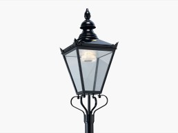
The starting point for David Webster when he founded DW Windsor in 1976 was to produce replica Victorian Windsor lanterns based on the original gas versions to fit onto original cast iron lamp posts. The name of the company is based on the founder’s initials, DW, followed by the Windsor from this lantern. The company has expanded over the years and has developed a wide variety of exterior lighting product ranges. However, the original copper Windsor lanterns are still produced and now even include the option of LED based faux ‘gas mantles’ that mimic the original gas lit effect.
The company, which is based in Hoddesdon, Hertfordshire, UK, now employs around 140 staff. DW Windsor joined the Luceco Group of companies in 2021 and the Group employs around 1,650 people worldwide.
Many of the mechanical components are made in-house although it is understood that pressure die castings are sourced from suppliers in the Far East.
The company has twice been awarded the Queen’s Award – first for Export Achievement and again for Environmental Achievement – the first lighting company ever to be granted this accolade. DW Windsor also previously held a Royal Warrant by appointment to HM The Queen.
The latest product development from DW Windsor is the Daytona range, which is designed for use in a wide range of urban lighting applications, including inner city roads, footpaths, and public spaces.
The Daytona range is based on a 460mm diameter luminaire, which can be fitted with four different output LED light engines. The smallest size 12 LED light engine provides up to 5,300 lumens from 38W while the largest 36 LED light engine provides up to 15,800 lumens from 107W. It is understood that two different brands of LEDs are used for the light engines – Seoul Semiconductor for higher colour temperatures of 3000K and 4000K, both 70 RA, while Nichia LEDs are used for the 2700K option.
Unusually for a street lighting luminaire, the Daytona range includes two tuneable white options, from 2200K to 3000K and 2700K to 4000K. The colour temperature can be configured via Bluetooth to create a fixed blended colour temperature output, a time-based colour change sequence during the night or dynamic control via a presence detector where the intensity increases, and colour temperature becomes cooler when motion is detected.
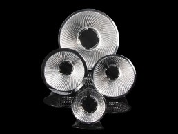
Optics are based on the DW Windsor Diamond Optic range, utilising Ledil lenses, and available in 12 different distributions for different lighting applications. The Daytona is Dark Sky friendly with a ULOR of 0%.
The design of the Daytona features a number of details to ensure long trouble-free working life and ease of servicing on site. The pressure die cast housing is produced in LM6 marine grade aluminium to minimise the chances of corrosion, while the soft disk profile ensures that water runs off, helping to achieve an IP66 rating. For marine applications, a C5 anti-corrosion coating is available instead of the standard polyester powder coating. Windows are available in toughened glass with an IK08 rating or polycarbonate with an IK10 rating.
The product is assembled using mechanical fastenings so that it can be easily disassembled at the end of life and the components either recycled or possibly re-used.
The mechanical design incorporates three over centre catches to secure the window cover assembly of the kind of that would have been found on a previous generation of lamp-based exterior luminaires, and therefore no tools are needed to open the luminaire for servicing. When the window housing is hinged down, access to the LED light engines and the driver is available. The light engines are mounted on a hinged, removable tray, which is fixed to the body casting with captive screws to ensure good thermal management of the LEDs. The light engines can be replaced on site at the end of their 100,000-hour life, or could be changed at an earlier point to take advantage of higher efficiency LEDs that may be available. Once the light engine assembly is hinged down, that allows access to the driver, which can also be replaced on site, keeping the luminaire in service for as long as possible.
The Daytona can be configured to incorporate up to two Zhaga book 18 sockets – one on top of the luminaire and one below. Alternatively, a NEMA-type socket can be installed on the top of the luminaire. A wide variety of controls, network nodes, and sensors can be installed into these sockets.
Anti-glare shields that follow the design theme of the Daytona can be fitted to control light trespass. Post top and side entry adapter castings for standard pole sizes are available.
The Daytona was designed and developed by the in-house DW Windsor team over a 12-month period during the pandemic and has recently been launched.
It is understood that feedback from specifiers and potential customers has been positive with particular interest in the tuneable white options, and the site changeable light engines and drivers, and the company reports that the overall product appearance is well-received.
The Daytona is a well designed and manufactured luminaire. The tuneable white and 2700K options meet the increasing interest in wildlife-friendly outdoor lighting and the traditional construction fits well into a circular economy model.
Jason Bruges
As Jason Bruges Studio celebrates its 20th anniversary, arc Editor Matt Waring sat down with its founder, Jason Bruges, to discuss his approach to experiential design and how he blends architecture, light, art and design in his work.
For the past 20 years, Jason Bruges has carved out a unique place within the art and design world with his eclectic portfolio of immersive, ephemeral, and experiential installations. As his eponymous studio celebrates its 20th anniversary, Bruges sat down with arc’s Matt Waring to reflect on the origins of the studio, his design inspirations, and where he sees the future of experiential design going.
Before venturing into the world of immersive art, Bruges’ background was in architecture, although his fascination with performative works was always present. “I studied architecture at Oxford Brookes, and then did a post-graduate at the Bartlett at UCL,” he explained. “They were both quite formative; in my degree I was looking at spaces for performance, but there were also a lot of parts of the course exploring areas like psychology, environmental and sustainability aspects – things that were perhaps not ‘classic’ architecture.
“Indeed, for my final year project, I created an experiential, performative media installation and performance space; there were a lot of indicators that I might be interested in other things, or in expanding my architectural repertoire.”
During his post-graduate at UCL, Bruges recalled being part of a unit that was “very much looking at the idea of cybernetics, interactive architecture, reactive and performative architecture”.
He recalled: “There was a mentality of very flexible spaces, performative spaces, buildings that moved and had personalities. It was very much exploring the idea of an architecture that performs and changes. Weirdly, some people have said that you can see a thread of that in the studio’s work today, as we’ve carried on creating performative pieces, interactive pieces and pieces that use different types of media to come alive, including light.”
In between his degree and diploma, Bruges took a year out to work with Norman Foster in Hong Kong, gaining valuable experience in the technicalities of the architecture profession. This experience continued following his studies at UCL. “At Foster + Partners’ London office, I worked on some of the bank buildings in Canary Wharf; but I realised that after having been at the Bartlett and exploring this very experiential, experimental work, I was thinking about what I could do with that, and how I could be a bit more theatrical and experiential with my work.”
This led Bruges to a role as Senior Designer for Imagination, where he worked on the Millennium Dome, among other projects, looking at experiences and early examples of interactive design. “I was looking at how a space might animate, how it might interact with people and come to life. There was a lot about scenography, theatre, early interaction design and performance.”
Alongside Bruges’ role at Imagination, he was commissioned to showcase some of his independent work in exhibitions. It was this interest in his ‘solo projects’ that then snowballed and led to the formation of his own studio.
“I was exhibiting work from about 2000,” he recalled. “People had seen my work from my post-graduate at the Bartlett and were interested in it, so I was asked to show some work. It was largely interactive art installations that experimented with different parts of the architectural world, using light and media and kinetics and various mediums.
“Off the back of starting to exhibit work, I also won a series of competitions that I needed to deliver on, so the studio was set up to deliver the work. It was quite organic and reactive to the needs of being commissioned to create work that I no longer had enough time to do. I suddenly realised that I needed a studio.”
And so, Jason Bruges Studio was born. Picking up where he left off during his studies, he explained that the idea or premise of his work being performative and “living” carried on. “I was really interested in architecture, being usually quite static, and wondering how much that can be explored, how much you can create a performance or something that’s living. The context of public art and public art commissions seemed like an interesting place to experiment with that idea.
“The ethos or idea was still very architectural, in that it was about improving environments, looking at narratives in environments and bringing spaces to life. There was an element of regeneration, creating something from liminal, unwanted, downtrodden spaces and creating a catalyst for change and discussion within that environment.”
Within this approach, technology has formed a key part in the studio’s work, with Bruges keen to merge the boundaries between art and technology. “I could see an opportunity in an area where the world of art, architecture and technology overlapped,” he said.
“I couldn’t see many people operating in that space already, and I realised that there was a chance to explore with a relatively new palette. Digital lighting technology had just come of age with various colour LEDs appearing in the mid-90s and media and control systems becoming more sophisticated. So, the palette of things that we could use, suddenly, was quite interesting.
“We wanted to pioneer the exploration of this application of technology to our environment and creating a hybrid space. We’ve since been fairly consistent in terms of exploring that space and how we can combine the idea of living architecture, living art into a space through a new media palette that largely consists of light, media, and kinetics.”
One of the first large-scale installations created by Jason Bruges Studio, which harnessed the new palette of light and media, was Litmus. Commissioned by the London Borough of Havering – the city’s most eastern borough – Litmus consists of four landmark, 12-metre-high sculptures placed on separate roundabouts near the borough’s raised A13 highway. Responding to various environmental stimuli, the sculptures present information such as light levels, tide levels and traffic news to passing motorists through giant alpha-numeric displays, and were designed to draw attention to the brownfield sites adjacent to the road, and the regeneration of the area.
“The London Borough of Havering is quite an amazing place,” said Bruges. “It’s both natural, with protected marshlands where amazing species of birds can be found, but then there are these brownfield sites with car plants and wind turbines, with developments and urban areas scattered amongst this, so it’s got an amazing, eclectic environment.
“Thinking about what would be interesting to an audience that is largely on the move, commuting in or out of London, we looked at things that gave information – roadside clocks or thermometers – and thought about how we could disrupt that communication. We talk about data now, about bringing it to life, but this was really early in terms of the idea of visualising data and making invisible things visible. It was quite a critical piece and was quite formative in terms of making me think about how we use data, what interesting data exists in the world and how we can bring it to the foreground.”
The notion of visualising data was present in another of Bruges’ early, standout projects – a piece titled Memory Wall, which was created at the Hotel Puerta America in Madrid, Spain. Part of a wider architectural extravaganza, in which the Silken Hotel Group invited 22 architecture firms to collaborate on one project – including names such as Zaha Hadid, Norman Foster and Jean Nouvel – Jason Bruges Studio collaborated with architect Kathryn Findlay on the lobby space of one of the hotel’s 12 floors.
For Memory Wall, Bruges transformed the lobby into a real-time, video-controlled environment, where the walls would react as visitors entered. Motion and body mass were captured, filtered, and displayed on a light canvas embedded within the wall, meaning that as guests passed by, they saw distorted images of themselves, and as the day went on the images lingered and changed, moving into one another and creating a wall of memories.
“The piece was like a fashion barometer,” Bruges continued. “The walls responded to you and what you were wearing, and depending on what colours you were wearing, it would mirror these. As far as I know, it was one of the world’s first video-controlled interiors.
“Memory Wall was under the spotlight of the world’s media, there was a lot of attention because of the architects involved. I remember sitting on a stage with 10 of these ‘starchitects’ and thinking how crazy it was that I was at the same level as them. But suddenly people were interested in my work; even the other architects were asking how the environment was changing in real time as a piece of reactive, interactive architecture. They saw it as an interesting layer that can be added to the architecture that they’re creating.”
However, when it comes to Bruges’ favourite project, he said that Nature Trail, a piece he created for Great Ormond Street children’s hospital in London holds a special place in his heart. “The projects that really make a difference, where there is empirical evidence of them making a difference, stand out. Nature Trail was the first project that my own children got to see; it was a piece that created a narrative on the journey from the ward to theatre, and was all about distracting children on this journey.
“Working as an artist with ephemeral media, including light and sound and other media, there is an opportunity to create these moments that distract. There are a lot of connotations around wellness at the moment, but in the context of a hospital, the ability to decrease levels of anxiety around the process of what happens around you is incredibly important. The scenario where you see that the work functions beautifully, and it has this magnificent effect is great to see. The team worked so hard to make it work, we took the time to really interrogate the visual poetry of things and bring joy to people.”
This idea of “visual poetry” is something that is a constant amongst Bruges’ portfolio, but rather than thinking of it as a signature style, he believes it is the overall approach that sets his studio apart.
“Our signature style is conceptual, it’s a thought-based style, a thinking process rather than something that is completely visual – more of a signature approach,” he said.
“I think what slightly differentiates our work from that of our peers and competitors is that it is highly grounded in the place and the site specificity of them, taking in the atmosphere of a place rather than things being quite abstract and placed or deployed without any recognition of the place or environment around them.
“Being site specific, in the architectural world is stating the obvious, but when we segue into the media art world or the light art world, creating site-specific work is not always necessarily normal. But the context of a site gives a lot of guidance to form, composition, animation, choreography.
“I never know where inspiration is going to come from. I see inspiration in the natural world, its systems and behaviours, and our interaction with it. I see the work as living, becoming alive, being animated and dynamic; it’s ephemeral, it’s not necessarily all encompassing, but it always creates sensations and interaction. We’re looking at a live connection with our audience that we are then reacting to and interacting with, and the applications become a type of interaction design, it’s omnipresent in that context.”
Across the studio’s eclectic array of past projects, the scale and scope has varied greatly, from vast façade pieces and large-scale installations to smaller, more bespoke works. Despite the ranging scope, Bruges believes that the studio’s approach remains the same in all works. “There is poetry in all these scales,” he said. “There are a lot of sub narratives and layers, and they can exist in really small works, and at a larger scale. The fact that there is this variety, for me, as someone who is continuously curious about the world around me, there’s an excitement. The work being bespoke, or having elements that are very bespoke, means that we’re inventing, pioneering. There’s a lot of research and development happening in the studio, and that helps keep people very engaged, and it means that there is never a dull moment.
“There are some aspects of the studio that are architectural, because we’re building things and we’re sometimes part of big, multi-disciplinary teams. Other times, it might be more like we’re creating a sculpture, or other times it can be a faster process, so it’s like we’re making a film. People can walk in and see an architecture practice, or an art studio, or an agency, depending on what we’re creating. We have a team of nearly 30 in the studio now, from all walks of life and all different disciplines, and that’s really important, because we become like an orchestra – we all have these very specialist functions, but it all comes together to create amazing things.”
As Bruges has always aimed to create ephemeral, immersive, multi-sensorial works, light has always played a prominent role, although he sees it as a small part of a wider palette of materials and textures. “As I’ve worked with media, digital media, new media, light is a very core part of that palette,” he said. “I wouldn’t single it out, but I wouldn’t be able to work without it. It’s essential at its core.
“But for me, being multi-sensorial, relying on other things as well is more important. It needs to be considered alongside a soundscape and sound texture, alongside materials that we’re using. People ask me if my work is all about technology – I’m fascinated by technology, but we very much start with things being site-specific, and work with the context and the stories and narrative first, and then which bits of the palette are used is the next important piece of the puzzle.
“Light has been there, and has been at the forefront of my thinking, but it’s part of a slightly wider palette, and I don’t isolate it. It comes in context with the systems and other materials and sensory devices as well.”
With such a focus on technology within his work, Bruges has always got one eye on the future, and on any new technological advancements that he can harness in some capacity. “We’re continually exploring new technologies,” he said. “I think of myself and the studio as no different to a painter; new pigments of paint arrive all the time and you’re trying them out to see how well they work, how efficient are they, how bright are they, how long do they last, what colours they produce. For us, it’s the combination of systems that we use as well. Sometimes we’re using old technology in certain ways and combinations, or subverting things, changing how they’re used, or disrupting something – taking something from one industry and using it in another. We’re spotting those opportunities, and it gives us the chance to work in spaces that we wouldn’t otherwise work.
“We’ve been working with surfaces a lot in terms of projection, but now I think quite often about voids and in-between spaces, working very subliminally and ephemerally to create work that’s very dynamic.
“We’re also thinking more and more about creating work that is regenerative, building content that creates itself, using AI and developing algorithms so that it can learn to change or update content.”
The idea of self-generating content sounds like science fiction, but Bruges believes that multimedia art can enter into this realm, as well as becoming more experiential and ephemeral in the process.
“There will be some highly crafted pieces where every second is thought out, and then combinations of this and pieces that are very generative, but there is a space for both in certain environments,” he said. “There is no shortage of spaces or immersive spaces, there is a shortage of good ideas and original, interesting, immersive content.
“There are opportunities to carry on with the idea of the experiential – lots of opportunities where we almost become experiential master planners. When you think of things on that scale, it’s like being atmosphere designers, looking at what a space looks and feels like, but not touching anything – all the ephemeral, in-between things, at a larger scale, multiple networks in these interactive, intelligent spaces that are made up of this mixed media, ephemeral space.”
As he continues to look to the future, Bruges believes that there will be a continued push towards experiential design, alongside the ongoing shift to more considerate, reflective design.
“The volume and expectation around experiential is ramping up. I can see the work being embodied in many more environments, commissions and many more types of development, in places you wouldn’t normally think. We obviously think that experiential is important in areas like sports, retail, mixed use developments, hospitals, but everywhere can have experiential moments, whether they’re educating, they’re didactic or purely about happiness and fulfilment,” he said.
“Wellness is a word that crops up a lot at the moment too – we worked on the Museum of the Future recently, and we were commissioned to think about a space that is very much reflecting on the idea of self-transcendence, a space for meditation and reflection and mindfulness. Quite rightfully so, we’re thinking about how we make people feel in the environments they’re inhabiting.
“Within all of that, we’ve always looked at the boundary between the natural and the artificial. I think it is the time of the natural to come into its own, and working with natural phenomena, natural materials, will become more and more important, and that’s what I’m really excited about.”
Although he has one eye on the future, as he celebrates the 20th anniversary of his studio, Bruges remains appreciative of where he has come from, and the support he has had along the way.
“We want to have a giant party to celebrate the anniversary, primarily as a thank you to all the collaborators, friends, past colleagues, commissioners, and patrons. We’re going to reach out as many people as possible as a thank you. There are so many projects, and we’ve collaborated with so many people, so it’s important this is celebrated.
“Looking back, there are some things that are fantastic to have been involved with, but there are also things I would have liked to have done, because I’m always aspiring to push the boundaries. So, there are some regrets about things that we haven’t done, but also an excitement about things still to explore and to do.”
Watch this space then, to see what the next 20 years brings for Jason Bruges Studio.
Satu Streatfield
Earlier this year, London Mayor Sadiq Khan appointed 42 new Mayor’s Design Advocates (MDAs) to support the city’s Good Growth by Design (GGbD) programme. Satu Streatfield is one of the new MDAs, joining as lighting designer and night-time strategist. Here, Streatfield tells arc more about the initiative.
What is London’s Good Growth by Design (GGbD) programme?
It’s been run by the Mayor’s office since 2017 to promote high quality design that serves all Londoners. The programme comprises research, projects and policies underpinned by six main pillars: Setting Standards and Informing Delivery; Ensuring Quality; Building Capacity; Supporting Diversity; Commissioning Quality; and Championing and Learning.
How do the MDAs help support this?
MDAs are drawn from a variety of sectors within the built environment profession, so bring a broad range of expertise to assist, advise and critique projects and policies, with a view to delivering the GGbD objectives. We support research, help steer design briefs, identify good practice and case studies, and help shape performance criteria for projects. MDAs also sit on the London Review Panel, reviewing projects that the Mayor is investing in or making a planning decision on.
What do you hope to bring to the programme?
Since 2020, I’ve led Publica’s work for the Greater London Authority’s (GLA) 24 Hour London team, supporting local authorities across London to develop evidence-based night-time strategies and projects, so the MDA role is expanding upon that work. A major part of my role is helping to ensure that the night-time experiences of London are considered as part of every new policy, plan, or design. Effectively, I want to help implement the ‘Night Test’, which London’s Night Czar and her team are promoting to create places, infrastructures and policies that support a diversity of social, cultural, and economic life at night. I hope to help developers, designers, and council officers think carefully about what their plans and designs look like after dark. It’s also about understanding how good design can help minimise conflicts and inequalities that might become more visible or pronounced at night. Those could relate to feelings of safety, access to spaces and activities, providing amenities and a safe commute home for night workers, or mitigating conflicts between night-time activity and residents wanting to sleep.
How significant is it that lighting design and night-time strategy has been included?
There’s a growing understanding of the importance of after-dark and night-time spaces, infrastructures, and communities to the cultural and economic health of the capital. Lighting design is increasingly recognised as a critical component of good urban design and a key tool in creating spaces that are accessible, welcoming, beautiful, fun and inspiring.
We’re seeing better cross-departmental working within local authorities since Covid and it’s really encouraging to see the importance of good lighting design and well-funded, sustainable lighting, recognised across the board.
Across the 42 MDAs, 55% are women and 45% come from Black, Asian and minority ethnic backgrounds. Do you feel this will help boost diversity within the design industry?
I certainly hope so, as the industry has a long way to go to be representative of the people it’s serving. As a society we’ve created systems and cultures that allow inequality to flourish. These disparities start from an early age and are based largely on where kids live, how much their parents earn, what school they go to, what they look like, etc. I think lighting design can provide a more accessible route into the industry as it attracts designers, technicians, and engineers from fairly diverse fields. Architecture, by comparison, requires a huge commitment of time and money that most cannot afford, and the culture of the profession puts a lot of people off. The GLA’s ‘Supporting Diversity’ handbook cites analysis suggesting that more than 90% of jobs in the creative economy are done by people in more advantaged socioeconomic groups, compared to 66% of jobs in the wider economy. When you look at those stats, it’s clear just how important it is to involve under-represented groups in designing and planning the city – women, disabled people, and those from households earning less than £20k a year feel least safe in London at night.
How important is such an initiative to London?
Having a group that brings a broad range of experiences, backgrounds and expertise to the review process is critical. I’m sure every lighting designer has joined a project and identified issues, opportunities, and challenges that hadn’t been picked up previously. So, it’s reassuring to know there’s a group helping to review projects and policies through different lenses.
Should this be replicated in other cities?
Every city is different and has its own governance structures and processes, but I think the principle of bringing together a group of built environment professionals offering a broad range of expertise from both the private and public sectors, along with people from community-led initiatives, is a great way to improve design quality and representation in the built environment.
The National Museum, Norway
The newly-opened National Museum in Oslo highlights the history of Norway in the country’s largest art exhibition. Henning Larsen and Massimo Iarussi designed the architectural and exhibition lighting respectively, to showcase this grand collection.
Opened in June of this year, Oslo’s National Museum showcases the full breadth and history of Norway with the largest and most valuable art collection in the country.
Bringing together extensive collections of classical, modern and contemporary Norwegian art, as well as architecture and design, the new museum has instantly become a landmark for Oslo, sitting on the scenic harbour of the Scandinavian city.
Designed by architect Klaus Schuwerk of Kleihues + Schuwerk, the museum was commissioned by Statsbygg, the Norwegian Directorate of Public Construction and Property, and merges four pre-existing museums – the Museum of Architecture, the Museum of Contemporary Art, the Museum of Decorative Arts and Design, and the National Gallery of Norway.
The new National Museum spans 54,600sqm, with 10,000sqm of exhibition space. Materials such as slate, limestone, glass, marble, bronze, and brass, as well as light and dark oak contribute to the radiance of the facility, which blends natural and artificial light to create a bright, welcoming aura.
A melding of classical and contemporary architecture, one of the defining features of the exterior is the vast “Light Hall” that tops the building. Made of backlit layers of glass and marble, the Light Hall is the largest backlit façade in Norway, and instantly helps make the new landmark museum stand out.
Given the size and scope of the museum, the lighting design was split into two different teams, with Henning Larsen (formerly Rambøll) designing the architectural lighting for the exterior and outdoor spaces, as well as general lighting for the museum’s public spaces, offices, and cafeteria; meanwhile Italian designer Massimo Iarussi designed the lighting for the 86 galleries and exhibition spaces.
Kathrine Hjelmeset, Senior Lighting Designer at Henning Larsen, explained the design concept: “Designed with the perspective of housing artworks for centuries, the museum is built with clean and robust materials that will age with dignity, like oak, bronze, and marble. The same intentions were set for the lighting design – to be timeless and still relevant many years after the opening.
“The concept of the lighting was a balanced design with a focus on light quality and experience, with a luminance hierarchy. The lighting level in the area in front of exhibitions is therefore toned down according to this hierarchy. We wanted the lighting to emphasise the architecture and be a natural part of the environment. Visual comfort, readability and luminance are the main elements; both technical and aesthetic solutions are emphasised.”
As part of this, Henning Larsen considered placement and luminaire types that would provide a balanced, homogenous lighting throughout. “The light was placed where it was needed and with the shielding necessary to provide the experience that was desired, as well as the required light level for performing the task in the specific room,” Hjelmeset explained.
“Three types of ceilings were chosen in the project: metal, textile and fixed; these lighting concepts are used throughout the museum. For the outdoor areas, the concept was to make this museum an integrated and natural part of the city by choosing solutions used in surrounding areas. The historic buildings in front of the museum received lighting that reflected original fixtures and locations reproduced from old images.”
The historic buildings stand in direct contrast to the illuminated Light Hall that sits behind. Lighting for this feature was developed in close cooperation with the architects. Hjelmeset explained further: “The design goal was to create a calm and monumental façade with a lighting design that emphasises the materiality, with possibilities to slightly change the appearance.
“The lighting concept was to create an ice feeling, with allusions to ice flake layers in the façade. The original material was alabaster, but changed to recycled glass in the detail phase. Unfortunately, this couldn’t handle the differences in temperature the façade faces and the material had to change. There was a lot of testing of new materials on site, and the final solution was to use a 4mm thick layer of marble stone.
“The lighting was designed and programmed with 10 scenarios, designed in dialogue with the architect and the lighting staff of the museum. The scenarios vary from warm to cold, with slow movements of shadow, colour temperature changes and dimming variations. These are programmed in a wheel of the year, and the idea was to use warmer light in wintertime, slowly turning cooler in the summer. Our goal was to emphasise the marble material and give the light environment a sober and delicate visual appearance despite its enormous dimensions. The lighting levels are also balanced with the visual environment of the surrounding buildings.”
Inside the museum, lighting comes via a series of artificial skylights, in both the exhibition and general spaces. The decision behind this came from the architects, but Hjelmeset explained how the lighting designers “had an important role in the design and result”.
“We did a full-scale mock-up and tested out many different solutions. The result was a double layer of textile in front of a grid of LEDs, varying from 2700K to 6500K,” she said. “The boxes are custom-made by Zumtobel, and there are many different sizes in the project. The architect wanted the artificial skylights to have a visual depth and for the textile to be partially translucent. We did a lot of testing to get the right textile, the combinations of textiles and the placements of the LEDs, to have the desired translucent effect, while at the same time not seeing the LED dots.
“Due to restrictions for artificial lighting towards paintings, the skylight is significantly dimmed down in most of the exhibition rooms. We performed measurements of the amount of light and quality in one of the sample rooms, before ordering the solution for the rest of the museum. The test also included a spectral distribution measurement and focus on the dimming quality without flicker.”
Throughout Henning Larsen’s work on the museum, collaboration and cooperation were essential factors - from working closely with the architects on some elements, to liaising with exhibition lighting designer, Massimo Iarussi.
“There was close cooperation between all disciplines in the project, and the architect was in lead of the aesthetic choices that were made,” Hjelmeset explained. “All luminaires and locations were discussed and reviewed with the architect, with some special-made luminaires that were designed for this project in cooperation with the architect.
“Henning Larsen already set the infrastructure for the lighting tracks in the museum by the time Massimo Iarussi became engaged for the exhibition lighting design. We worked closely with him when deciding the light levels for the artificial skylight. Henning Larsen were also commissioned by Statsbygg to lead the process of providing all spotlights for the exhibition areas, and we were responsible for setting the demands for the light quality. We worked both with the museum lighting staff and Massimo in the specification process, coming to us with thier professional input.”
Iarussi added: “There was an excellent communication with Henning Larsen on the themes for which we were both involved, such as the skylights and the exhibition halls, or the transition areas between exhibition and non-exhibition spaces, or in lighting some of the external courtyard where contemporary art installations are exhibited. There was also a very good collaboration in the phase of fine-tuning the tender procedures for the supply of lighting fixtures for the exhibition, which was taken care of by Henning Larsen, with our collaboration for the drafting of technical specifications of the lighting.”
Iarussi joined the project in 2016, following an international competition for the exhibition design, which included lighting design, graphics and multimedia installation. Part of a collaborative that included Guicciardini & Magni Architect for the exhibition design, Rovai and Weber for graphics and InnoVision for multimedia installations, Iarussi hoped to use lighting to reinforce the experience of the visit within the museum.
“The museum has enormous dimensions, with several thousand artworks on display, and is housed in a grandiose, rigorous architecture. It was necessary to keep the visitors’ attention on the exhibition; variation became the key word,” he said.
“We wanted the light to accompany the visitor, reinforcing the experience of the visit. The light had to appear innate with the set-up, it did not have to be intrusive, nor become the protagonist. We wanted the focus to be on the artworks. The set-up and the light both contribute to this goal, reinforcing each other.
“Developing around the unique collection, the exhibition design emphasises both the precious individuality and the choral value of the artefacts, through a fruitful journey of ideas and solutions created in close collaboration with the museum curators, conservators, educators and technical experts. To enrich the exhibition for visitors, the arrangement of the main exhibition sections has been diversified by the use of different solutions, colours and tones. In various ways, the exhibition elements aim to shape the galleries by creating installations evoking classical archetypes or modern abstractions. Materials, colour and light contribute to creating environments where the artworks are exhibited and highlighted.”
Iarussi shared some examples where this variation in lighting approach helped to differentiate the many exhibits. “In the first room, the faces of ancient Greek and Roman sculptures turn their gaze towards the visitor, who is invited to place themselves at the centre of the scene, marked by a bright spot of very warm colour. The shadows of the sculptures on their pedestals draw a star on the floor, which evokes the propagation of ancient civilisations in all directions, towards the whole world. The next four rooms describe the cultural relations between the Scandinavian states and the rest of Europe, between 1100 and 1600, through the exhibition of works of sacred and profane art. This section is characterised by the vivid red colour of the walls and dark grey platforms. The chiaroscuro tone, generated by a strongly contrasted lighting, gives greater richness to the objects on display.
“Once again, in Room 7, dedicated to East Asia, the bronze panel coverings of the display case evoke the richness and mystery of the Far East under a golden light. Unusually warm, it accentuates the charm, together with the texture of the backlit panels that evoke rice paper. These are just a few examples - throughout the exhibition, where the lighting and the set-up always go hand in hand, in a constant dialogue, which reinforces each other.”
This constant dialogue of the lighting and set-up spans across the 10,000sqm exhibition space, and Iarussi believes that the variation helps to create a feeling of narrative and flow throughout.
He continued: “We treated the 86 rooms as if they were the chapters of a novel. The consistency in a novel is given by the style, by the hand of the writer, by the language. In our case, it is given by the touch, by the light hand, by the discretion in manipulating the objects we use to create a light scene. But each chapter tells a different part of the story, with inevitably different words, with the infinite, small variations that from time to time, we bring to all the attributes of light: intensity, contrast, hue, direction, and so on.”
Iarussi looked to use the balance of contrasts and modelling to bring each room to life, while sticking true to the concept of light as a narrative tool: “The first rooms are extremely contrasted, with punctual lights with precise and narrow light beams, which generate very strong contrasts, with almost theatrical effects. The exhibition unfolds on a chronological criterion; the light becomes a kind of metaphor of a journey through time. The rooms of antiquity, characterised by very strong contrasts, are gradually followed by rooms characterised by lighter colours and softer contrasts that represent the unfolding of time. As we approach the present day, light becomes more and more ‘democratic’, less focused on individual objects, more pervasive.
“The transition to the modern era is marked by Room 20, where the journey into modern design begins and in which the massive use of diffused light combined with the punctual light of spotlights is introduced. The multitude of objects offered by industrial production is underlined by a light of greater intensity and, above all, more diffused, symbolising the availability of such objects for all. It was necessary here to create a custom system that combines the soft and diffused light of extended luminous panels with that of point projectors, housed in the same system.”
Across the museum’s extensive, diverse range of exhibitions, there is a wide range of artefacts on display - many of which are, due to their history, very delicate. This means that Iarussi and the wider exhibition design team had to be very considerate in their approach, to preserve the objects on display, while still providing effective illumination.
As someone who has worked on a number of museum projects in his career, this was a challenge he has become used to. He explained: “We know that conservation is one of the top two priorities for museums. However, this must always be balanced with the need for the best enjoyment of the artworks, which is the other major priority of the museum, without which the museum itself would have no sense of existence. In many cases, compliance with the best requirements for conservation can have a negative impact on the perception of the artworks, if it is not carried out with great care. For example, if in a room we only have very precious objects that must be lit at a very low level, we can illuminate only those in a focused way, keeping the whole room at an even lower level to make them stand out. However this is not possible if delicate objects cannot be isolated and are displayed close to less delicate objects.
“We have done a lot of work in this regard, organising during the design process workshops with curators, so that they could become aware of the perceptual effects, as well as the conservative ones, of the different solutions. In some cases we suggested simple solutions, such as a faster rotation of exposed objects to reduce their exposure time. In others, we have proposed more complex solutions. For example, in the beautiful royal costumes gallery, we proposed a dynamic lighting system: the light on the clothes is very low most of the time, but from time to time, a dynamic sequence follows, in which the costumes are illuminated one at a time, at a higher level, for a short time. This has no negative effects on the conservation, because the total luminous exposure is kept within the allowed limits, but at the same time it allows visitors to fully enjoy the preciousness of the Queen’s clothes, even if for a few minutes.”
With the sheer size of the museum and the delicate nature of the artefacts on display all factors, the biggest challenge that Iarussi faced on the National Museum is perhaps not what you might expect it to be. “It may seem paradoxical to tell, especially for a project like this, which required such a long preparation time, but the biggest challenge was to close the project on time.
“From our experience in museum lighting design, we know that a huge part of the job takes place in the field, in the final stages of installation and tuning. It is the phase in which the last details, the aiming and the adjustments, are decided, which are what makes the difference, even when everything has gone smoothly until then.”
Iarussi added that the size of the museum, and the fact that it was all brand new, was also a factor to consider: “We have worked in museums even larger than this, such as the Uffizi Gallery in Florence. But these were always existing museums, which were renewed one section at a time. Never have we had to manage these dimensions and this amount of artwork exhibited all together, to have to stick to a single completion date for the whole museum. And we could not accept compromises on quality. We managed to get out of it, simply by putting all our resources into play and using all the time we had, until the last minute.”
That being said, now that the museum is open to the public, Iarussi and his team of collaborators are “very satisfied with the result”.
“As we completed the last adjustments in the galleries, it was exciting to see how much of what was taking shape responded to what we had imagined for some years now,” he said. “This is even more true for some aspects that we had not fully foreseen. For example, what struck me most in the final result was how much the museum really succeeded to represent the identity of a nation. It was an aspect expected and pursued by everyone from the very beginning, but I did not realise its success until I saw the final result.”
This is a view echoed by Hjelmeset, who feels the lighting adds to the visitor experience of the National Museum. “The lighting design is united with the architecture, and we are very pleased with the result,” she said. “We are very pleased with the light quality, especially in the exhibition areas, and the downlights in between the textile ceilings. We think the public areas work visually very well, and that the carefully planned solutions work well in practice. The lighting is an important part of the design and experience of the museum.”
The National Museum in Oslo is the result of wide-scale collaboration among a number of different teams and studios from a myriad of fields, and Iarussi concluded that the strong cohesion among the various partners is what led to the project’s success.
“The process of collaboration is always a fundamental element for us, and perhaps in this project it has been even more so,” he said.
“Being a lighting designer, by its very nature, is a job that only makes sense within a team. Lighting designers are used to dealing with different skills - architects, interior designers, curators and so on. The interpersonal dynamics of the work group are as decisive as the individual skills and specialisations. When the perfect harmony of the group is added to the experience of each one, the results can only be exceptional.”
www.massimoiarussi.it
www.henninglarsen.com
Little Island, USA
Designed by Heatherwick Studio, Little Island rises from the Hudson River on a series of concrete ‘tulips’, giving New Yorkers a unique new public space in which to explore and unwind. Fisher Marantz Stone designed the lighting for the park, which was intended to complement both the architecture and landscape features.
Situated on New York City’s historic Pier 54, Little Island is a totally unique public space unlike any other in the city. Emerging from the Hudson River, the island sits atop 280 concrete supports, dubbed ‘tulips’, offering a literal and metaphorical escape from the hustle and bustle of downtown Manhattan.
Conceived as a collaboration between media entrepreneur and philanthropist Barry Diller, and the Hudson River Park Trust (HRPT), Little Island was designed by Heatherwick Studio as a public park and outdoor performance space.
Inspired by the hundreds of wooden piles that stuck out of the Hudson River as remnants of old piers that had previously existed, Heatherwick crafted the identity of the park around its structural piles. Expanding on the idea further, the architects made the design decision to extend the piles out of the water, raising up sections of the island, and fusing them together to form the topography of the park. The resulting design developed as a system of repeating piles that each form a generous planter at their top – each planter then connects in a tessellating pattern at different heights to create a single manipulated piece of landscape.
Lighting for the unique structure and parkland came from Fisher Marantz Stone (FMS), which became involved following a longstanding relationship with HRPT.
Enrique Garcia Carrera, Associate Principal at FMS, explained further: “For 15 years prior to Little Island, FMS had been involved with HRPT in creating the park system lighting masterplan and providing peer review for the lighting of each individual segment. When the time came for Little Island to engage a lighting designer, HRPT put our name forward for consideration among a selection of potential lighting consultants. After several interviews and negotiation sessions, the Little Island design committee decided that FMS was the right firm to help create Little Island’s luminous environment.”
The original lighting brief to create this “luminous environment” was to “subtly highlight the concrete supporting structure and landscape features”, while keeping the lighting instruments as inconspicuous as possible. However, Garcia Carrera continued, “it was later understood that lighting the ‘tulips’ would have unacceptable environmental ramifications, which constrained the lighting interventions we could consider. In addition to that, we were aware that lighting for safety and wayfinding would be of high importance, given that the park would be open until midnight every night, weather permitting, and would programme evening performances several times a week.”
As such, FMS developed a lighting concept that would bring a base layer of wayfinding and accent light from low heights and concealed positions, where possible, supported by lighting from taller positions whenever scale or topography required it. “We hoped to extend and further enhance the magical environment created by the architects and landscape designers during the day,” Garcia Carrera added.
“To do this, we had vigorous discussions with the client and design team about what areas and elements of the projects should be highlighted at night, which areas were necessary to light for code and/or safety, and which would be superfluous to illuminate. We then set about to research and develop the means to make the island and its components the star of its night-time environment, while the lighting instruments would be concealed from view.”
As part of its ambition to conceal fixtures, FMS designed a bespoke, slender light pole with multiple fixture heads that provide path illumination and highlight the tops of trees, in instances where existing light poles were not sufficiently inconspicuous to satisfy the vision of the design team.
Alongside this, FMS looked to pay tribute to the heritage of the site – Little Island is on the site of the former Pier 54, which received the surviving passengers of the Titanic. “The Hudson River Park esplanade in front of Little Island is home to the only remaining structure of Pier 54, its historic façade arch, which was also illuminated by FMS as a beacon to announce the entry point to Little Island,” Garcia Carrera added.
Despite the striking architectural gesture of the supporting tulips, Garcia Carrera explained that the architecture on the island itself is “very subtle”, and instead defers to the topography and landscape. As such, he said that the main architectural gestures involve the accessway bridges, the tulips, and the formal amphitheatre that sits within the park. “Each of these would be subtly highlighted while carefully limiting the reach of the lights to avoid perturbing the wildlife native to the Hudson River below,” he said.
The presence of this wildlife within the river was brought to the fore during the design process, and was one of the key challenges that FMS had to work around, particularly when figuring out how to best illuminate the supporting tulips. Garcia Carrera explained: “The support pillars are undoubtedly the most striking design element of the island park, and at the onset of the project there was little doubt that they should be suitably highlighted.
“However, they are also the elements in closest proximity to the Hudson River, and of special concern to the New York State Department of Environmental Conservation (NYSDEC). We eventually came to the decision that only the tulips that were not directly visible from the water would be able to be highlighted, which mostly limited us to those adjacent to the entrance bridge and those visible above the island surface.”
Environmental considerations for the lighting design also extended to light trespass and pollution – something that Garcia Carrera said is “important in every architectural lighting project, including urban projects, as we’ve learned in the past decades of the harm to wildlife and to the visibility of our night sky”.
On Little Island, it became evident that the project was located in a section of the Hudson River that is home to the American eel, meaning that FMS had to be mindful not to disrupt its habitat.
“We performed several studies, including existing illuminance values on the site, illuminance values in nearby sites along the Hudson River, and projections of light penetration underwater at the depth of the eel habitat, to demonstrate to NYSDEC that the habitat would not be disturbed by the negligible stray light component in our design. This exercise also led us to limiting the highlighting of the tulips, regardless of their architectural importance to the project.”
The extra considerations towards the surrounding nature also meant that the designers had to be slightly more discreet than they had initially planned, despite the new park’s relative isolation from the inner city of Manhattan. Garcia Carrera added: “The more isolated location makes the project and its lighting stand out in a way that might not have happened in a more densely built-up part of the city. However, that same river location prevented us from implementing some of the lighting concepts that we originally developed, in consideration to the natural environment below and surrounding the island. So, we in fact had to be more restrained at this location than almost anywhere else in New York City, including other segments of the Hudson River Park.”
Other challenges that FMS had to overcome on this particular project included the harsh, corrosive environment caused by the salty seawater that comes from the Hudson River merging with New York Harbour as it reaches lower Manhattan – which meant that only the sturdiest of light fixtures would survive. Alongside this, the outdoor park needed state-of-the-art dimming controls, but lacked ventilated, dry areas to locate control equipment and repeaters. Overcoming this, the lighting control system, fully hard-wired with cables and boosters, was buried underground for robustness and resilience in the harsh environment. Despite this, the system allows for park staff to wirelessly recall and adjust lighting scenes from any location within the park.
While the lighting controls are buried beneath the park, the lighting fixtures themselves are fully immersed within the architectural fabric of the project. “The lighting, as in all FMS projects, seeks to be fully integrated and indistinguishable from the architecture,” Garcia Carrera said. “Heatherwick Studio did have specific ideas on how the park should look at night, but left it to us to devise the methods to achieve this vision.
“FMS took the lead in determining the lighting approach for each area, while always going through rigorous review by Heatherwick, landscape architects Mathews Nielsen, and the Little Island committee – a process that kept informing and fine tuning our design as it developed.”
Indeed, the high-profile nature of such a project meant that there was several different teams, departments and external stakeholders involved, making the process slightly more arduous than perhaps expected on other, more traditional projects. However, as Garcia Carrera explained, the ends justify the means.
“Having such a high visibility project, of unprecedented design and scope, guided by so many different stakeholders, all with their own priorities, makes our job as a lighting designer much more difficult than on more ‘normal’ projects,” he said. “However, FMS has a long history of working on unique, exceptional projects and we know going in that the journey will be difficult, but the result is often quite satisfying for all. That was the case with Little Island.”
Looking back on the project following its completion and unveiling to the public last year, Garcia Carrera reflected on the magical experience that has been created for visitors. “In order to convey our design concepts to the committee, we produced several renderings and animations of the illuminated, night-time environment from various vantage points. None of them ended up doing justice to the completed project,” he said.
“Little Island surpassed our expectations of what it could be at night. The experience is a magical trip of discovery, with outstanding architecture and landscape areas being revealed and concealed by turns, thanks to the thoughtfully designed and executed lighting. At night, Little Island is transformed into a luminous floating jewel.”
And this “floating jewel”, Garcia Carrera believes, comes at a much-needed time for New York, particularly following a tumultuous few years. He concluded: “A city like New York has a shortage of welcoming exterior public spaces that can be visited after dark. Appropriate lighting has the power to draw the public in and help them feel safe, comfortable, and in a mood to explore.
“Nothing made this clearer than the pandemic, in which New Yorkers, mostly confined to their cramped apartments, needed to experience the outdoors like never before. Little Island came around at the exact moment when it was needed, and it being able to operate after dark is something that people have dearly appreciated.”
Exchange Square, UK
As part of a wider lighting vision for London’s Broadgate area, Speirs Major has created a tranquil, serene lighting scheme for Exchange Square that enhances the park’s character against the surrounding urban environment.
As cities continue to grow and build up all around us, there becomes a growing need for calm, green spaces within urban metropolises. One recent example of this in action is the newly completed Exchange Square in Broadgate, London.
Set above the tracks of Liverpool Street Station, the tranquil park within the urban heart of the capital offers a much-needed dose of respite and relaxation within the heavily built-up area.
Adding to this ambience after dark, lighting design studio Speirs Major has shaped a warmly evocative blend of light and darkness, revealing the multi-level topography and curved landscape elements, while supporting intuitive wayfinding and ease of access.
Aimed at revealing the natural texture, colour and movement of the various materials and finishes – from foliage and water to stone and wood – the lighting design enhances the park’s character as natural light fades, creating a gentle respite from the harsh urban fabric of glass, steel and concrete.
Speirs Major’s lighting design is part of a wider lighting vision that the studio developed for the Broadgate Public Realm Framework for British Land, becoming the latest project for the firm, following 100 Liverpool Street and 3 Broadgate. The space focuses on wellbeing and open access, marking an important journey for the client in its journey from an office-led campus to a mixed-use, creative environment.
Benz Roos, Associate Partner at Speirs Major, explained the brief for the space further: “British Land was closely involved in the concept development and attended early workshops with us and with architects DSDHA.
“The brief was to support a park-like feel for the square, creating a natural, tranquil feel that would offer people respite from the intensely urban surroundings.”
As such, Speirs Major’s lighting concept focused on how light could help people to “slow down and enjoy a moment”, by creating an inviting, warm ambience with plenty of opportunities to dwell and socialise. Roos added: “We played up the textures, colours and movement to reinforce the sense of a natural park and revealed the unique multi-level topography to ensure safety and aid wayfinding after dark.
“We kept the lighting soft, warm and beautifully integrated within the landscape elements to create an intimate ambience. We worked with the curving topography, proposing the light slots that reveal the terrazzo steps, highlighting the meandering surface of the ribbon retaining wall and underlighting the benches, creating multiple places to stop, sit and enjoy.
“The lighting also responds to the patterns and textures of nature, with soft light to planting and through the leaves of silver birch trees, casting a dappled effect on the ground. The colour of the light adjusts tonally with each season, with warmer white light enhancing the rich autumn leaves and bare wooden branches in autumn and winter, and fresher, cooler white light celebrating the green buds and vibrant leaves of spring and summer. Light integrated into the water feature in the steps also creates beautiful ripples and patterns.”
In line with this concept, Speirs Major opted to keep much of the lighting at a low height, preserving an intimate ambience that encourages easy social interaction. At the perimeter, light for circulation is provided from We-ef luminaires on columns at a human scale, while low-level bollards from DW Windsor reveal the internal routes and low-level planting.
Across the multi-level site, light is beautifully integrated within landscape elements to improve legibility and contribute to the warm ambience; an even wash of light from Architape reveals the dark metal vertical face of the curving ‘ribbon’ retaining wall that runs through the park, while the slatted timber benches that sit above the wall are softly lit from beneath. Elsewhere, slots cut into the faces of the terrazzo step seating and water feature contain hidden light sources, also provided by Architape, creating mesmerising patterns and ever-changing ripples. Integrated handrail lighting came from Stoane Lighting, alongside tree uplighting and projectors, and canopy downlighting, while floor washers in the steps came from iGuzzini.
While the lighting design was intended to foster a welcoming, relaxing environment, Roos added that this was in tune with the core architectural ambitions for the space. “The key considerations for the landscape architecture were largely aligned with those for the lighting: to create a park-like environment that encourages people to meet up, rest and relax within this heavily urbanised setting, while also bringing nature back to the city,” he explained.
“The design focused on creating a bucolic, soft, organic space with a priority to create a space that nurtures both people and plants, promoting wellbeing and biodiversity. The generous planting, curving lines and soft materials create a distinct contrast with the hard granite of the post-modern architecture around it, while the design also prioritises ease of access for all.”
The softer, low-level lighting of Exchange Square creates a warm, intimate atmosphere throughout the space, and Roos added how the minimal, pared-back design was a conscious move on the part of Speirs Major. “Retaining darkness and a degree of shade is always a conscious part of our design process. Not only is this more sustainable and better from an ecological standpoint, but by carefully choosing where we add light, we make use of contrast to shape atmosphere, support improved legibility and wayfinding, and promote a sense of security.”
The decision was also aided by the wider environment in which the park sits, as Roos explained: “There was already a lot of light spill from surrounding buildings, we worked within those conditions to create the right atmosphere for the park. We always try to limit uplight where possible, and in this case the lighting is all integrated or pointing downwards.”
The more restrained lighting approach is a welcome one for a green space within an inner city, and Roos added that, while some clients may have requested higher light levels under the belief that this would improve safety and wayfinding, Speirs Major had a supportive client throughout. “The client and architects were very engaged from the outset with the concept and the approach,” he said. “We had early access to the Broadgate estate management team, so we were able to explain our ideas and discuss their requirements (for CCTV, for example), so that they could be integrated within the approach as much as possible from the start.”
That being said, the lower lighting levels meant that there were some additional challenges when it came to CCTV. Roos explained: “One of the more difficult challenges was achieving the necessary vertical illumination on faces for CCTV and facial recognition software, given the low height indirect lighting approach. We assessed the contribution of light from the adjacent main routes and buildings, balancing the CCTV requirements against preserving the contrast we wanted for the square.”
Followint the project’s completion, Roos reflected on the success of the lighting – and the work of the contractors in bringing the design to life – particularly in creating a welcoming space for people to enjoy.
“We were thrilled to see how quickly people really took to using the space after dark,” he said. “For this project, the details were realised so beautifully by the contractors and the electrical sub-contractor – all done neatly and with immense care, they were a joy to work with.
“One of the major aims of the Broadgate development was a shift from an office-led campus to a truly mixed-use, creative environment. Bringing nature and wellbeing to the fore helps to encourage a more diverse group of people to come and use the public spaces to meet, celebrate, work and relax surrounded by greenery – which in turn fosters creativity, a sense of community and improved wellbeing.
“The right lighting not only allows the square to continue to be used for this purpose as natural light fades, but also shapes a completely different interpretation of the space, giving people a new experience to enjoy after dark.”
Zerostrasse, Croatia
Connecting the Croatian city of Pula, Zerostrasse is a labyrinthian network of tunnels and passages with a gallery at its centre. Local design studio Skira Architectural Lighting developed a lighting scheme for the tunnels that improves accessibility, while showcasing their heritage.
Hidden beneath the Croatian city of Pula lies a series of interconnected, underground tunnels. Built at the time of the Austro-Hungarian Empire, the subterranean labyrinth was used to shelter the city’s population during air strikes on the city during World War I.
Now, the network of tunnels, shelters, trenches, galleries, and passages, dubbed Zerostrasse, has been repurposed into a pedestrian metro, with a central gallery, and a vertical elevator connection to the Historical and Maritime Museum of Istria, which sits atop Pula’s highest hill.
As part of the renovation of the tunnels, led by architect Breda Bizjak of BB Arhitekti, Pula-based lighting design studio Skira Architectural Lighting was appointed to develop a solution that would provide comfortable linear lighting along the 2,700sqm of tunnels.
Dean Skira, Founder of Skira, explained how the studio first joined the project, and how the lighting concept developed: “The town authorities invited us to submit a bid for an initial lighting design concept for Zerostrasse several years ago, as is often the case for public projects. Our bid was accepted, and we were appointed to develop the lighting scheme for the network of tunnels.
“The collaboration with Breda Bizjak was very open and constructive; she was exceptionally familiar with the project, as she presented the concept of its revitalisation as a student. About 20 years later, the idea grew, and the project started with its active role in preserving the fortification heritage and improving accessibility for the museum and its new exhibition space. This indicated that the lighting design had to be immaculate.”
While the reconstruction of the tunnels created new opportunities for movement within the city, the isolation from external influences – particularly daylight – influenced the lighting design concept, as did the raw fabric of the site.
Skira continued: “The concept was apparently as simple as the elements of the project. But when you start to work, you notice the details, the constraints, the collaboration flow, and the overall complexity.
“The lower assembly was built in living rock, so during the renovation, great attention was paid to the preservation of the rock mantle, which necessitated the collection of all electrical installations in one route under the vault, which we then decided to use for the placement of lighting. This assured that no additional elements were added to the space. The complete lighting system needed to be controllable and easy to maintain. The intention was that the tunnels became a new attraction, and a pleasant shortcut from one side of the town to the other.”
Within Zerostrasse, there are two sets of underground tunnels on two levels: the lower set at city level, and an upper complex, lying below the fortress and museum at the top of the hill. The historic network of Pula’s streets, spread out in several concentric rings that organically adapt to the hill’s topography, are cross-connected, and complemented by the underground tunnels, that run in four different directions.
While the idea of illuminating a series of historic underground tunnels may sound like a challenge, for Skira, who has experience in such locations, the prospect wasn’t any more daunting than any other project. “Projects bring along challenges when you care about the result and take responsibility for it, regardless of the location,” he said. “We have had several interesting underground projects realised, like the Postojna Cave and the underpasses in Zagreb, with a lighting theme inspired by the metro map. We are currently working on a peculiar tunnel in Bakar, Croatia, as well.
“However, Zerostrasse was unique. Although it’s a kind of an underpass, the purpose is multifunctional and adaptive, but at first not strictly defined. We had to consider this, alongside humidity and leakage, low ceiling heights, and the preservation of the rock mantle. As well as this, the only surfaces that were physically intervened were the concrete floors and the vertical shaft of the elevator, which is located at the intersection of the corridors.”
The new lighting for the tunnels has been kept deliberately subdued, with linear fittings softly uplighting the cave ceilings. Placed in the metal constructions just below the ceiling surface, the fixtures are hidden from view while delicately illuminating the rocky texture of the tunnels.
Skira explained why the design team opted for a clean, minimal approach for the lighting: “Lighting is always essential in dark spaces, and the lack of windows or natural light influenced our motivation to make the area feel more breathable by providing clear and long-distanced visibility of the tunnel and its natural stone.
“We decided to keep the lighting to the lowest possible level, while still being in accordance with the norms and recommendations. The solution therefore provides comfortable linear lighting along the hallways. There is a gradation in lighting at the entrance points - the light intensity increases when you walk towards the exit for a more comfortable eye adaption. During the night-time, these lights are lowered in both directions.”
Alongside the functional linear fixtures, Skira created pockets of intrigue at points along the tunnels, with red flashes of light illuminating cave holes in the ceiling. He explained the process behind this decision: “When designing lighting, we balance and even rein a very powerful tool, which influences our field of vision. Our impulse is to provide visual pleasure and to make a pleasing environment and conditions for other activities. In private and public spaces, the light should bring joy, help people feel better, and also surprise and entertain them where possible.
“The holes in the living rock intrigued us, and it was clear that we should enhance them and make them attractive, thus they become a focal point for the use of red light, which is the colour of the earth’s core as we imagine it. The effect is hidden, it’s mostly not that visible from a distance, it’s an element of surprise.”
In the gallery space at the heart of the tunnels, which is used for exhibitions, music events and similar activities, additional linear lighting circles central pillars, providing increased illumination for the works of art on display. This is then further enhanced by “pop-up lighting solutions when necessary”.
Since completion, Zerostrasse has received plaudits from across both the design community and the general public, picking up a trophy at the 2021
[d]arc awards in the process. And Skira is grateful for the recognition. “We are humbled by every single award received by fellow professionals,” he said. “We strive to provide projects that push the boundaries of the profession and really embrace challenging projects.
“Zerostrasse affects the redefinition of public space and infrastructural communication networks by providing new opportunities for movement. The isolation from external influences – public content, atmospheric conditions, daylight and sound – is the opportunity for developing a specific multimedia exhibition space. The establishment of vertical communication between the tunnel and the fortress, and the high-quality lighting, made access easier for visitors with disabilities, while the museum has already recorded a significant increase in visitor numbers.
“We wanted to provide a high-quality lighting solution that would ensure a ‘wow’ effect; people seem to recognise this and react to it. Many visitors during tourist season walk through Zerostrasse and post photos to social media with positive comments; they share their experience and enjoy the venue, so our goal is achieved.”
West End Square, USA
With lighting design from HLB Lighting Design, a next generation-park, framed by an innovative technology trellis, transforms a former parking lot into a lush urban retreat within the heart of Dallas’ Innovation District.
West End Square is a smart park located in the centre of Historic Dallas, Texas, recently rebranded as the Dallas Innovation District. The park has become a testing ground for various technologies within the urban environment, such as WiFi, data collection, smart lighting controls, and remote water management and calibration. At the heart of it all is an intelligent water feature with three distinct operational modes that respond to wind conditions.
The project’s concept was organised around three main activity zones: the Frame, which houses task-focused programmes; the Prairie Gardens, featuring meandering garden pathways for a more relaxed and contemplative atmosphere; and the perimeter footpath providing direct access to the park.
The park’s context, surrounded by multi-family and commercial spaces, called for a transformative lighting strategy that enhanced the human experience while focusing on safety, wayfinding, and sustainability.
Using technology and activity zones, the park’s overall goal was to create a space residents could use to increase social interaction and work outdoors. This concept guided the lighting design process in creating a balanced luminous environment, while focusing on each task performed within the different activity zones. Responsible for the lighting scheme was lighting design firm HLB, which became involved in the project through a collaboration with James Corner Field Operations; together they share a longstanding working relationship spanning several projects, including the Miami Underline, Metrotech Commons and Ganesvoort Peninsula.
HLB approached the lighting design by combining cool and warm light sources, as well as using a play of intensity and uniformity to define and separate the park’s high activity areas and contemplative moments. The team developed a hierarchy based on important architectural and landscape features worth highlighting, and the unique programme of each area.
Three main elements were identified, starting with the floating technology trellis, which would become the primary feature and utilise the brightest intensity of light, since it houses most task-related programmes, including ping pong tables, swings, and worktables with integrated power. To keep the trellis canopy completely free of visual clutter, cooler column-mounted direct/indirect sconces illuminate the underside and activities below.
“The technology trellis allows for a shaded environment under the intense Texas sun,” said Eddy Garcia, Associate at HLB. “The challenge arose from the structure itself; we had limited space to mount various systems, including lighting equipment. We had to carefully coordinate with all disciplines (the Landscape Architect, Electrical Engineer, and Construction Manager) to ensure that when installed, these systems did not make the exposed structure look cluttered. As such, all equipment mounting, wiring, and conduit routing was 3D modelled in advance to provide a clean detail for the trellis.
“Our design intent for the project focused on creating a balanced luminous environment that supported the overall vision for the park. Using warm and cool colour temperatures, not only did we provide task-oriented lighting, but by including an indirect component at the Frame we ensured that the overall architecture was highlighted in a cooler light to not skew the finishes within the Frame. In addition, to correctly detail all the fixture and conduit mounting, all luminaires were custom painted to match the technology trellis and minimise seeing the light fixtures.”
Elsewhere, the footpath was considered a medium intensity and transition zone as the team needed to provide lighting for the street, in addition to the park interior. While for the Prairie Garden, general ambient lighting and low-level nuance lighting layers were introduced to maintain a relaxed, romantic, and warm atmosphere.
A 4000K CCT was utilised for the Frame and the sidewalk; and a moonlighting approach adopted for the Prairie Gardens, which provide a natural and soft wash of general ambient light filtered through canopy trees. The internal central garden was designed with two additional layers. The first layer was achieved through column-mounted adjustable area lights casting a cool wash of light through the garden trees, providing general ambient illumination and dramatic shadow play through the canopy trees. A secondary garden layer is achieved through warm low-level bollards with a 3000K CCT at crucial decision points to enhance wayfinding and tree uplights for vertical illumination throughout the garden.
“Light fixtures were strategically selected based on performance requirements to adequately illuminate the various spaces while minimising glare, energy consumption, and optimised optics to provide the light levels and uniformity appropriate for each task,” said Garcia. “Additional consideration was taken to ensure the integration of occupancy sensors within the light fixtures.”
The park’s programmatic needs and proximity to adjacent properties called for a transformative lighting strategy that not only enhanced the human experience at night but aided in sustainability goals and minimised light trespass.
As a steward to the environment and the various sustainability goals, the lighting design and lighting controls were strategically designed to minimise light spill into adjacent properties and minimise sky glow. Most luminaires were selected with appropriate optics and integrated shielding or strategically positioned, where they were either oriented down or shielded by landscape or an architectural element.
Additionally, a wireless adaptive dimming control system was integrated into the luminaires and trellis to lower energy consumption and minimise light trespass within late-night hours. After hours, the lights are dimmed to 10% intensity, activated by movement detection – an invisible forcefield of motion sensors strategically located within luminaires, signage, and the trellis. The lights then remain on at full intensity until five minutes of stillness. In addition to being 46% below the energy code, with this leading-edge exterior control strategy, the project achieved a 64% reduction of the overall connected load.
“Typically, adaptive dimming solutions (automatic occupancy driven dimming) have been widely used for indoor applications via occupancy sensing, but over the last few years it has become a widely viable solution for exterior applications,” continued Garcia. “Most of the dimming response in exterior environments has been used for street lighting, where the lighting control system dims the light at a specific time during the night. When motion is detected via occupancy sensors, each independent streetlight will dim up in response to the motion as the car approaches that individual light fixture. This technology provides operational cost savings and can also enhance safety. Imagine walking down a long pathway and seeing lights getting brighter. You can already be on alert that someone is coming towards you.”
Commenting further, Garcia said: “Architectural lighting design is a practice where we often engage both sides of our brain – art and science – and I like to say that we create poetry when we find the delicate balance between science and art. While designing, we must abide by local codes and ordinances, as well as best practices guidelines including energy codes, path of egress, or light trespass and sky glow requirements. As designers, we need to interpret these codes and guidelines to achieve the requirements properly, while designing for an inspired human experience.
“Shadows and the absence of light is critical for exterior spaces as we must balance not only the lighting within our project, but also the lighting in our surrounding environment and how that impacts our design. As we create spaces, we should consider how to incorporate these elements into our designs, and how the end user will interact with them. Think of evenly illuminated, shadowless spaces such as hospital rooms, which start to feel almost sterile and undesirable to be in. Creating safe outdoor spaces through appropriate lighting for the project and community creates a desirable space while also giving a sense of security through visibility by incorporating a balance of horizontal and vertical illumination, long distance visual cues, and excellent glare control, something that we often lose by over lighting spaces.
“Additionally, by incorporating various layers of lighting through the use of different colour temperatures, a brightness hierarchy, and various high and low-level nuance lighting, we can start using lighting to enhance not just safety, but also wayfinding and placemaking within our exterior environments at night.”
Through the extensive use of BIM modelling, collaboration between the design and construction team, and the use of various IoT technologies, the project sets out to be an example of the future of the urban environment. West End Square provides a venue for community connectivity and interaction in a challenging time of social distancing. Since its opening in the Spring of 2021, the park was immediately embraced by the community and serves as an economic driver for the neighbourhood. The lighting improves visual acuity and supports human wellness, as residents now benefit from access to this safe outdoor space to live, work and play well into the evening.
Reflecting on the project, Garcia told arc: “The resulting project is a beautiful and balanced space for interaction and work. I visited the park after it opened and just sat and observed how users interacted with the park, from people working on their laptops to others walking their dogs or even playing ping pong. Nothing is more rewarding than seeing the impact and life that properly illuminated spaces can bring outdoors. Light can make all the difference.
“I often look at Google reviews and see comments like these that bring a smile to my face: ‘Late evenings, the sun is perched behind a five-storey apartment building. The air is cool. The park is inviting as many visitors stop by to admire its beauty. The park has a calming effect on me, and I am sure others. I could sit for hours. I sat for hours.’”