LEDFlex Rigid Optico
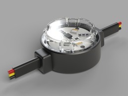
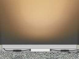
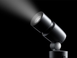
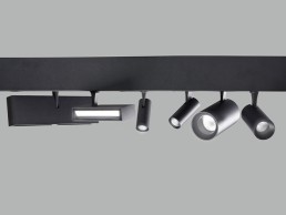
Rigid Optico is a range of high-powered optical fixtures for exterior façade grazing and wall washing. This innovative range from LEDFlex is the perfect solution for exterior architecture and façade lighting. Categorised by width: 36mm, 40mm, 54mm and a pixel solution, each fixture offers different beam angles, colour temperatures and voltages. All fixtures are available in a variety of colours. This range offers versatility and lighting results of the highest quality.
Hacel Xcel
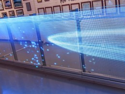
Hacel’s new Xcel recessed downlighter is minimal in size, but powerful in performance. Available in a choice of four and seven cells, with Lumen outputs of 2069lm and Efficacies up to 116lm/W, the luminaire features a discreet bezel, injection moulded cells and integrated lens construction. Designed and manufactured in the UK by Hacel, Xcel offers ideal accent lighting, suitable for offices, lobbies, museums and galleries.
Intra Lighting Issa
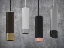
Issa is an opal tube that shines along its entire length. One diameter and a variety of sizes allow lots of creativity in compositions. It brings a general illumination to big open spaces, staircases and halls, with a touch of elegance. Due to its smooth milky surface, it stands out even when turned off. Adjust the suspension height the way you prefer Issa to be suspended. In line, completely vertically or a little inclined.
Museum of the Future, UAE
The latest architectural marvel in Dubai’s expanding skyline, the Museum of the Future opened earlier this year. arc speaks to Buro Happold and architects Killa Design about the iconic new landmark.
In a city that is already renowned for its outlandish, extraordinary architecture, how do you add to the skyline and create something even more eye-opening? Dubai’s newly opened Museum of the Future somehow manages to do just this – a vast oculus at the top of a vibrant green hill, the building is a beacon for the future and the newest landmark for the city.
Designed by Dubai-based architects Killa Design, the museum is situated adjacent to the Emirates Tower, alongside Sheikh Zayed Road, the main spine of city. The dynamic, 77ft-tall, seven-storey museum sits atop a man-made green hill, which elevates the building in a calm and unobtrusive way above the nearby metro line, while creating a rare green space within the city.
The glimmering, futuristic upper building was envisioned to “represent humankind with all of its strength, artistry and ability to create harmony with its surroundings”, while its elliptical void represents innovation and the “unwritten future into which humanity, and the world can symbolically look towards”.
Further adding to its extraordinary design, the windows of the avant-garde façade of the grand oculus take the form of an intricately 3D-mapped poem, written in Arabic calligraphy by His Highness Sheikh Mohammed bin Rashid Al Maktoum, Vice President and Prime Minister of the UAE and Ruler of Dubai. Offering a glimpse into the museum, after dark, His Highness’ words are outlined in light, illuminating the city’s skyline through 14km of LED lighting.
Inside, the museum tells the narrative of the future through a series of interactive exhibitions, inviting people to experience technologies and trends that will shape the future of humanity. Spanning an area of 30,000sqm, the pillarless structure also represents a novel global intellectual centre; a living laboratory designed to foster a spirit of collaborative innovation to inspire new solutions to tomorrow’s greatest challenges.
One of the most complex construction projects ever attempted due to its unconventional design, sustainability goals and awe-inspiring aesthetic, the façade is comprised of stainless steel and glass, consisting of 1,024 separate, unique panels – significant in itself as each panel represents a single byte of digital information.
Shaun Killa, Design Partner at Killa Design, explained how the studio first got involved with this landmark project, and how his designs first came together: “I was invited to take part in a design competition alongside 22 competitors from around the world. I submitted two options – one was a more conventional design, and the other was more iconic. When I presented to His Excellency and all the ministers, I was told that the design for the museum won outright.
“Looking at the site, I knew that it had to be on Sheikh Zayed Road, which is the heartbeat of Dubai and highly visual for tourists and residences. But due to the size of the site, to get the area requirement for the museum, we would have to go vertically, so to lift the whole building up, we created a hill of greenery that is effectively like the earth swelling up. It ties the site directly to the metro station and knits it into the urban fabric of the city.
“The building itself is a vessel that emulates the vision of Sheikh Mohammed and his father, Sheikh Rashid, and the vision for their future generations. I wanted to come up with something that was futuristic, parametrically optimised, with a sense of dynamic movement.
“The void in the centre of the building represents the ‘unknown’ and people who seek the unknown, innovate and discover new horizons and ideas that help guide humanity towards a better future.
“Then, I wanted to contextualise the building in the region, so I used the ancient art of Arabic calligraphy as the windows to the museum, using Sheikh Mohammed’s own words about the future, regionally and globally.”
The illumination of the calligraphy windows was something that Killa sought from the early concept stages, and he explained that lighting is always a core consideration in his work: “From the very first day of the competition, I made a night rendering. I always conceptualise lighting on buildings, and I knew that we would use LED to highlight the calligraphy.”
To illuminate this unique building, Killa Design worked with Buro Happold, who provided a broad scope of engineering services across the site. Despite the architects having a clear idea and vision for the lighting of the museum, Chris Coulter, Associate at Buro Happold, explained that the lighting team wasn’t given a specific brief for the building, but instead sought to create something that would complement the architecture without drawing focus. “The thinking was ‘how do you match the iconic nature of the design, and how do you do it in a way that is not showing off?’” he said.
“The building is so iconic that subtlety is a word that is strange to use, because every little move you make in lighting the calligraphy, etc, feels very extravagant, but it was always about the visitor experience, and how you are driving this as a destination and reinforcing the underlying concept of the calligraphy without being too over the top.
“We wanted to make sure that it wasn’t too cheesy or glitzy within the context of Dubai; Dubai is not your typical quiet neighbourhood, and while there is not necessarily an expectation that you have this grandeur, much of what is in the region is elevated up to this extra level. So, for the façade, we wanted to do something that was subtle yet iconic, that would match with the design but not turn into too over the top an expression.
“I laugh about it being a subtle design, but it is what we were trying to accomplish; it’s more about being integrated with the design concept and reinforcing the architectural expression.”
Owing to the atypical form of the building, the calligraphy lighting, which is the fundamental aspect of the façade illumination, required a great deal of attention, including several mock-ups and tests, before the optimal solution was reached.
Killa recalled some of the early approaches to the exterior lighting: “I’d initially anticipated that the lights would face flush and run through the glass, and we would use dots that were sandblasted into the glass to create the effect that light was coming through the glass itself. When we made the mock-up, because of the joints some areas were shadowed, so we took the same LED and turned it 90-degrees so that it faced directly out, and then it looked great.”
Coulter concurred: “It’s a curved building, and so for any of these windows, when we tried edge lighting, we found that we’d have hot spots at the corners and dead spots as well. We wanted to keep the façade relatively smooth and not having projections off the building, which would potentially harm the view of this ovoid shape, so we instead pointed the light outwards, which would reinforce the shape of the calligraphy.
“Some people were hesitant about having this outward facing, neon-type approach, but once we thought about the context of where the building is and what it is, we feel like it fits in – it’s very forward thinking, so we hope that it continues to inspire people.”
Buro Happold’s lighting designs also extended into the interiors of the museum, as well as the surrounding landscape, where the clean, subtle approach continued. Coulter explained: “All of the interior lighting, with the exception of the exhibition lighting, was by us. On the exterior, we did the façade lighting, some of the grounds lighting, but we also worked with the landscape architects in a collaborative effort in illuminating the landscape.
“We shared the same design goal, because we wanted the building to be the star, so everything was fairly minimal outside of that, but it still becomes very inviting and as people come up to the building at night, there’s enough welcoming light, but nothing too overpowering.”
In both the landscape lighting and inside the building, one of the primary considerations for Coulter was for lighting to act as a wayfinding tool to guide visitors through the space. While the uniform lighting inside at first seems to eschew this idea, Coulter explained that through subtle details at core moments, Buro Happold was able to highlight the features of the space. “The client was very interested in the notion of how lighting helps draw you through a project, but then also trying to be as minimally invasive as possible,” he said.
“The notion of minimalism and subtlety as you look at the lobby and all of the calligraphy coves doesn’t seem to hold true, but it’s about hiding the sources and having a uniformly lit zone, and highlighting where the ticket counter is, the threshold as you go into different portions of the building, the bridge piercing through the calligraphy pieces, having the elevator core lit with very subtle, grazing wall wash, it helps you identify where you are in the building. It was this blending of a subtle approach, lighting surfaces rather than trying to conceal as many of the downlights as possible.
“We also worked with Killa Design to identify where in the embellishments of the calligraphy we could locate fixtures, how we could hide the drivers for the façade lighting, or the interior calligraphy lighting within the embellishments. It was a really detailed effort between us, the architect and the engineering team to pull it all together.”
Another unique element of the Museum of the Future is that, within its clean, sparse interiors there are no structural columns, as the entire building is held together by the exterior “skin”. This helps to make the interiors feel even more vast than they already are – although the museum is just seven storeys in height, each storey is nine metres tall, meaning that it equates to around 20 storeys in a typical building.
Such large ceilings and open spaces did offer some difficulties to Buro Happold when it came to creating this uniform feel, but it was a challenge that the team was able to work through.
“It was challenging in the belly especially, because in some of those areas there are openings cut in the floors too, to have a grand view up through the spaces,” Coulter said. “The top floor is very shallow at the end as the roof comes down to the edge, but in the middle, it is very tall, so we had to match that lighting environment across the space. There was a ceiling system that we were working with, but in some of the special spaces, the geometry is irregular, so where we could place the lighting was also irregular.
“The structure itself wasn’t a great concern though, because it is not interrupting things on the interior like it would normally. There are some areas where the structure is a very fascinating part of the building, but it’s largely hidden, and aside from the calligraphy windows is not expressed in any manner on the interior. Occasionally you’ll see revealed portions of the structure, which is quite beautiful, it’s a subtle hint of what is supporting the building.”
Following its official opening in February of this year, the Museum of the Future has been widely publicised, and is already considered the latest iconic landmark in the already impressive Dubai skyline. Indeed, the high-profile nature of the project meant that there was an underlying expectation from the get-go that this would be another jewel in the already star-studded city.
That being said, both Buro Happold and the architect have extensive experience of working on high profile projects in the region. Coulter explained that his work on the Museum of the Future was sandwiched in between the stunning Louvre Abu Dhabi, and the Sustainability Pavilion at Expo 2020.
“There was definitely a lot of pressure on the nature of the project, and it was interesting to have these iconic projects all going on at the same time. The Museum of the Future and Expo are very different though, so it was nice that we had the more upfront, outwardly visible project that is Museum of the Future versus the Expo – both had their challenges, but they were opposites in the sense of how the designs came together.”
As for Killa, he added that, while he appreciated the enormity of the project, it was imperative to ensure that the museum was designed and executed to the highest standards due to the significance of the project for Dubai and its leaders. This also included the building reachinf some of the highest standards in sustainability and conserving, recovering and generating energy.
He added: “About 19 years ago, I designed the Bahrain World Trade Centre, which was the first building in the world to integrate large scale wind turbines, which became a catalyst to sustainability in the region. I also designed the Dubai Opera House, which is greatly appreciated as a cultural addition to Dubai. But I did know that the significance of this building would be greater than both of them.”
The overwhelmingly positive response that the museum has had since its opening is also reflected in both Coulter and Killa’s feelings on the project post-completion. Coulter in particular feels the illumination of the façade calligraphy helps to elevate the building to another level.
“The lighting successfully reinforces the design, and in particular the poem that Sheikh Mohammed has written. One of the great concepts once the poem was written and the calligraphy started to take shape was to zone the lights on the façade and selectively identify words and phrases from the poem. It’s a very subtle programming that allows the building to live and breathe, and really showcase what it’s about.
“There were a lot of challenges and trying to figure out the façade detail involved a lot of work and scratching the head, figuring out how it was going to work. We’d sold everyone, including ourselves, on the need for it to be lit, and making sure that we execute that and that it looks like something we want to be proud of, and at the end of the day, it exceeds all expectations.”
Killa concluded: “Over the seven-year journey of the design and construction of the Museum of the Future, one becomes accustomed to creating something through its challenges and constant improvements with the engineers and contractors. Even within a week of its opening, we were still snagging the museum where nothing had prepared us for the literal change of experience that happened after the opening.
“But because of this journey, I didn’t prepare myself for walking in there a day after the opening ceremony when it was filled with people taking pictures, looking up and enjoying the spaces, and seeing that it’s moments in people’s lives that they remember, it influences them and educates them. That’s an amazing feeling and I think fulfils an architect’s ultimate sense of creating something significant.
“We were the custodians of the design through to where we got to, but it’s great that the museum has now been handed over to its visitors and guests, who will take away their own memories of the space.”
www.burohappold.com
www.killadesign.com
SoFi Stadium, USA
As millions around the world tuned in to watch Super Bowl 56 this February, they will have seen the incredible SoFi Stadium. Lam Partners tell arc about the lighting for this dynamic new stadium.
The showpiece of the NFL season, the Super Bowl is viewed by millions of sports fans around the world every year. This February, the Los Angeles Rams and Cincinnati Bengals competed for the sport’s top prize at the awe-inspiring SoFi Stadium in Inglewood, California – home to both the Rams and local rivals, the Los Angeles Chargers.
Originally opened in time for the 2020 season – in which games were played behind closed doors due to the Covid-19 pandemic – the 2022 Super Bowl was, for many, one of the first opportunities to see the new stadium in all its glory.
Designed by Dallas-based HKS Architects, the 70,000-seat stadium, with larger Super Bowl capacity, is the largest NFL venue to date, encompassing 3.1 million square feet of outdoor-indoor space. Dominated by a vast roof canopy, the site also includes a 2.5-acre covered plaza and 6,000-seat performance venue, providing a unique fan and entertainment experience.
Lighting for the monumental site was designed by Lam Partners, who was invited to interview for the project, to be on the team with HKS Architects. Jamie Perry, Principal at Lam Partners, told arc about the early design stages for this project: “We were one of four lighting design firms that interviewed with HKS for the project, so we were thrilled to win the commission for the public-facing areas and to be involved in such an exciting project. Our parametric modelling design process and our lighting visualisation capabilities, along with our integrated design approach helped convince the client that we were the right lighting partner for the stadium architecture and the surrounding site.
“Our scope involved all public areas of the stadium, including the concourses, concessions, building façade and roof canopy LED media display, along with the entire 60-acre site and surrounding landscape. Another lighting design firm, KGM Lighting, was part of the design team, and they handled all of the hospitality and interior VIP spaces.”
Working closely with the architects throughout the project to help bring their architectural vision to life, Perry explained that, rather than being provided with a specific brief for the lighting design, Lam Partners instead “responded to the architect’s vision”.
“It was an integral process; as the architecture developed, we worked in tandem to determine ‘what we wanted to see’, and how integrated lighting can accentuate the architectural materials, while enhancing visual comfort and creating a memorable, luminous environment. Through extensive design sessions with the architect, we worked in parallel to weave the lighting hardware into the fabric of the stadium, rather than applying lighting to a finished architectural project.
“It was very clear that the client wanted this stadium to be unlike any NFL stadium ever built, so the lighting needed to reinforce the unique architecture to help achieve that vision.”
The huge roof canopy that covers the site radiates a lighting energy from within, organically coming to life with ever-changing, dynamic lighting effects that transform the perforated metal panel façade into a theatrical, scrim-like curtain that veils the activity inside the stadium. RGBW fixtures concealed within the structure work alongside exterior ground-mounted LED floodlights to accentuate the curvature of the canopy, creating a transparency that varies from day to night and from one elevation to the other.
“The architect wanted the perforated metal shell of the roof canopy to have a ‘lantern-like’ effect, with a dynamic and organic quality, and the architectural lighting was developed to support that notion,” Perry added.
More than 1,000 fixtures are integrated into the perforated metal shell of the roof canopy, creating a sense of mystery and intrigue within the luminous façade as it rises up, revealing the stadium within. These colour-changing fixtures light the space frame structure that supports the canopy and from the exterior, visitors see the lighting on the internal structural elements through perforations in the façade. The density in these perforations changes around the canopy shell, which creates a variation in the effect as you move around the site.
With the stadium situated just four miles from LAX airport, incoming planes have prime views of SoFi and its lantern-like canopy. With this in mind, a custom, 30,000-pixel LED media mesh turns the entire roof into a video screen, transforming the fifth elevation into a media display that is invisible to the building’s visitors below. “We believe this to be the first of its kind,” Perry said. “It was an amazing technical challenge and creates a video board display visible to all planes flying overhead at night, so it’s unlike any other roof lighting that we can think of. However, it was very important to the architect that this roof lighting/video board not be visible to the patrons within the stadium bowl.
“This meant the LED media mesh needed to be applied to the outer surface of the clear ETFE roof canopy so that the lighting for the airplane passengers flying overhead didn’t alter the purity of the architecture or the lighting effects within the stadium bowl. Creating a video board on a translucent material was a challenge, but it achieves some magic and mystery as from within the stadium, you would never know the entire roof is a video display. Ultimately, the roof lighting was completely separate from the lighting approach for the rest of the stadium.”
While the stadium’s proximity to LAX meant that there was more scope for unique opportunities on the building roof, it also affected the wider architectural approach of the stadium. “The stadium’s proximity to LAX and the FAA height restrictions on buildings within the flight path meant that the playing field was recessed 100ft below grade level of the surrounding site and the stadium bowl rises up from there. This created unique opportunities for the site to flow into the stadium and underneath the roof canopy, allowing for the project to blur the lines between indoor and outdoor spaces. This meant that some of the site lighting and landscape design became an integral part of the stadium experience.”
With this in mind, the project features a blend of dynamic, theatrical lighting effects, combined with more traditional architectural lighting components, with manufacturers involved across all aspects of the site including Lumenpulse, Erco, Gotham Lighting, HK Lighting, Selux, Musco Sports Lighting and SACO Technologies.
Perry explained how the lighting designers balanced the various lighting effects into one coherent scheme: “There are moments where the architectural lighting really recedes into the background, and other times where the dynamic quality of the architectural lighting is as much about the overall visual experience of the stadium as the field-specific theatrics are.
“Again, this required close collaboration with the architect, electrical engineer, and all other disciplines to achieve this in a fluid manner. Significant time was spent later in the design process to review ‘Modes of Operation’ with the ownership group, and then working with the electrical engineer to assure that this desired functionality was incorporated into the logic of the control system.”
The stadium’s position 100ft below grade level, and its location in California, also meant that seismic activity was a serious consideration for Lam Partners – a consideration that brought with it some significant structural challenges unlike any project Perry had ever worked on before.
“There are two examples of how this impacted the lighting design and fixture placement: Originally, the large columns that support the roof canopy were going to be lit from the top down, but the structural needs in how the roof would move on isolators at the top of the columns meant that our fixtures would have been crushed at those locations based on how much movement was designed into the structure. This resulted in a revised lighting concept to uplight the large structural columns from ground-recessed fixtures, but we got the added benefit of this uplight also washing the underside of the roof canopy, bouncing light back down to the concourse below.
“There is also significant seismic bracing that runs underground in all directions from each of the large roof canopy columns; not something that usually impacts the lighting design, however there were so many fixtures intended to light the landscape and the roof canopy soffit that were designed to be recessed into the ground to conceal them from typical pedestrian view that extensive coordination was required between the lighting team, the landscape architects and the structural consultant in order to achieve the desired effects with ground recessed real estate being so tightly constrained – not something that comes into play in most of our projects.”
Despite this, Perry added that the largest challenges that Lam Partners faced on the project came a lot earlier on in the design journey. “The condensed design schedule for a project of this size, along with the architectural complexity, were both extreme challenges on our design process and lighting visualisation during the design phases,” he said.
“The fluidity in the design process of the roof canopy and structure meant we had to model and render our lighting concepts and design at incredible speed. Ultimately, we exceeded our computer model rendering capability at the time. This resulted in our computational analysis and parametric modelling team constructing a few different, internal GPU render servers that allowed us to model all this complex geometry and lighting with actual photometrics in real time. This project helped push our internal processes, technologies, and capabilities to a new level.”
Although the scale of the project and accelerated design schedule meant that Lam’s design team was much larger than on typical projects, Perry explained that the overall approach was still the same: “We had to help the client’s vision and the architecture shine in a way that every project deserves to.”
That being said, he added that there was an added pressure, given the high-profile nature of the project: “Knowing very early on that this project was going to get plenty of TV coverage for Sunday Night Football games, the Super Bowl, and ultimately as part of the Olympics in the future, it would be dishonest if I said that there wasn’t an added level of stress and pressure applied to this project that I hadn’t personally experienced on a project before.
“We want every project to be seen as a success in our clients’ eyes, but it is not often that we understand during the design process how many people from around the world were going to experience this stadium in person and see it on TV. I may have aged a few additional years during this project.”
He continued that, while Lam Partners has worked on many large projects, SoFi Stadium is one of the most visible. “It was certainly one of the largest projects that we had worked on at the time and without question a much more visible project than others we had done. We work closely with our clients to craft beautiful luminous environments for people to live, work and play in, and I think that’s what motivates our designers on each and every project. But seeing your project host a Super Bowl and get prominent TV exposure is certainly rewarding and adds some depth to how proud I am of our entire team that helped make this project a success.”
Although the stadium hosted games in 2020, fans were able to visit for the first time during the 2021 season, which culminated in the Super Bowl this February. Because of this delayed opening to the public, Perry feels that only now is the stadium getting the attention and recognition that it deserves.
“The first time we watched the stadium on Sunday Night Football in 2020, there was a huge sense of accomplishment, but it did feel like it wasn’t fully finished yet,” he said. “Seeing the stadium full of fans on a game day during this past season, and obviously hosting the Super Bowl; it finally felt like the seven years of hard work had paid off, knowing how many people will get to experience this great venue.”
Now that the stadium is finally open to the world, Perry can look back on what was ultimately a very successful project. He concluded: “It’s amazing to look back at our computer model renderings and design studies and see how closely they resemble the finished built stadium. You can’t have good lighting without good architecture, and HKS awarded us the opportunity to be part of this monumental project.
“I feel like the lighting helps bring the stadium to life and transforms the project at night from a great architectural achievement to a wonderful visual experience that you won’t soon forget. The lighting reinforces the curvature and sweeping forms of the building, the transparency of the façade and the overall stadium experience.
“Our job is not to create memorable lighting, but to help our clients create amazing places that people enjoy being in and want to come back to, and I think in working with HKS, we’ve done that at SoFi. The scale of the project and the visual experience cannot be comprehended until you visit the stadium in person, so I encourage everyone to find an event that they want to attend at SoFi and go to see it first-hand.”
House of Wisdom, UAE
Lighting designers at Delta Lighting Design have created a subtle, yet complementary lighting scheme for the new House of Wisdom in Sharjah, UAE that accentuates the beautiful architecture of Foster + Partners, while giving the building a glowing impression.
Designed by Foster + Partners, the House of Wisdom in Sharjah, UAE, was created with the bold ambition of reimagining the role of libraries in the communities of the future.
Seen by many as archaic, old-fashioned institutions, the goal for the House of Wisdom was to revitalise the concept of the library, creating a high-tech cultural centre that would become a social hub alongside its role as a repository for books and periodicals, where guests could come in search of knowledge and exchange of ideas.
Situated adjacent to Sharjah airport, ten kilometres from the city centre, the two-storey building was designed to “embody a sense of clarity and lightness”, with a huge, floating roof cantilevering on all sides of a transparent, rectilinear volume. The 15-metre-wide overhang shades the façades throughout the day, and further accentuates the building’s glowing form after dark.
To help enhance this effect, Foster + Partners worked with Delta Lighting Design to develop an innovative lighting concept for the building. Intended to support the fundamental layer of transparency, the aim was that this would help to inspire future generations.
Ziad Fattouh, Director of Delta Lighting Design, explained further the lighting concept for the building: “The initial brief from Foster + Partners provided a vision for the project, and in this case the inspiration was taken from the design of some of the Apple stores that they had done, which also consisted of large, clear, glass façades.
“Naturally due to the façades being made of glass, we planned on illuminating key internal architectural elements that would in turn form a big part of the external scheme. Aesthetically, we wanted the building’s iconic architecture to be well captured, and wanted it to be as beautiful during the night as it was in the day.
“Our concept aimed to balance the interior lighting against the exterior illumination. The exterior shell would feel solid during the day and early hours of the evening, with the external lighting dominating the scene. The building would then transform and become much more transparent at night.”
Artificial lighting has been designed to bring out the depth of the architectural composition of the building, revealing its core and its timeless nature. This is done very subtly, in harmony with the transitioning daylight. To create this “chameleonic impression”, Fattouh explained that Delta Lighting Design used four core lighting effects that “form the primary lighting for the building”.
“These include the lighting of the book stacks, core walls, the downlighting – which is the main source of ambient lighting – and finally an exterior light source, that washes the canopy,” he said.
“These four sources run on a scene set with the interior lighting being strongly dimmed during the day, and gradually increasing in intensity during night time operating hours, and then dimming down again to about 5% during the later hours of the night. This serves to reduce energy consumption, as well as creating the changing impressions of the building.
“During the day and early hours of the evening, onlookers don’t see any of the building’s interiors and instead see a very dominant solid exterior. This slowly transforms and the interior lighting begins to increase in intensity and the interior starts to reveal itself. As the night sky becomes darker and the interior lighting goes to full intensity, the building becomes very light and transparent, and its inner core is revealed. Finally, as the last scene of the night happens, the interiors become dimmed again, reducing transparency and bringing attention to the exterior façade.”
A uniform wash of light to the four core pillars links the vast roof to the floor, the sky to the ground. Externally, a carefully selected narrow beam, inground mounted linear light runs beneath the cantilevered roof and provides a soft, uniform illumination to the 13-metre-wide canopy, while subtly grazing the metallic gold screen surrounding the façade. The glass façade – the physical boundary between inside and outside – melts under the power of light, and disappears from visual perception, revealing the core structure of the building. These lighting effects are organised in layers and, through carefully balanced light scenes, create a sense of depth, contrast, drama and orientation for the visitors of the library.
When the light levels to the underside of the roof are kept intentionally lower than the internal lighting, it provides the building with a strong horizontal cap, without drawing attention from the core of the building. Instead, as Fattouh explained, it serves to pull visitors inside.
“We didn’t want the canopy to dominate how we perceived the building from the outside,” he said. “We wanted it to be understood, but the intent was to keep the lighting subdued in order to draw the onlookers’ focus into the building and create interest. When you look at the core walls, as well as lighting on the book stacks, which run along the entire elevations, you become intrigued and interested to understand what this building holds inside.”
When illuminated, the vast volume glows from within; lifted from the ground, it appears to float weightless, drawing its grace and harmony from the very tension of the architecture. “Our design team in London, headed by Director Mohamed Medani, ran calculations on Dialux Evo, and were sure that the lighting would be very uniform and that you wouldn’t be able to distinguish from each fitting,” Fattouh explained. “They also designed the light on the canopy to be stronger towards the first 50% of the canopy, and to fade away quickly the further you got from the building. This created the impression that the internal lighting was spilling out onto the canopy.”
Medani continued: “A delicate balance was crafted out of the building composition with an aim of pronouncing the architectural anatomy of the structure, and also to achieve the main design intent, which is the glow from within. The factors dictated a strong lighting effect on the cores to serve the purpose of pronouncing the architecture and subtle soft treatment to the canopy, as this is the area where the inner glow should start to fade out to blend with the exterior environment.”
Another key component of the glowing appearance was the careful, seamless integration of fixtures within the fabric of the building. Medani further explained how this approach was achieved, both internally as well as externally: “Seamless integration within architecture was an important element in the design approach – this is reflected in the lighting approach in general and specifically in the helical stairs where the lighting was provided with flexible LED strips concealed at the edges of the stairwell; the integration of downlights within the services channels in the ceiling to provide general lighting; the integration of LED profiles within the bookshelves, which was coordinated with the shelf design at an early stage of the project; and also the integration of grazing LED profiles around the four core walls. This approach successfully provided a cohesive lighting integration within the architecture.”
Throughout the course of the project, Fattouh explained that Foster + Partners remained very hands-on, working with all consultants to get the best results for the project. He said: “Foster + Partners were involved in all aspects of the design, and of course had their vision. We were heavily involved with Senior Partner John Blythe on the design stages, and then with their partner in Dubai, Dara Towhidi on the later stages of design and supervision. They are meticulous and will look at every single lighting design detail.
“Having said that, they get the best specialists on board and expect to get strong, creative, out of the box thinking from their subconsultants. This collaborative approach to design works best, and is one of the reasons that Foster + Partners are so successful.”
Looking back on the project, both Fattouh and Medani are incredibly satisfied with the finished work, happy that the actualised lighting design is as intended. Medani said: “We believe the design delivers the main intent and key vision of the building, which is light from within.
“The building appears like a lantern from an exterior point of view, which attracts observers to visit and explore. The lighting approach was successful in creating a welcoming and comfortable experience for building users to enjoy the different spaces of the building.”
Fattouh added that the opportunity to work on such a striking piece of architecture, with as renowned an architecture firm as Foster + Partners, made Delta Lighting Design’s task easier.
“Working on the lighting design of striking buildings makes our work easier, because you don’t need to come out with magical light effects to make the building more interesting. Simple lighting effects that are well executed and balanced help enhance and show the building for what it is.”
He concluded: “Working with firms such as Foster + Partners is challenging, yet rewarding. I really enjoy the design process when you are working with other designers that really know what they are doing. They will challenge the design at every turn, which in the end is what is needed to create something special.”
Falkirk Wheel Experience, UK
One of the most iconic pieces of engineering and architecture in Scotland, the Falkirk Wheel is the only rotating boat lift in the world. To celebrate this remarkable piece of infrastructure, Lightalliance has created a dynamic, vibrant lighting scheme for the Falkirk Wheel Experience.
Connecting the Forth and Clyde Canal with the Union Canal in central Scotland, the Falkirk Wheel is an engineering marvel unlike any other.
Originally opened in 2002 as part of the Millennium Link project, the rotating boat lift is the only one of its kind in the world, and reconnects the two waterways for the first time since the 1930s, raising boats by 79ft in one fluid motion. The design of the wheel was a co-operative effort between the British Waterways Board, Arup, Butterley Engineering, and RMJM architects. Inspirations for the design included a double-headed Celtic axe, the propellor of a ship, and the ribcage of a whale.
Since its opening, the Falkirk Wheel has become one of the defining monuments of Scotland, appearing on a series of £50 notes issued by the Bank of Scotland; the Royal Fine Art Commission for Scotland has also described it as “a form of contemporary sculpture”.
To celebrate this unique structure, Scottish Canals wanted to upgrade the Wheel and surrounding site, to improve their asset, providing enhanced functionalities, and promoting increased visitor interactions.
Edinburgh-based Lightalliance was called upon to design a scheme that would accentuate the engineering and design, celebrate the unique forms of the structure and enhance its presence within the landscape.
Kevin Grant, Founder and Director of Lightalliance, explained how the studio first got involved in the project: “We were asked if we would be interested in lighting the wheel, and informed that the opportunity would be listed on a Public Contracts portal. When we saw the brief, their targeted aspirations, timescales, and budgets all seemed very challenging – especially given how busy we were at the time. However, it’s such an iconic structure, and we saw the potential to have some fun with the site and add value, so were keen to get involved.
“We submitted a proposal with our own proposed strategy, highlighting our observations, anticipated risks and identifying some exciting opportunities, and were lucky enough to win the commission.”
Grant continued that the brief was “quite detailed and demanding”, with the client team providing several performance indicators to measure the success of the project. From here, he said that it was clear that the client wanted the project to “create a big impact, improve the value of this unique asset and also improve the visitor experience”.
He continued: “The lighting was to be discrete and sympathetic to the structure, environmentally conscious, with reduced energy, reduced light spill, and was to be delivered for a specific budget within very short timescales. There was also a desire to provide a future-proofed design, good controllability, to promote increased visitor numbers and more exposure (both physically and online).
“We are used to working on some very large and complex sites, and so we planned out these works using a similar approach, to ensure that we could deliver all of the brief requirements. We were keen to deliver enhanced value by addressing the brief, but also exploring more dynamic and immersive opportunities and potential offshoots that could be incorporated now, or introduced later to add real value to the site.”
Using the unique design of the wheel as a starting point, Lightalliance developed a lighting concept that transformed the structure into a beacon that would “enhance the sense of arrival and help extend the use of the site during the winter months and after dark, whilst maintaining the overall impact and composition”.
“Our aim was to improve the experience for the users and visitors,” Grant explained. “We explored opportunities to celebrate the organic flowing forms of the structure, by being able to visually separate each of the component parts – the wheel face, spindle, gondolas, aqueduct supports, hoops and also the tunnel – in ways that could relate to each other and also overlay different textures, patterns, effects, and sequences.”
It was also important, that the designs would provide flexibility, but also be very intuitive and easy to operate. Lightalliance worked with Adlib to develop a bespoke and tailored control system. Their focus was on providing a fully automatic and autonomous asset, with opportunities to extend the use of the site past operational hours, enhancing the seasonal events programme, and providing ability to interact with and support local/international light-up events, or branded commercialisation opportunities.
“Projection mapping products aren’t always affordable for smaller facilities, and a permanent video projection installation would have been prohibitively expensive,” Grant continued. “Therefore, a compromise of individually controllable DMX luminaires and image projectors were used to create opportunities for big visual impact within the budget available. We used a combination of RGBAW LED DMX controlled products, provided by Studio Due, and two Exterior 1000 image projectors from Martin Professional, and all components were installed by Adlib.
“Effective and reliable control was essential, so we could synchronise the fixtures to deliver dynamic effects and complex sequences. The bespoke front-end lighting controls interface developed by Adlib was based around the ETC EOS system to provide a great balance of flexibility, portability, and automation. Each light or projector, and each of the Wheel’s structural components, can be controlled in isolation, creating a dynamic canvas for different colour combinations, effects, or show sequences.”
The lighting designs take inspiration from the architectural forms and surrounding environment, using a combination of static and dynamic scenes, with rotating overlays to convey the movement of the wheel.
Lightalliance modelled all of the lighting layers, providing test calculations and simulation renders to review the lit appearance and intensity of each individual element. This allowed the team to review, refine, and optimise the lighting and layouts before any equipment was installed.
“This process helped to refine the specification details, which were then trialled on site before ordering, to ensure that all equipment was ordered correctly and no time was wasted, given the restricted timescales available for on-site works,” Grant added.
It was important for the lighting components to be as small and discrete as possible, to minimise the daytime appearance, but powerful enough to deliver useful light, and a rich palette of colours. All luminaires needed to be robust and suited to use in an exposed canal-side environment, especially those on the elevated aqueduct areas that can be exposed to some very extreme weather conditions. The luminaires were all provided with marine-grade corrosion resistant treatments, and a range of accessories to ensure good optical control.
Sensors were introduced further along the canal to provide added automation: “We wanted to introduce enhanced capabilities and new immersive experiences for the visitors to the site during the day and after dark,” Grant explained. “The 180-metre long Roughcastle Tunnel links the Union Canal onto the aqueduct, providing a dramatic moment along the canal network. Naturally a dark space, the tunnel provides a truly immersive experience with dynamic and responsive lighting.
“The default ‘resting’ scene is deliberately subdued, with every second luminaire on the towpath side dimmed to around 20% and only white light; when a person approaches (by boat, foot or cycle), a vibrant wash of colour ripples across the full length of the tunnel in a rhythm that connects visually with the ribcage structure of the hoops further along the aqueduct.”
Tailored content has been curated and light/projection content is regenerative, within given parameters, to create unique images throughout the year. The design allows Lightalliance to frame and isolate each of the components to showcase this magnificent structure. “A nightly 30-minute show sequence animation, evolves and adapts to suit the time of year, theme, or occasion. Tailored content and show sequences can also be generated for specific events, increasing potential revenue streams and commercialisation opportunities. The control system allows for easy selection of any colour or combination of colours, onto any fixture, or surface.”
A key goal for the new lighting scheme was to minimise the impact on the local wildlife by reducing light spill to the surrounding environment. While reducing light spill was one particular area of focus for the design team, there was an overriding desire to be as environmentally minded and sustainable as possible. Grant explained further the measures taken to reduce the environmental impact of the lighting: “We wanted to create a more dynamic experience, but in more sustainable ways. This meant ensuring that the design minimised any negative impact on the surrounding areas, the neighbours and to wildlife, and helped to reduce the carbon footprint as much as was possible.
“Several of the luminaire types and projectors and are provided with glare shields, sculpture lenses and physical framing masks to reduce and minimise light spill. Some of the fixtures are also pre-set with top-set output values to reduce the light output and associated energy consumption. The new lighting scenes and sequences all use much less energy than the previous strategy of creating colours using gels and filters – the total wattage to illuminate the Wheel Experience is only 4.6kW, versus the original 13.6kW target, and was designed in compliance with BREEAM ENE 03 External Lighting Energy Efficient Luminaires.”
Despite the added challenges of the global pandemic, lockdown restrictions, new Brexit legislations and difficult weather conditions, the Falkirk Wheel Experience was designed and installed on budget within a very short timescale over the winter months. Since completion, the project has received a great deal of positive feedback from both the client and visitors – something that Grant is incredibly pleased about.
“It’s been amazing to see, and hear, the reactions of the visitors when the tunnel lighting appears, or when animated effects happen as they approach,” he said.
“The design exceeds all the performance indicators proposed in the original briefing pack. The client team is very happy with the new Falkirk Wheel Experience, and when our clients are happy, that makes us happy. The project has received some great feedback from visitors to the site, with lots of coverage online, on social media and TV. It’s been fantastic to see it get so much positive exposure and receive recognition among so many other great projects and design initiatives.
“We really enjoyed working on the project and are excited about the possibilities to evolve and enhance the events programme further during the darker winter months. Hopefully the Falkirk Wheel is now back where it belongs as a global icon, by day and by night.”
Riyadh Midtown Mall, Saudi Arabia
The new Midtown Mall, in the Saudi Arabian capital of Riyadh, features a dynamic, multifaceted faÇade and landscape lighting concept, created by Nulty.
Located on one Riyadh’s busiest thoroughfares, the Midtown Mall development was designed by global architecture firm Benoy, and comprises a series of interconnected retail and restaurant units.
With a sweeping restaurant frontage forming an integral part of the design, demarking the area as a vibrant destination that comes to life, lighting designers at Nulty worked closely with the architects to create a façade and landscape lighting concept for the commercial hub.
The goal for Nulty was to integrate the lighting design within the overall architectural vision for the project; light has been designed to work on both an emotional and aesthetic level, creating an immersive experience while bringing contrast and drama to the façade and landscape as a whole.
Nulty used three different lighting techniques across the façade to establish a clear visual hierarchy: each of the ceilings on the triple-floor frontage features an illuminated panel with a distinctive perforated finish. Here, the team used a cool colour temperature to provide high-level illumination, which frames each level of the exterior and reveals the textural detail of the perforated surface. Across the middle of each façade, a continuous line of cove lighting washes the lower walls with warm light and creates the illusion of a sweeping band of gold, which connects all of the individual restaurants.
The architectural form of the exterior was then given a third layer of contrast through a series of illuminated timber fins that travel across the entire expanse of the restaurant area. Inspired by Riyadh’s sandstone desert landscape, this flowing wave of light features concealed luminaires that emit light upwards and downwards to enhance the contours and tones of the structure. The overall effect is organic in its feel and creates a sense of movement throughout the space.
At a lower level, landscape illumination works throughout the mall district to mark out key features and assist with wayfinding. Uplights in planting and integrated lighting within decorative water features add a touch of theatricality, while linear lines of light serve to illuminate steps and highlight seating areas in planters.
Ahmed Saliem, Projects Director at Nulty, said of the project: “The lighting scheme for Mid Town Mall demonstrates how when the lighting design works cohesively with the architecture, we can enhance the way people perceive and experience an urban environment. Our lighting concept uses contrasting light levels to enrich the visual composition of the façade and add pattern, playfulness and character to the scheme.”
Dipali Shirsat
arc talks to recent Silhouette Awards winner Dipali Shirsat about her fascinating research into multi-sensory design, and how lighting designers can create more inclusive environments for the visually impaired.
It goes without saying that light is inherently a visual medium and that by harnessing it, designers can create beautiful, inspiring, and moving scenes. But how does lighting fit into a wider, multi-sensory approach to design? What can lighting designers do in their work to create more inclusive spaces, particularly for the visually impaired?
This is the core focus for Dubai-based, Indian lighting designer Dipali Shirsat. A recent graduate from KTH in Stockholm, Shirsat’s Master’s thesis was centred on how we experience the public realm, and how through their work, designers can redefine these spaces to make them altogether more inclusive.
“The idea of doing a thesis on multisensory design came after listening to the TED Talk – Design with the Blind in Mind, by architect Chris Downey,” Shirsat told arc. “The core idea of the thesis was emphasising how ‘disability’ is a term often misused, and that people are not disabled; the spaces are. The disabled spaces are limiting so many people to get the true experience of a city, and also limiting a majority of them indoors. The research therefore talked about how an ‘image of a city’ is defined by our experience of the spaces around it, and how we as designers can help to redefine it by designing spaces that are inclusive.”
The idea of redefining and redesigning spaces has been a constant for Shirsat ever since she first discovered the world of design. She explained: “I was in the process of choosing which professional career path to go down, between medical and design. My art teacher, Bhiva Punekar was a great artist, and he gifted me a book on the life and work of the architect Laurie Baker. Just as how a small child would be fascinated when discovering something new for the first time, I remember sitting intrigued and stunned at how architecture and light can create a beautiful world.
“After reading the book, I could not stop my imagination, and would think about recreating and designing spaces that would leave oneself spellbound. Unknowingly, light had created a huge impact on my mind as an architect, and it was along this architecture journey that I started developing more interest in light and becoming more aware of it.”
Shirsat went on to study Architecture at Mumbai University in India, and she explained that during her studies, she was heavily influenced by the organic architecture and deconstructivism style of breaking the picture-perfect ideology and designing experiences that are raw and true to the space. “I never designed spaces or put forward design proposals that depicted strong geometry or right-angles,” she said.
Following her graduation, Shirsat got a job as a lighting designer at Indian practice Lighting Dimensions Studio, with a curiosity to learn more about lighting. “In the process of learning and getting to know more about the profession, I came across James Turrell’s work and was completely mesmerised by it. It felt magical and surreal,” she said.
“I only had a very brief idea of lighting until then, but when I realised and became aware of how lighting can affect not just spaces, but also how deeply it can affect human psychology and how we feel in a particular space, I knew that I had to continue practicing as a lighting designer.
“Designing comes naturally to me, and I always knew that I would be a designer, whether it be architecture, lighting, or something else. I developed myself as a holistic designer over time as I believe the roots of designing are the same, it’s just the medium of expression that is different.
“The name Dipali means ‘light’ and is derived from ‘Diwali’, which is the festival of lights in India. So, when people ask me ‘why lighting?’, I say that it is part of my identity – I was destined to be a lighting designer!”
After this realisation, like many burgeoning lighting designers Shirsat enrolled in the Architectural Lighting Design Master’s programme at KTH in Stockholm, moving to the Swedish capital in 2018. “Moving to Sweden, I was surprised to see the lack of sufficient daylighting conditions, and how people cope with it,” she said. “Coming from a place with abundant daylight, I never realised the true importance of it until I moved to Sweden.
“The different cultural and geographical experiences coupled with the research-oriented studies at KTH made me rethink my design ideologies and was imperative in developing my own research, which is based on universal design thinking.”
It was here that Shirsat delved deeper into the notion of multisensory, inclusive design, and where she began work on her thesis on the subject. In her thesis, Shirsat explained that people with visual impairments were considered as “prototypical city dwellers”, and how by understanding their needs of navigation, designers can develop an approach that looks not just for their safety, but helps them engage in outdoor spaces and enhances their nighttime experiences.
“The change in designing and building such inclusive spaces starts with change in the perception and approach of designers, for which the research outlines a very important social experiment,” Shirsat said. “The ‘blind-fold experiment’, as we called it, was so designers could get first-hand experience and understanding of the limiting factors of a space, and how these can be further used to design inclusive spaces.”
The research put forward a holistic, four-point design module for designing outdoor spaces to make them more multi-sensory. The module was put forward by Shirsat as a starting point to designing multi-sensory experiences, and how non-visual triggers of a space can be enhanced with lighting to remove the visual bias of a design.
“The four-point module gives a step-by-step guide on improving the lighting conditions in the public realm,” Shirsat explained. “The first two points of the module are focused on understanding the user needs, limitations, and doing site analysis based on the ‘human dimensions of the public space’. The third part of the module focuses on carrying social experiments that help in understanding the visual and non-visual triggers of a particular space.
“The fourth point of the module is about applying lighting techniques based on the data generated from the first three points, and particularly on enhancing the non-visual triggers through appropriate lighting. The main element to consider while doing this is the relationship between the different aspects of lighting , such as value and luminance, to primarily enhance the tactile contrast in a space, but also to look at how different lighting techniques can be applied to strengthen the non-visual sensory triggers that activate the dynamism of the space and enhance social interaction.”
Since graduating from KTH in 2020, Shirsat has relocated to Dubai, where she works as a lighting designer at neolight global. However, she continues to expand on her thesis, and is looking to continue with her research into the subject of multisensory design.
“The thesis is just a starting point to what the actual research can develop into,” she said. “I have planned on taking the research forward and doing the social experiment in different parts of the world, gaining insights into how cultural and geographical diversity affect the design thinking.
“Especially after the pandemic, when people are deprived of touch, how are the visually impaired experiencing spaces, when one of their strongest attributes of sensing spaces is taken away? The research has totally changed my design perspective and outlook on many aspects of lighting, which I never considered in designing before. It’s now always a deliberate attempt to think of the four-point module while developing any concepts for projects.”
Shirsat is also hopeful that, with the continuation of her research and the expansion of the four-point module, more designers will begin to consider how their work will impact those with visual impairments. She continued: “I believe in general the design industry has overlooked or restricted the aspect of disability and inclusiveness to only talking about the safety of people, which is of course the priority. But what about their experiences of a city, which is much more than offering safety and allowing for social interaction?
“The very basis of appreciating any work of a lighting designer is first through your visual sense, so what happens when that base is challenged? I found this topic to be interesting; to re-evaluate and rethink the design ideologies that are not sensory-based. As per statistics, more than a quarter of the world’s population experiences some form of visual impairment, and that number is expected to triple by 2050, which is an alarming issue. If we act now and implement inclusiveness in design practice, the future will be much safer and equally more enjoyable place for all.”
Shirsat’s wish to create lighting that makes a difference to the wider public is something that has been with her since she first entered into the world of lighting design. She continued: “The only thing I knew was I have to stay true to my craft and be a responsible designer.
“Inspired by James Turrell, Olafur Eliasson and Daan Roosegaarde, I hoped to bring a small but impactful change in the design field. These are big names in the industry, but what they all have in common is they represent ideas and possibilities, something I wish to represent one day as well. I hope to bring about that change with my research on lighting and disabled spaces.
“I believe that if you are passionate and have got something to say and contribute to the industry, you will eventually get recognised. I thrive on creativity and collaborating with creative minds. Whether it be social engagement through Women in Lighting, the Lighting Police project, or my own research, I’ve been connected with so many creative minds that have helped me grow and stand out.”
On Women in Lighting, Shirsat has been heavily involved in the project, running the R.A.W blog alongside Martina Frattura. But while she has been a keen contributor to the project, she said that she has always felt supported by men and women alike in the industry.
“I have been very fortunate to have equal support from the men in this industry – be it my professors from KTH, Federico Favero and Rodrigo Muro; my previous work colleague Gary Thornton, who has been very supportive of my research; to now being mentored by David Gilbey. I feel the men in this industry have really supported me and I have learnt so much from them,” she said.
“Women in Lighting has been imperative in my journey also. The R.A.W blogs have been a successful collaboration with Martina, and it’s good to know that they have generated discussions in various lighting groups. I have connected with so many talented designers from across the industry through this project, and got more opportunities to collaborate with them properly, be it working with Katia [Kolovea] on The Lighting Police, or now collaborating with David Gilbey through the Silhouette Awards mentorship programme.”
The collaboration with Gilbey comes as part of the newly created Silhouette Awards, for which Shirsat was recognised earlier this year. The awards were created to recognise young talent in the lighting industry, and to pair them with experienced mentors who can help to guide them through the beginnings of their careers.
Two months on from her recognition at the awards, Shirsat updated us on how the mentorship is going: “The first award is always special, and the Silhouette Awards is much more than just getting recognition, it has given me a mentor for life. It’s a unique concept, and especially for the young designers it’s such a great opportunity to explore their journey under the guidance of esteemed and highly experienced designers from the industry.
“Partnering up with David was one of the best things that has happened. I have known David through professional networks and being connected with him through the Lighting Police project. With the kind of industry experience and expertise he has, there is so much to learn from him not only in terms of design, but also the kind of passion he has is rare.
“David is already helping me in gaining good understanding of the business side, helping me with my research, and making sure that I get help from the right people in the industry. This is just the beginning and moving forward, I hope to collaborate with him on many exciting opportunities, be it design or doing conferences together.”
With that in mind, Shirsat already has her eyes set on the future, and is hopeful of the new opportunities that both her research, and her new mentorship, will bring. She concluded: “I always go with the flow and allow myself to be open to any interesting opportunity that might come my way.
“For now, I am focusing on this exciting journey ahead with David and the Silhouette team, and making the most out of this collaboration. I am hopeful that this journey will take me to something more interesting ahead – that’s the plan!”
The R.A.W blog can be found on the Women in Lighting website.
Maha Shalaby & Isabel Villar
Since its first episode aired in July 2020, the Sustainable Lighting Design podcast has reached more than 2,000 listeners around the world. arc chats with hosts Maha Shalaby and Isabel Villar on the success of the series.
What is the podcast about?
We started the Sustainable Lighting Design Podcast in July 2020 as part of a research-in-practice project on sustainability and health and wellbeing in the lighting design process. In each episode we invite a guest to focus on a different aspect of how light and lighting design, through daylight and electric lighting, have an impact on us and our environment, for example by analysing their impact on energy efficiency, wellbeing, light pollution and circularity. We host researchers and practitioners aiming to spread their knowledge to a broader audience, and hope that the conversations help the lighting design community to close the gap between the research and practice worlds.
How was the podcast formed?
Initially we had the idea of interviewing researchers and people working with some of the aspects mentioned above and then publish these together with the final report of our research. But shortly after we started our project, we realised that it was going to take time to get these interviews published and therefore we needed to find a more rapid and agile way to share them, to ideally challenge the way we work now, and not in a couple of years. That, together with the start of pandemic, made us think that having a podcast would be a good idea.
Why did you decide to produce a podcast?
We thought that there were not so many podcasts on sustainability in lighting design, and that during the pandemic it would be the perfect format to listen to while working from home, without the need to pay visual attention. We also saw that digital presentations often take a long time for guests to prepare, and follow a very strict flow, while in the podcast one could interact more with the guest and be more spontaneous. All guests have been very positive about their episodes, and we think that part of the success is of course, their high competence in each subject, but also that they were more relaxed and spontaneous along the session.
Can you tell us more about the research-in-practice project?
We got the idea after working on a project that focused on different issues related to sustainability and wellbeing. We saw the lack of methods and processes that combine the work that a sustainability specialist and a lighting designer do across the design process. There was a lot of discussions about sustainability but very little experience on how, in practice, we should work together and how each other’s decision along the design process impacted the end result. After that project was finalised we were hungry for more, especially for finding methods to better integrate our services, and we applied for funding from Bertil & Britt Svenssons Stiftelse in Sweden to further look into this, and we were happy to have been granted the funding. Research-in-practice is rare in our field, but so relevant, especially on two levels, first developing methods and processes to close the big gap between research and practice, and second implementing, testing and evaluating these methods in real projects.
What are your main ambitions for this series?
Our ambition is to both give a novel platform for researchers to talk about their findings and to learn what practitioners can do to create better lighting for people with the least environmental impact, but also to inspire and spread the knowledge through the lighting design community and outside it. We hope to inspire people and to give them good arguments to tackle these questions in the design process and strengthen the importance of the work we do, lifting up the importance of good lighting and how we can contribute to a more sustainable and better future.
What has the response been like?
We are over the moon with the podcast’s exposure and the feedback. To be honest we had no expectations, we did this because we believed in it, and we believed in the message that our guests wanted to share. And so far, with only seven episodes, we have more than 2,000 plays, with people listening from all over the world, USA, Sweden, Germany UK, India, Mexico, Brazil, etc.
What’s next?
After the success of the podcast, which was one part in our research project (SLD), we are now continuing to work with the other parts of the project, as we aim to publish more case studies, in addition to some development studies that we have been working on in the past year. At the moment we don’t have any new episodes planned, but we might interview new guests in a couple of months. We also have the idea of opening the podcast to others who might have a subject of interest that touches on the same themes that we address and would like to interview someone. We are open to suggestions too, and if anyone is willing to collaborate with the podcast they are more than welcome to get in touch with us.
Designers Mind: Wellbeing becoming work's partner
Continuing the discussion on employee wellbeing, Designers Mind Founder Kaye Preston explores the relationship between work and health, and how companies can provide more support to their staff.
The mental health and wellbeing of employees has never been more important. As we navigate what comes next we have a real opportunity to explore how we can optimise our physical and mental health so we can improve how we’re working.
Understanding the relationship between our health and work is paramount, as is creating a culture within organisations where employees feel their mental health and wellbeing are supported.
Wellbeing and our work
We all know our health is important, however too often it gets slotted in around a long workday, family commitments, our partners, even life admin.
Work is important, no question about it. It not only provides us with financial security but can also create purpose, connection, collaboration, creativity and confidence. Unfortunately, we often prioritise work over other areas of our lives and many times way above our wellbeing. Who hasn’t grabbed something unhealthy to eat to save time and meet a deadline, or answered emails late into the night forgoing both down time and good quality sleep? These behaviours become the norm, sacrificing our physical and mental health in the long run.
But what if I told you that improving your health can improve your work? Let’s sit with that thought for a moment.
Be honest, would this be a mindset shift or, as I imagine for many, you know this is true but still don’t make your wellbeing a top priority?
Prioritising our health can lead to improved performance, productivity, more energy, better focus, resilience and impacts our overall happiness. We could have more creativity for our projects, be better able to make crucial decisions and have more confidence in ourselves and our abilities.
I recently came across this quote that really made me think about the concept of our health and work supporting one another: “Rest is not work’s opposite, rest is work’s partner” – Alex Pang, Author and former Tech Consultant.
Could we go one step further with this and say “Wellbeing is work’s partner”?
What about organisations’ role?
I often talk about prioritising our wellbeing as a two-way street. Employees need to take responsibility for their own health and be accountable for their actions. Only they can create healthy habits and make lifestyle changes to support their own health. However, organisations need to create a culture where employee wellbeing is built into its core. The two work together.
For organisations, maintaining employee wellbeing while understanding the link between mental and physical health is key to promoting productivity. People work better when they aren’t feeling stressed, overworked, and underappreciated.
Educating your employees about healthy food and lifestyle choices, stress reduction, exercise, and ways to increase their energy will not only improve their health and overall happiness but will also allow employees to understand the true benefits that prioritising their health can have on their work and lives in general.
Creating a work culture where wellbeing is at its core with proactive and preventative measures rather than reactive solutions when problems arise has also been shown to reduce levels of absenteeism and presenteeism, increase employee morale, enhance workplace culture, attract more talented employees, reduce turnover and improve the overall employee experience.
Research from the Mental Health Foundation and The London School of Economics and Political Science (LSE) suggests that employee mental health issues alone cost the UK economy £118bn a year with almost three-quarters of the cost due to lost productivity.
A UK Survey Report by the PAM Group shows that 40% of employees see help to sustain a good work-life balance as very important for helping them to stay healthy. This form of preventative support is twice as popular as more curative solutions, with two-thirds of employees saying the wellbeing support makes them less likely to want to work elsewhere. More supported employees were also more productive and less likely to take sick leave.
Two-fifths of people also said that working for their employer has undermined their health or caused them to become sick. Meaning employers have to think about how working practices are negatively affecting their employees’ health.
Employers should create a culture of health that prioritises and values the mental health and wellbeing of its employees, where it’s integrated into operations and goals, is supported and promoted through programmes, policies, and benefits, and includes engagement from all levels.
There are steps that any employer can take to help address wellbeing in the workplace and to help ensure that people feel supported. These could include the following:
• Develop Mental Health First Aid trained ambassadors and ensure HR staff (or a nominated person) have at least some basic training to understand mental health issues.
• Offer a health benefits plan to all eligible employees that includes both physical and mental health services.
• Use the support available through employee assistance programmes (EAP).
• Addressing work/life balance issues such as out of hour emails, flexible working schedules, overtime and parental leave.
• Identify individual employees’ needs and build a supportive culture around diversity and inclusion.
Creating a culture with mental health at its core can improve employee wellbeing and morale while decreasing health-related costs. Employers can educate and support employees to make healthier lifestyle choices to improve their physical and mental wellbeing. They can also educate employees on the benefits of making time for physical health and how this can support their mental health. In return, organisations will see an increase in engagement and productivity, and a decrease in employee stress and absenteeism.
Isn’t it time we created work cultures that prioritised our mental health and wellbeing and learnt how this could support our work?
GreenLight Alliance: An Inside Look
In this issue, the GLA asked Marc Salvany, Head of Global Professional Services at Signify, to summarise the company’s policies in the direction of a Circular Economy.
To transition to a circular economy, the lighting industry needs fresh thinking on design, materials and business models.
As lighting professionals, we have an inherent appreciation of the value of light. The light that surrounds us influences the beauty and liveability of our homes, the productivity of our workplaces, the yield of our crops, and even our ability to transmit data or eradicate disease. As we demand more of our lights, so our industry grows. In 2030, there will be 35% more light points in the world than there were in 2006.
With this growth comes a duty of care. As the lighting industry has transformed, Signify has adapted our products, our processes, and our business models to the reality of the changing world around us. With the great shift to LED, we have slashed electricity consumption and its associated emissions. And through the accelerating uptake of connected systems and services, we help customers manage their use of energy resources that come with both a financial and an environmental price tag.
But all of these light points come with another associated cost: their reliance on resources and the generation of material waste. In 2021, humanity was using 1.7 times the resources our planet can sustain. Unless things change, we will require three earths to supply our needs by 2050.
At Signify, we aim to address this point through a strategic commitment to the growth of lighting for circularity – or lighting that works within the principles of the circular economy. A circular economy aims to decouple value creation from the use of resources by using those resources more effectively. Lighting for circularity changes the way we consume light to focus on the true end product – the light itself. Products are designed to be serviced, upgraded, reused, and refurbished so that the previous materials, energy, and labour inputs will last. For customers, the benefits are readily apparent: there is no need to invest in equipment, take care of management and maintenance, or commit to long term innovation paths. In many cases, we are able to offer products, systems and services that save energy, too.
Signify defines products and services as circular when they are designed to preserve value and avoid waste. This includes the following categories:
1. Serviceable luminaires (incl. 3D-printing), which are upgradable, serviceable, connectable, energy efficient, reusable and recyclable.
2. Circular components, which are exchangeable and recyclable parts, such as drivers, controls, and LED boards.
3. Intelligent systems, which monitor serviceable luminaires and enable preventive maintenance.
4. Circular services, which aims to prolong lifetime and provide customers with end-of-contract options.
In 2019, those segments comprised 16% of our global business. In 2025, we aim to double it to 32%.
How do we make our products, systems and services work for the circular economy, and how can others do the same? Harvard Business Review identified three strategies businesses can use to create a circular business model: retaining product ownership, product life extension, and design for recycling. The best combination of these strategies is dependent on considerations like the complexity involved in recovering materials, and the ease of recovering the product from customers. All three of these strategies are very much at play in Signify, with different weightings across our businesses, sectors and products.
Retaining Product Ownership
Through shifting from product to service-based goods, products can live multiples lives. In our Light as a Service (LaaS) offering, Signify makes our products available through service contracts with a typical five to ten year term. This flips our commercial offering from the nuts and bolts of the products, to the end solution. We can provide a competitive offer to customers with a zero or low upfront capital investment, take on the maintenance of the customers’ lighting, manage their lighting operations, and at the same time, ensure we continue to extract value from the products – or their components – at the end of the contract or at the end of the product’s life. In this way, we give products a useful life when customers’ lighting needs change. And by ensuring we offer our customers an integral service including both products and services through their entire life cycle and recovering them at the end, we remove uncertainty about the future of their components.
This model is particularly appealing in industries that make intensive use of light, like manufacturing, warehouses, retail or entertainment spaces. In a recent project at ArcelorMittal’s factory in Sagunto, Spain, workers had struggled with poor-quality, yellow lights that needed frequent maintenance. By switching to LED on a LaaS model, ArcelorMittal has been able to bring down energy consumption while guaranteeing a fixed lux output for the duration of the contract and ensuring that maintenance is continually carried out.
The private sector has been faster to shift to a service model, as procurement is often set up with more flexibility. However, a LaaS model is also ideal for outdoor street and road lighting, where fast maintenance and easy availability of spare parts is essential for public safety.
The growth of this service-based model gives businesses like ours extra incentive to maximise the durability and lifespan of our products, keep them well maintained, offer operations managed services, and create a cost-effective and streamlined pathway at the end of their useful life.
Product Life Extension
To contribute to a circular economy, Signify aims to create products with a long life. LEDs are a great example of a vast improvement in longevity through a technological change. In our fast-moving field, we must ensure that all of our products are durable and serviceable, but also future-proof, offering potential to be upgraded and system connected as technology moves on.
When considering lifespan, we need to also consider serviceability, and we tackle that in part through modularity in product design. By standardising and simplifying, we allow for the easy replacement of components to give products a longer functional life.
Signify’s Luma gen2 road lighting is an example of a product that is intrinsically designed for serviceability and to make use of natural resources in a much more effective and regenerative way. Every element of this multi-purpose road and urban outdoor light is designed to be easily installed, maintained and recycled to extend its useful life. First, it is made of durable materials that are easily recycled. Under the hood, all electrical components are contained within a plug and play GearFlex module to optimise and simplify maintenance and repair. Technicians can easily remove the entire module and take it to the ground for adjustments in a safe workshop environment. Maintenance instructions come built in via a Service tag QR code on every product, further enhancing the product’s serviceability. And to equip it for the future, the Luma gen2 is System ready, meaning that customers who are not quite ready to switch to smart city controls and sensors can do so at a later stage via integrated universal connectors, without wasteful and expensive replacement of equipment.
Design For Recycling
Our third strategy focuses on products and manufacturing processes that optimise recoverability of materials. In a global company operating across many product families and geographical areas, this process is complex. We therefore work with dedicated recycling partners that share our vision and goals. For example, within the EU, we participate in collective schemes for lamps and luminaires through Collection and Recycling Service Organisations (CRSOs). These CRSOs ensure sustainable financing and guarantee effective and environmentally-sound collection and recycling. In collaboration with the EU lighting industry, we’ve established a dedicated infrastructure for the collection and recycling of lamps. At the end of their life, lamps are either crushed or cut to extract components like mercury, fluorescent powder, metals and glass. The processed materials can return to the lighting industry or can be repurposed for other uses – for example, glass from processed lamps can be used for glazing, industrial or cleaning use. Through this process, we are able to re-use more than 80% of the waste collected from lamps.
A second component of design for recycling is creating products, processes and techniques that facilitate use of recycled and recyclable materials. Through our use of 3D printing as a manufacturing technique, we can locally create product components to our customers’ precise specifications. These products can be accurately designed to fit existing fittings, minimising further material replacement. They are lighter to ship, make use of fewer components, and eliminate the need for glue. At the end of their life, the polycarbonate can be shredded and made into a new design.
3D printing can be used in the smallest to the largest scale projects. At Colombia’s El Dorado airport, 3D printing allowed us to customise to the specifications of the existing lights for seamless installation, covering close to 9,000 light points within Terminals 1 and 2. This meant we could upgrade the lighting experience for airport workers and visitors while minimising disruptive and resource-heavy installation in a busy 24/7 transit hub.
3D printing also lends itself to recycled materials; for example, the Philips LED table lamp made from 24 recycled CDs, or our MS Series Projector with at least 65% recycled polycarbonate, recovered from illuminated advertising, protective hoods from machines, carports or swimming pool covers.
A transition to a circular economy will be instrumental in managing our scarce natural resources as the world’s population grows. When the lighting industry transitioned to LEDs, we showed that a shift in technology could yield a lighting solution that was not just lower in energy consumption, but superior in every way. By shifting our mindset in the way we design, consume and re-use our lights, we can address this second fundamental issue, for brighter lives and a better world.