

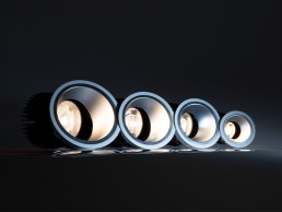
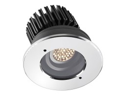
Lucent Prospex Performance
A range of high output reflector-style downlights, in fixed and accent versions, which feature locking graduated adjustment to 35 and full 358 lockable rotation.
Available in four sizes – 105, 140, 160 and 195mm diameter – with delivered lumen outputs from 1800lm to 8200lm with minimal trims and a low glare 40 cut-off with semi-specular silver reflectors. Typical applications range from residence, offices and retail for the smaller size downlight, through to shopping centres and airports for the largest version.
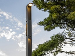
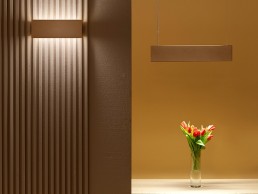
Landscape Forms Profile
The Profile family of lights creates beautiful and intentional light emanating from a refined, minimalist design. Shadows from Profile’s I-beam channels and modular column design build a light experience like no other, creating poetry between the sculptural form and the play of light upon the object and its surroundings. One product family composed of an area light, accent light, column light, and trio of bollards.
www.landscapeforms.com/lighting
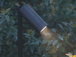
Reggiani Yori IP66
The Yori projectors family has widened with the Yori IP66 – the newest system of projects for outdoor lighting. Selected materials, IP66-rating and CRI>90 make Yori IP66 a reliable system for outdoor high-end lighting projects. Available in two different dimensions – Ø45 and Ø60 – and 10 colour finishes, its precision lenses offer quality distribution of light and smooth edge beams in line with standard Yori optics. A wide selection of accessories helps to beautifully integrate the product range into any project, from ground spikes and beam clamps to surface/pendant and wall versions.
Mawa Design seventies 70's plus contour
Creating precise lighting accents in museums: the lenses and slides of Mawa’s seventies 70’s plus contour spotlight focus light on artwork while letting it appear crisply lit from within. The seamlessly adjustable focussing lens sharply defines the artwork’s frame while the four contour slides determine the shape and size of the lighting surface. The suitability for museum use has been tested and approved by an independent research institute.
Clear Lighting Flexglo F2222
Accentuate your architectural-grade lighting with enhanced lux levels that complement the aesthetics of your space with a DMX controller that seamlessly transitions from white to RGB.
ClearTech TwinFlex and PinBoost ensure the longevity of the product’s robustness and maintenance-free features. A Combination of the silicone body and C-Mask offers protection against UV. The connector can be assembled in the factory or field, paired with InsulFit and DryWire that activate the IP68 to revolutionise a wide range of applications.
LightGraphix LD1094
LD1094 is an IP67-rated, high-power, adjustable downlight, designed for harsh exterior projects and delivering up to 755lm. It promises quick and easy on-site focusing through removal of the bezel, while installed in the mounting surface. As well as providing the ability to interchange optics, with the help of LightGraphix’s hand tool, the innovative ball joint containing the LED and optics can be rotated 360° and tilted up to 25°.
L&L Luce&Light Berica S
Berica S, the new suspended fixture from L&L Luce&Light, is defined by a minimalist design and contemporary style. Thanks to the option of elliptical optics, it’s an ideal choice for retail, offices and hospitality sectors. Available in three sizes – 620mm, 1180mm and 1740mm – and three different styles of cover – convex, concave and flat – the lamp has a double-beam output, emitting light both downards and upwards, providing a comfortable, uniform illumination. The range uses light sources with a colour temperature of 2700-4000K and a high CRI of >90.
BIO4, Denmark
Speirs Major and Gottlieb Paludan Architects have collaborated to create a wondrous façade for Copenhagen’s BIO4 biomass-fired power station.
As part of Copenhagen’s drive to become the world’s first CO2-neutral capital by 2025, local utility company HOFOR has drawn attention to its transition to sustainable energy with a bold and dynamic intervention of architecture and light at its new biomass-fired CHP power unit, BIO4.
Situated on the site of the original Amagervæket power station, the plant has undergone several upgrades since it was first constructed in 1971, eliminating the production of harmful emissions and ensuring that it is not an eyesore to nearby residents.
Completed in October 2021, the new project was spearheaded by Gottlieb Paludan Architects and Speirs Major, who won a design competition in 2014 with a concept that uses dynamic light to activate a unique ‘Forest Façade’. This six-metre-deep façade is adorned with a fascia of suspended tree trunks, creating the appearance of a dense forest. A clear visual signifier of the unit’s use and its move away from fossil fuels, the façade also plays an important role in engaging the local community and helping to embed the building into the wider identity of Copenhagen as a city.
Jesper Ravn, Architect and Lighting Designer at Gottlieb Paludan Architects, said of the initial design concept: “The story we wanted to tell was a story about wood, and giving the citizens of Copenhagen a relationship and connection to where their heating comes from.”
Keith Bradshaw, Senior Partner at Speirs Major, added: “What is very clever about the way the façade was designed, and the access in through the façade, is that it remembers to connect people to this huge, oversized, industrial facility. You don’t realise quite how big it is until you stand near it, and you certainly don’t realise how awesome it is until you stand within it. Allowing people to understand the scale of the project is something that was really ambitious, yet simple, but for me that is the nature of relating to a forest; as you walk towards it you realise that it’s much bigger and more sophisticated and complicated and layered than you might have imagined from the outside.”
Given the scale of the building and its prominent location, just two kilometres from downtown Copenhagen, its architectural expression and visual identity was also crucial. By day, the unique, organic wooden cladding system, mounted in a galvanised support structure, helps to soften the lines of the vast building while adding a sense of nuance and texture.
After dark, Speirs Major designed the visual image to be strong, yet subtle, managing the light intensity so that the façade would sit comfortably within the city context. The projected light creates a beautiful, dappled effect, gently revealing the depth and texture of the façade, while the kinetic animation celebrates the building as a source of heat for the city.
Bradshaw continued: “We went through several ideas about whether the fixtures and the light should be in the façade or projected onto the façade, and where we ended up was, in really simple terms, a very large-scale impact created with as minimal energy as possible.
“It’s layered up, sometimes with three layers of light, because you need that layering to create the magic moments where you don’t realise it’s artificial light. That’s a very rare thing in the work that we do. It’s like when you go to the theatre, most people don’t look at the lights, they just look at the effect, and they either believe it or don’t believe it. Once you clear away the technical solutions and just think about the effect, that made it feel magical.”
Ravn agreed that the new façade lighting brings a feeling of magic to the building: “One of the big achievements is when you look at the light, you can’t stop looking at it. You just want to dream your way into it. It’s like looking at little ripples in the water, a field of crops in the wind; it’s very recognisable, and yet you’ve never seen anything like it. It pushes buttons in your imagination in that it looks natural and organic, and it organically brings back the thought of where the wood comes from, that it’s alive.
“Residential buildings are less than a kilometre away, they can see this from their bedroom windows, and I don’t think that they tire of it because it’s so gentle and natural. There’s a great achievement in that.”
The lighting for the façade appears in tones of warm white under normal circumstances, with a limited palette of colours for special and civic occasions provided to further boost the local community’s engagement with BIO4.
To achieve this, Speirs Major used 49 Martin Professional Exterior 1000 projectors, while 150 DALI controlled lights from the likes of iGuzzini, Stoane Lighting, LightGraphix and Vexica are used for downlighting, linear stair handrails and other elements of the design.
Bradshaw explained further the components used to create the dynamic façade scheme: “It’s theatrical effects within architectural fixtures, and what is significant about it is that it is permanent, and it’s very robust,” he said.
“It is one of the most difficult environments in which you could put light fittings outside. There’s a lot of weather that comes through the harbour, so you need a fixture and an installation that can handle that. Also, because it’s an industrial facility, the detailing needed to feel appropriate for the setting. It’s a robust piece of infrastructure, but it creates a very delicate, theatrical effect.”
Although the six-metre-thick forest appears only on the main façade, the ‘forest’ thins out to a single skin of trunks along the east and west façades. While this may have been a challenge to Speirs Major, Bradshaw believes that the positioning of the light projections helps to reinforce the feeling of depth.
“While most of the fittings are on the public side of the project, we could project the light three-dimensionally around the corner, which created the layered effect that we were getting elsewhere on the main elevation. This means that the side elevation, which is only one-metre-thick, and the main elevation look like one piece. It took a lot of skill and quite a bit of luck for it to look just as beautiful as it does, as it is not just an elevation, it’s a three-dimensional object that we’ve lit. Everything about the façade is very three-dimensional – it is an abstracted, framed view of a forest that we’ve gently placed around the building. It’s a playful abstraction of what’s going on inside the building.”
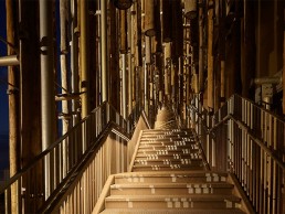
Within this abstract forest of light, a staircase leads up to a viewing platform on the roof. By ascending the stairs, visitors can immerse themselves in the forest and experience the kinetic light effect from within – an experience that Bradshaw compares to entering a remarkable alternate reality.
“The journey up the staircase is really amazing because this is a civic infrastructure project, it’s not a space that you think would be easy for people to inhabit. But what is so beautiful about the architectural design and the scaling of the staircase is that as you walk through it and experience the effect of the dappling of light coming through all the layers, all the narratives of being in an enchanted forest begin to start. There is something mystical about it. There is an energy in the forest. Even though the temptation may be there for some, you don’t really want to look for where the light is coming from, you just want to experience the effect.”
The addition of a means for the public to directly interact with the building is something atypical to what one might expect for this kind of infrastructure project, but Ravn feels the move was an integral part in giving citizens of Copenhagen a connection to the power station.
“If you think of power stations from different generations, Battersea Power Station for example, that is effectively a Victorian cathedral saying ‘we love energy, we love progress’. The next generation didn’t want to build in brick, they wanted quick, efficient, hidden sites that were out of the way. But that’s not enough today,” he said. “Cities are growing, and someone will be living close to these things soon, so it’s not acceptable that we build ugly infrastructure that no one wants in their back yard. That’s why we tried to make something attractive that people can relate to and appreciate. We then took that to extremes by inviting people to come closer, to touch it and walk up the façade, which is very unusual. Our desire was to connect citizens to the reality of where we get our heat.”
Bradshaw added: “Connecting people to where their heat comes from is what underpins this entire project. The level of civic engagement and civic responsibility, pride, and knowledge is extraordinary – people care about this project, they care about where their heat comes from, and they want to know what this site is for. By being humble enough to say, ‘this is what it is, this is the reality of who we are, let’s do something special with it’, rather than pretending it doesn’t exist is very brave.
“The celebration that this power plant is a major green provider of heat for Copenhagen – it covers almost 60% of the district heating in the city – means that as we continue to engage people with issues of energy and sustainability, telling the story of what it takes to power a city, rather than hiding it away or burying it underground, we are using light to promote its lower carbon footprint.”
Since the competition stage in 2014, Speirs Major and Gottlieb Paludan Architects have been in close, constant collaboration on this project, working together to create a finished project where the architecture and lighting are seamlessly intertwined in one, cohesive narrative.
Both Bradshaw and Ravn believe that this collaboration is something that directly contributed to the success of the overall project.
Bradshaw said: “If we were making a film, Jesper was the producer, the person that really made it happen, where he kept everyone connected and focused on what this was. That would not have happened had Jesper not done it.
“People use the word collaboration all the time, but there’s another story to what good collaboration is, and it’s much rarer. We do a lot of projects, but very rarely do you come out of it with an amazing result and an amazing feeling that you have done something special. There are no doubts on this project; we were always pointing in the same direction because we had an idea that was appropriate, timeless, authentic, real, and we felt that we had to protect it for as long as possible until it was delivered. Getting down to the heart of what we aspired to do, we can say that it has been delivered beautifully.”
Ravn concluded: “I’ve always known that I could trust Speirs Major, and that they could deliver a beautiful solution. It took a long time before anything regarding the lighting got specific, we were very close to the end before we saw what this was going to look like, but by throwing words back and forth about what we feel, what it is, how we understand each other, reassured everyone.
“That is the strong link between light and architecture; I don’t think that you can separate the two. I work with both and they’re one thing – there is nothing that architecture is about that light is not also about.
“How does the light work together with the architecture? How can it bring the space to life? How can it be the visual music to the physical building? The soul in the body? The electricity in Frankenstein’s monster? How can the light be that? That’s hard, but that’s the point in bringing light and architecture together, and I think we’ve been able to do that all along.”
www.smlightarchitecture.com
www.gottliebpaludan.com
Glenlivet Visitor Experience, UK
The iconic whisky brand Glenlivet has created an immersive and interactive visitor experience at its Speyside distillery that reflects its rich heritage, high standards, and welcoming nature. A vibrant lighting scheme from Into adds to the warm and welcoming atmosphere of the space.
The Glenlivet, Speyside’s original single malt, is welcoming whisky fans to its newly refurbished home in Speyside, Scotland. After undergoing 18 months of extensive renovations, the home of The Glenlivet has become so much more than a distillery, with a new look and feel.
Following in the footsteps of its founder, George Smith, and his legendary hospitality, the redevelopment reflects his high standards and welcoming nature. Using innovative technology combined with exclusive bottlings, immersive tours, and whisky tastings, The Glenlivet brings visitors an experience like no other. From exploring the art of whisky-making and showcasing rare editions, to reflecting The Glenlivet’s heritage throughout the interiors, the new visitor experience pays homage to being the original mark of quality for Speyside single malt.
Designed by London-based studio Blacksheep, with lighting design from Into, the valley of the smooth flowing River Livet echoes throughout the visitor experience, while the interiors have been inspired by The Glenlivet Estate and the wilderness of the Cairngorms National Park, in which it sits.
Working closely with the interior designers throughout the entire project, Johanna Paice, Associate at Into talks arc through the design process: “When we first met with the interior design team, they ran through their concept for each area – their visuals had a very strong aesthetic and really helped us to get an idea of what the client would like and how the overall space would work. We discussed possible lighting ideas and solutions at this stage; for some areas, they had very strong ideas of what the lighting should be like and the effect they wanted to create, in other areas it was more of a discussion. Our concept was to make the space feel inviting and to ensure there was a balance between showing off the products and experience but still making it feel authentic to the original space and location.”
The visitor centre is spread over the ground and lower floors of the distillery. Visitors enter via the reception where they are greeted by a spectacular custom chandelier by London-based florists, Grandirosa, which is made from local dried wildflowers. From here the visitors embark on a guided explorative journey through a series of spaces that bring the story of The Glenlivet to life. Spaces that follow, include a lounge, which acts as a waiting area ahead of the tour; The Tasting Room - a dramatic circular space featuring a round custom walnut table at its centre as well as a sculptural display that rises from the table displaying a selection of whiskies; then there’s The Sample Room and The Provision Room retail spaces; The Drawing Room - an atmospheric and relaxed onsite bar; The Smugglers Hideout - an elevated private space for tasting the finest bottles of whisky; and then finally The Glenlivet Warehouse, featuring floor to ceiling whisky barrels that are illuminated with hidden linear LEDs washing down. The Warehouse space is split into three, the angel’s share showcasing the aging process of the whisky with a large backlit display, with the two other areas focusing only on the areas of interest making the space feel moody and interesting.
Initially, Into focused on each area of the Experience separately, reviewing the integral details via mock-ups to ensure they worked with the finishes suggested. The team then added layers of light to the space to enhance Blacksheep’s interior design. “Every fitting was reviewed and colour temperatures throughout the space were considered to get the best effect possible,” said Paice. Final fixtures for the project were selected from: KKDC, Engima, UFO, LightGraphix, Stoane Lighting, TM lighting, Hunza, Lightform, Lite-house, and Soraa.
Into used clever lighting design to differentiate the various spaces while ensuring they were seamlessly linked. “We wanted the space to feel harmonious, but the individual areas also needed to stand out in their own right, especially the retail spaces,” Paice explained. “Lighting was used to zone the areas with dimming to each; we also used colour temperature to denote different areas. The retail spaces were slightly cooler with 2700K light fittings, this also helped highlight the true colour of the whisky. Whereas the Experience area was a lot warmer with 2200K fittings.
“Showcasing the products was one of the main focuses of the lighting scheme,” Paice continued. “This was done with integral lighting details mounted within the joinery and I think this helped to get the balance between showcasing the products and staying true to the concept and the homely feel of the ground floor space. It helped that the interior finishes were naturally warm, with lots of rich colours and woods used. The whiskey itself is such a lovely amber colour that highlighting this with warmer light helped to really bring the bottle to life.
“The tasting room was slightly different to the other spaces, while it was still very dramatic as you walk in, the lighting was more visual with large circular suspended profile rings mounted at high level and used as a feature. They were dimmed very low instead of using them to light the space. We also highlighted the bottles within the display using light sheets hidden within each bespoke shelf. As the visitors taste each one, the shelves with the whisky they are tasting illuminates.”
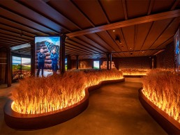
The main theatrical elements throughout the space are within the lower ground floor experience and as guests walk into the Speyside room filled with barley, the architectural lighting is used to create drama within the space. “We wanted to bring the barley to life and make sure it didn’t get lost,” continued Paice. “This was done with fibre optic pavers mounted within the base of the barley shining up and through. The light shimmers and moves to create the effect of barley moving in the wind.
“The rest of the lighting in the space is focused, with dramatic pools of light on the floor and uplighting details to the carved wood walls to add depth and layering the space.”
For Paice, as there are so many beautiful handmade displays and finishes within this project, highlighting them in a sensitive way became even more important. “Lighting also helped to create unusual effects and make the space feel more impactful and dramatic,” she said. “We are really happy with the overall lighting design. It’s very close to what was originally discussed at the concept stage with the only differences occurring because of the various mock-ups, which identified the best execution of each lighting detail. Not only did these demonstrate to the client possible ways to present their product, but they also steered the collaboration between lighting and joinery, which was a great success.”
Darren Orrow, Director at Into, added: “This was such a fantastic project to work on; both the interior designer and client had some great ideas for lighting. We all worked very closely on mock-ups and detailing to make sure our collective creative vision could be realised within budgets and timescales.”
Commenting on the finished product, Miriam Eceolaza, Director of The Glenlivet, said: “After 18 months of renovations, we can’t wait to open the doors to our local communities and bring whisky lovers into our new visitor experience. It’s a true immersion into the iconic Speyside region, walking guests through our stunning indoor field of local barley, tasting from our old and rare archives, experimenting with our famous cocktail capsules and taking a unique piece of Speyside home with our straight from the cask personalised bottling. From the decor and design to ambience and atmosphere, guests will witness something truly original at every turn.”
Yotel Vega, UK
With a dynamic, retro-futuristic lighting scheme, Artin Light has created a vibrant, experiential journey of light at Glasgow’s newly opened Yotel hotel and Vega bar and restaurant.
For those of us that enjoy a city break, the hotel is often seen as a place of respite, somewhere to lay your head after a busy day of exploring. But, for Glasgow’s newly-opened Yotel hotel, and adjoining Vega bar and restaurant, the hotel is a destination in itself.
As a brand, Yotel has become known around the world for its quirky, vibrant aesthetic, and the Glasgow branch is no exception. Designed by Canadian interior designers DesignAgency, with lighting design from Artin Light, the hotel takes visitors on a retro-futuristic adventure from the lobby - dubbed ‘Mission Control’ - up to the Vega bar and restaurant on the seventh floor.
Peppered throughout this journey are a series of dramatic light interventions, more akin to a trail of light art installations than a traditional architectural lighting scheme; from the Purple Pills in Mission Control, to the Reflection Portal in the lift lobby, the lift experience itself, and the dynamic, graphic equaliser-inspired bowling alley inside Vega.
Luke Artingstall, Director of Artin Light, explained the concept behind the lighting: “There was a lot of influence from what other Yotel branches had done, and the experience that you get when you first walk in,” he said. “I wanted the lighting design to tap into that, but with a futuristic twist so that when people walk in, they think that it’s really cool and a little bit different.
“The interior for Mission Control was quite minimal and clean, with lots of curves and strong materials. This worked really well with the lighting design as we could then integrate lighting into details; there’s a lot of indirect lighting, letting light dissipate from the perimeters into the interior space.
“The Purple Pills in the entrance area were such an important part of the visual experience as you approach the building as you see them externally in the double height void, and as you walk underneath them, they are slowly and subtly animated in the purples and blues synonymous with the Yotel brand. The design for the pills was inspired by the interior vibe - there are no sharp corners, everything is smooth and curved, so that was the start of the journey.
“We wanted to create an immersive experience where it’s not just about lighting, it’s like you’re entering an art installation. Interaction was such a big part of what we were trying to achieve.”
With so many bold light elements across the space, Artingstall said that he was encouraged throughout by a very enthusiastic client. “Yotel were really excited about our initial concepts,” he said. “They bought into the theme straight away, and that was really exciting for us because there are some iconic pieces within the building that create this fragmented journey, and then the lighting design flows through it.”
From Mission Control, guests are guided to the lift lobby - a beautiful, arched space that has been highlighted with concentric channels of indirect light. Here, Artin Light created a “surprise” element: the Reflection Portal at the end of the archway. Inspired by reflection and movement, as well as the concentric geometry of the space, the Reflection Portal features a backlit, digital mirror that was designed to play on illusion and perception of the 3D space, drawing visitors into a ‘portal’ and absorbing them into the artwork. The digital mirror features bespoke artwork content developed by Artin Light, alongside Studiotech, which creates a “digital portal” that reacts to the movement detected within the lift lobby.
From here, guests step into the feature lift, which takes them up to Vega on the seventh floor. A far cry from the typical lift experience, Artingstall wanted to create a “complete inversion” of the lobby experience.
“The lift lobby where we have the mirrored arch is a beautifully bright, light space, and the concept was to flip it on its head and play with your perception of space and darkness,” he said. “Inside the lift, we wanted to create a black void, where you walk into this cube and everything is blacked out, with no light whatsoever. The idea was that as you go up to the seventh floor, it’s like going through space, so from the black void we created an animated experience with light and sound that would take you on a journey up the building, immersing you into a digital artwork that is inspired by the different elements of the interior design.
“It was a really challenging part of the project, because of the confinements of the lift and what we had to work with, but it’s such a massive element of the scheme and was one of the starting points where we developed the whole concept from there. One of the first things that the client said to us was ‘we’ve got this lift and we want you to do something with it’, and that then inspired what we did in Mission Control, the Purple Pills, the Reflection Portal, and it had an influence on the bowling alley in Vega too. It was as if once the client had a taste for it, they wanted to see how far we could push it, and that’s ultimately what you want to hear as a designer.”
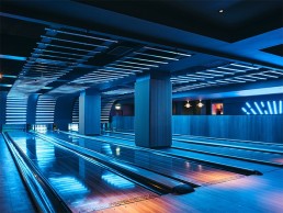
Moving up the building, the Vega restaurant and bar continues with the overarching “futuristic, sci-fi, cyber city crossed with Miami Vice” feel that was established in Mission Control, with neon lighting details punctuating the dark and moody atmosphere of the space. This also served as a direction influence on what Artingstall did with the final artistic element of the project, the bowling alley.
“The bowling alley was a space that the interior designers wanted to take in one direction, using projection to create interaction, but because of the architecture of the space it was a little bit problematic. That was the opportunity to take the neon influence from the bar area and bring it to the bowling alley by creating a retro sci-fi, synth wave mashup of an installation, that would have a visual interaction as you bowled as well.”
The vast ceiling installation, for which Artin Light again collaborated with Studiotech, serves as a digital canvas, with bars of light that interact with users as they bowl, tracking the ball down the alley and creating a vibrant play of light. “I don’t believe anyone has ever gone down that route in terms of what we achieved with the final installation,” Artingstall continued. “The space had a massive ceiling expanse that needed us to do something cool with it. When I first saw it, I thought that we could do something so much better.”
With the various dynamic, artistic lighting elements throughout the project, the lighting for the Vega bar and restaurant was kept deliberately minimal, with low levels adding to the intense, moody atmosphere of the space. Alongside pops of colour from decorative pendants and neon-esque wall lights, the lighting for the bar is characterised by an expansive mirrored ceiling, interspersed sporadically with “night sky” panels.
Artingstall explained: “Within the mirrored ceiling panels, we saw an opportunity to create miniature infinity panels as well. We used fibre optics to create a night sky effect, which was a big part of the concept. We also had mirrors in the walls of the restaurant and bar that had fibre optics behind them too, so while it was dark and moody, the colour pops and the twinkling lights in the mirrors help to amplify the whole visual experience.”
The night sky effect comes into play after dark, mixing with the coloured lights within the space to add to the vibrant ambience of the space. “During the day, the lights are switched off and everything is quite bright and light, and not about the colour, but at nighttime it would transition - all of the RGBW elements of the scheme go into pinks and blues, while the fibre optics in the mirrored panels completely flip the space,” Artingstall added.
“But the contrast of the lighting was so important; it wasn’t about trying to over-light the space, but using really tight, narrow beams where we could, pin spotting tables and letting the colour and reflectiveness in the space do the talking.”
Looking back on the project after completion, Artingstall believes that there were a number of unique challenges to overcome, but the end result proves that the work was worth it in the long run.
“Naturally with any type of project like this, it was not just about the visual effect but the detailing as well - this was such a big part of the process, and coordinating all of the elements into one build-up was very difficult. It was one of those projects where you step a bit out of your comfort zone, but you don’t progress unless you do that.
“I believe that the lighting design really complements the interior design - the two go hand in hand. The artistic moments where we did the Purple Pills, the Reflection Portal, the lift and the bowling alley make a massive part of the hotel. People want to go there and experience that, they want something different and a bit more, and I think that we’ve done that with this project.
“I love art, I love light art and playing with perception and space. I wanted the project to be a visual experience that is like going to a mini light art festival.”
Artingstall concluded that it was through the encouragement of an engaged and supportive client that he was able to create such an experiential journey of light throughout. “Yotel is a worldwide brand and it has got some amazing sites and hotels. It’s a really exciting brand to work with, and they really pushed it on this project. They let go, and I think that’s what’s really nice about it.
“Naturally, it’s got an excitement about it that draws you in, and hopefully the general public who go there will really enjoy it as well, as it’s such a visual treat for the eye.”
The Londoner, UK
Blending an art gallery and a theatre within a luxurious boutique hotel, The Londoner offers guests a relaxing yet mysterious environment to unwind. Inverse Lighting Design sought to use light as a means of complementing and enhancing the decadent interiors of the hotel.
Described as ‘the world’s first super boutique hotel’, The Londoner is nestled in London’s world-famous Leicester Square, offering guests a luxurious stay with a vast array of amenities and experiences, as well as the highest levels of comfort and decadence across its 350 rooms, 35 suits, seven meeting rooms, six bars and restaurants, ballroom and Wellness Retreat.
The hotel is the latest project from the UK’s largest family-owned hotel group, Edwardian Hotels London, and was designed by architect Woods Bagot, interior designers Yabu Pushelberg and lighting designers Inverse Lighting Design to play into the roots of Leicester Square as London’s historic theatre district, with a ‘West Side Story’ narrative underpinning the guest experience.
The hotel is spread across 16 floors, but due to strict planning, restrictions limited any upwards build. This means that eight of the 16 storeys form the capital’s deepest habitable basement - the hotel was even, at one point, the largest excavation project in Europe. The bedrooms and suites remain above street level, while public areas, guest attractions and services are housed in the lower floors, with no natural light - a significant challenge from a lighting design perspective.
Edwardian Group Founder and Chairman Jasminder Singh hoped that The Londoner would be “a centrepiece and anchor of the West End; a celebration of London, its history, aesthetic and people. Stylistically, the public areas have been designed with a minimal and cohesive neutral palette, a modern British sensibility, continuous reminders to theatricality, and a sense of mystery, with nods to British humour, especially in the vast and multifaceted art collection.
“The lighting scheme reflects all of this with hints of theatrical lighting, surprising moments and a focus on the artwork,” said Nicola Agresta, Senior Lighting Designer at Inverse Lighting Design. “This has also been infused into the guest rooms, but in a more subtle way so that they are still spaces for comfort and relaxation.”
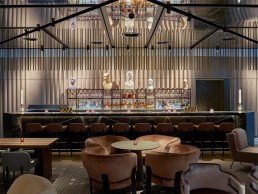
The lighting concept is based on the main themes present in Yabu Pushelberg’s interior design: theatre, mystery, and the art collection. One of the best examples of this can be found in the ground floor bar, The Stage, which references a living theatre orchestrated around a box-shaped, veiled piling with mirrored surfaces for added spectacle.
The use of surface and track mounted spotlights and framing projectors reinforces the idea of being ‘under the spotlights’, like on a real stage; the corrugated velvet walls mimic the curtains of London’s West End theatres, and the light strikes them exactly as they would theatre curtains.
Agresta continued: “The sense of mystery is achieved by balancing focus and accents, playing with reflections and shadows, or creating moments of surprise: on the mezzanine level of The Residence, a floor dedicated exclusively to hotel guests featuring three distinctive spaces to enjoy a drink, relax and engage, the Y Bar wood panelling is neutral by day but in the evening guests are surprised every 60 minutes with vivid, illuminating illusions of artist Andrew Rae’s comic illustrations. The light is focused on the tables, leaving the rest of the bar in darkness, allowing the illuminated walls to become as visible as possible.”
Elsewhere on the mezzanine level, the Drawing Room offers guests a plush, soft environment to relax, characterised by cove and diffuse lighting that is offset with decorative floor and table lamps. Meanwhile the Whisky Room is one of The Londoner’s hidden secrets, featuring just six tables, sumptuous velvet seating and a collection of the world’s finest whiskys. The glass cabinet housing the spirits illuminates each individual bottle and is the main feature of the space, while the rest of the room is kept very dim.
On entering the hotel, visitors are greeted by a large, open space. An unobtrusive reception to the side allows for free passage through to the lounge. Lighting here keeps the atmosphere inviting with soft and integrated fixtures.
Opposite check-in and beyond the lounge is Whitcomb’s, The Londoner’s all-day restaurant. The space transforms throughout the day with two harvest tables changing for breakfast and dinner, each highlighted by the lighting. Illumination for the rest of the space is more general, owing to the flexibility of the tables.
Heading down to the basement levels, the sense of mystery is further highlighted within the Green Room - the hotel’s private club and lounge space. Fixtures hidden behind the mirrored ceiling create accents and shadow that accentuate the soft waves of curved wood panels and rich velvet seating within the space.
On level B2, the ballroom is one of the largest in a hotel in central London. A glowing halo encircles the ceiling, concealed behind a suspended metal mesh curtain - again giving the impression of theatre curtains. The ballroom comprises three layers of lighting: general, from suspended black floodlights; functional, courtesy of remote controlled spotlights; and decorative accents through RGBW glass globes, which interact with the other coloured lights in the space to create different settings.
Completing the basement levels is the Retreat, which houses a pool, treatment centre, gym and juice bar. The pool is beautifully lit from Barrisol panels in the criss-crossed ceiling for a bright yet soft atmosphere. RGBW LED strips create different settings, from warm to dim throughout the day to colourful and playful scenes for special occasions.
Above ground, The Londoner is capped off by its rooftop izakaya lounge. Upon arrival here, thick, dark wood slats stand floor-to-ceiling, revealing glimpses of the dining space. Spanning the ceiling and partitioning the dining space is a network of intricate ropes, reminiscent of the ancient Japanese art of shibari. To create a soft dining atmosphere and highlight the shibari ropes, surface-mounted spotlights graze the wood ceiling surface to diffuse the light and highlight the ropes by contrast.
Among the various bars and restaurants, the hotel also hosts a large art collection, which the lighting design team studied in great detail. From flexible spotlight solutions to dedicated picture lights in both the public spaces and guest rooms, lighting focuses on the artwork to create highlights. One of the key areas that shows this is The Gallery on level B3, where artworks rotate and alternate with empty frames: plug in spotlights have been used here to give maximum flexibility while still reducing the number of fixtures needed, accenting the artwork and playing with shadows from the empty frames to connect with the hotel’s overriding sense of mystery.
Agresta explained how throughout the project, Inverse worked closely with Yabu Pushelberg to create a lighting scheme that would enhance and complement the interior design. “We’ve always worked very closely with Yabu Pushelberg in our projects. They have a great sense of how they want the spaces to look, but they also always left us enough freedom to design our own scheme and create different moods, as long as it was coherent with the overall concept.”
With a brief that desired the contrasting feelings of theatricality and mystery with a balance of drama and functionality, Agresta highlighted some of the main challenges that the lighting design team faced in bringing the concept to life: “As the two main themes of the interior design were the connection to the West End and the sense of mystery, the main challenge in turning the brief into a reality has been trying to balance these two almost opposite directions.
“With the theatre theme, we had to show the luminaires, the spotlights and the projectors to have a direct, visual reminder. For the sense of mystery, we had to conceal the lighting fixtures, create interesting and magical moments. And obviously all of this had to fit into the guest experience of a luxurious hotel.”
With half of the hotel being situated underground, Agresta added that the lack of natural light in the front of house areas was another cause for concern. “It was a real challenge from the very beginning,” he said.
“We had to make sure that these spaces would have looked bright enough during the day to avoid a contrast too big when entering or exiting the hotel, while still looking interesting and sexy. We achieved this by creating accents, washing the corrugated velvet walls to mimic the curtains of London’s West End theatres, in connection with the theme.
“Uniform peripheral lighting on walls usually creates subjective impressions of relaxation - we used a combination of both to highlight interior design features, make the rooms feel bigger, and play with day and night scene settings.”
Control also played an integral role in achieving the required ambience throughout the hotel. As such, Inverse sought to implement a lighting control system that enabled automatic adjustments throughout the day to set the right mood for guests, but also provided the necessary reporting to ensure that any faults were reported promptly to minimise disruption to guests and operations.
As such, the use of DALI-controlled luminaires in combination with Lutron’s lighting control system allowed the lighting designers to meet the challenging requirements of the project. The attention to detail in specifying a fully-controllable scheme led to Inverse winning the Hospitality category at the 2021 DALI Awards.
Agresta said: “The Londoner is a showcase for what the use of the latest technologies can achieve to deliver unforgettable experiences. DALI enabled us to meet the customer’s expectations, and to be able to improve on them in the future without having to change the infrastructure.”
Throughout the hotel, Inverse opted primarily for fixtures from Lucent and TM Lighting, while products from LEDFlex, iGuzzini, LightGraphix, Targetti, RCL, Cooledge and Applelec also helped achieve the required ambience of the space. Lucent in particular worked closely with Inverse to provide architectural lighting for all rooms and penthouses, including downlights, LED strips and profiles, and low level wall lights. The corridors are also lit with Lucent LED strips and downlights, with the manufacturer specifically designing a Line 1 Cell unit for this project. The façade and public areas, which rely on the mixture of dramatic and intimate light, are also lit with Lucent’s downlights.
Speaking of the specification process, Agresta added: “The lighting plays a double role in enhancing the luxurious feel of the hotel - it highlights the interior design features and the art collection, and helps to create a great atmosphere.
“All products have been specified knowing that they would ensure a great result, being good quality products. Specifically for the exposed spotlights and all the picture lights, the main reasons these have been specified were the great light quality and glare control - absolutely necessary for the guest experience - and the beautiful finishes the light fixtures can be made of, to match the rich materials specified by the interior designer.”
Looking back on the project following its completion, Agresta is satisfied that the lighting design meets the brief and the intention of the interior design, adding to the luxurious feel of the space.
He concluded: “There’s an incredible mix of feelings when you walk through the hotel: a visible connection between the exposed light fixtures, the theatrical theme and the art collection; a sense of mystery and discovery that creates interest, and an overall sense of comfort and relaxation. All of this couldn’t be possible without a methodical study of the space, and a meticulous control of the light scene settings.”
Athens Capital Center Hotel, Greece
Completed in late 2020, Lighting Design International has brought a fresh, yet homely feel to the luxurious Athens Capital Center Hotel, highlighting the beautiful artwork and striking interior design of the space.
Completed towards the end of 2020, the Capital Center Hotel – M Gallery in Athens, Greece received a complete interior renovation and upgrade. The hotel is located near Syntagma Square in the heart of Athens, across from the Parliament buildings on one side and the bohemian district of Kolonaki.
With a unique identity, the hotel’s interiors are heavily inspired by its Greek surroundings. Lighting Design International (LDI) was commissioned to provide a fresh yet homely approach to highlight the elegant interiors created by MKV Designs.
arc hears from Sandra Brookes, Senior Lighting Designer at LDI, to find out more about their involvement in the project: “LDI has been working on many successful projects in Greece for several years now. We have developed excellent relationships with our clients in the area. As a result, one of our clients recommended us to MKV Designs.”
Brookes explained how the initial design brief shaped the approach for the lighting, ensuring it was balanced throughout: “This was created was created through layers of light, while the unique and distinctive atmosphere in each space added drama, which is highlighted through accent lighting.
“We worked in tandem with the interior designers creating harmonious integral lighting that highlighted the interior in places and was the protagonist in others.
“One of the project’s strengths was that once the lighting brief was defined, it was thoroughly maintained. The final design result was an elegant, sophisticated ambience with a residential feel focused on art, which represented the initial vision agreed with the client.
“LDI was commissioned to provide a fresh yet homely approach, highlighting the elegant interiors by MKV Designs. The concept was brought to life via the art and the successful relationship with lighting throughout the hotel. Art plays a very important role within the interiors of the hotel. The different pieces dotted around the hotel were emphasised with light, reinforcing the significance of great artistry to the M-Gallery brand.”
The hotel presents a luxurious arrival experience starting at the porte-cochere, where a valet service receives the guests. You are welcomed by a warm and vibrantly uplit façade and an arcade containing the Gallerie Café. The arcade café incorporates an abstract marble relief on the inner perimeter wall. This element is enhanced by accent lights that emphasise the form and texture by using light and shade. The marble wall also provides an introduction to the excellent blend of art and architecture that is experienced throughout the hotel.
In the reception lobby, vibrant colours and bold patterns are highlighted with soft lighting to give the space a residential feel. The light wrapping around the grand staircase, the subtle vertical washes and the lighting concealed within the furniture make this a unique space.
“The ground floor public areas are a labyrinth of areas interwoven with each other tied up by a central atrium flowing from the main entrance to the Galerie Café,” continued Brookes. “Art is dotted around with lighting providing an interest and focus in every corner.”
“The reception is at the far end, away from the entrance, offering a sense of intimacy and exclusivity, which is highlighted by the subtle lighting atmosphere. This area is perfected with two paintings by Yannis Adamakos that were highlighted with recessed spotlights, enhancing, and lifting the blue hues that are a symbol of Greece.
“LDI designed the lighting layouts with the existing structure in mind, but with the advantage that most of the equipment was concealed from view successfully by the new interiors. Bespoke tailored details were developed in conjunction with the interior designers and incorporated within furniture and the building envelope.”
Central to the building is a large atrium that houses a Mappemonde art piece mounted on the entirety of the façade viewable from the staircase, guest rooms and roof terraces. The original Mappemonde was sculpted by Greek artist George Lappas for the Venice Biennale of 1988. This piece consists of parts of metal cut out of a house-shaped form at roof level and mounted horizontally on square white boards in a checkerboard formation. Composed of 3,000 metal pieces, it is carefully lit with colour changing floodlights, producing textures and patterns with movement enhanced by individually controlled white and colour changing lighting.
As daylight moves throughout the space, different shadows form through the silhouetted sculpture. At night, the piece comes alive with concealed colour changing spotlights that cast shadows across the boards in various directions. At night, the lights, which are located at different levels, are programmed to cross fade with changing colours to create an animated focal point to the centre of the building.
Telling arc about some of the challenges the team faced during this renovation project, Brookes explained that bringing the historical building into the 21st century in a careful and considered manner was a main consideration, with the focal point art piece in the central lobby being another.
“The project was a refurbishment of an existing site. The outer shell and structure were maintained while the building was completely renovated. The original layout was maintained throughout, but the building services and interiors were totally upgraded. Therefore, we had the opportunity of having a new and more current lighting scheme and control system incorporated within the building, leaving a minimal lighting aesthetic visible so that guests could enjoy the warm inviting lighting ambience without knowing where the equipment is located.
“The pièce de résistance of this project is in the central atrium and is viewed from the terrace above; The Mappemonde art piece. During the night, the metal pieces of the work were carefully lit with colour changing floodlights producing movement and creating an explosion of shadows, textures and patterns through individually controlled white and colour changing lighting horizontally positioned throughout the length of the piece. A special effort was made for the sources to be carefully concealed from view within the building envelope, focusing on the art piece.
“Designing and programming this piece was one of our greatest challenges as the lighting effect needed to be the focus and the equipment totally concealed from view, and for the lighting to transition seamlessly not only from day to night but to subtly crossfade between the colours, performing a spectacle of light at night.”
Art played a major role in the design scheme throughout the hotel, so it was integral to the overall success of the project for Brookes and the team to integrate lighting to suit the individual artworks cohesively into the grander design. Brookes explained further: “Art and light is a relationship that has always existed from the beginning of time: from the humble picture light to more immersive installations. Art and lighting are used throughout hotels to help accentuate the identity of their location, so the guest gets a local feel. Nowadays, art is taking centre stage in hotels more and more, attracting the interest of potential guests and passers-by and with lighting adding a new dimension to the experience.
“There are several ways of using light to accent art, and these have all been used throughout the Athens Capital Centre Hotel – M Gallery. The hotel’s art was inspired by Greek culture. The hotel is at the heart of Athens in a prominent position looking towards one of Athens’ most popular tourist destination, the Parthenon, on one side and on the other side looks towards the bohemian quarter of Kolonaki with its numerous art galleries setting the scene.”
Moving further into the hotel to the contemporary and cosy guest bedrooms and suites, luxurious materials, flexible lighting, and the addition of original artwork were chosen to add to the experience of luxury and intimacy. “The interiors and art represented the Greek heritage and the resulting fresh approach helped to enhance the art within the rooms. Spotlights and traditional picture-lights were used to add accent to all artwork exhibited,” explained Brookes.
“Intimacy and art were connected via the creation of lighting scenes. At the touch of a button the atmosphere of the room changes, and different objects were highlighted in each different scene. These scenes are governed by a control system, which is essential to realise the subtlety required to create the perfect balance of lighting effects within a space.”
The layered lighting used throughout the project came to life with various scenes created. “Like an artist, the lighting designer uses different combinations of light levels across the space to create the desired ambience throughout day and night. During the daytime the ambience was welcoming and lively but with levels balanced enough to provide a homely feel. During the night scene the levels were subtle, and the art was emphasised by increased brightness,” said Brookes.
When asked about the mix of classical and contemporary architecture throughout and whether it was challenging to create a scheme that would effectively complement the varied architecture, Brookes commented: “The success of the scheme was in the creation of the right ambience for each style in a cohesive way where the classical and contemporary architecture felt unified in its approach to lighting. In both, there were commonalities that made the transitions seamless. The lighting worked as a silent backdrop creating that all-important consistency throughout.
“The lighting complemented the distinctive look of the interiors through the careful control of accent lighting. Each space focuses on that special ‘je ne sais quoi’ created solely for that space with lighting in a subtle way.”
The blend of architectural and decorative lighting allowed the decorative pieces and the artworks to take centre stage. “Oversized bespoke decorative luminaires help to retain a cleaner soffit and introduce a sense of scale. Their special design adds uniqueness to the style of the Gallerie Café, the lobby lounge, and the lift lobbies,” explained Brookes.
“The warm, welcoming atmosphere at the reception area is provided mainly through a decorative loop of lighting that flows, interweaving the labyrinthic spaces. These are curved coves with integral linear lighting, which are shaped around the columns, providing soft lighting. Accent lighting was positioned only as required and highlighted the intricate lattice behind the reception.”
Reflecting on the project and the lighting’s success, Brookes concluded that the “overall impression is a fresh yet homely space brought to life via the focus on the art and its successful relationship with lighting throughout the hotel”.
She added: “Art played a key role within the hotel’s interiors, which was part of the initial brief and was developed as the main feature during the whole process. The different pieces of art dotted around the hotel were emphasised with light providing a cohesive approach where traditional and contemporary architecture were combined successfully by the power of light.”
www.lightingdesigninternational.com