Glamox acquires Wasco

(Germany) – Glamox has acquired 100% of the shares in German lighting company Wasco. Located in Lower Saxony, Germany, Wasco specialises in continuous line luminaires.

“The acquisition of Wasco will strengthen our lighting solutions offering for logistics buildings and warehouses,” said Rune Marthinussen, CEO of Glamox. “Glamox will support Wasco’s product development strategy and we look forward to offer these innovative products to all our customers globally. Wasco will remain an independent, wholly owned subsidiary within the Glamox Group, welcoming customers both inside and outside the Glamox Group.”

The growth in eCommerce has led to an increased demand for warehouses; Wasco has proven lighting solutions that are in particular suitable for such warehouses, and highly valued by its customers. Its solutions significantly reduce product cost and installation cost compared to conventional continuous lighting systems.

Wasco founder Friedrich Habben is enthusiastic about the new opportunity: “Glamox is a very solid international lighting company with a focus on engineering and quality. Together we allow customers worldwide to discover our Wasco products and strengthen our ability to develop new lighting solutions for the future.”

www.glamox.com
www.wasco.eu


Lights in Alingsås reveals theme for 2021 event

(Sweden) – Returning for its 22nd edition, the Lights in Alingsås organisers have revealed that the theme for this year’s event will be ‘Together’.

In a statement, the organisers said: “The world has changed quite a bit since the last ‘normal’ edition of Lights in Alingsås was held in 2019. The pandemic may not be over yet, but the time has come to slowly start reconvening, albeit at a safe distance.

“Autumn is around the corner, yet even as the days are getting shorter, brighter times await. Lights in Alingsås wants to kindle that sparkle of hope by turning on its lights and creating opportunities for visitors to gather once again.”

For the 2021 event, the same seven lighting designers who were scheduled to participate in last year’s workshop now get the chance to create this year’s installations. They will be joined by roughly 50 lighting design students from KTH Royal Institute of Technology and the Jönköping University. Partnerships with international schools will remain on hold until the global situation stabilises. New routines have also been established ahead of this year’s workshop to ensure all participants’ safety and to comply with current Covid-19 guidelines.

The trail for this year’s event will be around three kilometres long and will feature six installations spread out through the heart of the Swedish town of Alingsås. Both the trail and guided tours will start in Åmanska Parken. Visitors are also able to explore the installations independently via a digital guided tour in the Lights in Alingsås app. There are several additional installations and surprises for visitors to discover along the way.

Child-friendly installation Barnens Lights, which is sponsored by Sparbanken Alingsås, will be held in Museiparken. Designer and drama teacher Malin Wallin will create this installation.

The event will take place from 1 October to 7 November. Tickets for the guided tours have to be booked in advance and will be available later in September.

www.lightsinalingsas.se


Pulsar: LuxEOS

Combining advanced multi-channel LED technology and precision optics, the LuxEOS range from Pulsar has been designed to deliver exceptional quality of light and performance. 

Perfectly suited to a wide range of exterior applications - from floodlighting to distance projection - LuxEOS has been engineered to Pulsar's exacting standards and constructed to withstand the toughest environments. 

Available in multiple sizes and with a choice of colour-changing LED sources, including RGBW, RGBA and Tunable White, LuxEOS offers a flexible architectural lighting solution like no other. 

www.pulsarlight.com


Nichia and Zumtobel announce collaboration

(Japan) – Nichia has announced a joint-product development collaboration with Zumtobel to provide LED lighting with advanced human-centric lighting benefits.

The partnership has become a key factor for Zumtobel to develop a new offer to its customers; the recently launched Zumtobel Spectrum is a lighting solution developed for its luminaires that harness proprietary technologies developed by Nichia – especially those designed within Optisolis and Vitasolis – to produce a colour spectrum that has daylight properties as reflected by nature, instead of mimicking the conventional sky daylight spectra like other high CRI LED solutions available on the market.

“The demand for high quality, human-centric LED lighting continues to grow,” explained Satoshi Okada, General Lighting Business Planning Manager of Nichia Japan. “Nichia has been a pioneer in LED development for human-centric lighting, having already introduced our Vitasolis technology platform in 2019. With more than 65 years of research into the production and application of phosphor and LED development, Nichia is actively engaged in making scientific breakthroughs in lighting, improving its quality and our relationship with it.”

Zumtobel is also utilising Nichia’s Optisolis technology, which provides a natural light source with a spectrum that achieves the industry’s closest match to that of the standard illuminant, including both the sun and incandescent.

www.nichia.com
www.z.lighting


GreenLight Alliance: An Architectural Perspective

Perkins + Will Sustainability Director Dr. Asif Din, alongside Associate Erik Svensson, offer an outsider’s view on how the circular economy fits within the wider design approach.

At Perkins&Will, we have always been looking at the environmental impact of our projects. We are an architectural practice based in London, part of a larger worldwide company, working at a range of differing scales from masterplanning to corporate interiors. The more we quantified the impact of corporate fit outs, we found the impact was larger than first thought. This is due to the fit out of buildings being a continuous cycle of environmental impact, which eclipses the building envelope over its lifespan. We looked closely at a designer’s input and the influence we have in terms of design and specification of our projects.

Our design responsibilities are extending beyond sustainability to a circular economy mechanism to meet 2050 carbon targets. We cannot delay in providing a methodology on how this would be achieved and act immediately.

The impetus is not solely from a designers’ standpoint; there are a range of client requirements that are emerging. The concept of corporate extended responsibility requires all corporations to conduct themselves correctly, looking at their whole supply chain. Much of the funding they receive is increasingly tied to environmental indicators. Corporations are also increasingly declaring their carbon emissions with commitments to use completely renewable energy, roadmaps to zero carbon and the payments of offsets through verified methodologies such as science-based targets.

We believe that offsets should be used as a last resort to meeting carbon commitments and designers have the remit to minimise carbon within the real estate sector. There is a limited resource of offsetting that corporations can access. To reduce carbon at the earliest stage of the design that has the potential for the largest reduction of carbon.

To achieve this vision, we had to set our own roadmap. This included a commitment on transparency and reporting stages to the industry to communicate the successes but also where the gaps and failings are to achieve our milestones. A net zero carbon interior is not possible now and will require effort from the whole supply chain to achieve our 2030 target date to systemically change the way we deliver interior projects.

Our roadmap outlines a series of focus areas. While we cannot currently design a fully circular project, we can make at least one or a few areas on each project circular. The knowledge gained from each project will move us towards designing complete circular projects. This would be achieved through:

1. Sourcing materials with Environmental Product Declarations (EPDs) and/or Health Product Declarations (HPDs) supporting transparency and engaging with smaller manufacturers developing new sustainable materials. 

2. Design for disassembly: consider how each component is put together and how it can be taken apart to be reused in the future.

3. Undertake a Life Cycle Analysis during the earlier stages of the design process to evaluate and highlight opportunities to reduce the project impact. This should be considered an iterative process that continues on site in collaboration with the contractor. 

The incremental targets set along the timeline include processes, training, and specification changes to achieve goals. This not only effects how we design but what we design as the aesthetics move towards concepts that favour honesty of materials and how things are fitted together.

Using a Life Cycle Analysis (LCA) is the most transparent methodology to quantify where we are in the journey to achieving a net zero carbon interior. This, like any other construction project, is large in its initial amount and then decreases over the lifespan of the project. However, as the cycles are short with interiors projects, this spike occurs at a more frequent basis. Using Greenhouse Gas Emission impacts (GHG) allows us to show the impact of a range of chemicals and potentially allows the comparison of projects to take place in the future.

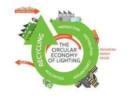
However, the scope of GHG quantification is limited to the closed system boundary of the site and its materials. To reduce impacts on a larger systemic level the principles of the Circular Economy (CE) are used. There are no established metrics for circularity, but a LCA impact assessment is a good fit. During the lifetime of a product, GHG reduction can be demonstrated through reuse, manufacturing of goods using different and less raw material, eliminating waste and the need to recycle at the end of the product’s life, and to increase longevity, creating a secondary market for the product. 

The reality is that it is often easier and more cost effective to dispose of existing materials on project site and source all new. This is one of the many barriers our industry needs to overcome. 

If the long-term goal is fully circular, there must be an invested interest from the manufacturers to receive their products back. In current design process the industry is ill prepared for circularity as purchasing reconditioned materials raises concerns, particularly around warranties. There is also often a perception of the concepts of second hand, reused or reconditioned items that must be overcome. 

There are products already in the market that are moving towards a circular ethos. A good example is that of a European carpet manufacturer who offer full transparency on the list of all the ingredients that they use. They have operated a takeback service aligning with extended manufacturer responsibilities for several years but in addition have a Materials as a Service offering where the flooring is leased.

Within their manufacturing their product is fully recyclable, and they are increasing their recycled content as the feedstock from old product allows. They are only able to control this process through the ownership of their own recycling facility disassembling product to provide feedstock to mills to be made into new yarn.

We are currently working on a project in London; with the full project teams’ goals on sustainability aligning, the project is an opportunity to explore and continuously find opportunities to drive change in the industry. The project focused on circularity and going beyond sustainability accreditations from the start, creating a strong framework for the client and project team to work towards.

The project is in a previously occupied building, giving the project team a set of materials and components already installed. Repurposing elements from the previous fit out offers potential cost saving and innovative opportunities. Some are less glamorous, such as reconfiguring existing WCs rather than demolishing and installing new, whilst others can be part of a project storytelling, such as repurposing the timber from existing door frames to create handrails for new staircases.

Sourcing furniture in a more circular way, by focusing on remanufactured and reused furniture, aims to drive a much-needed shift in the furniture industry away from a linear model. According to Eramus+ (2017) approximately 80-90% of discarded furniture goes to landfill, many designed to last far longer than a typical office lease period.

Considering each material that goes into the new project can make a significant impact. For example, reducing the amount of metal used in the project by installing a glulam staircase. Each component change may not be significant in impact, but in combination creates a large difference. When we do the final LCA at the end of the project we will evaluate what we have achieved and take these learnings to the next project. 

This is a journey in which we are now gaining the knowledge and clear direction to achieving a net zero carbon interior in the future. From this process we have learnt that we can only assess progress if there is a defined methodology involved. Although an LCA does not fully include CE, it does provide a good fit to the main aims of carbon reduction in interiors projects. We have discovered splitting of technical and biological components as much as possible allows better quantification and end of life processes to be made. This will require a designer mindset shift to viewing the building as a temporary material store rather than the end of the material journey occurring at hand over.

This cannot be achieved by us alone and requires the whole industry to similarly examine and deliver products in a similar light. We need transparency of material ingredients as it is the feedstock of the future building components. We need to eliminate waste through all stages of production and allow dismantling of components to be reused. This will require manufacturers to no longer view new product as a primary source of income but the responsibility of maintenance and repair to elongate life, making refurbished components the equivalent of new. This can only occur if this process is less arduous than the current practice of placing all components into a mixed recycling skip at the end of a lease period in an office fit out.

The most efficient way of reducing embodied carbon is to not install the component to start with. As designers we need to ask ourselves what the purpose of each component is, and if it really needs to be there. Whilst currently this puts restraints on the design, the industry is and will keep changing.

www.perkinswill.com


David Morgan Review: DGA Nano Tini

DGA’s Nano Tini was the latest miniature spotlight to take home a [d]arc award earlier this year. Here, David Morgan puts the miniscule spotlight under the microscope.

If this product review reflected the size of the luminaire under discussion it would already be well on the way to reaching its conclusion. The DGA Nano Tini spotlight is a very small luminaire indeed.

DGA was founded by Antonio Di Gangi in Florence in 1989 and the first lighting products produced by the company were based on fibre optics for use in museum and architectural projects. These early ranges included downlights, projectors, and linear systems for interior and exterior applications.

The company introduced its first LED lighting systems in 2000 and has invested heavily to create a full range of interior, exterior and underwater LED luminaires. DGA has always aimed to reduce the size of luminaires to the minimum during the design and manufacturing process.

The company undertakes the full luminaire design and development process in-house, including mechanical, thermal, and optical design, as well as photometric testing. The primary in-house production process used by DGA to produce its range of luminaires is NC machining of brass, aluminium, stainless steel, and magnesium materials. The waste material produced by the NC machining process is carefully collected for recycling to ensure minimum waste within a circular economy model. DGA aims to keep as many production processes in-house as possible and undertakes its own LED light engine assembly and powder coating of metal components. 

The company currently employs 60 people in Florence and has a sales network covering all major specification markets. Focusing on the specification sector, DGA works closely both with Italian and international lighting designers. 

The latest product introduced by DGA is the Nano Tini miniature spotlight, which recently won the [d]arc award for the best interior product. 

The Nano Tini lives up to its name and is a very small luminaire – only 9mm in diameter and 20mm long. The miniaturisation in size is made possible by the 5mm diameter lenses used in the range. The design of this range of lenses was undertaken by the DGA design team using one of the standard optical design software systems. 

Most of the small spotlights I have reviewed for arc magazine in recent years were based on a 10mm lens, such as the LEDiL Lisa range, and I was interested to compare the performance of the DGA Nano spotlight with these other products.

The sample I was given to test by DGA was fitted with a 30° medium beam lens; it performed well, producing a pleasant, soft edge spot. There were some visible striations in the output when the luminaire was placed close to the lit surface but in normal use in jewellery cases this should not cause any major problems. 

The Nano Tini range includes three beam angles ranging from a 20° spot, 30° medium beam and a wide 50°. The light engine incorporates a chip scale LED mounted onto a tiny aluminium PCB. The moulded nano lens incorporates two legs that push into holes in the LED PCB, so the relationship between the lens and the LED could be somewhat variable and that might lead to changes in the beam quality or shape. The medium beam lens in this sample incorporated a series of simple domed micro lens details on the top surface, which are used to control the distribution. 

The Nano Tini has a simple but effective construction. The machined brass body/heat sink hinges on the joint with a spit pin to provide friction. The LED board appears to be bonded to the machined body as there is no space for screw fixing, which might cause a few issues with recycling at the end of life. A satin black threaded snoot ring screws into the body to keep the lens in place and provides some glare control. The rest of the metal work is available in five finishes including gold, brass, polished chrome, grey and satin black powder coat. 

The spotlight is mounted via an M4 threaded extension to the joint, which gives the smallest possible fixing to the mounting surface within a display case. There are currently three options for fixing the spotlight: a moulded plastic nut can be used to hold the spotlight to a mounting plate; a magnetic base is offered for use with steel panels; and a 19mm diameter surface mount base is available.

The LED light engine is available in five colour temperatures ranging from 2200K up to 4000K, all with CRI over 90. The lumen output with 350mA drive current is 50lm, which rises to 80lm with a drive current of 500mA. 

The machined brass body gets quite warm after a few hours of use when run at 350mA. When run at 500mA, it is understood that the spotlight needs to be mounted onto a metal plate of undefined dimension to help dissipate the heat and keep the LED operating at a safe temperature. 

The DGA Nano Tini spotlight is the smallest spotlight I have reviewed so far but it produces a useful light output that will be beneficial for the target applications of museum and jewellery display cases. The miniaturisation of LED luminaires continues as LED efficiency rises and smaller packages are developed. It will be interesting to see if there is a lower size limit beyond which there is no additional benefit.

www.dga.it


Paul Nulty

With Paul Nulty celebrating his studio’s 10th anniversary this year, arc sits down with him to talk about how it all got started, and what the next 10 years may bring.

Since establishing his own, eponymous studio in 2011, Paul Nulty has become one of the most widely recognised faces in the UK lighting design community. Under his leadership, the practice, Nulty, has grown from a one-man band operating from his dining room table to a global company with offices in the UK, US, Middle East and Asia, as well as two spinoff brands, Studio N and Nulty Bespoke.

With a background in theatre and set design, and having graduated from Liverpool Institute of Performing Arts, it was here that Nulty ‘discovered’ the wider world of lighting design.

“In the theatrical work that I was doing, I became more and more interested in using light to define the space. I was designing fewer sets and just using light to tell the story,” he recalled. “I then had this epiphany about the power of light beyond the world of theatre.

“The line ‘if all the world’s a stage, I want better lighting’ is such a cliché, but I wanted to apply what I was doing to the real world. I started exploring other areas in the lighting sector and realised that there’s a whole fascinating industry of architectural lighting that I didn’t even know existed.”

Keen to be a part of this industry, Nulty sent his CV out far and wide, before landing a job at the Lighting Design Partnership (LDP). After a year there, he moved on to join Paul Traynor at Light Bureau – then known as Indigo Light Planning.

“I was the junior there, and God was I a junior,” he joked. “Naivety is a wonderful thing – you never know what you don’t know until you know it.

“I look back and think how pushy and opinionated I was, and to Paul Traynor’s credit, and patience, he allowed me to flourish. I was with Paul for 11 and a half years, and I owe him an awful lot.”

Traynor was a key figure in Nulty’s burgeoning career, and he was quick to cite him as one of his lighting role models when starting out. He also reserved special praise for LDP and its incredible track record of nurturing young talent that have since gone on to become leaders in the lighting industry: “We are so fortunate to work in an industry that has such an amazing history and a rich tapestry of talent.”

After 11 years of being an employee, soaking up as much knowledge as possible, Nulty had what he calls his “Jerry Maguire moment”, where he decided to leave the relative comfort of the practice and go out on his own.

“I always had a lot of frustration with the industry and that there were only a handful of really well-run professional practices in the UK. I had this moment where I thought that there’s got to be a different way of doing this. It’s not just about creating great lighting design, it’s about delivering a brand with exceptional marketing and PR. The business of lighting design fascinated me.

“So, I left and started up on my own. I had zero savings – I bought my first Mac, printer, and camera on an interest-free credit card, taught myself HTML and how to programme my first website. I rang up a few people, who sent me a bit of work here and there. Luckily, one of those projects was the Nike store for Manchester United, which was a turning point for us.”

An early partnership with engineering practice E+M Tecnica, whereby they invested in some equity in Nulty’s self-titled studio, allowed the firm to “springboard very quickly”, he explained, growing to six people by the end of year one, and doubling to 12 by the end of year two. By the end of year three, Nulty was in a position to buy back the equity sold to E+M Tecnica, by which point, he said, they “were off and running, and we haven’t looked back since”.

When considering the early years of running his own practice, Nulty reflected that there were two key lessons that he learned: “Number one is it’s OK to make it up as you go along, and number two: say ‘yes’ and then worry about how you do it afterwards. There was a bit of winging it; there’s no denying that. I had a very clear strategy though, and a very clear mission statement, which has been crucial to our success. I was very clear about what I wanted to achieve, and I knew roughly how it should be achieved. Because I came at it from a very strategic perspective, I think that made growing the business a lot easier.

“One of the biggest challenges was building a perception that we were credible. We were a brand-new start-up, very small, with a limited portfolio and trading history, so trying to convince people to take a chance on us was challenging. I think the solution to it was making sure that our story and narrative as a practice was crystal clear so that people could understand our authenticity as a brand and come along for the ride.”

On top of this, Nulty added that he has consistently looked to build strong working relationships throughout his career – a trait that proved beneficial when starting out on his own.

“I’ve always tried to be polite, kind and respectful to people in the industry,” he said. “I’ve always thought that we’re only as good as the service that we get. So if you have created good relationships with people, then they’ll hopefully want to build upon those relationships.

“We worked with some amazing people back then, won some great work and took on some really fantastic employees. It’s been a runaway train ever since.”

Over the course of the past decade, Nulty’s practice has grown to become one of the most well-known within the lighting design community, working on a broad scope of projects from retail and hospitality to workspaces, museums, and exhibition spaces. 

And while there is always a wide variety of projects on the go for Nulty and his team, he explained that there isn’t one sector that he prefers over others. “I love that we have such a variety of projects – we’re probably one of the broadest spread practices in terms of sectors in the industry,” he said. “You’re always learning on a project, and what you learn in one sector, you often airlift and apply to another; I love the cross fertilisation of ideas and technologies. I also enjoy the fact that you can be working on a project that’s going to take 12 years, whilst working at the same time on a project that’s going to take 12 weeks. Retail for example turns around very quickly and the learning curve on these projects can be steep, whereas some projects take a lot longer, and it’s more about the finer detailing.”

Amongst the studio’s vast portfolio of projects, which has seen them work with the likes of Nike, Harrods, the Ritz-Carlton, J.P. Morgan, Hard Rock Hotels, BP, Google and Estée Lauder (to name a few), Nulty doesn’t have one specific ‘favourite’ project, but rather those that have a long-lasting impact. “I love projects where you really get to make a difference, that are challenging and really push boundaries. My least favourite projects are those where you’re basically a marriage counsellor between a husband and wife agreeing on how their house should be illuminted,” he joked.

Across this spread of work, Nulty explained that he has always aimed to instil the same ethos and approach in everything that the practice does. “If it’s good enough, it’s not good enough,” he said. “We can always do better. We should be striving for excellence in everything we do, whether that’s writing a single email or delivering an entire project. Everything we do should be excellent. I think that’s the ethos that then pushes everybody to evolve and grow.”

Another key facet of Nulty’s approach has been consistently giving opportunities to the next generation of lighting designers. This can be seen from the presence of junior and intermediate designers at events, in feature articles, and taking part in a myriad of speaking engagements.

Nulty explained that this was a conscious decision from the moment he set out on his own. “I came into this thinking of what frustrated me as a young designer. I want my staff to have complete ownership over their work, I want them to love it and be passionate about it, and that passion comes from having accountability and responsibility.

“I don’t shy away from employing people that are more talented than I am. It’s absolutely my intention to employ people who I think are better than me, as it strengthens the team, and inspires me. I have an enormous amount of gratitude for everybody that has come and gone through the life of our practice. Success is about teamwork and I’m incredibly grateful to my team.

“I’ve always described us as a merry band of pirates (which my team hates!). If you look at a pirate ship, you have hierarchy, you have structure, you have teamwork. But you can also make your own rules and plough your own furrows, you can go your own way and if you want to go against the grain, you can do that collectively, as a team. So Nulty is the pirate ship that we’re all aboard. I might be the captain of the ship, but I don’t tell everybody where we’re going – I would actually describe myself more as the rudder: you tell me where you want to go, and I’ll help steer us there.

“We have a young and energetic team. I owe so much of our success to people like our MD, Ellie Coombs, Creative Director Dan Blaker and Associate Lighting Designer Phil Copland. They are powerhouses of ideas and creativity. When they talk, I listen.”

Alongside teamwork, Nulty stressed the importance of other, often under-recognised sides of running a successful business, areas such as an effective PR and marketing strategy. “I wouldn’t profess to be the greatest lighting designer in the world, but I think I’m a pretty good designer,” he said. “I also have a clear understanding of marketing and PR, and I believe that unless you celebrate your company achievements, no one is going to know how you are progressing. So, success is borne out of doing great work, delivering great service, and being passionate about what we do, but also about being able to tell the story.”

However, for all of the successes that Nulty has had as a lighting designer, it almost never happened, as he revealed that growing up, he had aspirations of another career entirely. “I wanted to be a doctor. When I look back at my old Record of Achievement from school, it’s all about wanting to be a doctor,” he said. “But I had an unmotivating science teacher in my final year of school when I was doing my GCSEs, who said ‘you’re going to fail your exams; you’d better not go to college and apply for science’.

“So, I thought ‘what else am I good at?’ I was good at drama, so I thought I’d go and be an actor – I went to college to do a BTEC in Performing Arts and off the back of that, got into set design. The rest is now history.

“Although for the record, I actually proved her wrong, I left with an A,” he added.

“I realise now was it wasn’t so much medicine that I was interested in – I wanted a career that had a bit of science; a bit of sociology because I’ve always loved the power of people and how they interact; I was always interested in psychology; I was pretty good at engineering; and then I was really passionate about the creative arts too. It’s amazing that I’ve ended up living a life that encompasses all of the things that I was passionate about.

“I feel very privileged that unless NASA come calling, or Liverpool want to sign me as a professional footballer, then I don’t think I could have a better career – I love what I do, because our industry and our work affects people in such an amazing way.

“When you get it right, lighting brings a space to life and even to this day, I can walk into a space and get goosebumps. There’s nothing better than turning all the lights off and slowly bringing the circuits on one at a time to balance and compose the light within a space. It’s one of those breath-taking moments seeing a space come to life.”

As the company celebrates its 10th anniversary, Nulty can look back on a decade that has seen the firm expand into new markets, with studios in Dubai (run by Mark Vowles), most recently Bangkok (run by Spencer Baxter) and Miami, and spinoff ventures, with the launch of Nulty Bespoke and Studio N. However, he says he never expected to be in such a position after just 10 years. 

“I always thought that it was possible to grow a business to 20 people and work across the world and be respected for it. A lot of people were doubtful and said it’s not possible, and I think part of my motivation was about proving people wrong. But I never thought it would be like this. It’s amazing to think of what we have achieved in such a short space of time.

“Part of that is coming from genuine hard work, not just by myself but by the whole team, and a key factor is recognising when opportunities arise and taking those opportunities.

“We’ve always been entrepreneurial, and I’ve always had the attitude that you have to at least try out ideas, just in case it leads to something amazing. We’ve always tried new things – some fail, but some have worked out well for us. It’s good, and it constantly challenges me as well.”

Looking to the future and what the next 10 years might bring, Nulty explained that he has a couple of bold ambitions that he is yet to meet in his career: “My grand aim is twofold: I would love us as lighting designers and as a profession, to be taken as seriously as architects and interior designers – I think we’re still a long way off from that. 

“My other goal is that at the end of my career, I would love to look back and find that we’ve had a positive effect on the lives and careers of talented lighting designers. I’d like to think that we’re creating a legacy and that future lighting practices and successful designers made their start at Nulty. I take great pride in developing good designers through the business and giving them great opportunities – if anything it’s one of the most satisfying things about the last 10 years.”

As for lighting design as a whole, Nulty predicts big challenges ahead with the ever-changing technology on offer, and the growing impetus placed on sustainable approaches, even if the actual core aspect of lighting design remains the same.

“At its most basic level, lighting design hasn’t changed. You’re still breathing life into a space and emotionally connecting people with that environment, whatever it is.

“I do think that the next 10 years are probably going to be more challenging than the last, because of the way technology is going, the way sustainability and green thinking is going, and because of the understanding that people have of human psychology, and how that’s also evolving. I think lighting is going to become even more scientific, psychological and sociological, as well as creative. There will be more and more layers of complexity than there ever used to be. The need for lighting design is going to grow, so it’s important that we evolve with it.

“But at the same time, when it comes to light itself, it has been the same since the dawn of time; it will continue to be the same and it will affect people emotionally in many different ways. I think the beauty of light, lighting and lighting design is that we get to impact those emotions. To me, that’s why I do what I do. I love the impact that we can have on people’s lives.”

www.nultylighting.co.uk


Dr. Shelley James

Throughout lockdown, Dr. Shelley James has been spreading the word about the importance of healthy light. Here, she tells us all about the Luna project, the Age of Light Innovations Group, and her goals for a better lit future.

Dr. Shelley James is on a mission to bring healthy lighting to the masses.

Founder of the Age of Light Innovations, the self-proclaimed “lumenologist” has been making waves in the lighting industry and beyond, working to educate the wider public on the power of light and the lasting impact that it can have on both mental and physical wellbeing.

With a well-travelled upbringing that has seen her move from Jamaica to Kent, Nigeria, South Carolina, Paris and back to the UK, James has experienced a diverse array of cultures, and attitudes towards light and colour. “I’ve been all over the world growing up. That led to a fascination in the way that changes in climate shape culture and colour,” she said.

This fascination firstly led to her studying textiles in Paris, before entering the world of corporate branding, “working with clients to help them to bring together different types of visual, textual clues to create the experience of an organisation”.

A traumatic head injury meant that James had to learn first-hand about light and vision as she had to retrain her own central nervous system.

From here, she moved on to working in printmaking at the University of Bristol, integrating prints into glass to create illusions of space and depth; before eventually undertaking a PhD at the Royal College of Art on Perception, which led to working with glass that changes colour in different lights.

It is here that James’ interest in artificial light began to grow, as she sought to use more light in her own work and as such undertook a City and Guilds qualification in electrical installation, after which she began to work with artists, designing lighting to complement their work.

“I also got funding from the LIA to do a qualification in lighting design, and discovered parallels in the way the brain is wired to how lights are wired in a house.”

In 2019, James founded the Age of Light Innovations Group, where her goal is twofold: “I work as a consultant for individuals and organisations, where I work with them to see how light can help them to be healthier, happier and more productive – and more environmentally sustainable too,” she explained. “I work with architects and interior designers, and also large organisations, on how light can contribute to their offer, whether that be to do with staff engagement or product development, and that draws on my background in branding and product innovation.

“Alongside this, I also work as a teacher, teaching and mentoring at the Royal College of Art and King’s College, and part of that is working with artists, and looking at how they can use light to create experiences and tell stories.”

However, as with everyone else around the world, things took an unexpected break in early 2020, when Covid-19, and the resultant lockdown hit. It was during this enforced isolation that James realised that there was a dearth of information about the ramifications of poor lighting.

“When lockdown happened, I found myself in Bridport with my mum and my nieces struggling to be indoors with a badly wired-up lightbulb in their back bedrooms, seeing them struggle with depression, putting on weight, bad behaviour. 

“I did some more research, and during lockdown, the number of children presenting with myopia has tripled between the ages of six and eight. The people presenting with depression is up 40%, obesity levels are rising, and a lot of that has got to do with not getting the right light at the right time.

“With what I knew about how the power of light, I started to see how little other people knew about it.”

Sensing an opportunity to do some good for the world, James, along with her brother, “cooked up a plan” to create LunaTM – a series of YouTube videos to educate the wider public on the “right” kind of lighting for the environments that they now found themselves in.

“I talked to some amazing people from around the world – scientists and education specialists – on how light affects the brain. I also reached out to some manufacturers that I thought were doing great work. Fagerhult, Signify and Seoul Semiconductor came on board as sponsors; they saw that there was a body of knowledge that needed to be shared, and came in to help us to do that.”

The series, which includes short, 40-second TikTok-style videos and longer, more in-depth videos incorporating solutions and interviews with scientists, launched in the UK in mid-January, and James was amazed by the response that it received.

“I started to promote it on Facebook and Instagram, and it suddenly took off. We’ve had 1.9 million views, reaching 1.9 million kids. We then translated it into German and Italian, and again, had a great reaction in these countries too.

“I then tried to promote it in India, and we had a quarter of a million views in four days, which is just amazing.”

Following the success of the LunaTM project, James expanded this to LunaPro, the next iteration, which is connecting with professionals from across the business chain – from architects and facilities managers to specifiers and installers – about the value of investing in lighting. This time, the sponsorship team has expanded to include Bios, Phos, Glamox Luxonic and Zumtobel – alongside Seoul Semiconductor and Signify.

“There’s a growing awareness that the way that decisions are made about lighting for the homes and offices where we spend 90% of our lives – and the schools and hospitals we send our most vulnerable people – is being made in a very inefficient way,” she continued. “To me, we’re missing a chance, for a very marginal increase in the overall spend, to not only reduce energy use and waste in terms of landfill, but to improve performance and improve health outcomes. The minute that you make the business case properly, it’s a no brainer.”

The overwhelming response that James has received for both the LunaTM and LunaPro projects has led to invitations to deliver keynotes for the IES, interviews with the BBC, and further collaborations with Arup, the ILP, SLL and WELL Standard. “We started from a spare bedroom in Bridport just nine months ago. We’re now working with a growing team of remarkable professionals to get good quality lighting onto the spreadsheet.

“It’s time to move lighting from the supermarket with the loo rolls and the budget cleaning products and put it where it belongs: with the IT, the health insurance and the ergonomic chair. We know that the right light can transform performance – let alone motivation. And, now we are working from home more and more, employers are realising that they have a legal responsibility to provide a safe, healthy working environment – and light is a vital part of that.”

With a particular focus on lighting for educational facilities, James explained that achieving the “right” lighting is, in and of itself, relatively simple: as much natural daylight as possible, supplemented with good-quality LED lighting. “That’s bright, full spectrum, low glare, ideally tunable lighting. A good-quality light will not only last longer, reducing the number of lights you use overall – cutting down on landfill and maintenance costs – but be designed with some level of retrofit capability so you just switch out the parts that are broken,” she said.

“The real problem is not getting the lights right, it’s getting it onto the agenda in the first place where it belongs, part of the health, safety and sustainability agenda of the school.

“The starting point for most schools is simply to think about it,” she said. “Installation and maintenance is so often left to the facilities person, along with the plumbing and parking.  But if you think about how much education has changed from paper and pencil to screens and interactive whiteboards, you can see how much the lighting needs to adapt. A lot of the time, it’s also designed for a one-size-fits-all approach, which isn’t necessarily the right solution.

“We also need to be aware of the pressures that teachers face in a busy classroom: they have little or no time to set up the room before the class begins. A study by the Helen Hamlyn Centre showed that if it’s too complicated to open the blinds, they will stay down and the lights will go on instead.

“But the first thing is to have lighting on the agenda. A bit like Jamie Oliver put Turkey Twizzlers on the agenda – we’re seeing now how a proper breakfast helps kids to learn, and actually, proper lighting is probably as important. We’re still at Turkey Twizzler lighting. We can do better than that.”

When it comes to getting lighting on the agenda, James revealed that she is “using all the channels that I can find to raise awareness of the potential of better quality lighting,” in a two-pronged approach, to try and reach as many people as possible, from both the consumer side, and the business side.

However, while she is working to get lighting on the agenda for both decision makers and the general public, she believes that there is a much deeper, societal issue surrounding the commodification of lighting. “We know that disrupting your body clock has a huge impact on your life chances. It affects your ability to concentrate, it gives you cancer, it’s a killer. We rely on a huge number of ‘hidden’ workers to work through the night – nurses, cleaners, and food packers, for example. These are often low-paid, precarious jobs and many are women. Many of these low-grade environments are poorly lit too. People who work after dark in the shadows often have a poor diet of light.

“Much like the Turkey Twizzlers debate, the diet of light for people without much money is worse than it is for those with money. Not only because of a lack of awareness, but also because the people who design and manage the places where they work, where they learn, are delivering to the bare minimum legal standard and cutting costs where they can, simply because their ‘clients’ don’t have many choices.

“Think about the classic office buildings, the boss gets the corner office with the window, while the low status workers are in the cubicle in the middle. That makes a difference to their ability to concentrate, their ability to sleep, to manage social interaction, which means those workers sitting in the dark don’t perform as well, and so their career trajectory is affected. So, you end up with a perpetuation of disadvantage when you don’t give people the chances to see clearly.

“It’s a political issue in the sense that we spend money on people who are considered to be valuable, including the lighting environment. We talk a lot about how valuable employees are, but there’s a whole group of people who are considered much more of a commodity. Whether that be working in a call centre, shift workers, care workers at night, we don’t spend the same amount of money or attention on the lighting environments that they live in. And yet, arguably, changing the quality of lighting for a nurse who works at night could not only make the biggest difference for her life, but also to the patients that she takes care of.

“The technology is there now to deliver good quality, full spectrum, flicker free, time appropriate lighting for everybody, and yet we don’t. And the reason we don’t is the way the spreadsheet works for different populations is different. We also know that, as we’ve found through Covid, we’re all in this together. Everybody who is underperforming is not only a missed opportunity, but has a knock on effect on everybody else. Nobody is an island.

“The other thing that is important to think about is that cheap lights, unbranded, unregulated lighting that ends up in HMOs [houses of multiple occupancy], hostels, local authority care homes, they come from sources where the environmental cost of extracting the materials is completely unregulated,” she continued.

“Better quality lighting from a reputable manufacturer is part of at least some effort to improve the environmental footprint and lifecycle of the object. So if you think about humanity centred lighting in the sense of taking care of the planet, which then takes care of us, that’s part of the equation – the need to make sure that we’re aware of where this stuff comes from and where it’s going.”

As such, James believes that the lighting design community needs to take a more “humanity centred” approach to lighting – this means a shift of focus from ‘product’ to solution, cost to value.

“I was speaking with Florence Lam of Arup about Humanity Centred Lighting, and she was saying that when she first started out, every time they went from fluorescent lighting to LEDs, they had to make the business case and fight tooth and nail for it. And now, if you haven’t got LED lighting, your building isn’t considered a modern building.”

Looking ahead, James is keen for the conversation on healthy lighting to continue. With a couple of books in the pipeline – targeted towards businesses and parents and teachers as a means of making the case for healthy lighting and its benefits – along with the continued success of the Luna project, she is hopeful that people will become more aware of the impact that lighting can have. Although she understands that it may be a slow process.

“People need to realise just what a difference it makes. You can improve employee performance by improving the quality of light that they get. We didn’t know that before, but now we do, so we need to talk about it, get it on the agenda and use the information that we know” she said.

“The next thing is to invite organisations to put their money where their mouth is. If they’re talking about the environment and sustainability and employee wellbeing, then small changes in the way they spend money on the places where people work will make a huge difference to their outcomes.

“It’s a slow process, it’s like a tanker. It’s a bit like smoking and seatbelts – it took a while, but now you wouldn’t see someone smoking in a car with a child; you wouldn’t get into a car without a seatbelt. It needs to be a culture shift.”

While it may be a slow process for James, she has her sights on an ambitious end goal, both for the lighting industry and wider society.

“My goal is that one day lighting is on the agenda in the same way as healthy eating. Not only because it makes us feel better, but it offers us a chance to live healthier, happier lives, and to tackle the urgent issue of climate change. Anybody who has been into a well-lit space can taste the difference, as with a good quality, delicious meal.

“One of my dreams is that some form of lighting design, the professional consideration of lighting, is included in every major building project, in every sector; that it’s not a nice to have, it’s a business decision that makes perfect sense, that’s on the spreadsheet alongside other things that you would do as an organisation to keep yourself resilient and profitable.

“I’d also like to see people move away from the idea of lighting as a product and think about it as an attitude or solution or situation. As long as we’re talking about lumens per watt and cost not value, we’re missing a chance to think about the overall lighting environment, and that’s where the added value is, where the savings are and where the performance is.”

She is also hopeful that the “Humanity Centred Lighting” concept is one that will become common place - not simply another buzz word for the industry, but a standard consideration.

She concluded: “The next phase, I hope, is that we’ll move from LED to full spectrum, flicker-free, tunable lighting, which will be the baseline for healthy light. In the same way that you would expect an ergonomic chair, or a place to make a cup of tea, a sterile operating theatre, or properly-fitting shoes for your child, the lighting can and should be simply what you expect.”

www.ageoflightinnovations.com


David Sellam

Following a recent rebrand and the launch of its first ever lighting collection, Carra, arc sits down with TLS CEO David Sellam to talk more about the new collection, the history of TLS, from its beginnings as a printing company, and the new direction for the brand.

Can you give us a brief overview of your career to date?

We started out as a small printing company in Israel more than 26 years ago. We then moved to Canada in 2002, offering large-format prints on fabric, then SEG lightboxes. Years later, as we continued to grow, we had no choice but to move to another larger facility when we received a project for a large lightbox that, once it was assembled, could not fit through our shipping doors. 

How did you get into lighting?

At one time, we were using fluorescent tubes to backlight our lightboxes and, as our production sizes grew larger and the need for higher quality and sustainable illumination increased, we designed the award-winning TLS, which stands for Tension LED System. The system, which took four years to develop, is collapsible and offers even lighting for our clients’ single or double-sided lightboxes.

Can you give us a bit of background on TLS as a company? How did it start? And how has it grown to the position it is in today?

TLS is our architectural lighting division. At one of our print tradeshows, we were highlighting our lighting system in our lightboxes and a designer came up to us and asked a question that changed us dramatically: “Can you take your TLS and backlight stretch fabric in a ceiling?” 

We then realised we had a product for the architectural lighting sector and that’s what pushed us to launch our architectural lighting division. We got to today’s position by working with our agencies and partners in each territory and providing high-quality products for different project applications. We are continuously developing a wide range of products from tunable white to a pixel-controlled RGBW system along with control systems that provide our clients with the highest quality solutions. 

The company launched its first-ever lighting collection, Carra, earlier this year. What was the inspiration behind the collection?

We felt that we needed to simplify our process by offering a standardised, off-the-shelf type of product, that can be easily specified into projects with our standard sizes, saving on costs, shop drawings and communication time. TLS originally grew by specialising in larger and more complex projects - a good fit for our tension LED system. The flexibility in terms of design demands and structure restrictions meant that we won a lot of large-scale projects. However, we recognised the growing demand for surface lighting.

Why now? What led to the launch of Carra?

It came from our designers and partners. We understood that the simplicity of having various standard sizes, mountings, lighting engines and frame colours made the entire process straightforward. Having high-quality surface lighting as a commodity product is something that we felt was needed amongst the designers. Our technology is really unique due to our patented system, and making that more easily accessible was the smart next step for us.

TLS specialises in both bespoke and larger, more complex projects. How will that change with the introduction of Carra? Will this still be your core focus?

We will still be known as the bespoke architectural lighting company. Carra has just made specifying certain projects easier. We added some high-tech machinery to our arsenal to continue delivering creative large-scale projects.

What applications/markets would the Carra collection best serve? Where do you see it being specified?

We see it being specified in small and large scale environments, such as airports, retail, hospitality and, medical. The possibilities are virtually endless.

Alongside the launch of the Carra collection, TLS has undergone a full re-brand. What was the reason behind this? What do you hope to achieve with it?

As our brand awareness has grown exponentially over the last few years, we decided to take the company to the next level, by re-branding ourselves for our widening worldwide clientele. 

Do you have any more new products/collections in the pipeline? What is next for TLS?

Our pipeline is filled with new products and technology, shortly we will launch two more collections, Circa and Linéa. Circa, our circular collection, will have standard sizes like Carra, and the same mounting and frame colour options. Linéa is our linear collection, standardised widths and available up to 20ft in length. With the three collections and our bespoke offerings, designers will be able to create lines, shapes, angles, circles with colours and contrast. 

What do you think the future holds for the lighting industry?

We see the market shifting towards immersive lighting and away from static lighting. As with our VegaRGBW lighting engine, we can programme static lighting, a circadian sequence, then have the option to control each RGB and W pixel to create a scene or a mood. The best example would be the Whitacre tower lobby at the AT&T discovery district in Dallas, Texas. More than 12,000sqft of wall-mounted and recessed LumiCLoud VegaRGB creates the entire mezzanine.  

www.tls-led.com


Google Store, USA

The first ever physical Google Store opened in New York this June. Designed by Reddymade Architecture, a complementary, minimal lighting scheme was developed by Reveal Design Group. 

The opening of a new retail space for one of the global tech giants always comes with a buzz of excitement – whether it’s the latest Apple store, a new flagship location for Microsoft, or Amazon’s supermarket chains.

This buzz has once again been seen with the opening of Google’s first ever physical retail space in New York this June.

The store, located on the ground floor of Google’s headquarters in Chelsea, Manhattan, was designed by Suchi Reddy, Founder of Reddymade Architecture and Design, with the concept centred on the core principles of Neuroaesthetics – a theme that Reddy explored in A Space for Being, a collaboration with Google and its VP of Hardware Design, Ivy Ross, at Salone del Mobile in Milan.

The architect’s work follows the belief that “form follows feeling”, meaning that the design has been carefully calibrated to the human, and positively influences wellbeing, creativity, and productivity. 

The architecture and interiors of the store are a pragmatic, playful expression of this motto, bringing a unique focus to the interplay of good design with human perception. The intention from Reddy was to “re-awaken visitors to the childlike wonder found in the technology and digital innovation on display”.

The architectural lighting for this landmark store was designed by Reveal Design Group and co-founder Levia Lew explained how the firm got involved in the project: “My firm and I are currently working on a large residential/hotel project in Florida, which started in 2017 with Suchi Reddy. Suchi and I found that our creative processes are very compatible; we have a lot of fun designing and problem-solving together. In 2019, she invited me to assist on A Space for Being, the Google partnership for Salone del Mobile. The success and impact of the installation paved the way for the collaboration between Reveal Design Group and Reddymade for the flagship store.”

The overall design for the store is warm and calming, with an abundance of soft, tactile surfaces and natural materials such as cork and wood. Lew explained how this impacted on the brief for the lighting design: “The overarching goal and design vision was focused on sustainability and natural materials to convey a sense of light, openness and possibility, as well as a feeling of ‘home’ given the products and services that Google planned to showcase in the space. The goal of LEED Platinum certification also set very clear boundaries as to what kind of lighting could be used in terms of energy consumption.”

Lew explained that because of the material palette selection and “flow” of the space, the lighting concept was kept deliberately minimalist and restrained. As such, a precise and orderly arrangement of fixtures in the 16ft ceiling, with an aperture size and warmer colour temperature more typically found in hospitality and residential spaces, was used. This, Lew added, served to highlight the dramatic architecture, while simultaneously bringing the visual focus down to the human level to create the sense of home.

Alongside this, moments of intimacy and relaxed ambience were intended through the selective use of integrated lighting, with illuminated display cubes and focused lighting casting a warmth, while visually organising the expansive space into comfortable areas and differentiated zones.

“The goal was to create a sense of differentiation between each ‘room’ as Google wanted them to embody the various experiences of the products and services featured within,” said Lew. “Thus, one area is a homey living room setting, another is a gaming setting, and another a product showcase setting. They all had distinct personalities to be shared.”

One of the key design elements that Lew had to factor in when developing the lighting scheme was the abundance of natural light that fills the store, and how to marry this with artificial lighting. With the lofty, 16ft ceilings and huge, double height windows, daylight, and the ambient brightness of streetlights outside, were prominent influences on the interior of the space.

However, instead of seeing this as a challenge, Lew was eager to create a scheme that would complement the ambient daylighting, while using this as a tool to enhance the natural materials and clean lines of the interior design. 

“The space was already naturally lit though the curtain wall with the most powerful source we have: the sun,” she said. “One of my mentors years ago said to me that a space will tell you how it wants to be seen. In this case, the sheer amount of daylight coming in through the windows was a major force that we could not fight, nor did we want to.

“The room, with its light, wide open planes and surfaces that gently reflect the ambient light from the window directed the choice to continue that gesture by gently washing the interior surfaces with light rather than to accent them with dramatic beams.” 

Softly diffused and reflected light creates an even ambience with relatively few fixtures; Lew then selectively accented gathering and product showcase areas with direct illumination to create visual contrast to add emphasis on certain zones.

She continued: “Lighting designers often speak about painting a space with light. In this case, I used light like watercolours, to wash and blend surfaces, allowing the crisp lines of the architecture to cut its own path through it. The paintings of Morris Louis and Mark Rothko, as well as the works of James Turrell, were initial inspirations for the design of this project.”

Thanks to a strong pre-existing relationship with architect Reddy, Lew and her team were given the trust and freedom to create a lighting scheme that would sit in harmony with the store’s interior design. She explained: “My team worked closely with Suchi’s team from start to finish. We were in near-constant contact, problem-solving and coordinating field conditions along with the usual challenges that come up during the design and construction process.

“However, once Suchi’s vision was strongly established, we were given the freedom to come up with our own lighting scheme and ideas to communicate the intended feeling within her design. We have an exceptional, open dialogue between our two firms. It is incredibly refreshing and rewarding when ideas flow both ways with such honesty and clarity, allowing for that rare creative freedom and trust.”

This trust meant that, while the approach of “form follows feeling” was an integral facet of the architectural design, Lew could bring her own interpretation of this mantra for the lighting.

“Like many lighting designers in the architectural field, I was trained in the theatre, where I learned to use light to elicit audience emotion based on script and story. My design methodology is inspired by the way something makes us feel, whether it’s a sculpture, space or building. I’m driven to discover and tell a meaningful story, and to evoke an intended feeling.

“However, light is both abstract and technically scientific at the same time. The Google store’s space and architecture made me feel and see specific things, but from a lighting perspective, in order to realise those feelings in reality, hard science and calculations are required to make light behave as we envision.”

Inside the store, the warm lighting and neutral tones guide the eye to one of its main focal points, dubbed the “Imagination Space”. Standing at the entryway to the store, a semi-circular node of extruded glass tubing suspended between the ceiling and the floor refracts light and invites visitors to interact with Google’s products and technologies on an individual level.

Lew explained how a minimal lighting approach helps to bring this key element of the store to life: “Suchi’s vision for the Imagination Space was so elegantly minimalist with its clean, austere lines and magnificent fluted tubes enveloping the visitor in a glass cathedral of light that it seemed vulgar to treat the volume with more than what was necessary to make it sparkle.

“We exploited the physical optics of the vertical fluting by using a simple, uninterrupted circle of light from inside of the column so that the visitor’s kinetic experience changes depending on whether they are inside or outside of the cylindrical space.

“I am always looking for inspiration and had an ‘aha!’ moment one night at home, noticing how light reacts through the crystal strands of my selenite votive when a candle is lit within. It is exactly the same principle at the Imagination Space, only on a much larger scale.”

With the store designed according to the highest standards of sustainable and renewable practices, receiving LEED Platinum certification in the process, Lew was given limited wattage allowances for any fixtures specified for the project. “What that translates into is minimal quantities of lighting fixtures, stringent energy efficiency and functional longevity criteria for those fixtures, and the use of sensors that limit energy consumption,” she explained. To achieve this, she opted for fixtures from USAI, DMF Lighting, Kelvix and ETC, alongside Lutron’s Vive wireless control system.

As the first physical retail space for the tech giants, the Google Store will no doubt be compared to those of its rivals. However, Lew said that such comparisons didn’t factor into her approach to this landmark project. “I try very hard not to get distracted by previous projects and design gestures, since every project has its own DNA and story it wants to tell,” she said.

“In the theatre, we learned early on that as every show is unique, you must approach each production like a blank slate. This also goes back to my belief that every space will tell you how it wants to be seen. What I consider and strive for above all is that each client sees the best possible reflection of themselves and their intentions in the final result.”

This final result is a space that encapsulates the warm yet inspiring aesthetic that both the architects and lighting designers aimed for. And while the environmentally conscious, sustainable interior design is gaining plaudits, Lew feels that the lighting goes a long way to creating a strong impression on visitors.

“Lighting is crucial to creating a subconscious impression that presents itself through an emotional response to the viewer,” she said. “Suchi wanted to create a welcoming feeling of openness and possibility. By taking our cues from her vision and material palette as well as the actual spatial conditions, we were able to create a cohesive layer that ties all interior and architectural elements together.”

Adding this landmark project to the Reveal Design Group portfolio was a singular opportunty and privilege for Lew, yet she says the greatest joy is seeing the pride her team has on completing a winning project.

“It is certainly exciting and gratifying to add such a successful, groundbreaking endeavour to our portfolio,” she said. “However, what I find most rewarding is seeing our team’s pride in a successful project after tirelessly investing tremendous dedication and effort.

“Our Google Store project management team - Josh Klein and Ashton Allin - spent more than two years of hard work and careful coordination to achieve the design and I am incredibly proud of them and their teamwork.”

www.revealdesigngroup.com


Collepardo Caves, Italy

Italy’s Collepardo Caves have been given a mystic, ethereal new lighting scheme from OkiDoki Arkitekter that highlights the naturally-formed caverns, while protecting the thriving ecosystem within.

Located in the Frosinone province of Italy, around 70km from Rome, lie the Collepardo Caves. A site of significant ecological and archaeological interest, the underground labyrinth is home to a diverse assortment of natural resources, wildlife and plant life.

Under the supervision of Albino Ruberti, Head of the Cabinet of the Lazio region, and the region’s Cultural Heritage Department, the caves have been given a new lighting scheme that brings a sense of mystique and drama, while protecting the delicate ecosystem.

Stockholm-based, Italian lighting designer Chiara Carucci of OkiDoki Arkitekter, was approached by Ruberti to take on the challenge of illuminating the space in a respectful manner.

“I was ecstatic to be offered the project, especially after visiting the caves for the first time; but I only accepted after making sure that we could respect the heritage of the caves,” she said. “Too many touristic caves around the world are lit like an amusement park for the sake of tourism, with no respect for the biodiversity.”

The aim for the new lighting was therefore twofold, as Carucci explained: “Initially the main goal was to seduce tourists, therefore giving a new input to the local economy; but also, to enhance the beauty while protecting the heritage.

“My interpretation of these goals, shared and agreed in several meetings with the client [Lazio Region and LazioCrea, particularly Director Maurizio Stumbo and Laure Maurizet], was not related to the so-called “wow factor”, nor the Instagrammability of the project. I meant to convey one simple message: respect the heritage.

“I was hoping that through a simple yet incisive lighting design, I could inspire people to look beyond. If I could seduce them, maybe scare them a bit too, and revive the spirit of adventure we always have, at least until adulthood, they would hopefully be inspired to respect and love nature.”

Within this “biodiversity treasure”, as Carucci described it, lives a large community of bats, including at least five species. Falling under the “Habitat Directive” on the conservation of natural habitats and of wild fauna and flora, it was therefore vital that any lighting interventions do not disturb this vibrant colony. Further to this, Carucci had to ensure that the new lighting limited the ecological problem of lampenflora – the proliferation of principally phototrophic organisms near artificial light sources at sites where under natural circumstances they would not appear.

Luckily for Carucci, she was given guidance from multiple sources when developing the lighting concept: “Vito Consoli, Regional Director for Natural Heritage and Protected Natural Areas, was extremely supportive. He shared a wide bibliography about chiroptera [bats], lampenflora and touristic caves,” she said. “‘Get informed before doing’ has always been my way of working, and I’ve never felt so encouraged as I did here.”

“The guides also shared their experience and love for the place with me, as well as a lot of knowledge. When I first met them, I hoped that I could replicate their genuineness in my design.”

To help get into the zone while developing the lighting concept, Carucci rented a flat in Collepardo with friend and architect Ruggero di Maio, who has a lot of experience in construction site management. Here, she “lived and breathed the atmosphere, slow pace and the mood of the village,” immersing herself into the locale to better understand it.

“The way the daylight brings to life the beautiful cliffs, woods, nature reserves and rivers, helped me to build the concept. I felt that I could enhance the caves through effects of light that I experienced in the area,” she explained.

“I used the long shadows and soft contrasts of central Italian afternoons to enhance several speleothems, through side light and medium beam lighting fixtures. I looked at the glistening on the Torrente Cosa river for gently treating the splattermites, which are active and yet so fragile. I was inspired by the sharp morning sunrays through the hillside for enhancing the depth of the cave, while keeping several areas darker, providing comfortable aerial corridors for the bats. I looked at the midday sun in the clearings and the woods for more contrasting effects, especially for the entrance. Finally, the sunset that would make a golden “explosion” on the steep cliff in front of the cave, is my main inspiration for the lighting of the detachment fault.”

Throughout the project, Carucci was in close communication with an extensive team of researchers, scientists, and advisers, who provided guidance on what lighting scenarios would best protect the habitat within the caves.

“This was one of the most challenging and interesting aspects of the project,” she explained. “From the beginning we had invaluable support from Giovanni Mastrobuoni, LazioCrea’s consultant for chiroptera, who has been studying the local colonies for the past year.

“My ‘voyage au centre de la terre’ continued with researchers Leonardo Ancillotto, Rosangela Addesso and Jo De Waele. We met several times, online and in person, and their input and reports were extremely valuable.

“Particularly, Rosangela and I discussed the use of specific wavelengths of light spectrum that would reduce the development of lampenflora – after careful evaluation, we agreed to work on three parameters: distance, low intensity, and total time of operations.”

Practically, this meant that fixtures were installed 800mm from speleothems (mineral formations), with very low lumen outputs and short operating times. It was also suggested to avoid illuminating soft surfaces and those covered with vermiculation, with lighting instead focused on rocks and crystalline solids.

Bearing these suggestions in mind, one of the core facets of Carucci’s design was to keep the lighting deliberately minimal, and purposefully dark, with a respectful approach more akin to illuminating delicate artefacts in a museum. “I completed the design with 89 lighting fixtures [excluding the handrail lighting], 64 of which deliver 160lm, 1.5W each, and I dimmed several of these down to 50% when in use, so it’s pretty dark!

“Some may think that a place must be bright to be awesome, but in my opinion it all depends on both the context and the education of the visitors,” she said.

“Especially after electrification, caves became tourist attractions, however they are naturally dark. Since we could inform the public, before and during the visit, I decided to work with low intensities, not only for environmental reasons. I used an entire palette of effects (light, shadows, contrast, colour temperature, etc) when and where necessary, and worked with perception to achieve a three-dimensional vision that supports storytelling and narrative and creates an experience for visitors.

“The darker, almost mystical atmosphere may make visitors feel like explorers and support the mood for listening and learning.”

To further enhance this atmosphere, Carucci created a series of lighting scenes to showcase the various spaces within the cave. This also helped to create a natural flow for visitors, guiding them through the caves in a sequence that would follow the new accompanying audio guide, delivered by President of WWF Italy and local TV personality, Donatella Bianchi.

“Besides practical suggestions, the researchers supported my effort in having ‘time’ as a key aspect of the design,” she said. “I interviewed all the guides, getting info on visit durations, number of people per group, and their ‘highlights’. From there, the narrative and landscape suggested to divide the caves into five zones or thematic areas, so that I could reveal the caves’ marvels gradually through five corresponding light scenes, activated as visitors pass by.”

The first scene, the entrance, is strongly characterised by daylight for most of the day, so Carucci had to find a balance between variable light levels and safety needs while creating anticipation. “Daylight was a key inspiration for my design, but also a constraint – it truly influenced my design,” she said.

Visitors adapt to the darkness as they move towards the inner part of the cave; as their vision adjusts, they discover more details. The walking path is uniformly lit depending on the level of natural light, with fixtures recessed into the handrails. Lumen output was kept deliberately low, with levels dimming down further once visitors pass by, until the first “stop”, where sensors activate the second scene: the Stalagmites. Here, visitors gain a better view of the complexity of the cave and can spot the parallel between the daylight and the new interior lighting.

The third scene, The Cathedral, is the lowest part of the cave. Here, the lighting was designed to make visitors feel very small, compared to the stalagmites and columns, and to experience the silence. “Just like in a gothic cathedral, people should just be in reverence and awe,” Carucci continued.

“I had the chance to keep lighting levels very low, especially since daylight is rarely visible from this area. However, the transition to the fourth scene is majestic – in 20 second fades, the detachment fault is revealed, as well as the most active part of the cave, the splattermites.”

The main visiting area of the cave, The Terrace, is a large space where people can spend more time, admiring the complexity and extension of the cave. Here, the play and juxtaposition with the daylight is fundamental, revealing the arches and telling the story of the formation of the cave.

When the group is almost ready to leave, the guides then turn off several light fixtures, and activate a holographic projection while the audio guide talks more about the cave and its inhabitants.

The final lighting scene sees the lighting for large parts of the cave gradually turn off, and as visitors adapt to the lower light levels, they experience a semi-blackout, turning the darkness into a resource for storytelling.

On top of the need to be respectful of the caves’ delicate ecosystem, Carucci revealed that the sheer logistics of illuminating the space, from planning and mock-ups to fixture placement, was one of the biggest challenges that she faced.

“I wanted to protect the cave’s fragile ecosystem through a careful plan for the installation: lighting fixtures would be mounted on the existing handrails, or placed on areas of collapse, or areas disturbed by previous works or human intervention. However, in order to limit new intervention and the amount of alien materials brought into the caves, I also had to find a compromise between quantity of fixtures and quality of lighting for each area.

“I found it more practical to create the concept through a complete test lighting, while relying on my personal experience and sensibility. Besides the compromises on quantity and quality, I also had to consider space for visiting and for mounting, while working with perception.

“Moreover, explaining the concept to the client is usually very complex, almost impossible in this context, without a full-scale mock-up. So, after testing the entire cave, I set up the lighting for the Cathedral, and invited the client in to experience it in person.

“In three weeks, I broke several gloves and two pairs of mountain shoes, my muscles hurt as I was not used to climbing. But the test lighting was a key experience, and the mock-up was fundamental to get the client’s approval.”

Although faced with multiple issues throughout the project, Carucci said that she is “usually motivated by challenging situations”.

“The collaboration with LazioCrea’s maintenance team and Ruggero di Maio during test lighting, with electrical engineer Massimiliano Faina on the design development, the client and the entire team of researchers was key for a successful process. Especially when working very long hours, admitting when you need help is fundamental.”

With the complexity that working in a cave with such a dense, thriving ecosystem brings, it is a far cry from what one may consider a typical architectural lighting project. However, Carucci believes that this project is what her lighting career has been building towards.

“Looking back, it seems that I prepared for this project for my entire career. Examining the effect of light on the ruins of a Roman villa in one of my first junior experiences in 2004; the special attention to conservation issues and details, learned from my mentors in several projects in Milan and abroad; my most recent experience in landscape lighting, especially in Eskilstuna, Sweden, built up a basis for taking on this project.

“However, none of the projects that I have worked on so far compared to the honour and challenges that I had here. For example, I usually design accessories for installation, especially for heritage buildings. In the caves, mounting also means noise. When designing bases and bollards for mounting fixtures off-path, I had to choose between including an extraneous material, such as concrete for the foundations, versus disrupting the ground with perforations. After consulting with the researchers, I decided for the latter – the drilling produces noise, but speeds up the installation process, and allows a higher flexibility in the aiming of the fixtures.

“Even the construction process was completely different, especially for the times and methods of installation: the building site was planned in relation to the bats’ phenological phases, starting after hibernation and concluding before the nursery.”

Despite some testing circumstances, the project was completed earlier this year, and Carucci explained that the new lighting has been very greatly received by tourists, guides, and researchers alike.

“The tourist feedback is gratifying, especially their silence during scene three, their surprised expression in scene four and their awe at the semi-blackout of scene five. But the most rewarding feeling is the joy and pride of the guides, who now introduce the caves feeling like owners of the project. The guides have been my most valuable asset and their approval and enthusiasm means everything.

“The researchers, especially Giovanni, highlighted how the lighting design sheds a new light on to the authentic spectacle of the site by supporting the visiting experience, while protecting its biodiversity.”

Indeed, while caves naturally have a mystic aura surrounding them, the new lighting within the Collepardo Caves helps to emphasise the wonder of the naturally formed caverns and formations, while respecting the wildlife that call the caves home.

“I take pride in the transformation, especially related to the quality of perception, towards a more natural look based upon a conscious use of darkness as a tool for design, that gives the space a mysterious charm, seducing visitors,” Carucci concluded.

“The lighting not only enhances the landscape and the intrinsic beauty of the caves, but also communicates the values of its heritage, and our care and our effort towards stewardship.”

www.okidokiarkitekter.se


Shanghai Astronomy Museum, China

The newly opened Shanghai Astronomy Museum is characterised by its beautiful, swirling form, designed by Ennead Architects to replicate the “geometry of the universe”. Brandston Partnership developed the lighting concept for this striking new centre.

Designed by Ennead Architects, the Shanghai Astronomy Museum was opened earlier this year. At 420,000sqft, the new astronomical branch of the Shanghai Science and Technology Museum is the largest museum in the world dedicated solely to the study of astronomy.

The building’s sweeping, flowing form – which features no straight edges or right angles – is inspired by the solar system itself, and has been designed as an immersive experience that places visitors in direct engagement with real astronomical phenomena. Through scale, form, and the manipulation of light, the building has been designed to heighten awareness of our fundamental relationship to the sun and the earth’s orbital motion.

Lead designer Thomas Wong, Partner at Ennead Architects, drew inspiration for the museum from the classic “three-body problem” in physics, looking to the intricate choreographies created by gravitational attraction of multiple bodies within solar systems - this is reflected in the winding architectural ribbons of the museum’s façade.

The museum and each of the three principal architectural components of the design - the Oculus, the Inverted Done, and the Sphere – act as functioning astronomical instruments, tracking the sun, moon and stars.

The Oculus, suspended above the main entry to the museum, demonstrates the passage of time by tracking a circle of sunlight on the ground across the entry plaza and reflecting pool. The Sphere houses the planetarium theatre, which is half submerged within the building. With minimum visible support, it evokes an illusion of weightlessness or anti-gravity, while its perforated shell transforms into a glowing orb after dark. The Inverted Dome is a large, inverted glass tension structure that sits on top of the central atrium of the building at the roof line. Here, visitors can occupy the centre of the glass dish with an unimpeded view of the sky. The culmination of the exhibit journey, the Inverted Dome cuts the view of the horizon and adjacent urban context, and thus focuses the visitor’s eye on the all-encompassing sky. A 720-degree spiralling ramp inside the museum underneath the Inverted Dome traces the orbital flow of the visitor sequence throughout the museum exhibits, sending the eye upward to its apex.

Set within an expansive green zone, the museum grounds also include a host of buildings and programming, including temporary and permanent exhibits, a 78ft solar telescope, an observatory, optical Planetarium, Education and Research Centre, and Digital Sky Theatre.

The lighting concept for the new Astronomy Museum was developed by Brandston Partnership Inc, who later passed the project on to a local design team for the onsite installation.

Thomas J. Wong, AIA, Design Partner at Ennead Architects and designer of the Shanghai Astronomy Museum explained the importance that light plays on the museum’s wider design, and why it was so important to work with lighting designers at Brandston Partnership: “Light is one of the primary ways we study and understand the universe, so it was an incredibly important aspect of the design.

“We worked with Brandston Partnership to supplement the natural daylight and integrate a lighting design that highlighted the major architectural features in a dramatic way.”

Director at Brandston Partnership, Wai Mun Chui, explained further how the lighting studio got involved in this landmark project: “We were brought in to work with Ennead’s design team to create the Big Picture idea. That mainly involved highlighting the building exterior and all the major public spaces of the interior – the area under the Inverted Dome, the Sphere, etc – but not the exhibition spaces. These were handled by a local company,” he said.

“Ennead has been a collaborator of ours for a long time, we’ve worked on projects with them for many years and probably completed more than two dozen projects with them. So, when they called us to say that they really wanted us to help on developing the concept, of course it was a yes from us.”

By the time Ennead approached Brandston Partnership to develop the lighting concept, the bulk of the spatial design for the building was completed. However, as soon as he saw the renders for the site, Chui knew that they were on to something special. “When I first saw it, I thought that it was a stunning design. We saw a lot of images and renders from both the exterior and interior, and it’s stunning. And I think the building, in terms of features, speaks for itself. It’s very clear that Ennead wanted this to be a very special experience for visitors.

“They already had some idea of how they wanted the space to look, but we spent a long time locked up in a room to work out all of the big ideas for the whole project. We put all of the drawings up on the wall and on the TV screens, so that we could draw at the same time as we spoke and discussed ideas. It was a very fun process, which we have truly missed in the last two years, but that’s how we came up with the ideas together.”

The collaborative process was built on creating a lighting scheme that would sit in harmony with the architecture, and allow the building itself to take centre stage, rather than the lighting becoming the primary focus. “We didn’t want the message when you approach the space to be “wow” in terms of the lighting,” Chui continued. “It should be about the space and the whole experience – from approaching the site and the building, how you perceive the space and the features within. We wanted the lighting to really enhance the experience, but not necessarily be what you see when you arrive.”

To that end, the lighting strategy was relatively minimal, particularly on the exterior. Because of the museum’s proximity to the nearby observatory, light pollution was a real consideration. “We really wanted to minimise how bight the site was, and avoid any light pointing directly upward,” Chui continued.

“We also didn’t want to light up all of the surfaces. The idea was to just put a few strokes of light here and there, so that you recognise the building. We also knew that the metallic finish of the façade would reflect light, so any surface lighting or surrounding lighting would be reflected off the façade surface.”

With a stripped back, simple exterior lighting concept, the main lighting feature was the addition of a band of light spanning the exterior of the Sphere. The light, tracing a path that winds up the side of the building, was kept low, so as not to distract from the glowing Sphere.

“The idea was to use some sort of step light to illuminate the path and bounce light up the surface,” Chui explained. “We didn’t want anything inground, or anything pointing upwards. Instead, what we have is a simple solution that creates a uniform, continuous line of light along the path while at the same time, lighting up the base of the slender wall, but the source remains hidden from view. That highlight came through our development work with the architect to create a detail at the edge of the path that allowed the light source to be concealed, but still deliver an intense band of light.”

Elsewhere, the museum’s other defining features, the Oculus and the Inverted Dome, had a much more minimal lighting strategy, instead allowing the design itself to shine. “Our concept was really about highlighting certain edges so that you can read the form of the building, we tried not to overdo it,” Chui continued. “We haven’t lit the Oculus because it creates a really dramatic effect on its own, projecting the sun throughout the day.”

Instead, the lighting concept features a series of small, lit domes within the ceiling of the entrance, surrounding the Oculus. These are softly uplit to provide a gentle, functional illumination, appearing as planets orbiting the sunlight of the Oculus.

Similarly with the Inverted Dome, the design concept used the ambient lighting from the museum interiors to bring a gentle glow to the centre of the dome. “The whole idea is that when you’re in the top of the Inverted Dome, you don’t need any lighting, it’s about light coming through from the interior, and I think it works really well,” Chui said. “It’s purely about the architecture and how this works, it’s not about the lighting. I think Ennead can be very pleased with it.”

With the Shanghai Astronomy Museum’s atypical, curving form specifically designed to “echo the geometry of the universe and the dynamic energy of celestial movement”, Chui felt that there was more freedom for expression when designing the lighting concept, which was equally inspired by the museum’s subject matter. “The team wanted something that was not a typical solution – they wanted to push the boundaries,” he said.

“The whole building is very edgy. In the same way, they had the same expectation that the lighting would not be typical. When you go inside, you realise that there are no straight lines, everything is curved, so the lighting expression is also to enhance the building’s curve.

“If you imagine starlight, it’s a bit random, the sky is a bit random, so in expressing the curve, we also saw lines of light, random patterns of light, to match the design of the building.”

This approach continued with the interior lighting concept where a layered approach combining linear fixtures, wall washes and a small selection of downlights accentuate the curves and shapes within, while also respecting the plentiful daylight that filters into the space. “There is so much daylight coming in, so the idea was to create a lower ambient condition,” Chui explained. “There’s a striking light around the ramps and the stairs, the walls are lit, and then there are a few downlights on the path, so it’s very subtle.

“At night, the ambience is expected to be much lower, so we issued guidelines about the light levels, and guidelines about the general lighting control system, to make sure that there is a control system in place so that adjustments could be made.

“We wanted to make sure that there is a flexibility and capability, so that everything can be balanced.”

Indeed once Brandston Partnership had drawn up the lighting concept, they passed it on to a local design team to bring to life. Chui explained this process further: “We created a package with the layout and the sketches and details so that the local team would know the idea behind it and the basic detail that was required. For example, when talking about the path lighting, it’s very schematic, but we explained that it had to be essentially a light box behind a perforated panel.

“It’s important to coordinate to make sure that everybody understood the overall concept, but also the important things for each detail.”

And while Chui has yet to visit the museum in person, from what he has seen from images, he is satisfied that Brandston Partnership’s original concept has been brought to life. “What I judge is did they get the concept correct, and I think from that standpoint, it’s very close.

“When I first saw the photos, I thought ‘wow, this is really stunning’. We were involved in the concept stage, we developed all these big ideas and gave Ennead a lot of sketches about where to locate light, in terms of the details, but they worked with the local team to make all these things work.

“When I look at the pictures, I see our concept. They did a really good job in terms of carrying on and developing the design, and the lighting at the end of the final product looks exactly like what we all envisioned. That’s the beauty of this project.”

www.brandston.com