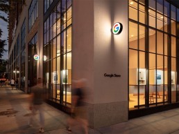
Google Store, USA
The first ever physical Google Store opened in New York this June. Designed by Reddymade Architecture, a complementary, minimal lighting scheme was developed by Reveal Design Group.
The opening of a new retail space for one of the global tech giants always comes with a buzz of excitement – whether it’s the latest Apple store, a new flagship location for Microsoft, or Amazon’s supermarket chains.
This buzz has once again been seen with the opening of Google’s first ever physical retail space in New York this June.
The store, located on the ground floor of Google’s headquarters in Chelsea, Manhattan, was designed by Suchi Reddy, Founder of Reddymade Architecture and Design, with the concept centred on the core principles of Neuroaesthetics – a theme that Reddy explored in A Space for Being, a collaboration with Google and its VP of Hardware Design, Ivy Ross, at Salone del Mobile in Milan.
The architect’s work follows the belief that “form follows feeling”, meaning that the design has been carefully calibrated to the human, and positively influences wellbeing, creativity, and productivity.
The architecture and interiors of the store are a pragmatic, playful expression of this motto, bringing a unique focus to the interplay of good design with human perception. The intention from Reddy was to “re-awaken visitors to the childlike wonder found in the technology and digital innovation on display”.
The architectural lighting for this landmark store was designed by Reveal Design Group and co-founder Levia Lew explained how the firm got involved in the project: “My firm and I are currently working on a large residential/hotel project in Florida, which started in 2017 with Suchi Reddy. Suchi and I found that our creative processes are very compatible; we have a lot of fun designing and problem-solving together. In 2019, she invited me to assist on A Space for Being, the Google partnership for Salone del Mobile. The success and impact of the installation paved the way for the collaboration between Reveal Design Group and Reddymade for the flagship store.”
The overall design for the store is warm and calming, with an abundance of soft, tactile surfaces and natural materials such as cork and wood. Lew explained how this impacted on the brief for the lighting design: “The overarching goal and design vision was focused on sustainability and natural materials to convey a sense of light, openness and possibility, as well as a feeling of ‘home’ given the products and services that Google planned to showcase in the space. The goal of LEED Platinum certification also set very clear boundaries as to what kind of lighting could be used in terms of energy consumption.”
Lew explained that because of the material palette selection and “flow” of the space, the lighting concept was kept deliberately minimalist and restrained. As such, a precise and orderly arrangement of fixtures in the 16ft ceiling, with an aperture size and warmer colour temperature more typically found in hospitality and residential spaces, was used. This, Lew added, served to highlight the dramatic architecture, while simultaneously bringing the visual focus down to the human level to create the sense of home.
Alongside this, moments of intimacy and relaxed ambience were intended through the selective use of integrated lighting, with illuminated display cubes and focused lighting casting a warmth, while visually organising the expansive space into comfortable areas and differentiated zones.
“The goal was to create a sense of differentiation between each ‘room’ as Google wanted them to embody the various experiences of the products and services featured within,” said Lew. “Thus, one area is a homey living room setting, another is a gaming setting, and another a product showcase setting. They all had distinct personalities to be shared.”
One of the key design elements that Lew had to factor in when developing the lighting scheme was the abundance of natural light that fills the store, and how to marry this with artificial lighting. With the lofty, 16ft ceilings and huge, double height windows, daylight, and the ambient brightness of streetlights outside, were prominent influences on the interior of the space.
However, instead of seeing this as a challenge, Lew was eager to create a scheme that would complement the ambient daylighting, while using this as a tool to enhance the natural materials and clean lines of the interior design.
“The space was already naturally lit though the curtain wall with the most powerful source we have: the sun,” she said. “One of my mentors years ago said to me that a space will tell you how it wants to be seen. In this case, the sheer amount of daylight coming in through the windows was a major force that we could not fight, nor did we want to.
“The room, with its light, wide open planes and surfaces that gently reflect the ambient light from the window directed the choice to continue that gesture by gently washing the interior surfaces with light rather than to accent them with dramatic beams.”
Softly diffused and reflected light creates an even ambience with relatively few fixtures; Lew then selectively accented gathering and product showcase areas with direct illumination to create visual contrast to add emphasis on certain zones.
She continued: “Lighting designers often speak about painting a space with light. In this case, I used light like watercolours, to wash and blend surfaces, allowing the crisp lines of the architecture to cut its own path through it. The paintings of Morris Louis and Mark Rothko, as well as the works of James Turrell, were initial inspirations for the design of this project.”
Thanks to a strong pre-existing relationship with architect Reddy, Lew and her team were given the trust and freedom to create a lighting scheme that would sit in harmony with the store’s interior design. She explained: “My team worked closely with Suchi’s team from start to finish. We were in near-constant contact, problem-solving and coordinating field conditions along with the usual challenges that come up during the design and construction process.
“However, once Suchi’s vision was strongly established, we were given the freedom to come up with our own lighting scheme and ideas to communicate the intended feeling within her design. We have an exceptional, open dialogue between our two firms. It is incredibly refreshing and rewarding when ideas flow both ways with such honesty and clarity, allowing for that rare creative freedom and trust.”
This trust meant that, while the approach of “form follows feeling” was an integral facet of the architectural design, Lew could bring her own interpretation of this mantra for the lighting.
“Like many lighting designers in the architectural field, I was trained in the theatre, where I learned to use light to elicit audience emotion based on script and story. My design methodology is inspired by the way something makes us feel, whether it’s a sculpture, space or building. I’m driven to discover and tell a meaningful story, and to evoke an intended feeling.
“However, light is both abstract and technically scientific at the same time. The Google store’s space and architecture made me feel and see specific things, but from a lighting perspective, in order to realise those feelings in reality, hard science and calculations are required to make light behave as we envision.”
Inside the store, the warm lighting and neutral tones guide the eye to one of its main focal points, dubbed the “Imagination Space”. Standing at the entryway to the store, a semi-circular node of extruded glass tubing suspended between the ceiling and the floor refracts light and invites visitors to interact with Google’s products and technologies on an individual level.
Lew explained how a minimal lighting approach helps to bring this key element of the store to life: “Suchi’s vision for the Imagination Space was so elegantly minimalist with its clean, austere lines and magnificent fluted tubes enveloping the visitor in a glass cathedral of light that it seemed vulgar to treat the volume with more than what was necessary to make it sparkle.
“We exploited the physical optics of the vertical fluting by using a simple, uninterrupted circle of light from inside of the column so that the visitor’s kinetic experience changes depending on whether they are inside or outside of the cylindrical space.
“I am always looking for inspiration and had an ‘aha!’ moment one night at home, noticing how light reacts through the crystal strands of my selenite votive when a candle is lit within. It is exactly the same principle at the Imagination Space, only on a much larger scale.”
With the store designed according to the highest standards of sustainable and renewable practices, receiving LEED Platinum certification in the process, Lew was given limited wattage allowances for any fixtures specified for the project. “What that translates into is minimal quantities of lighting fixtures, stringent energy efficiency and functional longevity criteria for those fixtures, and the use of sensors that limit energy consumption,” she explained. To achieve this, she opted for fixtures from USAI, DMF Lighting, Kelvix and ETC, alongside Lutron’s Vive wireless control system.
As the first physical retail space for the tech giants, the Google Store will no doubt be compared to those of its rivals. However, Lew said that such comparisons didn’t factor into her approach to this landmark project. “I try very hard not to get distracted by previous projects and design gestures, since every project has its own DNA and story it wants to tell,” she said.
“In the theatre, we learned early on that as every show is unique, you must approach each production like a blank slate. This also goes back to my belief that every space will tell you how it wants to be seen. What I consider and strive for above all is that each client sees the best possible reflection of themselves and their intentions in the final result.”
This final result is a space that encapsulates the warm yet inspiring aesthetic that both the architects and lighting designers aimed for. And while the environmentally conscious, sustainable interior design is gaining plaudits, Lew feels that the lighting goes a long way to creating a strong impression on visitors.
“Lighting is crucial to creating a subconscious impression that presents itself through an emotional response to the viewer,” she said. “Suchi wanted to create a welcoming feeling of openness and possibility. By taking our cues from her vision and material palette as well as the actual spatial conditions, we were able to create a cohesive layer that ties all interior and architectural elements together.”
Adding this landmark project to the Reveal Design Group portfolio was a singular opportunty and privilege for Lew, yet she says the greatest joy is seeing the pride her team has on completing a winning project.
“It is certainly exciting and gratifying to add such a successful, groundbreaking endeavour to our portfolio,” she said. “However, what I find most rewarding is seeing our team’s pride in a successful project after tirelessly investing tremendous dedication and effort.
“Our Google Store project management team - Josh Klein and Ashton Allin - spent more than two years of hard work and careful coordination to achieve the design and I am incredibly proud of them and their teamwork.”
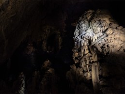
Collepardo Caves, Italy
Italy’s Collepardo Caves have been given a mystic, ethereal new lighting scheme from OkiDoki Arkitekter that highlights the naturally-formed caverns, while protecting the thriving ecosystem within.
Located in the Frosinone province of Italy, around 70km from Rome, lie the Collepardo Caves. A site of significant ecological and archaeological interest, the underground labyrinth is home to a diverse assortment of natural resources, wildlife and plant life.
Under the supervision of Albino Ruberti, Head of the Cabinet of the Lazio region, and the region’s Cultural Heritage Department, the caves have been given a new lighting scheme that brings a sense of mystique and drama, while protecting the delicate ecosystem.
Stockholm-based, Italian lighting designer Chiara Carucci of OkiDoki Arkitekter, was approached by Ruberti to take on the challenge of illuminating the space in a respectful manner.
“I was ecstatic to be offered the project, especially after visiting the caves for the first time; but I only accepted after making sure that we could respect the heritage of the caves,” she said. “Too many touristic caves around the world are lit like an amusement park for the sake of tourism, with no respect for the biodiversity.”
The aim for the new lighting was therefore twofold, as Carucci explained: “Initially the main goal was to seduce tourists, therefore giving a new input to the local economy; but also, to enhance the beauty while protecting the heritage.
“My interpretation of these goals, shared and agreed in several meetings with the client [Lazio Region and LazioCrea, particularly Director Maurizio Stumbo and Laure Maurizet], was not related to the so-called “wow factor”, nor the Instagrammability of the project. I meant to convey one simple message: respect the heritage.
“I was hoping that through a simple yet incisive lighting design, I could inspire people to look beyond. If I could seduce them, maybe scare them a bit too, and revive the spirit of adventure we always have, at least until adulthood, they would hopefully be inspired to respect and love nature.”
Within this “biodiversity treasure”, as Carucci described it, lives a large community of bats, including at least five species. Falling under the “Habitat Directive” on the conservation of natural habitats and of wild fauna and flora, it was therefore vital that any lighting interventions do not disturb this vibrant colony. Further to this, Carucci had to ensure that the new lighting limited the ecological problem of lampenflora – the proliferation of principally phototrophic organisms near artificial light sources at sites where under natural circumstances they would not appear.
Luckily for Carucci, she was given guidance from multiple sources when developing the lighting concept: “Vito Consoli, Regional Director for Natural Heritage and Protected Natural Areas, was extremely supportive. He shared a wide bibliography about chiroptera [bats], lampenflora and touristic caves,” she said. “‘Get informed before doing’ has always been my way of working, and I’ve never felt so encouraged as I did here.”
“The guides also shared their experience and love for the place with me, as well as a lot of knowledge. When I first met them, I hoped that I could replicate their genuineness in my design.”
To help get into the zone while developing the lighting concept, Carucci rented a flat in Collepardo with friend and architect Ruggero di Maio, who has a lot of experience in construction site management. Here, she “lived and breathed the atmosphere, slow pace and the mood of the village,” immersing herself into the locale to better understand it.
“The way the daylight brings to life the beautiful cliffs, woods, nature reserves and rivers, helped me to build the concept. I felt that I could enhance the caves through effects of light that I experienced in the area,” she explained.
“I used the long shadows and soft contrasts of central Italian afternoons to enhance several speleothems, through side light and medium beam lighting fixtures. I looked at the glistening on the Torrente Cosa river for gently treating the splattermites, which are active and yet so fragile. I was inspired by the sharp morning sunrays through the hillside for enhancing the depth of the cave, while keeping several areas darker, providing comfortable aerial corridors for the bats. I looked at the midday sun in the clearings and the woods for more contrasting effects, especially for the entrance. Finally, the sunset that would make a golden “explosion” on the steep cliff in front of the cave, is my main inspiration for the lighting of the detachment fault.”
Throughout the project, Carucci was in close communication with an extensive team of researchers, scientists, and advisers, who provided guidance on what lighting scenarios would best protect the habitat within the caves.
“This was one of the most challenging and interesting aspects of the project,” she explained. “From the beginning we had invaluable support from Giovanni Mastrobuoni, LazioCrea’s consultant for chiroptera, who has been studying the local colonies for the past year.
“My ‘voyage au centre de la terre’ continued with researchers Leonardo Ancillotto, Rosangela Addesso and Jo De Waele. We met several times, online and in person, and their input and reports were extremely valuable.
“Particularly, Rosangela and I discussed the use of specific wavelengths of light spectrum that would reduce the development of lampenflora – after careful evaluation, we agreed to work on three parameters: distance, low intensity, and total time of operations.”
Practically, this meant that fixtures were installed 800mm from speleothems (mineral formations), with very low lumen outputs and short operating times. It was also suggested to avoid illuminating soft surfaces and those covered with vermiculation, with lighting instead focused on rocks and crystalline solids.
Bearing these suggestions in mind, one of the core facets of Carucci’s design was to keep the lighting deliberately minimal, and purposefully dark, with a respectful approach more akin to illuminating delicate artefacts in a museum. “I completed the design with 89 lighting fixtures [excluding the handrail lighting], 64 of which deliver 160lm, 1.5W each, and I dimmed several of these down to 50% when in use, so it’s pretty dark!
“Some may think that a place must be bright to be awesome, but in my opinion it all depends on both the context and the education of the visitors,” she said.
“Especially after electrification, caves became tourist attractions, however they are naturally dark. Since we could inform the public, before and during the visit, I decided to work with low intensities, not only for environmental reasons. I used an entire palette of effects (light, shadows, contrast, colour temperature, etc) when and where necessary, and worked with perception to achieve a three-dimensional vision that supports storytelling and narrative and creates an experience for visitors.
“The darker, almost mystical atmosphere may make visitors feel like explorers and support the mood for listening and learning.”
To further enhance this atmosphere, Carucci created a series of lighting scenes to showcase the various spaces within the cave. This also helped to create a natural flow for visitors, guiding them through the caves in a sequence that would follow the new accompanying audio guide, delivered by President of WWF Italy and local TV personality, Donatella Bianchi.
“Besides practical suggestions, the researchers supported my effort in having ‘time’ as a key aspect of the design,” she said. “I interviewed all the guides, getting info on visit durations, number of people per group, and their ‘highlights’. From there, the narrative and landscape suggested to divide the caves into five zones or thematic areas, so that I could reveal the caves’ marvels gradually through five corresponding light scenes, activated as visitors pass by.”
The first scene, the entrance, is strongly characterised by daylight for most of the day, so Carucci had to find a balance between variable light levels and safety needs while creating anticipation. “Daylight was a key inspiration for my design, but also a constraint – it truly influenced my design,” she said.
Visitors adapt to the darkness as they move towards the inner part of the cave; as their vision adjusts, they discover more details. The walking path is uniformly lit depending on the level of natural light, with fixtures recessed into the handrails. Lumen output was kept deliberately low, with levels dimming down further once visitors pass by, until the first “stop”, where sensors activate the second scene: the Stalagmites. Here, visitors gain a better view of the complexity of the cave and can spot the parallel between the daylight and the new interior lighting.
The third scene, The Cathedral, is the lowest part of the cave. Here, the lighting was designed to make visitors feel very small, compared to the stalagmites and columns, and to experience the silence. “Just like in a gothic cathedral, people should just be in reverence and awe,” Carucci continued.
“I had the chance to keep lighting levels very low, especially since daylight is rarely visible from this area. However, the transition to the fourth scene is majestic – in 20 second fades, the detachment fault is revealed, as well as the most active part of the cave, the splattermites.”
The main visiting area of the cave, The Terrace, is a large space where people can spend more time, admiring the complexity and extension of the cave. Here, the play and juxtaposition with the daylight is fundamental, revealing the arches and telling the story of the formation of the cave.
When the group is almost ready to leave, the guides then turn off several light fixtures, and activate a holographic projection while the audio guide talks more about the cave and its inhabitants.
The final lighting scene sees the lighting for large parts of the cave gradually turn off, and as visitors adapt to the lower light levels, they experience a semi-blackout, turning the darkness into a resource for storytelling.
On top of the need to be respectful of the caves’ delicate ecosystem, Carucci revealed that the sheer logistics of illuminating the space, from planning and mock-ups to fixture placement, was one of the biggest challenges that she faced.
“I wanted to protect the cave’s fragile ecosystem through a careful plan for the installation: lighting fixtures would be mounted on the existing handrails, or placed on areas of collapse, or areas disturbed by previous works or human intervention. However, in order to limit new intervention and the amount of alien materials brought into the caves, I also had to find a compromise between quantity of fixtures and quality of lighting for each area.
“I found it more practical to create the concept through a complete test lighting, while relying on my personal experience and sensibility. Besides the compromises on quantity and quality, I also had to consider space for visiting and for mounting, while working with perception.
“Moreover, explaining the concept to the client is usually very complex, almost impossible in this context, without a full-scale mock-up. So, after testing the entire cave, I set up the lighting for the Cathedral, and invited the client in to experience it in person.
“In three weeks, I broke several gloves and two pairs of mountain shoes, my muscles hurt as I was not used to climbing. But the test lighting was a key experience, and the mock-up was fundamental to get the client’s approval.”
Although faced with multiple issues throughout the project, Carucci said that she is “usually motivated by challenging situations”.
“The collaboration with LazioCrea’s maintenance team and Ruggero di Maio during test lighting, with electrical engineer Massimiliano Faina on the design development, the client and the entire team of researchers was key for a successful process. Especially when working very long hours, admitting when you need help is fundamental.”
With the complexity that working in a cave with such a dense, thriving ecosystem brings, it is a far cry from what one may consider a typical architectural lighting project. However, Carucci believes that this project is what her lighting career has been building towards.
“Looking back, it seems that I prepared for this project for my entire career. Examining the effect of light on the ruins of a Roman villa in one of my first junior experiences in 2004; the special attention to conservation issues and details, learned from my mentors in several projects in Milan and abroad; my most recent experience in landscape lighting, especially in Eskilstuna, Sweden, built up a basis for taking on this project.
“However, none of the projects that I have worked on so far compared to the honour and challenges that I had here. For example, I usually design accessories for installation, especially for heritage buildings. In the caves, mounting also means noise. When designing bases and bollards for mounting fixtures off-path, I had to choose between including an extraneous material, such as concrete for the foundations, versus disrupting the ground with perforations. After consulting with the researchers, I decided for the latter – the drilling produces noise, but speeds up the installation process, and allows a higher flexibility in the aiming of the fixtures.
“Even the construction process was completely different, especially for the times and methods of installation: the building site was planned in relation to the bats’ phenological phases, starting after hibernation and concluding before the nursery.”
Despite some testing circumstances, the project was completed earlier this year, and Carucci explained that the new lighting has been very greatly received by tourists, guides, and researchers alike.
“The tourist feedback is gratifying, especially their silence during scene three, their surprised expression in scene four and their awe at the semi-blackout of scene five. But the most rewarding feeling is the joy and pride of the guides, who now introduce the caves feeling like owners of the project. The guides have been my most valuable asset and their approval and enthusiasm means everything.
“The researchers, especially Giovanni, highlighted how the lighting design sheds a new light on to the authentic spectacle of the site by supporting the visiting experience, while protecting its biodiversity.”
Indeed, while caves naturally have a mystic aura surrounding them, the new lighting within the Collepardo Caves helps to emphasise the wonder of the naturally formed caverns and formations, while respecting the wildlife that call the caves home.
“I take pride in the transformation, especially related to the quality of perception, towards a more natural look based upon a conscious use of darkness as a tool for design, that gives the space a mysterious charm, seducing visitors,” Carucci concluded.
“The lighting not only enhances the landscape and the intrinsic beauty of the caves, but also communicates the values of its heritage, and our care and our effort towards stewardship.”
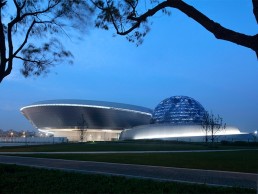
Shanghai Astronomy Museum, China
The newly opened Shanghai Astronomy Museum is characterised by its beautiful, swirling form, designed by Ennead Architects to replicate the “geometry of the universe”. Brandston Partnership developed the lighting concept for this striking new centre.
Designed by Ennead Architects, the Shanghai Astronomy Museum was opened earlier this year. At 420,000sqft, the new astronomical branch of the Shanghai Science and Technology Museum is the largest museum in the world dedicated solely to the study of astronomy.
The building’s sweeping, flowing form – which features no straight edges or right angles – is inspired by the solar system itself, and has been designed as an immersive experience that places visitors in direct engagement with real astronomical phenomena. Through scale, form, and the manipulation of light, the building has been designed to heighten awareness of our fundamental relationship to the sun and the earth’s orbital motion.
Lead designer Thomas Wong, Partner at Ennead Architects, drew inspiration for the museum from the classic “three-body problem” in physics, looking to the intricate choreographies created by gravitational attraction of multiple bodies within solar systems - this is reflected in the winding architectural ribbons of the museum’s façade.
The museum and each of the three principal architectural components of the design - the Oculus, the Inverted Done, and the Sphere – act as functioning astronomical instruments, tracking the sun, moon and stars.
The Oculus, suspended above the main entry to the museum, demonstrates the passage of time by tracking a circle of sunlight on the ground across the entry plaza and reflecting pool. The Sphere houses the planetarium theatre, which is half submerged within the building. With minimum visible support, it evokes an illusion of weightlessness or anti-gravity, while its perforated shell transforms into a glowing orb after dark. The Inverted Dome is a large, inverted glass tension structure that sits on top of the central atrium of the building at the roof line. Here, visitors can occupy the centre of the glass dish with an unimpeded view of the sky. The culmination of the exhibit journey, the Inverted Dome cuts the view of the horizon and adjacent urban context, and thus focuses the visitor’s eye on the all-encompassing sky. A 720-degree spiralling ramp inside the museum underneath the Inverted Dome traces the orbital flow of the visitor sequence throughout the museum exhibits, sending the eye upward to its apex.
Set within an expansive green zone, the museum grounds also include a host of buildings and programming, including temporary and permanent exhibits, a 78ft solar telescope, an observatory, optical Planetarium, Education and Research Centre, and Digital Sky Theatre.
The lighting concept for the new Astronomy Museum was developed by Brandston Partnership Inc, who later passed the project on to a local design team for the onsite installation.
Thomas J. Wong, AIA, Design Partner at Ennead Architects and designer of the Shanghai Astronomy Museum explained the importance that light plays on the museum’s wider design, and why it was so important to work with lighting designers at Brandston Partnership: “Light is one of the primary ways we study and understand the universe, so it was an incredibly important aspect of the design.
“We worked with Brandston Partnership to supplement the natural daylight and integrate a lighting design that highlighted the major architectural features in a dramatic way.”
Director at Brandston Partnership, Wai Mun Chui, explained further how the lighting studio got involved in this landmark project: “We were brought in to work with Ennead’s design team to create the Big Picture idea. That mainly involved highlighting the building exterior and all the major public spaces of the interior – the area under the Inverted Dome, the Sphere, etc – but not the exhibition spaces. These were handled by a local company,” he said.
“Ennead has been a collaborator of ours for a long time, we’ve worked on projects with them for many years and probably completed more than two dozen projects with them. So, when they called us to say that they really wanted us to help on developing the concept, of course it was a yes from us.”
By the time Ennead approached Brandston Partnership to develop the lighting concept, the bulk of the spatial design for the building was completed. However, as soon as he saw the renders for the site, Chui knew that they were on to something special. “When I first saw it, I thought that it was a stunning design. We saw a lot of images and renders from both the exterior and interior, and it’s stunning. And I think the building, in terms of features, speaks for itself. It’s very clear that Ennead wanted this to be a very special experience for visitors.
“They already had some idea of how they wanted the space to look, but we spent a long time locked up in a room to work out all of the big ideas for the whole project. We put all of the drawings up on the wall and on the TV screens, so that we could draw at the same time as we spoke and discussed ideas. It was a very fun process, which we have truly missed in the last two years, but that’s how we came up with the ideas together.”
The collaborative process was built on creating a lighting scheme that would sit in harmony with the architecture, and allow the building itself to take centre stage, rather than the lighting becoming the primary focus. “We didn’t want the message when you approach the space to be “wow” in terms of the lighting,” Chui continued. “It should be about the space and the whole experience – from approaching the site and the building, how you perceive the space and the features within. We wanted the lighting to really enhance the experience, but not necessarily be what you see when you arrive.”
To that end, the lighting strategy was relatively minimal, particularly on the exterior. Because of the museum’s proximity to the nearby observatory, light pollution was a real consideration. “We really wanted to minimise how bight the site was, and avoid any light pointing directly upward,” Chui continued.
“We also didn’t want to light up all of the surfaces. The idea was to just put a few strokes of light here and there, so that you recognise the building. We also knew that the metallic finish of the façade would reflect light, so any surface lighting or surrounding lighting would be reflected off the façade surface.”
With a stripped back, simple exterior lighting concept, the main lighting feature was the addition of a band of light spanning the exterior of the Sphere. The light, tracing a path that winds up the side of the building, was kept low, so as not to distract from the glowing Sphere.
“The idea was to use some sort of step light to illuminate the path and bounce light up the surface,” Chui explained. “We didn’t want anything inground, or anything pointing upwards. Instead, what we have is a simple solution that creates a uniform, continuous line of light along the path while at the same time, lighting up the base of the slender wall, but the source remains hidden from view. That highlight came through our development work with the architect to create a detail at the edge of the path that allowed the light source to be concealed, but still deliver an intense band of light.”
Elsewhere, the museum’s other defining features, the Oculus and the Inverted Dome, had a much more minimal lighting strategy, instead allowing the design itself to shine. “Our concept was really about highlighting certain edges so that you can read the form of the building, we tried not to overdo it,” Chui continued. “We haven’t lit the Oculus because it creates a really dramatic effect on its own, projecting the sun throughout the day.”
Instead, the lighting concept features a series of small, lit domes within the ceiling of the entrance, surrounding the Oculus. These are softly uplit to provide a gentle, functional illumination, appearing as planets orbiting the sunlight of the Oculus.
Similarly with the Inverted Dome, the design concept used the ambient lighting from the museum interiors to bring a gentle glow to the centre of the dome. “The whole idea is that when you’re in the top of the Inverted Dome, you don’t need any lighting, it’s about light coming through from the interior, and I think it works really well,” Chui said. “It’s purely about the architecture and how this works, it’s not about the lighting. I think Ennead can be very pleased with it.”
With the Shanghai Astronomy Museum’s atypical, curving form specifically designed to “echo the geometry of the universe and the dynamic energy of celestial movement”, Chui felt that there was more freedom for expression when designing the lighting concept, which was equally inspired by the museum’s subject matter. “The team wanted something that was not a typical solution – they wanted to push the boundaries,” he said.
“The whole building is very edgy. In the same way, they had the same expectation that the lighting would not be typical. When you go inside, you realise that there are no straight lines, everything is curved, so the lighting expression is also to enhance the building’s curve.
“If you imagine starlight, it’s a bit random, the sky is a bit random, so in expressing the curve, we also saw lines of light, random patterns of light, to match the design of the building.”
This approach continued with the interior lighting concept where a layered approach combining linear fixtures, wall washes and a small selection of downlights accentuate the curves and shapes within, while also respecting the plentiful daylight that filters into the space. “There is so much daylight coming in, so the idea was to create a lower ambient condition,” Chui explained. “There’s a striking light around the ramps and the stairs, the walls are lit, and then there are a few downlights on the path, so it’s very subtle.
“At night, the ambience is expected to be much lower, so we issued guidelines about the light levels, and guidelines about the general lighting control system, to make sure that there is a control system in place so that adjustments could be made.
“We wanted to make sure that there is a flexibility and capability, so that everything can be balanced.”
Indeed once Brandston Partnership had drawn up the lighting concept, they passed it on to a local design team to bring to life. Chui explained this process further: “We created a package with the layout and the sketches and details so that the local team would know the idea behind it and the basic detail that was required. For example, when talking about the path lighting, it’s very schematic, but we explained that it had to be essentially a light box behind a perforated panel.
“It’s important to coordinate to make sure that everybody understood the overall concept, but also the important things for each detail.”
And while Chui has yet to visit the museum in person, from what he has seen from images, he is satisfied that Brandston Partnership’s original concept has been brought to life. “What I judge is did they get the concept correct, and I think from that standpoint, it’s very close.
“When I first saw the photos, I thought ‘wow, this is really stunning’. We were involved in the concept stage, we developed all these big ideas and gave Ennead a lot of sketches about where to locate light, in terms of the details, but they worked with the local team to make all these things work.
“When I look at the pictures, I see our concept. They did a really good job in terms of carrying on and developing the design, and the lighting at the end of the final product looks exactly like what we all envisioned. That’s the beauty of this project.”
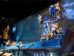
The National Museum of the United States Army, USA
Opened at the end of 2020, the National Museum of the United States Army tells the storied history of the US Armed Forces, with a dramatic lighting strategy from Available Light.
The National Museum of the United States Army opened to the public in November 2020. Located on a publicly accessible area of Fort Belvoir, VA, it acts as the Army’s “front door” and is an enduring effort to tell the Army’s story and honour the accomplishments, sacrifices and commitment of American soldiers.
The museum is the first comprehensive and truly national museum to capture, display and interpret more than 245 years of Army history and brings to life that history in times of war and peace as told through the eyes of soldiers. The museum also offers educational experiences illustrating the Army’s role in building and defending the US, as well as Army humanitarian missions and technological and medical breakthroughs built on Army ingenuity.
A joint effort between the US Army and the Army Historical Foundation, the building was constructed using private funds, with the US Army providing the infrastructure, roads, utilities, and exhibit work that transformed the building into a museum.
Architect Skidmore, Owings & Merrill designed the building, with Clark Construction Group beginning construction of the 185,000sqft facility in 2017, while the US Army Corps of Engineers coordinated site preparation, constructing the roads, and installing utilities.
Exhibit designers Christopher Chadbourne & Associates and later, Eisterhold Associates, created the museum’s storyline and exhibit design, supported by lighting designers Available Light. Having first got involved in 2008, Steven Rosen, Creative Director, and Derek Barnwell, Lead Designer and Project Manager at Available Light spoke with arc about the design.
“From the Army’s founding in 1775 leading all the way to modern American society, the project is a cultural history museum,” says Rosen. “The nine galleries are laid out in consecutive time order with a 300ft long media and lighting-rich connecting concourse and with commonly designed entry portals leading to each experience.
“Because we had a 45,000sqft plan with an almost 27ft-high ceiling ‘black box’ to work with, we conceived a continuous flowing gallery-to-gallery immersive theatrical environment. We worked diligently to let the corners of the various spaces go dark, so the entire visitor experience felt as if it emerged from darkness.
“For continuity, clarity, and orientation there are many similar elements in each gallery exhibit, including the strategy of presenting and lighting graphics. To tell a myriad of stories, each gallery is given a deep historical treatment using artefacts, tableaus, realistic cast figures, macro-scale artefacts, synchronised A/V presentations and so on, to tell the story of how specific events shaped a nation.
“Multi-layers of light take on a significant role to help craft the visual environment. From clean shadow-free brushstrokes of light on graphic panels and rails to hundreds of theatrical accents, we aimed to deliver a vibrant and dynamic sense of place.”
Over the many years of the design process, Rosen, Barnwell and their team (Associate Lighting Designer, Rachel Gibney; and Designers Li-Hwa Yu, Nastassia Ortiz, Matt Zelkowitz, Bill Kadra, Hess Smith and Lindsay Duval) had dozens of conversations with exhibit and graphics designers, content developers, A/V treatment writers, expert army historians, army personnel, and museum leadership about how the lighting should look. “As storytelling collaborators, we’re not interested in simply adding light to a completed 3D environment,” Rosen says. “That rarely leads to a satisfactory and organic experience. By the time installation rolled around, we felt we had our task mapped out and we set to work on delivering the lighting experience that had been discussed and vetted.”
Rosen and his team ensured special consideration was given to the hundreds of delicate objects from the army’s archives, which all required conservation lighting levels of 35-60 lux. “Too often, conservation level lighting equals boring lighting design,” continues Barnwell. “Our investment in creating a theatrical and dramatic experience didn’t end at the outside of the artefact cases. In most of the cases we installed a fibreoptic grid system developed by Luxam Lighting; just as every theatrical spotlight and track head was considered an individual paintbrush of light, a variety of zoom-focus fibre spots and light bars were distributed in every case and dramatically focused by a team led by Rob Rowlands of Luxam.”
Within the museum there is a wide range of dioramas and exhibits depicting scenes from various wars and battles. While it was important to the lighting team to find similar gallery-to-gallery treatments for clarity and orientation, it was equally important that they developed unique storytelling moments to make the arc of the visitor’s journey more interesting and compelling.
Rosen explains: “Control over the environment is key. We are dedicated to using small paint brushes of light instead of big washes. Those smaller strokes allow us to strategically avoid video projection surfaces, control light levels on artifacts and direct focus to what is important. This high level of lighting control brings a sense of drama and gravitas to the moment and this specially crafted light supports the desire for an extremely meaningful visitor experience.
“As an example of this, at the Soldiers Stories entryway to the galleries, 42 stainless steel pylons, each celebrating a person who gave the ultimate sacrifice, is presented in a striking and sterile lighting presentation – it is unlike anything else in the museum.”
Another striking highlight within the museum is a replica of the Wright Brothers’ Wright Flyer, “an abstract environment, bathed in theatrical light,” says Rosen. “Then you also have moments of the Meuse-Argonne Offensive in WWI being re-enacted and given the full multimedia theatrical immersion treatment with lighting, audio, video and special effects, all synchronised together to form a powerful battlefield experience. Visitors stand on a glass bridge, allowing the environment to extend beneath them.”
As mentioned previously, the museum benefits from ceiling heights of 27ft and while the vertical space was created to accommodate macro-artefacts, the lighting team took full advantage of the height. “The ceiling heights were fantastic,” says Rosen. “In most museum gallery situations, the distance from luminaire to target is very short and the magical softening and blending that happens when a beam of light has distance to travel is mostly lost. The gift of height means many of the dioramas are more beautifully sculptured from a distance away. To this end, we deployed more than 460 ETC Source Forward profiles in multiple layers of light, for framing objects, laying down gobo/colour washes and artfully creating evocative lighting compositions.”
However, with hundreds of feet of curvilinear wall displaying graphics, artifacts and so on, the high ceilings – hosting many large, hanging macro-artefacts – also presented the team with challenges when it came to allowing them to consistently illuminate the long flowing walls. Barnwell explains: “To address this situation, we designed and built a curving lighting track eyebrow”, stood off from and tracing the walls. For a clean appearance, track heads were concealed in a channel.”
Reflecting on challenges during the project, for Rosen the biggest issue was the drawn-out amount of time the project took, explaining: “Maintaining continuity, engagement and enthusiasm over the 12 years this project was in our studio was difficult,” he says. “We saw many critical contributors exit the project for any number of reasons. Keeping track of changes to this enormous experience could be a little mind-bending, but thankfully Derek Barnwell was with the project from day one and continues to address client questions even today, his institutional knowledge of this project is encyclopaedic!”
Over the 12-year span that the lighting team worked on the project, the LED Revolution hit the industry. The original lighting specification called for ceramic metal halide profile units and track heads. Thankfully, there was time for the lighting team to sit on the side-lines with the project to better understand the implication, challenges and benefits of transitioning to a radically new and game-changing light source. “Ultimately, we decided moving away from what was soon to be an obsolete technology was the better route to take,” Barnwell says, “and we began the process of educating our client – and frankly, ourselves – on why we believed we should revisit the entire lighting specification and use LED. We did an exhaustive cost-benefit analysis and oversaw several workshops and mock-ups. Although this was an extraordinary effort that touched virtually everyone on the project team, we believe the change was of long-term benefit to the job.”
Taking a final reflection on the project, Rosen explained to arc how it’s hard to describe the emotional impact the project has had on its audience. From soldiers and families who lost colleagues and loved ones in battle, to the public interested in making better sense of what the US Army is and how it operates, to the myriad of people in between these two extremes, the reaction, has been “incredibly satisfying.”
“We poured a lot of effort into every detail, large or small, and we are proud of the final product,” says Rosen. “We are grateful to have worked with some of the best in the business to create this world-class experience.”
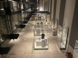
Museo Egizio, Italy
The oldest museum dedicated to Ancient Egyptian culture, Turin’s Museo Egizio has recently undergone a renovation, with a new lighting scheme created by Belgian designer Chris Pype.
Located in Turin, Italy, the Museo Egizio is the world’s oldest museum dedicated to Ancient Egyptian culture. Currently, the museum preserves a collection of roughly 40,000 exhibits across its numerous rooms and galleries.
During its most recent renovation, Licht was brought on board to complete the new lighting design scheme to complement the exhibits, but also be sensitive to the preservation of the artefacts on show.
Founder of Licht Chris Pype brought a wealth of knowledge in museum lighting to the project, with a portfolio of works that include Louvre in Paris, the British Museum in London, Kunsthistorisches Museum in Vienna, Egyptian Museum in Berlin and München en Medelhavsmuseet in Stockholm.
“In 2016, we were responsible for the lighting design for the Egyptian wing of the Rijksmuseum van Oudheden in Leiden, Netherlands,” explained Pype. “We were able to realise this project with a great appreciation for the museum and its scenographers, Kinkorn.”
As a result of the work they completed in Leiden, the Egizio’s Museum Director approached Pype directly to recreate the same scheme in his museum in Turin.
Telling arc of his design concept, Pype said: “The atmosphere in the renewed museum was dull. Everything was immersed with the same source of light and there was little differentiation with many objects remaining in relative darkness.
“In the latest renovation, the museum’s approach was rather architectural. The lighting design did not originate from the objects in the exhibits. Egyptian artefacts need a very specific approach due to their unique appearances. Monumental statues against miniscule amulets, carved hieroglyphics, light-sensitive papyri in contrast with light resistant stone or metal artefacts, sarcophagi with outer and inner decoration.
“I have focussed on the objects themselves and tried to preserve them in their intrinsic value yet provide a strong visual impact in all their aspects. In addition to all of these points of consideration, we also reduced the light spill to increase the overall contrast levels.
“The problem was the previous lighting scheme was too coherent. Instead, we have tried to bring more life into the spaces by building up distinctive spheres.”
Due to budget constraints, the Licht team worked as much as possible with existing light equipment in the museum. However, there were some rooms that needed complete overhauls and specific attention to improve. “The grid of the existing tracks was too limited. We added extra tracks to achieve more angles to light the collections,” explained Pype. “For existing spotlights, we ordered other optics and accessories to improve them.”
Working within the listed museum building also presented some placement issues for the new fixtures Pype planned to integrate into the scheme. It pushed the team’s creativity to come up with appropriate solutions to the task, including bespoke options for the showcases.
Using products from Erco, LED Linear, Luxam, Nemo and Viabizzuno, Pype and his team paid close attention to the sensitivity of a lot of the exhibits. To maintain preservation, Pype ensured the luminous intensity never exceeded 50 lux. With neighbouring pieces that weren’t as sensitive, lighting was increased to “give a punch of light to liven up”.
“Individual spotlights with very narrow light beams and framer units were used to address these varied light intensity needs,” said Pype.
Fibre optic lighting products were chosen for conservational reasons to illuminate the mummies on display, but also because they were able to reach the refined integrated lighting needs.
“The biggest challenge were the many showcases,” continued Pype. “Internal lighting equipment would have been the best option but was no longer technically possible. The lighting from outside of the showcases was providing a lot of unwanted, distracting shadows from the edges of the glass cabinets, hinges and tablets. By choosing to light under the right angles with spots, we could reduce these shadows to a minimum.”
Further lighting successes were proven at the sandstone temple, which has suffered a lot under erosion. Pype’s lighting solutions resulted in the re-emergence of once lost figures in the stone, and reducing the traces of erosion.
Overall, the project was a great success and well received by those at the museum. “Due to the complexity of integrating internal lighting into the showcases, we could only implement these solutions in the showcases that really needed it. And, due to the scale of the museum and its budgets, we had to balance where we could have the greatest impact for the least amount of effort.
“We were amazed at how powerful the medium of lights is once again. By a well thought-out approach, we were able to bring a new look and feel to the museum,” said Pype.
Christian Greco, Director of the Museo Egizio, added: “Thanks to the new lights installed in the museum’s rooms and in the showcases, visitors are first of all offered the possibility of a closer encounter with the artefacts of our collection, as they can observe even the smallest details, such as engravings, bas-reliefs and hieroglyphs. The public can therefore enjoy a much more effective view of the Museum’s objects for a better visiting experience.
“However, this project does not represent a simple technical improvement. Having a closer experience with the museum’s artefacts allows the public to have a better understanding of the material culture of ancient Egypt, engaging in dialogue with an ancient civilisation that is still able to speak to us today through the biography of its objects, and to transmit universal stories.
“The artefacts of the Museo Egizio’s collection can then no longer be mute testimonies but a way to raise public awareness of the importance of the past, a key to understanding the present time and ourselves.
“The important work carried out by Chris Pype and his team is therefore not limited to the technical and technological components, but represents a distinctive element of how the Museum wants to relate to its public, fulfilling one of the essential tasks of a cultural institution like ours, as stated also in the fundamental principles of the Italian Constitution.”
Unilumin Sharklite
Unilumin has recently launched the Sharklite series of street lighting products. The series has been designed for street and urban lighting applications by delivering high quality and performance. SharkLite is future oriented and smart ready with smart sensor interfaces to facilitate smart cities. With explicit optical design, SharkLite with its high visual comfort feature is dark sky friendly.
SharkLite has an efficacy of 150lm/W with lumen package options from 3000-22500lm, greatly reducing energy consumption and carbon emission while improving the urban lighting environment and safety.
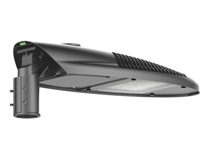
With the future-proof NEMA and Zhaga control interface alternatives, the luminaires are sensor and smart ready for the smart city deployment. They can be connected to wireless CMS, enabling remote management of the street lighting infrastructure and improving the urban connectivity.
The luminaire is made of heavy duty die-casting aluminum for housing, PMMA and tempered glass for optics, and powder coated to enhance its corrosion resistance for harsh environment. Apart from that, most of the materials can be recyclable responding to circular economy initiatives.

Coupled with solar lighting system, it provides green and sustainable lighting solutions for off-grid areas and protects the environment in which we live.
With all the features and benefits, SharkLite can be widely used in public area lighting such as urban streets and roads, rural street and roads, residential streets, industrial streets, parks, parking lot, cycle and foot paths etc. to make it an ideal choice for public lighting applications.

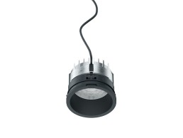
Erco Iku
With five sizes, ranging from 84-221mm, three downlight distributions, plus wallwashers and double wallwashers, as well as six white light colours, and tunable white, Iku recessed downlights are compactly designed and offer high lumen output with a luminous efficacy of over 100lm/W. Iku represents a universal system for uniformly designed, ceiling-integrated lighting. The range is ideal for public buildings, offices and administrative buildings, as well as conference centres, hotels and restaurants.
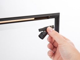
L&L Luce&Light Tago
Tago is a new LED profile with built-in power supply that is drive-over up to 2000kg. The fixture is intended for architectural lighting for urban façades. With a body in Anticorodal low-copper-content aluminium for excellent heat dissipation, Tago is available in three lengths – 30, 50 and 100cm – and three configurations: recessed flush, recessed with rebated frame, or surface mounted using brackets with two pivot points. A wide range of deep-set optics – including elliptical, wallwasher and wall grazing – is available, with colour temperatures ranging from 2200 to 4000K.
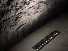
corporate friends R-SL-16
R-SL-16 – a luminaire profile with a diameter of only 16mm, was specially developed for use in showcases. The special feature is the skilful combination of a light bar with integrated spotlight, which is individually dimmable. In addition to a restrained and unobtrusive basic illumination of exhibits, it also allows for expressive additional accent lighting. R-SL-16 can be used in various ways in horizontal as well as vertical installation situations.
CLS Jade Zoom Tunable White
The new Jade Zoom Tunable White is the ultimate lighting tool for light designers. The Jade has a Zoom range of 10-60° and 2700-6500K colour temperature control range. CRI≈96 on all colour points between 2700-6500K and R9≈95. Due the (Wireless) DMX and Casambi Bluetooth control options, dynamic lighting options or sensor-controlled daylight adjustments are easy to programme. Multiple mounting options are available for example track or ceiling.
Reggiani Traceline Track 48V
Traceline Track 48V is the latest addition to the Traceline family, allowing you to complete your linear configuration with spotlights or suspensions at any time, creating a unique combination of diffused and accent lighting. Available in four lengths and three different applications – Surface/Pendant, Pendant with indirect lighting or Deep Pendant with both direct and indirect lighting, integrating accent lighting with ambient lighting has never been easier.
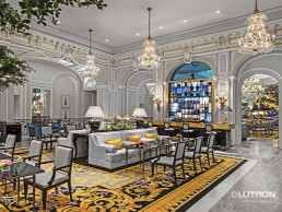
Lutron Athena
Athena is Lutron’s newest architectural lighting control system. It’s a simple, flexible, all-in-one solution that delivers the perfect light experience by combining the world’s most advanced lighting control system with intelligent shades and connected applications. Nurture a mood in spaces large and small, with warm dimming and tunable white, as well as Architainment lighting. Use light as an amenity – enhancing the experience in restaurants, galleries, spas, and more.