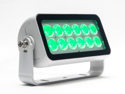
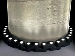
Linea Light Group Lingotto

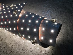
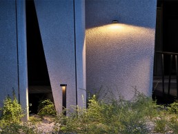
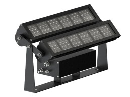
Lingotto is a new solution particularly suited to lighting up pergolas, exterior walls, cellars and basements. Perfect for outdoor environments, thanks to the polyurethane resin diffuser with an IP65-rating, the fixture is weather and humidity resistant, characterised by a body lamp in AISI 304 stainless steel. Lingotto is available in black and dark brown finishes in various suspension wall and ceiling versions

www.linealight.com


111 Piccadilly, UK

A landmark building for travellers arriving into the UK city of Manchester, 111 Piccadilly has been given a facelift with a new, dynamic lighting scheme, designed by local firm Artin Light.

Standing on Station Approach, the main thoroughfare in and out of the city of Manchester for travellers into Piccadilly Station, is 111 Piccadilly. Formerly known as Rodwell House, the high-rise development, owned by Bruntwood Works, was first opened in 1965, and has long been recognised as one of the first buildings commuters and visitors see on arriving in the city. 

The building, defined by its sharp, grid-like geometry, has recently been given a new lease of life thanks to a dynamic new light art installation from Artin Light.

Brought in by Bruntwood Works via a connection with architects 3D Reid, Artin Light was appointed to transform and enhance the building’s architecture, bringing a sense of movement and vibrancy to its vertical and horizontal lines and turning it into a defining landmark for the city. 

“Bruntwood Works was looking at the external lighting design, and they felt that there was a big opportunity to do something out of the norm, particularly as the building is fundamental in terms of the gateway into the city,” explained Luke Artingstall, Director of Artin Light.

“I met with them and pitched a number of design ideas, trying to think out of the box in terms of what we could do with the building to show the potential that it has and what we could do with the lighting, the main body of which was focused on how we can illuminate it to have an impact and make it a key gateway building.”

With Bruntwood Works already open to the idea of a creative lighting scheme for the building’s façade, this opened up a host of possibilities for Artingstall, ranging from traditional architectural lighting, through to more intricate and dynamic ideas, all centred around adding something awe-inspiring to this busy area of Manchester.

“I wanted to do something a little bit more unusual, something more dynamic that wouldn’t necessarily be static over time,” he added. “The design team’s initial thoughts, prior to Artin Light being appointed, were to uplight the building and focus on the vertical aspect of the tower, whereas the way that I looked at it was to look at both axes. If you strip back the geometry of the tower, it’s very simple and clean, so we looked at the vertical aspects and how we can play on the height of the building itself, and then also flipped that on its head, using the strong geometry of the horizontals to slice and intersect it in a way which is slightly different to what they first considered.

“Once the client and design team considered the way light could be used on the building in a more dynamic way, their aspirations for what we could achieve grew from there.”

As such, Artingstall was able to develop the concept from a simple façade lighting scheme into something more artistic, that would alter the way the building was perceived.

“From that point onwards, it wasn’t about illuminating the building or creating an external façade scheme, it was about creating a digital art piece that we could use in a way that would completely transform the nature of the building and how it was visualised, where we could use light in a graphic format.

“Our vision was to blend fiction with reality, creating a range of bold, geometric, linear infused forms that would transition from one form to another. Each transition was meticulously designed to deliver smooth, natural animations that were inspired by several forms of movement: generative flow; wind and water, the natural movement of particles in the air; and architectural traffic, defining the transitions in vertical and horizontal movement.”

This concept saw Artingstall approach the building in a three-dimensional manner, using light in a pixelated format to create 3D forms and structures across each of its elevations, “using the angles of the buildings and the façades to create the perception that the building is transforming into different geometries, but using that as the backdrop to the darker sky and creating a contrast between the two.”

To help bring this dynamic concept to life, Artingstall worked with local specialist integrators Studiotech, who developed the lighting controls and content generator for the live data streaming element of the scheme, opting for Osram’s Ecue lighting control system. The system works on an open API format, which allows for live data, generated through specific hashtags on social media to be translated into specific visuals of light, mirrored across the façade in particle-based forms, essentially turning 111 Piccadilly into a canvas for one of the largest live data streaming visual artworks in the world.

“Studiotech also presented a number of digitally addressable products that we could potentially use to achieve our design requirements,” Artingstall added. “And the technology behind what is happening in the software and control of the pixels means that of the three kilometres of linear LED on the façade, we can control every 125mm of the actual LED profile.”

On a technical level, the content generated for the exterior lighting scheme is something that Artingstall believes is integral to its success. “The building has the potential to be beautiful, intricate and elegant if the visual content is developed in the right way. Therefore, it was fundamental that the design of the bespoke visual content animation sequences were developed for the building. We developed the concept and artistic vision and direction for the bespoke animations, which were then developed in collaboration with a specialist motion graphics studio.

“Creating buildings with dynamic installations is great, but if we don’t utilise it to the full potential, it doesn’t matter how good the actual architectural install is, or what kit is used. We could use a really basic product and visually make it look absolutely exceptional with the right content, so we put a fundamental importance on developing content that was completely unique and designed specifically for this building.”

Ed Vickery, Director at Studiotech, added: “We can use control systems to collaboratively create magic. A lot of the time, you spend lots of money delivering beautiful schemes but the content creation is forgotten.

“The content was the driver for this, and was how we could create something truly magical. The architecture is fairly simple, so the real skill and ingenuity and unique aspect comes from the marriage between our EQ programmer, and Luke, who is an artist. That’s what makes this a unique, game-changing scheme.” 

Adding this new, dynamic lighting scheme to the existing framework of 111 Piccadilly was not without its challenges though, as Artingstall explained: “There were a number of key things that we had to consider when we were designing the original scheme, one of which was putting this dynamic lighting system onto an existing building that we couldn’t necessarily perforate. We had to look at ways in which we could feed power and data into each floor of the building, but do it in a way that is designed and didn’t look like it was stuck onto the building.”

Artingstall therefore looked to use a bespoke architectural trunking system that sat underneath the existing ledges above and below the windows – this trunking system incorporates the lighting fixtures, as well as the drivers and power supplies, and has been finished in the same colours as the window frames, so that they naturally blend into the building without changing its visual fabric.

“We also had to look at a surface-mounted channel system, which then went from the base of the building all the way to the top, and that was where we obviously got the power and data in terms of the control aspect of it. That was probably, without getting into the installation, the key technical element – getting the power and data to the fittings in a way that didn’t detract from the existing architecture.”

Throughout the design process, Artingstall was in close communication with Bruntwood Works, providing reassurances to the client about the benefits that such a vibrant, dynamic scheme could bring to the city.

“There were multiple conversations and meetings behind the approval of the scheme – one of the biggest things about it was the fact that no one has done this in Manchester to this scale. Particularly the client had never got into the realms of this level of complexity and impact with lighting.

“One of the turning points in the decision was when we presented the importance that this could have to the city centre, how it would potentially be perceived and what it gives back on a cultural level.

“I don’t necessarily see this as being a lighting design project, I see it as a celebration of creativity and digital art and doing something new and innovative for the city. For me, it’s a reflection of the city itself and the direction we’re going in.”

Vickery added: “111 Piccadilly is a special project for us. Not only does it stand as a real beacon of the power of lighting, it also represents a shift that we’re so excited to see happen. Our towns and cities are the lifeblood of our country, and we need them to be supported in order for them to thrive once again.

“Bruntwood Works showed real courage in investing a significant amount of money in this feature and I believe it will have paid off for them, They have brought such life and vibrancy to this area of Manchester, which will have a massively positive impact.

“Largely because of the sheer scale, the project has been incredibly complex to deliver, but equally rewarding. Our hope is that this will act as a catalyst for further investment in dynamic and architectural lighting; the power of which cannot be overstated.”

Alongside the exterior lighting scheme, Artin Light was also asked to develop the lighting for 111 Piccadilly’s interiors. Described by Artingstall as a “yin and yang scenario”, the mixed-use, co-working space needed a lighting solution atypical to what one might consider for a working environment.

“When I was approached to work on the project by 3D Reid, they wanted to speak to me about the interior because they wanted it to have a hospitality feel. As a client they’ve been moving a lot more in this direction with their interiors, the way the space is used and the way people socialise and use the space – it’s not just about work, it’s about creating a mini community.

“With my hospitality background, that was the original driver for getting involved, and the interior design was very much a different kettle of fish to what happened on the exterior, but I still think they complement each other well.”

With a focus on the hospitality aesthetic, the interior lighting is designed around the multiple uses of the space. Architectural fittings from Precision Lighting, Optelma, XAL, Lumenpulse and iGuzzini are offset by decorative elements from Marset, Santa & Cole and Northern Lights to create a warmer, more relaxed ambiance, while architectural scene settings allow for the lighting to transition from day to night, giving the client an added flexibility.

“Moving away from the traditional, commercial-based lighting design that we may have envisaged five to 10 years ago, it is very much about mood, warmth, contrast, highlight and making things pop, and that was just as exciting for me getting involved in the interior aspects as it was the exterior.”

Artingstall continued that he believes workspace design will develop into a more fluid, mixed-use format going forward. “People want to be more flexible now than they ever have been before,” he said. “There will be an increase in flexibility in terms of how people use spaces, and from that perspective, the lighting design needs to work around that. I feel historically, we probably overlit spaces, and I think we’re going in a different direction now, which is a good thing.

“We still need to adhere to some of those key aspects of lighting design for office and working environments, but then there’s also that element of looking at it a little bit differently and more un-traditionally, which is more driven by this hospitality feeling. It’s finding that balance between.”

After a tumultuous year working amid the Covid-19 pandemic, the project is finally complete and ready to share, and Artingstall believes that the new lighting for 111 Piccadilly – one of the first major projects for Artin Light – has turned the building into a landmark piece of art for the city of Manchester, and a celebration of its rich cultural and creative heritage.

“For a number of personal and professional reasons, this project has been a very emotional rollercoaster, so to see it complete and to see the reaction that the client has had, has been truly humbling.

“I know in terms of technology that has been used and the way things have been done, we’ve not necessarily created something new, but what it has done is shone a light on what we can do as creative designers and artists, particularly in the north. Manchester is such a vibrant community built on worldly characters. We’re so culturally rich, and creativity is a big part of that. We’re starting to see it celebrated, but we need to be pushing it more, and part of that is seeing digital art or illuminated buildings or murals.

“We wanted this to be a landmark project, representing Manchester’s vivid, colourful, and diverse culture and celebrating our city’s community and progression. I believe that 111 Piccadilly is much more than an external lighting design; it’s a symbol of progression in the creative arts, and how it can enrich our experiences in the cities we dwell, work, and socialise in.

“We need to continue to be positive and create inspiration in the world we live in and adapt this to the times of change and technology we are so accustomed to. Manchester is becoming a smart city pushing innovation, and 111 Piccadilly symbolises this movement.”

www.artinlight.co.uk


Brown's Brook Street, UK

At the new flagship Browns store on London’s Brook Street, Nulty has used light to enhance the luxury, boutique feel, creating a more tailored, comfortable retail destination for shoppers.

Luxury London retailer Browns has recently been added to the Nulty portfolio of beautiful retail lighting schemes with its newly completed flagship store on Brook Street in central London. 

Browns has been a staple of British fashion for decades housing some of the greatest designer labels since its inception in 1970. This store is located in a Grade II* listed building that dates back to 1720. Each room has a unique identity, whether expressed through its architecture, size or colour scheme, and there is a mix of spatial and more intimate areas across the various floors. 

Flexibility was key in the lighting design, and each room’s style had to be accounted for in a changeable approach that retains the identity of each space. The lighting design needed to adapt to these variations in style and so a mix of integrated lighting in hanging rails, shelving and niches were needed to illuminate the items on display. The lighting schemes can be altered throughout the spaces to recreate day or nighttime scenes, whilst spotlights and integrated direct and indirect light can be changed to accommodate various events or parties. 

Evoking a modern twist within the plush historical setting was important to the concept. A breathtaking floor-to-ceiling light structure, by interior designers Dimorestudio, graces the atrium with neon-like LED light tubes from Encapsulite, creating a stunning focal point and contemporary ambience. 

Martina Alagna, Lighting Designer at Nulty, sat down with arc to explain the historically conscious lighting scheme. With an already well-established portfolio of retail lighting projects, Nulty was chosen by Browns as the specialist lighting designer. “They wanted an expertise on lighting,” explained Alagna. “They knew that the interior designers are very forward thinking with their designs, but also very attached to traditions and the historical part of the design. But to bring everything up, Browns wanted a lighting designer, so we got involved straight away.” 

During initial meetings, the team established a common design approach to the historic structure and understood that the lighting scheme was to be flexible according to the individual uses of each space. “From the first meetings together with Browns, they wanted to have a very flexible space, especially in areas like the Yellow Room and The Club on the third floor, where they have the VIP changing rooms. In these locations, customers have a completely different shopping experience from the other levels,” Alagna elaborates. “The Yellow Room, for example, turns into an event space, so it became a focal point for the entire project, and Browns really wanted this space to be changeable depending on the events that were happening,” she added. 

Working within the historic building also brought challenges for lighting placements. During these initial meetings to determine the lighting scheme, it was important for the team to address the structural issues that would prevent certain luminaire placements. It was decided that the majority of fixtures would be integrated into the furnishings rather than permanently fixed to any architecture. Pieces such as LEDFlex’s Ultimo Neon, LED Linear’s Lyra Hyrda, DGA’s Mini Tini spots and Folio’s Tiny miniature LED profiles are integrated seamlessly within the furniture within the store.

“The feeling when you walk in is very different to a traditional store. The lighting is more tailored and specific to certain elements, whether it’s the merchandise or the architectural detail, or a historical part of the building. Whereas, usually if you walk into a different store it’s more focused on the merchandise and the architecture itself is not really part of it. This was absolutely one of the nicest elements about the project as well – for example, the staircase that is original to the building has been painted gold but all the nice details are there, and having this lighting structure in between also highlights all the little elements that you can see through the staircase. The major element is the handrail that goes all the way up, which is a very unique part of the staircase. Illuminating this from the centre to the outside means that you can appreciate the heritage part of it a lot more than you would through traditional spotlights or wall-mounted luminaires.”

She continued: “To create this level of lighting within retail, you definitely need to have some ambient lighting, focus and accent lighting on merchandise, and any other elements that you want to bring attention to. 

“In this case, we couldn’t create the ambient light in a traditional way. We had to find alternative solutions to make sure that it had other illumination around the merchandise and not just the spot and the accent lighting on it. For example, Dimorestudio had some lighting panels that created a silhouette of the merchandise, with mini adjustable spotlights to illuminate. But, it wouldn’t be sufficient to have just these elements in the room – they needed to have some ambient lighting and general illumination to make sure that there was not too much contrast.”

Nulty integrated uplighting elements within the furniture to illuminate the vaulted ceiling and bounce back the lighting within the store, while highlighting the architectural features. This was offset with floor lamps, an addition not typically seen in retail environments. “No one would usually include floor lamps in their specification, but Browns was happy to have these ‘out of the box’ elements that would create a more comfortable environment for people,” explained Alagna. 

“It has more of a boutique, tailored feel, instead of being in a big store where everything is brightly illuminated. It was nice to tailor the levels depending on the heritage building elements. There are pockets where the ambient lighting drops a bit to purely focus on merchandise and architectural elements, to let these stand out.”

“On a few occasions we couldn’t include the lighting within the furniture because it was so thin or so delicate, so we had to seek other solutions. For example, in the jewellery rooms we wanted to have a line of light integrated into the profile of the cabinets, but we couldn’t. Instead we went for miniature spotlights [DGA’s Maestro] at the perimeters of the cabinets to shine onto the jewellery.”

In order for the design team to achieve the overall, luxury boutique feel in the store, a lot of time and consideration was put into the choices of furniture and finishes. The same dedication to specification was translated into the lighting fixtures and Nulty choreographed a series of fittings that worked perfectly in each space.  Speaking of her experience working with the interior designers, Alagna said: “I really enjoy working with studios with clear ideas and high standards because it makes our work even more appreciated. In instances where things weren’t possible, we had to find a different solution because we needed the light there. We tried and tested together, and I think the result comes up pretty well,” she added.  

While the store has specific lighting scenarios on each level, there is an overarching continuity amongst each floor. “It’s definitely unique as a general approach but at the same time, there are elements that are repeated several times within each floor,” explained Alagna. “It is very interesting because for a lot of heritage buildings in the UK, the higher you go up in the building, the shorter the ceiling gets, so it’s not just ambient in terms of the space around you, but also the height of the ceiling changes quite a lot. 

“Every space is definitely unique, all of the rooms have different shapes and different sizes, and we had to play with the lighting. We knew what elements we’d have in the room, and then depending on the size of it, we could change and adapt and move things around in the structure, or have a floor-standing lamp to boost the light levels a bit – it was great fun.” 

Elsewhere, an interesting design feature in the VIP fitting rooms was the technical mirrors. Not only do they perform as a regular mirror, but they also have integrated screens that allow the customer to select clothes to be brought to them, and even the option to pay for an item. Within the third floor VIP fitting and lounge rooms there is no natural daylight. To recreate day and night scenes, Nulty chose dynamic white lighting panels on the ceiling to create a unique shopping experience for the user. “There are eight different scenes, from the ‘night out’ scenes with warmer lighting effects that are able to reach the candlelight colour temperature, typical of restaurant lighting, through to daylight scenes with brighter, cool lighting to reveal the richness of the fabrics, etc.,” Alagna told arc. “There are also smaller lighting elements around the room, such as integrated hanging rail lighting or elements within the shelving – all these different elements within the room change depending on the shopping experience that you want to have. If you have an evening dress for a special occasion, you might have the lighting that matches the situation to see how it looks. If it’s a daylight outfit instead, you can tailor it to a daylight setting, where it’ll be a cooler colour temperature.”

Working with Browns was a great experience for Alagna, and the brand shone with its willingness to be involved and be as flexible as possible in order to create the beautiful scheme. “The lighting was a really big support for the entire project, so of course there was a lot of pressure, but we thought of all these little necessary elements from the beginning. So, by the end of the project, we had discussed so much and reviewed things extensively together with Browns, who were always part of the design processes and meetings. They were really present to review everything and make sure the concept was captured. I think in the end it came out really well and they were happy with the result,” she explained. 

The final impression of the project was a challenging yet successful one for Alagna. She said: “It was very challenging in the beginning, because it was so different to anything else that I have worked on. There were so many different elements, and different collaboration elements with the Italian interior designers. Of course we know what we’re doing, but you never know what the client’s response will be. But, we did our best to make the different areas stand out, while also creating these little pockets of different experiences to bring that boutique feel.

“It’s a very comfortable space where you walk in and you don’t feel like you’re in a store. It’s more like you’re entering into someone’s house and trying to find the little pockets of what is going on in the space. It’s also really nice how it is connected with the restaurant area and the courtyard, which is all part of our design too. You might have your very nice shopping experience, and then you go to the restaurant for a relaxing meal with friends. The inviting space is full of personality – it doesn’t make you buy something and run away, you want to spend more time in the store.” 

www.nultylighting.co.uk
www.dimorestudio.eu


The Original Store, Thailand

Inverse Lighting Design’s new lighting scheme for Bangkok’s Original Store beautifully accentuates its clean lines and sharp interiors, while transforming the multi-use space into a glowing lantern after dark.

Situated on one of Bangkok’s very first roads, the Original Store, owned by Central Group, is a multi-storey, mixed-use facility that combines a retail space and café with a library, temporary and permanent exhibition spaces, as well as a fine dining restaurant, spread across five floors.

Designed by Vincent Van Duysen Architects (VVDA), the Original Store is striking for its crisp, sharp lines and exterior terracotta brickwork – a sharp contrast to the surrounding neighbourhood. This contrast is accentuated further by a sleek lighting scheme, designed by Inverse Lighting Design.

Inverse became involved in the project after having previously worked with Central Group on a number of other projects in Bangkok, but Bangkok Studio Director Bernhard Bstieler revealed that he had been a longstanding fan of the Original Store’s notable architecture.

“This project, located in Bangkok’s “Creative District”, is just a few steps away from our studio. We passed by this charming building every day and saw its great potential,” he said.

“Although we worked on several projects for the Central Group like the Central Embassy, Open House and Park Hyatt Bangkok, we did not know this building belongs to them until the client asked us to get involved in the project. Also, with Vincent Van Duysen as the concept architect, it was even more exciting for me as my first project in London was the Designer room at Selfridges with the same architect.”

With the space having a number of different uses across its five floors, the lighting design had to serve multiple functions, from retail lighting, to schemes suitable for exhibitions and fine dining. Such variety was noted in the brief, as Bstieler explained: “As the programme of each floor is different, the brief called for a coherent lighting solution that expressed the architectural design language, while supporting the function and enhancing the atmosphere of each space.

“Another objective was to transform the retail space to provide a more relaxing atmosphere in the evenings when Aksorn, the restaurant owned by chef David Thomson, and the Siwilai Soundclub are operating. The displays and merchandise should radiate a soft glow as a ‘lantern’ to guide the guests to the two venues.”

Meanwhile, the main staircase connecting each level was another key architectural feature within the project; with a large roof light at the top, the stairwell is filled with natural light during the day, but Inverse sought to use artificial lighting to create a more dramatic feel to the primary connecting space after dark.

In the main building, the architect created a series of glass vitrines for curated product arrangement. In the evening, these are then transformed into the lantern-like objects desired by both the lighting designer and client.

“The main concept was a combination of flexible lighting in the ceiling and integrated lighting within the vitrines, which provided accent lighting to the merchandise on levels one and two, and the exhibition on levels three and four,” Bstieler continued. “The integrated lighting within the vitrines was essential to provide sufficient illumination and minimise possible shadowing on the merchandise. At the same time, the lights can be dimmed in the evening, when the vitrines are closed and act as a glowing lantern, providing a warm and soft backdrop for evening guests.”

The integrated display lighting, courtesy of Pro-Light, is complemented by formalighting’s Zero Compasso track-mounted spotlights, which illuminate the free-standing displays and the exhibition and event areas on the upper floors. All sources have a high colour rendering to ensure a true render of colour for the exhibition area’s merchandise and objects.

Along the central staircase, Inverse looked to provide indirect lighting concealed along the perimeter walls for the stairwell in a move to highlight the contrast between the terracotta walls and the concrete staircase. The use of hidden fixtures creates a gradient lighting along the walls, guiding customers from the entry level all the way to the roof level.

For such a clean-lined, sharp scheme, Inverse took great care and attention to ensure that the lighting was just right. Bstieler explained: “We explored the possibilities and developed a detailed design using many tools, including lighting simulations, physical models and mock-ups on site. For example, we built some ceiling and furniture details 1:1 in our studio to test the lighting effect and coordinate the architect’s details. We also studied whether continuous indirect lights along the perimeter wall in the stairwell were sufficient for the guest to walk up and down.”

As the Original Store comprises a number of different spaces, each with their own unique lighting requirements, Bstieler explained how the lighting was modified to suit each need: “We tailored the lighting specifically for each area by using spotlights with varying beam angles mounted onto the track, allowing us to create different ambient and accent lighting levels for each location.

“In addition, concealed lighting within the shelving of the vitrines and fixed counters create another layer of lighting defining, for instance, the store and library. In the restaurant, we used indirect ambient light, and decorative lighting on the walls and tables, creating a pleasant atmosphere.”

Stepping outside, the building’s clean lines are accentuated and highlighted with a carefully integrated lighting solution. Lighting here is provided from internal vitrines that light up the façade’s openings. The terracotta finish on the outside, matching the terracotta tile work in the internal staircase, is gently uplit from each floor level’s ledges, with fixtures from Clear Lighting providing a very smooth gradient to the outside of the building. Combined with the soft glow from the inside, the entire building is lit up and, from a distance, appears as a large lantern, which gives a subtle illumination to the historic neighbourhood.

And Bstieler is hoping that the crisp façade lighting will inspire others in the neighbourhood, leading to an improved nighttime ambiance in the district. “The surroundings are rather dark at night, so our subtle exterior lighting seems to stand out,” he said. “We hope that this project opens up an opportunity and sets an example of good lighting for other historic buildings in the area, which would enhance its unique identity at night.”

Throughout the process, Bstieler continued, Inverse worked in close collaboration with VVDA to “discuss all the possible options to ensure the function and aesthetic”. “Inverse and VVDA were developing detailed designs to ensure seamless integration of the lighting into the architectural details,” he explained.

This meant that early on, the lighting designers needed to modify their original interior concepts, but such was the collaborative nature of the project that this was a simple hurdle to overcome. Bstieler explained: “The initial idea was to conceal all the ceiling spotlights within troughs to maintain a clean ceiling appearance. But due to the existing beam structure and the cooling strategy of the space, the air handling unit between the existing beams occupied most of the area.”

“However, coordination between the services led us to a consistent solution in all the floor levels, having track recessed on either side of the AC unit, while keeping the correct distance to provide sufficient lighting to the display units.”

Bstieler continued that It was through this consultation and collaboration that he found most reward while working on this project. “I appreciate the most how the design develops with all the constraints and problems you face on site,” he said. “With a great team effort and collaboration with other consultants, the result is very satisfying, and we feel that lighting is an integral part of the architecture.

“The most rewarding thing in this project is the close collaboration between the client, architect, local team and operator, with all the cultural differences and expectations, to create a project that everyone can be proud of.

www.inverselightingdesign.co.uk


Nanushka Flagship Store, UK

Fashion brand Nanushka recently launched its flagship store in the heart of London – a high end location with a relaxed, welcoming feel. This is complemented with a simple yet well thought-out lighting scheme from 18 Degrees. 

Contemporary fashion label Nanushka, founded by Sandra Sandor, has seen success grow across its flagship stores in Budapest and New York. The label’s latest opening is the recently completed flagship store in Mayfair, London. 

UK-based architect Hyphen approached long-time collaborators 18 Degrees to work with concept designer Festen Architecture on the lighting design of this Grade II listed retail space. Christopher Knowlton, Director of 18 Degrees, sat down with arc to explain his team’s involvement and the design decisions taken to create this simple, yet effective scheme for the fashion brand. 

“Representing the biggest project for Nanushka in their portfolio so far, we joined the team to develop a lighting language for the space as well as gain heritage approval,” said Knowlton. “In the early stages of the project, we worked with the client and team to understand the quality of light required within the space. Retail design often enjoys high contrast providing visual hierarchy,” he continued. “It was important that while providing hierarchy we didn’t remove all other light. Giving a soft, diffuse lighting element is a good way to ensure flattering light for shoppers and also make the space social media friendly. An ever-important element of store design.”

Taking inspiration from the label’s focus on sustainability and importance in supply chain transparency, the lighting scheme was designed to evoke an openness that would reflect these company values. “We wanted to balance the daylight, diffuse light and focused light to make the space feel light and airy,” said Knowlton. “The store needed contrast to give some structure, but we didn’t want the clothes to look different once out of the display and in front of the mirror. This is a key element of supporting the sales process,” he added. “Often, products look great on the rack or shelf until the customer interacts with them, taking them off the display and the appearance changes. The result of this effect can be lower sales and therefore it’s important to manage this in concert with the sales choreography used by the brand.”

Breaking down the space, the lighting is divided into three elements, each designed to work sensitively within the historic fabric of the building. “Firstly, a lightweight track provides soft diffuse light to the ceiling. This enhances the large floor-to-ceiling heights in the space,” explained Knowlton. “It also gives a good fill light when looking at products or in the mirrors. The track also facilitates spot lighting to add highlight. Increasing the intensity of the product gives visual hierarchy without the overall space feeling gloomy.

“The final element is special features. Lighting integrated into display units or decorative features. While mostly diffuse sources, these highlight the visual appearance of the space.”

Working within a listed building also brought with it structural placement issues for the team to consider when planning the fixture positions. “Architecturally we needed to be sensitive to the historic fabric,” said Knowlton. “Cutting lots of holes in a historic building is fraught with danger. The unknown structural timbers, fibrous plaster clinging to timber laths from the 1700s and the undocumented changes to the building through its history.

“These considerations and the requirement to gain heritage approval led us to the track system. Minimal architectural intervention with flexibility in cabling locations. In locations where we wanted to use downlights, investigations were made to check if it was possible and adapted as we went through the construction phase.

“Historic buildings always throw up surprises and so designing flexibility is key!”

18 Degrees worked closely with concept designers Festen Architecture and Hyphen to develop a lighting scheme that would work cohesively with the brand and the environment. “It was a really collaborative effort and there were a lot of influencing factors on the design,” said Knowlton. “This is also Nanushka’s first UK store and one of the largest globally, so we needed to make sure that the design worked for them and the way they wanted to use the space.

“At the start of the project, we met the design team and client onsite. It was freezing cold, but you could feel a sense of energy about this incredible building being re-imagined. Little did we know that the world as we knew it would change beyond belief. The global pandemic took hold and suddenly our client and concept architect were unable to travel to site. We couldn’t even meet up with our UK collaborators.

“Testament to the client, design and construction teams, we got back to it as quickly as we could. While the online video conferencing platforms are now a daily staple, the signing off materials and lighting tests are both logistically and visually difficult when the team is unable to meet in one place,” Knowlton told arc

Further to the demands of completing this project, 18 Degrees used its status as an independent designer to its advantage, utilising the freedom to select equipment from its chosen suppliers. Knowlton continued: “In this project, we needed equipment quickly to satisfy the programme. We also knew that physical form would have a big impact on the aesthetic of the space. The 48V system from Reggiani lent itself well to the installation and the team always work hard to ensure the product arrives on time and assist the contractor when needed. Quality of light is critical in retail, so to match the Reggiani spotlights we used Lumino for our linear lighting.  

“The interior feels almost residential by design. Nanushka want people to come to the space and feel comfortable interacting with the clothing and also the staff. The coffee bar at the back of the store is located in a glazed atrium space with an external courtyard. This isn’t a space you come purely for the transaction of buying a product,” he added. 

“The look and feel were also driven by the desire to host events and experiences at the store. 

“Everyone has been very impressed with the way in which the products look and how the space feels. The design is simple; it relies on solid well-considered principles rather than flashy equipment or gimmicks. The space in person feels very comfortable day and night and the ability to dim either the uplight or the track means it can be used for a range of activities.

“Overall, I think the design is successful in balancing the retail objectives against a space that feels comfortable to spend time in,” Knowlton concluded.

www.18degs.com


WHITEvoid

Following the launch of its latest exhibition, Dark Matter, arc speaks with WHITEvoid founder Christopher Bauder about the studio’s design approach, its immersive artworks, and its fascination with light.

For those with a passion for light and design, there is a hope that, as we finally start to see signs of normality after 18 months under the Covid-19 cloud, that we will see the return of large-scale, immersive light-art installations, where we can lose ourselves in another world of light and sound, beyond borders and beyond pandemics.

As one of the leading names in such installations, this is a hope also shared by Berlin-based WHITEvoid. The two-time [d]arc award winning studio has made a name for itself over the past 16 years for the way in which it fuses light, sound, and technology to create vast, vibrant works of art. Following the opening of its latest exhibition, Dark Matter, at the beginning of June, arc sat down with founder Christopher Bauder to learn more about the studio’s origins, its inspirations, and how it creates its phenomenal works.

“I established WHITEvoid with a close friend of mine when we were both studying at art school here in Berlin,” Bauder explained. “Our professor asked us to do some interactive stuff for museums, and to look a bit more professional, we thought that we needed to give ourselves a name and look like we would be an agency, not just two students.

“When we were thinking of a name, we thought ‘what’s the basis of everything that we start with? A writer starts with a white piece of paper, we don’t even have that, so it’s white nothing. And that’s how we called it WHITEvoid.

“We both studied interaction design, so the beginning was mostly about programming, writing some software that was run on touchscreens, or some sensor-based systems for museums. From there, we grew into spatial installations and more interior architectural projects.”

Alongside WHITEvoid, Bauder simultaneously established Kinetic Lights, a manufacturing arm formed to create the automation systems, winches, and moving parts needed to bring his creative visions to life.

“So WHITEvoid is the creator of the ideas and the production and execution on the design and organisational level, and Kinetic Lights takes care of the hardware,” he said.

From the early days of developing interactive web and sensor-based audio-visual works for local museums, things quickly grew for Bauder and WHITEvoid. “We did a lot of installations for very traditional museums, like the Jewish Museum in Berlin, for example. But then, in combination with developing the winch and light systems, we moved into trade fair stands and designs, and a lot of brand-related installations, such as car shows for the launch of the new S Class Mercedes or BMW. We did a lot of these, always in parallel with developing our art projects.”

One of the first art projects, which has been resurrected for the new Dark Matter exhibition, is Tonleiter (Tone Ladder). In this interactive installation, household ladders have been transformed into musical instruments, where users, by stepping on or touching the rungs of the ladder, can create sounds, tones, or musical loops.

Bauder’s first large-scale, kinetic light and sound installation, what he would perhaps become best known for, was Atom. Unveiled in 2005, Atom features a grid of 64 balloons, each tethered to a small winch on the floor and illuminated via dimmable super-bright LEDs. These balloons are intended to float in the space “like the atoms of a complex molecule”. Here, Bauder worked with musician Robert Henke, with whom he would collaborate on several other audio-visual works, to create a dynamic sculpture “composed of physical objects, patterns of light, and synchronous rhythmic and textural sonic events”.

From there, Bauder has gone on to create a series of stunning, large-scale installations, each continuing to push the boundaries of what is possible with light, sound and technology; from the [d]arc award-winning Skalar and Deep Web, to pieces such as Stalactite and Grid, which also features in the Dark Matter.

Through these huge works of art, Bauder is able to get to the core of his focus as a creator. “I’m always after the “wow” effect,” he said. “I like it when people are amazed or mesmerised or moved.

“I’m not necessarily aiming for the new in terms of technology, but the new in terms of the effect that I achieve by creating something. Lately I’m experimenting a lot with emotions and how to trigger these, because on the one hand we’re very sophisticated, thinking beings, but on the other hand we’re also very primal and simple. We react to very simple stimulation like movement, light, colour intensity, music, and sound. 

“So, by using those very abstract patterns, I’m trying to create basic emotions, and it seems to work quite well because I get feedback from people that they almost need to cry in a section of the show. But why? What am I doing? I’m just moving lights and turning them on and off. But we’re working with your very primal receptors, creating an experience that triggers something in you. This is what I’m after: the “wow” effect and playing with your emotions in a positive way.”

Despite establishing WHITEvoid and Kinetic Lights at an early age, Bauder explained that it was never his intention to run his own company: “I tried some internships, and while doing that I realised that it’s not for me to work in a corporation with a hierarchy and stuff like that,” he said.

“I was always this artistic, free-thinking person, that I ended up having a company myself is an accident, because I needed more and more people and a bigger team to create the visions that I had. I never wished or planned to run an agency, I was more interested in the teamwork behind it, and it just happened.

“I was always interested in the scale, I like everything that’s superhuman in scale, basically bigger than yourself. Because you have this possibility to build something that’s bigger than you. But because of the large-scale, you need more people. You can’t do it alone.”

Similarly, Bauder added that it was never an end goal to work with light, despite a fascination that saw him collect candles, matchsticks, and fireworks under his bed at just four years of age. “I always had a fascination for things that shine, and when I got into art school, I got more interested with the digital stuff, the software and CAD, programming, and all that. But then I started to connect that with light again, because you’re able to control light in a totally different way using these software tools, so my fascination came back, and I integrated that with the new life experience that I acquired.”

However, while Bauder has a long-standing interest in the power of light, he is reluctant to class himself as a lighting designer or a light artist. At least, not in the traditional sense.

“I don’t consider myself specifically being a lighting designer or light artist, even though I do part of those things,” he said. “I would say I do more media art because my work can be different things. Most of it happens to be light, but it can also be projection or pure kinetics without light, mostly something in motion.

“On the lighting side, a lot of people confuse the kind of lighting I do with a classical lighting designer who designs light to illuminate something, or who knows about CRI values, colour temperature, etc. I’m not really a professional in that sense. I cannot light up your room. What I do is more decorative, the icing on the cake; it’s something you do not really need, but it makes everything pretty.

“People hire us to design their clubs, including all the lights and so on, and I approach it more as if it was an art project. I don’t care so much about the exact specifications of the lamps or the lumen outputs, I just look at it and if I like it as a light creation machine, I select it.

“Event lighting designers are closer to what I’m doing, but there it is also mostly about the effect. For me, it’s more about the texture and the material of the light,” he continued.

“I see light as a material, even though it’s ephemeral and you can’t really touch it. It’s hard to manipulate, to modify and bend and change, and that’s exactly the challenge that I like about it: to do with light what actually does not seem possible. With Skalar, I’m trying to bend the beam in space with a mirror effect. With Deep Web, I use lasers, but I’m stopping the beam in the air in a magnetic way.

“I’m trying to create a kind of vector drawing out of light, which is dynamic. I’m trying to go where a traditional lighting designer doesn’t because this technology that I’m using doesn’t exist off the shelf. I’m trying to push the boundaries of that.”

Continuing the theme of what Bauder is trying to create through his projects, he explained a little further the creative process when developing WHITEvoid works – a process that in some cases is extremely quick.

“The ideation process for some of the installations is sometimes 10 seconds,” he revealed. “For example, the Deep Web installation: I had the idea when I was in the actual space at Kraftwerk in Berlin, where I later presented it. There’s a beautiful electronic music and visual festival called Atonal that happens every year. I was at that festival, and I was thinking “this is all great, I love the big screen and the lights, but this huge air space is completely empty”, so I was thinking of filling it with lasers and kinetic balls to create a structure in mid-air that’s not using the wall or the floor, what we would traditionally play with. That was a 10-20 second thought. It then took another three or four years to make it happen as the creation requires testing and development.

“In parallel, I normally develop the storyboard – what story do I want to tell? Even if it is super abstract, we always have a concrete story behind our work. The audience can realise it or not, it’s up to them for interpretation, but we’ll always have a story behind it.

“At the same time, we’re testing technology, because I always say we are building an instrument while we’re learning to play it. So that’s months and sometimes years of development to get to the point where we have the machine ready, and then starts the second part of the creative process, which is to make the actual show, which I also enjoy very much.

“I like to have the first idea, then there’s a painstaking process of development in between that I’m actually not that fond of, I have to manage it, and then comes the short time span of two to four weeks to work on the actual show. So, the two creative parts of the whole process are maybe 5% of the whole project, the rest is managing the teams and the development.”

Throughout his career, Bauder has been a pioneer of new technology, whether that’s developing the kinetic fixtures needed for his projects via Kinetic Lights or adapting existing technology to suit his needs. However, rather than the technology guiding the projects, he explained that it is more a case of developing what is needed to bring his ideas to life.

“I’m more about what shape or what kind of experience or what kind of environment I want to create, and then on the second thought I’m thinking about the technology that I might be able to use for that. It’s more looking for the right tool for the right application,” he explained.

“I use existing event technology – or abuse it maybe, using it in a different sense than it was originally meant for. We will modify it, take it apart and add some stuff in, or add a different layer of control to it, or combine different technologies. We’ll also work with lighting fixture companies or software companies to push their boundaries and ask them what is possible and what we can do with their technology, which helps them to push ahead and make their products.”

However, his approach, and his development of kinetic fixtures, has led to a number of imitators and copycats. But rather than getting annoyed at this, Bauder instead relishes the added competition. “You have to start competing with them,” he said. “An uneducated outsider does not know, and at some point, it’s fair to say that it doesn’t matter anymore. You need to continue to prove yourself. It doesn’t help to say, “but I was the first one”.

“In the beginning, I was always angry if someone tried to create or do something similar, but I think it’s a very human thing. I think that’s how development and progress works – a very small group of innovators who have the real new ideas, and then a much bigger group who pick up those ideas and advance them much further than the initial guys who came up with them – that’s a very important way of how everything develops in the world.

“Of course, the competition that we respond to makes it harder for us to exist on the market, so you need to continuously evolve and innovate and develop to keep up with all of this. You have to prove yourself again and again and again, and that keeps your thinking fresh.

“I also like what others are doing now with this kind of technology. They’re inventing things that I have not thought about. Sometimes I think “Why didn’t I think of that?” But it’s interesting to see how it lives a life of its own now and is becoming a standard in the events industry – everyone knows what kinetic lights are, and this is what we started. I’m proud of it, and it’s interesting to see how it develops.”

Looking back on his portfolio of projects and installations, alongside the award-winning Skalar and Deep Web, Bauder referenced Lichtgrenze (Border of Lights) as another stand-out favourite. 

A step away from what could be considered WHITEvoid’s “signature” aesthetic, Lichtgrenze was created to commemorate the 25th anniversary of the fall of the Berlin Wall, and saw the installation of 8,000 balloons of light along the 15.3km border that once divided the city. Over the course of three days, more than two million people visited the installation, making it very special to Bauder.

“It was one of the biggest public events in Berlin’s history, so it will always be the one that stands out and defines me, which is very helpful because when I meet people, sometimes it’s hard to explain what I actually do. Now, and especially if it’s in Berlin, I say “did you see Lichtgrenze? That’s what I do.” I think that will be one that will stick with me forever. I still love it very much.”

Going forward, Bauder and WHITEvoid’s latest exhibition, Dark Matter, finally launched on 4 June, after a number of delays and pushbacks. The show, which features seven different installations of varying size and scope, is described by Bauder as “a journey through different kinds of emotions”.

“It has a couple of different layers: in general, it’s a parallel world of light, sounds and motion, and at the same time, it’s a journey through different kinds of light-art, from pure white light to static light, animated light, kinetic light and projection mapping and so on.

“At the same time, it’s also an exhibition of the history of WHITEvoid works and works of myself, from the 20-year-old Tonleiter to the newest one, that we created just for this occasion.

“It’s a very abstract journey as people take a one-way walk through the exhibition. It’s pitch black inside, and pitch black outside, so it deprives you of the natural influences that you normally have. It’s totally artificial in that sense, and we’re using this emptiness of your senses to charge you with a completely new experience and take you on a journey to different emotions along the way.”

While Dark Matter is the first exhibition for WHITEvoid in the aftermath of Covid-19, Bauder is already looking ahead to what is next in a post-pandemic world. “We’re getting into club designs a lot, not only the light part but the entire club, which is extremely interesting for me because I am a club kid,” he said.

“My education happened in the clubs of Berlin in the 90s and 2000s, so I really come from these environments, and I’m interested in DJ culture. So for me to design the surroundings that I know in detail as a person who goes there to party, I always wanted to be involved in the design of these spaces. It’s almost the most artificial place you can design, there’s nothing natural about it. It’s humans at their most extreme, so it’s very interesting to design for this kind of application that allows for crazy creativeness, because there’s no limit to that. What needs to work is that the DJ is presented well, and that it encourages people to drink, but apart from that, it’s about the “wow” effect, we want to have a crazy experience one night, that’s what it’s all about and I really like being a part of that.”

Bauder added that alongside the move into club designs, there are still firm plans to continue with the large-scale, immersive installations that WHITEvoid has become known for, the success of which he is very humbled by.

He concluded: “Doing more of our own shows has become really successful over the last two to three years. During Corona we obviously had a big break, but the year before we played our own shows to more than 200,000 people. That’s a big audience, almost like a touring band. I can see that when I was dreaming for many years that this would become something for the general public, it’s happening now, and it’s really possible to perform something where the visuals, not a musician, is the centre of attention, and I take great pride in that.”

www.whitevoid.com
www.darkmatter.berlin
www.kinetic-lights.com


Barbara Horton & Carrie Hawley

In March of this year, it was announced that Barbara Horton, Senior Principal and co-CEO of Horton Lees Brogden Lighting (HLB), was to retire after 41 years with the firm, with fellow Senior Principal Carrie Hawley assuming the role of sole-CEO.

Throughout her career, Horton has been one of the core figures in the international lighting design community, serving a term as IALD President from 2014-15, and acting as a mentor and leader both within her own firm and the design world as a whole.

With a background in interior design, Horton first became fascinated with light during her studies at FIT (Fashion Institute of Technology) in New York City, where lighting design pioneer Jules Horton was teaching a class. Eager to continue learning from the greats, she also took some classes at Parsons taught by James Nuckolls and Bob Prouse, where she developed her “first foundation of understanding some of the basics of lighting”.

From here, she was invited to join Horton’s studio, Jules G. Horton Lighting Design – the firm that would later become HLB Lighting Design – initially for three weeks. “Three weeks turned into three months and three years and 30 years,” she said. “I was inspired by the fact that I could still work with interior designers and architects, but now I had a new knowledge, and I brought something to the table that my colleagues didn’t really fully understand – they thought of lighting as circles and squares on a piece of paper, and now we were thinking of it more as a way to paint the space.

“But then I also got more intrigued by the science of lighting, where it was less subjective and more proven, as opposed to interiors. That’s what propelled me to stay in the business, and then as my career advanced, I moved more into the business side of things, and really enjoyed that part of my career.”

With this focus on the business aspects, Horton, alongside Stephen Lees, was able to grow the practice and turn it into a thriving studio. “Jules Horton was one of those pioneers, alongside the likes of Lesley Wheel, Jim Nuckolls and Howard Brandston, who saw this as an opportunity as a profession.

“Stephen and I were just the next generation who wanted to see the company succeed and have a good reputation, but also have sound financial footing to make sure that we could survive and get paid.”

During the early stages of building the company, Horton and Lees worked with external consultants for professional guidance on the various business aspects, as, according to Horton, “you don’t go to a car mechanic to have your teeth fixed”.

“The two of us realised that we were trained as designers, no matter how much we might have learned about marketing or accounting, we needed guidance from a professional to help us guide our business strategy. Of course, we wanted to maintain some design notoriety, but also at the same time make money, which the first generation of designers were maybe not as interested in.”

As well as bringing a sense of business acumen to the firm, the external management consultants also introduced the strategy of succession planning and looking to the future – something which has become a core facet of HLB’s philosophy ever since.

This is evident by the career progression of Carrie Hawley, who first joined HLB’s New York studio in 1995, and has over the past 26 years risen through the ranks, spearheading the formation of its Boston office and becoming Principal of the firm in 2007, joining the Board of Directors in 2011, and now, becoming sole CEO.

Hawley’s journey into lighting was similar to Horton’s, in that lighting was something that she “discovered” halfway through her studies. A student of architecture at Miami University in Oxford, Ohio (not affiliated with the University of Miami in Florida), during her sophomore year, a professor that was a daylighting specialist noticed that Hawley had a particular interest in the lighting effects and encouraged her to pursue a specialism in lighting design. “He said that there’s lighting everywhere in architecture, you need to learn about it, so I took one class and was hooked right away. I spent the rest of my undergraduate degree doing some specialised lighting coursework and independent studies, before going on to the Lighting Research Centre at Rensselaer Polytechnic Institute (RPI) to get my Master’s of Science and Lighting. Like Barbara I was originally drawn to lighting by the art, and then I got fascinated by the science.”

This roundabout journey into the profession for both Hawley and Horton is something that Hawley believes stemmed from a lack of educational opportunities available to them when they were starting out – something they hope is changing for the better. “At the time Barbara and I started getting involved in lighting, there were little to no educational programmes available to undergraduates. Now it’s becoming more and more exposed, but it’s still a very niche market, particularly in the States,” said Hawley.

“There wasn’t even a degree programme when I got involved,” added Horton. “And I think because of that we’ve been thorough advocates of supporting education to architects and interior designers because it has to start there, they have to understand what it is we do.

“Technology is changing all the time, but the fundamentals of light aren’t, so I think if we can get that across to architects and interior designers, we’ve done a good job.”

Using these fundamentals of light, Horton and Hawley have amassed a vast and diverse portfolio of projects at HLB, ranging from workspace, hospitality and transport facilities to monuments, cultural landmarks and wider urban regeneration schemes.

Across this broad scope of work, Hawley doesn’t believe that the studio has a distinct “aesthetic” within its work. “We’re here to serve our clients and help them discover the best within their design thinking, not create our own style or influence them. We have a more collaborative, design-centric approach to projects, where it’s about what the client is trying to achieve. The thing that we consistently strive for is to produce excellent high visual quality, and we like to take our clients on a design exploration, so they see a lot of different possibilities.”

Horton added: “We gravitate more to people that want us to be collaborators. One thing that I can say is overriding is that we don’t necessarily make the lighting the feature. We come in and look at the architecture, we look at the interiors and landscape and find ways to realise the ideas that the architect, landscape architect or interior designer had.

“I think about how we use light to move people through a space, the colour or type of light that we use. Now that we can apply our craft to psychology or physiology, it’s really exciting to think about all that we do. Lighting design has become so much more than those original circles and squares on a piece of paper, it’s now the whole science of how we see, how we experience a space, and how we maximise all of that knowledge into creating a really great environment.”

With more than 40 years’ experience at HLB, Horton has crafted many great environments through light in her time, but while she has several personal favourites, she can’t pinpoint one specific ‘landmark’ project. “I think it’s really the collective,” she said. “But on a personal level, there are projects that were rewarding for a number of reasons, the ones where we’re giving back to the public; certainly, any of the exterior park projects or the monuments where we understand their history and how they impact people’s lives, those are the things that are exciting and rewarding for me – how we can make a space, and make people feel good in that space or use it in a better way, those are the projects that really make a difference to me.”

Hawley concurred: “I think it’s the people-based projects, the ones where you feel like the design team just nailed it, that stand out. Sometimes you see projects and you’ll think ‘that was so easy’. We strive to make it look effortless because that’s when the architecture and the space comes alive and they’re transformational emotionally. When you hit that moment on a public project or one that’s really focused on people, it’s extraordinary.”

Hawley cited two projects that stand out in this regard, the Temple Beth Elohim synagogue in Wellesley, MA, and the Sean Collier Memorial at MIT. Temple Beth Elohim saw HLB work with William Rawn Associates in what Hawley describes as “an epitome of daylight and the visual experience”. She explained: “It has a lot of technical elements, and it looks really easy, but it was probably one of the hardest projects I’ve ever worked on.

“To this day I’m extremely proud of the results that we pulled off, it was a really harmonious project with all of the right visual sensibility associated with it.”

The Sean Collier Memorial, constructed in memory of the MIT Police Officer who was killed by the Boston Marathon bombers in April 2013, is another landmark project for Hawley. “That one meant a lot to me, and the way it came together was amazing, as it represents a tragic moment, but we were able to take that tragedy and find the significance of it and come up with a design concept that had a really strong sense of meaning, and it looks great.

“The fact that these projects are going to be there for a long time, you have to think about that. The disposable, trendy architecture is exciting, I like doing it for other reasons and it can be really fun, but I think these are the most meaningful long term.”

To that end, Horton added that the World War II Memorial in Washington DC was another incredibly moving project to have worked on. “Living through Jules’ history through World War II, getting a first-hand view of it, and then having a client who were participants and hearing their stories from Auschwitz to the Pacific, and then to understand the meaning of each of those components of the monument and the longevity of it was really powerful.”

The lighting here, designed by Horton and Stephen Lees, incorporates a subtle, warm-coloured, almost imperceptible light that emanates from the features, so as not to take away from the other monuments on the National Mall – a stark contrast from the floodlighting the architect initially requested. “It immediately proves the point that lighting shouldn’t be the first and most important thing here, it’s about the monument,” Horton added.

Hawley continued: “How do you work with light and materials to really connect with people and give them a strong visceral response, so they feel engaged when they’re there? Those are the projects that I think really matter in the long run.”

Alongside their impressive portfolio of projects, one of the areas in which HLB has really stood out amongst its peers is the emphasis it places on the business of lighting design, and in particular the notion of succession planning. This is an area that Horton has regularly spoken about, both at IALD conferences, and at [d]arc room livestream in 2020, and it is an interest shared by the entire firm.

“Once people enter the profession, one of the things that our firm has been committed to is educating the industry at large in the business of design. Nearly nobody in the industry has a business degree – a lot of people can be fantastic designers, but don’t really know how to run a business, how to mentor their teammates, understand insurance requirements and contracts and so on,” said Hawley.

“Barbara and Stephen were amazing in recognising this early on. In the transition through Jules’ retirement, they learned a lot and became committed to long range planning, and they nurtured whole generations of lighting designers who now understand the power of strategic planning, of having a strong financial understanding and how to mentor people long term.”

Such was this long term, forward thinking that there is a running joke at HLB that in Hawley’s first interview with the firm, Horton was already thinking about her as a potential replacement – a joke that it transpires, wasn’t too far from the truth.

“You’re always looking to hire your replacement, that’s the way that it should be at all times,” Horton said. “So, you look at certain candidates and what attributes they have, certainly the confidence level, even if they have no idea what they’re talking about yet, if they feel good in their own skin you know you’ve got lots to work with.

“Carrie was one of those people, there are many in the firm just like that, but she persevered and proved herself, which is how she got to where she is today.”

“I never envisioned taking Barbara’s job, I was just enjoying learning the whole way,” Hawley added. “It wasn’t until eight years ago that we even started talking about it in very loose terms.”

“Frankly, Carrie expressed the interest. We posed the question to several people, and she was the only one who said she’d like to take a shot at it. It has to start with an individual who has the interest. You can always teach the skills and techniques, but having the interest to start with is extremely important.”

With the growing success of the Women in Lighting initiative and the recognition of female designers in the lighting industry, HLB has been leading the way with its proud status as a women-owned practice. However, Horton, a winner in the Achievement category of the first ever Women in Lighting Awards, explained that this wasn’t a conscious decision on the owners’ part.

“When I started out, the only two prominent women that I can think of were Lesley Wheel in the United States and Motoko Ishii in Japan; they were stand out lighting designers, strong women and people who in some ways influenced me.

“I don’t know that we ever made a conscious decision to be a women-owned business – we had two male partners, so I was outnumbered. But it was pretty early on in my career that I said we have to mentor women. I don’t want to sit at a table and be the only woman in a room with 30 men, it was uncomfortable, and it took a long time to gain respect, so it was a move to elevate the industry, hire the right people, mentor them and get them to be leaders in their own right.

“We’re not the only firm that has done that, but I think we’ve been successful in that now more than 50% of our principals, our owners, are strong women leading offices, with long standing careers, who are now mentoring the next generation.”

Both Horton and Hawley cited the role that their parents played in encouraging them to pursue their goals. Hawley explained: “I feel very fortunate because I grew up with parents who never gave me a reason to doubt that I could do anything.

“I met Barbara at the beginning of my career, and she continued that approach, alongside Jules and Stephen, so it never crossed my mind that I couldn’t do something. And now, I have three daughters, and they have had a lot of visibility in terms of seeing women in their lives succeed at a high level. They don’t see any limitations and I think that’s a really great thing.”

“I look at my mom’s generation and she struggled to be recognised as somebody with intelligence and abilities and everything else,” Horton added. “And just like Carrie is promoting her daughters, my mother was really supportive, pushing me to education, and I think that influenced me to say that I’m no different to a man, I can do the same things. But when I got into the world of business, I realised that I was the only woman at the table, so I wanted to make sure that women got a fair chance. I think we’ve definitely succeeded from that point of view, but there’s still a glass ceiling out there.”

When asked if they had any advice for any young female designers entering the industry, Horton cited IALD associates Anna Sbokou and fellow WiL award-winner Chiara Carucci as inspiring examples, adding: “You have to be strong and maintain your integrity. You should never go into a meeting with a chip on your shoulder. You need to be smarter than the other people in the room, but not arrogant; I think that humility goes a long way, but also being strong in your convictions about what you’re doing and standing up for yourself in those situations.”

Hawley continued: “I think a lot of women feel like they have to be all things to all people and do everything, manage everything seamlessly and never complain.

“One of the things that Barbara has really instilled in me is that it’s better if I can build an army of people around me that can help support the vision, learn to delegate and let someone own it, let them be that champion of something. Barbara automatically goes out of the gate trusting people, assuming that they’re going to do a great job. And then she’s there if they’re struggling, but she gives you an ownership on something so that you can really take it and run with it.”

“I think the most important thing is to give designers an opportunity,” Horton added. “Trusting people to do the right thing and to be invested in what they’re doing means that they own it, and you have a great success.

“Any advice that I would give to somebody who has a small practice, is just starting out or even a couple of years into their career: think about when you were sitting at that desk for the first time and what you didn’t know, and how you incrementally added to your toolbox to get to where you are now. Reflecting on where you started from and what it took for you to get there gives a certain amount of humility and helps with the expectations of everybody else around you. Having that perspective is really important.”

Because of the strong emphasis that HLB places on mentoring the next generation and having succession strategies in place, Horton explained that while the news of her retirement broke earlier this year, it has been on the cards for a long time.

“I saw the first generation of lighting designers in the US fade and close their doors without a real plan. Most of them were single ownership companies, including ours, so it struck me that there was an opportunity to create a legacy,” she said.

“Teal [Brogden], Stephen and I developed that ownership transition plan very early on. We had a strong belief in sharing what we had inherited and making sure that we had a long-term vision. 

“I always anticipated that I wasn’t going to be 80, with people saying, ‘we need to get rid of her’. I wanted to go out gracefully and with honour, and Stephen felt the same way. I also think that, seeing how the industry has evolved and the technology has changed, lighting design is so much more than when I first started. I think having fresh ideas, new team members with different expertise, helps the company grow and become more viable and relevant. There is a time in your career to say you’ve got to step down because there are people that can do this better than you, and for me that came this year.”

Far from having a clean break though, Horton will continue to serve her term on the Board of Directors until the end of the year, ensuring a seamless transition. She also hopes to continue her involvement with the IALD, something that is still very important for her.

“And then on a personal level, Stephen and I want to go sailing,” she said. “We’ve had that in our blood for 20 years, we’ve finally got the right boat that can get us where we want to go. All the work and experiences that we’ve had over the years, we’re now ready to take that big adventure and just enjoy life.”

As part of the company’s succession strategy, Hawley has been working alongside Horton as co-CEO for the past year, which she feels has helped make the transition as easy as possible. “People ask me if it’s much different and frankly it’s not because I’d already been getting ramped up for the last couple of years and Barbara has been very graciously transferring things over and mentoring me, she’s been fantastic.

“I have some really good executive members alongside me too, which is wonderful. Teal Brogden, our President, and our COO Beth Nilsen, so I’m definitely not alone. We have a lot of shared leadership, which is great.”

Hawley continued that she is looking forward to this new chapter of her career, and of nurturing the next generation of lighting designers. “There are pivotal moments in your career; you get to a point where you’ve been successful as a designer, maybe you’ve won some awards and served on some committees and had that recognition, but what becomes more fulfilling later is watching the people that you’ve been mentoring rise up, do great things and get that recognition themselves.”

As a business, Hawley continued that HLB has started to put together its “aspirational” new 10-year target, what she calls their “Big Hairy Audacious Goal”. “It’s about designing with purpose and making an impact on the world,” she said. 

“We’ve been very US-centric in our first 50 years, but now we want to open up and have a greater voice in the design industry, period. Lighting design needs to be a best practice and a basic practice everywhere in the world, not just in these privileged countries. It’s about people now. 

“Everybody at the firm is really jazzed about what we can do when we put our minds to it, and having it be about purpose and people and making an impact on the world is really exciting. I think we have a great ride ahead of us.”

So while Horton may be taking a step back from HLB Lighting, the special attention paid to nurturing and mentoring talent, and having a strong succession plan in place, means she can rest easy, knowing that the firm is in good hands.

www.hlblighting.com


Chris Lewis

Following his retirement in April of this year, arc spoke with Chris Lewis, the former Principal Designer at Lighting Design International, about his 38 year career in lighting.

How did you get into lighting?

I first became interested in lighting when I chose to design a light fixture at Ravensbourne College of Art and Design, where I studied furniture and related product design in the early 80s. I began experimenting with light and soon became fascinated with the play of light on surfaces. This was later augmented by a seminar on lighting design given by Janet Turner from Concord Lighting, who showed us examples of how a space can be transformed using light and how the right light can enhance a space and the materials within it.  

Can you give us a brief overview of your career to date? 

When I left college, an opportunity arose at a newly formed lighting design and supply practice called John Cullen Lighting Design, set up by John Cullen and Sally Storey. This was a foot in the door early on when lighting design as a profession was in its infancy in the UK. Sadly, John Cullen died in 1986 and the company split in two: John Cullen Lighting, and Lighting Design International (LDI). From 1986 through to 2021 my focus was always on running projects and achieving the best possible results for our clients and LDI, which at times involved a lot of travelling and time away from home. In that period the company expanded and in 2006 I became Principal Designer. With much water under the bridge, I have now been at LDI for 34 years and in the industry 38. 

How has LDI grown and changed over the years? 

LDI has changed massively over the years, starting with a few relatively inexperienced designers in a small office, through to there now being just under 20 people in a much larger premises, led by experienced Directors and Designers covering a broad range of projects both in the UK and overseas. At the beginning, all drawings and many presentations were prepared by hand but now everything is computer aided. Over the years we have seen staff come and go, but overall, we have done well at retaining people, which hopefully reflects how the company is run, the quality of the projects we undertake and the work we do.  

How would you say the lighting design profession has developed over the past 38 years? 

Back in the early 1980s there were few fee charging architectural lighting designers, with most lighting schemes being designed by the architect, interior designer, electrical designers or lighting manufacturers. However, with a surge in technology and the realisation that lighting could do so much more for architecture and interiors, the specialist lighting designer profession in the UK was established. In the 1980s there was a lot of hard work in convincing clients, project managers and developers of the value of an independent lighting designer, but now it is almost a given that any project of any complexity/value will appoint a lighting designer. Since then, many lighting design courses have become available for people wanting to enter the profession and as a result there are now many more lighting designers and practices. 

You have worked on many high-profile, award winning projects over the years. Is there one that stands out for you personally? 

I have enjoyed working on many projects, but one that stands out both technically and aesthetically is ‘Fifty’ St James’s back in 2004. ‘Fifty’ was a casino/club owned by London Clubs and the main casino area had a 5.5-metre-high decorative ceiling that was listed. The challenge came when we received a client approved visual showing an array of pendants hanging over the gaming tables from the listed ceiling, with no indication as to how they may be supported. To add to this, we were told we could only use the three existing central chandelier positions on the ceiling to support the proposed lighting. We came up with a solution to run two innocuous-looking trusses from one end of the room to the other, on which we could hang the pendants. These trusses were supported by cables connected back to the old chandelier positions and to the side walls, and all the electrical cabling came in at the ends of the trusses. The system consisted of pendants that incorporated downlighters to provide illumination to the tables, dome cameras on the underside of some pendants, back lit shades, and a tray on top to house transformers and connections; and trusses that incorporated all cabling and control gear for the lights and cameras, spotlights to light features on the walls and ceiling, and emergency lights. The scheme was a big success, and the project won an award at the time.

What have been the personal highlights of your career? 

I have lots of fantastic memories of people, projects, places, and incidents, but I think the main highlight was always seeing a project completed to my expectations and the client’s satisfaction, followed by the industry lighting design awards. 

When you first started out, what did you hope to bring to the world of lighting design?

When I first started out, I aspired to design beautiful but functional lighting schemes using appropriate technology, and where necessary to design innovative light fixtures and details to create the look and effect required. Looking back, I certainly feel I have done all of these and added to many manufacturers’ product ranges in the process. 

How do you plan on spending your retirement? 

Even though I have been wedded to lighting design for the past four decades I do have many interests, not least, sailing, travelling and bird photography. There are also lots of projects to do around the house and people to catch up with, Covid permitting.

Will you remain involved in the lighting industry in any capacity? 

I do not currently have any plans, but I cannot rule it out either. I will certainly stay in touch with what is going on in the design world, albeit at a distance.

What do you think the future holds for the lighting industry? 

Lighting is so important to everyday life and the nighttime economy that I can only see it continuing to develop. In recent times it has been the development of LED and wireless technologies, which developed so quickly and are now mainstream, so who knows what new technology and opportunities will arise!

www.lightingdesigninternational.com


GreenLight Alliance: The Go-To Standard

After achieving Cradle to Cradle certification for its new Cascade Flex Vitality, Whitecroft Lighting break down the importance of seeking such accreditation when it comes to environmental and social responsibility.

Companies in every sector face growing pressure from stakeholders to demonstrate the environmental and social responsibility of their products, projects and services, not to mention validate those impacts with transparent, credible communication. The building industry is no different: the way building products are designed and made today has a very direct impact on the world we will all inhabit tomorrow. 

Choices made during the design and development stage are particularly influential: not only are these decisions difficult to undo in future – they also have a significant bearing on overall indoor environment and the ultimate circularity of the product, space, building or project. Materials choices, sources and approaches to assembly also have a bearing on people and systems.

What’s more, product designers, developers and manufacturers looking to optimise the safety, circularity and responsibility of their products also face a proliferation of single-attribute standards that can make it challenging to drive holistic change across systems and business models. Architects, interior designers, and facilities managers face a similar challenge in sourcing and selecting products and materials for their projects.

The Cradle to Cradle Certified Product Standard answers this question with a science-based one-standard solution that makes it easy to address interconnected environmental and social issues through an actionable framework for designing and making products. 

For well over a decade, Cradle to Cradle Certified has been the go-to standard for manufacturers, architects and specifiers committed to creating spaces and products today that enable a healthy, equitable, sustainable tomorrow.   

Rooted in the Cradle to Cradle design philosophy pioneered by architect William McDonough and chemist Dr. Michael Braungart, the Cradle to Cradle Certified Product Standard is owned by the Cradle to Cradle Products Innovation Institute. Requirements for the third-party certification are developed through a multi-stakeholder process that encompasses public feedback as well as input and guidance from industry, subject matter experts and sustainability leaders from around the world. A fourth iteration of the standard was released earlier this year.

Differentiated by its comprehensive approach to the generation of safe and circular materials and products, the standard requirements are set forth across five critical performance categories: Material Health, Product Circularity, Clean Air & Climate Protection, Water & Soil Stewardship, and Social Fairness. The holistic scope of these requirements – and a bi-annual recertification system that encourages continuous improvement – make it both an immediately accessible and an aspirational standard for companies working to lead the way towards a future powered by products that enable greater human wellbeing and environmental health.

Whitecroft and Cradle to Cradle Certified

Whitecroft Lighting adopted the Cradle to Cradle Certified Product Standard in 2020 for this reason. Several years of implementing low energy lighting solutions had already led us to explore and adopt the principles of the circular economy into our core design philosophy. As we moved to further embed circular design principles into our product development practices, we started to consider the wider environmental implications of our materials, assemblages and products from one lifecycle to the next. We also heard from many customers that independent verification of our products’ circular and sustainability attributes would help to meaningfully support their own ESG goals and CSR values. 

The design brief for Cascade Flex Vitality, our first Cradle to Cradle Certified product - and the first recessed luminaires to achieve certification under version 3.1 of the standard - included the following circular principles:

1. Design out waste & pollution (Cascade Flex Vitality uses 67% less plastic than a typical 600x600 flat panel).

2. Keep products and materials in use (Cascade Flex Vitality uses long-life, high-efficacy systems with LED flip-chip technology).

3. Regenerate natural systems (Modular design cartridge technology in the Cascade Flex Vitality allows for easy maintenance, future upgradability and flexibility). 

4. Achieve third-party verification of circularity and sustainability attributes.

The Cradle to Cradle Certified Product Standard provided an enabling framework for moving these principles into practice, with the additional benefit of encompassing social fairness as an equally important consideration in the design process.

Outcomes & Optimisations 

Overall, Cradle to Cradle Certified helped us clarify and expand our definition of a circular product, giving us a pathway for pushing beyond dematerialisation and recyclability to examine what it truly means to design and make a sustainable product today with tomorrow in mind.

Given the proliferation of 600x600mm products in the market, we saw an opportunity to demonstrate that circularity does not need to come with a high price point. With Cascade Flex Vitality, we have created an accessible, higher quality product option made with long-term performance and cyclability in mind – better enabling designers to consider circularity in the selection of lighting solutions at this level.

In a broad context, applying the Cradle to Cradle Certified Product Standard to the design and manufacture of the Cascade Flex Vitality 600x600mm luminaires highlighted for us the importance of decisions made at the material selection and design stage, and illuminated the wider social impact of what we manufacture, how we manufacture and our impact on our local community. 

Some of the key product optimisations the certification process helped us achieve include:

Material Reutilisation

First, we took a “whole product” approach to considering the material reutilisation capacity of the Cascade Flex Vitality. In alignment with our existing commitment to keeping products and materials in use, we used a modular design cartridge technology to allow for easy maintenance, future upgradability and flexibility, avoided the use of glue, and ensured the fixings were robust (no ‘snap fixings’). Then, we prioritised the use of materials that also have the capacity to be recycled or reused at a future point in time. The process of considering future use cycles for the materials and components of the Cascade Flex Vitality luminaire individually and in combination led us to start the process of developing ‘material passports’ for our products featuring both material and technical data designed to facilitate future cycling. 

Water Stewardship

While we have always been committed to responsibly managing our water consumption, the Cradle to Cradle certification journey shed new light on the potentially broad-reaching impacts of water consumption in the manufacturing process. As a result, our volume of water consumption, effluents, and – equally important to us – the social impact of access to clean water on our local community were fully considered during the product development and manufacturing process. On the heels of this, our UK manufacturing facility is in the process of introducing greater water monitoring technology, which will enable us to identify heavy water usage areas – data that we can use to enact further efficiency and process improvements in the near future.

Social Fairness 

Sustainable design is about more than environmental impact. It’s also about the impact of our products on people, too. The Cradle to Cradle certification gave us a language for addressing the human impacts of our products and processes. This included both the health and well-being impact of our products (which is directly linked to material health and the use of safe ingredient materials), as well as our company’s impact on our employees, customers, stakeholders and the community we call home. The certification process has both broadened and deepened our understanding of the interconnectivity between the products we make, the way we make them, our suppliers, and the people who make and use them. We are now working to create a social impact roadmap that will build on our already active engagement in employee health and wellbeing programmes, support for local environmental projects and charities, and our ongoing investment in education through apprenticeship schemes and graduate programmes with local colleges.

Key Takeaways

The process of achieving Cradle to Cradle certification has clarified and strengthened our definition of a circular product. We now understand how to integrate key environmental and social performance considerations into the product development pathway from design through to manufacturing and end of life. And, we have a better understanding of the questions we need to ask ourselves to get there. Achieving Bronze certification for our Cascade Flex Vitality product was a challenge (particularly in terms of Material Health) but that is also part of the journey: the standard is based upon continuous improvement, and outcomes from this first certification have already informed Whitecroft’s enterprise-wide strategy for circular, responsible products. On the basis of these insights and our expanded perspective, we have set the goal of launching three additional Cradle to Cradle Certified products in the coming year under the Whitecroft Vitality brand. These will include a downlight, continuous linear and suspended luminaires. The aim of this is to make significant improvements in some or all of the standard’s five performance categories. 

www.whitecroftlighting.com
www.c2ccertified.org


One Year On: Impacts of Covid-19 on the lighting design industry

Throughout the Covid-19 crisis, the IALD has carried out regular surveys of the lighting design profession to see how it continues to be affected by the global pandemic. Here, they present their most recent findings.

As the Covid-19 crisis extends into 2021, lighting design firms continue to experience ongoing challenges as the economy continues to react to the global reach of the pandemic. While vaccines are being distributed and administered, rollouts globally have been slower than many had hoped. Lighting design firms and lighting designers have experienced a variety of effects from this pandemic based upon size, geographic location, and distribution of work across different sectors.

To better understand these challenges and gain insight into the pandemic’s ongoing impact, the IALD surveyed lighting design business owners and principals about the Covid-19 crisis in May 2020 and October 2020. This survey was repeated at the beginning of 2021, opening on 14 January and closing on 29 January, and posed questions for the January to March 2021 time frame. A total of 342 lighting designers, representing 46 countries, responded to the most recent survey. Lighting design firm sizes ranged from solo practitioners (22%); two to five employees (27%), six to ten employees (18%), 11 to 49 employees (25%); and 50+ employees (8%).

Lighting Design Firms Still Resilient

In May 2020, when the IALD first surveyed lighting designers, the results indicated that most lighting design firms were not fully prepared for this crisis – not unlike many other businesses worldwide. Though the majority of the respondents from this time did not have a business continuity plan in place when the Covid-19 pandemic started, almost 30% of respondents did. While many of us were hoping for 2021 to start off strong, the ongoing pandemic damped any strong recoveries. In 2021, survey results indicate that less than 10% of firms reported no negative effect from the pandemic, and most firms are largely maintaining the status quo since the October 2020 survey.

The full impact of the global pandemic remains unknown. In May last year, most firm owners (54%) anticipated it would take between one to three or more years before businesses return to pre-Covid-19 levels. In October, many lighting designers shifted the narrative from when business returns to normal to how the lighting design profession will look in the future. And in January 2021, many lighting designers recognised that the built environment will shift and there will be changes in how business is conducted.

Lighting Design Firms Maintain Status Quo

Lighting design firms around the world continue to experience a range of effects on prospective work. While only a small portion of owners and principals (8%) have not experienced any negative effect on prospective work, most firms seem split among a minor decrease (29%), a moderate decrease (31%) and a major decrease (26%) in prospective projects.

Solo practitioners seem to have been hit the hardest and were among the largest segment of those who cited a major decrease (26%) in prospective work. Firms with two to five employees were even split among minor, moderate, and major decreases. We start to see less negative impact – more moderate and minor impact – on prospective work as the firms (11 to 49 and 50+) increase in size.

Lighting design firm owners’ and principals’ confidence in getting new proposals and signed contracts in the months of January to March 2021 is much higher (approximately 20%) from the first survey in May 2020. While we still see an increase from October 2020 to January 2021, this minor increase equates 8% greater chance of getting new proposals and only 2% increase for signed contracts for January to March 2021. This means that optimism has increased slightly since the end of 2020.

Despite the minor anticipated increase in new proposals, lighting design firms predict an increase in revenue losses, up 6% from 32% in October 2020 to 38% in January 2021. This indicates a slight downturn in revenue for the beginning months of this year.

No Change In Breadth of Sectors Affected

Many sectors in which the lighting design community works have been affected by Covid-19, with some experiencing growth and others showing a decrease in activity. The sectors that are showing the most promise have not changed since the last survey. Increases are in the following sectors: residential (41%), public/government (20%), and health (19%).

As with the last survey, the same sectors that have been hit hard are more public facing like hotel (59%), retail (58%) and amusement and recreation (55%). With a portion of the workforce still working from home, the office sector has also seen a strong decrease (48%).

However, most current projects (73%) are either moving ahead as normal, or at a slightly slower pace. The January 2021 survey shows little change since the October 2020 survey. January 2021 shows a slight increase in slowed or stopped projects compared to October 2020.

Top Covid-19 Related Issues the Same

Since May 2020, the top three issues have remained the same for lighting design firms, but their severity has decreased indicating that things are looking more optimistic. These three issues are: increases in project delays/projects on hold; stalled or stopped construction on projects; and difficulties in getting lighting equipment. Owners or principals are seeing fewer issues with stalled projects and collecting payments since May 2020. There have also been increases in projects getting financed and abnormally high prices due to market uncertainty. However, neither of those issues are in the top three issues reported.

When Covid-19 first hit, most firms (71%) put a freeze on major expenditures. Freezes on major expenditures dropped from 71% in May 2020 to 46% in January 2021. 60% of firms in May placed a hold on discretionary spending compared to 48% in January 2021. Hiring has also softened indicating that 62% of firms are open to new hires.

The Positives for Lighting Designers

While many lighting designers have a range of thoughts from positive to negative about the impacts of the pandemic on the lighting design profession, we also know that many lighting designers have seen positives outcomes as well.

Overwhelmingly, lighting designers and teams cited that they can effectively work remotely and be productive. There were threads from lighting designers about how remote work allows for greater freedom and flexibility. One respondent shared that as remote work became more acceptable, there was more empathy for designers who had to juggle work and family responsibilities and demands. Another respondent shared that working remotely has changed the perception about being open to different working hours to accommodate personal schedules. One lighting designer happily shared: “I can maintain the calibre of work by working from home and I am still keeping my clients happy. I love the flexibility of working from home.”

A second theme that emerged from working remotely is that many lighting designers agreed that remote work cut down on unnecessary travel and expenses. This was especially true for lighting designers who travel internationally for client meetings and projects. One designer was relieved and shared that working from home was very efficient and saved a lot of travel time: “With more international projects this is a huge relief.”

Lighting designers have had more time to reflect on how the pandemic has affected them and their colleagues. One designer shared that the pandemic showed them that their company really cares about their employees. The staff had become closer on a personal level, and this has increased the strength of the team. A business owner shared that the pandemic gave them the opportunity to learn more about their employees and themselves. They already knew that they were able to operate remotely, and what they didn’t know they figured out. One designer said they learned about humility – how important “the in-between” is on all levels, adding that many high-end architects have “let their guard down” and become more “human.”

The pandemic also opened new business possibilities. Less travel allowed for some firms to focus more time and energy on strategic thinking and planning. From diversifying markets, studying new areas, to exploring new business, the pandemic may have given firm owners the chance to reinvent and expand. While the pandemic has affected lighting designers differently, there is hope that the lighting design profession will emerge stronger. As one designer said: “Our value as a design team member is evident as our workload has not diminished. The value of lighting is clearly an important asset to those still able to move forward with projects.”

www.iald.org


David Morgan Review: LAM32 minimumMAXIMUM

After it took home the KIT - Exterior trophy at the 2020 [d]arc awards, David Morgan was keen to take a closer look at LAM32’s minimumMAXIMUM range of in-ground illuminated panels.

When a recently formed Italian architectural lighting company produces a series of floating illuminated jellyfish for an iconic hotel project in Croatia, the combination of creativity and technical potential is clearly evident.

The unusual name of this company, LAM32, derives from Luce A Misura”, (tailormade light) while the number 32 was the sum of the years of experience of the two founders. 

With a background interest in electronics, and after working in marketing for iGuzzini, then for Targetti as a sales agent, Matteo Appignanesi launched LAM32 with a partner in 2007. Their aim was to create luminaires and lighting systems capable of satisfying the needs of lighting designers around the world. 

Initial sales came from the design and production of custom luminaires for a variety of international projects including the remarkable Hotel Belleveue concept with Dean Skira in Croatia. This is the project that involved the development of gigantic floating illuminated jellyfish with trailing side-lit fibre optic tendrils; the product and development images are presented in detail on the LAM32 web site.

In 2011 the company introduced the first standard ranges, designed in-house, including exterior-rated Round Evo and Wave projectors, which remain in the range today. The company currently employs 36 people and is located near the Adriatic coast of Italy with sales activity in all major international markets. 

The latest product range introduced by LAM32 is the extensive minimumMAXIMUM in-ground illuminated panel range that recently won the best exterior lighting product accolade at the 2020 [d]arc awards

This remarkable range includes five different panel shapes and each one is available in five sizes, hence the overall product range name. The first products to be commercialised were the Circles followed by the Square, Rectangular, Line, and Triangular shapes. The luminaires are drive over-rated, being strong enough to withstand 5,000kg loading. Both IP67 and IP68 options are available with the IP68 version being rated for continuous immersion in up to one metre of water. 

Apparently, the initial concept for minimumMAXIMUM came from Matteo Appignanesi who then asked lighting designers Francesco Iannone and Serena Tellini from the pioneering Consuline consultancy to develop the full geometric collection. They proposed adding the logarithmic shaped triangles to complete the range and also suggested the ratio for the rectangular types, which are now based on the golden section. The stylish and informative brochure for the range goes into considerable detail about Western and Eastern systems of geometries and how these have affected architecture and design over the centuries. 

The construction of the luminaires is very robust as would be expected with a drive over-strength, in-ground panel. The frosted finish, 15mm thick glass is bonded to a stainless-steel body with a 7mm layer of silicone. I was not able to open the luminaire to examine the light engine or diffusion system, but the lit effect is very even in the centre of the luminaire with a 20mm shadow running around the edges where the glass is bonded to the stainless body. 

The overall depth of the luminaire body is only 36mm so the diffusion process is clearly effective to give such a uniform lit effect. The heavily engineered stainless steel in-ground housing increases the overall depth to 96mm, which fits into the many projects where a maximum 100mm recess depth is allowed in the slab build up depth to accommodate basement car parking areas. Anti-slip details can be added to the glass, appearing as visible dots on the surface. 

The lumen output and efficiency are respectable for a diffuse luminaire of this type, the smallest circular size at 250mm diameter with 3000K LEDs provides up to 1,250lms with a consumption of 15W. The largest round luminaire is the 1,200mm diameter and provides up to 6,350lmswith a consumption of 76W. Standard LED colour temperatures are 2700K, 3000K and 4000K. Colour tuneable and RGB light engines are also available as custom options.

LAM32 undertakes all design and engineering in-house along with assembly and testing. Components are sourced locally from qualified ISO 9001 approved suppliers. It is understood that 90% of the materials used in the minimumMAXIMUM products can be recycled and the light engines can be factory replaced at the end of life, after around 75,000 hours of use.

The introduction of the range was delayed by around 10 months due to the pandemic, but samples have been distributed around the world and it is claimed that lighting designers have responded positively to the project possibilities that the range allows. The first project where the Circle type has been installed was at the Dalma Mall project in Abu Dhabi.

www.lam32.com


Lighting Design for the 21st Century: Applied research in lighting practice

Asst. Prof. Dr. Karolina M. Zielinska-Dabkowska IALD, IES, CIE, MSLL, RIBA, discusses three key and pivotal research topics for the future of our profession. She also presents some project examples where research has been performed to help derive outstanding results.

Basic research versus applied research

For those who are unfamiliar with research, it’s important to know there are two categories: fundamental (or basic) research [1] and applied research [2]. Basic research often discusses scientific ideas/theories, whereas applied research explores testing these ideas in practice to develop technology or techniques. It’s applied research that most interests lighting practitioners.

In the recent past, significant discrepancies in the spectral power distribution (SPD), correlated colour temperature (CCT) and colour rendering index (CRI) could be observed between the characteristics listed in lighting catalogues compared to obtained physical working lighting samples. The only explanation for this situation was the fact that previously, research was mainly performed in lighting labs owned by the lighting industry/specific lamp and luminaire manufacturers. (This usually involved expensive research equipment that the researchers from these labs understood how to operate). Furthermore, professional lighting designers most often did not have the necessary time, skills and access to the equipment required to verify these results. Therefore, some of the data could be manipulated.

Today though, due to the development of measuring equipment and improved accessibility (for example, small, calibrated handheld spectroradiometers with a flicker option), we as lighting designers can at least verify results by performing alternative measurements in our own practice. Access to free scientific knowledge is also now widely available. Additionally, improvements in research are being made via lighting designers and engineers who teach at the university level, and many students have the advantage of receiving excellent supervision when they perform research on light and lighting during their Master’s thesis and PhD studies.

Great lighting design that creates a pleasant and beneficial user experience in any given space doesn’t just occur miraculously. Rather, it’s built on the designer’s insights and understanding which comes from sound research and years of practice. This awareness comes from knowing the end users, as well as comprehending what’s best for them. It’s helpful to acknowledge that many of us perform research in our day-to day practice as part of the design process. However, there’s a tendency to disregard this, even though what we as lighting designers actually do, is applied research in practice.

In my view, there are three key research topics for the future of our lighting design profession that we should become familiar with. They are all based on the mounting research about daylight and artificial light and its impact on circadian relevance and biological stimulus. These are: environmental impact and light pollution, biophilic office design and user oriented daylight integrated lighting (DIL).These topics have been demonstrated below by some pioneering project examples, where research has been performed to help derive outstanding results.

Environmental impact and light pollution

Firstly, there’s the environmental impact of artificial lighting on humans, flora, and fauna, which includes light pollution. When lighting professionals began to illuminate skyscraper buildings in metropolitan cities in the 1920s and 30s, to make architecture and urban environment visually more prominent at night, it wasn’t even considered that these actions could have adverse consequences for living organisms in the future to come. Light was perceived as a positive medium that can beautify cities and be used as a powerful marketing and advertisement tool [3]. Over time, things have changed for the lighting design profession, as there’s an increasing body of knowledge from various research fields such as astronomy [4], biology [5], medicine [6], and ecology [7], all of which confirm that our design actions, if not carefully thought through and skilfully applied, could have far-reaching negative effects.

Due to accessibility of various information on the topic of environmental impact and light pollution from nighttime illumination via the internet, the general public were made aware of the situation and later, began taking things into their own hands, demanding better quality, improved, environmentally sensitive lighting [8]. This means that today, we must ensure that the illumination of urban elements such as buildings, squares, landmarks, and parks etc, is visually pleasing, as well as energy efficient, sustainable and responsible. There’s no doubt that lighting designers have a moral obligation to decline urban lighting commissions that do not support human health and environmental wellbeing [9].

While our cities were “painted with light” in the past, we simply didn’t have the knowledge that now exists. So, the illumination of our cities today must be executed with far more care, caution and restraint, and furthermore, our actions should bring about positive change. We should always consider the possible impact of lighting projects and be able to provide our clients with evidence-based answers to meet their demands.

The controversial illumination of Duijangyan’s irrigation system in Duijangyan, China, with jade-coloured lighting in the Minjing riverbed (Figure 1) is a reminder of the careless application of colourful external illumination that lacked any background research on the topic. Although some recognised lighting design practices have designed projects in the past like this example, which at the time, didn’t even consider the impact of lighting on the environment and fauna - this approach ended up facilitating important change because it was strongly criticised by biologists and fellow lighting designers. Case in point, lighting design practices today talk about dark infrastructures in urban environments being a much-needed positive transformation.

Figure 1.
Example of a lighting proposal with negative environmental impact, as it not only creates light pollution, it also has an adverse impact on fish and other living organisms in the water. (Pic: © Peter Molnar)

Not many of us know that the 9/11 Memorial and its park to honour those who died on September 11, 2001, might have been illuminated as brightly as a baseball pitch. This was one of the requirements of the NYC police to create safe and secure spaces. (It’s a common misconception that more light horizontally equates to increased security, when this isn’t the case at all.) Thankfully, it was the courage of Paul Marantz, the founder of Fisher Marantz Stone (FMS), who disagreed with this requirement (Figure 2), as based on his years of observation and experience, he understood how people perceive three-dimensional spaces at night.

His solution was the proposal of a benchmarking tool. (Benchmarking in lighting design is a tool that has been employed for many years to search for ‘best practices’). This project required a few of my colleagues from FMS and I, to travel around Manhattan, where we measured the horizontal illuminance in public parks and squares to prove that with even low levels of horizontal illuminance, if the vertical surfaces of the buildings at the perimeter level in the distance, such as shop fronts or restaurants etc. are illuminated, then pedestrians will feel safe (Figure 3). This is a great example of applied research being carried out by lighting designers in 2004, before it became more widely applied in practice.

This project received a 2012 IALD Award of Excellence, a 2012 IESNA Lumen Awards of Excellence, and a 2012 IES Illumination Award of Merit.

Figure 2.
9/11 Memorial, New York/USA demonstrating that if the vertical surfaces of the buildings at the perimeter level in the distance, such as shop fronts or restaurants etc. are illuminated, pedestrians will feel safe (Pic: ©360images/Jerome Boccon-Gibod).
Figure 3.
The 9/11 Memorial project is great example of applied research being carried out by lighting designers in the urban environment, proving it is possible to create darker spaces which are also safe, in metropoles such as New York. Lighting Design: Fisher Marantz Stone (Pic: www.exp1.com)

Granary Square, with the Grade II listed Granary Building, London, UK, forms part of a wider nighttime strategy developed by the UK-based Speirs Major in 2006, with discreet illumination that subtly highlights its historical importance, as well as a grid of trees. At night, when the square is unoccupied, the four rectangular water features are left static and dark, reflecting the architecture, to form a quiet, meditative, dark space (Figure 4). When Mark Major discussed with me an approach toward urban lighting masterplan [ULM] research, in connection with the King’s Cross project, he explained a very important design philosophy: “Unless [we] are committed to really spending time going around the site at night, taking photographs and recording lighting levels, talking to everyone involved and getting much deeper knowledge and doing a lot of research, we are in no position to make any recommendations, because [we] would be doing it from a position of ignorance.” [10] This clearly highlights why background research should be part of every project that a lighting designer decides to take on.

Figure 4.
Granary Square, with the grade II listed Granary Building, London/UK. This project involves discreet illumination that subtly highlights its historical importance, as well as a grid of trees. Lighting Design: Speirs Major (Pic: © Argent/John Sturrock)

Biophilic office design

Secondly, there’s the fascinating and important emergence of biophilic design development. This has arisen to address the needs of those people who migrated from rural areas to cities during the 20th century. The abandonment of pastural and natural landscapes had physical and emotional consequences for these individuals, who now lived in man-made urban environments, often without greenery and trees. This urban growth continues to this day, with 68% of the current world population predicted to occupy cities by 2050 [11].

Due to the evolutionary disposition of humans, when people live in an urban habitat, they will still seek to restore their lost relationship with plants and the natural world by spending time in open green spaces outdoors, and by bringing plants indoors. As a consequence, at the turn of the 21st century, a noticeable global movement developed in the application of biophilic design principles in the projects of numerous, internationally recognised architectural practices. Clients and architects now expect their projects to incorporate theses new elements. Interestingly, when lighting manufacturers or plant specialists are consulted about how to illuminate ornamental plants in real life interior projects with LEDs, a lack of knowledge is apparent, as there are no worldwide established standards and recommendations regarding how to correctly illuminate indoor decorative vegetation. What’s more, if there is no daylight available for built environments, many plants do not survive so they need to be constantly replaced due to insufficiently designed and poorly specified artificial lighting.

When working on the Zurich Innovation Center Givaden, Julia Hartmann and her team from Lightsphere in Switzerland, designed special illumination for 12-metre green columns of ornamental plants in the new laboratory buildings that surround the atrium, which serves as a common space for encounters and exchanges.

It was vital that the plants thrive indoors, and a special luminaire was created using a biophilic approach to provide the right light spectrum (Figure 5). In order to understand the lighting that’s best for plants, numerous lighting mock-up scenarios were set up with various light sources, and the results were recorded via photographic documentation. Lighting research was also conducted, and the experiment was shared in an open access publication [12]. This project received an IALD Award of Merit in 2020, an IES Illumination Award of Merit in 2020, the Deutscher Lichtdesign Preis in 2020, a Lighting Design Award in 2020, and it was also a LIT Award Winner in 2019.

Figure 5.
The Zurich Innovation Center Givaudan, Kemptthal/CH project provided a suitable light spectrum to allow indoors ornamental plants to thrive inside buildings. This is an example of pioneering biophilic office design. Lighting Design: Lightsphere. (Pic: © Filipa Peixeiro)

User oriented daylight integrated lighting (DIL)

Thirdly, we should apply user-oriented daylight integrated lighting (DIL) for interior illumination, which combines daylight and artificial lighting in indoor spaces to produce visual and biological benefits for humans. Sometimes the terms “circadian lighting” or “human centric lighting” (HCL) [13] are used interchangeably for interior illumination, yet artificial lighting cannot replace the unique qualities and characteristics of natural daylight. Additionally, it’s crucial to acknowledge that removing natural light from this equation is inappropriate because humans as a species have evolved under natural light.

As rightly indicated by Prof. Kevin Houser, in his lecture during Light Symposium Wismar 2020/21, “Human Centric Lighting: Myth, Magic, or Metaphor” the term HCL is clearly used for marketing purposes [14]. Researcher and Educator Asst. Prof. Ellen Kathrine Hansen and her team from Aalborg University, Copenhagen (AAU), use the term “double dynamic lighting” (DDL) to describe a concept for office spaces that combines natural daylight with artificial lighting in the space [15].

Light, be it natural or artificial, has a profound impact on our biology and the environment, so we need metrics that provide information relevant to this to enhance the existing practice of lighting design. The crucial challenge facing lighting professionals today regarding designing lighting schemes, is to provide LED lighting that is both visually and biologically safe to general health [16]. This is difficult as there’s still a wide lack of knowledge about the impact of LED technology, coupled with an absence of lighting products with clearly labelled characteristics such as SPD and flicker [17].

The American Society of Interior Designers Headquarters (ASIDH), completed in 2016, is one of the first pioneering projects that showcases both daylighting and the artificial lighting of interior spaces that’s centred on humans, their health and wellbeing. Lighting consultants Benya Burnett used existing research knowledge on light and lighting, and translated it into their unique design. For this project, the luminaire specification was completed in late 2015, when LEDs were still costly, therefore, designers specified and selected high output fluorescent lamps with 5000K uplight, and 3000K downlight components, integrated with the office luminaires. As for the luminaire CCT, the designers specified and selected lamps based on their SPD and the specified work or function of the occupants in that space.

Pre and post occupancy evaluations were conducted. The ASIDH staff wore sensing monitors that measured speech and body movements when people interacted with each other. This study provided data on how their interactions changed as a result of the new office design. The new design had numerous benefits including the following - “collaborative work increased by 9%, there was improved physical and mental health of employees, their productivity increased by 16%, and there was also an increase of 25% in sleep efficacy” [18].

A new concept of integrated circadian zeitgebers for the central work area was introduced, with controls that are aligned with a mechanical set for a gradual 14-minute shift in both light and ambient temperature, beginning at astronomical twilight and astronomical dawn (18° from horizon line). This was to initiate the cortisol awakening response (CAR) for those workers who were at their desks two hours before dawn and also for those working late. As well as applying a 14-minute period to align with the average solar movement above the building’s geographical location, the following factors were also considered: the time zone, latitude, compass direction of the window wall, height and shadow of adjacent buildings and the leading edge of location, the time zone, as well as the proximity to ocean and yearly average cloud cover. This was calculated manually, and the combined information was included in an in-depth survey. One on one interviews were also conducted with each occupant of the space in order to establish control sequences and light source specification.

After completion, this was the first project in the world to be certified platinum by both the U.S. Green Building Council, Leadership in Energy and Environmental Design (USGBC LEED) and the WELL V1 building standard. It has received an IES - San Francisco chapter Award for Excellence and an IES - International award of Excellence in Energy and Environmental Lighting Design.

Figure 6.
The American Society of Interior Designers Headquarters (ASIDH) is a pioneering example of user oriented daylight integrated lighting (DIL). Lighting Design: Benya Burnett (Pic: © ASIDH)

Key Takeaways

1.There is a great deal more to learn

It is important to understand that much more science and research is needed to further broaden our understanding of the impact of light upon living organisms. Additionally, we are facing an unprecedented shift in the lighting profession from a vision/perception-oriented lighting approach, to one that is orientated towards biology. It’s imperative that scientists and researchers provide new lighting metrics that can be easily understood and applied by the average lighting professional. There is already an international lighting standard which lighting professionals should become familiar with and apply [19].

2. Skills require an upgrade

It’s essential to upgrade our skills as lighting professionals. More than ever before, we need to become educated in order to interpret the circadian relevance of light and its biological stimulus for health and well-being.

3. New lighting equipment is needed

We need to start using spectroradiometers to measure SPDs to assess and specify lighting in individual environments, as CCT is an inadequate metric for LED lighting technology, especially when we look at lighting from a biological perspective.

4. The physics of light must be understood and respected

We need to look at light and its impact on humans, flora and fauna, in a way that takes various lighting characteristics into account, such as the percentage of energy contained within visible light (this means the percentage of short wavelengths and long wavelengths), as well as flicker.

5. New design rules apply

If we want to provide safer illumination that supports health and wellbeing, we need to approach projects differently to how they have been approached before. It’s essential to become knowledgeable about existing research and metrics in order to engage in conversations about responsible lighting with clients, colleagues, scientists and the lighting industry. This will involve additional time, effort and study. In my view, the only way to establish lighting design as a recognised profession is to ensure that a transdisciplinary design-led research approach is established, in order to generate strategies that support both the health and life quality of humans and wildlife.

To conclude, perhaps the words of American lighting designer Paul Gregory can guide us in the 21st century: “We consider every project an opportunity for greatness. We feel we are being given a canvas and a team of collaborators and that the only restriction is our creativity. We approach every project as a new beginning” [20].

So, let us start a new beginning today, by applying the above in our daily practice!

References

[1] Fundamental research. Available online: https://bit.ly/34gXGMN (accessed on 19 May 2021).

[2] Applied research. Available online: https://bit.ly/34jiwej (accessed on 19 May 2021).

[3] Pérez Vega, C.; Zielinska-Dabkowska, K.M.; Hölker, F. Urban Lighting Research Transdisciplinary Framework—A Collaborative Process with Lighting Professionals. Int. J. Environ. Res. Public Health 2021, 18, 624. https://doi.org/10.3390/ijerph18020624

[4] Falchi, F.; Cinzano, P.; Duriscoe, D.; Kyba, C.C.M.; Elvidge, C.D.; Baugh, K.; Portnov, B.A.; Rybnikova, N.A.; Furgoni, R. The new world atlas of artificial night sky brightness. Sci. Adv. 2016, 2, e1600377 https://doi.org/10.1126/sciadv.1600377

[5] Longcore, T.; Rich, C. Ecological light pollution. Front. Ecol. Environ. 2004, 2, 191–198. Available online: https://bit.ly/34hceMe (accessed on 10 March 2020).

[6] Spivey, A. Light Pollution: Light at Night and Breast Cancer Risk Worldwide. Environ. Health Perspect. 2010, 118, A525. Available online: https://bit.ly/34TuxaG (accessed on 19 May 2021)

[7] Jägerbrand, A.K.; Bouroussis, C.A. Ecological Impact of Artificial Light at Night: Effective Strategies and Measures to Deal with Protected Species and Habitats. Sustainability 2021, 13, 5991. https://doi.org/10.3390/su13115991

[8] Zielinska-Dabkowska, K.M.; Xavia, K.; Bobkowska, K. Assessment of Citizens’ Actions against Light Pollution with Guidelines for Future Initiatives. Sustainability 2020, 12, 4997. https://doi.org/10.3390/su12124997

[9] Zielinska-Dabkowska, K.M. Knowing when to say no. Arredo & Citta, 2019, 2, pp. 64-73. https://bit.ly/3wziZFh

[10] Zielinska-Dabkowska, K.M. Urban Lighting Masterplan—Definitions, Methodologies and Collaboration. In Urban Lighting for People: Evidence - Based Lighting Design for the Built Environment, 1st ed.; Davoudian, N., Ed.; RIBA Publishing: London, UK, 2019; pp. 18–41. ISBN 9781859468210 https://bit.ly/2SskhmL

[11] 68% of the world population projected to live in urban areas by 2050, says UN. Available online: https://www.un.org/development/desa/en/news/population/2018-revision-of-world-urbanization-prospects.html (accessed on 19 May 2021).

[12] Zielinska-Dabkowska, K.M.; Hartmann, J.; Sigillo, C. LED Light Sources and Their Complex Set-Up for Visually and Biologically Effective Illumination for Ornamental Indoor Plants. Sustainability 2019, 11, 2642. https://doi.org/10.3390/su11092642

[13] Zielinska-Dabkowska K.M. Human Centric Lighting. The New X Factor? arc magazine 2019,108, pp.081-086. ISSN 1753-587 http://bit.ly/3bgHhu5

[14] Houser, K. Human Centric Lighting: Myth, Magic, or Metaphor. Available online: https://bit.ly/34kvg4k (accessed on 19 May 2021).

[15] Hansen, E.K.; Bjørner, T.; Xylakis, E.; Pajuste M. An experiment of double dynamic lighting in an office responding to sky and daylight: Perceived effects on comfort, atmosphere and work engagement. Indoor and Built Environment 2021. http://doi.org/10.1177/1420326X21991198

[16] Zielinska-Dabkowska K.M. Home Sweet Home. Connecting the dots for healthy evening residential illumination. arc magazine 2019, 111, pp.055-060. ISSN 1753-5875 http://bit.ly/30TqCss

[17] Zielinska-Dabkowska K.M., Kelly Waskett R. Three Principles for Healthy Living with Light and Lighting. arc magazine 2021, 121, pp. 116-117. ISSN 1753-5875 https://bit.ly/3yJ3bSu

[18] Impact of Design Series, Vol. 1. Available online: https://www.asid.org/impact-of-design/asid (accessed on 19 May 2021).

[19] Commission International de L’Éclairage (CIE). CIE System for Metrology of Optical Radiation for ipRGC Influenced Responses to Light; Standard CIE S 026/E:2018; Commission International de L’Éclairage (CIE): Vienna, Austria, 2018. Available online: https://cie.co.at/publications/cie-system-metrology-optical-radiation-iprgc-influenced-responses-light-0 (accessed on 19 May 2021).

[20] Gregory P. The Lighting Designer’s new role and responsibility. In Proceedings of the 1st Global Lighting Design Convention PLDC, London, UK, 24–27 October 2007; VIA Verlag: Guetersloh, Germany, 2007; pp. 45–46.