ILP CEO to stand down
(UK) - The Chief Executive Officer (CEO) of the Institution of Lighting Professionals (ILP), Tracey White is to stand down from her position later this year.
After three years in post, White is relocating abroad and will work on new projects from a distance.
Commenting on White’s decision, Anthony Smith, ILP President, said: “It was with reluctance but understanding I accepted Tracey’s resignation. Over the last three years she has delivered in all areas, working tirelessly to improve the standing of the Institution within the industry and government, alongside the day-to-day duties of the CEO role.
“The Executive Board and I wish Tracey well in the next, much sunnier chapter of her life and thank her for all the hard work, guidance and commitment to the Institution during her time at the helm. Tracey is working with the Executive Board in relation to finding a suitable replacement and is committed to ensuring a smooth transition.”
Tracey White replied: “It has been a privilege and honour to serve as CEO of the ILP. The last three years have been extremely successful for the ILP. We have continued to maintain and develop our services to members and represent their interests, in spite of the difficulties posed by the pandemic.
“I have been lucky enough to work with very talented colleagues on the Board and within the staff team and I have enjoyed working with skilled professionals across our sector. I have no doubt that the ILP is well-equipped to meet the future challenges of the lighting industry and I would like to wish the Board, the members and my future successor all the best.”
The ILP Board has agreed a process for recruiting Tracey White’s successor. Expressions of interest can be made to jobs@theilp.org.uk.
teamLab brings interactive, immersive artworks to Barcelona
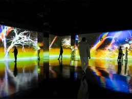
(Spain) – Art collective teamLab has opened up a new exhibition at CaixaForum in Barcelona. The exhibition, which opened on 17 May, will remain in place until 9 January 2022 and comprises the works Born From the Darkness a Loving and Beautiful World and Graffiti Nature: Lost, Immersed and Reborn.
The two interactive, immersive installations explore the concept of changing the relationships among people to Barcelona’s CaixaForum.
“Art created using digital technology has the ability to change the relationships among people who are present within the same space,” said the art collective. “For the majority of art up until now, the presence of other viewers has constituted a hindrance. But when an artwork made using digital technology changes based on the presence or behaviour of visitors, it causes the boundaries between artwork and visitor to become blurred. In this case, the visitor becomes part of the artwork itself.
“This changes the relationship between an artwork and an individual into the relationship between an artwork and a group of individuals. Whether a viewer was present five minutes ago, or how the person next to you is behaving now, suddenly becomes important. If the interactions of other people with an artwork creates changes that we feel are beautiful, then the presence of others can in itself become a positive element.”
More details on the exhibition can be found here.
Buro Happold announces new CEO
(UK) – James Bruce has been appointed as Buro Happold’s new Chief Executive Officer.
Previously the firm’s Chief Operating and Financial Officer, Bruce has announced plans to grow the business, which is active in 26 locations worldwide, doubling employee numbers over the next six years to create a better balance and resilience across regions. He hopes that in doing so, the firm can help to create a better, more sustainable world.
“It is a really exciting time for Buro Happold. We are continuing to expand our international markets where there is the best potential for us to grow as a business. This will create significant opportunities for both our people and our clients,” he said.
“Our heritage of tackling complex engineering challenges in the built environment puts us in the perfect position to advise and design exceptional solutions for our clients, anywhere in the world. We are enhancing our consultancy capabilities in addition to our world-renowned engineering expertise for a period of rapid acceleration in our industry.
“The business has delivered consistent global growth by strongly promoting a strategic focus on design, consultancy, sustainability, equity above all else, and driving best use of technology. What will not change as we move forward is any deviation from our principles of caring deeply about the legacy of our work and a collective courage and passion to create; this is what drives our culture. Where we have plans to grow, we will only do that by acquiring businesses that share our values and vision.”
Prior to joining Buro Happold in 2018, Bruce’s background is in building businesses outside of building engineering and consultancy. He has previously been CFO for a number of Omnicom and WPP subsidiaries, including Interbrand and Landor, and believes his track record in delivering growth in design focused businesses will add a fresh dynamic to Buro Happold’s expansion plans.
Renowned architect Art Gensler dies aged 85
(USA) – Art Gensler, the American architect, interior designer and founder of global architectural firm Gensler, has passed away at the age of 85 after a long illness.
Gensler, founder of the world’s largest architecture firm, died in his sleep at his family home in Mill Valley, Marin County, reported the San Francisco Chronicle.
Gensler founded his practice in San Francisco in 1965 alongside his late wife Drue, and James Follett. Today, the firm operates across 50 countries around the world, with an annual revenue of $1.5bn.
Diagnosed with lung disease 18 months ago, Gensler continued to work for his practice, with a full calendar of meetings scheduled when he died. His son, David Gensler, said: “My dad was a regular guy, respectful and friendly and never pompous. He loved serving clients through the power of design.”
Born in Brooklyn, New York in 1935, Gensler was the son of a phone company employee and a ceiling tiles salesman. He grew up in West Hartford, Connecticut and graduated from Cornell University’s College of Architecture in 1958.
Following university, he moved to California on the advice of his mentor, architecture critic Henry Hill, and worked for architect William Wurster, while establishing his own practice.
His eponymous firm got its start designing interiors for corporate offices in San Francisco skyscrapers. Early work included the 237-metre Bank of America Center (renamed 555 California Street) and the 121-metre Alcoa Building (now One Maritime Plaza).
The practice opened its first office at 555 Clay Street in San Francisco, before expanding around the US; its Houston office opened in 1972, followed by the New York office in 1979. The firm also expanded overseas with the opening of its London office in 1988, followed by studios in Japan and Hong Kong in 1993, while its first Chinese office opened in Shanghai in 2002.
Landmark projects for the studio include the 632-metre-high Shanghai Tower – the world’s second-tallest building, the long-term renovation of San Francisco International Airport, the renovation and expansion of New York’s Museum of Modern Art, offices for the New York Times, Washington Post, London Stock Exchange, and the interiors for the new US Embassy in London. Gensler also designed the first 100 Apple stores.
Gensler always put the success of his practice down to its business-mindedness, writing a book called Art’s Principles to mark the 50th anniversary of the firm. “When I started Gensler, there was a day when I woke up and realised that although I had 22 people working for me, I didn’t know what I was doing when it came to managing the business,” he said in an interview about the book. “So I went to business school at night, and I ended up hiring the professor of my class.
“We continually reinvest in our business, we offer competitive wages, reinvest in people, offer profit sharing – we incorporated all kinds of things that architects never thought about. I did this because I wanted to hire people and ask them to stay forever, not work on a project-to-project basis.”
Gensler stepped down as Chairman in 2010, but continued to serve as an advisor until his death. He is survived by his four sons and 10 grandchildren.
[d]arc awards 2020 online ceremony

The winners of the 2020 [d]arc awards were announced via a live video stream. Catch up on the awards presentation and find out who took home the top prizes this year.
The [d]arc awards is a unique concept utilising arc and darc magazines’ reputation as being the most widely read and respected lighting design publications in the world. In collaboration with creative consultants Light Collective, we have created a unique opportunity to get every practice involved in the awards process.
Anyone can enter (lighting designers, architects, interior designers or manufacturers) and once the shortlist has been chosen by an international jury of independent architectural lighting designers; lighting design practices, architects and interior designers are invited to vote on their favourite projects making this the only truly peer-to-peer lighting design awards in the world.
LIA appoints new CEO
(UK) –The Lighting Industry Association (LIA) has appointed Matt Sturgess to the position of CEO.
Sturgess took up the position on 12 April, replacing interim CEO Paul Crisp, who had been supporting the LIA team and its Members as they plan for the post-2020 era.
Sturgess started out professional life as an electronics graduate engineer, sponsored by a Thorn EMI business. Early on, he moved into sales and progressed into senior roles in different industries, with a passion for personal learning and development. Drawing from his experience supporting growth in blue chip global businesses and SMEs, along the way he gained an MBA.
More recently, he has worked within the lighting industry, having operated as the Commercial Director of Sylvania Lighting and also held the position of Managing Director at Simmonsigns. He has a passion for combining his technical heritage, a history of developing customer partnerships and helping individuals and businesses grow and develop.
Past President of SLL named new CIBSE President
(UK) – Kevin Kelly, Past President of the Society of Light and Lighting (SLL), has been named as the new President of the Chartered Institution of Building Services Engineers (CIBSE).
Kelly, who served as President of the SLL in 2013/14, succeeds Stuart McPherson as CIBSE President, and will in turn be succeeded by Kevin Mitchell, Global Practice Leader – Building Services Engineering at Mott Macdonald.
In his Presidential Address, delivered online on 6 May, Kelly called for a more diverse profession to help “build resilience against future crises and better respond to the pandemic and climate change”.
He pointed to the “warning shots” of the SARS, MERS and Ebola outbreaks that should have spurred an international effort to prepare for a pandemic. Instead, lulled into a false sense of security by the containment of these warning shots, he felt the world was woefully unprepared to deal with the arrival of Covid-19.
Kelly used the analogy of a sleeping frog – a frog immersed in water that is being heated will sleep until it is boiled – to describe this behaviour, and speculated that climate change threatens to be the next, most significant sleeping frog of all.
Outlining the central role being taken by CIBSE experts in analysing and responding to the threats posed by Climate Change, he warned that the industry needs to take a lead in building the strongest possible defence.
In his view, this demands positive action to improve inclusivity and diversity within the field of building services engineering. Kelly outlined his own experience of combatting not just overt discrimination but unconscious bias and stated his commitment to using his presidential term to support positive change.
As a University Professor who started his career as an apprentice electrician, Kelly is well suited to encouraging diverse routes to qualification and entry into a Chartered profession. He warned that challenging the status quo will require a willingness “to have the awkward and difficult conversations ahead and lean into them in order to change our industry for the better by making it more inclusive and welcoming to all.”
Nichia to host webinar on luxury store lighting
(Online) – Nichia will host an expert panel discussion on luxury store lighting via an online webinar, held on Thursday 20 May at 1.30pm BST.
The webinar will discuss key aspects of lighting for store locations representing sophisticated retail brands. The focus will be given to the efficacy, quality, design and sustainability of the lighting scheme.
For high-end retail spaces, the webinar will provide guidelines on:
- Designs based on brand alignment
- Fixtures that work best
- Effective LED solutions
- Quality, efficiency and sustainability
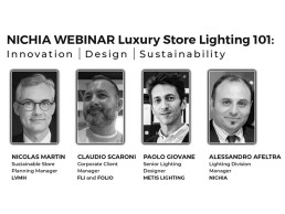
The webinar will aim to represent the complete lighting supply chain, with an expert panel that includes:
Nicolas Martin, Sustainable Store Planning Manager, LVMH
Claudio Scaroni, Corporate Client Manager, FLI and FOLIO
Paolo Giovane, Senior Lighting Designer, Metis Lighting
Alessandro Afeltra, Lighting Division Manager, Nichia.
The webinar will also feature a live Q&A session, moderated by arc editor Matt Waring.
Registration for the webinar is open now. Full registration details can be found here.
TLS launches first ever lighting collection
(Canada) – Architectural lighting brand TLS has launched its first ever lighting collection, Carra.
The move comes as a response to market demand for a more simplified product offer, and marks a new step in the standardised product arena for the company, who has offered strictly bespoke lighting products to date.
Carra, the architecture-inspired collection, has clean and simple lines, providing uniform lighting in square and rectangular shapes. Montreal-based TLS embraced its French roots to name the collection after the word “carré”, which means square. The standardised yet versatile collection offers six light sizes that can be powered by four different lighting engines, to achieve different lighting effects. In addition, clients can choose from three different frame colours and four mounting options.
The idea of developing a collection came from the growing market demand for everyday products in surface-lighting. TLS originally grew by specialising in larger and more complex projects – a good fit for its tension LED system. The flexibility in terms of design demands and structure restrictions meant that the company won a lot of large-scale projects. However, the company recognised the growing demand for surface-lighting, and with Carra being an off-the-shelf option, the specification process is much simpler, and the lead time is shorter.
“Having high quality surface lighting as a commodity product is something we felt was needed amongst the designers,” said David Sella, Founder of TLS. “Our technology is really unique due to the patented system we developed, and making that more easily accessible was the smart next step for us.”
The design interest in WELL building practices also influenced TLS’s decision to move forward with the collection. Daniel Lemajic, Sales Manager for Europe, added: “More and more we are having these kinds of conversations with business partners and designers, about integrating circadian rhythm lighting in offices, or having stimulating lighting for a bit of “lightertainment” in break rooms.”
Alongside the launch of its first collection, TLS has decided to revisit its positioning and visual language, undergoing a full re-brand to reflect what the brand has become over the past 10 years. The messaging has become simplified and more geared towards the design community, while keeping its original technology and engineering DNA.
IALD Nordic to celebrate International Day of Light 2021 with special PechaKucha event
(Nordics) - To mark the UNESCO International Day of Light 2021 on 18th May, the Nordic chapter of the IALD is hosting a virtual PechaKucha and networking event, sponsored by Lutron.
Inspired by the meme series “What People Think I Do/What I Really Do”, which plays on the range of preconceptions associated with a particular field of expertise, the session will compare the varying impressions people have of the lighting industry. This will include opinions held by others, self-image, and how this compares to the reality of the job and will aim to raise awareness as to the importance of lighting design.
The event is a recognised 50:50 event supporting Women in Lighting, and will feature six speakers from across the lighting spectrum.
Keynote speaker Aleksandra Stratimirovic is a visual artist based in Stockholm, Sweden, and is active in the world of art and light, having created a number of permanent and temporary site-specific artworks both internationally and across Sweden. Her work has featured in hospitals, school campuses, railway stations, residential areas and light art festivals, and has also been included in exhibitions at Noor Riyadh; Guggenheim Museum New York; and various other institutions across 15 countries.
Other speakers taking part in the PechaKucha include:
Jesper Ravn, architect and lighting designer, Gottlieb Paludan Architects, Denmark
Jari Vuorinen, Founding Partner, lighting Design Collective, Finland
Ute Besenecker, Associate Professor, KTH, Sweden
Darío Núñez Salazar, lighting designer, Verkis, Iceland
Katia Valerie Banoun, Director, Lyskultur, Norway
The session will take place at 5.30PM CEST on 18th May. Registration for the event is now open. Participants can register here.
Lightfair to sponsor IES’s “Light for Life” Webinar Series
(USA) – Lightfair 2021 is supporting partner organisation the Illuminating Engineering Society (IES) in facilitating a global conversation on the impact of light through its sponsorship of the “Light for Life” webinar series, taking place 10-13 May.
“With the postponement of the 2021 Lightfair conference until this October, sponsoring Light for Life allows us to continue to provide lighting professionals with educational opportunities this spring,” said Dan Darby, Lightfair Show Director. “By partnering with IES for Light for Life we are able to reach our global audience until we gather again.”
Brienne Musselman, IES Director of Education, added: “Light for Life was introduced in 2020 as a way to strengthen the connection among the global lighting community during a very uncertain time. Participation was so impressive, it was a natural progression to facilitate the series for a second year. We’re so excited about this year’s programme and are grateful to be able to partner with Lightfair to deliver this content to our community.”
Light for Life is a global series of webinars that explores the impact of light on the lives of humans, plants and animals. As hosts of this collaborative webinar series, IES will facilitate the presentations over three days in the week culminating in the International Day of Light (16 May). Last year’s Light for Life series reached nearly 4,000 attendees from 46 countries, and featured 17 sessions with 15 organisations and 20 presenters.
Partner organisations participating from around the world will each curate their own webinar in the series, shaping the discussion of “Light for Life” with their unique global perspectives. This year, at least three new countries are being added to the programme, with Japan, Brazil and Russia joining Australia, France, Germany, Guatemala, India, Israel, Mexico, New Zealand, South Africa, the UK and the USA. Among the highlights of this year’s series will be live Q&A sessions with individuals from around the globe.
The Light for Life webinar series is free for all. More information can be found on the IES website.
Aldabra: Storm Collection

In a world where climate changes are constant, the Aldabra Storm collection was born and designed for perfect lighting even in extreme conditions.
The perfect union of steel or aluminium and professional electronics fused with nanopolymer resins, has allowed Aldabra to create products completely protected from environmental hazards and suitable to withstand the most extreme climatic changes.

