Zumtobel: Vivo II
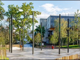
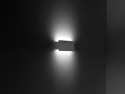
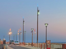
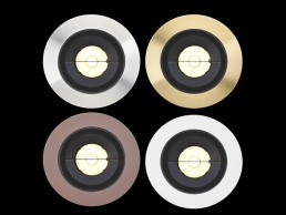
A versatile platform for all architectural requirements, Zumtobel's new VIVO II has a host of accessories to meet the demands of today's spotlight world. Suitable for ceiling heights of up to 10-metres, this powerful, ultra-flexible luminaire enables brand, product and space presentation tailored to the target group and application. VIVO II has three different optical systems - highly efficient reflectors for powerful accent lighting with minimal glare, high-precision lenses for exact light distribution without any light scatter and a manual zoom lens for flexibility.
Cristina Gil Venegas - The Nighttime Traveller
A new research project has been established to examine the ways in which women interact with the urban environment after dark. We speak to the research founder, Colombian lighting designer Cristina Gil Venegas, to find out more.
For many in the lighting design sphere, the job comes with the added bonus of plenty of global travel. Whether it’s working on projects overseas or attending international conferences, many of us are lucky enough to occasionally swap the office for the airport and see the world (before 2020 had other plans).
With this luxury of international travel comes the opportunity to experience different cultures, immerse ourselves in new environments and discover new cities. However, while it can be exciting to explore places that we’ve never been to before, for some, this can come with an added sense of caution or trepidation, especially once night falls.
This is the basis for a new research study from Colombian lighting designer Cristina Gil Venegas, entitled The Nighttime Traveller. Based in Bogota, Colombia, Venegas has travelled around the world, studying in Buenos Aires, Barcelona and Stockholm, and throughout her career has always had an interest in urban design and outdoor lighting. “I have always been keen to work in outdoor environments, and in the course of my lighting design studies, I began to feel an interest in working in urban environments at night,” she told arc.
“During the first urban intervention I saw in Barcelona, during the Llum BCN Festival for Santa Eulàlia, I felt really inspired by the poetical way Barcelona’s old town was transformed through lighting and the way that locals and tourists of all ages enjoyed the outdoor activities. Even though those activities were mainly contemplative, people’s mood transformed just by walking by and admiring the city, seeing Barcelona through new eyes.
“Since that moment, I wanted to inspire other people to explore the night with that curiosity I saw in people’s faces during the Llum BCN Festival, contrary to the current panorama in which most citizens almost don’t interact with the urban night. I wanted to become a spokeswoman for the endless opportunities of urban lighting design to create a sense of wellbeing at night.”
Venegas first came to lighting via architecture; she completed a degree in Architecture with Urban Environmental Emphasis at Santo Tomás University in Tunja, Colombia, during which she spent a year studying abroad at the Universidad de Buenos Aires (UBA) in Argentina. “I had some hints of lighting design while I was studying in Buenos Aires and saw a class given at UBA,” she explained. “I was intrigued by the description of that class, which was on the relationship between light and spaces, but I didn’t take the class because it overlapped with other assignments I had already enrolled on. It wasn’t until later that I realised that class was given by a really talented lighting designer, Eli Sirlin.”
Years later, while Venegas was working as a junior architect in an architectural heritage studio, she read an article on the ability of light to change the perception of buildings. “The article was on a group of people who stopped heritage buildings from being demolished in New York by lighting them up and doing an ephemeral intervention.
“Since that moment, I felt inspired by light as an ‘invisible’ tool that can transform a place with no visible interventions.”
This led Venegas to research lighting design postgraduate courses, which eventually led her to a one-year course at the Universitat Politècnica de Catalunya (UPC) in Barcelona, called “Proyectar la luz”. “I found this one-year programme a good way to understand light, from its basic concepts between light and shadow, then its application in indoor and outdoor environments, and finally the possibility to explore my own interests during the development of a final project,” she continued.
Venegas explained that it was once she began researching lighting design as a career choice that she realised what her true passion was. “During my last years as an architecture student and at the beginning of my work experience, I was interested in urban design and the job opportunities that I had. But at the time, even though I enjoyed my work and career, I didn’t feel the passion I used to see in my bosses. When they were working you could notice how much of themselves they put in their projects, so I realised I hadn’t found my own path yet.
“When I started researching lighting design, I began to feel that passion that I used to see in my bosses, so I followed my intuition and I believe that with the passing of the years, this passion just increases.”
Finally, in 2017, Venegas enrolled in the Master’s programme at KTH in Stockholm, Sweden, “driven by the recommendations of some lighting designer friends and my curiosity of living in a country with such drastic light conditions”. Here, she expanded on her interest in urban design, researching outdoor lighting and focusing her thesis on how light can positively influence and encourage peoples’ engagement and interaction with the urban environment at night.
“For this, I did field research at Norrmalmstorg and Biblioteksgatan in Stockholm, and a literature review about two case studies in Colombia and lighting designers’ approach to urban projects. I called this research Light as a tool to structure urban planning: a socially-oriented approach. My tutor for this was Florence Lam, Global Lighting Design Leader at Arup,” she explained.
The result of her thesis, Venegas continued, was the proposal of a guideline to approach urban lighting design. “The aim of the guideline was to establish the framework to structure urban lighting proposals, by identifying the attributes in light that encourage people to dwell and explore cities at night.”
This research ended up being a great influence for Venegas in creating The Nighttime Traveller. She explained: “During the research process of my thesis, I was able to study qualitative and quantitative data, and see the way people move through urban spaces differently during daytime and nighttime, and also to study how their paths and pace change in those two moments of the day.
“Additionally, when I was studying how facial perception changed under different light conditions, I realised how we as citizens avoid certain spots of the city due to the fear of not being able to identify other people because the light position makes us perceive faces with strong, dramatic shadows.
“That process made me enquire about my own way to explore the night and start asking some friends about their experiences. I began to ask about how, when recognising landmarks was easy, through planned lighting design, those places became more interesting for people to explore.
“Then, I realised how different the perception was between women and men about the urban night, and from that, I decided to inquire more about that situation.”
The contrasting perception in the way that men and women feel about the urban night, Venegas believes, stems from deep-seeded societal attitudes. On the Nighttime Traveller blog, she writes: “In my youth, I started to become aware of the difference between women and men. In the beginning, I was not sure if that feeling was just my own construction because of my shyness, or the fact that I grew up in a Catholic school, where the norms were very clear about ‘how a lady should properly behave’, referring to not give her opinion unless asked, not to speak up, not be so noisy or demanding, and among all those ‘nots’, not to go out outside alone at night.
“But then I discovered that the fear of the night was a shared feeling. As women, we hear statements such as ‘you should not walk alone at night outside’, or ‘you have to avoid wearing provocative clothing’. These statements can be more or less extreme between countries as a result of social constructions that translate into norms and boundaries.
“Most of us were raised with that fear of the night, in cultures where statements exclude women from enjoying the nighttime, and where we are judged if we do.”
Venegas even references Michelle Obama – a spokeswoman for freedom and empowerment – who herself wrote in her book Becoming, that she “knew never to walk alone at night”.
“After a while of exploring that shared feeling of fear and my own feelings, I came to the conclusion that, as women, we have been trying to be as invisible as possible in the urban nighttime. We use this as a sense of self-protection; as a way to remember those behavioural norms that society has imposed on us, in order to protect ourselves from harassment, and because we know if we are attacked, society is going to blame us for provoking these situations – this is something we continually see,” Venegas continued.
“I became aware that the way we move, the speed of our pace, the emotions we put in the urban journeys, suddenly became controlled and supervised by external eyes, and those eyes are prepared to judge us if a misfortune happens to us. In this situation, we become aware as women that our gender, that social construction, instead of including or integrating us into society, has instead limited our interaction with public space due to those prejudices.”
It is these attitudes that inspired Venegas to set up The Nighttime Traveller, to try and ascertain with more clarity how public spaces are perceived by women, and what can be done to create more inclusive public spaces at nighttime.
To do this, she created an anonymous survey to try and allow for a more open and transparent dialogue. The survey is divided into four sections as a way to structure the outcomes: General Information, Emotions, Travel and Comments.
In the first section, Venegas looks to obtain general data about the women taking part in the survey, to guarantee that the sample includes perspectives of women from different socio-economic backgrounds and age groups. In the second, Emotions, she seeks to identify how women interact with public spaces at night, emphasising the perception of safety and the main obstacles they identify when exploring cities at night. The third section, Travel, asks participants about their preferences when travelling, and hopes to gather qualitative data about whether the topics they search before travelling are connected to the obstacles they identify earlier in the survey. The final section is more open for women to share their experiences of cities after dark. The goal for this section is to explore qualitative information that can then open the discussion up to future research.
Venegas plans to present the outcomes through data visualisation that is easy to understand, communicate and interact with, and with that data, “adapt and design tools that decision-makers, designers and other professionals could use to design collaborative projects with citizens from a gender perspective approach”.
“I hope this research can contribute to raising awareness about how different women perceive and explore the urban environment at night, and to communicate how culture influences our confidence to explore the world and stand by ourselves as women,” she added.
“I believe light is a powerful tool to communicate, so I want to create and encourage other designers to create urban ephemeral interventions with the data of the outcomes of my research, to communicate to citizens, decision-makers and designers the female perception of the urban nighttime.”
It is an issue that Venegas clearly feels passionate about, and from the many women around the world that have already participated in the study, it is clear to see that this is a global concern. “I believe it is a situation that as women, we are aware of, but it still has many cultural barriers that make us avoid those conversations,” she said.
“One of the insights this process has brought to me was how different women feel when they travel abroad compared to the way they do in their own cities. I have identified this situation mainly in Latin American countries. So far I have found that, in general, women are cautious to explore urban spaces at night, and in countries such as mine, Colombia, this situation is even more evident.”
While Venegas’ research gauges how women perceive the urban environment at night, she has also begun to consider what lighting designers can do to help create more safe spaces for women after dark. “I have read about how we, as women, rely more on a sense of location and facial recognition to explore urban environments at night. So I believe that as lighting designers, we can contribute by lighting landmarks to turn them into reference points when we navigate through cities at night; light pathways to guide the flow through a visual sense of direction; and also to take care about the light direction in the urban environment, related to how citizens will perceive each other’s faces,” she said.
“With that in mind, I believe it is not just a matter of how much light, but where the light is coming from; what areas, buildings or elements to accentuate; and what the best lighting positions are that allow people to recognise other faces without distorting facial features.
“Additionally, the idea of designing urban environments at night around the activities people do would promote more vibrant spaces at night, and with more people engaging outdoors comes a feeling of more safe spaces.”
Venegas’ research is still open, and she is hopeful that, through the support of Women in Lighting (WiL), more women will take part. “WiL has given me a lot of support in sharing my research, and also brought me the opportunity to be in contact with other women who have either been researching this topic, or who have some interest in it. I believe these networks create an atmosphere that allows all of us to grow together, and I am really delighted to be a part of it,” she continued.
Looking forward, as Venegas continues to work on her research, she is already making a number of plans based on the outcomes she has already received.
“I am planning some ephemeral interventions with the outcomes of the research for raising awareness about this topic to a wider group of people. Additionally, on the Nighttime Traveller website, I am making the outcomes available through data visualisation, and will share a report with more detailed information for lighting designers and other professionals interested in the topic. My aim is for this information to be shared on other platforms to reach a bigger audience,” she said.
“I am also adapting and designing tools to help designers to go through the design process, taking into account the gender perspective, and working with citizens to design collaborative projects. The goal with these tools is to encourage professionals to use them during their design process, and get feedback from them to adjust the tools to diverse needs and locations, and make them available to anyone who wants to use it.
“I also want to encourage other women to share their own stories – nobody knows who they can inspire.”
Krishna Mistry
With more than 10 years’ experience in the lighting design industry, Krishna Mistry has this summer established her own independent lighting design practice, Mistry Lighting. arc sits down with Mistry to learn more about her lighting journey to date, and her goals for her new solo venture.
How did you get into lighting?
I studied interior design at university and always focused on the lighting element to design during my studies, which came naturally to me. I initially hoped to get into theatre set design but graduating during a recession, it was difficult finding a job. I got a temporary position at a wholesale lighting company, and it was only here I realised there was a possibility of a career in lighting design. I started looking for junior lighting jobs and got a position working for Fagerhult. It was a brilliant start to my career and it only took a few months for me to realise I found my passion!
Can you describe your lighting career so far?
After Fagerhult, I moved on to Buro Happold. Coming from a manufacturer to a large engineering firm was a big jump, but it gave me the opportunity to work on recognisable projects across the globe with the some of the most iconic architects. I later moved on to the Light Corporation specialising on hospitality projects. My favourite client was Nando’s, I love their ethos and we designed some creative colourful lighting schemes for them. 10 years later I now have a new journey as an independent lighting designer.
What led you to the decision to start your own lighting design studio?
I always imagined I’d work for myself in the future but whilst I was furloughed for several months, it gave me the opportunity to think about my future and I thought why wait when this is the path I always intended to go down.
Was it a difficult decision for you to make?
It wasn’t difficult at all; I have gained freedom to follow my passion independently and focus on my own values when it comes to lighting design.
How has the experience of forming a new studio in the middle of a global pandemic been?
Strange, but exciting! It’s been challenging not being able to meet face to face and create new connections. While work is harder to come by during these times, the support of the lighting industry has been amazing. I’ve been fortunate to have a great network of peers, which has made this transition smooth sailing for me.
Do you have a ‘Mission Statement’ or design philosophy for Mistry Lighting?
I don’t have a mission statement as such, but I’m very open minded when it comes to lighting. I never want to restrict myself to a particular style but like to keep adapting to the latest technology. I strongly believe in supporting small businesses.
Whilst working with Nando’s, I’ve had the opportunity to come across extremely talented artisans such as AAKS, who have a ‘weave for change’ initiative, which aims to create fair and dignified work for refugee artisans. Through creative collaborations such as these the refugee artisans living in extreme poverty may have an opportunity to change their lives. For me, this gives greater meaning towards a lighting scheme and I am actively sourcing artisans to widen my knowledge of what is available to us and support small business where possible, especially now in our current economy.
Will you have a particular area of specialism?
I will be open to working in all aspects of designs from hospitality, residential to landscape and retail design.
How does running your own independent studio compare to working for a global engineering firm such as Buro Happold?
It is completely different; working for a large firm like Buro Happold, there are bigger teams, a lot of admin and planning that goes into the project before you can even begin designing. Once you’re on the project, it can also last a number of years. A complete contrast to an independent studio, our projects are smaller and the pace is a lot quicker. I really enjoy the smaller projects, which has made the transition pretty easy. I find you have more authority over the lighting design as there are less people involved with the advantage of focusing on small details, which can often be overlooked on larger projects.
What are your aspirations for Mistry Lighting? What do you hope to bring to the lighting world?
I’d hope to continue to evolve my designs with every project I work on. I always believe you can never stop learning. Each project will always bring its own challenge and it’s how you adapt and push design forward that is important to me. I want to continue to enjoy each project I work on and keep lighting fun, not only for me, but hopefully in the future when I can expand the team and share my knowledge and experience.
Finally, lighting is so important to our daily lives, it almost gets unnoticed, so I hope I can be influential in making it one of the first aspects of design that is thought about.
What sort of reaction have you had so far? Do you have a lot of work already in the pipeline?
The reaction has been very positive. It’s always scary to start up on your own, especially in the middle of a global pandemic, but to have support from my network, friends and family has given me the confidence to take this next step in my career. I’m fortunate to have worked under some great peers through whom I’ve been able to get some work in the pipeline, as it’s still early days and I’m continuing to reach out to my network.
What do you think the future holds for the lighting industry?
The future is exciting for the lighting industry, as products are evolving, so are lightings designs. In the 10+ years I’ve been in the industry so much has already changed, who knows what the next 10 will bring. I have no idea but I’m enthusiastic about it!
David Morgan Review: RCL DRX1 & RCL Control
After a fascinating workshop session at [d]arc room livestream, David Morgan checks in with RCL to take a closer look at the DRX1 range, and the iPad-based RCL Control system.
It is unusual to find a lighting company founded by an engineer who wrote and published a successful series of books on how to gain entry to medical and dental school. Joe Ruston’s engineering degree from Cambridge University and experience as a Weapons Engineer in the Royal Navy probably also helped when building Remote Controlled Lighting ( RCL ).
Based in London, RCL currently shares facilities and staff with sister company Precision Lighting and both companies focus on the specification lighting market. RCL grew out of a custom product request to Precision Lighting in 2001 for a remote controllable motorised lighting system for ballrooms. The group has grown from two to 34 employees since 2001 with more than 100,000 fixtures installed worldwide.
The self-evident benefit of being able to aim and focus projector luminaires without the need for cherry-pickers, scaffolds or ladders has become more important due to increasing workplace health and safety legislation. These requirements have significantly increased the costs of manually aiming multiple luminaires in larger spaces. Conversely, the production costs of remote-controlled luminaires have fallen as the various enabling digital technologies develop, which in turn has widened the market opportunity.
Although the first recorded example of remote-controlled, motorised lighting dates back to the 1920s, RCL has developed and refined the concept. The most recent launch is its state-of-the-art RCL DRX1 range.
This new range includes options for remote control of all key functions including movement – pan and tilt, dimming, colour temperature control and focus so that, once installed, there is no need to touch the luminaires except for maintenance.
The DRX1 range includes a wide variety of options for light engine type, including both COB and high-power LEDs, lens type and control protocol.
To accompany the new luminaire range, a new control system has been developed, appropriately named RCL Control. While earlier RCL systems were based on wired DMX, which is still available as an option, the new system is based on the wireless Thread protocol, a low-power mesh networking technology developed for all kinds of IoT products. Thread has so far been adopted by a wide variety of companies including Apple, Samsung, Nest and others and is understood to be highly secure and to have a very fast response time – an important requirement for this type of motorised luminaire.
While all functions on individual luminaires can be controlled by the original RCL hand controller, it seems likely that most projects will be controlled by the iPad-based RCL Control system. The iPad links via WiFi to the RCL Mediator, which can control up to 200 luminaires, and the plan is to be able to control luminaires from other brands, in the same space, at some point in the future. The user-friendly RCL Control interface has some nice features, including the ability to select a setting for very fine control of dimming, colour temperature, beam angle and position. The communication between the luminaire and the control system is two-way so that the actual position of the luminaire is displayed as it moves. Different functions have their own on-screen interaction mode. Beam angle control is achieved via a pinch to zoom action on the iPad, while movement is controlled via joystick and jog wheel interfaces. Colour temperature is controlled via a slider.
The DRX1 sample kit I was given to test was well presented and worked without any problems. The beam quality was good when set to both narrow and wide distributions. The colour temperature mixing was also effective across the range. Dimming is finely controlled from 0.1% up to 100%. The colour temperature ranges from 2200K up to 4000K.
Beam angles for the DRX1 range with a fixed colour temperature light engine range from 4° to 34°. Adding the LensVector gives variable beam angle ranges from 8° to 16°, 5° to 55° and 10° to 55°. With the tuneable white light engine, the beam angle options are 14° and a variable 15° to 54°.
The DRX1 range offers lumen output of up to 1,474 lumens with centre beam value of up to 56,646 candelas.
The variable focus feature uses the LensVector liquid crystal lens system; this produces a zoom lens without any moving parts or without increasing the size of the luminaire. The technology, developed by Dr. Tigran Galstian and his research team at Laval University in Quebec City, Canada, aligns liquid crystal molecules to a shaped electric field to create a digital lens. By changing the electric field, the nature of the lens, and therefore the illumination effect, can be manipulated.
The control system includes a very neat scene setting capability so that individual luminaires and groups of luminaires follow pre-set scenes stored in a memory within the luminaires as well as centrally. Luminaires can be programmed by multiple iPads and controllers within the same space to help reduce commissioning time. The RCL hand controller is used to identify individual luminaires via it’s integral laser pointer, when pairing them to the RCL Control light plan, which also simplifies the whole process.
It is understood that the development of the DRX1 range and the RCL Control system were largely undertaken in house over several years by the joint RCL and Precision design team, with Joe Ruston providing the driving force behind these projects.
Apparently, the reaction to the DRX1 range and the RCL Control system from customers and lighting specifiers has been very positive, particularly the ease-of-use design features of RCL Control, and they are both likely to help the company to prosper and grow in this market area.
www.rclighting.com
www.lensvector.com
Empathic Design
While the adoption of ‘Human Centric Lighting’ looks at the physiological impact of lighting, what about its emotional impact? Communication Consultant and kindness advocate Bronwen Rolls asks if lighting designers can take a more empathic approach?
I was waiting to receive results of a medical test in a brightly lit, cold, windowless corridor a few days ago and, as the adrenaline and cortisol pulsed through me I realised it wasn’t the results that were making me feel so extremely anxious, it was the environment I was sat in that was compounding it. Bright, cold overhead light pulsed about and reflected and bounced of every white surface, flickering and agitating the space. I began to think back to all the people I have spoken to in lighting about its effect on our wellbeing and I realised that whoever had designed this specific space – or more likely had not – had never themselves had to wait for a medical test result. Or, worse still they had been through the exact same scenario, but had not then used their understanding of how people feel in that moment, in that environment, to improve their design.
This got me to thinking: are feelings too subjective for lighting design to consider? Should or could lighting be empathetic? Could it care more? I want to start a discussion about this.
2020 was unprecedented, a genuine game changer for pretty much everyone around the world. When any seismic shifts happen things can go either way. We adapt, we innovate and we move forward or we falter and panic, make rash decisions and we ultimately stop functioning. Observing the changes in society reminded me of the changes I have seen in the lighting. LEDification and digitalisation were light’s revolution. It was a massive disruption to everything, one that removed certainty and created shareholder unrest. What has followed are years of teetering uncertainty, of how to adapt, innovate and move forward.
When faced with the potential of LED technology and digitalisation, I think it has been too overwhelming, too competitive, driven too hard by the “let’s make it - because we can” reflex. It has seemed that for over a decade everything was prefixed with ‘Smart’, whether it was or not. Then we had connectivity - your lights could tell your fridge to tell your TV to send you a WhatsApp message saying that you needed to buy milk, and this service wasn’t cheap. In contrast to the smart/connective drive we saw the rise of Human Centric Lighting, #Betterlight, healthy light and an awareness of our own circadian rhythms. People were standing up and demonstrating intelligent scientific evidence that light affects us, that lighting manufacturers and designers have a responsibility to consider the people they illuminate in relation to their physical and mental wellbeing.
But, despite all this incredible potential nothing so far seems to have given lighting the equilibrium it needs to be confident again. I am not for one minute suggesting I know the answer because no one does, because there isn’t one answer. What there is, however, is a chance to reframe how light uses all its potential, and that is where I believe the idea of empathy and caring comes in.
A few home truths for you: user adoption of light as a service model is slow, a lot slower than the industry predicted or hoped. The requirement for smart projects is few and far between. Design projects are under increasing pressure to deliver as budgets become smaller and now we all face a possible recession. Light as light will always be the priority, and that is it. Lighting is still considered just that by the masses: a source of light. But maybe those in lighting seem to have forgotten this? Maybe lighting needs to revisit its roots and address light not only as a smart or intelligent service or product, but also as a vital source that could be more caring, could be empathetic.
The shared unrest and sometimes suffering experienced in the recent months has brought with it a collective moment of kindness. The antidote to human suffering is always human kindness. We, as a society have begun to look around and realise that we are all in the same boat and with that shared understanding we have become empathetic. Empathy now has visible, tangible value to a lot more people. It has been a buzz term in design and some businesses for decades. Multiple pioneers of design and innovation adopted user observance techniques and created formulas to follow in order to design user focused items that meet unknown user’s demands. They used empathy as a tool.
What I’m considering is can this now understandable tool of empathy create a new generation of lighting designers who are not just empathetic, but also care? After all, there is more to being human centric, it’s not the lamp, it’s the person. It’s not circadian rhythms, it’s how this person is feeling in a lit environment. In lighting we are on the right path, aren’t we?
I wanted to explore this idea and get a few more experts to discuss it with me. However, not one university or research centre I approached could comment with confidence on the role of empathy in built environments or lighting. It’s just so subjective, too subjective maybe? There is research into empathy and built environments - architecture focuses on it, and has done for a while - but not yet in light or lighting.
So, I went to a lighting expert who is known for her ability to care about the people she designs for. I spoke to Florence Lam of Arup.
“Light is fundamental to our social infrastructure as it connects people with space. Light has the ability to convey atmospheres, ambiences and expressions; and it enhances people’s experience and encourages social interaction. Therefore, empathy needs to be considered from the start of the creative lighting design process.
“As lighting designers, we need to undertake contextual research to understand how people would use and interact with the space we are designing, as well as how light engages with the architecture.”
I went on to ask Lam about what she believes to be the advantages of empathy and caring more when creating a design:
“We need to understand the intrinsic relationships people have with light, which can be both personal and emotional. The advantage of embracing empathy in design is to unlock the emotive potential of light in narrating a space. It directs movement and attention, creating atmosphere and manipulating the sense of space.
“We also know that light can also impact our physiology, physical health and wellbeing, which in turn impacts our performance, behaviour and mood. We therefore need to balance any empathetic intuition with evidence and knowledge to create lighting solutions that are not only beautiful and inspiring, but safe and healthy too.”
So, then we went on to the subject of Human Centric Lighting. I wanted to know is HCL as it stands today enough (circadian/mood support/etc) or should lighting tackle the emotional situations of people?
“We need both. At Arup, our lighting design philosophy is always to design for daylight first because there is an aura with natural light that artificial light can never replicate. Daylight is inherently a variable light source and its use introduces a dynamic aspect to light, which is tuned to our circadian system. When interior daylight is inadequate (for example in deep plan workspaces), HCL may help the human body stay aligned with the natural world. However, the lighting quality and sense of vitality that daylight brings is not replaceable by HCL as a technological solution alone. Using layers of light to create good spatial variation and contrast are techniques one can use to stimulate visual interest and enhance sense of wellbeing.”
Of course, emotions are extremely subjective so there might not be a simple answer, but could lighting design benefit from greater emotional understanding of their clients, the use of Empath Consultants for example...?
“In my view, experiencing architecture is multi-sensory: it is as much about ‘feeling’ as it is about ‘seeing’ and light has a key role to play. Light characterises a space through the quality, colour and even absence of light, which provides context for the architecture, much like a scene in a play or film. Most importantly, it warms the human soul through interacting with the subconscious in ways that other features of architecture cannot. This interaction of light is how we make sense of places and our experiences; it is important that this is properly recognised by designers and embedded into the design process throughout.”
I believe the conversation has just got going, so too has the design work and the research. Where this conversation will go I don’t know, where it could take light and lighting design I also don’t know, but I do know that empathy, caring, kindness and understanding that is associated with empathy is a potential way improve lighting designs, manufacture lighting solutions and create that balance that is needed in the industry again.
2021 comes weighed down with the expectations and I hate to add to them, but maybe this is the year lighting starts to care more.
Join in the debate. What is your experience of empathy in lighting?
The Acropolis of Athens, Greece
Perched atop a hill known as Sacred Rock, overlooking the city of Athens, the Acropolis is an ancient citadel housing the remains of several buildings of great architectural and historic significance, including the Parthenon.
A UNESCO World Heritage site, the Acropolis is an iconic landmark for the people of Athens, and viewed by many as an international symbol of Greek civilisation, with the temples of the Acropolis considered some of the most famous architectural landmarks in the world.
In late 2019, the Greek Ministry of Culture announced to the public the need for a new lighting scheme for the Acropolis hill and its monuments. This relighting was supported by the Onassis Foundation, who offered to fund the entire process, and invited distinguished lighting design offices to submit their proposals for the monumental project.
In January of this year, Athens’ own Eleftheria Deko Lighting Design was selected by the Onassis Foundation for the project. Although the project initially called for an improvement of the existing lighting study, Deko went one step further, proposing an entirely new lighting concept.
“We didn’t receive a brief for the lighting design, but we received a technical study with guidelines and restrictions from the archaeological department, which we had to apply to our study,” Deko explained.
“We respected all the guidelines that were presented to the technical study, we studied the previous lighting scheme, then we set up our intentions and concluded with a whole new design approach.”
The philosophy of this new approach was applied to the lighting of the Sacred Rock, the fortification wall and the monuments, including the Parthenon, the Propylaea, the Temple of Athena Nike, the Erechtheion, the Ancient Theatre of Dionysus, the Stoa of Eumenes, the Shrine of Dionysus, and five other monuments that were illuminated for the first time.
“The new lighting study was presented to the Ministry of Culture and to the Central Archaeological Council in March 2020 during a six-hour presentation. The new approach of distinguishing, for the first time, the Sacred Rock from the wall and the monuments through lighting was welcomed and approved unanimously.”
Because of the immense cultural significance of the Acropolis to the people of Greece, Deko revealed that when working on the new lighting concept for the landmark, she had to approach things in an entirely new way.
“This one was so different from every other project, I felt I had to forget all I knew and start from scratch,” she said. “I had to feel the energy of the space and understand the lighting requirements, so at the beginning I became an observer of the Acropolis.
“I spent many hours observing the monuments during the different phases of the day; in the morning, at noon when the light is harsher, at dusk while the sun sets, under the moon and in complete darkness. Just to try and imagine the reflections of the stone and marble sculptures in different versions of natural light. That observation was the guide and the teacher.
“Of course, I had to see the Acropolis as part of the city and its coexistence in today’s urban landscape as well. The Acropolis and the Parthenon are visible from many points of the city, so we were frequently walking away from the site to see the Acropolis from far away, from different neighbourhoods.
“When you are on the hill, you are overwhelmed by the feeling of admiration and awe for the Acropolis itself. As you move away, you realise its gradations: the rock, the wall and the monuments. From these observations, I realised that these three elements needed to be differentiated. Each bears the symbolism of its time and that inspired us to create those lighting layers through colour temperature and intensity differentiations. In the previous scheme, an emotional colour was chosen; a warm, almost orange light colour for all, the monuments, the rock and the wall. There was no differentiation, which in my opinion was necessary.
“The idea of differentiation was clear and essential to me because the Rock is nature, it existed and exists before human intervention. The wall represents the human effort, the craftsmanship. Monuments, on the other hand, are worship, art, and if I may say, mystery. These elements cannot be illuminated in the same way – apart from the difference in their substance, there is a different materiality. The Rock is made of one material, the wall is made of other materials and the monuments are made of the luminous Pentelic marble.”
This differentiation of materials was the starting point for Deko and her team’s research, where they carried out many tests to achieve the most appropriate shade, firstly for the Parthenon to reflect its light. This same approach was replicated for the Temple of Athena Nike, the Propylaea, the Erechtheion and also the Sacred Rock and the wall, in order to make them reflect their own light. “Moreover, we wanted to highlight the details and also create depth of field in order to make the different volumes distinct from afar,” Deko added.
Although an immense project, not just in terms of its geographical scope, but also its cultural significance, Deko and her team had to work to a very tight schedule, with 45 days in which to deliver the lighting study, while she was given just nine months to complete the whole project. Such a short timeframe was only exacerbated as according to Deko, “the available material, plans, 3D models etc, was in fragments, so our team had to dedicate time to collect the proper material and modify it into the necessary forms for the project to be carried out.”
The historical standing of the UNESCO World Heritage site also meant that accessibility on site was a challenge for the lighting designers to overcome. Deko explained further: “Firstly, the restriction on visiting hours due to the touristic archaeological site, and then the accessibility to the new desired positions for lights that were difficult to reach. On some occasions we had to use the same positions as the previous lighting scheme, and in others create new ones to serve our lighting study, but for every new position or new element, we had to get official approval from the Central Archaeological Council and archaeological ephorate. We had to submit detailed sketches for everything to get approval.
“Another important element to mention is that except for the implementation of the new lighting concept, we changed all the electrical panels and wiring of the Acropolis in order to comply with the new available technology and products – DMX control, tunable white luminaires, etc. The challenge was that throughout the change of the electrical network, the replacement of all the old fittings and the installation of the new ones, there was not allowed to be a black out of the site, neither the Sacred Rock nor the monuments. That was a big challenge as the whole installation had to be planned in a strict and organised way in order to achieve an unnoticeable transition from the old to the new, and deliver the new lighting without turning the lights off.”
The new lighting scheme called on a selection of luminaires from Erco, alongside fixtures from Linea Light Group and Griven. Deko requested Erco to customise a specific type of luminaire based on one of its existing products – Lightscan. “The characteristics of the new fixture are: tunable white from 2700K to 5000K, the control system based on DMX protocol, and lastly, to create a product with maximum enhancement of luminosity and high efficiency, while remaining elegant in shape and size,” Deko explained.
Erco’s Greek representative, Smeka, was onside throughout, supporting the lighting designers during the mock-up and testing period on site.
The need for tunable white, with a range in colour temperature from 2700-5000K was based on the desire to be able to decide on site the exact shade of white to illuminate each monument, with 12 slightly different, harmonious shades eventually used across the Acropolis monuments. Meanwhile, Lightscan’s exchangeable lenses meant that it was possible for Deko to define the optimum light distribution for each mounting position through on-site tests.
The lighting designers also sought a high CRI in the fixtures specified, which allowed them to achieve the optimum illumination to highlight the colour and textures of the marble and stone, while the DMX control provides independent control of every fixture. The transition to LED fixtures also led to an improved energy efficiency, reducing power requirements by around 60%.
“The complexity of the site, the differentiation of heights and structures, meant that it was essential for us to work with a range of different lenses, from elliptical to wide flood, oval flood, wall washer, etc, to accomplish the required light distribution,” Deko added. “That way, we managed to accurately focus the lights to the monuments and the wall, and overall, avoid scattered light and light pollution. The light only reaches where it is needed.”
Michalis Karousis, Vice President of Smeka, added: “The unique structural formation of the Parthenon, the Propylaea and the wall, and the morphology of the Acropolis rock itself required several on-site mock ups. The availability of a projector with interchangeable lenses helped to specify the ideal luminaire.
“The demanding challenge of the project was to use the minimum amount of energy possible. Energy efficiency is however, not only a question of efficient LEDs. Thanks to precise optics and different light distributions, it was possible to illuminate only the desired areas, even over long distances. In this way, we ensured a sustainable use of energy.”
However, the biggest challenge for Deko and her team is the same challenge that we have all faced throughout 2020, working around the Covid-19 pandemic. Deko explained how the global crisis impacted on this project: “In Athens, we went into a strict lockdown in late March, and that was exactly during the most significant period for the project mock-ups and the ordering of the lighting fixtures.
“The pandemic became a big challenge, as we didn’t have enough samples, the factories were temporarily closed and we were facing many delays in the process. However, our team continued working throughout the lockdown period. If we could say that there was a positive situation, it is that the Acropolis site was closed to the public during lockdown, so we had more flexibility to test and visit the site at any time, as well as get permission for the workers to work undisturbed in the daytime on the wiring infrastructure and the foundation of the electrical installation and afterwards, the positioning and installation of the lighting fittings.”
While the relighting of the Acropolis would be a big project for any lighting designer, for Deko, an Athens local, the project holds even more significance. “Being part of this project was a multidimensional journey not only for me but for the whole team,” she said. “From my first visits on site, I felt that I had to leave aside my knowledge and experience as a lighting designer, forget my art and science, and focus on ‘listening’ to the monument. It was as if I was listening to our ancestors, reading our history, baptised to our Ancient Greek culture. It was the greatest honour for me!”
Given the historical significance of the site, while it was a great honour for Deko to be involved, she added that there was an extra sense of pressure to get the new lighting right.
She explained: “The Parthenon, as many analysts and historians have said, is perfect! You can imagine how difficult it is to light the perfect – I was in awe.
“This monument is imposed on everyone and it creates emotions and feelings so unprecedented that they lead you to a personal introspection. Somehow, I felt that our task was not to illuminate the site, but to make the monuments reflect their own incredible light.
“As a Greek citizen and a lighting designer, the Acropolis of Athens has been a lifetime project. It has been a unique experience for me and my team. For nine months, I was dealing with the project’s lighting every day and night, and my thoughts were exclusively there. I was closing my eyes and ‘seeing’ the Parthenon; I was constantly thinking about the dilemmas of the shade of the rock; I was bothering my colleagues with successive sampling to be sure that our philosophy, which was presented at the Central Archaeological Council, would be implemented in the best possible way.
“Together with my colleagues, we studied every inch of the rock and the monuments in a photometric model, and then did tests and mock-ups at night to confirm the photometric findings and define the right number of luminaires.”
Once the lighting design was completed, an official unveiling of the new scheme was organised and curated by production company Yard and V+O, together with the Onassis Foundation. As part of this official unveiling, which was livestreamed around the world, Deko collaborated with director Alexandros Maragos and song composer Stavros Gasparatos to create a short film and dynamic light show that would catch the eye, while presenting different perspectives of the Acropolis from multiple viewpoints across the city.
“From the very beginning, I insisted that the lighting show should not last longer than three minutes, since our intention had to captivate the audience’s attention and not antagonise the final new lighting of the Acropolis,” explained Deko. “We believe that you cannot honour such a monument by presenting a dynamic lighting show, but you can create an exciting introduction, using the Parthenon as a symbol, and this is what we finally did.
“During the ceremony, I was sitting in the VIP area, where the Greek Prime Minister, the President of the Hellenic Republic, the Minister of Culture, and the President of the Onassis Foundation were sat. The whole time, I was crossing my fingers that everything would go as planned. I was so moved that I had tears in my eyes. When the ceremony was finished, I felt fulfilled with the result, and happy that everything went well.”
The new lighting concept for the Acropolis has, since its official unveiling, been universally lauded around the world, from the lighting design community, the press, and the general public. For Deko, she believes the overall reaction can be summed up with two words: enthusiasm and emotion. “We are constantly receiving moving and enthusiastic messages from people who live near the city centre and have a view overlooking the Acropolis, people who are walking around the area, and even from the owners of local restaurants who claim that after the new lighting reveal, their clientele grew, with a positive financial impact on their business.
“People are sending us thankful and congratulatory messages, photographs and comments that their daily life has changed by looking at a completely different nightscape, appreciating the beauty of the Acropolis.
“Also, the international press has applauded the new lighting approach and welcomed it as a fresh, optimistic and symbolic moment during the dark times that we are going through globally.”
Despite the international acclaim, for Deko, a perfectionist at heart, she said that she is still “fine-tuning details”, and is “continuously visiting the site now and for a few more weeks in order to bring it to its fullest completion”.
That being said, she is very satisfied with the final outcome of this extraordinary project. She concluded: “The new lighting emphasises the naturalness and the pure colour of the stones and the marble. The Acropolis hill is now more vibrant and to us, it feels like the Parthenon is proudly standing up again.
“I will use the words of the President of the Onassis Foundation during his speech at the opening ceremony – ‘In dark times, when you light the Acropolis, you bring light to the whole world.’”
Shanghai Bund District, China
The city of Shanghai is perhaps best known for the glittering metropolis of the Pudong district, with its bright, colourful skyline the benchmark for modern urban planning. However, just across the Huangpu River lies the more traditional, classical architecture of the Bund district. A protected, historic area of the city, the district is characterised by a stretch of 27 landmarked buildings that stand out within the wider fabric of the waterfront. All built between 1920 and 1931, the façades of these buildings were previously cast in the warm, almost orange light of high pressure sodium fixtures. However, in early 2018, lighting design studio Fisher Marantz Stone won a competition to spearhead a mammoth re-lighting project that sought to rejuvenate the buildings, and in the process, give the buildings back to the people.
Charles Stone, President of Fisher Marantz Stone (FMS), explained: “I’ve been involved in Shanghai, annually or more often, since 2013, when I began speaking at annual conferences, and served as a judge for a different competition on the Huangpu River involving 60km of Riverfront. We were then invited to this competition. I attended a competition day full of presentations to academics, municipal authorities, a variety of constituents.
“We were awarded the project, and from day one, as soon as we realised that it was going to happen, we joint ventured with Uno Lai Lighting Design, whom we’ve known for many years. That was the beginning of eight months of steady work.”
During those eight months, FMS specifically focused on two of the Bund’s most iconic buildings – the Custom House and the Shanghai Pudong Development Bank – while also developing an overall lighting concept for 25 additional buildings along the Bund, collaborating with Uno Lai and six other local lighting consultants, to deliver the end result.
Although not given a design brief in the traditional sense, Stone explained that FMS worked closely with the municipality of Shanghai in formulating the original concepts: “They knew that they needed to relight it, because the high pressure sodium was ageing. There were already different kinds of retrofit ongoing, so they already knew what they wanted to do in a larger sense,” he said.
“We discussed with them what it would look like in one year, five years, 10 years and asked them what they were trying to accomplish. From there we helped them write the brief.”
The central question for FMS was how to create a striking new lighting concept that would stand up to what was going on across the Huangpu River – the “riot of colour changing dynamic lighting”, as Stone described it, in the Pudong district.
“Between the two sides of the river, it’s tough to name another city that has more night time dynamism, it’s just outstanding,” he said. “Having that as context, we have these buildings that were all built between 1920 and 1931 that represent a snapshot of history – nobody tore them down, they survived revolutions, they survived big changes in government, and here they are – we wanted to celebrate that history.”
The best way in which to do this, Stone believed, was to move away from coloured light and use solely white light. Although, as Enrique Garcia Carrera, Associate Principal at FMS explained, this was achieved within the wider capabilities of tunable white fixtures. “There is actually the ability to tune the colour of the light for all the buildings, and although we used some colour changing lights here and there, they’re set to be white. But there was a lot of testing to be done as to how close to white we could get, versus how close to the existing high pressure sodium colour the client would allow us. We wanted to make it a little bit more modern, but stay within the warm range of white.”
“There is a drama of expectation,” Stone added. “In other words, our big central concept was that this was to be light for the people. That encompasses things like preserving history, as well as looking forward, and ideas like placemaking and comfort. All of this came together in a central concept that we then linked to white light.
“And Enrique is quite right, the tunable white, which we vary from a warm white into a cooler, whiter white, was driven in part by the history of sodium.”
To create this warm, historic feel with new LED fixtures, FMS kept the white light constrained to a CCT range from 1800K to 3000K – sympathetic to the stately façades of the Bund, and a marked contrast to the dynamic colour shows of the Pudong. However, to ensure a sense of consistency and uniformity across all 27 façades, FMS worked with Signify to develop a range of fixtures that could deliver on their expectations.
“One of the challenges was that we wanted to do this in a unified manner, and to achieve this result across dozens of buildings that all had to be completed in a short space of time,” said Garcia Carrera. “There was little choice but to use somebody with substantial resources like Signify, who we could move with along the whole district together.”
“What we ended up doing is developing new fixtures with them,” Stone added. “Signify was developing tunable white fixtures, and we were giving them a spec at the same time, so once you make thousands of a fixture type, I guess you can put that in the catalogue. I wouldn’t call them custom exactly, but I think they were the forerunners of the range of fixtures that you have today.
“And for the manufacturers that were involved in the project, once they were on for our two buildings, they were on the list to be used for the rest of the project, for very good reasons of consistency. If you call something 3000K, and then get another manufacturer’s fixture at 3000K, using a different chipset and different drivers, it will look different. The only way to solve that problem is: once you get one that you like, stay with it.”
When it came to the logistics of replacing the previous, ageing system of high pressure sodium fixtures, Stone explained that it was important to create a balance, and not go for anything too different, too quickly.
“On a practical level, we just threw the old fixtures away – and I say that because there was no question, everybody knew from the first hour that it was all going to be LED,” he said.
“But the emotional connection that could exist, perhaps in an older generation, from seeing the buildings lit in the golden light of sodium, was important. We didn’t want to change too quickly, as this is a project for the people. That wasn’t the only reason for tunable white, but it was a variable to consider, and as long as you go down low enough in colour temperature, you have a facsimile of sodium.”
Garcia Carrera continued: “The way that we laid it out for the client is, yes you could stay with a very warm glow similar to sodium and just update it with new technology and make it easier to maintain; or you could make it modern and bring it into true white light. And perhaps that is the thing to do because the only reason why it was orange to begin with is because there was no other way to do it at the time. Would they want to do it with high colour rendering ‘white’ light if they had the chance originally?
“We showed them what upgrading to a very low colour temperature effect would be, and we also showed them what an increased white effect would be, and then we hedged our bets and ended up with something in the middle.”
“Ever since professional lighting designers realised that perhaps we needed to temper our use of the RGB magic wand, we started thinking about what white light really is, and then here you have questions of what the indigenous colour should be,” continued Stone. “We agreed with the owner not to do colour, because we didn’t want to compete with the Pudong. Instead, with white light we had to find the balance between warm and vintage vs crisp and modern. And even in there, if you zoom in to that piece of the spectrum of white, you have a long way to go from a very yellow, warm incandescent feeling, all the way up to a crisper white.”
Garcia Carrera added: “Normally, we like to talk to the architects when working on a project like this, but of course they weren’t available at this time. We had to go back and start thinking that not all the buildings are made from the same stones, from building to building the stone character changes; the architects picked the stones for certain reasons, and we have to assume that the colouration of the stone is part of the reason, so why wouldn’t we want to be true to that at night as well as during the day?”
As such, FMS opted for a range in CCT from 1800K to 3000K, keeping the light levels warm to bring out the colours of the stone façades. And while, with the new tunable white system in place, there was a risk that the client could alter the lighting to a much cooler, more modern colour temperature, Stone explained that there was a clear agreement from all parties on what would work best. “It had been discussed in words, it had been drawn in renders, and it had been mocked up in the conference room and on site, with yet another more formal mock up on site, so there were no surprises,” he said.
“We walked arm in arm with the architects, the academics and the municipal authorities on the committee, Uno Lai, our partners in design – everybody was presenting a single attitude about how we would do the next step. Few projects have so many incremental mock ups.”
While the project sought to update the old high pressure sodium lighting to a new LED system, it wasn’t as straightforward as taking out the existing fixtures and replacing them, like for like, with new ones. Garcia Carrera explained the approach further: “We took an approach that was almost like putting makeup on an actor’s face where you start off with the foundation. We didn’t want to just highlight certain elements and have everything else go dark because the contrast would have been too much. We found ways to put a very soft wash of light on the main façades, and then we added accenting where we felt it was required. In many cases, that wasn’t in the same locations as where the original lighting was located.
“We also wanted to have most of the wiring and conduits concealed, to come from inside the buildings to the exact location where the fixtures were going to be, but because the buildings were occupied with active office spaces, that wasn’t possible in many cases. Instead, those exposed wires and conduits were integrated into groups behind parapets or cornices, and whatever we couldn’t fully conceal, was painted to match exactly the colour of the stone. Similarly in some cases the fixtures themselves are exposed, but they’re also painted.”
“Without the benefit of shadows from the sun, you can’t find a conduit, because we had scene painters in bosun’s chairs slipping down the façade of the building, painting them to match the colours of the stone,” Stone added.
Garcia Carrera continued that, during the refurb, FMS called for the removal of unnecessary, dated hardware and equipment that had previously been used to light some of the buildings. “The dome of the Bank building was illuminated with a bunch of out-rigged arms and light fixtures that looked like flies circling around the dome. We got rid of that, and convinced the client to go on the other side of the boulevard by the river and erect new poles so that we could get a proper aiming angle and be away from the building to let the building breathe.”
“It’s one of my favourite stories,” Stone added. “I do believe a lot of people involved thought ‘we can just use those brackets, we’ll just put new lighting on it, it’ll be LED and it will be wonderful’, then we’re out there saying that it all has to go, take it all down. And we came back a few weeks later and they had taken it all down – maybe the owner just wanted us to be the bad guy. He knew it had to come down – we had a great client.”
Perhaps the biggest challenge for this project was the very limited timeframe. For large-scale projects such as this, it’s not uncommon to be given several years to complete such extensive re-lighting, but for FMS, the timeframe of just eight months meant that everything had to move very quickly.
“We had to develop a point of view and a concept and just be sure of it right away, because there was no backpedalling,” said Garcia Carrera. “Once the concept was developed and signed off by the client, it was just about implementation and overcoming the obstacles.”
Stone added: “That’s one of the reasons people come to FMS, because we adopt the view that as a professional you don’t question a decision that’s well made. So yes, a compressed timescale was challenging, but also kind of fun in retrospect.
“But Enrique’s point is we had to go in a straight line, there’s no going back. You couldn’t get out to the field on the second mock-up and say ‘well, maybe not, we should do it another way’, everything had to go in a straight line.”
“And the projects really do look like the renderings that we presented early on,” Garcia Carrera continued. “They were very true, there was very little that changed from day one to the final implementation, and that’s rare. When you have time, you change it a lot, and maybe you go back to the way you had it originally, but after going through a whole process. We didn’t have time to go through that process, so we were very glad that we got it right the first time around, because there wasn’t going to be a second time around.”
“I’m certain that there are dozens of old city light ups in Europe over the last couple of decades that have received the same kind of care, attention and approach, but not in eight months,” Stone added. “It takes a curious blend of will, money, cultural integration, and imagine the bureaucracy that was avoided somehow. Imagine doing this almost anywhere without having 42 different civic organisations all involved in it and protesting this and that. This was a unique opportunity and we have a unique result.”
This unique result has brought a new lease on life to the Bund district, casting the landmark buildings along the waterfront in a new light, while also paying tribute to their heritage status. And while there is a uniformity to the new lighting, Garcia Carrera believes that this helps to bring the district together.
He explained: “The buildings bring their own character and their own individuality. The architecture varies from building to building, but what the lighting does is bring them together into a unified district.”
And the decision to solely use white light is something that Stone feels makes the project stand out on a world stage: “If they were lit each in a different way with bits of colour here and there, red and blue and green and yellow, it would be just another night of colour on somebody’s waterfront. That’s the key right there. There’s nowhere else in the world you can go and see it done quite so well at the moment.”
Garcia Carrera continued: “It also helps to establish the astonishing contrast with what’s happening on the other side of the river. Whereas, when you’re in London or Paris or other cities that are based around a city centre that has a river running through it, you usually have the same feel on both banks of the river. Here we see a unique contrast.”
Indeed it is the remarkable nature of the project, whether that be the location, the use of white light, the timeframe, or the combination of all three, that both Garcia Carrera and Stone believe makes this re-lighting project – which has already been recognised by the IALD with an Award of Merit – such a success.
“It’s hard to find something like this elsewhere, on the river front, all built within the same time period, from the same era, unobstructed by views because of the river,” said Garcia Carrera. “And I think that what we did with that, and how it looks at night now, really conveys the idea of the Bund as a district. It’s a destination. There is a common idea uniting these buildings. They’re distinct, but they’re joined together; and part of what joins them together is the lighting, and the lighting looks great.”
Stone concluded: “It’s a testimony to the power of white light. If we had used multi coloured light, and you flew in and out of Shanghai, it would easily be forgotten as another night of coloured lights, but instead the Shanghai Bund is etched in your mind as this white image of history. The light doesn’t tamper with the history. Instead, we’re enhancing your appreciation of the architecture, and creating a waterfront for the people.”
Christian Dior: Designer of Dreams, China
The turn of events the world has experienced this year has undoubtedly had an impact on everyone, globally. But from it, we have witnessed an increasingly staggering positive response from industry creatives, and the new lighting design scheme for the Christian Dior Designer of Dreams exhibition in Shanghai by Lightemotion is no exception, with its unique Zoom-based installation.
Beginning its journey back in 2017, the Christian Dior Designer of Dreams exhibition launched at the Musée des Arts Décoratifs of Paris before moving on to London’s Victoria & Albert Museum, and arriving at Shanghai’s Long Museum West Bund in 2020.
Canadian-based lighting firm Lightemotion was assigned the brief of illuminating the display by Nathalie Crinière in Paris, who designed the exhibit, which comprises more than 270 Haute Couture silhouettes alongside original documents, accessories and artworks by contemporary Chinese artists. A complex and dynamic lighting scheme was created to interact with and highlight the pieces in a sculptural aesthetic for what was the first big international exhibit put together after the Coronavirus was declared a global pandemic in March. As such, the designers embarked on a unique and ground-breaking approach to the task by establishing an entirely remote team to implement the scheme.
Professional camera operators helped to facilitate an accurate portrayal of each room, from their colours and tones to the size of each space. A number of cameras were also installed on tripods to give the team simultaneous virtual views of each room from various angles. At the same time, more cameras set at eye level moved through the rooms and around specific items that needed to be lit to complete the full picture for the designers, giving them a chance to understand the overall visitor experience and each item’s setting in the rooms.
Crinière, curator Oriole Cullen and the Dior teams had worked on the project for months leading up to its arrival in China, which made it possible for a smooth transition to working remotely on the lighting install. The process of the installation started with the placement of the dresses in the rooms, and it was only when the placement of each exhibited item with the remote teams by Cullen was finalised that the lighting process started.
Lightemotion was then connected to local staff, Crinière, the Dior team, Cullen, and audiovisual designer La Méduse via a Zoom link, which was left open at designated times for all members to access. The virtual meeting room was specifically for the usage of the lighting design team; however, it proved a useful tool for all parties to participate in consultations and voicing their opinions cohesively.
The open link – typically open for up to 12 hours a day – made it possible for the Lightemotion team to consult directly with the necessary people when making critical decisions - when lighting a specific dress, for example. The team could witness multiple lighting options and scenes that would highlight varying aspects of the dress and decide together on the most fitting outcome.
Francois Roupinian, President and Director of Design at Lightemotion, reflects on the collaboration with Crinière and the formation of the successful project: “It has been an amazing collaboration with Nathalie and her team, curator Oriole Cullen, and with the Video artist team La Méduse. From the beginning, we were able to sit with everyone and bring fresh new lighting ideas to really create that sensory experience. Nathalie also wanted to be able to tell the story of the show with light and wanted us to be able to create a subtle environment that would serve the purpose and the experience of the show.
“The concept was to create a sensory experience with light that would evolve throughout the show. I wanted to put the artefacts on stage and illuminate them in a way where they could tell a story and create a feeling, an experience that the visitors feel when they see the display. Also, the environment of each of these spaces was crucial; we went into detail to make sure that even the general lighting would fit with each theme and that the public always had a sense of being submerged and part of the environment. It is a very submersible experience,” he said.
“What unified the show was the extreme quality of the lighting and how it would sculpt the objects. Each artefact was treated as a star, as a personage.”
Understanding from the outset that communication was key to making this project a success, Roupinian saw the project as an opportunity to create a platform for everyone to be directly involved, like pieces of the puzzle coming together. “The challenge became a new way of working for us. I established from the get-go a level of communication where everybody would be involved and be part of the process. The client, the House of Dior, the exhibit design team, the auiovisual designers, and the installers were always invited to join us, to pop up in our Zoom sessions. So, these sessions became the pivotal point for everyone, and we were able to get some amazing human interaction. I do not believe in working solo and for me, 90% of a project is the human factor. Everyone felt part of the process and it made the artistic elaboration quite unique and collaborative.
“Our team in Shanghai was incredible. They were our eyes on the ground and we could not have reached the level of quality without them. They were engaged and generous; the local team is a major part of the lighting success of this project.
“The person in charge of cultural projects at Dior was involved almost every day in the Zoom sessions. We would ask her to pop in for a few minutes, ask her feelings and her level of comfort on how we were presenting the pieces, which was very different from what they had done in the past,” he added. “I think the key was to always stay connected with the curator and the Dior teams and be sensitive to their needs and business objectives, and be flexible and adapt what we were doing to the challenges they may encounter during the setup. Good lighting design is a process where you need to be generous - it has to be heart driven and not ego driven - we must never forget that we are the magic wand that is meant to serve a purpose, the exhibition’s purpose, not ours.”
When speaking to arc about the difficulties the project encountered, surprisingly the list was very short. With the on-ground support of the Activation team and the constant level of communication, the Lightemotion scheme was installed successfully and with minimal difficulty. One of the only unfortunate consequences, as a result of the global Covid-19 situation, was the team having difficulty sourcing the desired fittings for the installation. As such, many fixtures were replaced with more convenient local alternatives to combat this obstacle.
Another matter they had to address during the installation was the lack of track or support system for fixtures in the museum. Roupinian explained further: “We had to create an extensive study and layout of additional tracks and pointing structure to host the lighting needed for the project. Also wanting to use DMX, we had to come up with different scenarios, from wired DMX, to wireless DMX systems.
“Also, part our design was to take advantage of the beautiful brutalist architecture of the space by illuminating it and making it part of the background of the show. So, cable placement was critical; we did not want to have a busy ceiling. Furthermore, La Méduse created an elaborate, immersive video mapping environment, so it was important to have minimal intervention in some areas so the video could take full advantage of the surfaces.”
Reflecting on the successful installation, Roupinian added: “I feel the lighting brings a subtle aura throughout the show and embraces the visitors from the different spaces - we say in French “le fil conducteur”, which means it is like the connecting thread of the project. For Dior, a major difference was the way the dresses were lit up. I used a very sculptural approach with the lighting, we never used just a general wash of light. This technique made the dresses pop and it brought emotions. It was not just about creating beautiful environments but bringing that special attention to each piece so the visitor could really connect with them and feel something, maybe an emotion that the creator had when he designed that dress.”
Moving forward, Lightemotion is now undertaking numerous projects utilising its remote experience over Zoom, and is due to deliver a Magic exhibit in Toulouse, France this December, as well as a major show in Singapore and in Canada, an architectural project at Parliament Hill in Ottawa, all created remotely.
“We have developed a level of connectivity working remotely that does not affect or reduce the quality of the projects. In the way we produce our brief / mood boards and our narrative, we are able to give enough information so that the team on site feel well-equipped. We are present every day via Zoom. I see a major market opening up for us; we already have a very extensive experience and portfolio of international projects, and now our clients and future ones can see that we can deliver the same quality even remotely. That is a major selling point as it dramatically reduces costs,” concluded Roupinian.
Daiwa Roynet Hotels, Japan
In lighting design, the old adage goes that no two projects are the same; that each has its own requirements, its own concepts and its own unique end result.
This was particularly apparent for Akari-Lisa Ishii, Director of I.C.O.N. who has designed the façade lighting for three branches of the Daiwa Roynet Hotel chain across Japan. For these hotels, rather than create a uniform scheme across all sites that would become synonymous with the Daiwa Roynet brand, she instead drew inspiration from each hotel’s context – whether this is geographical, historical, cultural, architectural or temporal context – to create something unique to its location.
The notion of context is something that Ishii believes is integral to effective lighting design, in order to avoid cityscapes from becoming repetitive and boring. “Being bright or colourful is not a problem itself if it is an appropriate concept based on contextual research,” she said. “When you ignore the context, you end up with a similarity all over the world. I love the exciting, dynamic lighting in Times Square, in Shibuya, but if you only have this, it is going to be very boring. So I warn myself not to repeat the same thing everywhere in the world.”
The first hotel that Ishii was asked to illuminate was in Ariake, Tokyo. I.C.O.N. was appointed as the lighting consultant for the hotel by architect Azusa Sekkei, who has worked regularly with the Daiwa Roynet hotel group. “At the first presentation to the client, their president admitted that he always thought lighting was one of the key issues to create a hotel’s image, but he did not know how. Since that day, our close collaboration started, and the journey continues to this day,” Ishii explained.
The Ariake hotel is situated in a new district currently under development in the Tokyo Bay Area – a district that was intended to be one of the core sites for the 2020 Olympic Games (now rescheduled to 2021). The hotel, which is adjoined to a shopping centre, is also at the crossing point of two major railway stations, with a public concourse connecting the two stations. The exterior lighting therefore needed to signify the nocturnal identity of both the hotel and the area, while providing a visual connection between the stations in a unique and interesting way.
“The architectural context is always very important, and the architect came up with an interesting crossing notion of horizontal and vertical design,” Ishii explained. “The lighting design concept that I proposed to the client was of a Light Crossing Point; this was broken down into the urban crossing point, the vista crossing point, daily crossing point, feeling, green and time crossing point.
“The geographical position is very important for this particular project, so it was obvious for me to emphasise the high-rise building with lighting. This is the ‘vista crossing point’. On the other hand, the horizontal dimension was underlined by lighting on the great eave connecting the two buildings of the complex. This is called the ‘urban crossing point’.”
The façade for the high-rise tower was therefore illuminated with a semi-custom type of Stanley Electric’s LEDS Focus. With a beam of just 3°, it is one of the narrowest LED spots, and casts a strip of light halfway up the tower. “There was a space constraint for the façade uplighter,” Ishii explained. “The limit was at 15cm from the front of the façade, and the standard fixture from Stanley Electric was too large. But there is no alternative (equivalent or smaller) with a 3° narrow beam, so I requested the manufacturer to make a smaller version of it, incorporating six LED units instead of nine.”
The “daily crossing point” came in illuminating the corridor that joins the two railway stations. Here, Ishii sought to represent the feeling of the changing seasons via indirect lighting that changes colour each month – cherry blossom pink in April, ocean blue in July, autumnal orange in October, etc. “Those who are passing by every day on this concourse from one station to another, they might be stressed out, going back and forwards from the house to the office every day, so I wanted to help them, to remind them of the passing of time and the changing of seasons,” Ishii added.
On the shopping centre, a large beam was magnified in white to express the continuity of the complex, while in the same way, landscape lighting and exterior circulation spaces reinforce this effect, while complementing Azusa Sekkei’s architectural design.
“I also tried to dramatise the entrance of the hotel with a special lighting treatment, while the green crossing point also became a featuring element, as the surrounding landscape was designed by a famous garden designer. For me, it was interesting here to play with shadows, casting them onto the façade. The architecture is quite geometric and sharp, so to break this harshness with the organic green shadow was quite interesting.”
After successfully illuminating the Ariake Daiwa Roynet hotel, Ishii was asked to come up with another lighting scheme for the brand’s Kyoto branch. Working once again with architect Azusa Sekkei, the hotel features a different architectural design – a conscious effort to differentiate the hotels, and one that Ishii said “was always very inspiring for me”.
The former capital of Japan from the eighth to 19th century, Kyoto is a city very rich in heritage and history, and as such, Ishii wanted to tap into this history for the hotel’s façade.
Situated across from the main rail station of Kyoto, the entrance of the hotel is located at the angle of the corner building. Therefore, instead of emphasising the horizontal and vertical lines, Ishii wanted to bring a dynamic movement to the façade through lighting. “In traditional Japanese paintings, this diagonal composition is very present to give a kind of dynamism to the painting,” she explained.
From here, Ishii drew further inspiration from Kyoto’s heritage. “This was our capital, where the nobles wore very beautiful kimono. From the Middle Ages, the noble women dressed in 12 layers of kimono, and they established very sophisticated colour codes by using different combinations of colours in the kimono to express the seasonal changes. I took this as a specific theme for this project, and I proposed three different modes of lighting, using colours inspired by the kimono combinations.”
The lighting scenarios for the façade give a life to the building, while anchoring it to its location through a slow rise of energy, as light rises diagonally from the corner entrance to the sky. The three different modes proposed by Ishii are all in coherence with the seasons; a discreet alternation between warm and cool white, a soft but colourful ‘daily’ mode with three tones of the same colour, and a ‘festive’ mode with three more vivid colours. All modes will have the same subtle movements, and will be used according to the calendar.
“The concept that I extracted was ‘Vibrant Light Poetry’, using traditional Japanese colours, original movements akin to candlelight, and diagonal composition inspired by local art to emphasise the entrance,” Ishii explained.
After creating the initial lighting concept, Ishii began thinking about how fast or slow the lighting should change. For this, she went to the site and observed the movement of cars and people passing by in front of the hotel. Here, she noticed that the area had a certain rhythm, where people move at a more laid back pace, so she applied this rhythm to the lighting movement.
“It was intention that we didn’t have very speedy changes, because this is a hotel where people come to rest. Instead we have a very subtle change of colours. It takes one minute for a full loop, so if you don’t gaze at the façade, you don’t see that it is moving, but every time you look at the building, it has a different expression, which gives it a richness.”
In February 2020, the third collaboration between I.C.O.N. and Daiwa Roynet was officially opened, this time in the Kyobashi neighbourhood of Tokyo. The Kyobashi district is characterised by a grid-like planning, going all the way back to the 16th century, while the architecture surrounding the hotel dates back to European-style modernisation that began in the 19th century. Playing off the square, grid-like vocabulary of the area, the architect came up with a cubic design for both the interior and exterior of the hotel. The exterior lighting was therefore guided by this cubic approach and the grid of window frames that span across the façade.
Each window frame is contoured by light emanating from a discreet fixture – iGuzzini’s Trick – which creates a classy light effect, without light spilling into the rooms. “Trick has a sharp-edged beam thanks to its special optical lens, so I was not worried about light spill into the guestrooms at all. But in order to convince the client, we showed the effect through a mock-up. At a very early stage of the lighting scheme, the architect prepared a window frame mock-up in which the fixture was integrated to present the unique effect to the client. Seeing is believing, and at a glance, they were impressed and convinced,” Ishii explained. She then added a sense of movement to the façade lighting, helping the building to stand out further from its neighbours.
“The concept for this hotel was ‘Light (e)motion in Urban Rhythm’. Learning from our experience in Kyoto, I immediately wanted to talk about urban rhythm in this project,” Ishii said. “This concept contains underlining grids, a classy warm white light, and elegant integration in architecture from the pedestrian perspective.”
Integral to this concept were three different dynamic lighting effects: the first a diagonal movement of light up the building; the second sees the entire light levels dim up and down very softly, like a gentle urban heartbeat; the third is a movement of light from one side to another, moving at typical pedestrian walking speed, which Ishii noticed following some research was faster in this business-oriented district of Tokyo, compared to the more touristic old city of Kyoto.
By taking a unique approach to each hotel, based on their local geography, history, culture and urban composition, Ishii believes that the lighting helps to create a bespoke branding for each location, particularly after dark.
“The lighting creates their identity at night,” she said. “Many of their clients arrive late and only see the hotel by night. When they leave, they don’t look back. When I reminded this fact to the hotel owner, they were astonished, because they never thought that their ‘main face’ was the night view.
“Thanks to the lighting, each hotel’s presence is symbolically connected to its surrounding urban context, thus its nightscape adds a specific character to the neighbourhood while always anchored to its background in some way,” she added.
“The Ariake hotel, since it is in a developing new quarter of Tokyo, became an urban ‘core’ visually, functionally and symbolically at night. Kyoto’s added veritable colours to the area that was previously sober and dim compared to the central part of the city. In Kyobashi, the hotel certainly contributed to bring a modern feel to its prestigious streetscape with the movement of light, while still being in perfect harmony in terms of colour and intensity.”
Since completing these three hotels, Ishii has remained in contact with the Daiwa Roynet hotel group, and is already in talks to illuminate two more hotels that are currently under construction, with many more still in the pipeline.
And she believes that the close collaboration and communication between the lighting designer, architect and client, only helped in creating such a positive end result. She concluded: “It’s a great joy to work with an understanding client and a cooperative architecture firm with whom we can build a solid, mutual and continuous confidence. A good lighting project is surely a fruit of good collaboration.”
The Light Tribe and Designers Mind launch #inlightofitall social media campaign
(UK) – Initiative hopes to raise money for CALM.
In the run up to the festive period, The Light Tribe, a division of Phos, alongside Designers Mind and suicide prevention charity CALM (Campaign Against Living Miserably), have launched a social media initiative aimed at raising awareness of mental health issues, following a huge increase in people struggling with their mental health this year.
Entitled #inlightofitall, the campaign hopes to celebrate “the power of coming together as a collective”.
“The design industry has always found ways of seeing beauty in things that others might not see. We wanted to use this inspiration and the power of light to provide a positive perspective, despite these tough times,” said The Light Tribe.
To take part, people are invited to post a photo of a lit candle on their social media channels between 14-20 December, use the hashtag #inlightofitall, and write one thing that they are grateful for this year, tagging @LightTribeRevolution and @DesignersMindForum, along with three friends that they’d like to take part.
The Light Tribe is also asking participants to donate £5 to the charity CALM, which they can do here.
The Light Tribe is also planning on sharing every image posted under the hashtag at a later date.
www.lighttribe.co.uk
www.designers-mind.com
Stoane Lighting: G-Cat
G-Cat is a versatile, decorative yet functional, wire-mounted IP-66 rated downlighter. It can be mounted to catenary wires using a locking hinge mechanism or via a direct single suspension. It’s compatible with multiple control methods and a wide choice of light sources and optics including acrylic fronts or patterned shades.
True to Stoane Lighting’s core ethos of sustainability. The aluminium used is over 90% recycled. The acrylic is virgin (for optical purity and longevity without yellowing) but 100% recyclable. Parts can easily be disassembled allowing for circularity in G-Cat’s life cycle.
Light installation send out signal for UN’s Orange the World campaign
(Austria) – Installation draws attention to International Day Against Violence Against Women.
The Hissisau Women’s Museum, in collaboration with female mayors across the Austrian region of Vorarlberg, has taken part in the UN campaign Orange the World with a unique lighting installation.
Every third woman worldwide is affected by violence, and in Austria, every fifth woman from the age of 16 experiences psychological, physical and/or sexual violence. The Hittisau Women’s Museum and Vorarlberg mayors hoped to set an example against this.
From 25 November – International Day Against Violence Against Women – 24 orange warning lights, arranged in a circle, will flash in the window of the Women’s Museum. The installation, entitled O, was developed with artist Wolfgang Schwarzmann, and is intended to draw attention to the topic with its radiance and call for discussion. For 16 days, the lights will send their signal outside, contributing to the Orange the World campaign.
Despite the museum being closed amid a nationwide lockdown in Austria, the installation is a means of the museum promoting its values and mission to its community.
Supported by the six mayors of Vorarlberg – Andrea Kaufmann (Dornbirn), Alexandra Martin (Raggal), Angelika Schwarmann (Alberschwende), Bianca Moosbrugger-Petter (Reuthe), Carmen Steurer (Lingenau) and Katharina Wöß-Krall (Rankweil), and by the mayor of Hittisau, Gerhard Beer.
Working with Wolfgang Schwarzmann, the installation was created and installed in just three days.