Nichia: What's Next for Office Lighting?

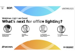
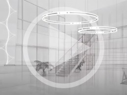
NICHIA hosted a webinar on office lighting on 22 October 2020 in association with arc TV.
The panel of invited expert speakers included: Ourania Georgoutsakou, Secretary-General, LightingEurope; Mark Ridler, Lighting Director, BDP; Kornelius Reutter, Design & Innovation Project Manager, Regent Lighting; and Kei Haraguchi, Manager, Lighting Business Planning, NICHIA.
A live Q&A session at the end of the webinar was moderated by Matt Waring, editor of arc magazine.
Siteco: Helsingin Olympiastadion
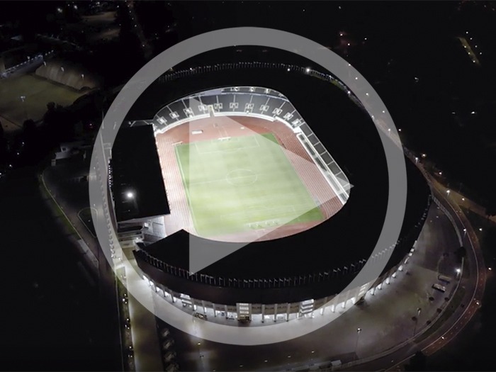
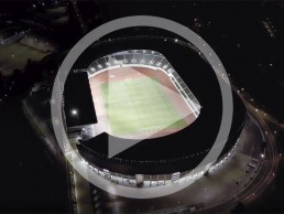
The Helsingin Olympiastadion, as it is called in the local language, is the largest stadium in Finland. Built in 1938, it has housed all the country's major events of the past 80 years: from the Olympic Games in 1952 to the World and European Athletics Championships and the Women's World Cup in 2009, the stadium has also been used as a concert arena by world stars such as Michael Jackson, the Rolling Stones and Tina Turner.
WAC Lighting given HEARTS Award
(USA) – WAC recognised for supplying 500,000 surgical masks to hospitals in USA earlier this year.
Representing citizenship within the lighting industry, WAC Lighting has been awarded the 2021 HEARTS Award for demonstrating outstanding leadership, empathy and service during the Covid-19 pandemic.
The announcement was made by the Dallas Market Center and ART, the creative home furnishings network.
In March of this year, WAC supplied 500,000 surgical masks to U.S. hospitals, primarily in the New York metropolitan area, where healthcare workers were being overrun by caseloads and were in desperate need of supplies.
“Our community wellbeing lies in the hands of the heroic healthcare providers among us,” explained WAC President and Co-CEO Shelley Wald, at the time. “Medical personnel and first responders need all the protection and support we can muster, but we cannot do it on our own. Please join our efforts to get supplies to the healthcare professionals on the front line. Our prayers are with those fighting this insidious illness and with all the people that love them.
“With regards to our customers, we recognise the particular hardships that retailers have been facing in the pandemic. To help make it easier for dealers to operate safely and avoid personal contact during Covid, we have been subsidising creative drop ship programs to eliminate unnecessary contact with their customers for handling deliveries that would normally be shipped to showrooms.”
The HEARTS Awards is a one-time special event to take place during the January 2021 Total Home & Gift Market in Dallas. The event is being held in partnership and solidarity with 13 leading industry organisations to honour 13 companies that have shown outstanding leadership, empathy and service during the Covid-19 pandemic by going above and beyond in service to their industry and/or community. The event will also include a fundraising auction supporting No Kid Hungry.
www.waclighting.com
www.dallasmarketcenter.com
Exhibitor registration opens for ArchLIGHT Summit
(USA) – New lighting trade event to take place on 21-22 September in Dallas, TX.
Event organiser Dallas Market Center has announced that exhibitor registration has opened for ArchLIGHT Summit, a new lighting trade event and educational platform for architectural, specification and design communities.
The first edition of ArchLIGHT Summit will take place on 21-22 September 2021 on the first floor of the Dallas Trade Mart building.
For exhibitors, the show will present an opportunity to reach the architectural, specification and design communities seeking commercial lighting brands that represent the leading edge of innovation and technology. For attendees, ArchLIGHT Summit will feature hundreds of commercial lighting brands, as well as the opportunity to explore permanent showrooms of residential/commercial crossover brands already located inside the marketplace.
Early-bird booth rates are available for a limited time, with special pricing available for a choice of two booth sizes. To accommodate demand, each brand is limited to a single 10’x10’ booth, or maximum of two 6’x10’ booths, although there will be a wait list for additional requests. Custom sponsorship and marketing packages are also available to increase visibility.
The show’s mission is to create something “fearlessly new”, driven by three progressive goals: “Showcase Only The Best. Be Boldly Inclusive. Be Radically Playful”. To accomplish these goals, the show is working hand-in-hand with industry thought leaders on shaping the show with a diverse group of perspectives, as well as creating hands-on product interaction and forward-thinking seminars and sessions.
ArchLIGHT Summit will include a full slate of seminars, hands-on lab learning and panel discussions, offering architects, lighting designers, specifiers and interior designers timely and accredited sessions on evolving lighting issues and solutions. Attendees will also be able to experience engaging displays and learning labs, receptions and tours within the permanent lighting showrooms participating in the show. A full schedule will be announced in Spring 2021.
The show will be co-located with Dallas Design Week, providing additional CEU and networking opportunities for attendees of both events. Meanwhile, show organisers are working closely with an Advisory Board of distinguished industry leaders, who are providing valuable perspectives for shaping this event and its educational programming. Members include: Francesca Bastianini (Sighte Studio); Andrea Hartranft (Hartranft Lighting Design); Archit Jain (Oculus Light Studio); Kelly Roberts (Wald Studio); Craig A, Bernecker (The Lighting Education Institute); and Kevin L. Wallace (DSGNworks).
Confirmed associate partners include American Lighting Association, Lighting Controls Association, National Lighting Bureau and Women in Lighting + Design.
Alfred Borden, The Lighting Practice Founder, to retire at end of year
(USA) – The Founder and Principal of The Lighting Practice to retire on 23 December.
Alfred Borden, Founder and Principal of The Lighting Practice (TLP), will retire on 23 December 2020, the company has announced. Borden has been a leader at TLP for more than 30 years, founding the studio in 1989 as a place where like-minded individuals could come together and make a positive impact through lighting design.
“I wanted to build a firm that was not dependent on my presence to succeed, which is why the firm is named The Lighting Practice, and not Al Borden Lighting Design,” Borden said.
Borden’s passion of light and understanding of its power began in the theatre; after graduating with an MFA in Theatrical Design from NYU, Borden started lighting dance, opera and musicals in New York and Philadelphia. His desire to work in a more permanent and accessible venue brought him to architectural lighting, and The Lighting Practice.
Throughout his career, Borden has illuminated thousands of buildings, driven by storytelling as the basis for how design decisions are made. His creativity, curiosity and commitment to unparalleled service became part of TLP’s culture.
In 2009, Borden looked to the future, as Helen Diemer became President and majority shareholder of TLP. Borden and Diemer together made the studio a success, inspiring long-term loyalty and growth amongst its team and clients. Diemer will continue to lead the firm as President, alongside partners Michael barber, Jered Widmer, Emad Hasan and Jonathan Hoyle. “I am confident in the leadership of my partners, and know that they will continue the success of The Lighting Practice after I retire,” said Borden.
“Al has been a great business partner and my dear friend for many years. We have built a business and a team together that neither of us could have done on our own,” said Diemer. “Al’s vision of The Lighting Practice recognised that two heads are better than one and good ideas can become great ideas when we all work together. I look forward to continuing that mission in collaboration with my other partners.
“We will miss Al and we will always be inspired by his creativity and determination. We wish him all the best in his next chapter.”
In an official statement, Borden said:
“To my Partners, Colleagues, Clients, Peers, and Family:
“Thank you for your friendship, your guidance, and for challenging me. You have made me a better designer and businessman. While the decision to leave The Lighting Practice and retire from lighting design was not easy, it was made easier by my confidence in my partners and the future of this firm. I have dedicated many years of my time and energy to The Lighting Practice, I am proud of our team and proud to have played a role in the firm’s 30+ years of success. I often refer to The Lighting Practice as my fourth child. And as with all children, there comes a day when the parents must step aside and let go, let their children determine their own path. I am confident in The Lighting Practice’s next generation’s leadership and the firm’s continued success.
“In retirement, I look forward to slower days, creative projects, reading, travel, more time with my family, and a wide range of tie-dye shirts and bucket hats (isn’t that what retired people wear?).
Thank you,
Alfred Borden, FIALD, MIES, CLD
Retiree in Training
New research project to combine dynamic daylight and artificial light
(Denmark) – Research to investigate quality of light for work environments.
A new approach to lighting design and technology is the focus of a new study currently being conducted at Aalborg University in Copenhagen, supported and accompanied by several lighting companies.
The study, entitled Double Dynamic Lighting (DDL), will explore the combination of dynamic daylight and artificial light in a spatial context, potentially opening up a new dimension for architects and lighting experts in supporting individual needs and different working requirements.
In a unique collaborative project, partners from the fields of lighting technology and solutions, including Fagerhult, Zumtobel, iGuzzini and Tridonic, have been working with Aalborg University for the past three years. “Rethinking Light” was the idea that inspired these companies to join forces in supporting this new fundamental research into dynamic lighting.
The DDL research project aims to set the guidelines for comfortable illumination in workspaces by combining direct and diffuse dynamic daylight and artificial light. The new approach of DDL will have a positive impact on perceived atmosphere, visual comfort, and work engagement, with the results hoping to demonstrate the potential to use new sensor and lighting technologies to meet human needs.
The project team has produced proposals for lighting scenes based on the natural course of daylight, as well as current sky conditions. By exploring how a responsive lighting technology that reacts to and complements daylight inflow can reconnect man and nature, the findings, researchers hope, will help to form a more holistic design approach in the future.
The project is examining the spatial conditions in a dynamic lighting environment, and their influence on the wellbeing of users. Practical design guidelines are being developed, tested and implemented in a series of investigations. This work is being conducted in existing working environments with dynamic light, in lighting laboratories at Aalborg University and in interactive, three-dimensional computer models.
The results of the field study have already demonstrated that it is possible to define dynamic light settings in response to the dynamics of daylight through a combination of direct and diffuse lighting. DDL was validated to have a positive impact on perceived atmosphere, visual comfort and work engagement when compared to static lighting. In general, it was confirmed that the combination of directional task lighting and diffuse ambient lighting in response to sky types and measured daylight levels in the workspace was preferred to standard static diffuse lighting.
An analysis of responses from interviewees has also revealed a large difference in perceived visual comfort between dynamic and static lighting periods, indicating that working with light zones and with direct and diffuse lighting components and uneven light distribution enable a high level of visual comfort to be achieved. The industry partners added their practical application knowledge, working hand in hand with the university.
Prof. Ellen Katherine Hansen, project lead and Head of Lighting Design in the Department of Architecture, Design & Media Technology, said: “The aim of the study is to apply an innovative mix of methods to create a holistic approach to lighting planning, which can then function as a seal of quality in the lighting industry. A combination of biological, aesthetic and functional aspects will form the basis for the design process.”
Karin Zumtobel-Chammah, Chairwoman Supervisory Board at Zumtobel, added: “A fundamental element of our DNA is our desire to improve health and wellbeing by providing the best possible light for both people and the environment. Our research and development projects constantly aim to achieve these improvements. We identified a great overlap between our research topics and the DDL project, so we were convinced that the findings of this research on combining daylight and dynamic lighting technology would contribute to better health and wellbeing.”
Henrik Clausen, Director of Fagerhult Lighting Academy, said: “For us it’s also about knowledge. It is a challenge to enhance our general lighting knowledge. We need to do that in order to take advantage of all the possibilities for health and wellbeing that light can give us.”
Peter Roos, Product & Project Solutions Director at iGuzzini, concluded: “The idea of the DDL research is to find new lighting design guidelines for workspace lighting which will improve the wellbeing of end users. So in the first instance, it will be ‘all of us’ living and working in spaces illuminated by applied DDL design guidelines who will benefit from the DDL research findings.
“We at iGuzzini believe that the lighting design community, together with architects and lighting professionals, will embrace the idea of Double Dynamic Lighting to create beautiful spaces we’ll love to live in.”
www.light.aau.dk/DDL
www.zumtobel.com
www.fagerhult.com
www.iguzzini.com
www.tridonic.com
Hacel: Smart Lighting
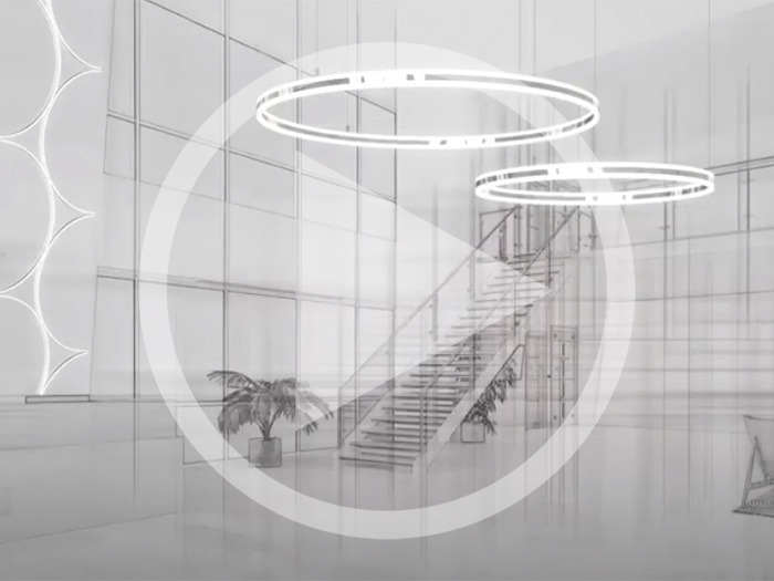
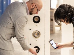
Hacel's range of innovative LED luminaires can incorporate the latest Bluetooth Low Energy control platforms, offering intelligent, revolutionary wireless lighting control. This smart, intuitive solution is controlled via an app to enable users to interact with lighting to suit their individual, group or spatial requirements. Hacel are proud to offer this versatile solution with endless capabilities at your fingertips.
Motoko Ishii named Tokyo Honorary Citizen
(Japan) – Commendation for those who have made a contribution to rise of social culture.
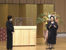
Lighting designer Motoko Ishii has been recognised as a Tokyo Honorary Citizen in a ceremony held on October 1 at the Tokyo Metropolitan Government Building.
The Tokyo Metropolitan Government commends those who have made a contribution to the rise of social culture by selecting “Honorary Citizens” as objects of respect for the citizens of Tokyo. This is the first time such an award has been given to a lighting designer.
Ishii was selected for this award for her continued work in cultivating the attraction of new lighting designs such as urban lighting, architectural lighting, and light performances, aiming for their spread under conditions where lighting design has not yet taken root.
She has worked on many light projects and events both at home and abroad, and continues to be active as a leading lighting designer, giving hope and vitality to people.
“Having been born and raised in Tokyo, it is a great honour for me to receive recognition as a Tokyo Honorary Citizen,” Ishii said. “I have done many lighting designs both inside and outside Japan, and I’m proud that the lights of Tokyo Tower, Rainbow Bridge and the Sumida River bridge group that I designed have become Tokyo landmarks.
“Unless it is peaceful, you cannot enjoy the lights of the city. I sincerely hope that Tokyo will continue to light bright lights.”
Ishii was selected alongside artist Tadanori Yokoo and traditional craftsman Toshio Takizawa as Honorary Citizens. Each Honorary Citizen is presented with medals, and their portraits are displayed in the hall of the Tokyo Metropolitan Government Building.
Lamp Awards postponed until 2021
(Spain) – The 9th edition of the awards will now take place in June 2021.
Due to the current situation of uncertainty around the world, Lamp has announced that the 9th edition of the Lamp Awards has been postponed, and will now be held in June 2021, in Barcelona.
In a statement, the Spanish manufacturer said: “Could we have opted to turn it into a virtual event? Yes we could, but then it would not be the Lamp Awards as we know it, and we preferred to retain its essence.
“This awards ceremony not only rigorously promotes the lighting culture within the lighting, architecture and interior design industry on a professional level; it is an event that, since 2008, has fostered personal relationships between these communities of professionals and, after eight editions, has made us one big family.
“Because now more than ever, we value the importance of little things: a smile, a handshake, a meaningful hug; and, as we are aware that zero risk does not exist in an event such as ours, we prefer to wait until we can come together as the great international family that we are.
“Because this too shall pass. And future Lamp Awards will once again be organised with the same essence and the same enthusiasm as usual. See you soon!”
KTH Lighting Design Division
As the Lighting Design Division of the KTH Royal Institute of Technology in Stockholm, Sweden celebrates its 20th anniversary, arc looks back on the history of the Division.
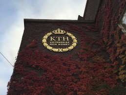
Widely considered to be one of the leading higher education facilities for lighting design in the world, the Lighting Design Division of KTH Royal Institute of Technology in Stockholm, Sweden, this year celebrates itsw 20th anniversary.
Founded by Jan and Agneta Ejhed in 2000, the division, formerly known as the KTH Lighting Laboratory and still colloquially referred to as the Lighting Lab by students and alumni, was created due to a lack of Master’s level education in lighting design in their native Sweden. The Ejheds wanted to change this and engage people in the discussion surrounding lighting design in a more advanced, deeper level, and in order to do this, an education was needed.
The origin of this educational offering was a series of independent courses with different specialised topics. In 2006, these were later compiled into an overall Master’s programme – the Architectural Lighting Design course. While the independent courses started out in Swedish, the number of international students expressing interest meant that the Master’s programme was offered in English.
Since then, it has become one of the most recognised Master’s offerings in the world, with students continuing to travel from around the world to enrol in the course.
Rodrigo Muro is the current Programme Director of the Lighting Design Division at KTH. He explained further the original vision for the programme and how it has grown: “Jan’s figure is extremely important to all of us who had the fortune to learn from him,” he said. “His legacy is to promote a deeper engagement in the knowledge and discussion on the subject, and move from a technical approach towards a ‘Human Centred Philosophy’. This has become the motto of the Lighting Design Division.”
Muro has been on the faculty at KTH since 2011, and having completed his own Master’s at the school in 2006, he believes that the international scope of its students and alumni has become a beacon of the course’s appeal. “That is the signature of our education; an international education that brings together people from around the world who, later on, will spread the gained knowledge and philosophy of the Lighting Lab worldwide.”
Muro’s own Master’s thesis was centred on the need to develop new theory, with education being at the core of the lighting design profession, so it was a natural move for him to return to KTH in an educational role, first as a teacher, then a course leader, before becoming the Programme Director last year. He explained further what this role entails: “My role at the Lighting Design Division is diverse; besides being the Programme Director, I am course responsible, an examiner, lecturer, tutor and I also do some research. So it is difficult to separate one activity from the other,” he said.
“Activities range from the macro to the micro: from programme planning to face-to-face tutoring of students’ projects; evaluating the prospects for each admission period; defining content for each course; evaluating each course to see how it works and how we can improve it; coordinating with the administration and aligning the programme into KTH’s vision; coordinating teachers; coordinating activities with students, amongst other tasks, are part of the everyday responsibilities. And very importantly, evaluating our own performance to be able to evolve and improve the course in every edition.”
In its current formation, the Architectural Lighting Design Master’s programme comprises five courses, which students go through in one academic year. The education is structured under the criteria of building up knowledge, course after course, with the principle to learn by means of first-hand experience, which is then complemented with theory. “So the students test a lot, they see light, they work with light, they feel light,” Muro explained.
“One of the main principles that we have is that students should start working with hands-on projects so that they really understand how light works from experience, and then the theory comes into place afterwards, so that they’re free of the constrictions that theory can give you. And when the theory does come, they then understand why things happen. We have noticed that sometimes when we start giving out facts and numbers and theory, it can be difficult to grasp if they don’t experience it first. That’s why we have this approach.”
The curriculum of the programme addresses different ways of learning under a structured, pedagogical system, and the learning process of the students follows a mix of processes where explicit, implicit and tacit knowledge is attained. Content is distributed under four main topics – Light and Humans, Light and Space – Outdoor, Light and Space – Indoor, and Light and Science, alongside the final course, a degree project, where students combine the theory and skills learnt throughout the course in a specific situation.
While the programme has naturally expanded across its 20 year history, the core principles instilled by Jan and Agneta Ejhed still remain in place, as former Programme Director Federico Favero, explained: “The programme is so immensely more dense, intense and structured,” he said. “But the basic philosophy and goals are the same: give the students the tools to understand conceptually and technically why they’re lighting a space.
“We provide a methodology to approach the complexity of the architectural space and the interaction between light, people and the environment. I believe we are advancing continuously in the understanding of this interaction, which is ever more important for health and the sustainability of the planet.”
Favero has been involved with KTH since 2005, when he “came to Sweden to attend a four-month course and never left”, and was the first full-time employee recruited by Jan and Agneta Ejhed to the Lighting Design Division. In the following years, he progressed to the position of Programme Director, before stepping down to focus solely on his PhD in 2019. “It was wonderful, exciting and overwhelmingly enriching,” he said. “It was my first job in an academic setting, and at 27 years old I found myself being an assistant teacher of a class of students who were my age or older, with more experience than me and an incredibly varied background from all over the world. I couldn’t have asked for more in that period.”
Favero also expanded on the “philosophy” of the Lighting Design Division, emphasising the experiential focus discussed by Muro. “Jan Ejhed’s approach to design education is at the core of our philosophy. We are very much concerned with understanding light and the effect of lighting on people and architecture, only when we have shaped that idea we discuss what and how to design lighting. Lighting design is a reflective practice that needs to learn continuously to dialogue with the complexity of the architectural process and the dynamic transformation of technology.
“The role of experience is also vital for us. We cannot conceptualise light, we need to experience it, observe it, play with it, recreate it, reconceptualise it, and then observe again what happened. It’s an amazing, never-ending process of discovery that is motivating and similar to life, which is a continuous process of learning and doing.
“We provide an open platform for discussion. We don’t talk of right and wrong - this approach helps the students to feel safe, which is important to create a sense of trust. This is perhaps one reason why we are called ‘the lighting family’, we create an atmosphere where it is possible to speak and develop freely.
“In this frame, at KTH we inspire the students to collaborate more than compete with each other. We really focus on the importance of good teamwork, of process development and not just the final product. Hopefully this approach teaches the students humbleness and respect for others, and also a reflective approach that shapes their design thinking positively.”
Muro added: “Considering that lighting design is a broad profession with many different angles and at the end, each student will decide their own route, we at KTH have the philosophy to create thinkers that can solve and create lighting related solutions. What does this mean? We promote in the students independence and a self-learning attitude. This comes hand in hand with cooperation and the ability to work in a team; with the spirit, skills and will that this requires.
“The whole point is to provide a constructive learning environment, in which the goal is to foster creative, critical and inquisitive thinking. We ask them not to accept blindly what we teach, so fruitful discussion is what is most important to promote during the sessions.”
While the Lighting Design Division began life as part of KTH’s School of Technology and Health, it has since become a division within the KTH Architecture School – a move that has opened up more collaboration and cooperation between architecture and lighting design students, while architects are also now able to take part in a one-year course on architecture and daylight. This is something that Muro feels will be beneficial in the long run, as it will increase the chances of architects bringing in lighting designers for projects and involving them in the design process, as they’ll have a more solid understanding on the importance of lighting.
Alongside the educational offerings, Muro added that research has always been an important factor for the Lighting Design Division. This has recently been expanded with the introduction of Ute Besenecker, who last year was appointed as Associate Professor in Lighting Design. “Ute is leading and strengthening the Division with multiple research projects, collaboration with other universities, and setting up a platform for a strong PhD programme within the Division,” he said.
Another new recruit to the faculty at the KTH Lighting Design Division is Foteini Kyriakidou, who joined as a lecturer at the same time as Besenecker. Another former student of KTH, having completed the Master’s programme in 2007, Kyriakidou teaches on both the Architectural Lighting Design Master’s course and also the Daylight Architecture Studio.
She agreed that the core principles of the school have remained the same in the time between her graduation and her return in an educational role. “What I find different is that the course is even more structured than before,” she added. “I believe this is due to the experience of my colleagues, the development of scientific knowledge within the KTH academic environment concerning light and the general evolution of technology – when I was a student, we used to work with different types of lamps (fluorescent, halogen, metal halide, etc), rather than LED lamps that are widely used today.”
This vast advancement in lighting technology over the past few years means that the Lighting Design Division needs to remain at the forefront, so that what it teaches its students is always up to date.
Favero explained how it achieves this: “We teach the students the basics in terms of terminology, approach and technique. With that in mind, we invite guests who are at the forefront of tech development to show us the way. But we always have to keep in mind that technology is a tool to achieve a goal, which is a sustainable and enjoyable environment. It is a key difference with educations that have photometric knowledge as the goal of their education. In the future we need more collaborations to help us develop, for instance, a better understanding of the interaction between technology and humans through software, controls and AI.”
Muro added: “We update ourselves as any other lighting design professional should: courses, training, conferences, reading papers, spreading information internally at the Division. A very efficient way is keeping in close contact with different actors within the profession; researchers, designers, manufacturers and other educators. I am personally also a part of Light Bureau, so this keeps me updated at the praxis level.
“But it is not just a matter of lighting skills or knowledge. We all in the Division undergo thorough training in teaching in higher education. This means we get pedagogical tools and philosophy to approach teaching and student learning in a more efficient and successful way. Collaborating with other departments at KTH also enriches our experience to learn from other fields. We support the interdisciplinary approach.”
Alongside the technological advancements, there are a number of other ways in which Muro believes the lighting industry has developed for the better, which will also impact on how KTH approaches each academic year.
“Today’s debatable commercial approach of so-called Human Centric Lighting might have been influenced partly by our 20-year-old approach to lighting; a Human Centred Philosophy. This is now at the core of the industry and the design profession. Light’s impact on health and a concern for taking care of the environment through initiatives such as the preservation of the Dark Sky, energy saving, and social aspects with active proposals like the Social Light Movement and Women in Lighting are all great examples of how much we have evolved.
“At the end of every light related event, I perceive a profession that agrees more and more in the important general questions. Of course there are different positions, but those different opinions create debate and help to push forward important themes. There are still issues to resolve. Maybe I am just too optimistic, but I think we are on the right path.”
While the KTH Lighting Design Division was hoping to celebrate its 20th anniversary this year, the ongoing Covid-19 crisis has made 2020 an incredibly difficult year for the school. However, out of difficulty comes opportunity, and Muro feels that the pandemic has actually led to some interesting new teaching developments.
“It started as a difficult situation and then became a challenge, but later on it actually offered more opportunities,” he said. “We used to run everything face to face, but going digital has provided space for new guests from around the world, who have given a different input into the education. We’ve been able to invite people who previously wouldn’t have had the time or wouldn’t have been able to come from another part of the world.
“This will certainly change our education for the future. Not changing into a digital format forever, but whenever it is possible, why not have digital lectures where you could talk with people that otherwise you wouldn’t meet?
“It’s a matter of resistance. If you would have told me a year ago that I had to do lectures online, I wouldn’t have liked that approach, but now that we’re forced to do it, it works. We basically update ourselves.
“From a project side, we had to re-evaluate the methods that we were following to make sure it works, if not completely then some parts of it being digital. We’re still having meetings where it is absolutely necessary to meet – when we’re looking at luminaires, lumen observations, etc. But having a smaller class this year helps a lot for us to be in the same room together and still be able to run it.”
Muro also revealed how the Lighting Design Division plans to celebrate its 20th anniversary in the new Covid climate: “We will have digital sessions, organised in different locations around the world with former students. The idea is to gather different generations from the past 20 years and start the lighting discussion around food.
“Food has been something that has unified the Lighting Family; Agneta Ejhed has welcomed us throughout the years at their place and shared with us on a more personal level their heart next to a plate of food. As a result of that, we have continued organising dinners where we all, students and staff, share dishes from each of our different backgrounds.
“At the 20-year celebration, we will discuss lighting through the first task that as students they all had - “My Favourite Light” - and what that would be today in 2020. All this is the frame around the acknowledgement of the importance of our founders, Jan and Agneta Ejhed.”
Over the last 20 years, the KTH Lighting Design Division has produced an enviable list of alumni that have gone on to achieve great things in lighting design, whether joining renowned practices, setting up their own studios or furthering the profession in other means.
As Programme Director for the Division, Muro explained that it is a source of pride to see what becomes of his students post-graduation. “I am proud to be able to call them colleagues,” he said. “I try to invite practicing KTH alumni as guest lecturers as much as possible to give the students inspiration, so that they can see where they can go. Being contacted by prestigious lighting offices around the world asking for graduates and praising KTH students is also certainly an honour.”
“The moment of catharsis when the students get confidence with the topic as long as they go through the programme is an immense source of joy,” Favero added. “That sparkle in the eye that is a sign that someone became confident and has grown is an epiphany and it motivates all the effort that you might have to make.
“We are proud to have given many students the basis to be able to speak with architects and engineers, therefore they are spread in a varied constellation of offices and institutions. They are not only professionals, but educated in the topic, who can push the boundaries of knowledge further in policy making, institutions and research.”
Another key factor in the success of the KTH Lighting Design Division is what has been dubbed the “Lighting Family” – a concept first nurtured by Agneta Ejhed that encourages a sense of community and camaraderie among students and alumni. “It’s all about taking care of each other, providing this sense that you are welcome and a part of something,” Muro explained. “You’re not just in school, you’re part of a group of people that are freaks in lighting, but are also sensible about the human aspect.”
It is through this Lighting Family that Favero met his wife, Isabel Villar, and Kyriakidou was struck by the sense of community within the school. “What I find remarkable is that the sense of belonging, which Jan and Agneta Ejhed initiated, is still alive among the alumni, no matter the year of graduation. I feel emotional when I think of how many friends I have around the world due to this Master’s Course, how much knowledge we exchange, and how much we feel part of this family.”
Finally, what advice is given to new students as they arrive each year? For Kyriakidou, she breaks it down into three steps: “It is evident that KTH principles have a strong impact on my personal ones since I was a student here. However, trying to summarise and distil them through my personal view, I encourage the students to work with light as an immaterial materials following three steps: Observe; Test; and Be Coherent and Consistent.”
Favero was more philosophical, with his advice being: “When the students arrive, I tell them to enjoy every minute of their education. It is a luxurious experience in this complicated world to be able to focus on one thing in the present moment. Have serious fun, which for me means to keep on being curious, motivated and focused.”
While Muro concluded with some more basic, but important advice: “We at the Lighting Design Division repeat this every year to all students: test, test, test. Test your ideas, test your proposals, test the luminaires, until you get there.”
As the Lighting Design Division celebrates its 20th anniversary, with such a vast, talented group of alumni, it’s clear that this advice is worth taking.
Testimonials
Paula Bez Cardoso
KTH Student: 2019-2020
“I think there is no better place to study lighting design than Sweden. The dark winters and almost 24-hour days in summer had a great impact on how I think about light.
“The culturally diverse character of my classmates was almost as important as the course itself. I can recall of at least 21 different nationalities in my class. To be in contact with so many ways to see light and the world made this experience much richer.”
Rodrigo Roveratti, La Luz Lighting Design
KTH Student: 2005-2006
“I chose KTH due to the lighting culture in Sweden and the high standards and infrastructure of the KTH university. At KTH they teach students to think about lighting as a material, different than at other universities.
“I had such a great experience at KTH, with an amazing integration among all the students and professors. It taught me how to think about lighting to enhance architecture. I have an immense gratitude to Jan Ejhed.”
Alexia Gkika, Buro Happold
KTH Student: 2012-2014
“KTH has a mentality of freedom that can only be appreciated when one becomes part of its community. I felt creative, challenged, inspired, and above all surrounded by people who wanted to share knowledge and experiences.
“The mentality of KTH has influenced the way I perform in my job and my interrelation to others to a great degree. KTH changed the course of my career, enabled me to be where I am today, and for that I feel both blessed and proud.”
Ognyana Zhelezova, Lichtkompetenz
KTH Student: 2011-2013
“I’ve always been fascinated by Scandinavian design, and a curiosity to learn more about lighting and do a Master’s degree abroad made me apply to KTH. KTH opened my mind for a lot of things professionally and culturally. I got to know the depth of lighting, which is still not even a profession in my home country of Bulgaria, and what a person can do with lighting is beyond borders. The people I met were amazing, so diverse, and I have friends all over the world now!”
Mahdis Aliasgari, Lighting Design Collective
KTH Student: 2010-2012
“Those two years were an unforgettable journey for me! From the international vibe to the school’s practical approach and variety of subjects, I learnt a lot from my teachers and classmates.
“KTH connected us to the international world of lighting. Thanks to the programme, we gained confidence to aim high not only for the practical sides, but also to be involved in the theoretical and academic side of lighting.”
Farahbee Rahman
KTH Student: 2019-2020
“My experience at KTH was deep and intense. It was one year of rigorous learning and exploring a new track. The Lighting Laboratory allowed us to indulge into both artistic and philosophical approaches, as well as hands-on, technical, playful experiments. It was stressful, but not in a negative way. Rather, KTH prepared us for facing harder challenges ahead in our upcoming careers. The experience has been triggering, boosting confidence in our chosen path.”
Basar Erdener, LED Linear
KTH Student: 2006-2008
“What appealed to me the most was the approach and attitude to lighting. It was deep, intellectual and holistic. I quickly realised that there is much to learn from your peers on top of school work. Jan and Agneta Ejhed deserve so much credit for putting us all together and running the programme.
“My entire career took shape during and after my time at KTH. All that I learnt from KTH professors, alumni and fellows are still a big part of what I do and how I work.”
Katia Kolovea, Archifos
KTH Student: 2016-2017
“With a very diverse and international student background, highly experienced professors and many recommendations from people in the field, I was sure that the KTH Master’s programme would be a fantastic way to begin my career.
“My overall experience at KTH, the interaction with my worldwide classmates, and the participation in global conferences, lighting festivals and other events during my studies has shaped my path as a lighting professional.”
Gayathri Unnikrishnan, International WELL Building Institute
KTH Student: 2012-2014
“My experience at KTH was life-changing. The whole year was filled with lighting experiences in different shapes and forms. It was such a rich, layered experience with a stellar faculty, challenging projects and lifelong friendships, all in the setting of Swedish culture. Working with a multicultural student body sharpened my collaboration skills and cultural sensitivity, and the ethos of the Lighting Lab of putting people at the centre of design has become the North Star of my career.”
Bojana Nicolić, BDP
KTH Student: 2012-2014
“When I enrolled, there were very few courses in Europe in English, and the KTH curriculum covered a little bit of everything - interior and exterior lighting, luminaire design, impact of lighting on health and environment, daylight. It was the perfect chance to get a firm knowledge base, and find out what I really liked. The fact that the course was based in Stockholm, with long sumer days and short winter days, just made a perfect setting for the whole experience.”
Selen Çelik Güngör, Ramboll
KTH Student: 2017-2018
“I was interested in the Nordic countries in general and their approach to designing light. The lack of daylight during winter, and how they deal with it is fascinating for me. The curriculum at KTH was very diverse in scale and detail. Besides its super intense programme that focuses on architectural spaces, our teachers’ vision taught us to study and understand light with its many aspects. I highly recommend it to anyone who wants to dive into the lighting world.”
Isabel Villar, White Arkitekter
KTH Student: 2006-2007
“I have no words to explain the positive memories I have from my time at KTH. When I started the course I wasn’t sure I wanted to specialise in lighting design, but it didn’t take too long until I found that this was exactly the field of specialisation I was looking for. I’ll always be grateful to Jan and Agneta, who fought so hard to make this education possible. I never would have discovered the passion I have for lighting design if it wasn’t for KTH. It changed my life.”
Paola Jose, SOMBRA
KTH Student: 2012-2014
“My experience at KTH was truly fulfilling. I learned so many new things, I created a beautiful family and I always felt safe and comfortable. What I loved most about KTH was that the teachers were always there to listen and discuss about our projects or ideas. My time at KTH was crucial in opening the doors to the beautiful world of light. It was the foundation for what I do now and I am extremely thankful to all of my teachers and classmates.”
Dane Amilawangi
KTH Student: 2019-2020
“KTH’s focus on a human-centred approach, and how light quality impacts humans, is for me the most fundamental basis to create a responsible design as a lighting designer.
“I had fantastic classmates from different backgrounds. At first I was nervous because some of my classmates were more experienced, but we were all excited to learn something new together, and our different backgrounds made us complement each other and collaborate better in projects.”
Beatrice Bertolini, giaEquation
KTH Student: 2016-2017
“I was lucky enough to be advised to study architectural lighting design at KTH. I must say that everything I was told about this course truly excited me: a very hands-on programme where I could exchange knowledge and experience both between peers and teachers. My expectations have never been disappointed.
“The year I spent at KTH helped shape my knowledge and skills, and strengthen my passion for lighting design.”
Martina Frattura, A Beautiful Light
KTH Student: 2013-2015
“Back in 2011, I attended the Light on Focus conference held during Euroluce in Milan. I listened to each talk and afterwards asked everyone “where do I study to be one of you?” They all answered the same: “Sweden!”
“When I was there, I felt I was in the right place, surrounded by friendly people full of passion like me. My KTH stay taught me many things about lighting and the impact that it has on a daily basis.”
Alp Durmus, Penn State University
KTH Student: 2007-2009
“During my time at KTH, I had the chance to meet a lot of great people, who I’m happy to call friends now. It is always great to see a familiar face at a lighting convention, conference or a fair.
“KTH has a great reputation as an institution. Beyond the obvious networking advantage, earning a Master’s degree from KTH added prestige to my resume. I’m sure it played a role in securing a lighting design job early in my career.”
Viola Deti, Sweco Architects
KTH Student: 2016-2017
“My experience at KTH was very important in helping me build a new perspective regarding the importance of light and lighting design in an architectural project.
“In my opinion, a deep understanding of lighting and how it can either improve or ruin a project still lacks in many architectural educations. The Master’s programme at KTH helped me to see this as a fundamental architectural element, crucial in spatial design and planning.”
Bright Special Lighting Linear Lighting Profiles
Bright’s Linear Lighting Profiles are available in length up to 4500mm. Custom lengths for continuous lighting systems are available and bespoke geometric shaped feature lights for recessed, trimless and suspended placement. This clean, refined luminaire option will ensure that any application stands out while maintaining a well-constructed, impressive visual as standard. Custom shapes, Opal, Opal-Mircroprismatic and Low Glare diffusers, up to 140Lumens/W, Direct / Indirect options, clip-in gear tray.
Siteco DL20
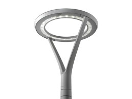
Elegant design based on lantern-shaped luminaires with robust workmanship (IP66, IK08) and dirt-resistant toughened safety glass, Siteco’s DL20 offers low-maintenance, continuous operation of up to 100,000 hours with minimum luminous flux degradation thanks to optimum thermal management. Precise light distributions due to MIRO-quality double reflector technology are suitable for various road and plaza situations, while optimum glare control allows glare-free view into the luminaire.

