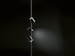
Ribag Milum

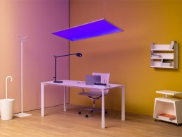
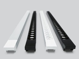
Milum is a multifunctional lighting system with three combinable modules, which allow a wide variety of room lighting scenarios as lightline, downlight or wallwasher. The compact construction is made possible by technically sophisticated components, including double-focus lenses and free-form reflectors that ensure efficiency and precise light control. The light output sits slightly recessed in the slim profile and delivers a glare-free light. In combination with an excellent light brilliance, it achieves a high level of lighting comfort.

www.ribag.ch


Lumenwerx Audia

This pendant luminaire was developed in collaboration with acoustic experts and combines a distinctive spatial effect with a sound-reducing surface structure. A patent-pending technology integrated into the body reduces sound by up to 30% over traditional PET acoustic luminaires. In addition, Audia also delivers a high level of lighting comfort. The easy-to-clean pendant luminaire is available in two sizes and various colours.

www.lumenwerx.com


Wever & Ducré Mick

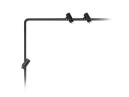
Inspired by the clear language of form of Bauhaus, these flexibly adjustable ceiling and wall lamps showcase geometric contours. Available in matte black as well as white, the slim powder-coated aluminium body of the luminaire is defined by a reduction to precisely worked edges and surfaces. Mick comes as a 330mm long version with an LED light source and as a 450mm long version featuring two light sources, with a brightness of 420 or 450lm each.

www.weverducre.com


corporate friends C1-mini Series

The C1-mini series has expanded its product range with a modular zoom optic with a diameter of 16.5mm. It can be retrofitted to the existing spotlight family and can be optionally combined and supplemented with additional microstructure foils. Equipped with a glass lens, the beam angle can be freely adjusted between 6° - 33° with a variable height of approx. 21mm. The optical attachment is reduced to a minimum and also offers optimised anti-glare protection. 

www.corporatefriends.de


Siteco City Light Plus LED

The LED luminaire family interpret the form of the classic lanterns into a new and contemporary design. The result is an installation-friendly, modularly designed luminaire with an elegant, transparent impression and state-of-the-art, efficient lighting technology. 

The glare-free, directed light distribution is generated via a precisely matched combination of high-performance LED arrays, 3-zone facetted reflectors and clear luminaire enclosures. 

Available in three performance packages: Basic, Plus and Premium. 

www.siteco.com


LightGraphix LD155

The new LD155 is an IP67-rated, high powered, adjustable uplight designed for internal and external use. The product features a new light engine giving more than 900lm output, and an innovative new ball joint design. This houses the LED, optics and accessories, allowing 360° rotation and 25° tilt adjustment in any direction. Quick on-site focussing is achieved with a removable inner bezel allowing all adjustments to be done from the front with no requirement to remove the product from the mounting surface.

www.lightgraphix.co.uk


3F Filippi Manta

Manta marks the first time in nearly 70 years that 3F Filippi has launched a luminaire for outdoor areas. Aerodynamically shaped in die-cast aluminium for low wind resistance, Manta is available in either pole or wall-mounted format. Suitable for all outdoor environments, from general lighting to work and roadway lighting, transit areas, building perimeters and parking lots, the IP66-rated Manta offers an output of 6800-22000lm at 3000K, with a CRI of >70.

www.3f-filippi.com


Bright Special Lighting FAMA S

FAMA S steps 1 and 2, are made by extruded brass or stained steel  IP-rated products, which meets the requirements of lighting design in outdoor areas. A choice of one side or double sided lighting emission offers appropriate solutions for a large number of lighting requirements. High efficiency, low maintenance costs, excellent colour rendering and efficient glare control make FAMA S the ideal solution for a wide variety of projects due to its extremely small size. A choice of lumen packages up to 230lm and flexible mounting options, make it ideally suited for open spaces and landscapes.

www.bright.gr


Filix Arpool Series

The new Arpool Series takes cue from the underwater lighting workshop and CPD seminars to implement technology that exalts the effect of light in water. Improved optical solutions, efficiency and design bring forward the light as one of the key features and value adders in hospitality and public pools alike and the projector versions make sure that water features get the same treatment. 

www.filixlighting.com


Opus by Omniyat, UAE

The marriage of Zaha Hadid’s iconic architectural vision, and the ever-expanding opulence of Dubai would seem to be a perfect match to most architecture aficionados. This dream pairing was brought to life with the completion of the Opus earlier this year.

Home to the new ME Dubai Hotel, the Opus is located in the Burj Khalifa district adjacent to Downtown Dubai and Business Bay on the Dubai Water Canal. Exploring the balance between solid and void, opaque and transparent, interior and exterior, the design was presented by the late Zaha Hadid herself way back in 2007, and is notable in that it is the only hotel in which she created both its architecture and interiors.

Spanning 84,300sqm, the Opus was designed as two separate towers that “coalesce into a singular whole”, taking the form of a cube. The cube has been “eroded” in its centre, creating a typically Zaha Hadid free-form void that is an important volume of the design in its own right. The two halves of the building on either side of the void are linked by a four-storey atrium at ground level, as well as an asymmetric, 38-metre-wide, three-storey bridge 71-metres above the ground.

“The precise orthogonal geometries of the Opus’ elemental glass cube contrast dramatically with the fluidity of the eight-storey void at its centre,” explained Christos Passas, Project Director at Zaha Hadid Architects.

The cube’s double-glazed insulating façades incorporate a UV coating and a mirrored frit pattern to reduce solar gain. Applied around the entire building, this dotted frit patterning emphasises the clarity of the building’s form, while at the same time dissolving its volume through the continuous play of light varying between ever-changing reflections and transparency.

The void’s 6,000sqm façade is created from 4,300 individual units of flat, single-curved or double-curved glass. This curved façade was designed using digital 3D modelling that also identified specific zones that required tempered glass. During the day, the cube’s façade reflects the sky, the sun and the surrounding city, while at night, the void is illuminated by a dynamic light installation of individually controllable LEDs within each glass panel.

The lighting design for the exterior void was developed by dpa lighting consultants, who were asked to provide “an interesting and practical solution to the façade lighting, and to take into consideration the visual appearance during the day and night, and the desired seamless appearance and integration into the façade,” explained Michael Curry, Senior Associate at dpa lighting consultants.

A critical design consideration for dpa was to ensure that the lighting equipment did not detract from or compromise the beautiful, smooth flowing form of the internal void. Maintenance and energy were also important considerations, as well as the infrastructure and integration into such an elegantly detailed façade.

Curry continued: “The void forms an important volume and canvas to which the lighting could complement by only lighting this void, leaving the outer body of the building to sit like a monumental mirrored sculpture. Our intentions were to provide dynamic lighting options with the LED pixels being used to create visual interest that could be used on a day-to-day basis as a sophisticated solution or subtle and soft colour, through to providing more dynamic event lighting solutions and specific designs used for specific dates within the UAE and world calendar, for example.”

For dpa, the project spanned several years from concept to completion, first joining the project in 2013, with various interesting challenges to illuminate such a unique and complicated piece of architecture. And while the brief called for a relatively simple solution, Curry added that “there was a lot of detailed work carried out post-design stage with the manufacturer’s design team with regards to visual and technical development”.

As such, dpa collaborated closely with ZHA and other team members, alongside lighting manufacturers Vexica to develop a unique, bespoke product that would integrate seamlessly into the façade of the void. This resulted in the installation of 5,000 individually controllable 1.5W LED ‘points’ of light, which provide a sophisticated and dynamic lighting solution. Using Pharos’ DMX lighting control system, programmed by Creation, enabled unique tailoring of the content, with the LED ‘pixels’ acting as a creative tool with which to paint light across the inner void of the façade.

Inside, the ME Dubai hotel incorporates 74 rooms and 19 suites, while the Opus building also houses office floors, serviced residences and restaurants, cafés and bars, including contemporary Japanese robatayaki restaurant ROKA and the Maine Land Brasserie.

Typical Zaha Hadid flourishes and themes permeate the interior of the Opus, as undulating curves and unusual shapes feature throughout the building. 

While dpa lighting consultants designed the lighting for the external void, the interior lighting design was developed by Illuminate Lighting Design. Rikus De Kock, Lighting Project Director at Illuminate, explained: “Illuminate was signed on the back end of 2014 to work with ZHA and our interior parent company, HBA, to take ZHA’s design direction and implement it for construction documentation.

“Opus was a bit different to our usual projects in the way that we typically have one lead design consultant and we just work with them on the lighting side. Here we had a very specific design direction from ZHA that included the overall lighting mood, and we had to work out all the technicalities with HBA to make it a reality.”

The brief for the interior lighting design, De Kock explained, came more in a “language of renders and visuals”, rather than a specific narrative. However, “through the visuals it was clear that the lighting design was extremely clean, with typical ZHA curved lines. The same language flowed from the rooms throughout the public areas.”

De Kock added that while the design changed during the timeline of the project, the overall intent of clean ceilings and curved lines remained the main focus. This is evident throughout, with the use of hidden linear fixtures creating flowing lines of light that seamlessly blend into the fabric of the building.

This feeling of flow is something that stood out to De Kock while working on the project – particularly considering the typically atypical interior design from ZHA. “It was refreshing to work on a design that is not typical,” he said. “I come from the theatrical side of lighting, and back then we deliberately strived to make everything unusual. A typical ZHA design is always ‘flowing’, and the form of the design is a driving factor. Once you get into the ‘flow’ of the design, it is quite remarkable how the lighting design just follows.

“The main challenge was to match the technical specifications of the lighting to match the design intent and still achieve the correct lux levels where needed. Luckily in the age we are in with lighting and technology, we could overcome this quite easily.”

While ZHA presented De Kock and the Illuminate team with a series of visuals to guide the lighting design, he explained that the entire process felt more collaborative, rather than the architects dictating what they wanted. “It was mainly a two-way street,” he said. “ZHA would provide us with the visuals of their design intent, and some elements of the lighting design were then ‘fixed’, so to speak.

“For example, if we had a cove or pendant in an area from their design intent, we would work to keep it, but we would also do the lighting study and add or modify the lighting where it was needed. We would then get back to the ZHA team with our comments. However, in some areas we had more of a free reign as the ZHA design was purely interior and no lighting was added, therefore we had to do the lighting concept based on that.”

In these instances, De Kock took inspiration from the wider work of Zaha Hadid to create a lighting scheme that would live up to the striking architecture. “I did a lot of studies on all of her designs, and how they evolved into the Opus,” he said. “As the actual architecture of the building is a masterpiece, I drew from that for the lighting design.”

Throughout the building, Illuminate specified a combination of spotlights and downlights from the likes of Reggiani, Ecosense, iGuzzini and LightGraphix to complement linear light strips from LED Flex. “The fixture selection was 100% driven by the design and technical performance that we had to get out of it to still make the lighting functional,” explained De Kock. “We wanted to keep it as clean as possible, and used low glare fixtures wherever possible.”

Although the fixtures specified by Illuminate were eventually value engineered out of the project due to budget restrictions, De Kock is pleased with the final outcome, believing that the “overall lighting design intent can be seen, and it complements the architecture”.

Indeed for a project such as this, so driven by the remarkable architecture and interior design, it is important that the lighting design doesn’t draw focus; instead it needs to serve as an accompaniment, highlighting Hadid’s beautiful architectural design. In both the interior and exterior lighting design, Illuminate and dpa respectively developed seamless lighting solutions, showcasing the latest jewel in the Zaha Hadid crown.

www.dpalighting.com
www.illuminateld.com


Private Company Workspace, USA

When it comes to modern workspace solutions, the world’s largest tech companies have long been seen to be leading the way. The likes of Apple and Google are regularly cited for their innovative workspace designs that veer away from the traditional office format for something altogether more creative.

This trend is once again on show in the renovation of Buildings 121 and 122 on the campus of one high-tech company in Redmond, Washington.

Formerly a labyrinth of formulaic private offices, the redesign opens the building out into an intelligent workspace built around an open office concept. The new look space blends plentiful natural light with dynamic artificial lighting, and was part of a move by the global tech company to bring the two buildings into alignment with its modern design philosophy, founded on the idea of creating welcoming atmospheres that are rooted in their local environments. 

As such, the newly designed buildings are inspired by two ecoregions within Washington State – the Olympic Rainforest and the Cascade Rainshadow – products of the two mountain ranges that flank the Puget Sound region. These regions are incredibly diverse – a few hundred miles from each other, one is characterised by tall evergreen trees, trailing mosses, fallen trees and filtered light, while the other features open views, deep gorges, caves and large expanses of open land dotted with barns and silos.

The architectural design therefore looks to explore the effects of light, form and materiality as interpreted through these lenses, while incorporating features that reference human activity and adaptation to these regions.

Integral to this is the lighting design; developed by Dark Light Design, the new lighting helps to convey a sense of place, while complementing the unique design and personality of each building, using techniques layered for visual variety throughout.

Brought on board by B+H Architects, whom Dark Light had previously collaborated with on other projects, the lighting designers were tasked with creating “an engaging space for employees and visitors, that supports innovation and collaboration, meets the very aggressive design and construction schedule, and meets the client’s desire to provide a sustainable workplace,” explained Jill Cody, Principal of Dark Light.

In the middle of this, Dark Light had to ensure that the new scheme would be in keeping with the wider design philosophy of the company. Kristen Hagland, lighting designer at Dark Light, explained further what this philosophy entails: “The philosophy is grounded in creating engaging, comfortable spaces that are accessible to everyone.

“There is a natural and familiar design language that is rooted in its local environment, but that also reflects the brand’s aesthetic. Work areas should be treated with great care and attention, rather than all focus being placed on gathering areas. Lighting is viewed as an essential tool to bring the right personality and atmosphere into each space.”

Because of this design philosophy that the client sought to instil into the fabric of the new-look buildings, the overall design schemes were developed in collaboration with the company, with lighting forming a part of that collaboration. However, because of a very short timeline – the project took just one year from design commencement to construction completion – Dark Light had no preconceived lighting concept. Instead, Cody said that “the design process was not a linear one, the design was very iterative”.

“While this meant that the design was still evolving even as construction was commencing, the entire team was in the same boat, so we all worked together to come up with solutions,” she added.

Although the renovation spans across two buildings, it was important for the design narrative to remain consistent between the two. As such, Cody explained that there are many common design elements between the two buildings, such as in the treatment of the open offices.

However, while there are some commonalities in design, she added that lighting design has actually been used as a means to differentiate between the buildings. A key example of this being found in the rectilinear conference room “huts”, that project out into each building’s central atrium. “In Building 121, they are outlined with a direct linear fixture that creates a graphic reveal of the room’s geometry, while in Building 122, the lighting detail is turned more inward, with indirect light to reveal the wood material while still gently highlighting the shape.”

Elsewhere, the buildings feature a blend of both architectural and decorative lighting elements. Large pendants in the breakout and casual spaces create a more relaxed, homely effect, while the open office areas are illuminated by a mixture of downlights and suspended linear fixtures from the likes of CSL, Reggiani, Tech Element and Vode.

In these areas, Cody believes that by keeping the lighting arrangements flexible, it can help to foster a more fluid, creative environment. “In this case, as in many other workplaces, the open office areas need to be flexible to allow teams to move and restructure as necessary,” she said. “We needed to provide adequate light throughout each workgroup’s space (which weren’t always regularly or efficiently spaced) to allow that flexibility.

“The existing structure’s low ceilings provided an added challenge. The architectural team developed a scheme with punctured openings to the acoustic ceiling clouds. The low ceilings, coupled with the irregularly located openings precluded the use of an indirect lighting solution, yet we still wanted to create an interesting and engaging lighting solution. The rectangular frames, in different sizes, allowed placement of light where it was needed, and created a visual interest beyond the usual expected in an open office environment.”

By using a mixture of decorative and artificial lighting elements, at varying light levels and luminances, the lighting designers were able to bring a sense of variety to the space, creating a number of new zones, each with their own ambience. This is something that Cody feels was an integral part of their design approach.

“One of our big concepts was providing visual variety to employees and visitors – especially employees, who spend a great deal of time in these facilities,” she said. “Designing different types of lighting in terms of light levels, fixture luminance and contrast in the space is important to us, so that employees have a chance during the day to experience some visual relief when they leave their team space to go to a meeting or take a break. That may mean a relatively low light level in a lounge space, more luminous light sources in communal collaboration spaces, or higher contrast in circulation spaces.”

The use of a non-standard grid-like layout for the lighting within the open office areas adds additional moments of intrigue even from outside the building, with the arrangement of fixtures creating a fascinating pattern of light.

Dark Light’s artificial lighting designs are complemented by vast skylights within the inner atrium of each building. However these skylights were a new addition, implemented by B+H Architects, alongside contractors Howard S. Wright. Prior to this, the building was incredibly dark, with little to no natural lighting in the innermost areas of the building.

To create these monumental skylights, B+H Architects used a series of daylight studies, along with a robust Revit model to create an immersive virtual reality experience for the client, which also allowed the entire design team to collaborate on the size, shape and feel of the new atrium spaces. The architects and contractors then had to cut through the structural slab of the building, across three floors, to create the airy new atriums that vastly improve the flow and feel of the spaces.

Dark Light complemented the new skylights by introducing daylight responsive lighting controls throughout. This helped contribute to the new lighting scheme aligning with the client’s high value on sustainability, while lighting power consumption is also 20% lower than Washington’s rigorous energy allowance.

In recent months, the world has entered into a state of uncertainty, especially surrounding the role of the workspace, as companies around the world have been forced into working remotely. However, as the signs of a post-Covid world are slowly starting to emerge, Cody believes that open office concepts, such as can be seen here, will continue to be the norm for workspace design, as long as they remain flexible.

“What we are seeing now is an even harder push toward reconfigurability in open office spaces,” she said. “Design teams are being asked to provide layouts for Covid and post-Covid configurations. Any lighting scheme that is tied to a furniture layout seems doomed. Although I personally don’t think the physical office is doomed, I do think that a post-Covid world will definitely have more video conferencing than before – so we need lighting that addresses that, and we need to continue to look for ways to make sure that people of all skin tones look good on camera.”

Since completion of this project, Dark Light has received a great deal of praise within the lighting design community, including an IALD Award of Merit at this year’s IALD International Lighting Design Awards. And for good reason – being given the task to create a workplace that supports innovation and promotes sustainability, and does so in a dynamic fashion, is no mean feat, but Dark Light has achieved this, creating a lighting scheme that complements the new architectural additions, and enhances the space for both visitors and employees alike.

And Cody was eager to share the praise with the rest of the design team involved. “We had an amazing team of collaborators all around,” she said. “The architects, interior designers, landscape architects, electrical and general contractors and owner were all part of a team that had to work nimbly throughout design and construction.

“We were fortunate that they understood the importance of lighting, both from a technical and experiential standpoint, and that helped develop the amazing space that resulted.”

www.darklight-design.com


Neue Direktion, Germany

In a bid to create a perfect symbiosis of old and new, Neue Direktion, housed in the former Directorate of German Railways in Cologne, fuses traditional architecture with modern design to create a striking new feature in the German city.

Situated in an open area directly on the Rhine and in the immediate vicinity of both Cologne Central Station and Cologne Cathedral, Neue Direktion was rebuilt according to the design of the kadawlttfeldarchitektur office, in cooperation with Graf + Graf Architects. Based on both the new and old architecture, Licht Kunst Licht has developed a lighting concept that highlights the historic charm of the building with a splendid light, while also providing a flexible, modern lighting concept for the office spaces. In all areas, it was important for the lighting solution to remain hidden in the background, instead letting the architecture itself shine.

Under the premise of “tradition meets modernity”, planners Hochtief Projektentwicklung alongside the architects, sought to redesign the former railway directorate in a way that would pay homage to the strong historical context of the site, while still creating a fresh, modern appearance within the context of Cologne’s Rhine panorama.

As such, the renovation follows a fine line between the preservation of the listed building and its historical façade, and the creation of a completely new, contemporary roof level, whose silhouette pays tribute to the original roof contours.

With the interaction of the neoclassical original façade and the new glass structure, the Neue Direktion sets an architectural precedent in the Cologne Rhine panorama. Four of the seven floors of the building sit inside the historic shell, while 30,000sqm of office space has been created within a modern and flexible office infrastructure. The development on the property was planned and built in accordance with the sustainable criteria of the German Sustainable Building Council, and was awarded the DGNB Gold Standard for Sustainability in October 2016. The European Aviation Safety Agency (EASA) has been renting the office spaces since May 2016.

Inside, both the architects and Licht Kunst Licht worked in close cooperation with the Department of Cultural Heritage Protection on the interiors. The impressive, historic entrance hall, the large ceiling oval and the grand staircase are some of the architectural features that have been faithfully recreated. In all instances, per the Department of Cultural Heritage Protection’s instructions, there were deliberately no visible lighting fixtures. Instead, Licht Kunst Licht worked on custom designs for the best possible integration of light into the architecture.

Because of its stringent requirements, the lighting concept for the entire building was planned in close coordination with the Department of Cultural Heritage Protection, and therefore also the architecture. Such close collaboration however, provided some challenges for the lighting designers, as Benjamin Dorff of Licht Kunst Licht explained: “The light concept was planned with the Department of Cultural Heritage Protection, which in some cases meant that it was not easy to meet current lighting standards.

“We had difficulties agreeing on the positioning of the luminaires in the historical entrance area, for example. The old placement of the luminaires had to be fulfilled, and at the same time we had to make sure that the new lighting standards regarding lux levels and uniformity were achieved.”

The positioning of the luminaires meant that the light sources are always in the background, with ambient light instead emphasising the charm of the building. While working in a pre-existing, historical building might have caused some difficulties for the designers when it came to placing these fixtures, Dorff explained that, in this instance, it was relatively simple. “Since the building was completely reconstructed from the inside, we had all the possibilities we needed to integrate the best possible lighting solutions.”

The clean lighting concept continues throughout the building, in the conference rooms and workspaces, in order to create a pleasant and refreshing working atmosphere with a glare-free, yet powerful light. The modern lighting, consisting of a uniform grid of nearly invisible linear downlights from the likes of iGuzzini, Hoffmeister and Insta, enables a very dynamic use of the open-space meeting zones. These downlights are complemented by linear fixtures from LED Linear in the conference rooms and the ground floor foyer. Using intelligent light control, users are able to adjust the illumination levels to flexibly adapt to the room’s usage purposes, and the associated room layout. 

Dorff continued: “To obtain the flexibility of workspaces, we decided on a grid of fixed and almost invisible recessed luminaires in the meeting areas and fixed pendant luminaires in all office spaces. The arrangement of the luminaires always follows the rhythm of the façade and provides a homogenous picture from the outside.”

The discreet general lighting continues in the bistro, where it is supplemented by Prolicht’s Super Sign round surface-mounted fixtures, whose colours correspond to the interior finishes.

Thanks to the minimalist architecture and well-planned lighting design on the modern additions to the building, there is a spectacular view of the Cologne Cathedral on one side, and the Rhine with the Hohenzollern Bridge on the other. Glass office façades recede behind band-like aluminium cladding, opening up roof terraces, while the uppermost conference room offers 360-degree views over the rooftops of Cologne; this space meets its various usage requirements via the different lighting scenes developed by Dorff and the Licht Kunst Licht team.

Simple courtyards in the core of the building feature huge art screens, which are illuminated with homogenous, well-shielded lighting, courtesy of We-ef. The building’s façade meanwhile, is illuminated by spotlights, which are mounted to the existing street poles for road traffic. The entrance portal, which consists of historic columns, is highlighted by additional accent lighting, again courtesy of We-ef.

While the hidden lighting fixtures help to emphasise the impressive architecture and interior design of the building, it was also important that attention was paid to the plentiful natural light on offer. “All spaces with access to natural light have daylight sensors, which in most cases only makes use of the well-hidden artificial light necessary in the evening,” Dorff continued.

“The building appeals with its huge open spaces with lots of light during daytime. During night time, the artificial light takes over, and due to the well-hidden fixtures, it was possible to create a smooth and almost unrecognisable transition from day to night time.”

By creating this smooth transition, and harnessing the available natural light, Licht Kunst Licht have greatly contributed to creating a workspace that offers a harmonious relationship between daylight and artificial light – a relationship that is becoming increasingly important as workers are spending more time indoors, away from natural light. Much like the balance between historical and modern architecture, the balance between natural and artificial light helps to create a pleasant working environment for employees.

www.lichtkunstlicht.com