Programme announced for Net Zero Lighting
(UK) – Taking place on 2 May, the inaugural Net Zero Lighting conference will aim to help lighting manufacturers on their Net Zero journey.
Organised by The LIA and Recolight, the conference will place emphasis on the practical steps that lighting manufacturers can take to reduce the carbon emissions of all parts of their operations, to contribute to the low carbon economy.
The programme will look to address seven vital areas:
- Strategy: Tim Bowes and Oliver Wallace of Whitecroft share their roadmap for achieving Net Zero by 2045. Taran Rai from Epson will present the approach taken by a leading IT company to attain Net Zero. Nigel Harvey CEO of Recolight will share the organisation’s measures to minimise its carbon footprint, its successes – and the challenges it has faced.
- Metrics and Measurement: Bob Bohannon Head of Policy and Sustainability at The LIA will give a summary of the differing metrics, (including B Corp, LEED, EcoVadis, SBTi, Earthly, Cradle-to-Cradle and TM65.2) Anton Borovy, Certification Manager for The LIA, will explain how low carbon operations can drive great TM65.2 scores.
- Materials: Speakers include a representative from Wieland Nemco who will discuss how the incorporation of recycled metals into lighting products can reduce embodied carbon.
- Energy: This topic includes Angus Rose, of Ineco Energy, who will guide delegates through their successful implementation of a solar project on a lighting factory.
- Packaging: Two case studies, a packaging materials supplier and a lighting manufacturer, will explore the world of sustainable packaging, and the steps taken to reduce plastic use and incorporate sustainable materials.
- Transport: Andreas Adam, of Ledvance, will deliver a case study highlighting their pioneering sustainable transportation of both its luminaires to customers and its intake of raw materials.
- Best Practice: The Manufacturer's Perspective will be presented by Irene Mazzei of Stoane Lighting, a pioneer in sustainable manufacturing. Rebecca Hatch of WSP will explore the lighting specifier’s perspective in consideration of Net Zero credentials.
The day ends with a panel discussion addressing "Commercial Imperative or Environmental Responsibility?”
Commenting on the programme, LIA CEO, Ayça Donaghy said: “I am delighted that so many leading experts in this field are willing to share their knowledge and prowess with us all. It is already clear that the event will be filled with essential information to help lighting companies as they collectively work towards Net Zero.”
And Nigel Harvey, Recolight CEO, added: “Achieving net zero is without doubt challenging, with input and change needed right across an organization. The broad range of presentations will address many of the challenges, giving delegates the tools they need to decarbonise their operations.”
Register for the event here.
www.thelia.org.uk
www.recolight.co.uk
The LIA's Spring Technical Forum a resounding success
(UK) - The Lighting Industry Association (The LIA) recently hosted a member-only Spring Technical Forum, bringing together industry leaders, and experts, to explore the latest trends and advancements impacting the future of lighting. The event, held on 18 April 2024, was labelled a “huge success”.
Attendees were introduced to topics such as Building Regulations, Lighting Controls, and Government Updates. Presentations by Juan Ferrari and Bob Bohannon were exceptionally thought-provoking, focusing on the areas of "Would you trust your Lighting Designer if they used AI?" which challenged the conventional notion about artificial intelligence (AI) in lighting design, emphasising the importance of embracing technological advancements as a tool for innovation rather than fearing its implications. Bob Bohannon provided insights into upcoming legislation changes, offering attendees a clear path to track and monitor industry developments and an impactful presentation on "Sustainability Driven Operations" setting the foundation for the upcoming Net Zero Lighting Conference. (https://www.thelia.org.uk/page/NetZeroConference)
Additionally, the forum highlighted the key role of the LIA's Technical Committees in shaping the direction of the lighting sector, and LIA members were encouraged to actively participate and contribute to these groups, underscoring the collaborative spirit that drives progress within our community.
One of the highlights of the event was the three university student award winners, who had the opportunity to present their innovative ideas on lighting design. Testament to the high-quality of their work, member representatives provided advice, guidance, and offers of additional support, as they embark on their professional career paths.
Ayca Donaghy, LIA CEO, expressed her gratitude to all speakers, the LIA team, members, and university students for their contributions to the success of the forum. "Our industry thrives on collaboration and innovation, and this event exemplified the remarkable potential that arises when we come together to share knowledge and expertise," said Ayca. "I extend my heartfelt thanks to our speakers for their presentations, our dedicated team for organising a seamless event, our members for their active participation, and our talented university students for inspiring us with their passion and creativity."
LMPG expands Fluxwerx to European Market
(Canada) – LMPG, formerly known as Lumenpulse Group, has announced the launch of its brand Fluxwerx Illumination in Europe.
Established in 2011 in British Columbia, Canada, the move is the first international expansion phase for Fluxwerx as it will simultaneously unveil its offerings in key European markets including the UK, Sweden, France, and Italy. Leveraging the robust sales network of its sister brand, Lumenpulse, Fluxwerx’s introduction has been meticulously orchestrated in collaboration with local partners in each territory, ensuring that its features and benefits resonate strongly with European lighting professionals.
François-Xavier Souvay, Founder, President and CEO of LMPG, says of the expansion: “It’s an incredibly exciting year for Fluxwerx and LMPG. We have worked hand-in-hand to bring this renowned brand to Europe, and it answers exactly what the lighting professionals are looking for – a perfect balance of aesthetics, innovation, comfort, and optical quality.”
Reuben Bartlett, President of Fluxwerx Illumination, adds: “The past years have shown an increasing demand from overseas, and Fluxwerx has felt a special connection to lighting professionals in Europe – perhaps because our products adhere to international design principles and have consistently earned accolades such as the Red Dot Awards from design juries worldwide. We’re very optimistic and strongly believe that the introduction of Fluxwerx in Europe will be highly successful.
“We look forward to collaborating with our incredibly passionate and knowledgeable European partners to meet the distinct needs of projects in the communities they serve.”
In the UK, Fluxwerx will have an exclusive partnership with Atrium. Ulysse Dormoy, Strategic Director of Atrium, says: “We are delighted to be at the forefront of introducing Fluxwerx to the UK market for the first time. This collaboration marks a significant milestone, bringing together our commitment to quality and innovation with Fluxwerx’s cutting-edge solutions.
“Together, we look forward to illuminating spaces in the UK with unparalleled brilliance and efficiency, setting a new standard in lighting technology and design with the common objective of enhancing the ambience and functionality of any environment.”
Marking the launch, Atrium’s showroom will showcase for the very first time in the UK a selection of designs, including Profile in black, a continuous lighting system with virtually seamless runs, Aperture Round in silver, a high performance suspended fixture with two unique breakthrough aesthetics, Lines Suspended in black, minimalist and ultra-thin in profile providing beam control with no view of the LED sources, and View Max, the ultimate transparent, vertical optics engineered specifically for LED.
www.fluxwerx.com
www.atrium.ltd.uk
Andrea Hartranft
Ahead of IALD Enlighten Europe, taking place in London this June, arc editor Matt Waring sits down with the IALD President, Andrea Hartranft, to discuss her career to date, and the ongoing evolution of the IALD.
Within the close-knit community of the lighting world, we are all very aware of the value of good quality lighting design, and the benefits that this can bring to a piece of architecture, a space, and most importantly, the users of the space.
However, it wouldn’t be unfair to say that outside of our lighting community, that awareness isn’t quite as strong. But this is something that Andrea Hartranft, Principal of Hartranft Lighting Design and President of the IALD, is hoping to change.
“Inside our lighting walls, we’re roaring to each other,” she tells arc. “But when you are standing outside of the walls of the lighting industry, it’s more of a meow. We need a louder voice. We need to be able to sing the values, roar the values of what quality light brings to the built environment, and to help and improve people’s lives in all the ways that we’re able. We need that voice, and my hope for the future of the IALD is that our voice strengthens, and that we can send our message outside of those walls loudly and clearly.”
Hartranft took over as President of the IALD earlier this year, succeeding Monica Luz Lobo – the culmination of a journey that began at Penn State University in the 1980s, although it was one that almost didn’t happen at all.
“I started at Penn State in journalism, because I thought I was going to write,” she recalls. “But after about a year, I wasn’t bored with Penn State as such, but I was bored; I wasn’t taking journalism classes yet, it was a lot of liberal arts that was interesting, but it wasn’t challenging. My grades didn’t show it that way, but it wasn’t challenging like I thought something like engineering might be. My dad was an engineer, but I had never really thought about it as a career. But one morning I woke up and had the words ‘architectural engineering’ in my head, and that afternoon I transferred into architectural engineering. I didn’t even know what it was, I had no clue what I was doing, but something told me that it was the path that I ought to take.”
After a couple of years, Hartranft had the opportunity to work with Craig Bernecker in the lighting lab – an experience that she feels showed her “the power of light in the human existence, how light can benefit people”. An experience, she says, that was powerful enough to guide her onto the path of lighting design.
“For the first 10 years or so of my career, I worked in engineering and lighting, working for architectural engineering firms, learning everything. But with every year that went by, it became clearer and clearer that I really wanted to just do lighting.”
With that, Hartranft began working at CM Kling + Associates, under the tutelage of her mentor, Candace Kling. Hartranft explains how the two met, and how they came to work together: “I’d had to have a hard conversation with somebody in the lighting industry, and I didn’t really know Candy at the time. We were at an event, and another person in the lighting industry came up to me and just railed into me, and Candy stood up for me. She didn’t know me, but she knew it wasn’t right, and stood up for me, and I thought ‘this is somebody that’s going to always have my back, and she always did. That in itself was a good enough reason to come work with her.
“She was probably the most generous boss a human could have,” she continues. “I got great training from someone who was super generous with their knowledge, and everything that she did communicated how much she loved being involved with lighting. And it rubs off on you – it’s hard not to get excited about it.
“Her ability to see the space three dimensionally and understand the architecture and the opportunities, just by closing her eyes – very few people have the skills that she had. She started on Broadway, and worked with Jean Rosenthal, made the transition to architectural lighting working for Howard Brandston and then Jules Horton, and ultimately starting her own firm, so she had some pretty good mentors as well, but she didn’t study lighting. She didn’t go to college for lighting, she learned by doing it. She just had an extraordinary vision; she was a great person to learn from. She gave me the opportunity to be creative and to have a voice.
“You learn from bad bosses, and believe me I learned plenty from others that were not good managers or not kind people, but she put her ego at the door and understood that we are here to serve the people whose needs we meet. We don’t do this for us. Any time I had a question, of course I got a good answer, or I got sent to a place where I would get a good answer. She taught me a lot about how to be.”
This kind of leadership meant that throughout her career since, Hartranft has always tried to stay humble and grounded, continuing to look at ways to improve her knowledge and skillset. “You never want to think that you’ve learned all you can learn. I don’t ever assume that I’m the smartest person in the room because I’m not by a long shot usually, especially with my team, I have some really smart people around me.”
Hartranft worked at CM Kling + Associates for 18 years, before branching out on her own in 2013 and forming Hartranft Lighting Design. When setting out, she sought to continue with a design philosophy that she developed while working under Kling. “Always remember that you’re doing this for others. That’s a really good place to start,” she says.
“It doesn’t matter what you think, it matters what you do. In our firm, we went through the ‘why’ of it all, and our ‘why’ was to support all, so others may thrive. I’m paraphrasing, but the idea is that from within the firm, you want people to thrive, but also in the environments that you create, you want the people to thrive.
“Even the clients that we work with, we try to educate. Anything that we touch, we want to make better, that’s not a bad place to start. Do your job, try to do it as well as you can, keep learning, and always remember that you’re doing it for other people.”
Across its portfolio of work, Hartranft Lighting Design has covered a broad spectrum of projects, covering fields as varied as retail, places of worship, infrastructure, workspace, transport, and stadiums. But across this scope, Hartranft feels that the firm’s specialism is simply “people”.
“We light for people; wherever they are, we light for them. We’re in pretty much every sector, and depending on the person in the firm, they’re going to have their preference. Everyone has their thing. We have folks that are theatrically educated, so they bring that to the table; some are architecturally educated and focus on wellbeing and sustainability and those conversations. But if it’s a good project, it’s a good project. I’m looking for good clients that really do care about how the lighting is in the spaces that they’re building.”
As a thriving business owner, Hartranft has spoken at a number of lighting events already this year – including Light + Intelligent Building Middle East in Dubai, and the Women in Lighting anniversary celebrations at Light + Building in Frankfurt, on the subject of business ownership, but she admits that running her own firm is not something that was originally in her plans. However, she is hopeful that her story can be an inspiration to others.
“I have to say, until I started my firm, I didn’t have any interest at all in running a business. It wasn’t on my radar. Candy was well aware of that. The business side of things can be a real slog, it’s hard. It is good for people to see that someone with no business background can find their way, but it’s not for the faint of heart. You have to be a risk taker, or maybe in my case be so oblivious to the risk that you jump in with both feet and hope for the best, knowing that you’ve surrounded yourself with really smart people, really good people. There are definitely some skillsets that are necessary.
“I’m thrilled that I get calls and emails from young designers wanting to have a conversation, and I want to follow Candy’s path of being as generous as I can with my experiences. They’re not necessarily their experiences, but I can share some pitfalls that I learned from. But until you experience them on your own, it’s like anything else; you don’t really get it until you have to pay your first tax bill or whatever. Then, you realise all of the things that you need to learn.”
To help prepare the next generation for potential business ownership, whether it is on their radar or not, Hartranft adds that she actively encourages the young designers on her team to read proposals, get involved in business-centric conversations, and be a part of the business management process. “We’re not perfect, but we’re trying to figure it out so that they have a voice, and they start to understand some of the things that go into at least managing a firm.
“My job now, with my partners, is making the decisions that keep the firm strong, competitive and moving forward, so I’m not as day-to-day on the design part of it, but for the younger members of the team, even if they’re not interested, even if they never want to run a practice, it’s really important for them to understand what can make or break a firm.”
Hartranft’s position as a leader and mentor now extends to her role within the IALD as the current President of the association. She has been a member of the association for more than 30 years, getting involved as soon as she heard about it. In recent years, she has served as Awards Chair, overseeing the IALD Awards process, before sitting on the Education Trust board and serving as Treasurer and then Trust President, most recently being nominated and elected to the Presidency.
“A couple of years ago, it seemed like the IALD was changing and evolving, and it was exciting. So, in my mind, I thought ‘if I’m going to do this, now would be the time’. I’d been on the board for a bit, and I felt like I had my paw in a lot of the different sectors of the IALD, and I really appreciate what I’ve gotten from it. So, when I thought about it in those terms, I wanted to be able to give back as well.”
After spending a year as President Elect, Hartranft began her term at the beginning of this year, and she is hopeful that during her stint as President, she can continue to lead the evolution of the association.
“I feel like it’s a new day,” she says. “My predecessors worked really hard, figuring out how best to move the IALD forward, and I’m thrilled that the membership agreed with their vision for the future of the association.
“In my mind, all the pieces are in place to have open minds, and a willingness to see beyond the boundaries that had been set for the IALD in the past, and now take the conversation with membership to a whole new level.”
“Having Monica [Luz Lobo] as the President and learning from her has been invaluable – knowing that she is there to share her experience is comforting – Monica is such an incredibly kind, patient soul and I hope to learn to listen as well as she does. Working with Christopher [Knowlton, IALD CEO], who I think is absolutely brilliant and a visionary and Brandon Thrasher [IALD Treasurer], who is super smart and so pragmatic is an absolute gift – not just to me, but to the membership as a whole. Having Jill Cody at the helm for the Education Trust, Rachel Fitzgerald leading the Membership Committee, our unbelievably hard-working staff, the support of the LIRC and our incredible network of volunteers gives me great confidence in the future of the association and the profession.
“It’s a really good time for the IALD to grow and to be as inclusive as possible,” she continues. “For so long, our conversation has been about independence and what you can and can’t do, rather than being about what you can do to make things better and what you should do as a lighting designer. And now we have this opportunity to really focus on the quality conversation – how we can make things better using all the tools that are available to us and all of the knowledge that we have accrued. That’s the conversation, how do we add quality.
“That’s where I think lies the opportunity to educate our clients. It doesn’t mean that we can’t voice pride in being an independent lighting designer. I’m proud of the fact that I’m totally objective, but I’m aware that there are other ways to do lighting design, and do it at a very high level, and that’s been demonstrated by others. For me, it’s having the opportunity to move things forward, to be able to talk about lighting design and what quality lighting design really can do across the board.”
One such opportunity to talk about good quality lighting design is the IALD’s Enlighten conference. A popular fixture in the lighting design calendar, the next edition of Enlighten Europe will take place in London this June, and Hartranft is looking forward to getting the lighting community together again.
“I am so excited,” she says. “Berlin was fantastic last year, and I know London will be as well. It’s so inspiring to go to any of the Enlighten events, whether it’s Enlighten Europe, Enlighten Asia or Enlighten Americas, which will be in San Diego this Fall. It’s such great conversation.
“As a North American, I really relish the opportunity to chat with people who are not North American and get those perspectives and understand the different business models, and all the different things that people are focusing on that maybe aren’t necessarily the same exact focuses in the United States. That’s how we grow. And above all, the events are fun.
“I’ve said this before, but for me, the IALD is a home, and my great hope for it is that more and more people are able to see it as a home, a place where you go because your family is there, the people that share the things that are important to you, your values. We have that in our personal lives, but it’s nice to be in a profession and an industry where it transcends just the workday part, to becoming some of your closest friends. I consider some folks in our industry as my family, and that means that when you go to these conferences, whether they’re local, regional, national, or international, you’re getting to have conversations that matter and learning from others and maybe imparting your own knowledge to others.”
Another aspect to these conferences, particularly the Enlighten events, that stands out to Hartranft is the social aspect. “It has always been a fascination of mine how lighting people can be up having drinks until one, two, three o’clock in the morning. And yes, we’re talking about other stuff too, but it’s amazing how much lighting we’re talking about. To me, going to the events and the talks is great, but I think a lot of us really look forward to those late evening drinks, just sitting at a table in a hotel or in a bar and talking. It’s a good thing.”
The revived Enlighten conferences come after a difficult few years not just for the IALD, but for the world, as we had to adapt to a “new normal” and a new way of working. Thankfully, it would appear that we have all emerged from the other side, but this changing atmosphere, Hartranft believes, only helped to solidify its online presence, and the idea of the IALD as ‘home’.
“Here’s a global organisation, working all the time to be global-er. We worked hard to redevelop the website to be much more functional – it looks the same, but functions a whole lot better. But the next step will be to create a place where people can go, all in one place no matter where they are in the world, and get what they need. This improved functionality provides the foundations for the new learning platform that we are launching this year. The Learning Education Resource Network, LERN is aimed at bringing high quality content to professionals of every level irrespective of geographic location. Increasing the availability and benefit of being part of the IALD family.
“The IALD has over 30 regions and chapters and is continuing to grow regionally, adding new chapters, means that we able to, at a much more local level, benefit people, no matter where they are or what their needs are. The needs in the United States are very different from the needs in India or Japan or the Middle East. There’s a learning curve, but I love how the IALD is growing and finding ways to be more for the people that it serves.”
Indeed, Hartranft is hopeful as she looks to the future that the IALD can continue in its growth and evolution, to the point that it reaches outside of the “walls” of the lighting community and into the wider architectural world.
“Humans are humans, and their needs are still their needs. The physiological, the psychological, those don’t change. Maybe they evolve, but the essence of the needs humans have, those are the things that we have to serve,” she says. “How we do that may change, how lighting designers make their money may change, the impact of AI on lighting design may force a change, but I think smart businesspeople and smart designers are agile and they evolve with the times.
“I wish I had a crystal ball, but my hope is that the people that are building spaces understand better why quality lighting is important, and seek it from the lighting design, specifically the IALD community. That is a great future. That’s what we want.”
www.hartranftlighting.com
www.iald.org
SKP Chengdu, China
A vast new luxury retail space, spanning two distinctive underground environments and a large civic park, has been given a stunning after dark identity, courtesy of a lighting scheme designed by Speirs Major Light Architecture.
Situated within a greenbelt site in China, SKP Chengdu is a vast, luxury retail masterplan that comprises three interconnected spaces – two distinctive underground retail environments, overlaid with a large civic park – in one remarkable, harmonious scheme.
Designed by architecture firm Sybarite, the entire space has been elevated to another level thanks to a lighting scheme from Speirs Major Light Architecture (SMLA).
Activating the site at night with a stunning after dark identity, the lighting design plays an integral role in enhancing the signature SKP style, creating a vibrant atmosphere for shoppers, while also supporting intuitive wayfinding and navigation.
SMLA joined the project having previously worked with Sybarite and SKP on its Beijing superstore. The existing relationship meant that the initial brief from SKP was relatively straightforward, as Benz Roos, Associate Partner at SMLA, explains: “The client said to us ‘you’ve done this great thing in Beijing, can you repeat it?’ That was the starting point, but the scope of this project turned out to be vastly different.
SMLA Senior Partner and CEO Keith Bradshaw notes: “We were incredibly excited to work on this project as our experience was that there is something special about working with Sybarite. Their ambition and encouragement lead us to do great work together. SKP Chengdu was an extraordinary opportunity – a huge public park and retail environment flowing across multiple levels.
“Working also with our close friends at Field Operations and Fountain Workshop also meant that we were able to develop ideas and solutions that are often simple but never dull. The after dark image was on everyone’s mind from the very start, and the project was a real team effort.”
Roos continues: “It was such an unusual location for a retail space - sunken into the ground with green space on top of it. Where typically in retail you have a public-facing presence, here you can’t see it from street level.
“Our scope was initially for the retail façade lighting, but this naturally grew and evolved to include the interiors and the landscape lighting for the park, until we ended up lighting essentially everything.”
Across SKP Chengdu, the project is interspersed with standout moments, from the sprawling Towers of Life – six illuminated water towers – to the glazed Central Cube, the spectacular escalator entrances, and the ‘Supernova’ – a bespoke light feature.
Connecting each of these elements together into one fluid scheme was one of the core components of the lighting approach, as Roos explains: “We had to think of this not as individual pieces, but as parts of a larger puzzle. Within that, we honed down a strategy based around some key moves. The Central Cube is a centrepiece in the space; the Towers of Life is another centrepiece; the Supernova is another.
“So, part of the concept was built around creating these fabulous sculptures and an almost museum-like experience – that was something that we embraced.
“And on the other hand, something that Torquil Macintosh from Sybarite was very open and honest about, which I appreciated, is that it is still retail – people come to this place to buy stuff. That is what the true core is. While we aim to be poetic and experiential, it’s necessarily both a spectacle and an experience – that is what retail is about. Sybarite and SKP do retail spaces very well, so it was inspiring to work with them. As a designer you want to create amazing spaces, and that is what they do.
“It’s a tricky balance however, because as lighting designers you are always thinking about the experiential moments, the arrival, and using light to create space and legibility, but in retail you are by definition the background, because you can’t overshadow the shops themselves. You need to have that journey sequencing throughout."
Within the park space atop the shopping centre, the lighting design team was mindful of retaining its luxuriant green character. The lighting of the landscape elements is carefully controlled, with bespoke fixtures creating contrast that gives rise to a stylish, ‘outdoor film set’ feel.
“We designed these fixtures as Sybarite initially didn’t want to include lighting columns,” Roos continues. “We showed them a column that created an effect that looked almost like a fashion show – where the trees become the models. The columns use indirect light and reflectors, so that there is no glare. We also made smaller versions to uplight the trees – it was a much softer way of lighting and creates a sense of drama and celebration.”
The softer approach to illuminating the park space atop SKP Chengdu is punctuated by the “major moments” of the Towers of Life – the spectacular, colour-changing lighting for six water-spewing beacon sculptures that rises to 39-metres above the ground – and the stunning glazed Central Cube, which provides access to the metro network. Here, light creates a beautiful glow with gentle animation on the water-washed glass, but equally provides vital functional light for wayfinding and orientation.
Criss-crossing the park, canyon-like avenues are cut into the landscape, connecting the 500,000sqm of submerged retail environments. Apertures are encircled at park level by lit handrails, providing a buffer between the landscape and the retail, and assisting with wayfinding and orientation. The handrails, Roos explains, were fitted with a mesh detail throughout, casting the space in a soft glow, while the patterned grazing of light along the frit creates a unified aesthetic across the site.
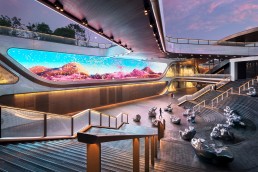
With multiple ways to descend, each entranceway has its own character. The open stair is a grand descent, lit simply by light along the handrail, keeping the focus firmly on the retail vista ahead. Several escalator entrances feature backlit shimmering mirrored wall panels and eccentric linear roof lights, supporting a glamorous, lively transition.
These enticing features were complemented, Roos believes, using reflective materials, such as metal canopies and the aforementioned mirrored wall panels, meaning that the lighting approach could be kept relatively simple.
“It’s not always about the luminaires, it’s about the materials and how light interacts with these materials. We worked with Sybarite on what finishes should be used; in one of the retail spaces there are large copper canopies – if these are fitted with downlights, it’s a no brainer to put white paving underneath it, because then the white paving reflects, and it lights the space much better. It’s quite simple lighting but it works by the nature of reflections. Architects often forget that with metals, you should not light the metal, you should light what is opposite it to make it come to life. But Sybarite was open to this, and it has helped the overall appearance of the space, both during the night and the day.”
The collaborative approach to bring the best out of the space is also evident on one of the entrance portals – a space where the absence of light adds to the overall aesthetic quality. Roos continues: “We talked a lot about contrast. At one of the entrance portals, the elevator shaft is black. At first, they wanted to light the shaft, but we talked about it, and I said, ‘don’t light the shaft at all’. Because everything else is lit, this black, monolithic thing becomes a centrepiece; the absence of light makes it a centrepiece.“
Within the retail space, SKP Chengdu is broken down into two separate, distinct areas: SKP-North and SKP-South. The lighting design for the common spaces, avenues, and concourses is designed to reinforce the powerful branding inherent in the design language. Details are fully integrated and the lighting focuses on enhancing the signature curved surface elements, ‘folded’ textured façade details, and revealing the material qualities of key vertical surfaces.
In SKP-N, the lighting feels positive and luxurious, while allowing the merchandise to remain the primary focus. SKP-S, however, is the cutting-edge, fashion-forward zone; here, the design is more brutalist, with a lot of textured concrete, and the lighting reflects this through a more monochromatic, industrial aesthetic.
“They are like two different worlds that live next to each other,” Roos explains. “It made the project very exciting to work on, as there is the elegant, high-end retail setting of SKP-N, and then the craziness of SKP-S, which was more of an experimental, experiential shopping environment.
“What is fun about SKP-S is that it is more about the overall experience, whereas SKP-N is calmer, and the brands are more like experiences in themselves. Because SKP-S is a brutalist space, the idea was to create a lit environment that was monochrome in colour, which would contrast with the amazing colour of the shops.”
SKP-S is also home to the bespoke Supernova light feature. Inspired by stars, planets, gravitational waves and the connection of time and space, the piece spans eight metres in diameter and consists of three layers of triangular, perforated panels that move and rotate around a giant luminous hemisphere, creating a mesmerising, otherworldly effect.
With multiple spaces, each with their own requirements and unique aesthetics, Roos’ description of the project as a “puzzle” is entirely apt. Because of this approach, he says the result is “a wonderful and remarkably cohesive tapestry of different spaces and areas, each containing different experiences in light.”
Looking back on the completed project, and the culmination of each of these different spaces, he says, is “surreal, because of the scale”.
He continues: “We were often focused on all the individual details, yet in the end, all the puzzle pieces came together. Sometimes you can only imagine so much; and to comprehend something of this scale and have the overall vision, it feels like you need to be like a film director – I’m not always sure if my brain can process that volume!
“As a designer, you always design in the context; it was always about this sunken space and the dark park on top of it. There are so many details that we can talk about for hours – we constantly zoom in and zoom out, but then the finished images came in, and this is where we finally saw the full picture coming together. We saw how all the elements work together and form this language.”
By designing a lighting scheme that is perfectly tailored to the key architectural elements of SKP Chengdu, SMLA has further contributed to this great retail space, crafting a stunning, experiential after dark identity.
Nulty appoints Brice Schneider as Design Director
(UAE) – Brice Schneider has joined Nulty as Design Director for Dubai, following a period of expansion for its Nulty and Studio N brands.
In his role as Design Director, Schneider will be responsible for fostering a culture of creative excellence; he will work closely with the Nulty and Studio N teams through all phases of the design process, shaping a compelling creative vision for every project and guiding the team towards innovative design solutions. His role will also see him nurture the growth of designers and facilitate professional development opportunities.
A graduate of the European Institute of Design in Milan, Schneider has a diploma in industrial design, a Master’s degree in lighting design, and 18 years of experience working as a lighting design professional for practices in Milan, Brussels, and Singapore. His design philosophy has been informed by an awareness of different cultural influences and architectural landscapes, and this breadth of knowledge has enabled him to amass a diverse body of work.
He has worked on award-winning projects with some of the world’s leading names, including Foster + Partners, Philippe Starck, SOM, and UNStudio. Projects of note include the KLCC Tower in Kuala Lumpur, Singapore Sports Hub, South Beach Development and Bay East Garden in Singapore, and the LAC Lugano Arte e Cultura in Switzerland.
Schneider is a firm believer that designers should channel their creative input in non-project related endeavours and actively contributes to international conventions and trade fairs. In 2021, he received the 40 under 40 award in lighting design in
recognition of his contribution to the industry.
Paul Nulty, Founder, Nulty comments: “Brice is a talented designer with an inherently global mindset. He’s exactly what our Dubai studio needs right now and we’re confident that his creative energy and wide-ranging expertise will take both Nulty and Studio N to even greater levels.”
Schneider adds: “Both Nulty and Studio N share my vision that lighting design is about enhancing the storytelling aspect of a project to infuse a scheme with depth, so this role feels like a natural next step. I’m looking forward to working closely with the teams to develop original visual narratives that illustrate the emotional power of light.”
Olympia Lighting - AW06 Flexible LED Wall Grazer
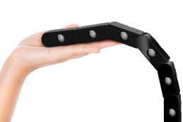
The Flexible LED Wall Grazer AW06 is an innovative product based on AW01, featuring 18 rotatable high-power waterproof modules that can be flexibly moved horizontally. It has a waterproof rating of IP67 and also offers six lens options including 20°, 30°×60°. What sets AW06 apart is its compact size and flexibility. Its small form factor allows for hidden installations, achieving a "lights hidden, impact visible" effect.
Registration opens for IALD Enlighten Europe
(Europe) - Preparing to "Illuminate the Future," the International Association of Lighting Designers has opened registration for the IALD Enlighten Europe 2024 conference, taking place in London.
From 21-22 June, hundreds of lighting design industry professionals worldwide will converge in central London to participate in seminars, roundtable discussions, immersive workshops, receptions, and more.
The conference agenda is organised around more than 24 presentations from renowned designers, business owners, academic researchers, and lighting innovators. Networking opportunities weave between these speaking sessions to maintain the lively engagement and exchange of ideas at the centre of the IALD's mission to advocate the lighting design profession.
IALD President Andrea Hartranft welcomes the lighting design community to the upcoming event and looks forward to the international collaboration.
She said: "Enlighten conferences have always been where valuable professional development and collaboration occur, but the European series is exceptional.
"This event brings people together from diverse backgrounds and cultures, allowing for a broader range of perspectives and ideas to be shared," Hartranft continued. "This leads to more innovative and creative solutions to industry challenges."
Those interested in the IALD Enlighten Europe 2024 conference can learn more about the daily schedule of events, the roster of speakers and sponsors, and more here. Reduced-rate early badges are available through 22 April, and registration remains open through 22 June.
Women in Lighting Global Gathering Survey now live
(Online) – During Covid, Women in Lighting (WIL) created a one-day virtual event for International Women’s Day, the Global Gathering. Throughout the day, the event shifted focus from Asia Pacific, to Europe, to Middle East, Africa, and the Americas, running alongside a social networking feature where attendees could connect with other members around the world. The popularity of the event meant that it was repeated in 2022.
In 2023, instead of connecting the community together in this way, the project decided to undertake a “Global Gathering” of data instead, launching a survey that hoped to examine the lighting profession in the context of the theme of International Women’s Day 2023 – Embracing Equity. The aim was to gather a comprehensive impression of the lighting industry both in terms of where it was thriving, and where it needed to improve in the area of gender equity. The hope was that the results would provide a valuable contribution to the profession as a whole, or at least create a “line in the sand” for future evaluation and thought.
WIL called upon its community and supporters to assist in creating a global gathering of information by completing a survey, aiming to investigate and ultimately embrace equity in regard to working practice in all aspects of the lighting industry – the survey was open to and welcomed input and information from all genders.
A year on from the survey opening, WIL has published the findings in a Global Gathering report, available to view on the WIL website.
Almost 800 people completed the survey from across 73 countries, with the majority of participants being women (69.1%). Analysing the findings, WIL said: “We learnt that we are not questionnaire experts, and despite the majority of participants making no comment on the survey’s content, a section of people felt the questions weren’t relevant to them, in particular people who were self-employed or in entertainment felt that the survey wasn’t applicable in all instances. We appreciate all the comments as it allows us to improve should we undertake something like this again.
“We are not data experts either, so the pages that follow are not analysed or accompanied by judgement. They just present the data as given and are therefore available for those interested to interpret as useful.
“There are some extremely interesting data slices – some are very positive. For example, it’s great to hear all of the positive policies that many companies have in place. Some are very negative – the high percentage of people reporting on sexism and racism in the workplace is alarming.
“We have tried to intersect some of the data that we found particularly interesting. If there is something that you would like to know that we have missed, or is of special interest to you, please contact us and we will happily share that particular slice of information.
“We welcome everyone to join and to be part of inspiring women everywhere and helping us to grow the network wider, ultimately supporting diversity and equity in all aspects of lighting. We want everyone to join in because we only get better together.”
The full report can be found on the WIL website here.
LEDFlex - Rigid Optico
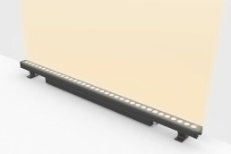
Introducing the Rigid Optico: a robust, dynamic optical fixture engineered for exterior wall washing. This versatile solution boasts an array of colour options, from single white to dynamic white, RGB/RGBW, and pixel configurations, alongside adjustable colour temperatures and beam angles (single: 8° to 60°; dual: 10x40° to 20x50°). Designed with overheat protection, IP67 rating, and a resilient operating temperature of up to 55°C, it thrives in harsh outdoor environments. With an impressive efficacy of 100 lm/W and an optional marine-grade variant, experience unparalleled performance. Visit LEDFlex at Light + Building Hall 3.0 Stand F51 to witness the grand reveal.
Luminii acquires Glint Lighting
(USA) – Luminii has announced the acquisition of California-based Glint Lighting. The move expands Luminii’s North America presence, bringing new product innovations to its growing roster of architectural lighting solutions, while enabling the company to further innovate new LED lighting technologies and products that service commercial and residential markets.
Jeff Parker, CEO of Luminii, said of the acquisition: “We welcome Glint into the Luminii family. As we embark on this exciting journey with Glint, we’re not just acquiring a company; we’re fortifying our company vision.
“At Luminii, our commitment lies in introducing highly discreet solutions that seamlessly blend form and function. The addition of Glint enhances this commitment, bringing together their expertise in wellbeing-focused products with our legacy of innovation in architectural lighting. This collaboration propels us to engineer fresh possibilities, both within our current product portfolio and in exciting new solutions on the horizon.”
By integrating the Glint collection of highly adjustable luminaires, Luminii is poised to unlock a myriad of innovative opportunities for its diverse customer base. With a strong presence in key market segments including museums, galleries, retail, hotels, restaurants, residential, and casinos, these lighting solutions are ideal for environments seeking an effortlessly adaptable lighting approach.
“We are thrilled and see no better collaborator to expedite the success of the Hero product line,” added Peter Kozodoy, CEO of Glint Lighting. “Luminii’s vision and complementary product strategy seamlessly aligns with ours, making this decision a straightforward one for our team. Fuelled by our award-winning innovation and dedicated focus on optical systems R&D, combined with Luminii’s proficiency in linear expertise, we recognise an extraordinary opportunity to propel our products even further in the lighting industry.”
www.luminii.com
www.glintlighting.com
MYS Hotel, Thailand
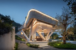
Nestled in the mountains of Khao Yai, the MYS Hotel is a luxury, boutique destination that fuses Scandinavian and Thai design. SEAM Design developed a lighting scheme that seamlessly blurs the interiors and exteriors of the space.
Fusing contemporary Scandinavian and Thai-inspired design, the MYS Hotel is the newest boutique destination in Khao Yai, Thailand.
Blurring interior and exterior spaces, the luxury resort provides a calming retreat amidst verdant greenery, giving guests a beautiful spot in which to relax and unwind.
Lighting for the stunning new hotel was designed by SEAM Design, and one of the main parameters of the scheme was to delicately merge the modern and natural elements together into one cohesive ambience.
Aticha Padungruengkit, Associate at SEAM Design, explains: “The project serves as the ideal retreat for those seeking proximity to nature while preserving their privacy and enjoying high-end services. Achieving this balance involves a thoughtful lighting design that facilitates wayfinding without being overly conspicuous, ensuring a harmonious blend of natural surroundings and modern amenities.
“The overall concept for the lighting was to establish a sense of comfort that harmonises with nature, while infusing a subtle element of surprise. The lighting scheme is crafted to complement the distinctive architectural design – we hope that guests will always remember the unique character of the MYS Hotel and want to come back.”
To realise this harmonious concept, the lighting design team conducted “extensive studies and research” to ensure that the lighting struck the required, delicate balance that would be “sufficient to create an inviting mood and atmosphere for guests without disturbing the wildlife and natural surroundings,” Padungruengkit adds.
Lighting control is used to ensure the appropriate amount of light is provided at the right times. During late-night hours, only wayfinding lights are activated, with lobby lighting dimmed while not in use, allowing for only a special light setting to remain on.
One of the defining features of the hotel is its remarkable “levitating” outdoor pool; reaching out over the hotel lobby, the pool is connected to a lounge café that opens to expansive, highly curated gardens across the hotel grounds.
Padungruengkit explains how the lighting helped to further showcase this standout feature: “The distinctive feature of the project is the levitating pool, easily visible from the main road in its elevated structure. We wanted to emphasise this ideal by incorporating vibrant colours into the pool, making it particularly prominent during nighttime from a distance. As guests pass through the gate to the drop-off area, they are welcomed by the watery floor that mimics the visual effect of the pool above, creating an immersive underwater experience.”
The use of dynamic colours and movable lighting helps to further distinguish the reception area and set it apart from the rest of the hotel, but Padungruengkit explains how the lighting design shifts throughout the space to create pockets of distinction and enhance the overall guest experience. She says: “As guests move to the wine bar and restaurant, the ambient lighting and textures gradually lower to create a formal and refined ambience suitable for fine dining.
“In the guest rooms, lighting is customisable, allowing guests to tailor the brightness to their preferences. A brighter setting is available for work or other business activities, an evening scene promotes relaxation, and a night scene is designed to facilitate a peaceful night’s sleep.”
Padungruengkit adds that the illumination levels across the various areas of the hotel were designed to blend from space to space with minimal variation, while low-level lights, while providing different effects and functions, are similarly placed in terms of height and rhythm. These strategies, she explains, were used to seamlessly connect one area to another.
That being said, the nature of the resort, and its merging of interior and exterior spaces, did provide a degree of difficulty for the lighting designers, as Marci Song, Director at SEAM Design, explains: “Blending across a fully glazed threshold between interior and exterior is definitely one of the biggest design challenges, particularly on a project in a mountain-side setting where there are hardly any buildings in sight.
“When it comes to fully glazed partitions, the challenges are twofold: firstly, ensuring that the light spill from interior to exterior does not negatively impact the magical expression of the surrounding landscape and landscape lighting; and secondly that fully glazed openings allow views outward towards the beautiful vistas of the mountains, but they also allow for views within the rooms and villas. Careful positioning of lighting, optical accessories, and controlled scene settings all help to tune the light on both sides of the glass to increase privacy for the guest when and where needed.”
Given the hotel’s beautiful surrounds, Padungruengkit adds that the lighting was designed with the idea of “facilitating a close connection with nature”, something that was posed to SEAM Design by the project architects, Urban Praxis. “We seized this opportunity to enhance the lighting scheme by developing creative concepts, delineating areas to be subtly and elegantly highlighted, while other areas were intentionally subdued to preserve the natural environment and privacy,” she says.
This is but one example of how the design team worked in harmony across the board to achieve the desired, high-end finish, as Padungruengkit continues: “We worked closely together with the design and consultant teams from the project’s primary concept to ensure a unified vision among all team members.
“During the detailed development stage, effective communication and coordination with the team became even more crucial, as the intricacies of lighting had to integrate with both architectural and interior details perfectly.”
Being in close contact with the wider design team from an early stage also served to avoid any would-be structural issues later down the line, once the project got underway, as Song elaborates: “Structural constraints for lighting would need to be mitigated in the early stages of the design. We were lucky to be brought on board during stages two and three, where we had a chance to coordinate key details with structural engineers.
“Sometimes, when we are brought in too late, the structures are fully coordinated, and we are only left with attaching rather than integrating the light. Other design opportunities could have been missed if we were not brought in for the early adoption of lighting.
“The design is quite modernist, meaning that the buildings and structures are clean, and in a way monolithic, with very few embellishments. So, rather than attaching fittings for an expressed lighting approach, which is common in luxury and hospitality projects, we had to come up with clever and creative detailing. The luxury refinement is in the shaping of light with finessed details, rather than deploying luminaires with refined finishes.”
With the majority of the common spaces of the hotel open to the elements, the SEAM Design team had to work to find luminaires that would be durable and robust enough to withstand external use, yet available in the quality finishes and small sizes needed for a luxury environment. A tough balancing act to achieve, but Song explains that the team was able to find the necessary products needed to create the required ambience from local suppliers, where possible. “We do our best to find locally sourced products,” she says. “We worked closely with local suppliers and manufacturers to find high-quality luminaires that rival the European market. Where we can, we try to cut down on carbon footprint related to transportation, replacement materials and lighting equipment is supplied by the local and regional market with shorter lead-times for better support and customer service to the operator.”
Completed in 2023, the MYS Hotel provides guests with a magical mountain retreat, with the fusion of Scandinavian and Thai design providing a contemporary, yet calm destination where they can immerse themselves in the beautiful Khao Yai surroundings.
The lighting from SEAM Design only adds to the experiential nature of the resort, with Padungruengkit satisfied with how it fits within the overall visitor experience. She says: “Lighting can prioritise different areas of the resort, ranging from the entrance spaces where anyone can appreciate the captivating design of the lobby or indulge in a fine dining experience, to more private areas within the hotel building reserved for guests. The subdued illumination within the hotel rooms and pool villa, coupled with strategically positioned light sources, contributes to a sense of privacy.”
Looking back on the project, Song is also satisfied that the collaboration on show has bore fruit, leading to a “magical” destination for guests. She concludes: “The project team, including the design team and the client team, were highly collaborative from beginning to end. While there are numerous resorts and vacation spots in the area, it felt like we were all working together for a common goal of creating a truly special place for Khao Yai. We think that we have achieved that.”

