Bergen Light Rail, Norway
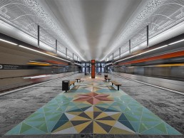
An extension to Bergen’s Light Rail has seen the opening of seven new stations, including the first underground station for the Norwegian city. The lighting concept for the stations was developed by Light Bureau, which sought to create a safe and fluid ambience.
In November, a new, 9km extension to Bergen’s Light Rail network was opened. Among the seven new stations opened was Haukeland Sjukehus – the first underground light rail station in the Norwegian city.
Alongside 3RW arkitekter and engineers at Sweco, Light Bureau developed the lighting concept for the new stretch of the Light Rail, with a particular focus on the new underground station.
Thea Collett, lighting designer at Light Bureau, told arc about the overall vision for the lighting concept: “Our aim was to create the impression of moving towards a clearing, and the feeling of always moving towards a brighter area, to make sure that one would always feel as if moving towards a safe area. This naturally resulted in the discussion to keep the escalators more dimmed, for example.”
All vertical surfaces that the travellers move towards have been treated with light, to make sure that people always move towards a bright and safe place. The main goal was to create a project where lighting and architecture work seamlessly towards a common goal of creating the right atmosphere.
“We believe that the magic happens when we work as an interdisciplinary team; this project is a great example of that. We participated in several workshops together with the architects and electrical consultants at an early stage, shaping the project jointly.”
As the Light Rail in Bergen moves along an unlit track, Collett explained that the overall concept for the lighting was to create an experience like arriving at a clearing. This was particularly prevalent within the underground Haukeland Sjukehus station, where the designers wanted to create a safe journey from the platform and out into the daylight.
To bring this concept to life, the lighting design team carried out a careful processing of the visual and technical qualities of all areas of the station, to make sure the traveller had the desired experience of moving towards a clearing.
“From the platform area, you should experience this as a clearing as you move towards the outside,” continued Collett. “The contact with the exterior, and the daylight entering the shaft through the glass façade at the entrance of the building, is of great essence for the architecture. The task was to make sure that daylight enters as far into the building as possible.
“We adapted the lighting levels and colour temperatures within all zones, to make sure the contrast between the areas was right. We used tunable white and RGBW luminaires in some areas to make sure that we have the possibility to tune the light to the correct temperature.”
The use of tunable white and RGBW lighting was integral in creating the right ambience throughout the stations, particularly given the simplistic material finishes and abundance of glass.
Collett continued: “We had to find the right balance between what surfaces to prioritise and emphasise, to set the mood and rhythm of the space. The station is designed in primarily robust and simple materials, and we chose to emphasise and add high light levels to the materials and surfaces that define the room.
“For instance, on the platform, the white and curved ceiling reflects both cold and warm white light. We also chose to illuminate the stone floor with high lux levels. The end walls, however, are left completely unlit, since they consist mainly of glass and open fire doors, leading to the lift and escalators.”
The escalator shaft at the underground station proved to be one of the most challenging aspects of the project, particularly given the lack of mounting options for luminaires. “The main shaft area with several escalators and lifts consists of mainly concrete and glass,” said Collett. “The area is 40-metres deep, and there are very few areas to mount lighting. Because of this, the room has no lighting, aside from some vertical lighting on the very high walls lighting the shaft itself, and lighting in the escalator. We did not make use of traditional wall mounted or ceiling mounted luminaires. In the design process, we used light calculations to make sure the journey through this room would appear as bright as we wanted it.”
Elsewhere, the onus on safety meant that there were several further criteria for the lighting to fulfil, as Collett continued: “All material used in the station needed to be within a certain fire certification. This gave us some limitations on how to create a glowing expression from the glass in front of the lift. We wanted to add a layer of side lit plexiglass, but this proved to be impossible due to fire restrictions. Our plan B was to sandblast or frost parts of the glass in front of the lift so that it catches some of the light from inside the lift shaft. This became a successful solution.”
In the lower concourse areas, where natural light was lacking, the artificial light therefore became an active wayfinding tool, designed in a way that it would “move people in the right direction”, guiding travellers to and from the platform and the naturally lit escalator shaft.
“Lighting is used very actively as a wayfinding tool, as the traveller is always moving towards the brighter area. In any project, we deliberately use light as a tool to move people in the right direction, to add the right atmosphere, and to facilitate the necessary functions,” Collett explained.
“From a secondary entry point of the station, travellers must pass through a 100-metre-long corridor before entering the platform area. In this area we deliberately designed unevenness in the lighting, to make it easier for the traveller to read the distance they move through. Just like the numbers and lines on a ruler, both the architecture and the lighting create a rhythm that helps the traveller to read the room intuitively.”
Throughout the lower levels, and particularly on the 100-metre-long concourse, Light Bureau opted for a mixture of direct and indirect lighting, which contributes towards a brighter and more pleasing environment for travellers passing through.
“In the corridor between the secondary entry point and the platform area, we added high light levels to the curved ceilings and the floor tiles,” Collett continued. “The walls are left completely dark. This contrast makes it easier to read and understand the geometry. The indirect and integrated solutions make it possible for the materials and the geometry to stand out without barriers from visible luminaires.
“Indirect solutions allowed us to emphasise the different surfaces and materials without the obstacle of glaring luminaires. Our eyes will always be attracted by brighter areas in our field of vision. When the brightest area is our destination or our path, instead of a luminaire, this allows for a more natural orientation through a space.”
To that end, Collett is satisfied with the finished lighting scheme, and particularly how it sits within the wider architectural design of the stations. She concluded: “We are very happy to see how the lighting has become an integrated part of the architecture.
“We think that this is a great example of interdisciplinary teamwork, and we are proud of the result.”


