Bolon Eyewear, China
Utilising the properties of high-quality materials, pfarré lighting design’s bespoke lighting scheme celebrates Bolon’s eyewear products in a way that creates a unique visual experience for the Shanghai store’s customers.
Bolon is one of the world’s largest spectacles manufacturers and China’s best-known sunglasses brand. The Bolon brand is positioned as a premium lifestyle brand in this segment, with the main advertising campaign, revolving around French actress Sophie Marceau, evoking French elegance and fashion consciousness.
Its new store design in Shanghai, China offers a clear spatial interpretation of this attitude in a space that is barely more than 1,000sqft. Unique spatial elements that retell a narrative, such as iconographic shelves and a polished gold ceiling, vividly illustrate the brand’s realigned public image as a self-confident market leader.
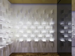
The interior design centres around a clear, iconographic and instantly recognisable product presentation, created by Ippolito Fleitz Group. White square panels, set at right angles to each other, create a strict, three-dimensional grid on the presentation walls, where each pair of glasses sits on its own mini stage. The impression made by the product is further enhanced through a skilled use of directed lighting, designed by Munich’s pfarré lighting design, who were recommended by Ippolito Fleitz Group and introduced to the client Xiamen Artgri Optical Co.
The pfarré team worked with no design brief and purely reacted on the display system/interior design created by Ippolito Fleitz. “We refined their design with light, presenting the products in the best possible way,’’ explained Gerd Pfarré of pfarré lighting design. “Carefully considering the general lighting and not disturbing the product presentation, we minimised the amount of fixtures in the ceiling, creating shadow, contrast and reflection where we wanted to have it.’’
Each pair of glasses is set against an illuminated background, thus highlighting the colour of the lenses. At the same time, a targeted LED spotlight is directed at the product from the vertical panel suspended immediately above it, giving it a subtle aural emphasis.
The shop space is characterised by the use of high-quality materials such as a white marble floor and black marble for the presentation cases and service desk. A leather-covered expanse of wall provides an additional focal point within the space, as well as creating a warm setting for in-depth consultations.
4,000K adjustable LED downlights create an evenly distributed glow on the white marble floors, which is then reflected on the gold ceiling. The gold-toned ceiling and carpet provide a contrast to the white backdrop of the main eyewear displays.
Initially, the panels started out with glowing edges but Pfarré and his team saw that it didn’t highlight the eyewear, and thus moved the band of horizontal light to the back. They also needed to highlight the product from above, and help it shine without creating glare or shadow. Pfarré worked with the manufacturers on the shelf design to build a one-to-one mock-up and tried LEDs against a variety of shelving material, including tests with glass and samples using a translucent foil. After necessary trials, they decided to paint it in a solid white to prevent light penetration.
In order to achieve the correct balance of light levels throughout the project, selecting the correct colour temperature was very important.
“Generally, the taste in China is for a cooler colour temperature, especially in jewellery and retail,” said Pfarré. “In the end, we came up with 4,000K for the entire store, which is rather warm.” This temperature works best for both the products as well as the warm reflection generated by the gold ceiling.
The final result is a horizontal display lit by a 4W LED strip hidden behind the rear panel edge. The three visible edges are coated in a solid, high-opacity white paint. A vertical fin above uses a custom-designed 3W LED spot with a lens with an oval beam spread to further emphasise the product.
Elsewhere in the store, the free-standing vitrines are illuminated by off-the-shelf lightpads selected by the designers. They selected an evenly distributed 4,000K at approximately 200W per sqm. Adjustable 18W, 4,000K downlights with black anti-glare rings and an 8° beam spread illuminate the freestanding vitrines from above. The wall vitrines use the same off-the-shelf lightpads, except with a 6W version, and are paired with 4,000K downlights.
Pfarré explained how, in terms of integration and sensation, this project was very special. “I think we really squeezed out the potential of LED and optics – in order to create a truly minimised solution,’’ he added.
Upon reflection of the project and design process, the studio said the effect of the overall lighting scheme topped its expectations. “You think, yes, it’s a good idea, it’s feasible, all in budget and time, and then, when the lights have been turned on, there was this thrilling wow effect,’’ Pfarré concluded. “The sum of all displays together create this very special visual sensation, enhancing each pair of glasses, like in an exhibition, all together evoking this incredibly strong impact for the eye of the customer.’’
Pic: Shuhe Architectural Photography


