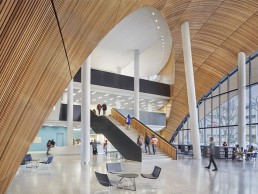
Charles Library, Temple University, USA
This time last year marked the opening of the new Charles Library at Temple University in Philadelphia, Pennsylvania, ready for the beginning of the Autumn semester. arc sat down with Suzan Tillotson, Founder of Tillotson Design Associates, to find out more about how she and the team became involved with creating the lighting scheme for the striking Snøhetta creation.
Located at the intersection of two major pedestrian pathways, one block away from the connecting artery of the city, and connected to Temple’s Main Campus, the Charles Library anchors a new social and academic nucleus for the university’s student population of more than 39,000.
First impressions of the building are dominated by a soaring high cedar wood archway that envelopes the entrance way, inviting visitors into the 40ft-high cedar wood ceiling lobby. The solid foundations are clad in vertical sections of split-faced granite as a nod to the materials of the surrounding campus context, with its unusual geometric expression providing the building with a distinct identity.
Snøhetta’s design, developed in collaboration with Stantec, is deemed a reinterpretation of the traditional typology of the research library, with a strong theme of integration and unity taking lead in the firm’s design. Incorporating a diversity of collaborative and social learning spaces along with an automated storage and retrieval system for the library’s collection, affectionately termed the BookBot, has allowed the original 1960s floor plan to more than double. The 220,000sqft library anticipates welcoming more than five million annual visitors to its larger space.
Moving inside the building, architectural elements are continued throughout, creating a seamless transition between spaces and a cohesive design aesthetic. The vast wooden arches continue internally, forming a dramatic three-storey domed atrium lobby where a central 24/7 working zone is located, which includes a computing work zone for residents of Philadelphia.
Offering views to every corner of the library, the atrium serves as a wayfinding anchor for users at the centre of the space. An oculus carved into the expansive cedar-clad dome lets daylight pour into the lobby from the floors above, creating a connecting void of light to each level.
Beginning its journey with Snøhetta, Tillotson explained that the team was contacted by the architectural firm in 2012 to join its team for a “Request for Qualifications”. “We went through an evaluation and negotiation process that lasted through April 2014 when our team was formally awarded the project,” she said.
“Their design emphasised transparency and openness as key themes and included the glass curtain wall wrapped around the upper floors, allowing light to fill the space. The undulating wood surfaces and indoor/outdoor connections were very important to them. The main lobby, with its curved 40ft-high cedar wood ceiling is the heart of the library with connections to all floors of the building vertically through the oculus.”
It was also vital that this wooden structure was to be kept clear of any fixtures causing blemishes on the natural finish, so Tillotson ensured the fixture placements were kept away: “One of our design goals was to keep the beautiful curving wood ceiling clear of fixtures, so systems were organised at the columns and track mounted LED downlights mounted to the top of the columns are used for general downlighting. Adjustable LED downlights were integrated into the top of the curtain wall to provide task lighting for the desks below. The three intersecting direct/indirect circular LED statement pendants draw students deeper into the building while also adding ambient lighting to the space and illuminating the wood ceiling.”
Working towards emphasising the colour of the cedar wood was also prevalent in the design approach for both Tillotson and Snøhetta. “The high CRI lighting system and warm 3000K LED lighting brought out the richness of the material,” commented Tillotson.
Further warmth was brought to the space via the clever use of outdoor, in-grade LED uplights with louvers and shields to reduce glare, to render the warmth of the cedar ceiling and create an “elevating yet intimate space in the evening”.
“An array of indirect/direct linear uplights at the fourth-floor wooden ceiling (which spans the length of the building) help to unify the library from the exterior,” she explained.
During the daytime, the library is typically flooded with natural light through the vertical void cutting through to the lobby. Tillotson explained how the architectural lighting was used to elevate the light levels in a cohesive manner with the daylight that would then transition into the evening hours: “During the day, study spaces are bright with vertical illumination to balance with daylight and attract students and staff to these pleasant areas to work in. But the library also needed to be available to students on a 24/7 basis, requiring a safe and inviting experience for studying late in the evening when the rest of the building was closed.
“Multiple open study spaces throughout offer varying levels of brightness to create intimate spaces, with 20fc to facilitate laptop use and brighter spaces at 30-50fc for reading and writing tasks,” she added.
“On the fourth-floor, visitors are invited to stroll through the serene sun-filled, glass enclosed collection stacks where we mounted linear lighting to the tops of the stacks to provide ample lighting for the collections, with supplemental pendants to uplight the wooden ceiling.”
She continued: “The architectural design intent was to promote interactivity and unification, so one of the key architectural lighting design considerations was to ensure that the lighting was consistent on all architectural elements, vertical surfaces and ceilings. In the study areas, we used linear T5 fluorescent fixtures with a custom reflector above a one-inch cell egg crate ceiling system to create a visually appealing pixel image effect. This concept repeats throughout the building to create a feeling of unity and consistency.”
In addition to being an architectural icon for the city of Philadelphia, the construction and design teams on the project were also mindful to make the library an environmentally conscious addition to the city. The fourth floor boasts glazed glass walls on all four sides, giving views out onto the lushly planted green roof. Covering more than 70% of the building’s roof surface, the 47,300sqft garden is one of the largest in Pennsylvania and also plays a key role in the site’s stormwater management system. The meadow-like landscape is filled with ornamental grasses and flowers, providing a rich habitat for pollinators and a calming visual to those both inside and outside the library.
In addition to the garden and water management system, the University also had a target for LEED Gold certification for the library, which required Tillotson’s lighting scheme to adhere to a Lighting Power Density level to be 40% under ASHRAE 90.1.2010.
Overall, Tillotson reflects on the project being “a rewarding and collaborative process. We presented our solutions to Snøhetta and they co-operated to help make their vision for the building’s image at night a reality”.


