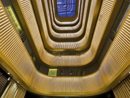
Chifley Tower, Australia
Drawing comparisons to some of the world’s greatest buildings, such as the Chrysler and Empire State Building in New York, and the Petronas Twin Towers in Kuala Lumpur, the Chifley Tower in Sydney, Australia, epitomises the luxury and opulence of the Art Deco era.
Occupying one of Sydney’s most expensive sites, bought by the Bond Corporation in 1988 for AUS$306m, the 6,438.6 sq metre site, designed by New York architects Kohn Pederson Fox in association with Travis McEwen, is one of the most elevated in the city with harbour views never to be built out. When the time came to upgrade the main lobby and satellite lobbies, such an iconic Sydney landmark required a delicate approach, particularly with the lighting. While the fabric of the building was constructed from such quality material that it required no attention, it was felt it deserved to be celebrated in a more appropriate light. Design consultancy PointOfView (POV) was brought on board by building owner GIC to work on the upgrade of Chifley, having previously worked together on the exterior lighting at Sydney-based office accommodation No.1 Martin Place.
“The building has such a strong aesthetic our design had to look timeless and as if it was part of the original,” said Mark Elliott, Principal of POV. “This drove a bespoke solution whereby we designed all of the equipment used in the space.” The Chifley concept began with researching Art Deco buildings such as the Chrysler for inspiration, and then taking these approaches and developing them into a more contemporary style, bringing Chifley into the 21st century so that it can stand as a premium building for the future to come.
The palette of materials used in the original KPF design is a collage of fabulous stones with stainless steel detailing, Elliot commented: “The lighting approach was obvious to us, we had to freshen the space during the day, in order to enhance the daylight ingress while creating a more dramatic space after dark.
“We washed the rear wall, which draws the eye through the full height glazing into the space from an external view point. The light bouncing off the walls is what lights the space and together with uplighting to the ceiling, creates a sense of volume.” ERCO metal halide wall washers were used in the double height spaces, while ERCO LED wall washers brought single height spaces to life. In order to highlight the artwork featured in the lobby, ERCO LED track spots were implemented. To replace the previous suspended square light fixtures, which felt underscaled and awkward in the wing shaped lobby, POV custom designed a series of stainless steel rings made by Lightforce, providing uplight to the ceiling during the day through the use of Xicato LED modules and focused downlighting at night thanks to acdc LED downlights integrated into the rings. The materials used for the custom fittings were critical and had to match the existing stainless detail of the building – the grade of stainless steel, weight and direction of the brushing were all tested until a perfect match found.
Together with the rings, a custom cluster of pendants – also made by Lightforce and featuring acdc LED downlights – were suspended over the reception desk to anchor it in the space and give visitors a point of destination, where previously it had been lost in the open space. The lift lobbies were also suffering from a cave effect and so a new architecturally integrated stainless beam was strapped through the lift lobbies, connecting the existing lateral beams.
Elliot explained: “The previous wall light and downlight combination left the walls and ceiling dark. Lift lobbies are a critical part of the journey to the office floors, these transition spaces shouldn’t be forgotten.” The new beam houses T5 uplights to uplift the ceiling and wash light across the stonewall cladding, while downlighting from acdc enhances the diamond pattern in the stone floors. The upgrade to this space relied purely on the lighting to enhance it with light and with a new sculptural form.
“This kind of solution can only be achieved through custom designed solutions, the kind of work that we pride ourselves on,” said Elliott. “We light spaces but we also create beautiful objects to light from. This project demonstrates the power of light and how a it can change the face of a space.”
The aesthetics of the space are supported by all the usual sustainable design technologies; using LED and lighting control systems that harvest daylight and transition from day to night scenes, as well as out of hours settings ensuring the installation not only creates different settings, but is efficient in its use of energy.
Concluding, Elliot said: “It’s amazing to see how the style of architecture has changed from the late ‘80s to today. KPF are great architects and great architecture stands the test of time, a slight face lift was all that was needed to bring this gem back to life.”


