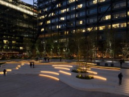
Exchange Square, UK
As part of a wider lighting vision for London’s Broadgate area, Speirs Major has created a tranquil, serene lighting scheme for Exchange Square that enhances the park’s character against the surrounding urban environment.
As cities continue to grow and build up all around us, there becomes a growing need for calm, green spaces within urban metropolises. One recent example of this in action is the newly completed Exchange Square in Broadgate, London.
Set above the tracks of Liverpool Street Station, the tranquil park within the urban heart of the capital offers a much-needed dose of respite and relaxation within the heavily built-up area.
Adding to this ambience after dark, lighting design studio Speirs Major has shaped a warmly evocative blend of light and darkness, revealing the multi-level topography and curved landscape elements, while supporting intuitive wayfinding and ease of access.
Aimed at revealing the natural texture, colour and movement of the various materials and finishes – from foliage and water to stone and wood – the lighting design enhances the park’s character as natural light fades, creating a gentle respite from the harsh urban fabric of glass, steel and concrete.
Speirs Major’s lighting design is part of a wider lighting vision that the studio developed for the Broadgate Public Realm Framework for British Land, becoming the latest project for the firm, following 100 Liverpool Street and 3 Broadgate. The space focuses on wellbeing and open access, marking an important journey for the client in its journey from an office-led campus to a mixed-use, creative environment.
Benz Roos, Associate Partner at Speirs Major, explained the brief for the space further: “British Land was closely involved in the concept development and attended early workshops with us and with architects DSDHA.
“The brief was to support a park-like feel for the square, creating a natural, tranquil feel that would offer people respite from the intensely urban surroundings.”
As such, Speirs Major’s lighting concept focused on how light could help people to “slow down and enjoy a moment”, by creating an inviting, warm ambience with plenty of opportunities to dwell and socialise. Roos added: “We played up the textures, colours and movement to reinforce the sense of a natural park and revealed the unique multi-level topography to ensure safety and aid wayfinding after dark.
“We kept the lighting soft, warm and beautifully integrated within the landscape elements to create an intimate ambience. We worked with the curving topography, proposing the light slots that reveal the terrazzo steps, highlighting the meandering surface of the ribbon retaining wall and underlighting the benches, creating multiple places to stop, sit and enjoy.
“The lighting also responds to the patterns and textures of nature, with soft light to planting and through the leaves of silver birch trees, casting a dappled effect on the ground. The colour of the light adjusts tonally with each season, with warmer white light enhancing the rich autumn leaves and bare wooden branches in autumn and winter, and fresher, cooler white light celebrating the green buds and vibrant leaves of spring and summer. Light integrated into the water feature in the steps also creates beautiful ripples and patterns.”
In line with this concept, Speirs Major opted to keep much of the lighting at a low height, preserving an intimate ambience that encourages easy social interaction. At the perimeter, light for circulation is provided from We-ef luminaires on columns at a human scale, while low-level bollards from DW Windsor reveal the internal routes and low-level planting.
Across the multi-level site, light is beautifully integrated within landscape elements to improve legibility and contribute to the warm ambience; an even wash of light from Architape reveals the dark metal vertical face of the curving ‘ribbon’ retaining wall that runs through the park, while the slatted timber benches that sit above the wall are softly lit from beneath. Elsewhere, slots cut into the faces of the terrazzo step seating and water feature contain hidden light sources, also provided by Architape, creating mesmerising patterns and ever-changing ripples. Integrated handrail lighting came from Stoane Lighting, alongside tree uplighting and projectors, and canopy downlighting, while floor washers in the steps came from iGuzzini.
While the lighting design was intended to foster a welcoming, relaxing environment, Roos added that this was in tune with the core architectural ambitions for the space. “The key considerations for the landscape architecture were largely aligned with those for the lighting: to create a park-like environment that encourages people to meet up, rest and relax within this heavily urbanised setting, while also bringing nature back to the city,” he explained.
“The design focused on creating a bucolic, soft, organic space with a priority to create a space that nurtures both people and plants, promoting wellbeing and biodiversity. The generous planting, curving lines and soft materials create a distinct contrast with the hard granite of the post-modern architecture around it, while the design also prioritises ease of access for all.”
The softer, low-level lighting of Exchange Square creates a warm, intimate atmosphere throughout the space, and Roos added how the minimal, pared-back design was a conscious move on the part of Speirs Major. “Retaining darkness and a degree of shade is always a conscious part of our design process. Not only is this more sustainable and better from an ecological standpoint, but by carefully choosing where we add light, we make use of contrast to shape atmosphere, support improved legibility and wayfinding, and promote a sense of security.”
The decision was also aided by the wider environment in which the park sits, as Roos explained: “There was already a lot of light spill from surrounding buildings, we worked within those conditions to create the right atmosphere for the park. We always try to limit uplight where possible, and in this case the lighting is all integrated or pointing downwards.”
The more restrained lighting approach is a welcome one for a green space within an inner city, and Roos added that, while some clients may have requested higher light levels under the belief that this would improve safety and wayfinding, Speirs Major had a supportive client throughout. “The client and architects were very engaged from the outset with the concept and the approach,” he said. “We had early access to the Broadgate estate management team, so we were able to explain our ideas and discuss their requirements (for CCTV, for example), so that they could be integrated within the approach as much as possible from the start.”
That being said, the lower lighting levels meant that there were some additional challenges when it came to CCTV. Roos explained: “One of the more difficult challenges was achieving the necessary vertical illumination on faces for CCTV and facial recognition software, given the low height indirect lighting approach. We assessed the contribution of light from the adjacent main routes and buildings, balancing the CCTV requirements against preserving the contrast we wanted for the square.”
Followint the project’s completion, Roos reflected on the success of the lighting – and the work of the contractors in bringing the design to life – particularly in creating a welcoming space for people to enjoy.
“We were thrilled to see how quickly people really took to using the space after dark,” he said. “For this project, the details were realised so beautifully by the contractors and the electrical sub-contractor – all done neatly and with immense care, they were a joy to work with.
“One of the major aims of the Broadgate development was a shift from an office-led campus to a truly mixed-use, creative environment. Bringing nature and wellbeing to the fore helps to encourage a more diverse group of people to come and use the public spaces to meet, celebrate, work and relax surrounded by greenery – which in turn fosters creativity, a sense of community and improved wellbeing.
“The right lighting not only allows the square to continue to be used for this purpose as natural light fades, but also shapes a completely different interpretation of the space, giving people a new experience to enjoy after dark.”


