Fetzer Institute Administration Building, USA
A renovation of the Fetzer Institute’s Administration building saw lighting, designed by SmithGroup, play a key role in creating the feeling of “lightness within”.
The Fetzer Institute was founded by broadcast pioneer and former owner of the Detroit Tigers baseball team, John E. Fetzer, with the goal of “helping build the spiritual foundation of a loving world”.
Combining science and spirituality, the institute was established to support work designed to discover and enhance the integral relationships of the physical, mental, emotional, and spiritual dimensions of experience that foster human growth, action, and responsible improvement of the human and cosmic condition.
Last year, the non-profit institute underwent a renovation of its existing, triangular-shaped administration building. In keeping with the group’s wider philosophy, the goal for the renovation was to create an environment that would encourage dialogue in support of its mission, create a memorable experience, and reconfigure for growth.
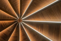
Using the building’s unique footprint and vision, designers at SmithGroup, who led both the architectural and lighting design of the renovation, sought to implement inspiring spaces, including a central gathering space that harnesses “distinctive geometry and lighting elements” to evoke ancient, tent-like structures.
Paul Urbanek, Vice President and Design Director at SmithGroup, tells arc: “This renovation is about ordering a new plan within the equilateral triangular footprint of an existing Administration building that speaks to the Fetzer Institute’s mission of supporting a holistic, loving world with open dialogue.”
Paige Donnell, Associate Lighting Designer at SmithGroup, adds: “Our multi-faceted design team worked together to charette the over-arching concepts and ideas that we wished to implement, driven by the client’s goals.”
In support of these goals, SmithGroup developed a lighting concept, titled “Revealing Legacy”, which Donnell says “empowers and enforces notions of inclusivity, awareness, and open dialogue by highlighting the warmth and texture of materiality and seamlessly integrating concealed lighting treatments within architectural forms”. Within this, the design parti looked to create a sensation of “lightness within” – a challenge in itself in a space devoid of natural light.
“We needed to craft a bespoke solution that not only performed similar to daylight – diffuse, ambient, soft illumination – but also created the visual sensation of daylight effortlessly pouring through translucent materials and crafting the human experience by creating a captivating and welcoming environment for gathering.”
Central to the renovation of the Administration Building, at the heart of its angular shape, is the Convening Room, a major sacred space within the Institute. About this are a series of supporting spaces that continue the open dialogue cherished within the organisation.
Urbanek explains how the triangular form of the building impacted the rooms within, and the lighting therein: “The unique shape of the building plan made for some unusually shaped rooms. Instead of rectangles, we were confronted with parallelograms and triangular spaces. Therefore, the application of standard lighting fixtures took on a creative slant. Even the straight corridors have special attention at the corners, because they are 120°, instead of 90°.
“The major Convening Room employed a myriad of triangular forms to create a tentlike structure that incorporated the lighting. Other rooms used regular treatments placed in juxtaposition with the angled geometries.”
The triangular forms in the Convening Room are comprised of a series of custom designed and fabricated, edge-lit acrylic panels that diffuse light from an LED source concealed in the ceiling. Meticulously detailed with limited space, the 16ft acrylic features, designed with knife-edge end conditions and z-clipped backer plates, effortlessly slide into the bespoke ceiling without visible fasteners.
SmithGroup worked on numerous mock-ups with the manufacturer to fabricate a distinctive, 3D-printed acrylic refraction pattern for uniform and effective transmission of light from top to bottom. The product was reviewed at multiple scales, with appearance, ease of maintenance, and accessibility as critical design drivers. With a CCT source of 3500K, the designers at SmithGroup believe that the feature strategically contrasts a cool daylit impression and warm material palette, evoking the sensation of daylight emerging through a tent-like form, amplified by the dynamic spiral play of veiling, and revealing illuminated panels.
Donnell recalls the design process for this unique feature: “Paul and I initially sat down together one afternoon with a napkin sketch of an idea to create this structure that emits light almost magically, without visible fasteners, and fully integrated into a custom millwork triangular shaped form. We wanted to both highlight and honour the angular architecture, while also crafting an experience that was inviting and encouraging of open community dialogue.
“We talked through the initial limitations – ceiling space, fabrication methods, achieved light levels, accessibility – and we determined the only way to achieve this aesthetic and function was to find a product that was small-scale, custom-sized, and edge-lit with uniform distribution.”
Elsewhere, a newly added exhibit space showcases the owner’s legacy, highlighting key storytelling features with a playful spin. Baffled adjustable track lighting, detailed into a reveal in the ceiling and situated within an extremely low plenum space, allows for spatial adaptability. RGBW cove lighting central to the space breaks the horizontal ceiling plane and continues to evoke the sensation of “lightness within”, while custom 3D-printed patterned metal partitions filter and extend daylight from the surrounding existing building, creating a playful and comfortable expression of natural light within the windowless interior.
Office support spaces, such as huddle rooms and a library, utilise glare-free perimeter indirect solutions for visual comfort and warmth; accessible restrooms exemplify how multiple layers of indirect illumination transform the elegance and intimacy of an occupant’s experience. “We created a custom control element at the door handle that visually notifies occupants of the room’s vacancy,” Donnell adds. “This custom millwork-integrated light illuminates green or red to enforce more ‘quiet’ methods for communication of everyday tasks, that in-turn allows more space for intentional conversation.”
Donnell explains how the overarching design concept of “lightness within” extends to the various spaces within the building: “The design philosophy encouraged achievement in our somewhat competing goals, by creating a juxtaposition of dark-toned intrigue, intimacy, and comfort, with a simultaneous feeling of lightness, awareness, and limitless bounds. We capitalised on indirect illumination strategies, paired with a warm material palette to both create that welcoming environment and express the sensation of vast openness and discovery.”
Alongside this, Donnell adds that the use of indirect lighting throughout limits contrast and visual discomfort and enhances the warmth and texture of the wood materials in an effort to “create elegant, intimate, and welcoming experiences that support and inspire open community dialogue.”
While the concept of designing lighting in a completely windowless environment may seem like one of the biggest challenges that a lighting designer can face, Donnell believes that there was another, more troublesome factor to consider. “Our biggest challenge was the design, execution, and installation of our customised feature ceiling element during a global pandemic,” she says.
“Throughout the mock-up phase of the project, we needed to review varied scales of custom 3D-printed acrylic refraction patterns both quickly and effectively. This led to countless video calls with the lighting manufacturer, an abundance of shipped material samples, and innovative methods for quantifying light level performance data for the design team to validate the system in their 3D models. Once the mock-ups became larger in scale, we benefitted from teaming with a local manufacturer, and were able to drive to the factory to review intricate details in-person, wearing masks and maintaining distance.
“During the construction phase of the project, we ran into unforeseen issues with in-field humidity conditions causing our custom panel elements to bow with the heat. Fortunately, we had a great team of designers, contractors, and fabricators, who were remotely able to verbally and visually communicate challenges and concerns to find novel solutions to these unprecedented site challenges.”
Urbanek adds that the logistics of remodelling within an existing building and framework brought with it some further struggles. He says: “As this was a remodel of an existing building, we tried hard not to disrupt the structure, but rather work within. Wherever possible we incorporated the existing columns into the design.
“The main Convening Room was placed in the centre of the plan, in the largest open space available, and its truncated hexagonal plan is a result of trying to gain the most area within the structure. The Fetzer Exhibit space is designed as a rhombus shape for many of the same reasons. In both of these spaces, working around the mechanical ducts and structural beams to achieve greater ceiling height was tricky.”
That being said, on reflection the design team at SmithGroup, as well as the client, are all “extremely satisfied” with the outcome of the project. Donnell adds: “Photos can’t fully describe the experience of this technically static system, with a seemingly dynamic effect. The sensation of moving about the space and experiencing the perspective-driven environment and its revealing panels is difficult to describe but it is immensely felt by the inhabitants.”
Both Donnell and Urbanek also feel that the new lighting design is integral to the ambience of the renovation, and particularly in achieving the goal of “lightness within”.
Urbanek comments: “Lighting is a key element of the renovation. The built-in fixtures of the Convening Room add to its tent-like form and act as almost skylights to the most internal room in the building. The mystery of an evenly lit space where one can only view half of the light fixtures from any point adds to the spiritual nature of the space. It is intended to bring a sacred feeling to those within. The exhibit space again is lit in a fashion to highlight within the exhibits, creating a rich visual environment.”
Donnell adds: “I believe the power of lighting and its intentional interaction with form can sometimes be undervalued. With this project, however, lighting was fundamental to the design process, which ultimately made the project much more successful. The design philosophy of ‘Lightness Within’ allowed us to challenge the norm, expand our impact, and truly design holistically to create a one-of-a-kind experience, curated for our client’s specific needs.”
Perhaps the highest praise for the renovation though, comes directly from the client. Rob Lehman, Fetzer Trustee, says of the new-look space: “The new expression of the Administration Building – the Commons, One World Room, and all the other carefully designed meeting spaces – has been created with such a sense of the sacred. These spaces represent a deepening of our relationship-centred work.
“Standing in the Exhibit Room and reflecting on our history made me realise how the remodelling is truly an ‘outward visible sign of an inward invisible reality’.”


