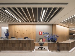
Fidelity International, UK
As modern workspace design continues to evolve, there has been a gradual shift towards creating more holistic, welcoming environments in which employee wellbeing is paramount. Through the introduction of cosy breakout spaces, private working areas, soft furnishings and warmer colour temperatures, more and more offices are stepping away from the staid uniformity of the past for something altogether more inviting.
This approach is evident at Fidelity International’s new UK headquarters on Cannon Street in London, where Nulty has recently completed a WELL certified lighting scheme. Working in close partnership with Fidelity, alongside architects AEDAS and engineering consultants Hilson Moran, Nulty has designed a lighting solution centred around employee wellbeing for the global investment company’s 108,000sqft office space.
“From the outset, the intention behind the project was to improve the client’s current workspace and create a comfortable environment for its employees,” Kael Gillam, Senior Lighting Designer at Nulty explained. “Increased light, higher ceilings, better technology, more surfaces on which to display their art collection: these were just some of the elements that spoke of a desire to increase employee wellbeing and activity.
“The design of the working floors was conceived to maximise daylight ingress and one of our key roles was to supplement the light levels in the deeper plan areas to give the overall scheme a sense of balance. We also strongly believed in the design of the quiet rooms and the café, encouraging use of these spaces for respite in what can often be a hectic day for employees.
“Our goal was to make sure that the lighting design within each space had its own identity, and in doing so give employees a variety of different options depending on whether they are looking to work or relax.”
Fidelity International features a blend of office floors – which house a colourful mix of relaxed and formal working areas including collaborative and private working zones – and additional areas that include client-facing meeting rooms, lounges and two media studios for the company’s video and audio broadcast. Nulty’s final design solution was rational in its response, circumnavigating the practical lighting needs of the workplace with Fidelity’s overall vision for the day-to-day wellbeing of its employees.
Gillam explained: “The initial brief for the lighting called for a very multi-faceted design narrative, with a strict distinction between the client-facing areas and the working floors. Colour psychology played a big role in the design of the space; a lot of the early reports that we received broke down the relationship between different material palettes and people’s traits and behaviours. Because of the richness of the interiors, the lighting had to play a role in celebrating the different finishes and treatments, while not appearing too disconnected from space to space.”
From the outset, Nulty worked closely with the client team, and examined lots of research, such as colour therapy insight, to guide the lighting design. This approach is something that Gillam feels differentiates Fidelity International from other workspace projects that Nulty has worked on. “The colour research and how we approached each different space was a response to the rationale that informed that particular material palette, while the brief from the client team, made up of representatives across different departments, guided us as to what parts of the office needed to be really honed in on to make the day-to-day experience simpler and more enjoyable,” she explained.
While catering to the multi-faceted design narrative sought after in the initial brief, Nulty kept its design intent relatively simple – a recurring motif of linear lighting runs throughout the building, connecting the main reception, open plan working areas and meeting rooms. Nulty commissioned a bespoke light-insert from LTS, designed to meet WELL requirements and deliver a high colour rendering for enhanced visual acuity. This linear concept was used in conjunction with adjustable recessed downlights from Modular and Kreon, diffusing light from both the centre and perimeter of the ceiling to create the perfect contrast ratio for day-to-day working and video conferencing.
On the fifth floor, where a glass skylight has been used to bring natural light into the room, the light-insert has been incorporated into the central spine of the ceiling. The team used tunable white linear LEDs to match the outside colour temperature with the interior of the room, allowing it to be adjusted from cooler lighting on a bright day to warmer lighting at sunset.
To contrast with the rectilinear design seen throughout the building, Nulty softened the aesthetic in casual breakout spaces and communal areas with copper and ceramic pendants from Marset, designed to create an environment that encourages downtime and relaxation. The client-facing meeting rooms were also given a gentler touch in some spaces, trading out the graphic linear line of light at the border of the room for a glowing circular stretch fabric feature, again courtesy of LTS. Pendants from Vibia were also added to the café area, producing a false-skylight effect in the only pocket of the working floors where natural daylight could not be found.
“The differentiation between linear and softer ambient lighting allowed us to distinguish spaces within the scheme,” Gillam said. “We picked out very rich colours and metallics for the pendants as a way to differentiate the more relaxed breakout spaces from the open plan working areas. The more you encourage someone to take a lunch break, and not to eat at their desk, the better job you’ve done as a designer.
“Interestingly though – and despite our best intentions – we’ve noticed post-commissioning that people prefer to use the quiet rooms without any overhead lighting on at all, or with the wall lights pressed up against the wall to create a really dim halo of light. We’ve managed to create something so cosy and personal that people prefer to be in near-darkness with an almost candle-lit glow in their periphery.”
While designing the lighting scheme, Nulty also had to be mindful of Fidelity International’s extensive artwork collection – although strangely, the artwork was not intended to be a focal point, instead blending into the fabric of the building. “The funny thing is that a key consideration was the installation of the artwork collection, but we weren’t meant to draw attention to it – just allow it to blend in with the environment,” Gillam explained. “There’s a vast array of both classic and A/V installation art throughout the building, so we had to consider viewing angles, colour fidelity and glare with our unobtrusive design scheme.”
Throughout the design process, Nulty worked closely with the interior design team, regularly sharing ideas about the creative direction of the project, as Gillam revealed: “In the beginning, the interior designers proposed more creative features like geometric copper or leather padded walls, but a lot of the discussions with the interior design team were stricter in terms of lighting. However, by having these conversations, we learnt how to open up that dialogue. We did so much of the later design hand-in-hand; there was a pretty clear intent for how the interior design team wanted the lighting to function in the space, but they weren’t prescriptive at all, which allowed us to explore different ideas.
“We knew pretty early on in the redesign that we had to specify high CRI/R9 value luminaires to achieve the credits we were targeting, and the interior designers were understanding about the restrictions this placed on what we could and couldn’t do in various areas.”
The WELL credits that Gillam and the Nulty team were targeting mean that the workspace is much more attuned to employee wellbeing, with the lighting design helping to create a more pleasant ambiance for staff. This is a trend that is gaining serious traction, particularly in workspace projects, and Gillam believes that it is an important development. “I think employee wellbeing is becoming more of the norm, which is great,” she said.
“We get asked about green walls and circadian lighting (defined in a different way each time) for almost all of our office projects now – even at the RFP stage – so you know it’s in the client’s mind as a pre-requisite, and not an afterthought.
“When you get into the nitty gritty of what the different standards and certifications entail it can be a bit daunting for everyone on the team, but I’ve never seen the difficulties become a total stop block to a project where everyone wants to prioritise wellbeing. I’m a very strong believer in certifications that focus on educating people about the built environment and giving them opportunities in their workplace and community to do better for both themselves and others.”
This approach has resulted in a lighting scheme that, while appearing relatively simple on the surface, blends in with the interior design to create a pleasing, yet functional space. Gillam explained: “I think it’s one of those projects that looks deceptively simple, but in actual fact disguises the backbreaking work that went into making it look as effortless as it does.
“In an office space like this, the lighting design isn’t meant to be front and centre, it’s meant to stitch together the rest of the design and allow the space to function in the best way that it can. For us, it’s the combination of daylight harvesting and place-making with a minimalist design aesthetic that will stand the test of time. And I’m pleased with that narrative.”
Looking ahead, while the trend of creating workspaces that promote employee wellbeing is gaining momentum, there are understandably questions being raised about how workspaces will change in the wake of the Covid-19 pandemic – whether this will create more isolated spaces or put an end to the open, collaborative areas. However, amid this uncertainty, Gillam is intrigued about what the future will hold for workspaces: “It’s both really exciting and terrifying to think about how office design is going to be moulded by the realities of the pandemic,” she said.
“Colleagues have told me about the governmental mandates in mainland Europe for acrylic partitions between desks and I’ve seen pictures of school cafeterias in South Korea with each individual seat cordoned off with plastic inserts.
“Perhaps the greatest hope I have for all of this is that we focus more on spending time outdoors and developing flexible working hours. I know that sounds odd coming from a lighting designer, but if we can shift to a less rigid 9-to-5 mentality, then people will be able to get more daylight exposure, time with their families and generally be happier. Isn’t that what we all want?”


