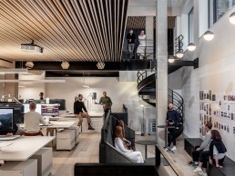
Great Sutton Street, Conran and Partners Studio, UK
When architecture and interior design firm Conran and Partners moved to its new premises in Clerkenwell, London, it called on Into Lighting to develop a lighting scheme that enhanced the “hospitality” feelings of intimacy and cosiness.
Architecture and interior design firm Conran and Partners has recently moved to a brand new headquarters in the heart of Clerkenwell, London.
Designed by the studio itself, the move sees Conran and Partners relocate its 70-strong team from its longstanding headquarters in Butlers Wharf – where it has been based for more than three decades – to a new, two-storey workspace that has been transformed into a creative hub in London’s key design district.
Following the passing of its founder, Sir Terence Conran, last year, and the global pandemic, the move to a new premises is part of a wider recalibration for Conran and Partners after a period of rapid evolution that included the expansion of its international reach with the opening of a Hong Kong studio in 2018. To coincide with the relocation, the studio has also undergone a rebrand, with a new company look that it believes “better reflects the ethos and design principles of the practice today and into the future”.
Situated on Great Sutton Street, Clerkenwell, the new studio occupies the ground and lower ground floor of an existing building. The two floors are connected at each end by double-height spaces and crafted steel staircases, which not only physically connect the spaces, but also allow natural light to penetrate to the lower floor.
The feeling of fluidity is enhanced further by organising the workspaces with as few impenetrable barriers as possible; meeting spaces that span across the width of the floors are formed of large, fluted and antiqued mirror glass panels, with wide, full height sliding doors that maintain sightlines through the depth of the spaces when open, and appear as translucent screens when closed.
The entrance was also kept deliberately understated – rather than being greeted by an imposing or intimidating reception or waiting area, on arrival guests are welcomed into an open reception space where they can immediately see from one end of the studio to the other, with an assortment of activity between, and also down to the level below, courtesy of a large light well and open staircase.
While natural light penetrates from both ends of the studio, a great deal of attention was also paid to the lighting landscape as a whole. As such, Conran and Partners worked closely with Into Lighting and MEP Gloster S-Worx to design the natural and artificial lighting for the space, with the aim of using light to enhance feelings of intimacy and cosiness.
Darren Orrow, Director at Into Lighting, explained how the collaboration began: “Into have worked with Conran and Partners on many projects over the last 10 years; to be asked to collaborate on the lighting design aspect of their new offices was a fantastic opportunity, one we knew would be challenging as the space was to be their new home, so it had to be right,” he said.
“With Conran and Partners acting as architect and interior designers on their own headquarters project, they had a very strong vision for the interiors and lighting. The lighting aesthetic and ambience was to be more hospitality than workplace focused – their vision was for the architectural lighting to be integrated into the interior architecture as much as possible. Where possible they wanted the architectural light sources to disappear, while providing appropriate levels for the different functions of each space.”
As such, Into Lighting worked with the architects to develop an architectural lighting concept that used concealed, low-glare fixtures where possible. A warm white colour temperature of 3000K was used throughout – dropping down to 2700K in integrated shelving and display details – providing a more hospitality feel.
“Conran and Partners really understand lighting and have an extensive knowledge of light fixtures, so the concept was developed around knowledge sharing favourite light fixtures, analysing performance criteria and working out how best to integrate fixtures into the interior architecture,” Orrow continued.
Alongside the warmer lighting, the use of timber throughout adds to the hospitality aesthetic. Blond oak flooring with birch ply ceiling battens softly reflect light and highlight the sense of unity and fluidity throughout the space. In contrast, the flank walls and shelving are constructed out of dark stained poplar ply, while fluted bronze glass panels and screens create additional texture but lift the space through light reflection.
The architects also considered the acoustics of the new workspace; these have been designed to be muted to the extent that open plan discussions can be heard, and a creative buzz is present without being overbearing. To do this, a black acoustic fabric is stretched above the ply ceiling battens to absorb noise disturbance, while also screening off ceiling services and adding to the visual and acoustic calm of the space.
However, Orrow explained how the extra acoustic treatments created some unexpected difficulties for the lighting. “Covid and associated lockdowns meant face-to-face meetings during the design stages were not as often as we would have hoped, and when you can’t be hands on as a team with samples and mock ups it is challenging to work out practical and discreet fixing methods to integrate light fixtures into concealed details,” he said.
“The acoustic treatments made this more challenging, and fixing details had to be carefully engineered to avoid any penetrations. Space was tight, fixtures and fitting methods had to be adapted and cable routing and connections re-engineered.
“Gloster S-Worx, were very proactive in helping explore all avenues and assisting with mock ups to ensure the desired discreet install and cabling of light fixtures could be achieved.”
Across the workspace there are no cellular offices, no division between teams and no hierarchical seating arrangement – a mixture of seating and desk space is provided, including dynamic sit-stand desks with a combination of desk lights and screen bars, to give each team member the tools they need to adjust their workspace throughout the day. Meanwhile meeting spaces offer a variety of environments suited to different ways in which the team can come together; from a traditional board table to more intimate spaces, relaxed sofa areas, a ‘snug’ and a double height ‘theatre’ space at the heart of the studio.
While this creates a varied environment for staff, Orrow explained how the lighting caters to the different requirements of each space: “To help differentiate the spaces, the designed light levels throughout change accordingly to create contrast – the transitional spaces and breakout areas are illuminated to a lower light level to help create a cosier ambience, with the lighting then ramped up as you move into the workspaces and meeting rooms to achieve a good level of functional illumination.
“The fixtures within the transitional spaces are also concealed as much as possible, with low glare light sources to keep the ceilings clean, the suspended linear profile lighting within the workspace provides direct/indirect, which throws light onto the ceiling to help lift ambient light levels. Areas such as sample rooms were designed with specific colour temperatures and beam angles so that material samples can be viewed correctly under both daylight and warmer light.
“Where we have exposed fittings, such as the linear profiles above the working area, the fixtures were specified to ensure the diffuser provided a homogenous light effect with no distracting features.
“The design intent was for the architectural lighting to be sympathetic to the interior design and materiality, and to see and feel the light effect rather than the light fixture to provide a space with suitable light levels throughout, but also creating the correct ambience within each specific area.”
Offsetting the architectural lighting, decorative lighting fixtures were handpicked by Conran and Partners. “Some came from their original office, and some were sourced new,” Orrow added. “The decorative lighting formed an integral part of creating a hospitality look, feel and ambience to the spaces.”
As an architecture and interior design studio, Conran and Partners is often described as “lifestyle designers” with an “aim to design for living, whether that’s for work, leisure, socialising, eating, playing, sleeping, etc.” This ambition can be seen by the firm’s new offices, and Orrow is hopeful that the lighting design contributes to an inviting, inspiring, and energising workspace.
“As Conran and Partners spend more time in the space, for sure there will be small adjustments to the lighting and control as one only ever really understands a space and lighting within when one uses the space regularly,” he said.
“But for now, we are really pleased with the end result, and feel confident that Conran and Partners’ vision has been realised.”


