Green Heart, UK
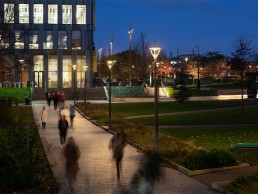
At the centre of the University of Birmingham campus, a new, 12-acre green space named Green Heart provides a welcome social and educational hub for students and faculty, with a perfectly balanced lighting scheme from Speirs Major.
In the built-up environs of a university campus, it is essential for planners, architects and designers to create break-out spaces where students and faculty can find time to relax, recharge, and switch off from the every-day stresses of higher education. The University of Birmingham offers this in Green Heart, a striking new 12-acre public park that connects the school’s historic Edgbaston campus with student residences.
Designed by landscape architects Churchman Thornhill Finch, with lighting designed by Speirs Major, the new green space was created with the ambition of “promoting interaction between students, staff, visitors and other users” to create a “safe but pleasing ambience and identity”.
Lighting was a key pathway to achieving this, as Mark Major, Senior Partner of Speirs Major, explained: “The concept was to achieve a sensitive and sustainable balance of light and darkness across this important social and educational hub, facilitating freedom of movement while enabling richly varied opportunities for interaction and outdoor learning after dark.”
Part of the overall design concept for the space was to “maximise opportunities for serendipitous encounter”, creating a space where students and staff would wish to linger and spend time outside of class.
Major explained how the lighting concept helps to facilitate this approach: “We made sure that circulation routes were clear and intuitive, and punctuated these with atmospheric places to congregate and socialise.”
The new Library Square’s central lawn is surrounded by a glowing halo of light that combines with the lighting of the main circulatory routes to make the interlinking spaces of the park legible after dark. Softly lit tertiary routes cut through the darker centralised pockets, with strong highlights to objects such as benches and architectural features.
The result is a delicate balance of light and darkness, that creates a sense of drama and ambience, while also allowing for aspects such as wayfinding and security.
“We employed a carefully considered hierarchy of light intensities, managed through the lighting control system, to ensure safe passage and a good sense of security, while enhancing the character of the landscape, protecting its ecology and minimising energy consumption,” Major continued.
“The highest lighting intensities occur on the primary pedestrian and cycle routes, and at the many changes of level across the park,” added Philip Rose, Associate Partner of Speirs Major. “The bridge features integrated balustrade lighting, creating a dramatic lit effect on the bridge floor. Concealed lighting within the handrails highlights the staircases and selected pathways, and creates the halo effect to the sloping grass banks that surround the central lawn – which acts as an additional area of informal social and study space.”
Meanwhile, located at the top of the sloped bank between the new Library Square and existing University Square, the retained and relocated heraldic shields have been lit as a feature, using ground recessed lights.
The scheme by Speirs Major also emphasises the site’s natural character. Glowing tree canopies announce the primary pedestrian entrance gateways, while rows of illuminated trees frame the views from the amphitheatre, creating a sense of enclosure. Further key trees are uplit in the University Square to the south of the site, facilitating social encounters beneath them.
With the project spanning across 12 acres, Speirs Major worked very closely with the landscape architects and the wider project team to ensure that there was a “seamless integration of lighting into the wider design of the campus”, while creating a sense of coherence and consistency throughout the park. “With the sheer scale of Green Heart, it was important to determine what to illuminate and what to leave unlit,” added Major. “This allowed us to develop a targeted approach that focused on supporting access and routes, along with defined areas of dwell space.”
All circulation routes, planting and “areas of encounter” are lit in a consistent colour temperature – a warm white 3000K that evokes a relaxing character akin to an outdoor living room. The only exception is the water feature’s cascades, which are enhanced using a tonally complementary, cooler white light.
The choice of lighting equipment itself reflects the character of the different elements of the scheme, as Rose explained: “The hierarchy of light intensities is consistently applied sitewide, and the mounting heights of the lighting equipment are similarly scaled. The main routes adjacent to the university buildings have taller, eight and 10-metre timber columns, with multiple spotlights to help reduce the quantity of columns overall.
“For the internal pedestrian routes, four-metre timber columns provide a more human scale and a natural aesthetic that complements the park design. In the darker landscaped zones, the routes are revealed through low-level light only.
“The use of timber for these columns allows them to be more sympathetic to the landscape also, which helps to make it feel less like an urban or regeneration project.”
The scheme also enables 100% internet coverage across the site, so that it can function as an academic space as well as an area of relaxation. This technology was incorporated into the lighting columns, helping to reduce clutter. “Innovation was also incorporated into the project by installing the 13sqm Pavegen, just before the bridge,” Rose added. “Here, footfall actually powers the USB charging points at the nearby workbenches.”
Indeed the efforts made by both Speirs Major and the wider design team have contributed to creating a communal space that is both pleasing on the eye, interestingly and creatively lit, while retaining a sense of security after dark. Major continued: “The overall impression is one that is well-considered, that provides a highly legible, safe and attractive after dark environment – simple and elegant.”
While Speirs Major has worked on numerous public realm and external lighting projects, the lighting designers commended the university for creating this new, green space in the middle of the built-up academic setting.
“It was brave of the client after building a new library and demolishing the old building that, instead of redeveloping the site with a further building, they chose to retain and develop a large, open landscape,” concluded Major.
“Historically, there was an intention to create a formal open space in the middle of the campus, however the old library did not allow this. Green Heart reinstates the original 1920 axis that runs north to south, and opens up the campus, providing a unique public green space.”


