Hoare Lea: LightSIM
Dominic Meyrick, Partner at Hoare Lea, explains how the lighting design studio’s web-based controls app – LightSIM – helped to rejuvenate the lighting for LTS Architects’ new office space.
Back in August 2019, I gave a talk to LTS Architects at their rented offices in Bermondsey. During the conversation that followed, we discussed workplace lighting and
I mentioned that I thought their lighting was terrible… fortunately Greg Shannon, director and founder of LTS, took this in good grace, and we went on to examine the existing scheme, with its 600×600 ceiling downlights, together.
Recognising that the ‘LG3 throwback’ lighting was awful, Greg had hoped that the task lighting in which LTS had invested would enable everyone to turn off the inherited background fluorescents. However, when they tried this, staff complained that the space was too dark. My CPD seminar had mentioned that this approach doesn’t generally work, and because LTS were moving to a new office at 66 Wentworth Street in Spitalfields, London, I agreed that I would advise on the lighting scheme with a view to trying out new ideas about how an office could be lit to save energy, while creating a comfortable, attractive visual impression.
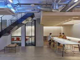
The new office comprises a ground floor containing the main workspaces and a small meeting room, while the basement level is designed around a long meeting table set beneath a timber slatted ceiling, lit by an internal skylight. I had the plans, knew the environment and the work that would be carried out, and so could tailor the lighting accordingly. Obviously, this is the luxury of a Cat B fit-out.
Ground Floor
Bang on trend, LTS were thinking of painting the ceiling and services black. Perhaps this aesthetic works in a hip coffee shop, but I didn’t think it would work for an office where visual comfort is paramount and factors, such as age, should be considered. The brain and visual system is designed for daylight. If the ceiling above our heads is dark, our visual system will take us to the time it is naturally dark overhead: nighttime. And so any space will appear dark. Clearly this would be a problem in a workspace. We therefore recommended keeping the galvanised silver elements on the ceiling and painting the concrete slab white. We could then uplight the ceiling and use the interreflection created to bring brightness into the space. Such an approach would mean that the mechanical kit would be lit and, well, why not! If it is there, why not flaunt it à la high-tech architecture.
The big idea on the ground floor was to have a continuous linear system, rather than pendants hanging over the desks. The main obstacle to this change was the aesthetic of exposed services, which were set.
We knew staff would be largely working in the middle of the floorplate, so the only space available for lighting was around the edge. Supplied by Optelma Lighting, the linear system runs around the space, uplighting the room and creating a background lighting level of 200lux +. The asymmetric system runs right across the windows. This is because at night, windows become ‘light suckers’; putting artificial light on the ceiling above the window opening reduces the impression of ‘black holes’. Therefore, with the exception of the entrance door, the eight areas of large glazing within the ground floor working area all have the system running across. However, the channel is so small (around 50x10mm) that it appears as a line, which does not upset the aesthetic.
We brought 13 Dyson Lightcycle task lights from LTS’s old office. These are the only ‘feature’ light fittings in the interior, and give the task lighting on each desk as required by BS EN 12464-1.
Having been a lighting designer for more than 30 years, I am happy to admit that while I love their light, I ‘hate’ light fittings as too often they distract from the architectural character of an interior. However, in this office, the Dyson task light is part of the ‘desk architecture’ and so is a visual enhancement rather than distraction.
Away from the main office space, the second big idea was to use concealed lighting. In the corridor between the office area and back meeting room, a floor-mounted, buried light fitting along one side uplights the wall. Opposite, in the alcove area where desks are located, concealed fittings ‘push’ downlighting onto the working area.
Finally, rather than trying to hide the ugly fan coil air-conditioning units, we decided to make them a feature, with colour-changing LED lighting putting colour into the space.
Basement
The basement comprises a meeting room, break-out space and desking. At present three of the desks are spares, which might in the future be rented out. As there is no task lighting in the basement, it was agreed that pendants would provide direct lighting over these. The main feature is the pin wall, which at 15m long, runs from one end of space to the other. Rather than putting downlighting on this thoroughfare, we specified asymmetric light fittings under the board. This system provides light that washes down onto the corridor that runs from the front to the back of the building.
The same asymmetric profile is used in the basement and the ground floor. Interestingly, we changed the lumen package for the LED strip: on the ground floor ceiling it is 3000lm per square metre, whereas under the pin wall in the basement it is 1000lm. Opportunities can be missed if care is not taken when working out the LED strip to be used within a profile. LED tape will only do the job if you consider the lumen package, placement and purpose.
LightSIM
Hoare Lea’s web-based LightSIM Controls App enabled LTS to explore lighting scenes, with photometrically accurate imagery on- screen, before they were uploaded to the real-world environment. Once a ‘scene’ is created in the app’s virtual environment, it is sent to a web-based lighting controls system and then imported directly into the enabled light fittings. We specified Mymesh from Chess; this enables each fitting to be ‘spoken to’ without hard wiring a control system.
LTS can easily reformat any of the lighting scenes. Whether in the building or working remotely, they can control the light, creating different scenes, while saving energy by making sure light is only on when needed.
Energy
The energy use across the lighting, if all on at 100% output, sails close to the maximum requirements of Part L (10.76W/m) for an office space. However, the LightSIM has allowed the ‘trimming’ downwards of the energy use to 6W/m, without losing that all important visual impression; and obviously the task lights are only on as and when required. The key is to remember that the eye, designed for the lit condition of daylight, will not ‘see’ the difference in visual impression of a lit scene when the lighting is at 100%, compared to 70% output. With further ‘tweaking’ the overall energy use was reduced without any detriment to users.
Commenting on the success of the solution, Shannon said: “It has been an absolute pleasure to work with Dominic and his team, and watch our humble home come to life. The results have transformed our thinking on lighting, energy use and what’s possible. We have saved significant sums on the build and on our running costs and have gained a beautiful scheme of which we are all very proud.”


