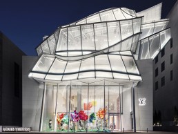
Louis Vuitton Maison Seoul, South Korea
Louis Vuitton announced the grand opening of Maison Seoul, a new South Korean flagship store, last year.
The opening of Louis Vuitton Maison Seoul marks a further link in the already strong connection between the Maison and Korean culture. Located in the prestigious Cheongdam-dong in the Gangnam district, the new flagship store brings together two world-renowned architects’ visions: Frank Gehry’s poetic façade and Peter Marino’s dynamic interiors. Throughout the store’s five floors, all of Louis Vuitton’s collections can to be experienced in a variety of intimate spaces, connected by an airy, floating staircase. Clients are provided with an entirely unique private shopping experience surrounded by works of art, historical Louis Vuitton archival objects and artisanal savoir-faire.
On the uppermost floor of the store, Louis Vuitton also inaugurated the Espace Louis Vuitton Seoul, the fifth exhibition space of its kind around the world. For its very first exhibition, the Espace Louis Vuitton Seoul presented eight emblematic sculptures by Giacometti, that belong to the collection, including L’homme qui chavire [The man who capsizes] (1950) and Grande Femme II [Tall Woman II] (1960).
L’Observatoire International was brought on board to complete the lighting design for the flagship store after a pre-established working relationship with the retailer. “We have a good relationship with Louis Vuitton from a number of projects, including the Fondation Louis Vuitton, where Gehry Partners was also the design architect,” explained Hervé Decottes, Principal of L’Observatoire International. “We were brought in from the beginning to create the overall lighting concept for the gut renovation of the five-story building, which includes retail spaces, multi-cultural space, façade and exterior lighting. The project took four years from the start to completion.”
Working on the project alongside Decottes, from L’Observatoire International, was project leader Jessica Jie Soo Tchah and project team members Carrie Chang and Sam Power .
“The nature of the building’s signature Gehry architecture brought with it some design challenges for the team to overcome when implementing the lighting scheme,” elaborated Tchah. “For areas in the Gehry Partners scope, the glass façade volumes, with a series of enclosed terraces, were the main challenge. We had to locate the fixtures within the very complex geometrical shapes of the building. Each curved glass panel has a different shape and height, and is positioned in different angles, but the lighting effect needed to be revealed in the same manner throughout. In addition, as fixtures are located in interior spaces, the detailing needed to be visually pleasing to the visitors.”
In order for this to be accomplished, the luminaires were tried and tested in multiple full-scale mock-ups and 3D modelling reviews to provide glare-free illumination.
“To enhance the dynamic and poetic façade, we grouped lighting control zones according to volume, including roof louvers, and within the volume, different height glass panels had separate control zones. During the scene setting proofs, each volume was set with different dimming percentages,” explained Tchah.
“For areas where the Peter Marino team designed interior retail spaces, the main challenge was to harmonise the atmosphere and lighting elements from each floor to Gehry’s façade.”
Each floor represents a different universe, according to Marino’s interior design, but the obvious statement comes from the airy and spacious entrance atrium. It was important for the lighting scheme to respond to this vast space and connect the different universes with the varying lighting fixtures from Flos, Feelux, formalighting and SR Luxconex, considerately placed to avoid being visible. “The lighting gesture was to reveal Peter Marino’s modernist interior volumes, embracing textural stoned walls, and using grids of light to allow for flexibility throughout the space to highlight merchandise. By providing back drops with perimeter illuminated walls, lighting created depth within the spaces,” continued Tchah.
“The other challenge was to locally source the majority of fixtures. To accomplish both the client’s and our desires, most of the lighting fixtures were developed as custom fixtures [from IMS, PTG and Miso Lighting] to meet our required design criteria to support the project’s specifications.”
Over the course of the project, the fourth floor changed purpose from a permanent dining café to a multi-purpose space that required flexible lighting. The original lighting plan for the dining area aimed to “light the dining tables using fixtures with a very tight beam spread, since the ceiling is five-metres high,” said Tchah.
For the updated layout the team “kept the same track lighting system but reconfigured the layout and modified beam spreads for the fixtures, with added wallwashers.”
Due to the nature of the building’s structure, the team had some issues with placing the fixtures. “We had placement issues for the interior ceiling lights, which were conflicting with the existing MEP system. Because of limitations of height above the finished ceiling, the fixtures were replaced from a track system within a recessed backlit slot gorge to a low-profile recessed track system with surface mounted track heads and linear glowing light lines to provide ambient lighting.”
To enhance the beauty of Gehry’s architectural statement, the façade of the building was illuminated from the inside out. “The key was to provide lighting from the enclosed spaces and integrate the detailing as a part of an architectural element. During the daytime, light fixtures are hidden but as night falls, light accentuates each volume and creates a lantern effect for the glass volumes.
“We had several mock-up studies with a 1:1 scale single glass panel with the team, then two large full-scale visual mock-ups were constructed with cladded glass from a high zigzag-shaped vestibule and window, and a series of enclosed terraced spaces and roof louvers,” she added.
During the visual mock-up stages, the team reviewed the lighting fixture locations and specifications as well as the mounting details, cable management, remote power supply locations and the lighting control system.
“The review process was very critical for the team, as most of the structural elements (tubular structure, membranes, glasses, joint, etc.) are exposed and lighting elements had to be accommodated accordingly within the listed elements discreetly,” continued Tchah.
In order to combat potential glare from the LED chips, the team designed custom luminaires to reduce visibility of the fixtures. “For the signature façade, most of the light fixtures were visible from different viewpoints and reflected in the curved glass paneling. We had a limitation on locating the fixtures, where they are mounted above the tubular structure, so we developed fixtures that can rotate and tilt in a wide range to reach not only floor surfaces, but also wall surfaces.
“In terms of lighting controls, daisy chaining was one of the important factors for wiring, since we had a limitation on locating remote drivers.
“For the interior spaces, besides lighting the merchandise with high-quality fixtures from exact fixture offsets, we had to consider the strict lighting layout, with grids of light for flexibility throughout the space. We specified and designed the fixtures and layouts throughout to have a minimal, clean aesthetic with options to have flexibility.”
The ground floor entrance space had specially developed custom track fixtures that were used to target three visual elements from a single DALI track system. One was used to highlight the artworks that are mounted on the stone wall and suspended in space using projectors with medium beam spreads. The second set was aimed at the merchandise using projectors with very tight beam spreads, and the third washed the stone wall with a soft, wide beam spread.
Throughout the retail space, L’Observatoire International designed fixtures that aimed at all the products, including those on top shelves. These fixtures were easy to aim and lock during the light focusing. A customised-finish Flos fixture was used on the stairs to combat the site and programmatic restraints of height limitations under the stairs.
Overall, the team created a successful lighting scheme for the designer retail space. “As we were collaborating with Gehry’s and Peter Marino’s teams, we wanted our lighting design to harmonise with their spaces and give continuity throughout, even though each space has a different concept and programme,” reflected Tchah.
“We designed the entire building to be controlled with an astronomical time clock, so when the sun starts to go down, the building envelope begins to bring a new vibe to the store and to the neighbourhood. Working with Louis Vuitton and two standout architects was a unique experience. It is always challenging working with two architects, but from other projects we’ve worked on together, we are familiar with their design processes and expectations, so we were able to manage this with a joyful vibe.
“This project was really a team effort, because we had a big team to work with: the client (Louis Vuitton), two design architects, two local architect teams, the façade consultant, two general contractors, the millworker, local lighting distributors, local lighting control parties, and so on.
“I want to thank all of the teams once again, because we had some challenges during construction, but it turned out very successful with their support. The success of this project was this great team work and positive energy!”


