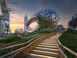
Museum of the Future, UAE
The latest architectural marvel in Dubai’s expanding skyline, the Museum of the Future opened earlier this year. arc speaks to Buro Happold and architects Killa Design about the iconic new landmark.
In a city that is already renowned for its outlandish, extraordinary architecture, how do you add to the skyline and create something even more eye-opening? Dubai’s newly opened Museum of the Future somehow manages to do just this – a vast oculus at the top of a vibrant green hill, the building is a beacon for the future and the newest landmark for the city.
Designed by Dubai-based architects Killa Design, the museum is situated adjacent to the Emirates Tower, alongside Sheikh Zayed Road, the main spine of city. The dynamic, 77ft-tall, seven-storey museum sits atop a man-made green hill, which elevates the building in a calm and unobtrusive way above the nearby metro line, while creating a rare green space within the city.
The glimmering, futuristic upper building was envisioned to “represent humankind with all of its strength, artistry and ability to create harmony with its surroundings”, while its elliptical void represents innovation and the “unwritten future into which humanity, and the world can symbolically look towards”.
Further adding to its extraordinary design, the windows of the avant-garde façade of the grand oculus take the form of an intricately 3D-mapped poem, written in Arabic calligraphy by His Highness Sheikh Mohammed bin Rashid Al Maktoum, Vice President and Prime Minister of the UAE and Ruler of Dubai. Offering a glimpse into the museum, after dark, His Highness’ words are outlined in light, illuminating the city’s skyline through 14km of LED lighting.
Inside, the museum tells the narrative of the future through a series of interactive exhibitions, inviting people to experience technologies and trends that will shape the future of humanity. Spanning an area of 30,000sqm, the pillarless structure also represents a novel global intellectual centre; a living laboratory designed to foster a spirit of collaborative innovation to inspire new solutions to tomorrow’s greatest challenges.
One of the most complex construction projects ever attempted due to its unconventional design, sustainability goals and awe-inspiring aesthetic, the façade is comprised of stainless steel and glass, consisting of 1,024 separate, unique panels – significant in itself as each panel represents a single byte of digital information.
Shaun Killa, Design Partner at Killa Design, explained how the studio first got involved with this landmark project, and how his designs first came together: “I was invited to take part in a design competition alongside 22 competitors from around the world. I submitted two options – one was a more conventional design, and the other was more iconic. When I presented to His Excellency and all the ministers, I was told that the design for the museum won outright.
“Looking at the site, I knew that it had to be on Sheikh Zayed Road, which is the heartbeat of Dubai and highly visual for tourists and residences. But due to the size of the site, to get the area requirement for the museum, we would have to go vertically, so to lift the whole building up, we created a hill of greenery that is effectively like the earth swelling up. It ties the site directly to the metro station and knits it into the urban fabric of the city.
“The building itself is a vessel that emulates the vision of Sheikh Mohammed and his father, Sheikh Rashid, and the vision for their future generations. I wanted to come up with something that was futuristic, parametrically optimised, with a sense of dynamic movement.
“The void in the centre of the building represents the ‘unknown’ and people who seek the unknown, innovate and discover new horizons and ideas that help guide humanity towards a better future.
“Then, I wanted to contextualise the building in the region, so I used the ancient art of Arabic calligraphy as the windows to the museum, using Sheikh Mohammed’s own words about the future, regionally and globally.”
The illumination of the calligraphy windows was something that Killa sought from the early concept stages, and he explained that lighting is always a core consideration in his work: “From the very first day of the competition, I made a night rendering. I always conceptualise lighting on buildings, and I knew that we would use LED to highlight the calligraphy.”
To illuminate this unique building, Killa Design worked with Buro Happold, who provided a broad scope of engineering services across the site. Despite the architects having a clear idea and vision for the lighting of the museum, Chris Coulter, Associate at Buro Happold, explained that the lighting team wasn’t given a specific brief for the building, but instead sought to create something that would complement the architecture without drawing focus. “The thinking was ‘how do you match the iconic nature of the design, and how do you do it in a way that is not showing off?’” he said.
“The building is so iconic that subtlety is a word that is strange to use, because every little move you make in lighting the calligraphy, etc, feels very extravagant, but it was always about the visitor experience, and how you are driving this as a destination and reinforcing the underlying concept of the calligraphy without being too over the top.
“We wanted to make sure that it wasn’t too cheesy or glitzy within the context of Dubai; Dubai is not your typical quiet neighbourhood, and while there is not necessarily an expectation that you have this grandeur, much of what is in the region is elevated up to this extra level. So, for the façade, we wanted to do something that was subtle yet iconic, that would match with the design but not turn into too over the top an expression.
“I laugh about it being a subtle design, but it is what we were trying to accomplish; it’s more about being integrated with the design concept and reinforcing the architectural expression.”
Owing to the atypical form of the building, the calligraphy lighting, which is the fundamental aspect of the façade illumination, required a great deal of attention, including several mock-ups and tests, before the optimal solution was reached.
Killa recalled some of the early approaches to the exterior lighting: “I’d initially anticipated that the lights would face flush and run through the glass, and we would use dots that were sandblasted into the glass to create the effect that light was coming through the glass itself. When we made the mock-up, because of the joints some areas were shadowed, so we took the same LED and turned it 90-degrees so that it faced directly out, and then it looked great.”
Coulter concurred: “It’s a curved building, and so for any of these windows, when we tried edge lighting, we found that we’d have hot spots at the corners and dead spots as well. We wanted to keep the façade relatively smooth and not having projections off the building, which would potentially harm the view of this ovoid shape, so we instead pointed the light outwards, which would reinforce the shape of the calligraphy.
“Some people were hesitant about having this outward facing, neon-type approach, but once we thought about the context of where the building is and what it is, we feel like it fits in – it’s very forward thinking, so we hope that it continues to inspire people.”
Buro Happold’s lighting designs also extended into the interiors of the museum, as well as the surrounding landscape, where the clean, subtle approach continued. Coulter explained: “All of the interior lighting, with the exception of the exhibition lighting, was by us. On the exterior, we did the façade lighting, some of the grounds lighting, but we also worked with the landscape architects in a collaborative effort in illuminating the landscape.
“We shared the same design goal, because we wanted the building to be the star, so everything was fairly minimal outside of that, but it still becomes very inviting and as people come up to the building at night, there’s enough welcoming light, but nothing too overpowering.”
In both the landscape lighting and inside the building, one of the primary considerations for Coulter was for lighting to act as a wayfinding tool to guide visitors through the space. While the uniform lighting inside at first seems to eschew this idea, Coulter explained that through subtle details at core moments, Buro Happold was able to highlight the features of the space. “The client was very interested in the notion of how lighting helps draw you through a project, but then also trying to be as minimally invasive as possible,” he said.
“The notion of minimalism and subtlety as you look at the lobby and all of the calligraphy coves doesn’t seem to hold true, but it’s about hiding the sources and having a uniformly lit zone, and highlighting where the ticket counter is, the threshold as you go into different portions of the building, the bridge piercing through the calligraphy pieces, having the elevator core lit with very subtle, grazing wall wash, it helps you identify where you are in the building. It was this blending of a subtle approach, lighting surfaces rather than trying to conceal as many of the downlights as possible.
“We also worked with Killa Design to identify where in the embellishments of the calligraphy we could locate fixtures, how we could hide the drivers for the façade lighting, or the interior calligraphy lighting within the embellishments. It was a really detailed effort between us, the architect and the engineering team to pull it all together.”
Another unique element of the Museum of the Future is that, within its clean, sparse interiors there are no structural columns, as the entire building is held together by the exterior “skin”. This helps to make the interiors feel even more vast than they already are – although the museum is just seven storeys in height, each storey is nine metres tall, meaning that it equates to around 20 storeys in a typical building.
Such large ceilings and open spaces did offer some difficulties to Buro Happold when it came to creating this uniform feel, but it was a challenge that the team was able to work through.
“It was challenging in the belly especially, because in some of those areas there are openings cut in the floors too, to have a grand view up through the spaces,” Coulter said. “The top floor is very shallow at the end as the roof comes down to the edge, but in the middle, it is very tall, so we had to match that lighting environment across the space. There was a ceiling system that we were working with, but in some of the special spaces, the geometry is irregular, so where we could place the lighting was also irregular.
“The structure itself wasn’t a great concern though, because it is not interrupting things on the interior like it would normally. There are some areas where the structure is a very fascinating part of the building, but it’s largely hidden, and aside from the calligraphy windows is not expressed in any manner on the interior. Occasionally you’ll see revealed portions of the structure, which is quite beautiful, it’s a subtle hint of what is supporting the building.”
Following its official opening in February of this year, the Museum of the Future has been widely publicised, and is already considered the latest iconic landmark in the already impressive Dubai skyline. Indeed, the high-profile nature of the project meant that there was an underlying expectation from the get-go that this would be another jewel in the already star-studded city.
That being said, both Buro Happold and the architect have extensive experience of working on high profile projects in the region. Coulter explained that his work on the Museum of the Future was sandwiched in between the stunning Louvre Abu Dhabi, and the Sustainability Pavilion at Expo 2020.
“There was definitely a lot of pressure on the nature of the project, and it was interesting to have these iconic projects all going on at the same time. The Museum of the Future and Expo are very different though, so it was nice that we had the more upfront, outwardly visible project that is Museum of the Future versus the Expo – both had their challenges, but they were opposites in the sense of how the designs came together.”
As for Killa, he added that, while he appreciated the enormity of the project, it was imperative to ensure that the museum was designed and executed to the highest standards due to the significance of the project for Dubai and its leaders. This also included the building reachinf some of the highest standards in sustainability and conserving, recovering and generating energy.
He added: “About 19 years ago, I designed the Bahrain World Trade Centre, which was the first building in the world to integrate large scale wind turbines, which became a catalyst to sustainability in the region. I also designed the Dubai Opera House, which is greatly appreciated as a cultural addition to Dubai. But I did know that the significance of this building would be greater than both of them.”
The overwhelmingly positive response that the museum has had since its opening is also reflected in both Coulter and Killa’s feelings on the project post-completion. Coulter in particular feels the illumination of the façade calligraphy helps to elevate the building to another level.
“The lighting successfully reinforces the design, and in particular the poem that Sheikh Mohammed has written. One of the great concepts once the poem was written and the calligraphy started to take shape was to zone the lights on the façade and selectively identify words and phrases from the poem. It’s a very subtle programming that allows the building to live and breathe, and really showcase what it’s about.
“There were a lot of challenges and trying to figure out the façade detail involved a lot of work and scratching the head, figuring out how it was going to work. We’d sold everyone, including ourselves, on the need for it to be lit, and making sure that we execute that and that it looks like something we want to be proud of, and at the end of the day, it exceeds all expectations.”
Killa concluded: “Over the seven-year journey of the design and construction of the Museum of the Future, one becomes accustomed to creating something through its challenges and constant improvements with the engineers and contractors. Even within a week of its opening, we were still snagging the museum where nothing had prepared us for the literal change of experience that happened after the opening.
“But because of this journey, I didn’t prepare myself for walking in there a day after the opening ceremony when it was filled with people taking pictures, looking up and enjoying the spaces, and seeing that it’s moments in people’s lives that they remember, it influences them and educates them. That’s an amazing feeling and I think fulfils an architect’s ultimate sense of creating something significant.
“We were the custodians of the design through to where we got to, but it’s great that the museum has now been handed over to its visitors and guests, who will take away their own memories of the space.”


