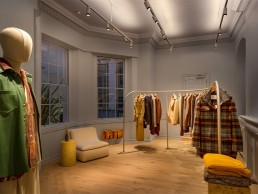
Nanushka Flagship Store, UK
Fashion brand Nanushka recently launched its flagship store in the heart of London – a high end location with a relaxed, welcoming feel. This is complemented with a simple yet well thought-out lighting scheme from 18 Degrees.
Contemporary fashion label Nanushka, founded by Sandra Sandor, has seen success grow across its flagship stores in Budapest and New York. The label’s latest opening is the recently completed flagship store in Mayfair, London.
UK-based architect Hyphen approached long-time collaborators 18 Degrees to work with concept designer Festen Architecture on the lighting design of this Grade II listed retail space. Christopher Knowlton, Director of 18 Degrees, sat down with arc to explain his team’s involvement and the design decisions taken to create this simple, yet effective scheme for the fashion brand.
“Representing the biggest project for Nanushka in their portfolio so far, we joined the team to develop a lighting language for the space as well as gain heritage approval,” said Knowlton. “In the early stages of the project, we worked with the client and team to understand the quality of light required within the space. Retail design often enjoys high contrast providing visual hierarchy,” he continued. “It was important that while providing hierarchy we didn’t remove all other light. Giving a soft, diffuse lighting element is a good way to ensure flattering light for shoppers and also make the space social media friendly. An ever-important element of store design.”
Taking inspiration from the label’s focus on sustainability and importance in supply chain transparency, the lighting scheme was designed to evoke an openness that would reflect these company values. “We wanted to balance the daylight, diffuse light and focused light to make the space feel light and airy,” said Knowlton. “The store needed contrast to give some structure, but we didn’t want the clothes to look different once out of the display and in front of the mirror. This is a key element of supporting the sales process,” he added. “Often, products look great on the rack or shelf until the customer interacts with them, taking them off the display and the appearance changes. The result of this effect can be lower sales and therefore it’s important to manage this in concert with the sales choreography used by the brand.”
Breaking down the space, the lighting is divided into three elements, each designed to work sensitively within the historic fabric of the building. “Firstly, a lightweight track provides soft diffuse light to the ceiling. This enhances the large floor-to-ceiling heights in the space,” explained Knowlton. “It also gives a good fill light when looking at products or in the mirrors. The track also facilitates spot lighting to add highlight. Increasing the intensity of the product gives visual hierarchy without the overall space feeling gloomy.
“The final element is special features. Lighting integrated into display units or decorative features. While mostly diffuse sources, these highlight the visual appearance of the space.”
Working within a listed building also brought with it structural placement issues for the team to consider when planning the fixture positions. “Architecturally we needed to be sensitive to the historic fabric,” said Knowlton. “Cutting lots of holes in a historic building is fraught with danger. The unknown structural timbers, fibrous plaster clinging to timber laths from the 1700s and the undocumented changes to the building through its history.
“These considerations and the requirement to gain heritage approval led us to the track system. Minimal architectural intervention with flexibility in cabling locations. In locations where we wanted to use downlights, investigations were made to check if it was possible and adapted as we went through the construction phase.
“Historic buildings always throw up surprises and so designing flexibility is key!”
18 Degrees worked closely with concept designers Festen Architecture and Hyphen to develop a lighting scheme that would work cohesively with the brand and the environment. “It was a really collaborative effort and there were a lot of influencing factors on the design,” said Knowlton. “This is also Nanushka’s first UK store and one of the largest globally, so we needed to make sure that the design worked for them and the way they wanted to use the space.
“At the start of the project, we met the design team and client onsite. It was freezing cold, but you could feel a sense of energy about this incredible building being re-imagined. Little did we know that the world as we knew it would change beyond belief. The global pandemic took hold and suddenly our client and concept architect were unable to travel to site. We couldn’t even meet up with our UK collaborators.
“Testament to the client, design and construction teams, we got back to it as quickly as we could. While the online video conferencing platforms are now a daily staple, the signing off materials and lighting tests are both logistically and visually difficult when the team is unable to meet in one place,” Knowlton told arc.
Further to the demands of completing this project, 18 Degrees used its status as an independent designer to its advantage, utilising the freedom to select equipment from its chosen suppliers. Knowlton continued: “In this project, we needed equipment quickly to satisfy the programme. We also knew that physical form would have a big impact on the aesthetic of the space. The 48V system from Reggiani lent itself well to the installation and the team always work hard to ensure the product arrives on time and assist the contractor when needed. Quality of light is critical in retail, so to match the Reggiani spotlights we used Lumino for our linear lighting.
“The interior feels almost residential by design. Nanushka want people to come to the space and feel comfortable interacting with the clothing and also the staff. The coffee bar at the back of the store is located in a glazed atrium space with an external courtyard. This isn’t a space you come purely for the transaction of buying a product,” he added.
“The look and feel were also driven by the desire to host events and experiences at the store.
“Everyone has been very impressed with the way in which the products look and how the space feels. The design is simple; it relies on solid well-considered principles rather than flashy equipment or gimmicks. The space in person feels very comfortable day and night and the ability to dim either the uplight or the track means it can be used for a range of activities.
“Overall, I think the design is successful in balancing the retail objectives against a space that feels comfortable to spend time in,” Knowlton concluded.


