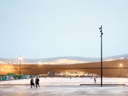
Oodi Central Library, Finland
Oodi, the new central library for Helsinki, stands centrally in the cultural district of the city as a gift for Finland’s 100th anniversary of independence. Created by ALA Architects, the firm also designed the lighting scheme alongside Rejlers Finland.
ocated opposite the Finnish parliament, the site for Oodi, Helsinki’s new central library, was chosen specifically because literature and education are regarded to be as important to Finnish society as politics is. The United Nations named Finland the world’s most literate nation in 2016, as well as being among the most enthusiastic users of public libraries; the country’s population borrows an average of 68 million books a year.
As part of the Helmet network (Helsinki Metropolitan Area Libraries), the Oodi offers far more than just book loans. Creative spaces with glass walled rooms for visual projection artists, media suites, children’s areas, a cinema, recording studios, areas for hosting exhibitions and even 3D printers are all available to the people of Helsinki.
Oodi, translated as ‘ode’ in English, is a three-storey open plan structure, created by ALA Architects, a Finnish design firm that won the opportunity to design the new public building in an annonymous competition open to international designers.
Niklas Malhberg, architect and Oodi project team leader at ALA Architects, described the firm’s initial involvement: “In 2012, we entered the first phase of the open international and anonymous architectural competition between the 5th January – 16th April. At the end of 2012, the second phase of the architectural competition began on 21st November, where six candidates (out of the original 544) were selected by the jury. The winner was announced in 2013, and it was our project, titled Käännös.
“Our multidisciplinary team started the process to execute the building in 2014; construction started on 1st September 2015 and was completed in 2018.
The project was presented in the Mind-Building exhibition at the Finnish Pavilion in the Venice Biennale 2018 before opening its doors on 5th December.”
The building is divided into distinct levels that are split into different active spaces. The ground floor is an extension of the exterior Kansalaistori square, drawing visitors in to an open and clean space. The first floor is home to a host of workable spaces and the top floor is nicknamed book heaven.
The book heaven is a bright and airy floor that is filled with natural daylight through the floor-to-ceiling glass windows and skylights that perforate the undulating roof.
With the changing role of a library for current and future generations, ALA designed a modern and energy efficient building that utilised local building materials to sustain local climate conditions. A sweeping curved canopy is clad with 33mm-thick Finnish spruce planks that extend the façade into the exterior square, creating shelter for public events in front of the library. The upper surface of the canopy, located adjacent to the café, provides an outdoor roof space that allows visitors to gather and view the square and the city.
Lighting was an important aspect of the build, as it had to fit with the natural aesthetic of the building, but also act as a functional tool for readers and workers alike.
With no initial lighting brief offered by the client, the team at ALA had artistic freedom to create a scheme fitting for their design, as long as it was energy efficient and met the normal lighting levels for libraries.
The team collaborated with Rejlers Finland, an electrical design company, to implement a lighting scheme according to the appropriate lighting levels, good serviceability and measured lighting control.
“We utilised the in-house expertise we’ve gathered through several public projects. The electrical designer specified the lighting and did the necessary calculations. All in all, we had plenty of freedom to design the lighting,” explained Mahlberg.
With the functions of each floor varying, it was important that the lighting adapted to each need.
A variety of fixtures were used, from Regent, Planlicht, iGuzzini, Finlight, GDS and Erco for the larger main spaces, multipurpose hall and children’s multipurpose area on the third floor, whilst Zumtobel was used for the second floor studios. Bega and LTS fixtures were used for the staircases and exterior lighting, whilst LED Linear illuminated the escalators. Erco luminaires were placed as indirect lights for the third floor pillars as well as in the cinema room, alongside Osram LEDs.
Mahlberg described the functions for each of the levels and how the lighting adapted to these needs: “The design divides the functions of the library into three distinct levels: an active ground floor, a peaceful upper floor, and an enclosed in-between volume containing the more specific functions. The lighting scheme had to be in sync with the architectural concept and therefore every space had a specific lighting solution. As we had control over the lighting design and also had a continuous presence on the building site during the realisation period, we could easily follow up on any issues, and when necessary, propose solutions that supported our original concept.”
In the most part, the lighting fixtures were subtle and blended into the architecture seamlessly, disappearing into the background. Some exceptions appeared, for example in the bathrooms, where pendants were suspended from the ceiling to create another layer of light in the space.
“There were fixed requirements for lux levels depending on the function of each space and the light fixtures had to fulfil the illuminance demanded,” explained Mahlberg. “In some areas, dimmer lighting was sufficient to emphasise other more important areas, such as circulation routes and bookshelves. The fixed furniture is equipped with lamps for personal work, and these lamps are effectively part of the furniture.”
Most of the lighting scheme is controlled and dimmable with DALI and operated with KNX building control.
In the workspaces and reading rooms, the lighting was important to the users needs. The glass façades and skylights in the book heaven provide ample daylight in the public areas, reducing the use of artificial lighting. However, during different seasons and weather conditions, the lighting throughout Oodi is an integral part of its architecture, adapting to the different times of day and seasonal lighting conditions.
“There were some new concepts to be implemented in this particular project. The overall design concept was based on the idea that the building itself would not be illuminated. Instead, the functions inside were made visible through the glass façades using light. This was a new concept and we had to develop a lighting control programme that would support this idea. Since the building is standing in the very centre of the city, it can never be completely dark. Outside opening hours it is only dimly lit up and thus avoiding looking deserted, it participates in activating the city space around it,” described Mahlberg.
“In the cinema hall for the first time we used fibre optic lighting combined with LED lights to achieve the design intent with continuous light dot lines on the walls and the ceiling marking every seating row. This worked out fine in the end, even though we had our doubts regarding the possible difference of the quality of light from these different light sources. This is also the first project where white neon light tubes were used in the signage.
“One element was the colour of the light, normally 4000K is used as a standard but sometimes it gives a rather pale and dull atmosphere, especially with wood involved. So, we did some testing and found out that 3000K or 3500K worked better in some circumstances.”
There were some custom made solutions throughout the building made to accommodate the lighting fixtures, such as the bookshelves that were modified so the lighting fixtures could contribute to the overall lighting of the book heaven.
A hanging bubble made of ETFE (Ethylene Tetra Fluoro Ethylene, a plastic construction material) hangs in the southern entrance way and acts like a lantern guiding visitors in.
“Lighting brings clarity, warmth and readability to the spaces and helps one to orientate through the building. The final result is fantastic and works very well with our initial ideas. There are still some adjustments to be made in the lighting control, but we are very happy with the overall finish,” reflected Mahlberg.


