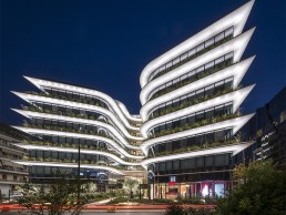
Orbit Urban Office Campus, Greece
With bold façade illumination from Danilof light + visual perception studio, the newly-opened Orbit Urban Office Campus is the latest marvel in modern workspace design.
Opened in August of this year, the Orbit Urban Office Campus in Athens, Greece, exemplifies modern workspace design. With its glowing, undulating façade drawing you in, the clean, organic design is complemented by a crisp, homogenous lighting scheme that acts as a celebration of the architectural form.
Commissioned by Noval Property, project managers and directors for the project, and designed by Lianou Chalvatzis Architects and Vikelas Architects, the low-rise building stands nine storeys tall, with six additional basement levels. Local lighting designer Thanos Danilof, Studio Director of Danilof light + visual perception studio, was tasked with illuminating the new building. Danilof explained further how his studio was selected for this particular project: “As an Athens-based lighting design consultancy, we have worked with the same client in other smaller projects at various stages in the past.
“Since this project was aiming for a unique nocturnal image, and at the same time for a LEED certificate, the developers decided early on that they have to appoint a dedicated lighting designer that will work creatively and technically with all management, design and construction teams. We were involved from the concept design stage, all the way through to technical design, tender stage and construction support.”
Once brought on board, Danilof was given a clear brief from the clients to create “a nocturnal city landmark that at the same time achieves LEED certification and will be completed within a reasonable lighting budget for a project of this scale”.
“The architects were concerned on how the characteristic shape of the façade they designed, the continuity of its form, the sharpness and the curvilinearity are going to be perceptible at night,” Danilof added.
As such, he and his design studio decided that its lighting design concept would be to make the façade appear “self-luminous: homogenous and clear”, with a pure white illumination that would allow the structural form of the building to “shimmer” over the dark, reflective glazing. “A continuous band of cool white light picks out the distinctive shape of the building, wraps around it and dissolves into darkness and ambient luminance,” Danilof explained.
As the concept grew and evolved, Danilof decided that the interior lift lobby areas – the visible “spine” of the building – would be revealed in a welcoming, warmer tone. “At ground level, warm light would delineate the sculptural qualities of the landscape, while cool white light would accentuate the olive trees,” he continued.
“A subtle note would also be introduced by the delicate shadows cast by façade plants on each level, that would move gently as they get caught in the night breeze.”
Danilof decided very early on to specify lighting at 4000K MacAdam step 2 for the façade illumination, for a strict, pure white consistency, while all interior areas were kept at 3000K or less in order to have a colour contrast at all times. Further to this, interior office lighting has been set to automatically switch off after business hours, and the dark reflective glazing contributes to an even higher contrast while allowing for visually interesting reflections. Because of these measures, with CCT contrast, the lighting designers didn’t need to use higher lighting levels in order to bring out the form of the façade and visually separate the interior volume and the glazing.
However, as the studio approached the detailed design stage, it faced some challenges, as Danilof explained: “Ideally, as a design principle, in order to have an even, homogenous wash on the façade, we wanted to keep the same projection geometry throughout the building. Obviously this was not feasible everywhere, therefore at level 0 we asked for a bespoke luminaire housing structure of detailed dimensions attached to the glazing. This would illuminate the first white cladding at the same projection distance as at all other levels. Other areas necessitated custom long throw, short throw or in-ground fixtures that would match the visual result of the standard projection.
“At this point, we did a lot of testing at the studio. We started with detailed photometric calculations and 3D models, and then we decided to do a bit of bricolage. We built a 1:1 section detail out of cardboard and double-checked the standard projection geometry optics with various luminaire samples. At the same time, we had to constantly collaborate with the sustainability consultants in order to keep everything in check with LEED criteria, and the electrical engineers to conclude on feasible wiring solutions.”
By harmonising aesthetics, functionality and sustainability into one coherent lighting solution, Danilof Studio aimed to seamlessly integrate lighting within the architectural fabric of the building, while creating an environment with high levels of visual comfort that prevents light spill and light pollution. Towards that end, the studio developed architectural lighting details and lighting design specifications for bespoke luminaires with special optics, housing and light chromaticity characteristics.
In doing so, during the construction stage, Danilof Studio worked with Illumination Physics and its Greek partner Luce Ataliotis, who engineered and delivered the bespoke lighting systems to meet these specifications.
Peter Kemp, Co-Founding Partner of Illumination Physics, explained further how the manufacturer developed these bespoke systems: “Consistency of the quality of the white light was of paramount importance to Danilof.
“The horizontal strata were to be illuminated from below: curved white surfaces lit in neutral white at 4000K. This created a set of critical parameters requiring extreme level of care in binning. Neutral white is the most sensitive colour temperature to work with, because the slightest variation in colour temperature or hue is obvious, and illuminating a perfectly white surface is a sure way to reveal any inconsistencies.”
In order to create an even illumination around the curved façade, Illumination Physics developed a new family of linear light fixtures, based on a six-LED, 300mm version of its Linear Graze Mono, DC, CV and DMX.
“The linear light fixtures that would be used were to be as physically small as possible for aesthetic reasons. They could not be continuous due to the curves, and therefore the overlapping beams must be perfectly overlaid to produce a homogenous result,” Kemp explained.
The manufacturers developed numerous prototypes for factory mock-ups, while tests were conducted simulating the precise distances and projection surfaces that would be encountered on-site. They then took these prototypes on-site for final testing, after which three custom variants of the new fixtures – each with different lengths and wattages – were specified, alongside an in-ground version.
These custom-developed fixtures cast an even wash of light on the façade, which, when combined with the attention to detail of Danilof Studio that saw detailed photometric calculations in 3D models, and a consistent use of mock-ups all the way from concept design to construction, create a crisp, homogenous illumination along the Orbit’s curving façade.
Alongside the striking façade lighting, there were numerous other considerations for the lighting designers – notably in carefully illuminating the abundant plant life.
Each stratum of the façade contains a continuous planter for flowers and other organics that are partly illuminated, casting complex shadows on the soffit above. This inclusion of plant life was seen as a means of softening the hard, modern lines of the architecture – a fusion of organic and inorganic.
“It was a part of our lighting concept to include discreetly the plant life into the nocturnal image of the façade,” Danilof said. “This required careful coordination during the technical design and construction stage with the landscape architects and designers.”
This collaboration with the landscape architects and designers, as well as Danilof Studio’s work with Illumination Physics, is something that Danilof believes was integral to the eventual success of the project.
“Collaboration is key in all projects, big or small, business or otherwise. It is how we evolve individually and collectively,” he said. “We were lucky in this project to collaborate on a daily basis with so many disciplines and diverse teams during both the design and construction stage.”
Continuing this collaboration, Danilof added that, on completion of the project, he is looking to help with the maintenance of the building, to ensure that the lighting doesn’t fade with time. “We are preparing a lighting maintenance manual, and we will be having meetings with the company that won the maintenance contract of the building. In a way this is one of the most challenging parts of the project.”
Going the extra mile in this way is a testament to how pleased Danilof is with the final lighting design for the Orbit – a design in which the lighting responds perfectly and organically to the unique shape and context of the design. The sharp, even illumination to the Orbit’s flowing exterior, in which the lighting is seamlessly integrated into the architecture, further enhances this new landmark, and what will no doubt become a new monument to modern workspace design.


