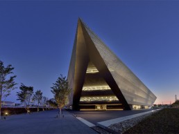
Otemon Academic Ark, Japan
The Otemon Gakuin University’s newest campus opened a year ago in the heart of Smart-City Ibkaraki in northern Osaka, Japan. The 40,000sqm facility is home to half of the university’s student population, equating to roughly 3,600 students.
Designed by architectural firm Mitsubishi Jisho Sekkei with lighting design from akari+DESIGN, the striking triangular structure presents a beautiful learning facility for the students.
Project Architect Yasuhiro Sube sat down with arc to discuss the project: “I wanted to design a one-building campus that would encourage communication in the age of texting and smartphones. My inspiration was the image of an iconic inverted triangular pyramid floating over the Earth,” he explained.
“An analysis of the surrounding urban landscape led me to conclude that a triangular plan was most appropriate for the site, and this developed into an inverted pyramid form, a powerful contemporary shape that attracts students and community members. I used environmental simulation software to further refine the form through computational design.”
In an age of internet technology increasing the ability to communicate remotely, the architects were driven to create an educational complex that would draw students in, stimulate their interests and encourage exploration.
Taking inspiration from traditional Japanese shrines, the architects created the dubbed Academic Ark as a place of gathering, much like that of a shrine that attracted pilgrims from across the country to meet. The Academic Ark’s outstanding triangular form presents steeply angled sides that create an inviting “gate” that students and educators enter through. Inside the Ark, audiences are welcomed with a great floating silver volume in the main hall. The floating volume contains a library filled with books and a book trail that encircles the centrepiece, which is flanked by six large classrooms on both the second and third floors. Above, 21 classrooms fill the fourth and fifth floors. “A large void between the library and the book trail allows for visibility between the floors, making apparent the energy created by a learning site where individuals both see and are seen by each other,” explained the firm.
Lighting design, by Hiroyasu Yoshino and Mai Okada at akari+DESIGN, was integrated in the early stages of design in a close working relationship with the architects. “I contacted Mr [Hiroyasu] Yoshino at quite an early stage in the project, once I’d decided on an inverted pyramid form with a floating library inside,” explained Sube. “I wanted the lighting to strengthen the impact of the design, so that the structure and space would really stay with people. Mr Yoshino and I have collaborated on other projects, and I love the way his lighting design is modulated to create a mysterious atmosphere, similar to the light of the sun and moon.
“Mr Yoshino’s lighting is as essential to my spaces as the sun and moon. The most striking space is useless in the dark. His lighting is an art, with the power to give life and emotional impact to architecture, differentiating it from ordinary environments.”
Speaking of his collaboration with Yoshino, Sube added: “I tell him about the space I am envisioning and the points that require special attention from the perspective of user convenience and leave the rest to him. Satoko Uda, Mitsubishi’s electrical engineer, also collaborates with Mr Yoshino not only on the engineering but also on issues related to post-construction management and operation.”
When discussing the design details for the floating library, Sube describes how the working relationship with Yoshino influences his architectural choices. “We jointly came up with the idea of using reflective material from the K-Spot spotlights designed by Shiro Kuramata, whose work we both love,” he said. “I’d been wanting to use that material in an architecture project, but there weren’t any previous examples of it being applied in such a large space. The way we worked with contractors and construction workers unfamiliar with this industrial item was through trial and error to create a huge, seamless floating mass, made a strong impression on me.”
Inside the Academic Ark, the modern architecture is enhanced with the use of architectural lighting, which defines the lines and textures of the building.
“My brief was to attractively illuminate this unique triangular architectural form,” explained Yoshino. “I was also asked to design artistic, centripetal interior lighting, and exterior lighting that would make the structure into a reassuring local landmark. These fundamental concepts remained consistent from start to finish.”
Yoshino claims his initial impressions of the triangular structure, both inside and out, were like that of a spaceship. “I wanted to somehow use light to make this silver form float in the air,” he explained. “I was also thinking about maintenance and using indirect lighting in a way that creates a physical sensation. All of the interior spaces are lit with long, thin dotless LED lights. These thin lines of light emphasise the edges of the triangles, creating a futuristic impression. In particular, the 15mm-wide linear LEDs on the outside of the corridor handrails both effectively bring out the library’s exterior walls and contribute ambient light to the entire atrium through reflection.”
Inside the library space, Yoshino encountered one of the inevitable challenges a project like this brings. One of the structural constraints he faced was with the library bookshelves. “At first, I intended to install horizontal LEDs on the shelves, but I then learned that the lights could not be attached there, so I hastily switched to vertical linear LEDs on the boards forming the sides of the shelves so that the bookshelves themselves function as lighting,” he explained. “Switching to a vertical design had the added effect of emphasising the height of the shelves and making the space more striking, so the design ended up evolving thanks to on-site problem solving.”
Yoshino’s lighting scheme was so successful due to the attention to detail he carried throughout the building and to the student’s wellbeing when using the space. One example of this is seen in the embedded LEDs in the handrails illuminating the exterior of the library in the atrium. He explained further: “These linear dotless LEDs are controlled with a DMX signal, which dims them in a slow, random pattern. I felt that the light needed to flicker in this way because there are no skylights or other source of natural light in this space. When students leave the classrooms, they experience a sense of passing time arising from this flickering light, which is similar to slowly passing clouds.”
Along with the health and wellbeing of the student’s playing a big part both the architectural and the lighting designs, the architecture was also sensitive to its environmental impacts. As Sube explained: “The façade is fabricated from unpainted cast stainless steel, treated to prevent dulling and shaped like cherry blossom petals – the first example of its kind in the world. This “eco-screen” reduces thermal load by 50% and blocks visibility from the surrounding residential neighbourhood, so that those inside and outside the building are not aware of one another.
“In Japan, when the cherry blossom trees are in full bloom, groups of friends gather under them to eat and drink. I wanted to create a place for learning that was surrounded by this same motif of cherry blossoms in full bloom. For the past 10 years or so, I have been interested in the potential of cast metals to reduce environmental load by lowering the amount of solar heat that buildings absorb. Cast aluminium must be painted but cast stainless steel can be used as-is in a façade. I’d used this contemporary approach previously on commercial façades and interiors at the Taipei Nan Shan Plaza in Taiwan, and this current project further deepened my understanding of the material.”
Yoshino’s lighting design responded to this awareness of environmental impact, and he specifically chose LEDs for their environmentally friendly and long-lasting nature.
“Architects can give their buildings windows and skylights to bring natural light inside. That makes the interiors more comfortable, but the accompanying solar radiation can also create an unpleasant environment,” added Sube. “In the areas where the stainless-steel façade and windows don’t bring in sunlight or moonlight, Mr Yoshino went beyond providing the bare minimum of necessary light by contributing to the creation of one-of-a-kind artistic spaces.”
Throughout the Ark’s unique triangular shape, Yoshino’s design emphasised its shapes, yet stayed discreet and unassuming. “Because the architectural design was so incredibly futuristic and fantasy-like, I did my utmost to ensure that the lighting design would be unnoticeable,” explained Yoshino.
“The building has so many sloping and acutely angled forms, I decided to illuminate them only from a fixed direction. That created shadows, and a contrast of light and dark that emphasises the forms,” he added.
“Wherever possible, I designed the lighting to follow the circulation paths and architectural forms so that it would blend into the space. Aside from the classrooms, I did not attach downward-facing fixtures to the ceilings. That allowed me to illuminate the ceiling and wall surfaces so that the forms came forward strikingly.
“The narrow dotless LEDs also allowed me to linearly connect the lighting into a seamless overall design. The dotless lights look like the lightsabres in Star Wars, which I felt was perfect for creating a futuristic, new kind of space.
“I’m very pleased with how the lighting design turned out. I think that thanks to the lighting plan, the lighting became an element of the architecture. It’s not simply task lighting or illumination, but instead functions similarly to wallpaper or curtains. I feel like the small, delicate LED lights gave rise to a new kind of design,” concluded Yoshino.


